Figure 501: Split Action Bar on Android 4.3
Android 5.0 introduced a Toolbar widget, offering functionality akin
to the action bar, but in the form of a ViewGroup that can be positioned
where you need it. You can even use a Toolbar as an outright replacement
for the action bar, for cases where you need a bit more control over
the action bar implementation than you get by default.
In this chapter, we will explore the use of Toolbar. Note that
an upcoming chapter will cover the use of
a backport of Toolbar that works back to API
Level 7… albeit with some issues.
Understanding this chapter requires that you have read the core chapters, particularly the one on the action bar.
Note that the examples in this chapter are clones of a couple from the core chapters. This chapter’s prose was written assuming that you were familiar with those samples, so you may need to go back and review them as needed.
One of the samples relies upon using a custom Parcelable class, which
is covered in another chapter.
As noted earlier, a Toolbar is an ordinary ViewGroup. While it does
not support placing arbitrary children in it the way a LinearLayout
might, it otherwise can be used like any other ViewGroup. In particular,
you can put it in a layout resource and position it wherever it makes
sense, such as in a lower quadrant of a tablet-sized screen, tied to
some specific part of your UI.
However, the Toolbar is not the action bar… at least, not by default.
As such, you will use somewhat different methods for interacting with
it, particularly for dealing with menu items:
inflateMenu() when you want to pour action items
into the menu, as a counterpart to the work you do in onCreateOptionsMenu()
for the action barsetOnMenuItemClickListener() to set a listener to be
invoked when the user taps on a menu item in the Toolbar, as a counterpart
to the work you do in onOptionsItemSelected()
A Toolbar does not automatically adopt much in the way of styling from
your activity’s theme. In particular, it does not set the background
color to be the primary color of a Theme.Material theme, the way the
action bar does. However, whether via a style resource, XML attributes in
a layout file, or Java code, you can affect these same sorts of
capabilities.
In Android 4.x, and in the original implementation of
the appcompat-v7 action bar backport, we had the
notion of the “split action bar”. On phone-sized screens in portrait
orientation, the action bar could easily get too crowded. We could
opt into having a split action bar in these cases, where action items
and the overflow would go into a bar at the bottom of the screen,
leaving the top for the app’s title, icon, and navigation items.
However, Theme.Material and modern editions of appcompat-v7 have
dropped support for the split action bar. To achieve the same basic
effect, you can use a Toolbar that you position yourself at the bottom
of the screen.
The
Toolbar/SplitActionBar
sample project demonstrates both the original Android 4.x way of getting
a split action bar and using Toolbar to get the same basic visual effect
on Android 5.0+. This is a clone of the ActionBar/VersionedColor sample
app from a previous chapter, supporting a tinted action
bar on Android 4.x (via a custom theme based off of Theme.Holo) and
Android 5.0+ (via a custom theme based off of Theme.Material).
Getting a split action bar on Android 4.x was easy: just add
android:uiOptions="splitActionBarWhenNarrow" to the <activity> or
<application> in the manifest. Putting it on <application> will affect
the default for all activities; putting it on a single <activity> affects
only that activity.
The sample app’s manifest uses android:uiOptions="splitActionBarWhenNarrow"
on the one-and-only activity:
    <activity
      android:name="ActionBarDemoActivity"
      android:label="@string/app_name"
      android:uiOptions="splitActionBarWhenNarrow">
      <intent-filter>
        <action android:name="android.intent.action.MAIN"/>

        <category android:name="android.intent.category.LAUNCHER"/>
      </intent-filter>
    </activity>
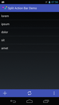
The result is, as the name suggests, a split action bar:
Figure 501: Split Action Bar on Android 4.3
Note that the bottom bar retains the tinting rules applied via our theme, created via the Action Bar Style Generator.
Since Toolbar is an ordinary ViewGroup, we can put one in a layout resource,
such as res/layout-v21/main.xml:
<?xml version="1.0" encoding="utf-8"?>
<LinearLayout
  xmlns:android="http://schemas.android.com/apk/res/android"
  android:layout_width="match_parent"
  android:layout_height="match_parent"
  android:orientation="vertical">

  <ListView
    android:id="@android:id/list"
    android:layout_width="match_parent"
    android:layout_height="0dp"
    android:layout_weight="1"/>

  <Toolbar
    android:id="@+id/toolbar"
    style="@style/SplitActionBar"
    android:layout_width="match_parent"
    android:layout_height="wrap_content"/>

</LinearLayout>
Here, we allocate wrap_content height for the Toolbar and give all
remaining space to the ListView (by means of android:layout_weight="1" and
no weight on the Toolbar).
The style attribute on the Toolbar points to a custom style resource,
in res/values-v21/styles.xml:
<?xml version="1.0" encoding="utf-8"?>
<resources>
  <style name="Theme.Apptheme" parent="android:Theme.Material">
    <item name="android:colorPrimary">@color/primary</item>
    <item name="android:colorPrimaryDark">@color/primary_dark</item>
    <item name="android:colorAccent">@color/accent</item>
  </style>
  <style name="SplitActionBar">
    <item name="android:background">@color/primary</item>
  </style>
</resources>
This sets the background color of the Toolbar to be the same background
color that we are using for the colorPrimary tint for our Theme.Material-based
custom theme. By default, Toolbar has a black background, despite
setting colorPrimary on the theme.
In onCreate() of the activity, we load up the layout file if we are
on Android 5.0 or higher:
  @Override
  public void onCreate(Bundle icicle) {
    super.onCreate(icicle);

    if (Build.VERSION.SDK_INT>=Build.VERSION_CODES.LOLLIPOP) {
      setContentView(R.layout.main);
    }

    initAdapter();
  }
Note that we could have had a separate res/layout/main.xml resource,
containing just the ListView. Then, we could call setContentView()
regardless of API level, with the resource system pulling in the right
one based on the device’s API level. In this case, since we are using
ListActivity, we do not need a layout for Android 4.x. Having two
lines of Java versus a separate layout resource is a tradeoff that could
be made either way.
This gives us a Toolbar, but by default it will be empty, making
it less than useful.
On Android 4.x, we can just implement onCreateOptionsMenu() and
onOptionsItemSelected(), and the items will work, whether we chose a
split action bar or not. On Android 5.0+, we need to explicitly put
the action bar items into the Toolbar and explicitly register a listener
to find out when those items are tapped.
We handle all of that in onCreateOptionsMenu() itself, using
different behavior based on API level:
  @Override
  public boolean onCreateOptionsMenu(Menu menu) {
    if (Build.VERSION.SDK_INT>=Build.VERSION_CODES.LOLLIPOP) {
      Toolbar tb=(Toolbar)findViewById(R.id.toolbar);

      tb.inflateMenu(R.menu.actions);
      tb.setOnMenuItemClickListener(new Toolbar.OnMenuItemClickListener() {
        @Override
        public boolean onMenuItemClick(MenuItem item) {
          return(onOptionsItemSelected(item));
        }
      });
    }
    else {
      getMenuInflater().inflate(R.menu.actions, menu);
    }

    return(super.onCreateOptionsMenu(menu));
  }
If we are on an Android 4.x device, we just inflate() a menu resource
into the supplied Menu for the action bar. If we are on an Android 5.0+
device, we:
Toolbar from the inflated layoutToolbar via inflateMenu()
OnMenuItemClickListener with the Toolbar, routing
the menu item click over to our onOptionsItemSelected() method, so
we can have one common implementation of logic for handling action items
that are either in the action bar or the Toolbar
Running this sample on Android 5.0+ gives us a split “action bar”
implemented as a Toolbar:
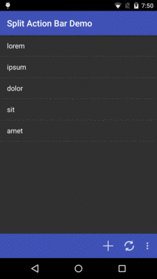
Figure 502: Split “Action Bar”, Via a Toolbar, on Android 5.1
One significant visual difference is the horizontal placement of the
action items. In a true split action bar, they are evenly spaced across
the bar. In a Toolbar, they are flush right (or, more accurately,
flush “end”, to handle right-to-left languages). There is nothing built
into Toolbar to spread the items out. While there are
hacks to make this happen,
they rely on internal implementation of Toolbar and may prove unreliable
over time.
Sometimes, the reason to consider a Toolbar is that you want the
user to have an easier time performing actions that pertain to a part
of the UI, instead of the whole UI. This is particularly the case on
tablet-sized screens, where the visual gap between parts of your UI
and the top action bar may be substantial.
As an example, the
Toolbar/EU4YouToolbar
sample project is based on the EU4You samples from
the chapter on large-screen strategies. There, we had a
master/detail pattern with a list of member nations of the EU as the
master and the mobile Wikipedia page as the detail.
EU4YouToolbar makes a few changes:
WebView in our UI, the user can go forward and backwards
in their browsing history, plus reload the current page.
On smaller screens, where the WebView fills the
screen, these controls are in the action bar:
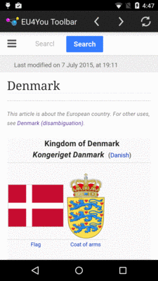
Figure 503: EU4YouToolbar Sample, on a Nexus 5
On larger screens, these
controls are in a Toolbar placed immediately above the WebView:
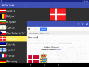
Figure 504: EU4YouToolbar Sample, on a Nexus 9
To keep things a bit simpler, this project has a minSdkVersion
of 21, so we do not need to fuss with backwards compatibility. In truth,
this would not be too difficult, requiring a different large-screen
detail layout (that lacks the Toolbar) and falling back to having
the navigational controls in the action bar if we cannot find a Toolbar.
The original sample used a WebViewFragment subclass (DetailFragment)
to display the detail, and it
supplied its own WebView. Now, we may want to show a flag (ImageView)
and Toolbar as well, so we need our own layouts. Normally, we still only
show a WebView:
<?xml version="1.0" encoding="utf-8"?>
<WebView
  xmlns:android="http://schemas.android.com/apk/res/android"
  android:id="@+id/webview"
  android:layout_width="match_parent"
  android:layout_height="match_parent">

</WebView>
However, on 720dp or larger screens, we add in an ImageView for the
flag and a Toolbar for the navigational controls:
<?xml version="1.0" encoding="utf-8"?>
<LinearLayout
  xmlns:android="http://schemas.android.com/apk/res/android"
  android:layout_width="match_parent"
  android:layout_height="match_parent"
  android:orientation="vertical">

  <ImageView
    android:id="@+id/flag"
    android:layout_width="match_parent"
    android:layout_height="0dp"
    android:layout_margin="8dp"
    android:layout_weight="1"
    android:scaleType="fitCenter"/>

  <Toolbar
    android:id="@+id/toolbar"
    style="@style/Toolbar"
    android:layout_width="match_parent"
    android:layout_height="wrap_content"/>

  <WebView
    android:id="@+id/webview"
    android:layout_width="match_parent"
    android:layout_height="0dp"
    android:layout_weight="3"/>

</LinearLayout>
That layout gives the Toolbar a style of @style/Toolbar, which sets
the background color of the Toolbar to be the primary color used by
our overall theme:
<?xml version="1.0" encoding="utf-8"?>
<resources>
  <style name="Theme.Apptheme" parent="android:Theme.Material">
    <item name="android:colorPrimary">@color/primary</item>
    <item name="android:colorPrimaryDark">@color/primary_dark</item>
    <item name="android:colorAccent">@color/accent</item>
  </style>
  <style name="Toolbar">
    <item name="android:background">@color/primary</item>
  </style>
</resources>
Originally, our DetailFragment only needed the mobile Wikipedia URL as
a data model. Now, though, we also need to know the image resource to use
for the flag. While we could handle this as two separate bits of data
(e.g., two extras to use with DetailActivity), another approach would
be to pass the Country as the data model. However, that requires
Country to be Parcelable, so we need to add some
code to Country to fulfill the Parcelable contract:
  protected Country(Parcel in) {
    name = in.readInt();
    flag = in.readInt();
    url = in.readInt();
  }

  @Override
  public int describeContents() {
    return 0;
  }

  @Override
  public void writeToParcel(Parcel dest, int flags) {
    dest.writeInt(name);
    dest.writeInt(flag);
    dest.writeInt(url);
  }

  @SuppressWarnings("unused")
  public static final Parcelable.Creator<Country> CREATOR = new Parcelable.Creator<Country>() {
    @Override
    public Country createFromParcel(Parcel in) {
      return new Country(in);
    }

    @Override
    public Country[] newArray(int size) {
      return new Country[size];
    }
  };
The onCountrySelected() method of the EU4You activity — which is called
when the user taps on a country in the “master” list — now passes the
Country itself over to the DetailFragment, whether directly or by
means of starting the DetailsActivity:
  @Override
  public void onCountrySelected(Country c) {
    if (details != null && details.isVisible()) {
      details.showCountry(c);
    }
    else {
      Intent i=new Intent(this, DetailsActivity.class);

      i.putExtra(DetailsActivity.EXTRA_COUNTRY, c);
      startActivity(i);
    }
  }
DetailsActivity just turns around and invokes the same showCountry()
method on DetailsFragment that EU4You uses when the DetailsFragment
is hosted directly in EU4You:
package com.commonsware.android.eu4youtb;

import android.app.Activity;
import android.os.Bundle;

public class DetailsActivity extends Activity {
  public static final String EXTRA_COUNTRY=
      "com.commonsware.android.eu4you.EXTRA_COUNTRY";
  private Country c=null;
  private DetailsFragment details=null;

  @Override
  public void onCreate(Bundle savedInstanceState) {
    super.onCreate(savedInstanceState);

    details=(DetailsFragment)getFragmentManager()
                               .findFragmentById(android.R.id.content);

    if (details == null) {
      details=new DetailsFragment();

      getFragmentManager().beginTransaction()
                                 .add(android.R.id.content, details)
                                 .commit();
    }

    c=getIntent().getParcelableExtra(EXTRA_COUNTRY);
  }

  @Override
  public void onResume() {
    super.onResume();

    details.showCountry(c);
  }
}
For the navigation controls, we need a menu resource. So, we define a
webview menu resource that contains action bar items to go back
in the browsing history, go forward in the browsing history, or reload
the current page:
<?xml version="1.0" encoding="utf-8"?>
<menu xmlns:android="http://schemas.android.com/apk/res/android">
  <item
    android:id="@+id/back"
    android:title="@string/menu_back"
    android:icon="@drawable/ic_action_back"
    android:showAsAction="ifRoom"/>
  <item
    android:id="@+id/fwd"
    android:title="@string/menu_fwd"
    android:icon="@drawable/ic_action_fwd"
    android:showAsAction="ifRoom"/>
  <item
    android:id="@+id/reload"
    android:title="@string/menu_reload"
    android:icon="@drawable/ic_action_reload"
    android:showAsAction="ifRoom"/>
</menu>
Most of the changes, not surprisingly, reside in DetailsFragment, which
now must manage the flag’s ImageView, the Toolbar (when it exists),
the action bar items (when the Toolbar does not exist), and the behaviors
to be invoked when any of those toolbar/action bar items are invoked.
DetailsFragment is no longer a WebViewFragment, as we need our own
layout. While ListFragment supports subclasses inflating a layout
(so long as the layout has a ListView named @android:id/list),
WebViewFragment does not. So, we inherit from the stock Fragment class
instead and have an onCreateView() method that inflates our desired layout:
  @Override
  public View onCreateView(LayoutInflater inflater, ViewGroup container, Bundle savedInstanceState) {
    View result=inflater.inflate(R.layout.details, container, false);

    webView=(WebView)result.findViewById(R.id.webview);
    flag=(ImageView)result.findViewById(R.id.flag);
    toolbar=(Toolbar)result.findViewById(R.id.toolbar);

    if (toolbar==null) {
      setHasOptionsMenu(true);
    }
    else {
      toolbar.inflateMenu(R.menu.webview);
      getNavItems(toolbar.getMenu());
      toolbar.setOnMenuItemClickListener(this);
    }

    return(result);
  }
Here, we inflate that details layout resource and retrieve our three
main widgets (webView, flag, and toolbar). However, there are two
versions of that layout resource, one for larger screens and one for
smaller screens. Only the larger screen has a Toolbar; the plan is for
smaller screens to use the action bar instead. Hence, toolbar may be
null.
If toolbar is null, we call setHasOptionsMenu(true), to opt into
this fragment participating in the action bar. If the toolbar is not
null, we have it inflate a menu resource via inflateMenu(), and we
set the fragment itself up to be the listener for click events via
setOnMenuItemClickListener().
In between those two steps, we call getNavItems(), passing the Menu
object that the Toolbar is using:
  private void getNavItems(Menu menu) {
    navBack=menu.findItem(R.id.back);
    navForward=menu.findItem(R.id.fwd);
    navReload=menu.findItem(R.id.reload);

    updateNav();
  }
Here, we retrieve our three toolbar items, stashing them as fields in
the fragment class. We also call updateNav():
  private void updateNav() {
    navBack.setEnabled(webView.canGoBack());
    navForward.setEnabled(webView.canGoForward());
    navReload.setEnabled(webView.getUrl()!=null);
  }
updateNav() updates the enabled state for each of those three toolbar
items, based upon the state of the WebView. If we can navigate back
(canGoBack() returns true), we enable the back toolbar item, and so
on. There is no canReload() method, so we substitute a check
to see if the URL in the WebView (via getUrl()) is null.
Since we called setOnMenuItemClickListener() on the Toolbar, indicating
that the fragment itself is the listener, the fragment needs to implement
the Toolbar.OnMenuItemClickListener interface. That requires an
implementation of a onMenuItemClick() method. In our case, as with
the previous example, we delegate that to onOptionsItemSelected():
  @Override
  public boolean onMenuItemClick(MenuItem item) {
    return(onOptionsItemSelected(item));
  }
onOptionsItemSelected(), along with onCreateOptionsMenu(), will also
be used if toolbar was null and we called setHasOptionsMenu(true)
to use the action bar. So, we have a mostly-typical implementation of
those methods, where onOptionsItemSelected() happens to be used both
for the action bar and the Toolbar scenarios:
  @Override
  public void onCreateOptionsMenu(Menu menu, MenuInflater inflater) {
    inflater.inflate(R.menu.webview, menu);
    getNavItems(menu);

    super.onCreateOptionsMenu(menu, inflater);
  }

  @Override
  public boolean onOptionsItemSelected(MenuItem item) {
    switch(item.getItemId()) {
      case R.id.back:
        if (webView.canGoBack()) {
          webView.goBack();
        }
        break;

      case R.id.fwd:
        if (webView.canGoForward()) {
          webView.goForward();
        }
        break;

      case R.id.reload:
        webView.reload();
        break;

      default:
        return(super.onOptionsItemSelected(item));
    }

    return(true);
  }
Note that in onCreateOptionsMenu(), we call getNavItems(), passing
in the Menu supplied to onCreateOptionsMenu(). Hence, no matter whether
we are using the action bar or a Toolbar to host the navigation items,
we have those MenuItem objects as fields.
The onOptionsItemSelected() implementation just calls appropriate
methods on WebView tied to the particular MenuItem, such as
canGoBack() and goBack() if the user taps the “back” MenuItem.
This gives us the visual result that we want. However, with the code as
shown so far, the toolbar items
would not change state as the user browses in the WebView. Their
enabled states are only set when the fragment is set up. We also need
to update those states as the user browses.
To handle this, we attach a URLHandler subclass of WebViewClient
to the WebView in the onViewCreated() method:
  @Override
  public void onViewCreated(View view, Bundle savedInstanceState) {
    super.onViewCreated(view, savedInstanceState);

    webView.setWebViewClient(new URLHandler());
  }
(note: this work could have been done in onCreateView(), but some
of this code was ported from a sample app that used WebViewFragment,
where we would not have an onCreateView() method)
Partly, URLHandler is responsible for ensuring that all clicks on links
keep the user within the WebView, via a shouldOverrideUrlLoading()
implementation. Partly, URLHandler is responsible for calling
updateNav() when it appears that the navigation state of the WebView
has changed. Unfortunately, there is no canonical place to update
those navigation items, so we hook into three methods and hope for the best:
onPageStarted(), onPageFinished(), and doUpdateVisitedHistory():
  private class URLHandler extends WebViewClient {
    @Override
    public void onPageStarted(WebView view, String url, Bitmap favicon) {
      super.onPageStarted(view, url, favicon);

      updateNav();
    }

    @Override
    public void onPageFinished(WebView view, String url) {
      super.onPageFinished(view, url);

      updateNav();
    }

    @Override
    public void doUpdateVisitedHistory(WebView view, String url, boolean isReload) {
      super.doUpdateVisitedHistory(view, url, isReload);

      updateNav();
    }
Now, assuming that those two hooks are sufficient, our back, forward,
and reload navigation items will be enabled or disabled as appropriate
as the user navigates within our app and the WebView.
Another thing that you can do with a Toolbar is make it serve as your
action bar. The net effect is that you can position your activity’s action
bar wherever you like, rather than have it be anchored at the top of
the screen. Also, you can control the Toolbar more than you can the
original action bar, for things like animations. For example, if you have
seen apps where the action bar slides out of the way while you are scrolling
down a list, only to return when you scroll back up the list, that could
be accomplished via a Toolbar as your action bar.
The basic mechanics of making a Toolbar serve as the action bar are
not especially difficult. Primarily, you need to inherit from
Theme.Material.NoActionBar (to suppress the regular action bar)
and call setActionBar() to attach your Toolbar to the activity to
serve as the activity’s action bar. As with all Toolbar-specific
code, this will only work on API Level 21+, though the appcompat-v7
backport offers similar capabilities.
The
Toolbar/SplitActionBar2
sample project is a clone of the SplitActionBar project from earlier
in this chapter, except that the Toolbar is set up to serve as the
activity’s action bar.
Our activity’s theme (Theme.Apptheme) now inherits from
Theme.Material.NoActionBar:
<?xml version="1.0" encoding="utf-8"?>
<resources>
  <style name="Theme.Apptheme" parent="android:Theme.Material.NoActionBar">
    <item name="android:colorPrimary">@color/primary</item>
    <item name="android:colorPrimaryDark">@color/primary_dark</item>
    <item name="android:colorAccent">@color/accent</item>
  </style>
  <style name="SplitActionBar">
    <item name="android:background">@color/primary</item>
  </style>
</resources>
The build.gradle file sets the minSdkVersion to 21, so we dispense
with the backwards-compatibility checks. So, in onCreate(), rather
than conditionally using main.xml as our layout, we always use it, followed
by a call to setToolbar():
  @Override
  public void onCreate(Bundle icicle) {
    super.onCreate(icicle);

    setContentView(R.layout.main);
    setActionBar((Toolbar)findViewById(R.id.toolbar));

    initAdapter();
  }
Our onCreateOptionsMenu() can also dispense with the conditional check
to see if we are on API Level 21+. However, since we are using the
Toolbar as our action bar, we can simply populate the action bar normally,
and it will affect the Toolbar:
  @Override
  public boolean onCreateOptionsMenu(Menu menu) {
    getMenuInflater().inflate(R.menu.actions, menu);

    return(super.onCreateOptionsMenu(menu));
  }
The result is that we have a regular action bar, with its normal contents
(e.g., title), but positioned where we put the Toolbar, at the bottom
of the screen, where it used to serve as the bottom half of the split action
bar:
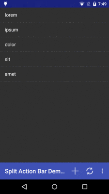
Figure 505: Toolbar as Action Bar on Android 5.1