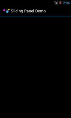
Figure 573: The SlidingPanel sample application, with the panel closed
Before ViewPropertyAnimator and the rest of the animator framework
were added in API Level 11, we had the original Animation base
class and specialized animations based upon it, like TranslateAnimation
for movement and AlphaAnimation for fades. On the whole, you will want
to try to use the animator framework where possible, as the new system
is more powerful and efficient than the legacy Animation approach.
However, particularly for apps where the NineOldAndroids backport is
insufficient, you may wish to use the legacy framework.
After an overview of the role of the animation framework, we go in-depth to animate the movement of a widget across the screen. We then look at alpha animations, for fading widgets in and out. We then see how you can get control during the lifecycle of an animation, how to control the acceleration of animations, and how to group animations together for parallel execution. Finally, we see how the same framework can now be used to control the animation for the switching of activities.
Understanding this chapter requires that you have read the core chapters, particularly the ones on basic resources and basic widgets. Also, you should read the chapter on custom views.
Android has a package of classes (android.view.animation) dedicated
to animating the movement and behavior of widgets.
They center around an Animation base class that describes what is
to be done. Built-in animations exist to move a widget
(TranslateAnimation), change the transparency of a widget
(AlphaAnimation), revolve a widget (RotateAnimation), and
resize a widget (ScaleAnimation). There is even a way to
aggregate animations together into a composite Animation called an
AnimationSet. Later sections in this chapter will examine the use
of several of these animations.
Given that you have an animation, to apply it, you have two main options:
ViewFlipper or TextSwitcher. These are typically
subclasses of ViewAnimator and let you define the “in” and “out”
animations to apply. For example, with a ViewFlipper, you can
specify how it flips between Views in terms of what animation is
used to animate “out” the currently-visible View and what animation
is used to animate “in” the replacement View.View to startAnimation(), given the
Animation to apply to itself. This is the technique we will be
seeing used in the examples in this chapter.Animation takes some getting used to. Frequently, it takes a fair bit
of experimentation to get it all working as you wish. This is
particularly true of TranslateAnimation, as not everything about it
is intuitive, even to authors of Android books.
The simple constructor for TranslateAnimation takes four parameters
describing how the widget should move: the before and after X offsets
from the current position, and the before and after Y offsets from
the current position. The Android documentation refers to these as
fromXDelta, toXDelta, fromYDelta, and toYDelta.
In Android’s pixel-space, an (X,Y) coordinate of (0,0) represents
the upper-left corner of the screen. Hence, if toXDelta is greater
than fromXDelta, the widget will move to the right, if toYDelta
is greater than fromYDelta, the widget will move down, and so on.
Some Android applications employ a sliding panel, one that is off-screen most of the time but can be called up by the user (e.g., via a menu) when desired. When anchored at the bottom of the screen, you get a container that slides up from the bottom and slides down and out when being removed.
One way to implement such a panel is to have a container (e.g., a
LinearLayout) whose contents are absent (INVISIBLE) when the panel is
closed and is present (VISIBLE) when the drawer is open. If we
simply toggled setVisibility() using the aforementioned values,
though, the panel would wink open and closed immediately, without any
sort of animation. So, instead, we want to:
This brings up a key point with respect to TranslateAnimation: the
animation temporarily moves the widget, but if you want the widget to
stay where it is when the animation is over, you have to handle that
yourself. Otherwise, the widget will snap back to its original
position when the animation completes.
In the case of the panel opening, we handle that via the transition
from INVISIBLE to VISIBLE. Technically speaking, the panel is always
“open”, in that we are not, in the end, changing its position. But
when the body of the panel is INVISIBLE, it takes up no space on the
screen; when we make it VISIBLE, it takes up whatever space it is
supposed to.
Later in this chapter, we will cover how to use animation listeners to accomplish this end for closing the panel.
With all that said, turn your attention to the
Animation/SlidingPanel
sample project and, in particular, the
SlidingPanel class.
This class implements a layout that works as a panel, anchored to the
bottom of the screen. A toggle() method can be called by the
activity to hide or show the panel. The panel itself is a
LinearLayout, so you can put whatever contents you want in there.
We use two flavors of TranslateAnimation, one for opening the panel
and one for closing it.
Here is the opening animation:
      anim=new TranslateAnimation(0.0f, 0.0f,
                                  getHeight(),
                                  0.0f);
Our fromXDelta and toXDelta are both 0, since we are not
shifting the panel’s position along the horizontal axis. Our
fromYDelta is the panel’s height according to its layout parameters
(representing how big we want the panel to be), because we want the
panel to start the animation at the bottom of the screen; our
toYDelta is 0 because we want the panel to be at its “natural”
open position at the end of the animation.
Conversely, here is the closing animation:
      anim=new TranslateAnimation(0.0f, 0.0f, 0.0f,
                                  getHeight());
It has the same basic structure, except the Y values are reversed, since we want the panel to start open and animate to a closed position.
The result is a container that can be closed:
Figure 573: The SlidingPanel sample application, with the panel closed
… or open, in this case toggled via a menu choice in the
SlidingPanelDemo activity:
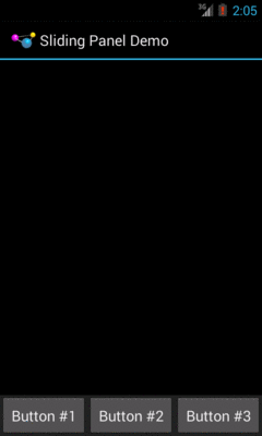
Figure 574: The SlidingPanel sample application, with the panel open
When setting up an animation, you also need to indicate how long the
animation should take. This is done by calling setDuration() on the
animation, providing the desired length of time in milliseconds.
When we are ready with the animation, we simply call
startAnimation() on the SlidingPanel itself, causing it to move
as specified by the TranslateAnimation instance.
AlphaAnimation allows you to fade a widget in or out by making it
less or more transparent. The greater the transparency, the more the
widget appears to be “fading”.
You may be used to alpha channels, when used in #AARRGGBB color
notation, or perhaps when working with alpha-capable image formats
like PNG.
Similarly, AlphaAnimation allows you to change the alpha channel
for an entire widget, from fully-solid to fully-transparent.
In Android, a float value of 1.0 indicates a fully-solid widget,
while a value of 0.0 indicates a fully-transparent widget. Values
in between, of course, represent various amounts of transparency.
Hence, it is common for an AlphaAnimation to either start at 1.0
and smoothly change the alpha to 0.0 (a fade) or vice versa.
With TranslateAnimation, we showed how to construct the animation
in Java source code. One can also create animation resources, which
define the animations using XML. This is similar to the process for
defining layouts, albeit much simpler.
For example, there is a second animation project,
Animation/SlidingPanelEx,
which demonstrates a panel that fades out
as it is closed. In there, you will find a res/anim/ directory,
which is where animation resources should reside. In there, you will
find fade.xml:
<?xml version="1.0" encoding="utf-8"?>
<alpha xmlns:android="http://schemas.android.com/apk/res/android"
  android:fromAlpha="1.0"
  android:toAlpha="0.0" />
The name of the root element indicates the type of animation (in this
case, alpha for an AlphaAnimation). The attributes specify the
characteristics of the animation, in this case a fade from 1.0 to
0.0 on the alpha channel.
This XML is the same as calling new AlphaAnimation(1.0f,0.0f) in
Java.
To make use of XML-defined animations, you need to inflate them, much
as you might inflate a View or Menu resource. This is
accomplished by using the loadAnimation() static method on the
AnimationUtils class, seen here in our SlidingPanel constructor:
  public SlidingPanel(final Context ctxt, AttributeSet attrs) {
    super(ctxt, attrs);

    TypedArray a=ctxt.obtainStyledAttributes(attrs,
                                              R.styleable.SlidingPanel,
                                              0, 0);

    speed=a.getInt(R.styleable.SlidingPanel_speed, 300);

    a.recycle();

    fadeOut=AnimationUtils.loadAnimation(ctxt, R.anim.fade);
  }
Here, we are loading our fade animation, given a Context. This is
being put into an Animation variable, so we neither know nor care
that this particular XML that we are loading defines an
AlphaAnimation instead of, say, a RotateAnimation.
Sometimes, you need to take action when an animation completes.
For example, when we close the panel, we want to use a
TranslationAnimation to slide it down from the open position to
closed… then keep it closed. With the system used in
SlidingPanel, keeping the panel closed is a matter of calling
setVisibility() on the contents with INVISIBLE.
However, you cannot do that when the animation begins; otherwise, the panel is gone by the time you try to animate its motion.
Instead, you need to arrange to have it become invisible when the animation ends. To do that, you use an animation listener.
An animation listener is simply an instance of the
AnimationListener interface, provided to an animation via
setAnimationListener(). The listener will be invoked when the
animation starts, ends, or repeats (the latter courtesy of
CycleInterpolator, discussed later in this chapter). You can put
logic in the onAnimationEnd() callback in the listener to take
action when the animation finishes.
For example, here is the AnimationListener for SlidingPanel:
  Animation.AnimationListener collapseListener=new Animation.AnimationListener() {
    public void onAnimationEnd(Animation animation) {
      setVisibility(View.INVISIBLE);
    }

    public void onAnimationRepeat(Animation animation) {
      // not needed
    }

    public void onAnimationStart(Animation animation) {
      // not needed
    }
  };
All we do is set our content’s visibility to be INVISIBLE, thereby
closing the panel.
You will see attributes, available on Animation, named
android:fillEnabled and android:fillAfter. Reading those, you may
think that you can dispense with the AnimationListener and just use
those to arrange to have your widget wind up being “permanently” in
the state represented by the end of the animation. All you would have
to do is set each of those to true in your animation XML (or the
equivalent in Java), and you would be set.
At least for TranslateAnimation, you would be mistaken.
It actually will look like it works — the animated widgets will be drawn in their new location. However, if those widgets are clickable, they will not be clicked in their new location, but rather in their old one. This, of course, is not terribly useful.
Hence, even though it is annoying, you will want to use the
AnimationListener techniques described in this chapter.
In addition to the Animation classes themselves, Android also
provides a set of Interpolator classes. These provide instructions
for how an animation is supposed to behave during its operating
period.
For example, the AccelerateInterpolator indicates that, during the
duration of an animation, the rate of change of the animation should
begin slowly and accelerate until the end. When applied to a
TranslateAnimation, for example, the sliding movement will start
out slowly and pick up speed until the movement is complete.
There are several implementations of the Interpolator interface
besides AccelerateInterpolator, including:
AccelerateDecelerateInterpolator, which starts slowly, picks up
speed in the middle, and slows down again at the endDecelerateInterpolator, which starts quickly and slows down
towards the endLinearInterpolator, the default, which indicates the animation
should proceed smoothly from start to finishCycleInterpolator, which repeats an animation for a number of
cycles, following the AccelerateDecelerateInterpolator pattern
(slow, then fast, then slow)To apply an interpolator to an animation, simply call
setInterpolator() on the animation with the Interpolator
instance, such as the following line from SlidingPanel:
anim.setInterpolator(new AccelerateInterpolator(1.0f));
You can also specify one of the stock interpolators via the
android:interpolator attribute in your animation XML file.
For the Animation/SlidingPanelEx project, though, we want the panel
to slide open, but also fade when it slides closed. This implies two
animations working at the same time (a fade and a slide). Android
supports this via the AnimationSet class.
An AnimationSet is itself an Animation implementation. Following
the composite design pattern, it simply cascades the major
Animation events to each of the animations in the set.
To create a set, just create an AnimationSet instance, add the
animations, and configure the set. For example, here is the logic
from the SlidingPanel implementation in Animation/SlidingPanelEx:
  public void toggle() {
    TranslateAnimation anim=null;
    AnimationSet set=new AnimationSet(true);

    isOpen=!isOpen;

    if (isOpen) {
      setVisibility(View.VISIBLE);
      anim=new TranslateAnimation(0.0f, 0.0f,
                                  getHeight(),
                                  0.0f);
    }
    else {
      anim=new TranslateAnimation(0.0f, 0.0f, 0.0f,
                                  getHeight());
      anim.setAnimationListener(collapseListener);
      set.addAnimation(fadeOut);
    }

    set.addAnimation(anim);
    set.setDuration(speed);
    set.setInterpolator(new AccelerateInterpolator(1.0f));
    startAnimation(set);
  }
If the panel is to be opened, we make the contents visible (so we can
animate the motion upwards), and create a TranslateAnimation for
the upward movement. If the panel is to be closed, we create a
TranslateAnimation for the downward movement, but also add a
pre-defined AlphaAnimation (fadeOut) to an AnimationSet. In
either case, we add the TranslateAnimation to the set, give the set
a duration and interpolator, and run the animation.
Starting with Android 1.5, users could indicate if they wanted to have inter-activity animations: a slide-in/slide-out effect as they switched from activity to activity. However, at that time, they could merely toggle this setting on or off, and applications had no control over these animations whatsoever.
Starting in Android 2.0, though, developers have a bit more control. Specifically:
overridePendingTransition() on an
Activity, typically after calling startActivity() to launch
another activity or finish() to close up the current activity. The
overridePendingTransition() indicates an in/out animation pair that
should be applied as control passes from this activity to the next
one, whether that one is being started (startActivity()) or is the
one previous on the stack (finish()).Intent containing the
FLAG_ACTIVITY_NO_ANIMATION flag. As the name suggests, this flag
requests that animations on the transitions involving this activity
be suppressed.These are prioritized as follows:
overridePendingTransition() is always taken into
accountFLAG_ACTIVITY_NO_ANIMATION will be taken into
account