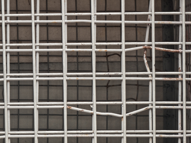
Gochsheim Wire Crates
The geometric patterns of shipping crates stacked up on the warehouse loading docks in this small German town offered an unusual photographic opportunity
Gochsheim Wire Crates
The geometric patterns of shipping crates stacked up on the warehouse loading docks in this small German town offered an unusual photographic opportunity
Technical Knowledge, Materials, and Equipment for Creative Purposes

I HAVE BRIEFLY TOUCHED ON TECHNIQUE IN THIS BOOK, noting that technique and creativity are inseparable. Ansel Adams once said, “There is nothing as useless as a sharp photograph of a fuzzy concept.” It’s a quote worth memorizing. Basically, it says that technique by itself is meaningless. If your photographs are technically exquisite, but they carry no deeper meaning, nobody cares.
That said, technique is important for several reasons. First, if your technique is lacking, whatever you have to say is seriously compromised. The message is clouded because you haven’t articulated it. It’s like a three-year-old trying to explain something of great importance to her mother. She knows what she wants to say, but she doesn’t have the vocabulary or understanding of pronunciation or grammar that is necessary to say it. So the poor mother is desperately trying to understand her daughter, but can’t quite get the message, a situation that is hugely frustrating for the little girl and certainly for the mother as well.
If your technique is good, it can be a conduit for expression. Photography is a non-verbal form of communication, very much like any of the other arts, including the visual arts of painting, drawing, and sculpture, and non-visual arts of music and dance. In every case, the artist is attempting to convey an idea via the means of the art form. Each art form has its own language, its own grammar. In a very real sense, technique in every one of these artistic realms is very much akin to grammar in the spoken or written word.
In many ways good photography technique is like the clever use of words. My favorite writer, Mark Twain, is the author of so many short, pithy comments that one wonders how anyone can compare with his use of language (i.e., his technique). Let’s just look at one: “Man is the only animal that blushes. Or needs to.” It’s short, succinct, to the point, funny, and insightful. You laugh, but it also forces you to think. It goes beyond the comedian’s typical one-liner, which makes you guffaw and then you forget it. Twain’s comment sticks with you. Brief as it is, it has depth.
When I made this photograph, I saw the shape of the graceful 10-foot wingspan of an albatross, a bird that can migrate 10,000 miles across the Pacific without touching down along the route. Viewers often wonder whether it’s a sand pattern just below my feet or an aerial view including hills and roads. Does it matter? Technically, it’s perfect, with extreme sharpness everywhere. But I photographed it because of what it represented to me: an albatross wing—and echoes of it—within its overall abstractness.
Dostoyevsky, Tolstoy, Dickens, Cervantes, and so many other great writers weren’t as fast on the draw as Twain, but they were obviously extremely deep in their own writings. Nothing of what they were articulating could have had much effect if their writing technique was not superb. None of the great speeches by Winston Churchill, Martin Luther King, Jr., Abraham Lincoln, or any great speaker would have been considered exceptional if they weren’t accompanied by extraordinary use of language—in short, technique.
Exceptional technique in photography is essential to a strong, meaningful statement. Depending on the statement to be made, it may be essential to have good sharpness or complete lack of sharpness, or even a combination of both; strong contrasts (figure 7–1 and 7–2) or extremely soft, subtle contrasts; dark, moody tones or light, ebullient tones; brilliant contrasting colors or quiet pastel colors; a riot of colors or a near monotone; a high-gloss paper or a matte surface. All of these and so many more considerations are part of the technique needed to convey your message.
You may be wonderfully creative, but unless you combine it with good technique, you’ll get nowhere.
Don Rommes has been my co-instructor on my Escalante Llama-Assisted Backpack Workshops for over a decade. During that time, Don has spent a lot of time in the remote canyons of southern Utah photographing ancient Anasazi cliff dwellings and rock art (pictographs and petroglyphs). Visitation to these vulnerable sites had been increasing dramatically, and as a consequence, these prehistoric cultural treasures were being quickly degraded. After consultation with locals, archeologists, public land advocates, scientists, and the Bureau of Land Management, it became clear that the best way to preserve the fragile sites was through education of the public. Don started by creating a book, The Cliff Dwellers of Cedar Mesa, co-authored by a leading archaeologist. Don’s photographs are compelling illustrations of the beauty and vulnerability of the sites. The accompanying text educates the reader about the significance of the sites and makes an argument for their preservation.
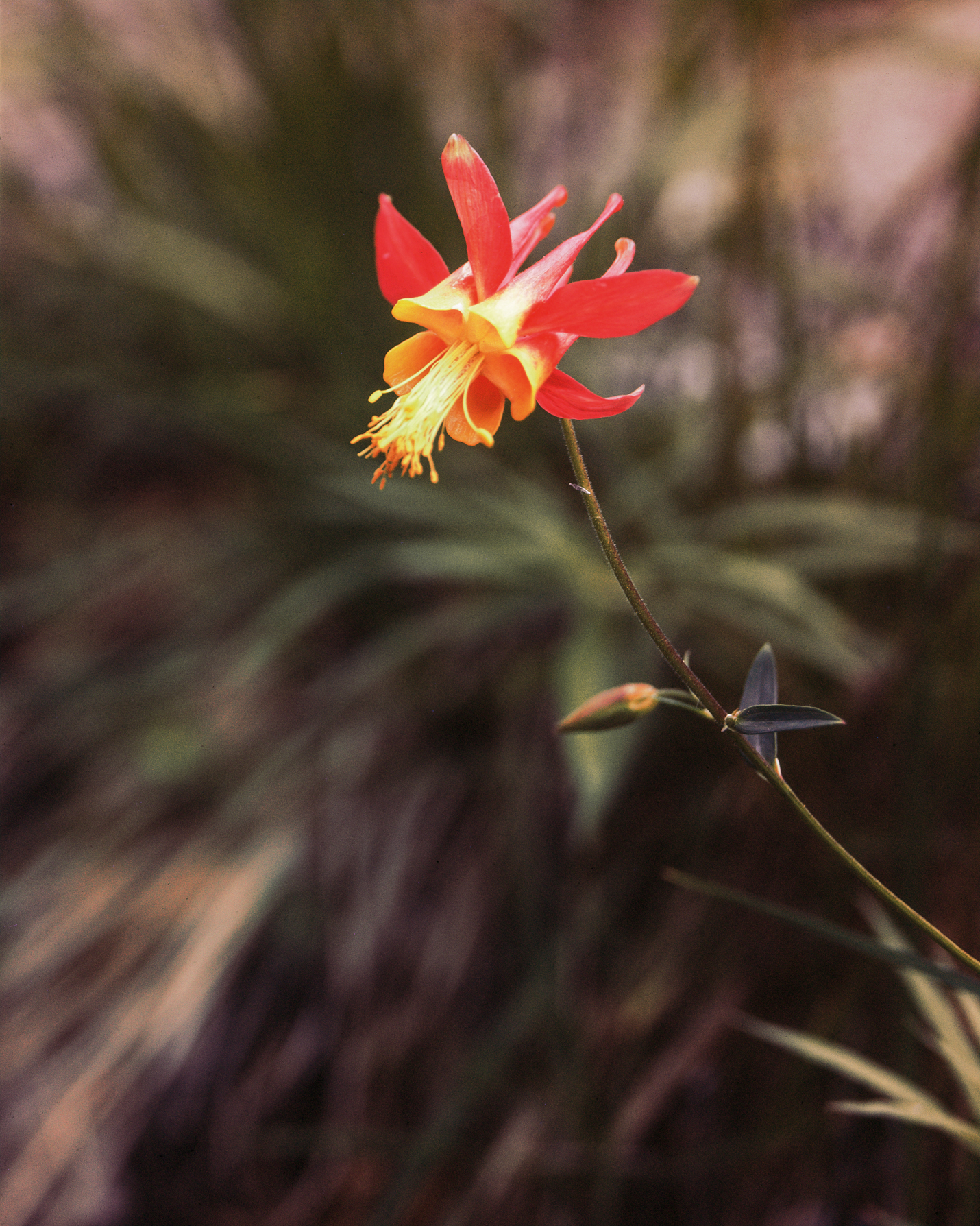
I took this photograph at the edge of a small Sierra Nevada mountain creek in the late 1970s. The photograph includes brilliant colors on the flower, and soft amorphous colors on everything else. The flower is extremely sharp, and everything else is blurry. In its own way, it too, like the previous image, is technically perfect. One is black and white, the other is color. One is completely in sharp focus, the other is mostly out of focus. Both are necessary for the goals I wished to achieve.
Recently, Don has been exploring ways in which digital technologies might further enhance the viewer’s experience.
Figure 7–3: Pictograph (as photographed), courtesy of Don Rommes
This is how the pictograph looked upon close inspection. At first, the dim background figures were virtually invisible, but upon closer inspection, their presence was revealed, and they became almost impossible to miss.

Figure 7–4: Pictograph (partial digital enhancement), courtesy of Don Rommes
This is effectively the midpoint in the digital transition from the untouched photograph to the full digital enhancement of all the background wall paintings.
He is now working on an e-book to go beyond what is possible in a conventional book. He started with a question: “How do I convey the experience of being at these sites to the reader?” He turned to digital techniques for answers. Let’s look at two examples of what he has come up with, in his own words. First, an Anasazi rock art panel (see figure 7–3).
“This pictograph is one of many that were painted on a single canyon wall in southern Utah. This site must have had great significance for the Anasazi, because they visited this wall repeatedly over two millennia. During their visits, they made new rock art and modified the older rock art. The pictographs that are still visible were probably made in the two thousand years between 1,000 BC and 1,000 AD. Their intended meaning is unknown to us today, but they undoubtedly communicated something of significance to the local residents for whom they were intended.
“The two main pictographs clearly represent women and were probably made by women. When you are there in person, your attention is drawn to the dark red figures and handprints. However, in the right lighting, if you stand there and look long enough, other figures seem to materialize. I have been here when I could not detect the faint white human-shaped figures, or anthropomorphs, lying beneath the deep red triangles. But I have also been here when I could see a dozen of them, side by side. This ephemeral quality is probably due to both the characteristics of the ambient light and the receptivity of the viewer.
“A straight photograph (i.e., the RAW file) taken in the right light does show the faint white figures, but they are very easily missed. The figures need to be enhanced to be seen clearly. Showing a “before” photograph followed by an “after” photograph does communicate to the viewer what she might have missed on the first look, but it lacks subtlety and doesn’t come close to the experience of being there. In person, the white anthropomorphs are effectively invisible. The more time you spend looking at the panel, the more obvious the figures become, but the phenomenon takes a while. After having seen the figures, you can no longer fail to see them. In essence, they become progressively more apparent, as if they are asserting their existence.
“I wanted to give people a semblance of that experience. I knew what I wanted to accomplish, but I didn’t know how to do it at first. After a bit of research, I found that an e-book would allow me to present my images dynamically so that my readers could interact with them. Of course, that meant that I needed to teach myself how to create e-books. For this pictograph study, I started by creating two versions of the image. The first was the straight digital capture presented without manipulation. In the second version, I enhanced the figures. I chose to lighten them by using a curves adjustment layer. Using the lasso tool, I selected a small portion of a white anthropomorph, then used the curves adjustment layer to lighten the tones to a level I liked. I then “painted” this effect on all the other anthropomorphs using a white brush on the mask that accompanied the curves layer. Finally, I chose Luminosity as the blending mode for this layer so that the colors of the anthropomorphs would be only minimally affected.
“Then, it was a simple matter of creating a transition between the two photographs. In a slide show, you would show the straight version first, followed by the enhanced version. A simple Fade transition would permit the first image to be replaced gradually by the second. The same effect can be achieved in an e-book with these two photographs. Since nothing in the images changes except the figures, the white anthropomorphs seem to slowly materialize—exactly the effect I was after (figures 7–4 and 7–5).”
In Don’s e-book, the transition unfolds over several seconds. You seem to be looking at a static photograph, but then you gradually become aware of the white pictographs that you didn’t notice at first. It’s quite magical watching the older, faded pictographs come to life. According to Don, the experience is very similar to what it is like in person. Then the white pictographs fade to their former, real intensity, and you wonder how you could have not seen them in the first place. In this printed book, the best we can do is show three snapshots of that transition: the two endpoints and the midpoint. It’s just not the same experience.

Figure 7–5: Pictograph (full digital enhancement), courtesy of Don Rommes
Full digital enhancement brings out the background paintings to their fullest extent, making them perhaps as brilliant as they were when first painted on the wall. It would be difficult to determine how apparent they were when they were originally overpainted by the obvious black figures, which are still so apparent today. In the e-book Don produced, you can see the startling transition from the full background enhancement to today’s barely visible appearance of the earlier paintings.
There is no doubt that creativity and technique cannot be separated in the work that Don Rommes has done. Don had a creative idea, but he needed to acquire the technical expertise to make it happen. But it also goes beyond that, because what Don has accomplished is also educational. In this work, we see how Don has employed available digital technology in a variety of creative, educational, and artistic ways simultaneously. That’s about as good as it gets.
The project is based on Don’s original creative idea of trying to recreate what he experienced in front of the rock art panels. So how do you come up with a creative idea? Well, have you ever looked at something and wished it looked a little bit different? That, right there, could be the start of the creative process. If you wished it could be different, maybe you can make that wish come true. It’s quite likely that was the start of Don’s work with the Anasazi rock art, and it is surely the start of much of my work. You have to take your desires and turn them into a viable image. That takes work, but once you start to think in terms of turning wishes into reality, you’re at least halfway there.
The second example of what Don has been working on for his e-book is also worth discussing. Again, let’s turn to Don’s description:
“This dramatic locale is reached by a three mile hike with 1,500 feet of elevation loss. The last few hundred yards take you down a rather precarious rock fall to the ledge that holds these structures. I hesitated before trying to reach the ledge because I knew I had that mandatory uphill return hike to the car. Besides, although I had a vague idea of the site’s location, I didn’t know what was there. For that reason, and since I was alone, I decided to leave my heavier cameras behind and take a point-and-shoot camera, my lightest tripod, and a leveling head for a panorama.
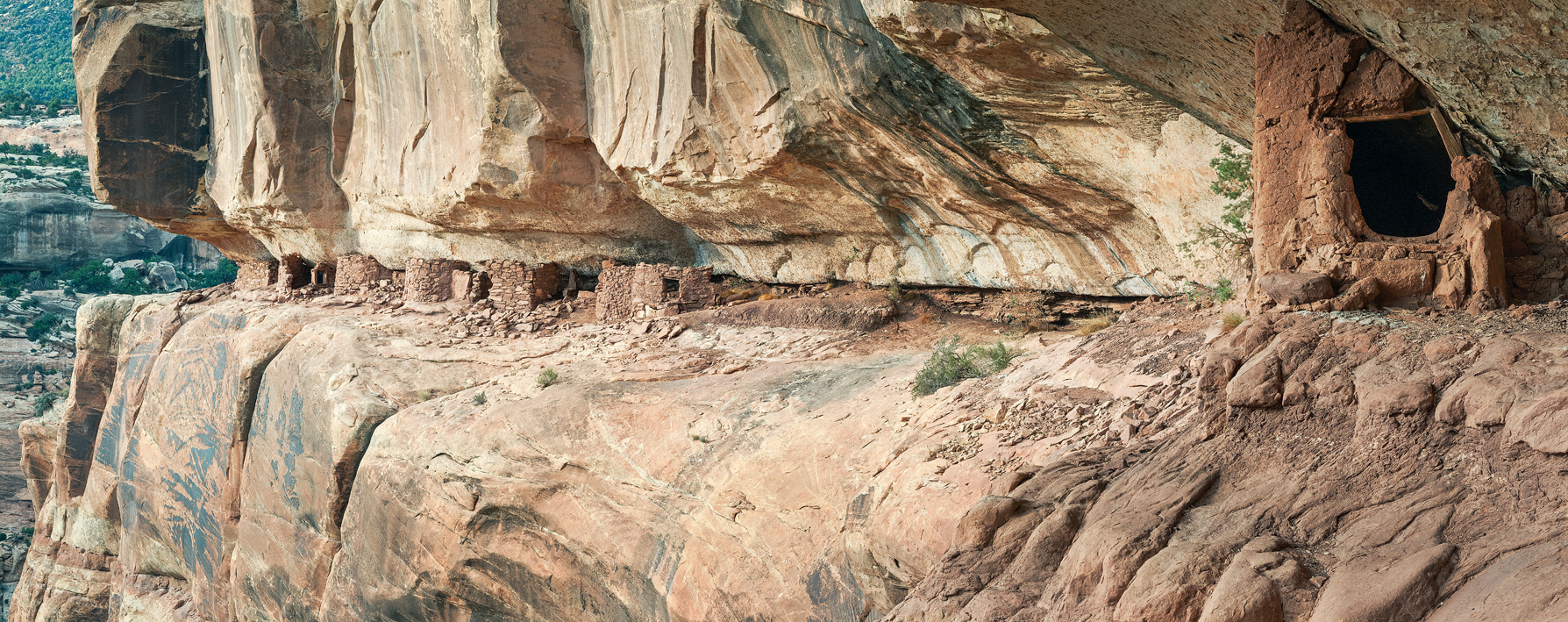
Figure 7–6: Anasazi Site Panorama, courtesy of Don Rommes
In Don’s e-book, this exceptional Anasazi site unfolds slowly from left to right, creating quite a surprise when the closest structure comes into view on the far right.
“When I finally reached the ledge, I still could not see any structures. I followed the narrow ledge under a waterfall, passed through a defensive stone gate, and continued around a promontory until I noticed the line of structures. The site exceeded my expectations, perfectly illustrating the hidden, defensive building locales chosen by the thirteenth-century inhabitants of this area. After absorbing the full experience of the site, I began to envision a photograph that would not only show its inaccessibility and defensive nature, but would also mimic my experience of gradually discovering the structures. The site was so dramatic that I also envisioned a very large print displayed in a museum or visitor center. It seemed to me that the best way to accomplish both goals was to first create a detailed panorama of the site.
“Using my tripod and the leveling head, I turned the camera vertically to maximize the number of pixels and composed the picture. I started at the far left and gave myself a bit of extra room on the top and bottom for the inevitable cropping that comes later. With white balance, exposure, and focus set to manual, I made a series of exposures from left to right, each new exposure overlapping the previous one by 30–40 %. There were seven exposures in all that were later stitched together in Photoshop to create a final image with a big enough native file size to make a very large print (figure 7–6).
“For the e-book, instead of showing the entire panorama at one time, I chose to display it as a slow, scrolling image. In other words, the e-book initially shows only a portion of the image—the far left side that shows the dramatic drop-off. But by swiping across the monitor with your finger, you can slowly reveal more of the ledge until you reach the far right side. I think the effect creates a sense of discovery for the viewer that is not unlike what I experienced at the site.”
I recommend trying to replicate the experience of scrolling in the e-book by covering the right 4/5 of the image with a card, and then slowly moving the card to the right, opening up the image over a period of several seconds. This mimics the way your eye would see the full site if you were there.
Stitching images to make a panorama is not uncommon anymore, but few have the impact of Don’s panorama here. Watching the image unfold in the e-book turns into a dramatic experience when you arrive at the closer structure at the far right. It produces a feeling of depth that is amazingly dramatic, and at the same time remarkably educational.
Obviously Don had to deal with a long, arduous, and precarious hike, which is quite a commitment itself. Beyond that, he employed well-known techniques in a unique way that is not only dramatic, but has the effect of placing you at the scene.
Here we have seen two examples of thoughtful use of digital technology for creative, artistic, and educational purposes.
I have discussed how my knowledge of the exceptional contrast range of black-and-white film combined with my knowledge of negative developing techniques to control that range allowed me to make photographs in the slit canyons. I used those same techniques in the English cathedrals as well. In both cases, whatever degree of creativity I was able to muster was integrally tied to the techniques employed. Without that understanding of technique those photographs could not have been made.
Many of the instructors teaching film methods in those days warned students not to expose a negative above Zone 8 or they may lose information. Apparently they were unaware of the fact that film will hold excellent tonal separations into progressively denser zones up to the mid-teens (up to Zone 15, 16, or 17), effectively many, many times higher on the scale than those instructors recognized. Had I not known the true range of film, or had I listened to those instructors who were unaware of its real range, my photographs of the slit canyons could not have been made.
Once the negative was exposed to that expanded range, the key to controlling the full range of tonalities was developing the negative in an extremely diluted developer solution, which prevented the high zones from developing to excessive densities. I used that method of development in situations of extremely high contrast for 16 years.
Then, in 1996, I encountered a unique situation in Oaxaca, Mexico, that equalled or even exceeded the range of tonalities I encountered in the slit canyons. But in this case, I wanted to retain textural detail in some of the dark areas that I was willing to dispense with in the canyons, letting them go black to preserve their elegant shapes unbroken by tonal detail (figure 7–7). In the Cathedral Metropolitana I wanted to see tonal detail in the carved wood on the massive panels holding the frosted glass with the etched saints on them (figure 7–8).
The tiny figure of the beggar sitting at the entryway is the essence of the image, despite the fact that she’s so small and unobtrusive. You don’t notice her immediately, but once you discover her presence, your eye keeps coming back to her. Had she not been there, I never would have exposed the image. In fact, I exposed five negatives in hopes of getting one useful image. I needed a full minute-long exposure to obtain the desired detail in the wood panels, but during any minute-long period, the beggar stayed still for only seconds at a time. I realized that if she were moving, the blur she would create in the photograph would have no meaning. She had to be recognizable. Out of necessity, I based my five exposures on the length of time she was motionless. The longest was 15 seconds, which I guessed from pure intuition since I had to keep my eyes on her to detect any movement, not on my watch. After five exposures, I gave up. It was apparent that she would never remain immobile for a full 60 seconds. I felt there was no way to get the image I wanted.
The problem was that developing the negative in the highly diluted developer would result in the loss of the lowest zones, the ones required for the carved wood detail, so I was stuck. Yet I had long understood that when using standard dilutions for negative development, the low zones develop the quickest, but then stall, gaining very little further density. Keep those two thoughts in mind.
Because I was so drawn to the image potential, the seemingly intractable problem remained foremost on my mind throughout the trip. It was still on my mind as I boarded the flight back home from Mexico. On the flight, I devised a new method of developing the negatives. I could first place the negative into a standard dilution bath to quickly bring up the low zones, and then transfer it to the very dilute solution to control the high (denser) zones. By combining these methods, I felt I could maintain the detail I so desperately wanted in the wood panels, which was lost when using the dilute solution exclusively, a technique I had used successfully for 15 years. I explain these methods in detail in chapter 9 of The Art of Photography, under the section titled “Two Solution Compensating Development for Negatives.” In essence, the old cliché applied: necessity was the mother of invention.
I created a new technique by combining two known techniques for negative development in a way I had never heard of or read about before, simply because I needed to. Again, this is an example in which technique and creativity are wound together in one tight ball. There was no genius invention here; it was simply a new way of using existing knowledge. As I’ve written throughout this book, many new ideas come from putting together existing ideas in new ways. This is the essence of creativity, even it if comes from the technical side.
After coming up with this new developing technique, I’ve used it exclusively for extreme contrast reductions. Had the technique been known to me when I exposed Circular Chimney, Antelope Canyon, or the many subsequent images I made in the slit canyons, I surely would have used it. But I believe I would still print the negatives as I do today due to the abstract nature of the images; I want the uninterrupted, elegant black shapes to remain unblemished by tonal detail within. Perhaps I would have retained a bit more usable shadow detail in my English cathedral images. Surely the technique proved instrumental for the negative I exposed in Germany’s Ehrenberg Castle in 2012 (figure 7–9). Fog filled the coachway that spiraled upward within the castle, and I wanted to retain as much detail as possible in the darkest walls, which had no direct light, and little indirect light, shining on them.
Figure 7–7: The Slit, Antelope Canyon
I was perfectly content to have the black shapes in the lower right portion of this slit canyon photograph remain uncluttered, without any tonal detail, which I felt could detract from their elegance. They were playing off of the forms above and to the left of them, and details within them would have diluted the impact of this image.
Whereas I was satisfied to have no detail within the forms in the previous image, I wanted detail in this image—even barely seen detail, but tonal detail nonetheless. To my mind, large, featureless, black areas in the huge wood panels holding the frosted glass saints would have created cumbersome, heavy areas in the lower portion of this image. Detail was necessary, at least on the dark panel facing me.
On a damp, windy, and very foggy day, I photographed toward the upper openings of a wide spiral ramp within this 12th-century castle. I wished to retain as much detail into the foggy mists as possible.
Look at the photographs created by your favorite photographers. I’d virtually guarantee that you are drawn to their technical methods as much as you’re drawn to the subject matter and the way they’ve dealt with it. Their technical methods are an integral part of the visual statements that they are making. Hopefully you’re not drawn only to their technical prowess—as some people inevitably are—but to the emotional resonance you feel when looking at the work. If you do feel an emotional response to the work, notice how the technique that the photographer used cannot be separated from the message they’ve conveyed so well to you.
Technical considerations are not only important, they are critical. They cannot be overlooked. Some photographers whose technique is lacking will implore the viewer to “forget technique; look at the image.” The problem is that it’s often impossible to see the image hidden behind wretched technique. Good technique must be integrated seamlessly into your approach.
I happen to like the crispness, sharpness, and clean appearance of the standard, traditional silver print on an air-dried glossy surface, so well pioneered by Edward and Brett Weston, Paul Strand, Ansel Adams, Ruth Bernhard, Paul Caponigro, Jerry Uelsmann, and so many greats of the past and present. I have been drawn to those technical characteristics—along with the subject matter—since I first became interested in photography. My attraction was so strong that those techniques became the basis for my own expression. I suspect that when you look at photographs that attract you the most, and then compare them with the photographs you produce (or want to produce), you’ll find that you, too, are drawn to the subject matter and the technical aspects simultaneously. Some people are drawn to the look of the softer platinum/palladium print, with its brown tones on a matte surface. Some people are drawn to out-of-focus or heavily grained photographs, and it’s likely they’ll try to produce such imagery themselves.
Some photographers have combined digital techniques with platinum/palladium prints to expand their expressive capabilities, and in doing so, extend their creative possibilities. Starting with either a standard film negative that has been scanned or an original digital capture converted to a black-and-white positive, they burn and dodge or otherwise alter the positive, and then convert it back to an enlarged negative, thus preparing it for the straight contact print required in the platinum/palladium process. In this manner, a second generation negative is produced that is ready for use in the platinum/palladium contact printing process. It’s a clever, creative technique to obtain the desired image. Employing Photoshop in this way, the photographer is able to manipulate the image, which is virtually impossible using traditional printing methods exclusively (except, perhaps, for some simple, broad overall burns or dodges). This opens up whole new possibilities for platinum/palladium printing, and as such, is a way of employing technical processes to expand creative and expressive possibilities. (Of course, there are direct Photoshop means of emulating the basic look of the platinum/palladium print, but to my eye, they don’t quite cut it. I think they are passable simulations, but they’re just not the real thing.)
So, technique can be used effectively as a creative, expressive tool. Too often, however, it’s used primarily as a show of technical prowess. You still have to combine technique with the message you hope to communicate. This brings us full circle to Ansel Adams’s quote at the beginning of the chapter. If you have nothing to say, if you’re not moved by the things you’re photographing, how can you expect anyone else to be moved by your photographs? So you can never rely on technique alone. There has to be something deeply felt inside you that you want to convey to others, and hopefully it’s not just technique that moves you.
In his exceptional book The Art Spirit, American painter and educator Robert Henri says, “I do not want to see how skillful you are—I am not interested in your skill. What do you get out of nature? Why do you paint this subject? What is life to you? What reasons and what principles have you found? What are your deductions? What projections have you made? What excitement, what pleasure do you get out of it? Your skill is the thing of least interest to me.”
Perhaps skill is another word for technique. I doubt that Henri was against the use of fine technique; instead, he was against the use of technique as a sole means to no real end. I’m sure that he and Ansel Adams saw eye to eye on this issue.
Good technique alone falls short in any field. Years ago a student who signed up for one of my darkroom workshops told me that he was a piano graduate of the Curtis Institute of Music in Philadelphia. That’s an elite school, so I was quite impressed and very much looking forward to meeting him. Weeks before the workshop started, he sent me a CD of his piano music. To me, it was all technique with no soul. He was able to play exceptionally fast, with each note ringing through cleanly, but it seemed to me that he had no personal interpretation of the music or any real feeling for it.
I knew he would ask my opinion of his playing when he came to the workshop and I dreaded that moment. Sure enough, he caught me with nobody else around and asked the question. I told him that I was taken with his technique and finger speed, but I felt that there was a lack of personal feeling and interpretation. He responded, “That’s exactly what my instructors at Curtis told me.”
There has to be an underlying message, a deep passion within you, if you are going to say anything in any of the arts. As was the case with the piano player, technique alone won’t convey anything but your mastery of technique. But good technique combined with a personal passion and ideas can create whole new worlds. Find the subject matter that excites you, learn the techniques that make it sing photographically, and you’ll create some wonderful work.
It may not be immediately apparent, but working with different materials may lead to some worthwhile creative breakthroughs. The same can be true of working with different equipment.
How often have you tried using different materials just to see what visual differences they could produce? I’d recommend experimenting with the possibilities. If you use a film camera, try shooting the same scene with two different films to see what differences exist between the two. Digitally, perhaps try using two different cameras to photograph the same scene to see if the RAW files are equivalent. They may be similar, but not precisely the same. Make many such comparisons. You’ll probably find that one type of film or camera serves your purpose well for certain types of subject matter, lighting, or levels of contrast, while another is better suited for other subject matter or ambient conditions.
What I’m suggesting for film or cameras could be equally true of scanners, printers, and papers. Each has its own qualities, its own look, its own “feel.” It’s rare that a single paper, for example, will satisfy all your needs.
Let me share some of my experiences using different materials, and how those materials have affected my work.
A number of years ago at one of my workshops that started in Death Valley, our morning field session took us onto the sand dunes, which I had already been exploring and photographing seriously for about five years by that time. On the dunes I generally seek side lighting (the sun coming in from the left or right) or backlighting (the sun coming toward me), for I find that those lighting directions offer the most dramatic effects. I tend to avoid axis light (the sun coming from directly behind me) because it flattens out the scene so much. Not only do I tend to avoid it, but in essence, I hate axis lighting.
However, just as I was packing up to head back to the workshop’s indoor conference room at the close of the field session, I saw a series of dune ridges lit by the flat axis light that looked so sensuous, luminous, and silvery that I felt I had to expose a negative (figure 7–10). I developed that negative to its maximum contrast using Kodak Tri-X film, and then in printing the negative I pushed my variable contrast paper to its highest level of contrast. In other words, I maximized contrast at two stages—negative and print—and still ended up with a high key, rather low contrast, but very effective image.
Several years later, I was on the dunes when smoke from enormous fires in Southern California filled Death Valley, turning the daytime into a bleak, murky scene, and virtually closing down whatever contrasts normally appeared on the dunes. I should note that sand dunes are inherently low in contrast, except when they are backlit at sunrise and sunset, because the shadows are generally filled with light reflected from nearby sunlit dunes. With smoke filling the atmosphere, contrast was at a near-zero level. It was grim.
But I had a film with me that Kodak used to produce called Technical Pan. I purchased and froze a number of boxes of it in 4×5-inch sheets. It was originally designed for astronomical photography through telescopes, with nighttime exposures that last up to many hours, where stars or galaxies would become very dense and the voids between them would be virtually clear.
So with contrast at a near-zero level and a film in hand that I jokingly said contained infinite contrast, I felt I could solve the age-old mathematical conundrum of seeing what happens if you multiply zero by infinity. I suppose my mathematics background surfaced yet again. Only this time, with a real, practical purpose in mind.

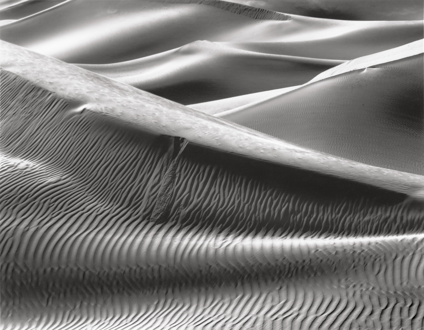
Figure 7–10: Silver Sunlit Dunes
Full axis light (i.e., the sun directly behind me) made this a very low contrast, high key, silvery image, despite developing both the negative (Kodak Tri-X film) and printing paper to maximum contrast. It is the maximum contrast I could achieve with the materials available, ultimately yielding exactly what I wanted in the final image.
Of course, because I was using film I had to wait until I got home to develop the negatives to see if it worked. This is something that digital buffs cannot comprehend because they’re used to seeing the image in real time, but to a film photographer, it’s one of the magical things that unfolds later on. Turns out, it worked! Almost miraculously I was able to achieve very high contrast on scenes that were virtually devoid of any contrast by using Technical Pan film. I actually had to lower contrast in the printing to maintain the tonalities I desired (figure 7–11). I made the image when the sunlight and shadow were both compressed to insignificance by the oppressive smoke, and when the light meter’s needle was virtually stuck without motion (equivalent to a histogram that spikes in a single location, with nothing showing elsewhere). Of course, this also proved that when multiplying zero by infinity, infinity wins.
It was an image that could not have been made with the standard Tri-X film I normally use. Based on that success, it occurred to me that in the future I could use Technical Pan film on other extremely low-contrast scenes beneficially. Now let me be clear, when I say extremely low-contrast scenes, I mean that in the extreme. That smoky day on the dunes was so low in contrast that I saw no discernible change in light value wherever I aimed my light meter. So I use that film only in the most extreme situations of low contrast.
On a day when Death Valley was filled with smoke from wildfires in Southern California, and there was virtually no ambient contrast, I used Kodak Technical Pan film to achieve extreme contrast in this image. Using very different materials than those I used for figure 7–10, I was able to achieve a radically different set of tonalities.
Using Kodak Technical Pan film, I was able to achieve pewter-like or satin-like tonalities under the same lighting conditions encountered in figure 7–10 (axis light). It’s very much worth trying new materials for their varied results, which lead to greater creative options.
Several years later, again with students on a field session on the sand dunes, I saw another axis-lit scene in which small deposits on the dunes—almost like iron filings that form interesting black patterns in some areas of the dunes—seemed to be the only discernible contrast. Admittedly, you could see the barest contrast difference between one ridge of dunes and the next, but it was tenuous, to say the least. Yet the forms I saw were exquisite, even while the contrast seemed to be nearly non-existent. Again using Technical Pan film, I photographed the Satin Dunes (figure 7–12).
Compare the tonal range of Silver Sunlit Dunes (figure 7–10) with that of Satin Dunes (figure 7–12). Both were photographed with axis light, but with the former exposed on a Tri-X negative and the latter on a Technical Pan negative. Surely the compositional designs of the two are different, but had the material been switched each would have a very different look and feel.
Having said all this, I have to admit to avoiding my own advice at times, perhaps too often. Yes, I’ve used different films, as explained above, but beyond that, I’m terrible. I have tried new and different papers over the years, but generally this is the result of a situation in which the paper I had been using was discontinued (often through company bankruptcy), forcing me to switch to another. I am now using the best black-and-white enlarging paper I have ever used in 45 years of darkroom printing: Fomabrom paper from the Czech Republic. It is outstanding. Having tried a few other papers currently available, I’m using Fomabrom exclusively. Maybe I shouldn’t be. Perhaps I should employ others for specific images. But at this point, I simply can’t imagine improving any image through the use of another paper. It’s really that good.
Perhaps I should try different developers. I’m not. I’m using Kodak Dektol exclusively, which yields brilliant images with this paper. Other developers may produce different qualities, perhaps better qualities overall or for specific images. Have I tried any? No.
I should. And I chastise myself for that failure, even while I encourage you to do what I’m not doing myself. Perhaps it’s simply lack of time; I am busy with a number of things in my life, but so are you. Perhaps I’m just being lazy. Whatever the reason, I can’t give myself high marks for trying different materials often enough to see how they expand my creative capabilities.
However, in my defense, weak as it may be, I know that I like the look of a rich, glossy paper, air dried to a high gloss, but not to a mirror-gloss surface. I do not enjoy a matte surface, primarily because the deepest blacks obtainable are little more than a deep dark gray on a glossy paper. And while I often enjoy imagery that is quite different from my own, I find that I rarely enjoy images on matte papers (whether silver-gelatin or platinum-palladium or other processes), so working with the single paper I’m now using conforms to my likes, simplifies my process, reduces my inventory, cuts costs, and avoids my dislikes.
While I have settled in to a rather rigid, fixed mode with darkroom materials, I’ve made the far bigger move of working with digital cameras and techniques. After several decades of using nothing but film cameras, I obtained my first digital camera about seven years ago. I wanted to try digital approaches and I wanted to start exploring the digital world. Perhaps I am guilty of waiting excessively long to try using a digital camera, but I had been seeing images made by students and other photographers with digital cameras for many years, and I was watching the kinks in the process get corrected. When I felt that digital cameras started achieving a level of quality that justified some of the hype, I started using one.
Figure 7–13: Two Old Men, Pisac
Pisac is an ancient Peruvian town upstream from Machu Picchu. Heavy rain was falling when we arrived during a workshop, so I grabbed a latte and sat down under an awning outside the corner coffee shop to avoid the rain. Two old men were sitting and talking across the intersection from me, and my digital camera allowed me to record the moment without them even knowing that I had visually intruded on their discussion.
My digital camera is, to be sure, my second camera, after my 4×5 film camera. But it’s by far the best second camera I’ve ever worked with, allowing me to do many things I simply can’t do with my 4×5: quick hand-held images (figure 7–13), extreme close-up to macro work (figure 7–14), photographing where tripods are not allowed (figure 7–15), photographing out of an airplane window (figures 7–16 and 7–17), and many other options not possible or easily accessible with my 4×5. (See figures 5–7 through 5–9 for more examples of digital imagery that may not be possible with my 4×5 camera.) Yet at the same time, my 40+ years of large-format work funnels me into thinking about the composition, light, relationships within the scene, and camera position (unless I’m looking through an airplane window, in which case I have little choice other than to press or not press the shutter release). In other words, it has taught me discipline that I find lacking in most digital shooters today. For the most part, digital cameras have resulted in an explosion of the number of images produced, but a reduction in high-quality images. Digital imagery is capable of being high quality. There is nothing about digital approaches that forces poor quality due to thoughtlessly quick exposures, but there is lot that encourages it. Those undesirable urges can be overcome with discipline.

At a United States Forest Service campground just up the road from my home, ice crystals were growing daily on a riverside picnic table during 10 days of dry, cold weather. Using my digital camera in macro mode, I was able to get so close to the crystals that the lens was pushing them over at times as I moved. I could never have moved in as close with my 4×5 large-format film camera.
My 4×5 film camera is destined to be my prime camera into the foreseeable future. But I am enjoying my digital camera and my entry into the digital world immensely. Most importantly, my digital camera has opened up creative possibilities for me that were simply unavailable with my 4×5, or with any other film camera that I have ever used as a second camera.
In chapter 1, I discussed finding your own rhythm. I explained how I’ve discovered mine, how I tend to be very spontaneous and immediate in my responses to new subject matter, often making my strongest exposures right from the start. So it may seem logical that a digital camera would be the ideal camera for me, since I can use it so much quicker than my 4×5, which requires pulling it out of a backpack, putting it up on a tripod, focussing slowly and carefully, and then stepping away to put a film holder in the camera. It’s not like a roll of film or a digital sensor that is always there inside the camera just waiting to be exposed. So why not just ditch the old 4×5 and go digital entirely?
Well, there are good reasons. But it may be necessary to first explain that zeroing in on my thoughts and feelings about new subject matter quickly is not exactly the same thing as tripping the shutter quickly, though there may be some real relationships there. Even when I see something that instantly excites me, I set up quickly but thoughtfully, looking at the compositional relationships carefully, even if I’m working as fast as I can. I look at the quality of light. I look at the relationship of forms and whether a different camera position can improve them. I don’t press the shutter release immediately even when I respond immediately. There certainly have been times when I worked as fast as I could under the pressure of rapidly changing conditions, but I always give it some serious thought during my speedy maneuverings.
So, even with a digital camera in hand, I find it virtually impossible to immediately expose an image without some careful looking and seeing thrown into the mix. Needless to say, I can make a photograph far quicker with a digital camera than I can with my 4×5, and there have been times when I relished that speed. It has served me well, and I have enjoyed using it immensely. Most of all, I’m having a lot of fun using it.
Because the digital camera has opened me up to new areas of creativity that are not available when using my 4×5 camera, I think I can recommend that others try different cameras and different materials. How many people who started photography with digital equipment have opened themselves up to the possibilities of film or large format cameras? It is not only a different process, it offers different possibilities and it requires a very different discipline. In particular, it requires deeper looking and planning prior to exposure. You can’t make a film exposure and then check the monitor on your camera to see how it looks. You can’t delete the exposure if you don’t like it. Those two thoughts may be enough to scare the hell out of people who use digital exclusively, but it’s those very scary thoughts that force a way of seeing that is quite different from the digital approach.
Try to envision, for a moment, the discipline of Michelangelo as he carved the David statue. He couldn’t chisel off a piece of marble and say, “Oops, that was wrong.” Every gouge into that block of marble had to be meticulously thought out and seen in advance, or the work was destroyed. It speaks to a degree of seeing, a degree of planning and a degree of discipline that is almost unimaginable. It is certainly unimaginable to the typical digital shooter who blithely says, “Well, I’ll just delete that one.”

Figure 7–15: Lima Museum Abstract
In one of many museums in Lima, Peru, I was able to photograph with my hand-held digital camera where a tripod was forbidden, preventing me from using my 4×5 camera. I had immense fun photographing the glass-enclosed displays, with the distortions and reflections from the glass as the essential part of the image. This is a somewhat confusing, abstract color image, one of many I made that afternoon.
Using film can dramatically sharpen a photographer’s seeing. It forces careful seeing and planning that is too often missing in the digital world. So I recommend that those of you who have never picked up a film camera give some thought to trying it. Even if it fails to open up new creative possibilities, which I think is unlikely, it will surely sharpen your seeing right from the start, and it could help you work through your thought process to completion even before you start. That, in itself, can prove to be a major step forward.
Figure 7–16: Andean Summit, Peru
There is no possibility of successfully hand-holding a 4×5 camera steadily at the window of an airplane, and they don’t let you set up a tripod at your seat either. But a digital camera allowed me to photograph this awesome Andean summit somewhere between Lima and Cusco.
Figure 7–17: Glacier, Greenland
Flying at 35,000 feet above Greenland from Europe to Seattle, I used my digital camera to photograph the astounding mountains and ice below me. So while most passengers were either sleeping, tapping away at their computers, or watching inane movies, I was photographing the wonders of our planet that few people will ever see, even if they have the option to do so by simply lifting up the window shade next to them.