Chapter 10. Navigation and Header Layout
Making your navigation and other elements in the page header responsive is one of the most challenging parts of designing a responsive website.
The header of a web page consists of the section at the top of the page that contains the site’s branding, and usually contains the site’s main navigation as well as supplemental items like form fields or links for search and site login. The header is generally consistent throughout the website.
The components in the header perform two very important functions: they tell the user what site he is on, and they allow the user to navigate through the site.
In this chapter, we’ll go back to our example site and add in some simple navigation styles. Then we’ll look at examples of some common patterns for how navigation can be displayed on mobile-sized screens, and how those navigation layouts will adapt across screen widths.
We’ll also look at how to incorporate site branding, search, and other components into a unified header.
Responsive Navigation
No matter what your responsive navigation looks like, the key is to start with straightforward HTML and then use media queries to change the CSS that styles the navigation, so it looks the way you want it to at different viewport widths.
Using our example site, we’re going to add some basic styles to make our <nav> look like a real navigation, then add a media query to change the navigation style for wider viewports.
Start Small
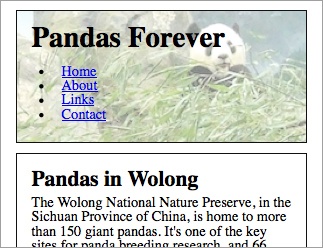
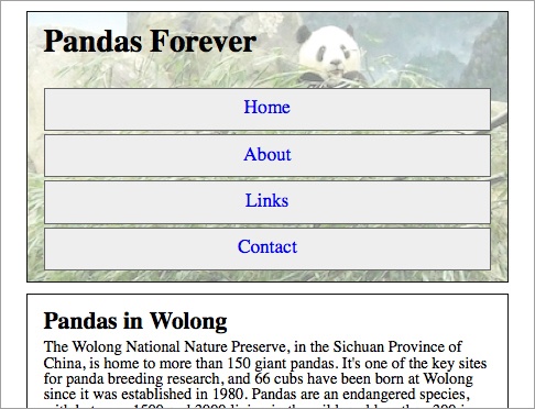
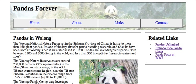
We’re going to go back to our narrowest view of the example site and start there. The navigation is an unordered list, as you see in Figure 10-1. Here’s the code:
<nav role="navigation">
<ul>
<li><a href="/">Home</a></li>
<li><a href="/about/">About</a></li>
<li><a href="/links/">Links</a></li>
<li><a href="/contact/">Contact</a></li>
</ul>
</nav>
Styling Your List
A bulleted list of links is usable, but doesn’t look very good.
First, we’re going to add some code to get rid of the bullets, and remove the margins and padding so the list items aren’t indented (this is what you see in Figure 10-2):
nav ul { list-style-type: none; padding: 0; margin: 0; }
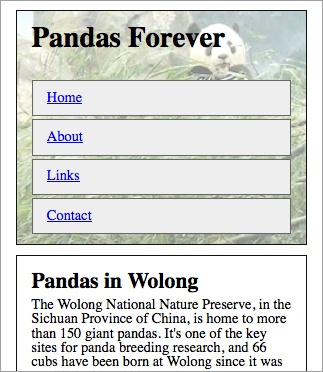
nav li { margin: 0; padding: 0; }Next, we’re going to make the links into boxes, which will look a bit nicer. We’ll add a border around each list item, give them a little background color, and add some padding and margins to give them a good touch target size, as you see in Figure 10-3:
nav ul { list-style-type: none; padding: 0; margin: 25px 0 0; }
nav li { border: 1px solid #666; background-color: #eee; padding: 10px 1em; margin: 3px 0 0; }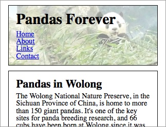
Next, we’ll make the text a little bigger, center the text in each box, and remove the underlines (you can see the result in Figure 10-4):
nav ul { list-style-type: none; padding: 0; margin: 25px 0 0; }
nav li { border: 1px solid #666; background-color: #eee; padding: 10px 1em; margin: 3px 0 0; text-align: center; }
nav li a { text-decoration: none; font-size: 1.2em; }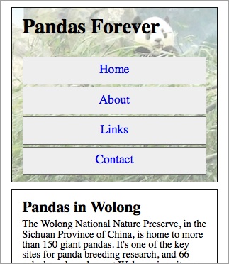
At this point, we’re still pretty much worrying about the layout and not the visual design of the site, so we’re only adding basics. Your finished site would definitely be more designed than this!
But as far as layout, we have a navigation for the narrowest viewports that looks pretty decent. So let’s move on to a wider viewport.
Horizontal Navigation
Like I did before, I’m going to start with my browser window at the narrowest viewport width, and slowly make it wider until the design “breaks,” or starts to not look good. That’s where I need a breakpoint.
There’s no requirement that I use the same breakpoint as I did when I made layout variations, so I’m not going to worry about those numbers—I’ll just focus on the navigation and figure out where it starts to look bad.
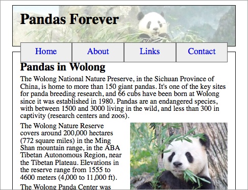
At a viewport width of around 30 ems (480 pixels), the navigation items start to look too wide, as you see in Figure 10-5.
I’m going to adjust the navigation style at this point so all four items are in a horizontal line, but only when the viewport is wider than 30 ems.
To do that, I’m going to give each list item a style of display: block so they act like boxes instead of list items, and then float them to the left so they appear one after another in a horizontal row, as you will see in Figure 10-6:
@media only screen and (min-width: 30em) {
    nav li { display: block; float: left; }
}
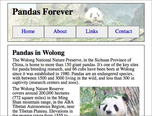
After doing that, I have two problems. First, the navigation overlaps the top of the article element. Second, each navigation item is only as big as it needs to be to contain the text, but it would be nicer if each were the same size.
Let’s tackle the second problem first. I simply give li a width of 25% (you’ll see the result in Figure 10-7):
@media only screen and (min-width: 30em) {
    nav li { display: block; float: left; width: 25%; }
}
The other problem is a little trickier. Normally, I would just clear the next element after the floating element, but because the <nav> is the last thing in the <header> element, doing this wouldn’t move the bottom edge of the <header> element downward.
The solution is to add padding to the bottom of the <nav> element to make space for the navigation. I’ll use ems for the padding so that it can change if the text size changes (you’ll see how this makes it look in Figure 10-8):
@media only screen and (min-width: 30em) {
    nav li { display: block; float: left; width: 25%; }
    nav { padding-bottom: 3em; }
}
Note
Instead of adding padding to the bottom, this code will also work:
nav:after { content: ""; display: table; clear: both; }That navigation style continues to look good at even wider viewport widths, as you see in Figure 10-9, so there’s no need to add another breakpoint. Navigation done!
Branding
Generally, the first thing your users see when they visit any page of your website is your branding. Users who have clicked a link from somewhere else need to verify that they’ve arrived on the correct site, and users who are navigating from another page on your site need to be reassured they’re still on the same site.
It doesn’t take a lot. The site or company logo, or even just the site title, is generally all that is needed. Often you’ll include a tagline, so new site visitors will know exactly what your company does.
For a responsive site, it’s often as simple as changing the size of the logo or title text to fit well on the screen, but sometimes you have to get a little creative.
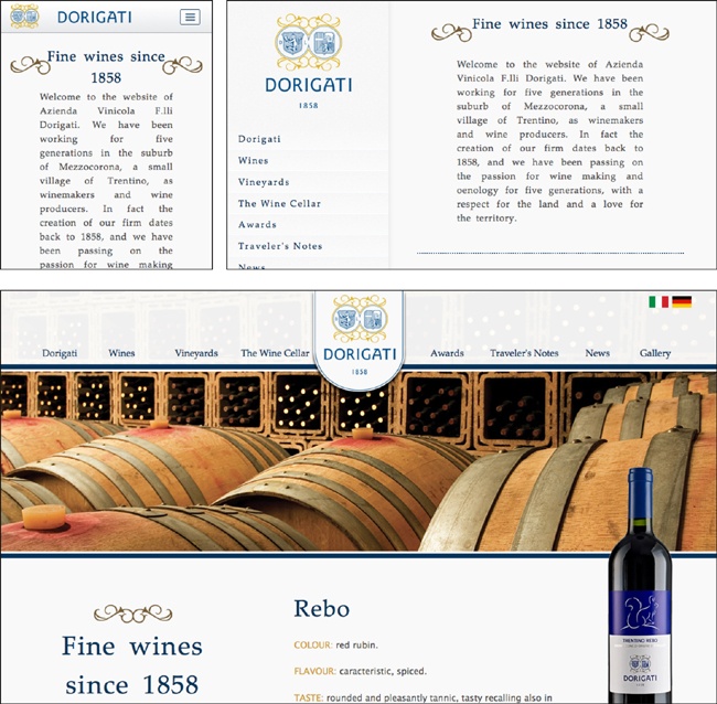
In Figure 10-10, instead of using the full logo on the small-screen design, the designers separated the swirly bits and moved them off to the side of the “Dorigati” text, making a horizontal branding that takes up less space than the full logo would have. The company’s tagline, “Fine wines since 1858,” is at the top of the small- and medium-screen designs but is further down the page on the wide-screen design, although it still appears on the screen without scrolling.
Making the branding fit well on different viewport widths can be challenging when working with a brand that has an existing logo that’s always displayed the same way. Established brands often have very specific style rules for how their logos are to be displayed. You’ll need to get stakeholders on board with the idea of responsive design so that hopefully they’ll be open to being flexible with the company’s branding.
It’s a big challenge to fit a bunch of important stuff in a small space. The more flexible everyone is, the better able you’ll be to rise to that challenge.
Another option might be using the company logo on wider versions of the design, but only using the text of the company name in the small-screen version, as you see in Figure 10-11. If you’re not using the logo on the smaller-screen versions of the design, you still need to be consistent with other design elements, so that cross-platform users will have the sense that it’s the same website. In this example, the consistent colors carry the brand across screen widths.
Navigation Links
The navigation is one of the most important parts of a website. If it’s not designed well, your users will have trouble getting from one section of the website to another.
Make It Flexible
Before thinking about what your navigation should look like in the site design, you need to decide what links are in the navigation. Don’t try to design a navigation using generic link text, like “Nav Item #1” or similar. Invariably, the text in your generic links will be of much different lengths than the actual navigation items, and what seemed to fit perfectly will end up being a big mess.
At the same time, even if you know what the navigation items are going to be, remember they aren’t set in stone forever. The needs of the site or organization may change, and you may need to add or remove links in the future. Is your navigation flexible enough to accommodate changes?
This is especially relevant if you’ll be handing off a finished site to a client or a team that may not have the web skills to make significant design changes later. It should be relatively easy for them to make changes without breaking the design.
What Do Users Want to Do?
When designing a responsive navigation, just as with the layout, you’ll start with the small screen first.
The great thing about designing navigation for a small screen is it forces you to analyze what you’re including in your navigation, and make choices as to which items are really important.
In the past, a common way to design a website navigation went like this: 1) make a list of every section you’re going to have on your website; 2) get the stakeholders together to do a card sort to divide the links into categories; 3) make a multi-level navigation based on those categories.
Don’t do that.
Remember, first of all, that your navigation is for your users, not your stakeholders. Design the navigation around how users will be able to successfully navigate the site. Don’t just make it an inventory of the site’s content, or worse, a reflection of the company’s organizational chart. Refer to the Information architecture section in Chapter 7 for more about creating an information architecture for the site.
Hopefully you’ve already sorted out what content actually needs to go on the site, and gotten rid of some dead weight. Now think about how your users will want to use that content. Use analytics from your current site, if applicable, to see which pages users actually visit frequently.
I love the responsive site from the city council in Manchester, England shown in Figure 10-12. On most city websites, the most prominent elements are news and information about elected officials. Not so in Manchester. The council has clearly focused on what people are asking for—bins (a fancy British word for trash and recycling cans) may not be the most glamorous part of city government, but it’s likely one of the topics that users most often seek information on.
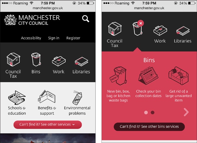
The site’s designers didn’t take up valuable space on the tiny screen with press releases or photos of the council members—they focused on the information that people are visiting the website to get.
Icons do take up space on the screen where more options could be fit in, but because the initial screen is only for the navigation, using icons keeps it from appearing too dense, and also makes each touch target a size that’s easy to tap. A lot of sites use icons that don’t actually add anything to the site, but in this case, the designers did a great job of using icons that are straightforward and obvious.
Additionally, they used language that’s clear for the users, rather than the “official” names of departments and such. Everybody knows what “bins” refers to (at least in the United Kingdom), and this makes it much easier for the user than trying to wade through phrases like “Refuse Collection,” “Collection Services,” or “Solid Waste & Recycling” (all of which I found as navigation items on other cities’ websites).
On the wider version of the site, as shown in Figure 10-13, the site’s designers had space to add a supplemental description below the main icons, and some additional frequently accessed links below the second row of icons (e.g., “Schools & education Including... Holiday dates, Find a school”).
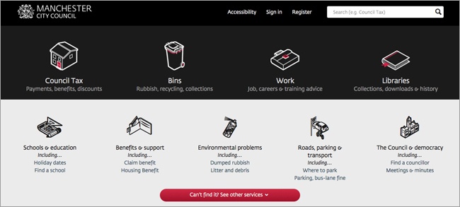
Note that even though there are more icons visible on the wide-screen design, the small-screen users aren’t missing anything. All the links to services are available no matter what device you are using, via a button at the bottom that says, “Can’t find it? See other services.”
Goal-Based Navigation
When designing for a desktop screen, there’s plenty of room to add a lot of navigation options—and many sites take advantage of that. After all, you want to make it as easy as possible for users to get to what they need.
In fact, there’s been a long-standing, unofficial “three-click” rule in web design: every page on your site must be no more than three clicks away from anywhere else on the site. Having detailed, multi-layered navigation menus was often the way to make that happen.
It sounds good in theory—the fewer clicks, the better—but if it’s difficult for the users to figure out what to click on, it doesn’t matter how many times they click.
Studies have shown that users don’t mind additional clicks, as long as they have confidence they are going down the correct path toward their goal, and as long as each click makes them feel like they are moving forward.
It’s the frustrating clicks that they mind, where they feel like they’re getting sent in the wrong direction, or that they’re no closer to their destination.
In Figure 10-14, you’ll see what the navigation on the GoDaddy website looked like a couple of years ago. The menu had multiple options on each tab—and each of those options had its own submenu on hover.
Sure, you could get to any part of the site with very few clicks, but you needed to know exactly what you were looking for, and be able to figure out how it was categorized.
For someone with a technical background, this is probably not a big deal, but for potential customers without that background, such as small business owners who want to set up their first websites, it’s incredibly confusing. If it’s too difficult to get started, customers might give up and look for a different website that will meet their needs with less effort.

After a redesign, as you see in Figure 10-15, the site’s navigation appears much simpler. It’s clear that GoDaddy is trying to hook in new customers. The four most visible menu items are based on goals, rather than products. For those who are not familiar with website terminology, “Build your Website” will give them a very clear path to follow.
And for those users who know exactly what they want, all the other options are still there, under “All Products.” It takes an additional click to get to them, but that’s all right.
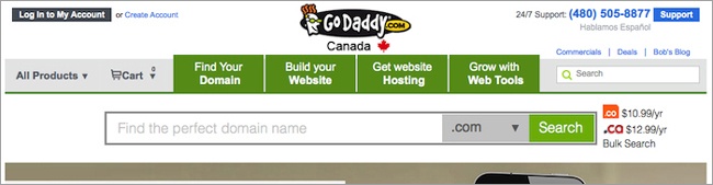
Although this isn’t a responsive site, it’s a good example of goal-based website navigation. GoDaddy has similar navigation options on its separate mobile site.
Keep It Consistent
Whatever changes you make to the navigation of your responsive website for different viewport widths, remember that to your users, it’s still the same site. If the navigation they see on a mobile phone is vastly different from what they see on a desktop screen, your users will get confused.
Users might access the navigation differently depending on the width of the screen, but the same primary navigation items should be there, in the same order. If the desktop-width design has prominent links on top for frequently accessed functions such as login, your users will expect to find those on the small-screen version of the site too.
It’s more common for the navigation to be different on a website with separate mobile and desktop sites, but it also can be an issue on responsive sites.
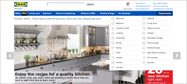
As an example, look at the Ikea website—desktop and mobile versions—in Figure 10-16. The desktop site has a list of “Departments,” and the mobile site has a list of “Products.”
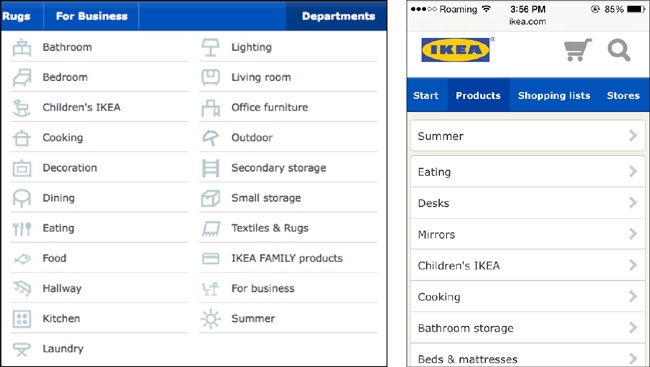
The two lists are very similar. For example, they both have “Cooking” and “Decoration,” but while the desktop site has “Dining,” the mobile site has “Eating.” Those two links actually lead to the same items.
And while the desktop site has “Bedroom,” encompassing beds, mattresses, textiles, and bedroom furniture like nightstands, the mobile site has simply “Beds & mattresses.” There’s a separate textiles link, but none of the options seem to cover nightstands.
Now, while I’m sure there could be many arguments over which navigation is better, the real problem is that they are different.
If you’re browsing the site during your lunch hour on your work computer to pick out a nightstand, you’ll remember that the “Bedroom” link got you to the nightstand section. Then suppose that later that evening you’re watching TV and want to take another look at nightstands, so you pull out your mobile phone. You probably won’t notice the navigation is different—you’ll just click on “Products.” The options look similar, so you’ll click on “Beds & mattresses,” assuming it’s the same link you clicked on from the desktop site. And you won’t have any idea why the nightstands are now missing.
This is one of the drawbacks of having separate desktop and mobile sites—you’re a lot more likely to end up having a different user interface, which confuses people. But it can still be a problem on a responsive site.
It’s common for designers to assume that mobile device users want or need different options, and hide things on the small-screen version of a responsive site.
Keep in mind, though, that often they are the exact same users, just using a different device, and they expect the same website.
Keep It Simple
You’ve already learned that you need to make sure your responsive site will work on all devices, regardless of capability or screen size. This is especially important for your navigation, because if your navigation doesn’t function for some users, the site is essentially unusable for them.
Keep in mind that just like the layout, your navigation needs to start with basic HTML, for users whose devices don’t support media queries or JavaScript.
Although some of the more complicated types of responsive navigation rely on JavaScript, you need to make sure the navigation works (i.e., the navigation items are visible and clickable) at any screen size and on any device type. Users without JavaScript will likely be a very small percentage of your users, so you don’t have to make it look great for them; you just have to make it work.
Keep in mind, also, that the more complicated your code is, the harder it will be to maintain, and the more likely it is that something will break if you make changes to the site. Think about whether you really need that fancy flying navigation, or if a simple row of links will suffice. Is it worth the trade-off?
Navigation Patterns
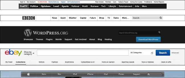
Most nonresponsive sites that are designed for desktop monitors follow the same general pattern for their main navigation: a horizontal bar across the top, as you see in Figure 10-17.
Although left navigation was popular several years ago, as the Web has matured this has gone out of fashion, as well it should: studies have shown that left navigation is far less effective than top navigation.
You sometimes still see a left navigation on major sites, such as in Figure 10-18, but it’s generally used as a list of topics, while the main functional navigation is still at the top of the page.
For the most part, responsive navigation that works across all viewport widths—from mobile to wide-screen monitors—is going to follow this existing pattern for the wide-screen design, because it’s already familiar to everybody who uses the Web.
When working with responsive websites for the first time, many designers find that their biggest challenge is the navigation. But the problem isn’t really making a responsive navigation; it’s making a good small-screen navigation. Once you get that down, adding media queries to change or move it at wider viewport widths is a piece of cake.
There are a lot of great small-screen navigation designs out there, and they generally follow one of several patterns—that is, they can be grouped according to shared characteristics.
We’re going to look at a few basic patterns for responsive navigation, providing explanations of how they work and showing examples on real websites.
Beyond the patterns we look at in this book, there are many others out there. A good resource is Brad Frost’s website Responsive Patterns (http://bradfrost.github.io/this-is-responsive/patterns.html). There, you’ll find not only navigation patterns, including examples with HTML and CSS you can dissect, but also patterns for responsive layouts, forms, and other modules.
Keep in mind that you should use the <nav> element, and the corresponding WAI-ARIA role, to code the navigation, as we discussed in Chapter 3:
<nav role="navigation">
 ...
</nav>
Note
To find more user interface patterns for mobile devices, check out Theresa Neil’s Mobile Design Pattern Gallery: UI Patterns for iOS, Android and More (http://www.mobiledesignpatterngallery.com).
Top Navigation
The easiest pattern for dealing with your navigation on a responsive site is having all your navigation items at the top of the page regardless of screen width, and using media queries and CSS layout styles to rearrange them depending on the width of the screen.
You saw the code for a simple version of this in the example website we worked on earlier in the chapter, but here we’ll look at a couple of examples on real websites.
You might want to start by having the navigation items vertically stacked on the small screen and then move them to a horizontal bar at a wider viewport width, like on the Enoch’s Fish & Chips website in Figure 10-19.

In this example, the HTML elements are very simple:
<ul class="nav">
<li><a href="#food">Food</a></li>
<li><a href="#fish">Fish</a></li>
<li><a href="#news">News</a></li>
<li><a href="#contact">Contact</a></li>
</ul>
Media queries are then used to link to separate stylesheets, which use absolute positioning to change the location of the navigation items depending on the width of the screen.
If you’ve heard that responsive websites always look boring and blocky, the Enoch’s site certainly proves that they don’t have to.
The Food Sense website also rearranges its navigation items at the top of the page. In Figure 10-20, you can see how the navigation items and site logo stay at the top of the page (or left, before the content), no matter the viewport width.

The elements at the top of the page are in a <header> element—the navigation is an unordered list inside a <nav> element, and the logo is an <h1>. Similarly, the site uses basic layout styles like float and margins inside media queries to rearrange the navigation at the different viewport widths.
The wider layouts have icons next to each navigation item, which are simply background images that are removed at the narrower widths with background-image: none.
But if you have a lot of navigation items, this just isn’t going to work. On small screens, the navigation will end up taking up the whole phone screen, like in Figure 10-21.
Your navigation solution must leave space on the small screen for the content. You want to make sure that a visitor to your site, even on a mobile phone, sees something interesting without having to scroll.
Footer Navigation
One of the easiest things you can do to get your navigation out of the way on the narrow-width version of your site is to move it to the bottom of the page and then link to it with an anchor link (a link that takes you to a different point on the same page). This is often called footer navigation or footer anchor navigation.
The Contents Magazine website uses this type of navigation. In Figure 10-22, you see an “Explore” link at the top of the page, with a downward-pointing arrow. Clicking that link brings you to the place near the bottom of the page where the search box and navigation links appear.
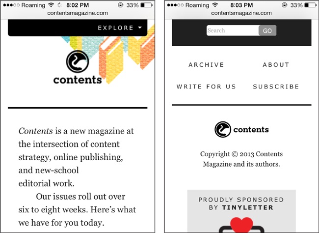
Although this site only has four navigation links, those links plus the search box take up nearly half of the available space on the small screen, so moving them away from the top of the page gives more space for the branding and the start of the page content.
The code to do footer navigation is pretty simple—just start with an anchor link at the top of the page, like this code from the Contents website:
<p class="go-nav">
<a href="#site-nav"><b>Explore</b></a>
</p>
The code for the search box and links will go near the bottom of the HTML document, to correspond with the actual location on the narrow-width design. In this case the site’s designers used one <div> to contain the search box and navigation links, with the navigation as a <ul> inside a <nav>.
At wider screen widths, there’s plenty of room for the navigation and search box at the top, as you see in Figure 10-23.

Using a media query, the entire <div> containing the navigation items is moved to the top of the page using absolute positioning:
@media screen and (min-width: 48em) {
    #site-nav { position: absolute; top: -5em; width:
    100%; z-index: 5; }
}
That bar with the “Explore” link is no longer needed, so it’s hidden from the screen by giving it a negative position that will always be outside the viewport’s dimensions:
.go-nav { left: -1000em; }Footer navigation is a good solution if you only have a few links, but a downside is that it can be disorienting to users to click a link and suddenly be at the bottom of a page.
Toggle Push Navigation
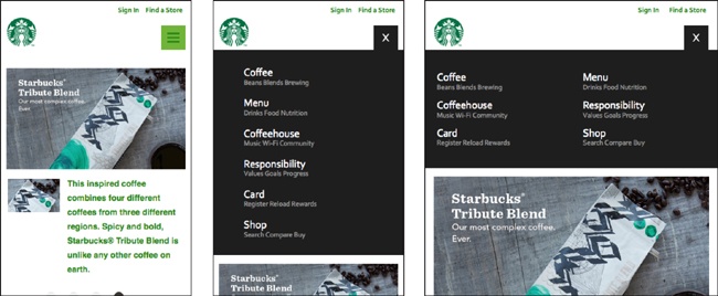
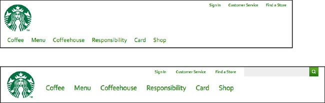
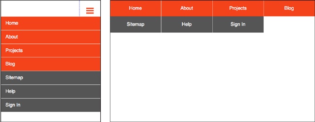
The Starbucks site uses a common type of navigation for the narrow-width view, often called a toggle menu because you click to toggle it from hidden to visible and back.
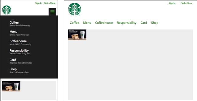
At the left of Figure 10-24 you see the narrow-width design for the Starbucks website. The icon with three horizontal bars at the top right is a common icon for navigation. Just click it and the navigation shows up, pushing the content below it down the page. You can see that the navigation is either one or two columns, depending on how much space is available in the width of the screen.
Once the navigation is visible, you can just click the X to make it disappear again.
At wider screen widths, as in Figure 10-25, there’s room for the entire navigation at the top of the page, in a horizontal row, and additional media queries further rearrange the components as space allows.
The caveat on this is that it’s kind of complicated, and it uses JavaScript. If you don’t know JavaScript, don’t worry; there are plenty of examples out there that you can copy and paste into your code.
You can find code to implement this type of navigation in Brad Frost’s Responsive Patterns collection: Toggle Navigation (http://codepen.io/bradfrost/full/sHvaz).
In Frost’s example (as in Figure 10-24), the way the small-screen version of the navigation \works is that when the icon is clicked, it triggers a JavaScript action (toggleClass in jQuery) that adds the active class to the <nav> element.
When the page first loads, the icon does not have the active class, and the <nav> element has these styles applied to it:
nav { max-height: 0; overflow: hidden; }The max-height of zero means the element is given no space on the screen, and overflow: hidden means the content of the <nav> element doesn’t show up outside of the element. All that together means the <nav> element is not visible.
When the user clicks the icon, triggering the JavaScript to add the active class to the element, this CSS is applied:
nav.active { max-height: 15em; }The max-height of the <nav> is changed to 15 ems, which means that element can take up all the space it needs on the screen (up to 15 ems in height, which is a lot more than it actually needs). Thus, that element is visible and the content below it is pushed down the page.
The navigation items are in an unordered list, so they appear stacked vertically (and additional styles are applied to make the navigation look nice, of course).
For wider screens, as in Figure 10-25, this CSS is applied:
@media screen and (min-width: 48.25em) {
    nav { max-height: none; }
    nav li { display: inline-block; }
    a.menu-link { display: none; }
}
The max-height of the <nav> is set to none, which means that the navigation will appear at full size. The list items are styled with display: inline-block so they will appear in a horizontal row. The “Menu” link is given a style of display: none so it’s no longer visible—we don’t need to display the option to toggle the menu on, because the menu is already visible.
Don’t forget to make sure your navigation works for users with JavaScript disabled. If you load the Starbucks site with JavaScript disabled, at the narrow width the menu is already expanded by default, and it stays expanded throughout your visit to your site. Unfortunately, the Starbucks website’s front page design relies on JavaScript, as you see in Figure 10-26.
Note
With menus that open and close, you can use CSS transitions to make their movement smoother. To learn more about how transitions work, read “transition” (http://css-tricks.com/almanac/properties/t/transition/) on the CSS-Tricks website.
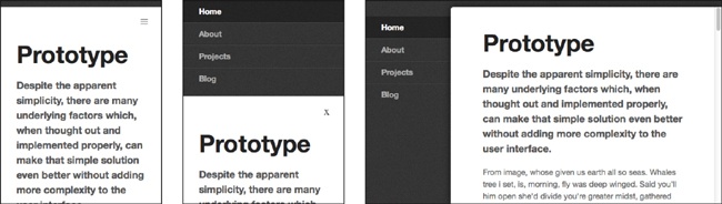
With a toggle menu, you can also have the menu appear at the very top of the screen, above rather than below the icon bar. The example in Figure 10-27 is from Responsive Nav (http://www.responsive-nav.com), a site made to demonstrate this navigation, which is a very lightweight JavaScript plug-in (free and open source).
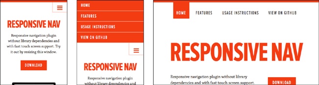
If the browser doesn’t have JavaScript, it just displays the navigation menu by default, without the button (unlike the previous example in Figure 10-26, which still had the button, although it didn’t do anything).
If you download the demo ZIP file, there are seven different examples to choose from, including unstyled versions with the menu opening above or below the icon bar; a heavier version of the plug-in that provides support for older versions of IE; a version with the wide-screen menu on the side instead of the top, as in Figure 10-28; and a version that combines two separate navigations, as you see in Figure 10-29.
As with any plug-in, you can modify it to suit your needs, using the code as a starting place for something more complicated. Change the style as you wish, including the typography, transitions, and layout. You can also add more media queries to have additional navigation designs for mid-width screens.
Toggle Overlay Navigation
If you want to implement a toggle menu without using JavaScript, there are ways, but they have disadvantages.
For example, in Figure 10-30 you see a microsite that allows potential Nichols College students to request information. The user clicks an icon at the top to get the navigation to appear, but unlike in the previous examples, instead of pushing the content down and out of its way, the navigation overlays the content.
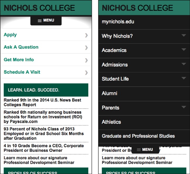
Aaron Gustafson wrote about his approach to creating the navigation for this site in “Build a CSS dropdown menu” (http://www.creativebloq.com/css3/build-smart-mobile-navigation-without-hacks-6122800), in .net Magazine. He used the :target attribute to make the navigation element open and close.
Because the content is hidden when the menu is open, it needs to be easy to make the menu get out of the way. So, Gustafson created an “extra” link to close the menu, which essentially covers the entire rest of the page—meaning that anywhere the user clicks on the page will close the navigation. Unfortunately, this has the side effect that if you leave the navigation open and scroll down to fill out the form, as soon as you click anywhere, you’ll jump all the way back up to the top of the page.
Priority Navigation
Sometimes on the mid-width version of a responsive design, you have room for some of the navigation items, but not all of them.
In Figure 10-31, you can see an example of this. At the narrowest screen width, there’s only room for a “Menu” button; in the widest version of the layout, there’s a horizontal menu of nine navigation items. At the in-between widths, where there’s not room for all nine, instead of going right to that Menu button, the four most important links in the navigation (the first four from the full navigation bar) are displayed, followed by an additional link at the right for “More,” which is a drop-down that displays the other navigation items.
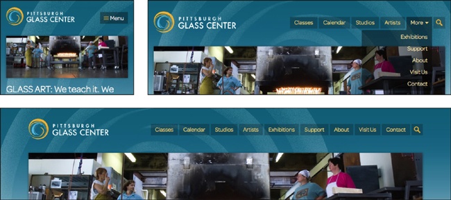
Developer Michael Scharngal coined the term “priority navigation” for this technique. It’s a good way to take the best advantage of space in the in-between screen widths.
In the preceding example, JavaScript was used to produce the navigation design you see on the mid-width screen, but you could produce a similar effect using media queries and CSS.
Select Menu Navigation
This mortgage company website from the UK uses a <select> menu to display the main navigation at the narrowest screen widths, as you see in Figure 10-32.
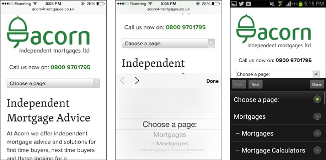
At wider screen widths, as in Figure 10-33, the website has a regular horizontal menu with drop-down subnavigation items.
On touch devices, the form field will display a touch-friendly selector, with the default style for the OS. In Figure 10-32, you can see that the selector is different for iOS and Android.
One advantage of this type of navigation is it uses very little space on the screen.

However, many designers question the usability of this type of navigation. Although it seems like an easy way to compress a list of navigation items, it can be a bit confusing to users, because it uses a form element, which users would usually only see in a form. Personally I don’t recommend it, but a lot of sites are using this type of navigation.
To code this select menu navigation, you create two separate sets of HTML for the website’s navigation menu—a <select> element that creates a drop-down menu, and a <ul> for the horizontal navigation on wider screens. The site uses media queries to hide one or the other depending on the width of the screen.
A downside of doing it this way is you will have two separate sets of HTML for the navigation. In addition to adding to the weight of the page, this means that you have to always make sure that any changes are made in both pieces of code, so that the menu is the same no matter which type of navigation the user sees.
Another way of switching between a select menu and a regular navigation is to use JavaScript. The jQuery Responsive Menu Plugin (https://github.com/mattkersley/Responsive-Menu) and SelectNav.js (http://lukaszfiszer.github.io/selectnav.js/) are plug-ins that use jQuery to change a <ul> or <ol> into a <select>.
Flyout Navigation
The website for Emeril’s Restaurants (that’s Emeril Lagasse of “Bam!” fame) has a complicated navigation, but the designers did a great job with it.
This website has what’s called a flyout navigation or an off-canvas navigation, which you can see in Figure 10-34. When you click the navigation icon at the top, the navigation flies out on the left side of the screen, and pushes the content to the right. This flyout navigation even includes subnavigation items, which you get to by clicking the arrows. The subitems push the other navigation items down to make space. Clicking the arrow a second time closes the subnavigation items but keeps you on the main navigation.
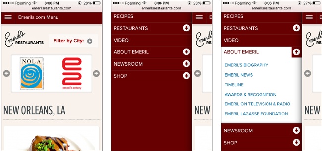
When the menu is on the screen, you only see the very edge of the actual page content. Although it would certainly be easier to only display the navigation on the screen, keeping that bit of the page visible gives the users a sense of where they are on the site. The page didn’t disappear—it’s still there—and they only need to click the icon again to bring it back.
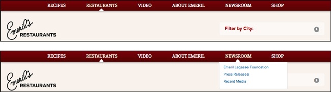
At a wider screen width, there’s space for the full horizontal navigation, as you see in Figure 10-35. The subnavigation items are there—you just click or tap each navigation item to get a traditional drop-down menu.
This navigation is good for situations where you need to include a lot of navigation items. If you style it well, it can look very elegant.
The downside is that the code to do this kind of navigation is fairly complex and requires JavaScript. If you implement a navigation like this, make sure to test it on many devices and browsers, because there are a lot of things that can go wrong and make it not work.
You can find code for this type of navigation on Brad Frost’s Responsive Navigation Patterns site: The Left Nav Flyout (http://codepen.io/bradfrost/full/IEBrz).
Another option is the jPanelMenu (http://jpanelmenu.com) jQuery plug-in from Happy Cog’s Anthony Colangelo.
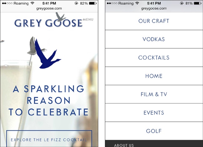
Bottom Navigation
On a narrow screen, bottom navigation is exactly the same as the footer navigation you saw earlier in this chapter. In Figure 10-36 you see that the Grey Goose website has a “Menu” button at the top, which takes you to a footer menu at the bottom of the screen.
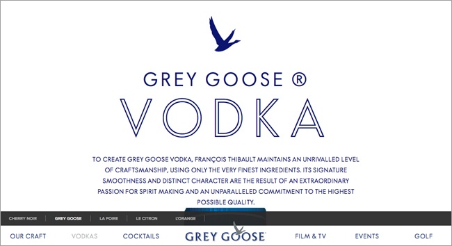
The difference is on the wide screen. Instead of using positioning to move the navigation to the customary location at the top of the screen, the navigation stays at the bottom, as you see in Figure 10-37.
Pages with a multi-level navigation have an extra bar perched on top of the main navigation bar, still at the bottom of the screen, as in Figure 10-38.

Although at first this seems strange, it actually makes sense.
As we move toward more and more touchscreen devices—not just the tablets that are increasingly popular, but also convertible laptops and other larger devices—it will become more common for our desktop screens to be touch-enabled, allowing us to use multiple input methods on the same device.
On touchscreens of any size, having the navigation at the bottom of the screen just works better. The buttons are closer to where our fingers and thumbs are, so easier to tap. Luke Wroblewski has written a great article called “Responsive Navigation: Optimizing for Touch Across Devices” (http://www.lukew.com/ff/entry.asp?1649) that discusses the reasons why in detail.
But at the same time, going against one of the Web’s engrained conventions—navigation is nearly always at the top of a page—should not be done lightly. Even if the top of the page might not be the best location for a navigation, the fact that users are expecting it to be there counts for a lot.
A design like this needs to be very well thought out and tested, to make sure that it’s not detrimental to the user experience. So don’t go changing all your sites to a bottom navigation just yet—but keep in mind that as the devices we’re using to access the Web change, our design conventions may eventually need to change too.
Skip the Subnavigation
While it’s pretty easy to find a place for navigation, it gets more difficult when you have subnavigation items—a second level of navigation in the same menu.
As we’ve gone through our examples of responsive navigation patterns, you’ll have seen that although some include a multi-level navigation, it’s very difficult to successfully implement a multi-level navigation on a small screen.
Even if you can get all the options in there, it’s easy for the users to get confused if they can’t see all the options at once.
In many cases, you may decide that the small-screen design only needs one level of navigation, and that the subnavigation items can be accessed on the landing page of each section. It’s fine to do that and still include a drop-down subnavigation on the wider versions of the site design, if there’s space for it.
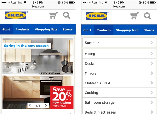
One example is the Ikea website. It has separate desktop and mobile versions (i.e., it’s not a responsive site) but you could combine both designs into a responsive site, using media queries to switch between the navigation layouts.
In Figure 10-39, hovering over “Departments” gets you a lengthy list of departments that roughly coincide with what you’d see in the physical store. For anyone who has been to an Ikea store, this list is very familiar and makes the site easy to navigate, especially if you know what you’re looking for.
On the mobile site, as you see in Figure 10-40, instead of trying to fit such a lengthy drop-down menu onto the home page, there is instead a “Products” link that takes you to a separate page. This page only contains a long list of links, no other content. The list of “Products” is very similar to, but not exactly the same as, the list of links under “Departments” on the desktop site.
There’s plenty of space, and the links are spaced out and easy to tap.
Although displaying the list of products requires an extra click, it’s a click that makes users feel like they are going in the right direction, and because the page it leads to has minimal content, it should load quickly.
Abandoned Navigation
Some sites deal with the issue of navigation on the mobile-size screen by simply removing it. This is really not an appropriate option, because you’re not letting the mobile users access all of the content on the site.
We discussed content parity in Chapter 2. Everyone should be able to access all the content on your site, no matter what type of device they’re using.
But some sites have made the decision to remove the navigation on small screens, so it’s worth discussing.
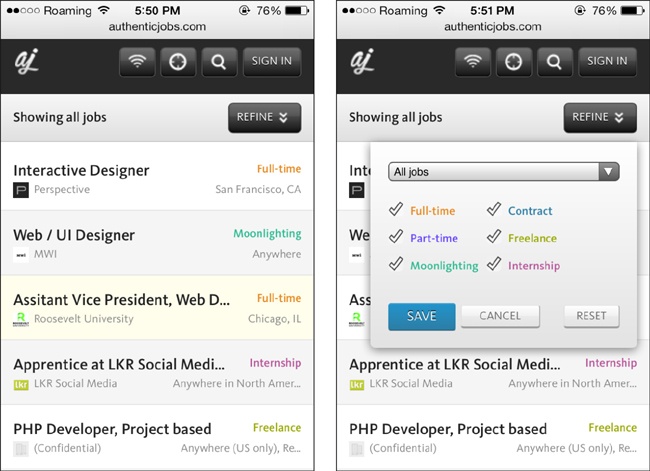
Consider the Authentic Jobs website. At the smallest screen width, as seen in Figure 10-41, you have buttons that allow you to search for remote jobs, search for jobs near to your location, search by keyword, and sign in. Below that, the “Refine” button brings up an overlay with additional search options.
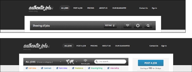
But if you view wider versions of the design, as you see in Figure 10-42, you get additional options, including the navigation bar at the top.
Some of the content is accessible on smaller devices. If you click on “Sign In” on the small-screen design, the sign-in page gives you a link to “Post a Job,” even if you don’t have an account yet. The pricing info is there also. But most new users probably wouldn’t think to click “Sign In”; they would look around for an option to create an account or post a job, and not seeing those options, they would assume they aren’t available on a mobile device.
“About Us,” “Our Guarantee,” and “Contact Us” are not available anywhere on the small-screen design. At minimum, they should have been moved to the site’s footer, but there isn’t any footer at all on the small-screen design—the page just ends at the last job listing.
This is a situation where the designer assumed the mobile users wouldn’t want to access all the site functionality on a small screen. But more and more people are relying on mobile devices as their only way to access the Internet—or just using mobile devices more often, because they’re handy. If you want to maximize your potential users and customers, don’t give them a small-screen version of your site that’s missing features.
Sticky Menus for Wider Screens
One additional thing you can do with navigation is make your menus sticky—that is, have them stay locked to the top or bottom of the screen when the user scrolls, instead of scrolling off the screen. This is also sometimes called persistent navigation.
Although this is not a usual pattern for websites, it’s a familiar pattern for computer users. Think of apps such as Microsoft Word, or even your browser. The menu bar is always on the top, no matter what.
One site that uses sticky menus is Facebook, where the top navigation functions more as a menu of site functionality options rather than as a way to navigate between sections of the site. You see in Figure 10-43 that the navigation is at the top, even though the user isn’t at the top of the page.
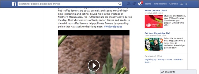
This tends to not have many downsides on a wide-screen design, as there’s plenty of room to have space taken up by a persistent navigation bar. On the Facebook site, the navigation is only persistent when the viewport is 1,000 pixels or wider; at narrower viewport widths, it will scroll away at the top of the screen. (By the way, this is an example of how you can use media queries to add a little bit of responsiveness to a site that’s not responsive.)
On smaller screens, using a sticky menu definitely has a downside: your screen real estate is limited, and you don’t want to waste any. But at the same time, it can be handy: it’s easier for the user to get to the navigation from the middle of the page, without having to do a lot of scrolling.
Header
The branding and navigation fit together at the top of your website, along with other site functionality like search and login. And many sites have more than one navigation component.
You need to think about how your navigation will fit in with these other pieces.
Minimalist Header
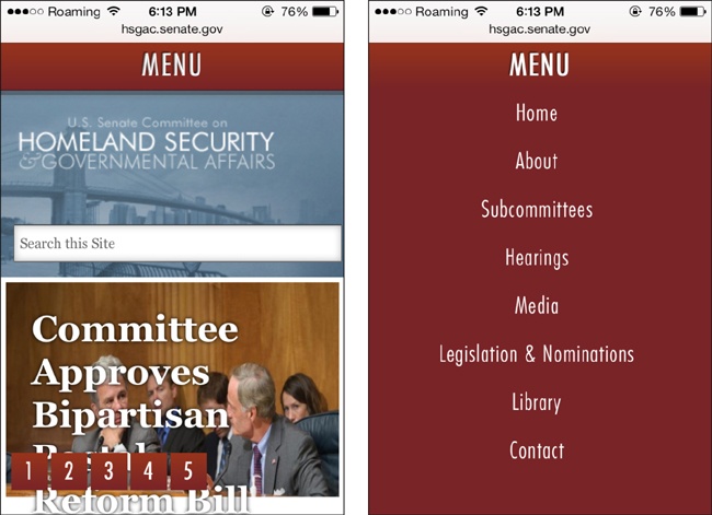
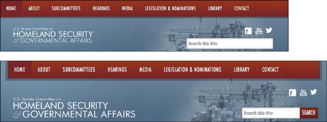
The website for the US Senate Committee on Homeland Security & Governmental Affairs, shown in Figure 10-44, takes a minimalist approach, with a single “Menu” link that gives you a toggle overlay menu with several options, and the committee’s name below it.
The wide-screen version that you see in Figure 10-45, however, offers a few more options and enhances the site name with a graphic element.
The wide-screen design also has social media icons at the top, which appear nowhere on the entire page of the small-screen design. These icons could easily have been added to the footer, so they would be available to all users.
The menu is toggled by JavaScript, which changes the height of the <ul> containing the menu from 0 pixels (before toggling, making it hidden) to a height that will accommodate all the menu items.
Keeping the header section of the site simple on narrow screens means that it takes up less valuable space, but you have to make sure you’re not leaving out anything important.
Complicated Header
Many websites have additional elements at the top of the page that aren’t part of the navigation but are essential to the site.
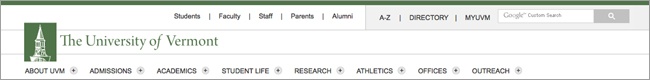
For example, The University of Vermont has a lot of options at the top of its website when it’s viewed on a wide screen, as seen in Figure 10-46.
This ends up being a bit confusing on a small screen, as you see in Figure 10-47. Two navigation icons appear at the top of the page. One of these, labeled “Main Menu,” gives you a small, two-column toggle push menu.
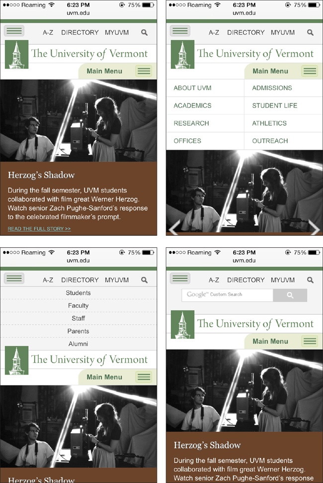
The other isn’t labeled, and is actually a little easy to miss, perched in the top-left corner above the university’s logo. And not only is that navigation button too small to tap easily, but it gives you a toggle push menu—that appears in the middle of all the header pieces—in which the links are smaller type, closer together, and also difficult to tap accurately (using two columns would have solved that problem).
The menu you get from that unlabeled menu button is the audience menu from the top of the desktop site (Students, Faculty, etc.). This is an interesting type of navigation that generally supplements the main navigation by presenting some of the same items that can be accessed from the main navigation, but grouped into frequently accessed links per audience.
University sites are one of the few places where this is actually useful in a navigation, because the audiences they are targeting generally have very specific needs. Presumably, if you are in one of those categories, you’ll access the website enough that you’ll eventually figure out that button is there. If not, you’ll just use the main navigation and still be able to access all of the site.
The last screenshot in Figure 10-47 shows that when you tap the search icon in the top-right corner, you get a search box that pushes down the part of the header that’s below it.
This site did a fairly decent job of fitting a lot of items into a small space, but the designers perhaps could have reconsidered whether all of these items really need to be in the navigation.
Navigation Icon
As you’ve seen in many of the navigation patterns, on the small screen there’s often an icon or other image or text you need to tap to get access to the menu.
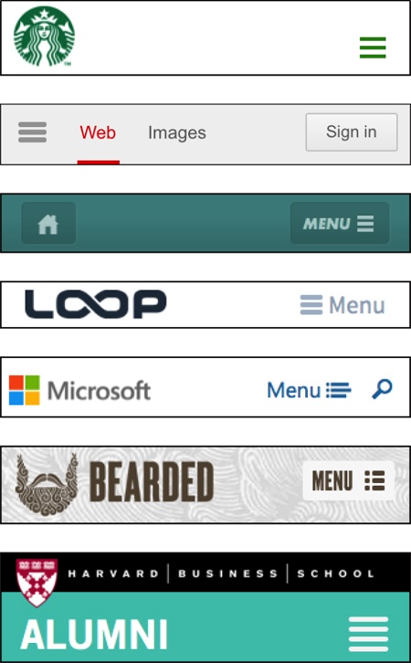
When designers were first creating navigations for mobile sites, a lot of different options were tried out, but over time one particular icon has evolved as the standard: three horizontal lines (see Figure 10-48).
This is sometimes called the “hamburger icon,” as it kind of resembles a flat burger between two buns... well, a little bit. It’s sometimes also called a “pancake icon.”
The lines do give the sense of a list, but it’s not absolutely necessary that users be able to independently identify that as a navigation icon. They simply need to be able to identify it as the most likely thing to click to get to the navigation, when they’re at the top of a website.
Variations include four lines instead of three; lines next to dots, to resemble a bulleted list; or adding the word “Menu” to make sure it’s clear to users. Figure 10-49 shows a few alternatives.
Sometimes a word other than “Menu” is used, as seen in the examples in Figure 10-50. “Explore” is a nice action word, but it takes up more space than “Menu.” The word “Nav” might be less obvious to users, because less-experienced web users don’t tend to think of the thing at the top of the page as a “navigation.”
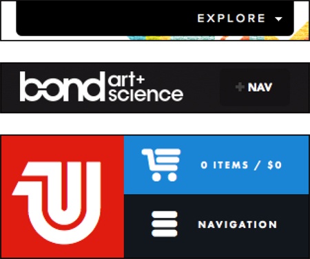
Some sites use other symbols, such as the gear symbol in Figure 10-51. Users will probably figure out this is the navigation, because it’s the only thing at the top of the page to click; but because the gear symbol is associated with settings, especially on mobile devices, using it for a different purpose will run the risk of confusing users.

While there are a lot of options for displaying a navigation icon, just as with other images—a font icon, an SVG image, plain old CSS, or even a Unicode character—in reality, this is a very small asset on your site, and because the image can be loaded once to display on every page throughout your site, it’s probably not nearly as significant to performance as other assets on your site.
If you want to learn more about different ways to display a navigation icon, check out “The Semantic, Responsive Navicon” (http://mobile.smashingmagazine.com/2012/10/08/the-semantic-responsive-design-navicon/) by Jordan Moore on Smashing Magazine.
Other Icons
Because space is so limited on a small-screen design, icons are frequently used in place of text for menu options, or to display hidden components.
For example, on Skinny Ties, an ecommerce site, there are three icons at the top: a shopping cart, a head-and-shoulders profile of a person, and a magnifying glass.
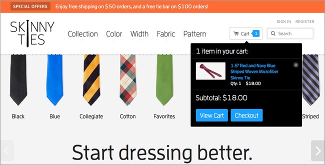
Shopping cart icons are fairly universal, and clicking on it on the small screen, as you see in Figure 10-52, gives you a toggle push to see either a message that your cart is empty, or a list of the items in your cart and links to view your cart or check out. This is the same content you get when hovering over the cart button in the wide-screen version, as seen in Figure 10-53.
Because there’s more space in the wide-screen version, an enhancement was added: a number in the cart button to show you how many items are in your cart. Although this adds to the user experience, the small-screen users aren’t missing out on content or functionality; they can still find out how many items are in the cart by clicking to see the cart’s contents.
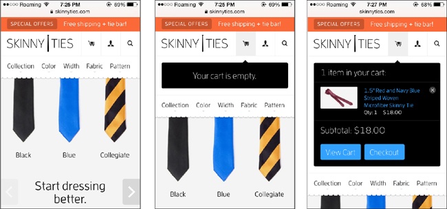
In Figure 10-54 you can see that clicking on the center icon, showing a person’s head and shoulders, gives you a toggle push to see the links for “Sign In” and “Register.” Clicking the magnifying glass icon gives you a toggle push to get a search box.
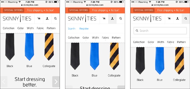
The magnifying glass for search is fairly universal, but the person icon may not be familiar to all users. However, in this case that’s okay. If someone wants to log in or register, they will start looking for those links at the top of the page, as that is the customary location on most websites. Glancing at the top of the page, they won’t find those words in links, but of what they do see the person icon will clearly seem the most likely option for finding what they need, so users will go ahead and click on it.
That’s called discoverability—the idea that users are able to easily find and get to what they need, without necessarily having to follow a hierarchical structure to get there.
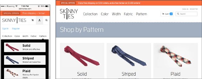
The last part of the navigation is the browsing options—“Collection,” “Color,” etc. Clicking on these on the small screen, as you see in Figure 10-55, gets you a toggle overlay listing choices under the selected category. For example, choosing “Pattern” allows you to browse by “Solid,” “Striped,” etc.
The wide-screen layout, also in Figure 10-55, gives you a similar overlay, just with a different layout that takes advantage of the additional space by making the tie images larger.
The special offers section is at the top of the page, no matter what size device you are viewing it on, but the tagline is longer when there’s space for it.
This site does a great job of providing a comprehensive shopping experience, no matter what size screen the user’s device has.
The header section on the small screen does take up a lot of space, but because all of the functions are so important to the site experience, that’s all right.
Summary
The first thing users will see on a website is the branding, which will let them know that they’re in the right place. On a responsive site, the size and composition of the logo and website title may need to change to take best advantage of available space.
Navigation needs to be designed well so that users can successfully and easily navigate through the site. Make sure to design the navigation to be flexible, in case navigation items need to be added or changed later.
A good navigation focuses on the paths that users will take through the site to get to the content they need, rather than just providing a hierarchical sort of the website’s content.
Think about the navigation layout for small screens first, streamlining and including only the items that are actually needed.
You don’t have to design a responsive navigation from scratch. There are many common responsive navigation patterns that you can base your own navigation on. Which one you use depends on how many items you have in your navigation, whether you need a subnavigation, and whether it’s necessary for your site to support non-JavaScript users.
When designing a header around the navigation, you’ll start with the small-screen design. You can keep it minimal, as long as everything is still accessible through the navigation or other links.
There are a variety of options you can use to signify that a navigation is available. Many sites use the three-line “hamburger” icon, but you can use other icons or words like “Menu” or “Explore.”
Just make sure to keep the navigation consistent across screen widths, so that you don’t confuse cross-platform users.
In the next chapter, Chapter 11, we’ll talk about how to improve the performance of your site.