Chapter 10
Unlocking features with the Data Model and Power Pivot
In this chapter, you will:
When I first saw the Power Pivot add-in in 2008, I thought the big news was the ability to handle 100 million rows in Excel. As time passes, and I realize that I frequently have anywhere near a million rows of data, I have started to appreciate the other powerful features that become available when you choose the box Add This Data To The Data Model.
The phrase “Add this data to the Data Model” is a very boring phrase. During the era of Excel 2013 and Excel 2016, Microsoft was slowly incorporating more of the Power Pivot tools into the core Excel.
At the same time, they were trying to convince customers to pay an extra two dollars every month for Power Pivot. You can see where the goal in Excel 2013 was to make the phrase “Add this data to the Data Model” sound pretty boring. If no one selected the box, then people might think they had to pay the extra two dollars a month.
But today, with Excel 2019 including the full Power Pivot feature set, there is no reason for Microsoft to be so cagey. When you see “Data Model,” you should think “Power Pivot.”
Replacing VLOOKUP with the Data Model
Some people describe Power Pivot as being able to do Access in Excel. This is true to a point: Power Pivot and the Data Model let you create a relationship between two tables.
Consider the two tables shown in Figures 10-1 and 10-2. The first data set, located on Sheet1, is a transactional data set. There are columns for Date, Invoice Number, Product, Quantity, Revenue, and Profit.
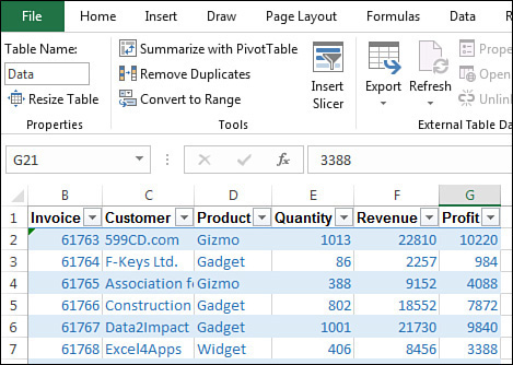
Note the formatting in Figure 10-1. Use either Home, Format As Table or press Ctrl+T to format the data as a table. The formatting is not the important part. Making the data into a table is important if you will be joining two data sets in Excel.
When you press Ctrl+T, Excel will give the data set a name of Table1. Press Ctrl+T on another data set and that table will be called Table2. These are horrible names. Take the time to go to the Table Tools Design tab of the ribbon and type a new name. In Figure 10-1, the table is called “Data.” The SQL Server pro would call this table “Fact.” I prefer “Data” just to differentiate myself from the SQL Server people.
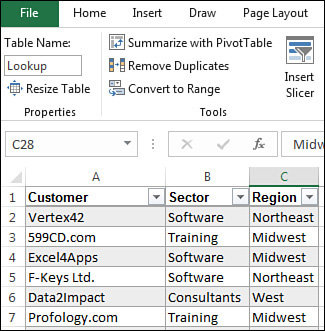
While there are hundreds or thousands of invoices in the Data table, the second table is much smaller. It contains one row for each customer and maps the customer name to a sector and a region.
In most legacy situations, if you needed to create revenue by region, you would knock out a column or two of VLOOKUP functions and bring the Region data in to the first table.
But with the Data Model, you do not have to do the VLOOKUP. Simply leave the two data sets on Sheet1 and Sheet2. You do want to take the extra step of defining the lookup table as a table using Ctrl+T. As Figure 10-2 shows, you can rename the table to be Lookup or CustomerLookup or anything that is meaningful to you.
Later in this chapter, you will see how to use the Relationships icon to define a relationship. But in this first example, you can create a pivot table without defining a relationship first.
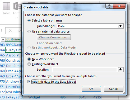
Select one cell in the original data set. Choose Insert, PivotTable. Excel will assume you want to create the pivot table from the table called Data.
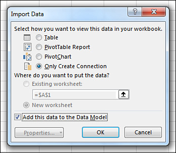
In the lower-left corner of the Create PivotTable dialog box, select the check box for Add This Data To The Data Model (see Figure 10-3).
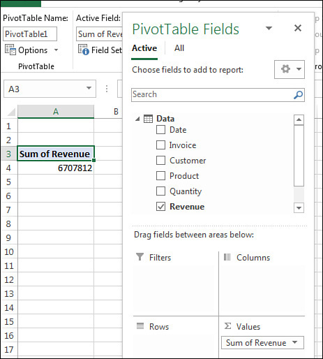
The first thing you might notice: It will take 8–16 seconds for the Pivot Table Fields list to appear. This delay is caused by Excel loading the Power Pivot engine in the background.
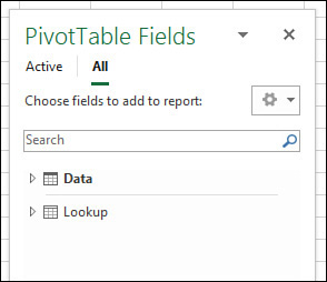
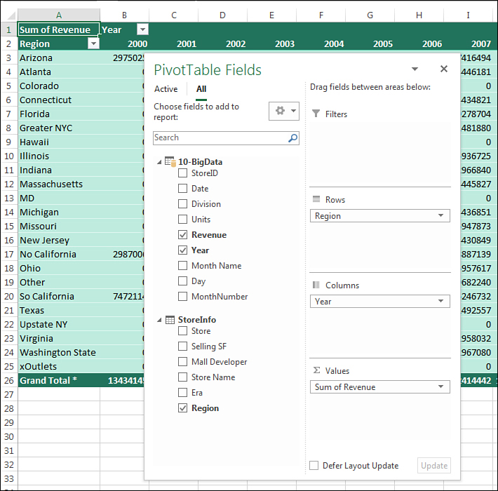
The next two items are very subtle. First, the table name appears at the top of the fields in the PivotTable Fields list. You could use the triangle to collapse those field names. Second, the words “Active” and “All” appear at the top of the PivotTable Fields list. The choice for “All” is the groundbreaking feature (see Figure 10-4).
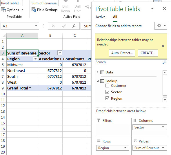
When you click All, a confusing series of things happens, as shown in Figure 10-5. The data table collapses to a single line. The Lookup table appears in the field list. The data table is bold, indicating that you have chosen fields from that table. The Lookup table is not bold, meaning that it is not yet part of the Data Model.
Click the Lookup table name to reveal the fields Customer, Sector, and Region. Drag the Sector field to the Columns area. Drag the Region to the Rows area.
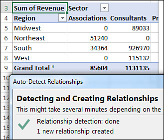
As shown in Figure 10-6, every non-zero number in the pivot table is reporting the Grand Total of 6,707,812. This is clearly wrong. A large yellow box in the top of the PivotTable Fields list warns you Relationships Between Tables May Be Needed. You have choices of Auto-Detect or Create.
Click the Auto-Detect button. This is a simple relationship: One table has many occurrences of each customer, and it is mapped as a lookup table with one occurrence of each customer. Excel figures out the relationship and updates the numbers in the pivot table (see Figure 10-7).
 Tip
Tip
In Excel 2019, you can use Relationships on the Data tab to explicitly define a relationship to avoid this awkward state of having wrong numbers in the pivot table. This is discussed later in this chapter.
The results in Figure 10-7 are fairly groundbreaking. You just had Excel do a database join between data on two worksheets. You did not have to know how to do a VLOOKUP.
Even if you know and love VLOOKUP, when you get to a data set with 100,000 records and lookup table with 12 columns, you don’t want to build 1,200,000 VLOOKUP formulas to join those data sets together. Power Pivot and the Data Model scales perfectly.
For me, joining two tables in a single pivot table is the number-one benefit of Power Pivot and the Data Model. But there are many more powerful features unlocked when you select the Data Model check box while creating a pivot table.
Unlocking hidden features with the Data Model
I do 35 live Excel seminars every year. I hear a variety of Excel questions in those seminars. Some questions are common enough that they pop up a couple times a year. When my answer starts with “Have you ever noticed the box called ‘Add This Data To The Data Model’?,” people can’t believe that the answer has been right there, hiding in Excel. A typical reaction from the audience member: “How was anyone supposed to know that “Add This Data To The Data Model” means that I can create a median in a pivot table?”
Counting Distinct in a pivot table
Consider the three pivot tables shown in Figure 10-8. The question is: “How many unique customers are in each sector?” The pivot table in columns A and B allow you to figure out the answer. You can mentally count that there are two customers (B4 and B5) in the Associations sector. There are six customers listed in the Consultants sector.

But how would you present the top-left pivot table to your manager? You would have to grab some paper and jot down Associations: 2, Consultants: 6, Professional: 3, and so on.
When you try to build a pivot table to answer the question, you might get the wrong results shown in D3:E10. This pivot table says it is calculating a “Count Of Customer,” but this is actually the number of invoices in each sector.
The trick to solving the problem is to add your data to the Data Model.
The pivot table in D13:E20 in Figure 10-8 is somehow reporting the correct number of unique customers in each sector.
A regular pivot table offers 11 calculations: Sum, Count, Average, Max, Min, Product, Count Numbers, StdDev, StdDevP, Var, and VarP. These calculations have not changed in 33 years.
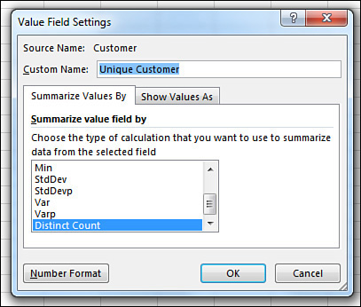
But if you create your pivot table and select the check box for Add This Data To The Data Model, a new calculation option appears at the end of the Value Field Settings dialog: Distinct Count.
Drag customer to the Values area. Double-click the Count Of Customer heading. Choose Distinct Count. Change the title, and you have the solution shown in Figure 10-8. Figure 10-9 shows the Value Field Settings dialog box.
One oddity: The Product calculation is missing from the Value Field Settings for the Data Model. I’ve never met anyone who actually used the Product calculation. But if you were a person who loved Product, then having Excel swap out Product to make room for Distinct Count will not be popular. You can add a new measure with =PRODUCT([Revenue]) to replicate the product calculation. See the example about creating median later in this chapter.
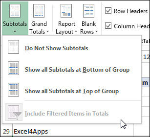
Including filtered items in totals
Excel pivot tables offer an excellent filtering feature called Top 10. This feature is very flexible: It can be Top 10 Items, Bottom 5 Items, Top 80%, or Top Records To Get To $4 Million In Revenue.
Shortening a long report to show only the top 5 items is great for a dashboard or a summary report.
But there is an annoyance when you use any of the filters.
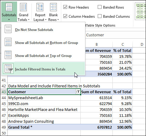
In Figure 10-10, the top pivot table occupies rows 3 through row 31. Revenue is shown both as Revenue and as a % of Total. The largest customer is Andrew Spain Consulting with 869K. In the top pivot table, the Grand Total is $6.7 Million, and Andrew Spain is 12.96% of that total.

In the same figure, rows 34:40 show the same pivot table with the Top 5 selected in the Top 10 filter. The Grand Total now shows only $3.56 Million. Andrew Spain is 24% of the smaller total number.
This is wrong. Andrew should be 12.96% of the total—not 24%.
On January 30, 2007, Microsoft released Excel 2007. A new feature was added to Excel called Include Filtered Items In Subtotals. This feature would solve the problem in Figure 10-10. But as you can see, the feature is grayed out (see Figure 10-11). It has been grayed every day since January 30, 2007. I can attest to that, because I check every day to see if it is enabled.
To solve the problem? Choose Add This Data To The Data Model as you create the pivot table. This enables the choice. The asterisk on the Grand Total in cell A49 means that there are rows hidden from the pivot table that are included in the totals.
More importantly, the % of Column calculation is still reporting the correct 12.96% for Andrew Spain Consulting (see Figure 10-12).
Creating median in a pivot table using DAX measures
Pivot tables still do not support the median calculation. But when you add the data to the Data Model, you can build any calculation supported by the DAX formula language. Between Excel 2016 and Excel 2019, the DAX formula language was expanded to include a median calculation.
Calculations made with DAX are called measures. Figure 10-13 shows different ways to start a DAX calculation. You can right-click the table name in the PivotTable Fields list and choose Add Measure, or you can use the Measures drop-down menu on the PowerPivot tab in Excel. Using the Measures drop-down menu is slightly better because any new measures are automatically added to the Values area of a pivot table.
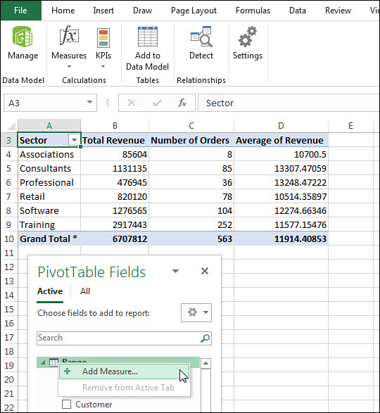
Figure 10-14 shows the Measure dialog box. There are several fields:
![In the Measure dialog box, specify a measure name of Median Revenue and a formula of =Median(Range[Revenue]).](Images/10fig14.jpg)
The Table Name will be filled in automatically for you.
Type a meaningful name for the new calculation in the Measure Name box.
You can leave the Description box empty.
The fx button lets you choose a function from a list.
The Check Formula button will look for syntax errors.
Type =Median(Range[Revenue]) as the formula.
In the lower-left, choose a number format.
As you type the formula, something that feels like AutoComplete will offer tool tips on how to build the formula. When you finish typing the formula, click the Check formula button. You want to see the result No Errors In Formula, as shown in Figure 10-14.
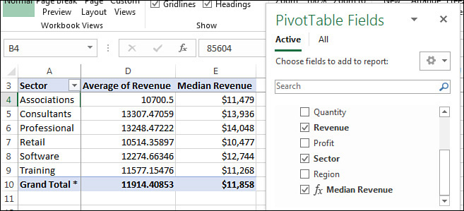
Click OK. Median Revenue will appear in the Fields list. Choose the field in the Fields list and it will get added to your pivot table.
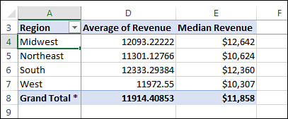
Column E in Figure 10-15 shows the median for each sector.
Calculations created by measures are easy to reuse. Change the pivot table from Figure 10-15 to show Regions in A instead of Sector. The measure is reused and starts calculating median by Region (see Figure 10-16).
Reporting text in the Values area
Pivot tables are great at reporting numbers. But you’ve never really been able to display text answers in the Values area of a pivot table.
The new DAX calculation for CONCATENATEX will return a text value to each value in the pivot table.
In Figure 10-17, the original data is shown in columns A:C. Each customer is assigned a team of three staff members: a Sales Rep, a Manager, and a Customer Service Rep.
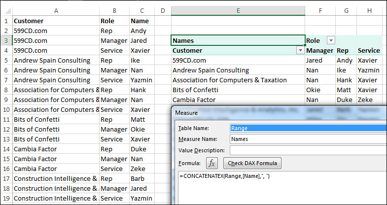
You would like to build a report with Customers down the side and Roles across the top. In each Values area, list the name of the people assigned.
The pivot table shown in Figure 10-17 uses the CONCATENATEX function to product the report.
Processing big data with Power Query
You might have been excited when Excel moved from 65,536 rows in Excel 2003 to 1,048,576 rows in Excel 2007. But what if you have more than a million rows of data?
The 10-BigData.txt file included with the sample files has 1.8 million rows of data. How can you analyze this data in Excel?
You can use the Power Query tools in the Get & Transform group of the Data tab of the ribbon. There are several different strategies:
Edit the file using Power Query. Try to remove the unnecessary records. You might not need sales from the outlet store or anything before 2005. If you can get the 1.8 million rows below 1,048,576 records, you can load directly to the Excel grid.
Group the file using Power Query. Maybe you know that you will not ever care about daily data. You can add a formula in Power Query to calculate monthly dates from the daily dates. Group the data by Store, Category, and Month, summing the quantity and revenue. If that data is under 1,048,576 rows, you can load to the Excel grid.
Skip the Excel grid and load directly to the Data Model using Power Pivot. You can still add calculated columns in the Power Pivot grid.
Use a hybrid approach: Use Power Query to remove sales through the outlet store, but then load to the Data Model.
When you load directly to the Data Model, you lose the ability to do any analysis other than a pivot table. But, you will have a much smaller file size. 65 MB of data in a text file will often become 4 MB of data in the Data Model.
The following paragraphs will outline the hybrid approach.
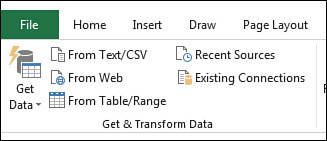
To load a text file using Power Query, choose From Text/CSV in the Data tab's Get & Transform Data group (see Figure 10-18).
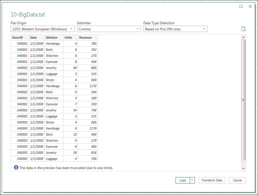
In the next dialog box, browse to and locate your text file. This dialog box is not shown. After you click OK, the preview in Figure 10-19 appears. If the file is under 1048575 rows and if you don’t have to edit the query at all, you can click Load. I’ve never been able to click Load. I always choose Transform Data.
After you choose Transform Data, the first 1000 rows from the file will appear in the Power Query editor. Tools are spread over the Home, Transform, and Add Column tabs.
In the current example, you want to remove four store IDs. If you open the Filter drop-down menu for StoreID, the choices are based on the first 1000 rows. The outlet stores that you need to remove are deep in the file and not in the filter drop-down menu. Instead, choose Value Filters, Does Not Equal.
The dialog box shown in Figure 10-20 appears. Type the first store number to remove. Click OK. Repeat for the other three stores.
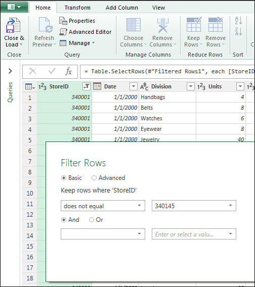
Looking at Figure 10-20, there is an Advanced version of the Filter. There is the option to specify a second store using the And or Or option. Each pass through this dialog box gets recorded as a different row in the Applied Steps pane. You might want the filters to be four separate lines so you can easily duplicate one later when a new outlet store is added.
If you have four stores to remove, repeat the steps in Figure 10-20 three more times.
Adding a new column using Power Query
The text file includes a date field. You want to add new columns for Year, Month Name, and Month Number. The function language in Power Query is annoyingly different from the functions in Excel. Plus, the language is case sensitive. In Excel, you could use =YEAR(A2), =year(a2), =Year(A2), or =yEaR( A2 ). But in Power Query, you would have to type =Date.Year([Date]) to do the same calculation. It had to be typed exactly that way. =date.year([date]) would return an error.
In the summer of 2018, Microsoft introduced a new icon called Column From Examples. This feature is similar to Flash Fill in Excel with one massive improvement: Column From Examples will insert the correct formula in the query so that step can be reused on a newer version of the text file.
I am a big fan of Column From Examples. Every time that I used to build a formula in Power Query, I knew that the process would involve the following:
Find the online Power Query function reference.
Search to try to find the syntax.
Copy the syntax without really learning anything.
Make a resolution to learn these new functions as well as I know Excel one day.
Never follow up with step #4.
Today, with Column From Examples, I know that I will never need to learn the Power Query functions.
Here are the steps to add a calculated Year field to your text file as it is imported.
In the Power Query editor, click on the Date heading to select that column.
On the Add Column tab, open the Column From Examples drop-down menu and choose From Selection, as shown in Figure 10-21.
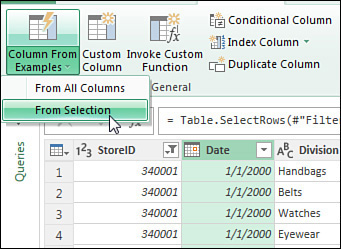
FIGURE 10-21 Select the column that contains the source data.
A new cell will appear on the right edge of the query window. Type the correct value for this year. In this case, you would type 2000.
In response to your typing 2000, a menu appears with the choices shown in Figure 10-22. Look at that list. I just wanted a year. But they are offering all sorts of amazing things such as End Of Quarter From Date or End Of Year From Date. Those might come in handy someday, but today, you just want the year, so choose 2000 (Year From Date).

By clicking this option, Power Query adds a new column with a heading of Year and the correct formula. You can look in the formula bar and see Date.Year([Date]), so there is an opportunity to learn the function language.
You can keep adding custom column from examples. Check the sample files to see Month Name and Day.
Power Query is like the Macro Recorder but better
As you perform steps in Power Query, a list of steps appears in the Applied Steps panel on the right side. Think of this list as the world’s greatest visible undo stack:
You can click any item in the list and see what the data looked like at that point.
You can click the Gear icon next to any step and see the dialog box that was used at that step.
You can remove the last step using the X icon. You can remove other steps as well, but you will likely screw up the query until you edit the Power Query code.
To see the Power Query code (the language is called the M language), go to View, Advanced Editor and you will see the programming code that you created by doing steps in Power Query.
How is this different from the VBA Macro Recorder? The code recorded by Power Query will work the next time. If you get a new text file that has 50,000 new records, the Power Query code will have no problem adapting the code to more or fewer records. In the VBA macro recorder, having more records would almost always make a recorded macro stop working.
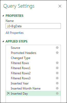
See the Applied Steps from this example in Figure 10-23.
Avoiding the Excel grid by loading to the Data Model
In the current example, you have a 1.8 million-row file that is now 1.7 million rows after you deleted the outlet stores. This is too big for the Excel grid. But even if you trimmed the file to 600,000 rows, you should still consider loading the file directly to the Data Model.
The Data Model uses a compression algorithm that frequently trims a 56 MB file to 4 MB in memory. This is a 14:1 compression ratio. If your plan is to create pivot tables from the data, loading straight to the Data Model is the way to save memory.
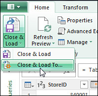
To skip loading to the Excel grid, go to the Power Query Home tab. Use the drop-down menu at the bottom of Close & Load. Choose Close & Load To…, as shown in Figure 10-24.
In the Import Data dialog box, choose Only Create Connection and choose Add This Data To The Data Model (see Figure 10-25) .
When you click OK, Excel will actually load the 1.7 million rows into your workbook. You will watch the row counter in the Queries & Connections panel count up. This will take as long as it will take. Excel doesn’t have any magic way to load the data from disk. But as they are loading that data, it is being organized and vertically compressed. From here on, the pivot tables will be very fast.
When the import is finished, the Queries & Connections panel will report how many rows were loaded (see Figure 10-26).

Adding a linked table
The database pros who created your text file are smart. They knew it would take a lot of space to include a 20-character store name on 1.8 million rows of text. Instead, they used a Store ID.
You probably have a small worksheet that maps the store number to the store name and other information. This workbook probably already exists somewhere in your company.
The worksheet shown in Figure 10-27 is a subset of a real StoreInfo workbook that gets a lot of use at a my friend’s company. In real life, there are columns for Manager Name, Phone Number, and so on.
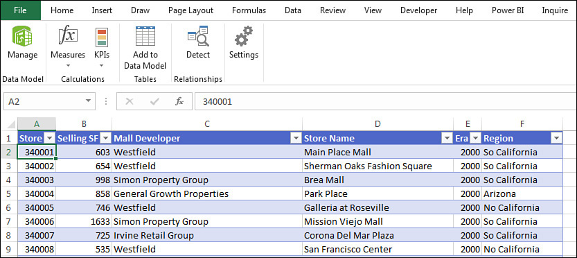
Compared to the 1.8 million-row text file, this tiny 175-row worksheet is really small. To add this worksheet to the Data Model, follow these steps:
Insert a new worksheet in your workbook that contains the 1.8 million row import.
Copy the Store Info to the new worksheet.
Select one cell in the data set and press Ctrl+T to define the data as a table.
Make sure My Data Has Headers is selected. Click OK.
Go to the Table Tools Design tab and replace the name Table1 with StoreInfo.
With one cell in the table selected, go to the Power Pivot tab in the Excel ribbon. Choose Add To Data Model.
Defining a relationship between two tables
To prevent the wrong numbers shown previously in Figure 10-6, you can proactively define a relationship. There are a couple of ways:
Use the Relationships icon in the Data Tools group on the Data tab of the Excel ribbon.
Use the Diagram view in the Power Pivot grid.
To use the Relationships feature, click its icon shown in Figure 10-28.
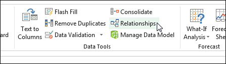
FIGURE 10-28 Start defining a relationship using the Relationships icon.
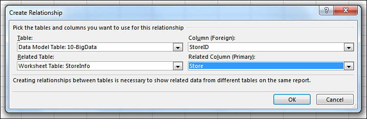
In the Manage Relationships dialog box, choose New…. The Create Relationship dialog box appears. You have to fill out four fields to establish a relationship:
Specify that the main table is 10-BigData loaded to the Data Model.
Specify the Column (Foreign) in that table is StoreID.
The Related Table is the Worksheet Table: StoreInfo.
The Related Column (Primary) is Store.
The dialog box should appear as shown in Figure 10-29. Click OK to create the relationship.
 Note
Note
Some lookup tables might require you to map Cost Center and Account from the data and lookup table. While this is not possible using the Create Relationship dialog box in Figure 10-29, you can achieve this in Power Query. Import both tables using Create Connection Only.
Use Data, Get Data, Combine Queries, Merge to define a third query that will join based on multiple fields. In the next dialog box, use the Ctrl key to choose the key fields in both tables.
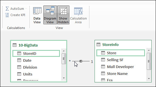
An alternate way to create the relationship is the Diagram View in the Power Pivot window. Drag an arrow from StoreID to Store (see Figure 10-30).
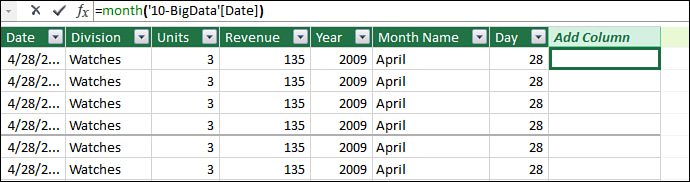
Adding calculated columns in the Power Pivot grid
In addition to adding calculations with Power Query, you can add calculated columns in the Power Pivot grid. Instead of the Diagram View shown in Figure 10-30, switch back to the Data View shown in Figure 10-31. Click into an empty column and type the correct formula in the formula bar.
The functions in the Power Pivot window are very similar to the functions you already know and love in Excel.
For example, the =YEAR() function in Excel is =YEAR().
The =MONTH() function in Excel is =MONTH.
So far, so good, right? There are two annoying differences:
The
=TEXT()function in Excel is=FORMAT()in Power Pivot. If you wanted to create the Month Name column in Power Pivot, you would use=FORMAT([Date],"MMMM")instead of=TEXT(B2,"MMMM")in Excel. Why did this function change? Remember that Power Pivot was not written by the Excel team. It was written by the SQL Server Analysis Services team. Excel hasTEXT. SQL Server hasFORMAT. The second argument inFORMAToffers more choices thanTEXT, so the team chose to go withFORMATinstead. That was a fine choice.The
VLOOKUP()function in Excel is=RELATED()in Power Pivot. At this point, you have defined a relationship between the 1.7 million row table and the StoreInfo lookup. If you needed to refer to Selling Square Feet in a calculation in the data table, you would use something like:=[Revenue]/RELATED(StoreInfo[Selling SF]). Related is superior toVLOOKUPin every way. Why should you care that Selling Square Feet is the second column in the lookup table? Why do you have to know the arcane=VLOOKUP(A2,Sheet2!A1:F175,2,False)? When I typeRELATED, it says to me, “Hey Excel—just go figure this out. I’ve given you all the information you need to know what I am talking about.”
In Figure 10-31, after you press Enter, the formula is copied down to all 1.7 million rows. That is great. The annoying thing: The new column will be called Column1. You have to right-click the heading, choose Rename, and then type a meaningful name. Or, you can double-click the heading and type the new name.
Sorting one column by another column
The Data Model is better than Excel pivot tables in almost every way. But there is one annoying exception.
Say that your data has a month column with Jan, Feb, Mar, Apr, May, Jun. If you add that to a pivot table in Excel, the data will be sorted Jan, Feb, Mar, and so on.
But in Power Pivot, the resulting pivot table will have the months appear as Apr, Aug, Dec, Feb. Why? That is the alphabetic sequence for the months.
When I wrote Power Pivot for the Data Analyst in 2010, I complained about this bug. I suggested that Power Pivot should automatically sort by the Custom Lists just as Excel would do.
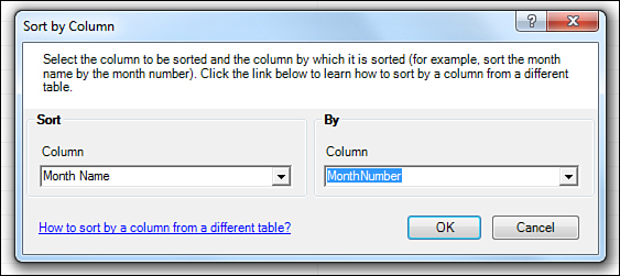
In later versions of Power Pivot, the team solved this in a different way. If you choose the Month Name column in the Power Pivot window, and select Home, Sort By Column, you can specify that the Month Name column should be sorted by the data in the Month Number column (see Figure 10-32).
Note that changing the sort sequence using the dialog box in Figure 10-32 will also ensure that any slicers are in the proper sequence. This makes the Sort By Column method better than using More Sort Options in the Pivot Table.
Creating a pivot table from the Data Model
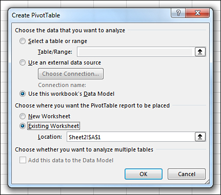
Now that you have two tables loaded to Power Pivot with a relationship, it is time to create your pivot table. Start from any blank cell on a blank worksheet. Choose Insert, PivotTable. In the Create PivotTable dialog box, select the choice for Use This Workbook’s Data Model (see Figure 10-33).
The Power Pivot version of the Fields list appears. You have choices at the top for Active and All. The pivot table in Figure 10-34 reports revenue from the data table and region from the lookup table.
Using advanced Power Pivot techniques
So far, you've seen a simple relationship between a data table and a lookup table. In real life, you might need to join two data tables. This section covers complicated relationships and time intelligence functions.
Handling complicated relationships
Relationships in the Data Model need to be one-to-many. You cannot have a many-to-many relationship in Power Pivot.
Figure 10-35 shows a 54-row budget table and a 2000-row actuals table register. Both tables have Region, Date, and Product in common. You would like to report total budget and actuals for each product or region.
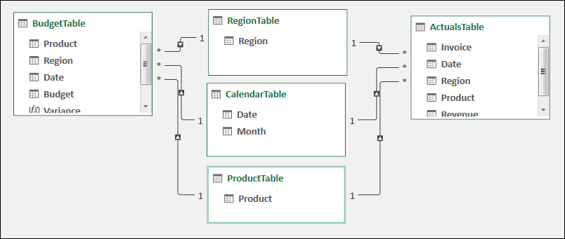
While you can’t directly relate Budget to Actuals, you can add three very small tables between the two tables. For example, the Product table contains one row for each product. You define a relationship from Budget to Product. This is a valid one-to-many relationship. Then, define a relationship from Actuals to Product. Again, this is a valid one-to-many relationship.
In your pivot table, the Values area will contain numbers from the budget and actual table. But any time that you need to report Product or Region or Date in your pivot table, use the field from the tiny joiner table.
Figure 10-36 shows the two data tables and the three tiny joiner tables.

Using time intelligence
Typically, Excel stores dates as a serial number. When you enter 2/17/2021 in a cell, Excel only knows that this date is 44,244 days after December 31, 1899. Power Pivot adds time intelligence. When you have a date such as 2/17/2021 in Power Pivot, there are time intelligence functions that know that year-to-date means 1/1/2021 through 2/17/2021. The time intelligence functions know that month-to-date from the prior year is 2/1/2020 through 2/17/2020.
Each value cell in a pivot table is a result of filters imposed by the slicers and by the row and column fields. Cell D28 in Figure 10-37 is being filtered to 2001 by the slicer and further filtered to January 25, 2001, by the row field in B28. But that cell needs to break free of the filter in order to add all of the sales from January 1, 2001, through January 25, 2001. The CALCULATE function helps you solve this problem.

In many ways, the DAX CALCULATE function is like a super-charged version of the Excel SUMIFS function. =CALCULATE(Field,Filter,Filter,Filter,Filter) is the syntax. But any Filter argument could actually unapply a filter that’s being imposed by a slicer or a row field.
DATESMTD([Date]) returns all the dates used to calculate the month-to-date total for the cell. For January 25, 2001, the DATESMTD function will return January 1 through 25, 2001. When you use DATESMTD as the filter in the CALCULATE function, it breaks the chains of the 1/25/2001 filter and reapplies a new filter of January 1–25, 2001. The DAX formula for MTDSales is as follows:
=CALCULATE([Sum of Revenue],DATESMTD('10-BigData'[Date]))
The measure in column E requires two filter arguments. First, you need to tell DAX to ignore the Years filter. Use ALL([Years]) to do this. Then, you need to point to one year ago. Use DATEADD([Date],-1,YEAR) to move backward one year from January 25, 2002 to January 25, 2001. Therefore, this is the formula for LYSales:
CALCULATE([Sum of Revenue],
All('10-BigData'[Date (Year)]),
DATEADD('10-BigData'[Date],-1,YEAR))
Other time intelligence functions include DATESQTD and DATESYTD.
Overcoming limitations of the Data Model
When you use the Data Model, you transform your regular Excel data into an OLAP model. There are annoying limitations and some benefits available to pivot tables built on OLAP models. The Excel team tried to mitigate some of the limitations for Excel 2019, but some are still present. Here are some of the limitations and the workarounds:
Less grouping—You cannot use the Group feature of pivot tables to create territories or to group numeric values into bins. You will have to add calculated fields to your data with the grouping information.
Product is not a built-in calculation—I’ve never created a pivot table where I had to multiply all the rows together. That is the calculation that happens when you change Sum to Product. If you need to do this calculation, you can add a new measure using the
PRODUCTfunction in DAX.Pivot tables won’t automatically sort by custom lists—It is eight annoying clicks to force a field to sort by a custom list: Open the field drop-down menu and choose More Sort Options. In the Sort Options dialog box, click More Options. In the More Sort Options dialog box, clear Sort Automatically. Open the First Key Sort Order and choose your Custom List. Click OK to close the More Sort Options dialog box. Click OK to close the Sort dialog box.
Strange drill-down—Usually, you can double-click a cell in a pivot table and see the rows that make up that cell. This does work with the Data Model, but only for the first 1,000 rows.
No calculated fields or calculated items—This is not a big deal, because DAX measures run circles around calculated items.
Odd reordering items—There is a trick in regular Excel pivot tables that you can do instead of dragging field names where you want them. Say that you go to a cell that contains the word Friday and type Monday there. When you press Enter, the Monday data moves to that new column. This does not work in Power Pivot pivot tables! You can still select Monday, hover over the edge, and drag the item to a new location.
No support for arrow keys in formula creation—In the Excel interface, you might build a formula with
=,LeftArrow>*<LeftArrow><LeftArrow><Enter>. This is not supported in Power Pivot. You will have to reach for the mouse to click on the columns that you want to reference.Refresh will be slow—The Refresh button on the Analyze tab forces Excel to update the data in the pivot table. Think before you do this in Excel 2019. In the current example, this forces Excel to go out and import the 1.7 million-row data set again.
February 29 1900 does not exist in power pivot—There was no February 29 in 1900. Lotus 1-2-3 had a bug: The date algorithms assumed that 1900 was a leap year. As Excel was battling for market share, they had to produce the same results as Lotus, so Excel repeated the February 29, 1900 bug. The SQL Server Analysis Team refused to perpetuate this bug and did not recognize February 29, 1900. In Excel, day 1 is January 1, 1900. In Power Pivot, day 1 is December 31, 1899. None of this matters unless you have sales that happened during January 1, 1900 through February 28, 1900. In that case, the two pivot tables will be off by a day. No one has data going back that far, right? It will never be an issue, right? Well, in 2018, I met a guy who had a column of quantities. He had values like 30 and 42 and 56. But that column was accidentally imported as a date. All of the quantities were off by one.
32-bit Excel is not enough—I meet people who complain Excel is slow, even though they added more memory to their machine. Unfortunately, the 32-bit version of Excel can only access 3 GB of the memory on your machine. To really use Power Pivot and the Data Model with millions of rows of data, you will need to install 64-bit Excel. This does not cost anything extra. It does likely involve some pleading with the I.T. department. Also, there are some old add-ins that do not run in 64-bit Excel. If you happen to be using that add-in, then you have to choose whether you want faster performance or the old add-in.
Enjoying other benefits of Power Pivot
Nothing in the previous list is a dealbreaker. In the interest of fairness, here are several more benefits that come from using Power Pivot and the Data Model:
You can hide or rename columns. If your Database Administrator thinks
TextSlsRepNbris a friendly name, you can change it toSales Rep Number. Or, if your data tables are littered with useless fields, you can hide them from the PivotTable Fields list. In the Power Pivot window, right-click any column heading and choose Hide From Client Tools.You can assign categories such as Geography, Image URL, and Web URL to fields. Select the column in the Power Pivot window. Choose a column. On the Advanced tab, choose a Data Category.
You can define key performance indicators or hierarchies. See “Creating hierarchies” in Chapter 4, “Grouping, sorting, and filtering pivot data.”
Learning more
Power Pivot and Power Query are powerful tools that are completely new for most Excellers. These are my favorite books to learn more:
For Power Query, read M Is For Data Monkey by Ken Puls and Miguel Escobar (ISBN 978-1-61547-034-1).
For DAX formulas in Power Pivot, read Supercharge Excel by Matt Allington (ISBN 978-1-61547-053-2).
For Advanced Power Pivot, read Power Pivot and Power BI by Rob Collie (ISBN 978-1-61547-039-6).
Next steps
The 3D Map feature lets you animate your data on a globe. Chapter 11, “Analyzing geographic data with 3D Map,” introduces 3D Map.