WWW To download the web content for this chapter go to the website www.routledge.com/cw/wright, select this book then click on Chapter 11.
Camera effects are all those effects that the imaging camera and lens system has on the photographed image. They range from lens distortion, the introduction of artifacts and the addition of light flares over the frame. Adding the correct camera effects to a comp is one of the key ingredients in photorealistic compositing as we try to make all the different layers of the composite appear to be photographed by the same camera. Beyond that, shots that are all CGI have no camera effects at all so they must be added to make them match surrounding live action shots.
Lens effects are a big component of making the multiple layers of a composite look like they were shot with the same lens so here we will document some 10 different effects that you can add to your comps with details on how to create them. The lens effects section is also organized in the operational order that you would lay the effects down in your comps with lens distortion first and regrain last with everything in between. A great deal of information is provided to help give CGI renders a more photorealistic look.
Lens distortion is an important and complex topic when you are comping multiple layers with different lens distortions (two or more live action plates) or no lens distortion (CGI and digital matte paintings). We have an entire section devoted to lens distortion work-flows that show how to manage the lens distortion information and apply it to the various layers of the comp to ensure a perfect fit without filtering or softening the live action unnecessarily.
The introduction of powerful new digital cameras has also introduced a troublesome new artifact – rolling shutter. There is an entire section devoted to explaining what it is and the techniques for dealing with it.
When a scene is photographed, the light must pass through a lens assembly to be focused on the image sensor in order to make a picture. Those lens assemblies are very complex with multiple elements, each of which adds some small defect to the captured image. We have seen these defects for nearly a century of photography and filmmaking and have come to expect them. Their absence is felt and the viewer feels that something is missing and that the shot does not look photorealistic, but not knowing why. I submit that it goes even further – that the eye loves visual complexity and complains when it is missing. Visual complexity is an essential component of photorealistic visual effects.
Lens effects are the main component of camera effects on photography, so this section is extensive and covers 10 different lens effects, how they affect the image, and how to duplicate them in your compositing software. Not in a button-pushing way for your particular compositing program as this is a software agnostic book, but in a step-by-step procedure way that describes the image-processing operations you need to execute in order to replicate each lens effect. Note that the lens effects are documented here in the order upon which you would apply them in a comp.
I am not suggesting that you add all 10 effects to every comp. While most of them are quick and easy to do, a few are time consuming. What you want to do is look at the shot you are working on in the context of the shots around it and decide which lens effects make sense. Be especially aggressive with CGI, as it rendered with a mathematically perfect lens so it is flawless and looks rather sterile right out of the box. It is up to the compositor to give the CGI the “noise of life” that convinces the audience that this is a real object in a real scene and not some sterile concoction from the mind of an engineer.
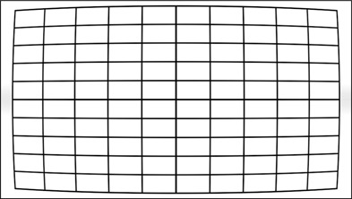
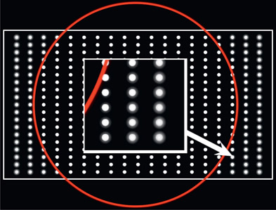
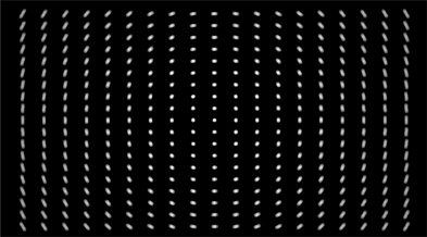
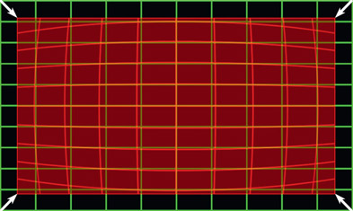
Lens distortion is a fundamental reality of all photographic images. It is so pervasive that it is an expected attribute of any photorealistic shot. Its effect is most noticed at the edges of the frame when the camera pans around or when an object enters or exits the frame. When shooting footage for a visual effects shot the production company is supposed to photograph a camera chart taped to a wall (like the one in Figure 11.1) with the same lens used for the shot, in order to aid in lens-distortion analysis. Unfortunately this is rarely done so we usually have to rely on our lens-distortion tools to calculate the lens distortion by analyzing the content of a shot. If you were to actually receive a photographed camera chart it would be distorted something like Figure 11.2.
The irony is that CGI is rendered with a mathematically perfect lens that does not distort at all so we have to actually add it to our CGI comps. Ideally your software will have a lens-distortion tool that will allow you to add a realistic lens distortion. Failing that, you could fake it with a mesh warp as long as you are not trying to match to something else.
The workflow for managing lens distortion for a variety of scenarios is a large topic on its own, so it is covered separately in Section 11.2: Lens Distortion Workflows below.
WWW Lens chart.png – this is an actual lens chart filmed on location that you can use to try out your lens-distortion tool.
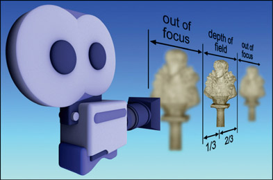
Cinematographers go to a great deal of trouble to make sure that the picture is in proper focus. Barring the occasional creative camera effect, the reason that anything would be out of focus in the foreground or the background is due to the depth of field of the lens. Depth of field is used by the director to put the object of interest in sharp focus and the background out of focus in order to “focus” the audience’s attention on the subject.
Camera lenses have a depth of field, a “zone” within which the picture is in focus. Objects closer to the camera are out of focus, as are usually objects on the other side of the depth of field, as illustrated in Figure 11.3. There is one case where the far background will stay in focus and that is if the lens is focused at its “hyperfocal” distance. Everything from the hyperfocal distance out to infinity will be in focus.
From the plane at which the lens is perfectly focused, the depth of field is defined to be the region considered to be in focus, which extends one-third in front and two-thirds behind the point of focus. The reason for the evasive phrase “considered to be in focus” is that the lens is actually only in perfect focus at a single plane and gets progressively out of focus in front and behind that plane, even within the depth of field. As long as the degree of defocus is below the threshold of detectability (called the “circle of confusion”) it is considered to be in focus.
The depth of field varies from lens to lens and whether it is focused on subjects near or far from the camera. The following are a few of rules of thumb about the behavior of the depth of field that you may find helpful when trying to set up a shot with no depth of field reference:
- The closer the focused subject is, the shallower the depth of field.
- The longer the lens, the shallower the depth of field.
Assuming a “normal lens” (28mm to 35mm) focused on a subject at a “normal” distance, you would expect to see:
- A subject framed from head to toe, a back wall will be in focus.
- A subject framed from waist to head, a back wall will be slightly out of focus.
- A close-up on the face will have a back wall severely out of focus.
- Focused close up on a face, the depth of field can shrink to just a few inches so that the face may be in focus but the ears are out of focus!
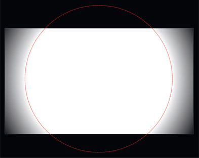
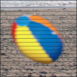
Vignetting is a darkening of the image at the corners due to less light hitting that part of the frame. There are several causes for vignetting – mechanical, optical, natural, and pixel – but frankly, the causes are not important. Our objective is to introduce it into our comps when appropriate and to make it look photorealistic. If the shot is all CGI then there will be no vignetting at all and it should be introduced to match the surrounding shots. If there are no surrounding shots to match it may be added for artistic reasons in order to add to the sense of photorealism.
If it is a CGI object comped over a live action plate like the example in Figure 11.4 then the background plate may already have vignetting from the principal photography that will have to be matched by the CGI. In this particular example the background had no vignetting so it was added to the finished comp in Figure 11.5 – somewhat overdone for illustration purposes. If the background plate already has some vignetting then a matching vignette would have to be added to the CGI prior to comping over the background, should it approach the edges of frame.
Figure 11.6 shows the shape of a vignette mask that would go to a Gain down color op. It should be circular with the core at 100% white and a graceful falloff at the edges. This size of the core and the shape of the falloff is a creative decision. If you really want to go all out for photorealism you would make three or four vignette masks – each a slightly different size and position – then combine them into a single mask. This will add a subtle variability to your vignettes that the eye loves.
WWW Vignette.tif – this is copy of Figure 11.4 for you to try some vignetting. Try the complex technique above to make it more photorealistic by merging several vignette masks.
Camera lenses are complex with many moving parts. Not surprisingly, they have defects of material and design that affect the images that they produce. Three of the most common and influential lens defects are collected here with an explanation of their causes, their appearance, and how to replicate them in your comps. The affect of these defects is to make small positional shifts to the pixel data, with each one making a different type of shift. These defects can be layered one after another in no particular order. They are small defects that should be felt, not seen. They subtly add to the delicious complexity of our comps and make major contributions to the photorealism of our work so the comp does not look so sterile.
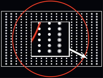
Spherical aberration is an intrinsic defect in lensing systems that causes the light rays to fail to focus sharply across the entire surface of the imaging plane. The net effect is that the outer edges of the image are a bit out of focus like the illustration in Figure 11.7. The red circle indicates that the mask for this operation is circular and that it falls off towards the edges of the frame. The insert shows a close-up of a true spherical aberration loss of focus. However, some are tempted to use a simple blur for this effect and the reason not to do that is shown in the inset of Figure 11.8. The blur has a very different look than the true spherical aberration.
While a defocus is blurry, a blur is not a defocus. The true spherical aberration in Figure 11.7 requires a variable radius blur operation so that the mask falloff causes the actual blur radius to get larger towards the corners. With the fake example in Figure 11.8 the blur radius is constant and the mask falloff is simply used as a mix-back of the blurred and the original image – and it looks like it. You just can’t fool Mother Nature. Having said that, should you really need to add a spherical aberration to your comp and you don’t have a true variable radius blur, then you will just have to use what you’ve got – the simple blur.
Astigmatism is when the light rays on the horizontal axis of a lensing system have a different focal plane than rays on the vertical axis. Not to get all “Ophthalmologist” on you, but one is called sagittal astigmatism and the other is tangential astigmatism. I honestly don’t know where they get these names. The sagittal astigmatism can be simulated with the circular blur illustrated in Figure 11.9, wildly overdone for illustration purposes, of course. Notice that the blur amount increases with the distance from the optical center. The tangential astigmatism can be simulated with a radial (zoom) blur like Figure 11.10, also wildly overdone, also getting stronger towards the edges.
Figure 11.10
Tangential astigmatism use a radial (zoom) blur
You may wish to add to your compositing complexity with one or both of these astigmatism blurs, but be sure to go lightly and don’t overdo it. This is one of those many effects that I like to describe as being “felt, not seen”. You don’t want viewers to say “ah, look at that great sagittal astigmatism”. You want them to say “look at that realistic comp”.
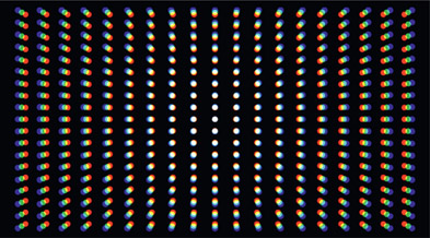
As you know, lenses bend the incoming light to a focal point, all nice and sharp. Unfortunately, each wavelength of light can come to a slightly different focal point causing an offset of the color channels. And the offset increases as you move away from the optical center of the lens. This is chromatic aberration. Figure 11.11 is a test pattern that illustrates the affect of chromatic aberration on the color channels.
Chromatic aberration is rather easy to create. All you have to do is scale up the blue channel from the center of the frame a tiny bit, which shifts the blue pixels away from the center of frame, while the red channel is scaled down by the same tiny bit. The example in Figure 11.11 is wildly overdone for illustration purposes of course. This is another one of those subtle defects that should be felt, not seen.
The complexity of camera lenses means that there are lots of opportunities for light to find a surprising path to the imaging sensor. Strong light sources can reflect off the lens surfaces at odd angles throwing complex light patterns on the image sensor (lens flare). Often filters are placed in front of the lens assembly that can refract light in odd ways, throwing soft pools of light on the image (lens filter flare). Strong light sources can refract around the lens aperture introducing glows (diffraction glows). And strong off-angle lights can bounce around the inside of the lens tube to throw a fog on the image sensor (veiling glare).
In this section we will look at each of these phenomena to understand what causes them, what they look like, and how to replicate them. In all cases, glows and flares are added (summed) with the finished comp so they all go on last, and they can be added in any order.
When working in a high dynamic range medium (film, digital cinema) these lighting effects can be stacked endlessly even though they produce high code values. When working in the limited dynamic range of video this will, of course, introduce clipping. The correct workflow would be to go ahead and stack them up, then at the end of the comp lay in a soft clip to bring the code values into spec (see Chapter 10: Sweetening the Comp). However, from a practical standpoint, these light effects could be screened in to keep them from clipping.
When strong lights enter the camera lens, the light rays reflect off the many internal surfaces of the lens assembly and strike the imaging sensor, which produces a lens flare. The complexity and character of the flare is due to the number and nature of the lens elements. Even a strong light source that is just out of frame can still generate a flare. The key point is that it is a lens phenomenon which showers light onto the imaging sensor where the original picture is being exposed. Objects in the scene cannot block or obscure the lens flare itself since it exists only inside the camera. If an object in the scene were to slowly block the light source the flare would gradually dim, but the object would not block any portion of the actual lens flare.
A lens flare is a double exposure of the original scene content plus the flare, so a normal composite is not the way to combine it with the background plate. Composites are for light-blocking objects, not light-emitting elements. The lens flare is added (summed) with the finished comp with no alpha channel.
Figure 11.12, Figure 11.13 and Figure 11.14 illustrate a lens flare placed over a background plate. Where this is particularly effective is when a light source such as a flash-light has been composited into a scene, then a lens flare added. This visually integrates the composited light source into the scene and makes both layers appear to have been shot at the same time with the same camera. Since many artists have discovered this fact the lens flare has often been overdone, so do show restraint in your use of them.
While it is certainly possible to create your own lens flare with a flock of radial gradients and the like, most high-end compositing programs can create very convincing lens flares on demand. Real lens flares are slightly irregular and have small defects due to the irregularities in the lenses, so you might want to rough yours up a bit to add that extra touch of realism. Also avoid the temptation to make them too bright. Real lens flares can also be soft and subtle.
If the light source that is supposed to be creating the lens flare is moving then the lens flare must be animated. The flare shifts its position as well as its “orientation” relative to the light source. With the light source in the center of the lens, the flare elements “stack up” on top of each other. As the light source moves away from the center the various elements fan out away from each other pivoting around the lens’ optical center. This is shown in Figure 11.15, Figure 11.16 and Figure 11.17, where the light source moves from the center of the frame towards the corner. Many compositing packages offer lens flares that can be animated over time to match a moving light source. Again, watch out for excessive perfection or presence with your flares.
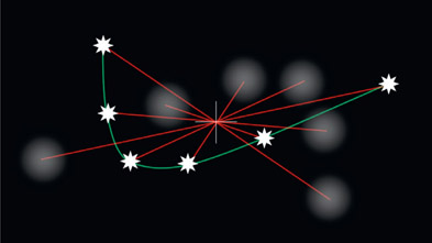
Photographers and cinematographers will often put UV filters or polarizing filters on their lenses and if there is a very bright light in the scene the filter can cast a vague flare over the image. This is a very subtle effect and it moves with the light source so it can be a very nice addition to the photorealism of a comp. Figure 11.18 shows an example of a lens filter flare (arrow) – again, overdone for illustration purposes.
The lens filter flare behaves like a lens flare in that it moves in the opposite direction of the flare source pivoting around the optical center of the lens as shown in Figure 11.19. The white star represents the “light source” with a red line linking it to a soft blob that is the resulting filter flare. As the white star follows the green path through the frame the flare moves in the opposite direction. The red lines linking the light source to its flare for each frame illustrates that their pivot is around the optical center of the lens.
Lens filter flares are cheap and easy to build. Following is the step-by-step procedure, but be sure not to make your filter flares over-bright. They are a subtle effect designed to add to the delicious complexity of your comps, not dominate the scene like a lens flare might.
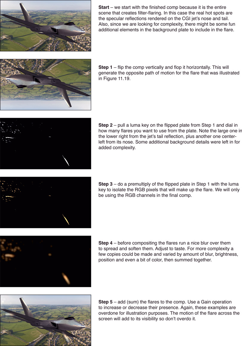
Figure 11.20 Lens filter flare procedure
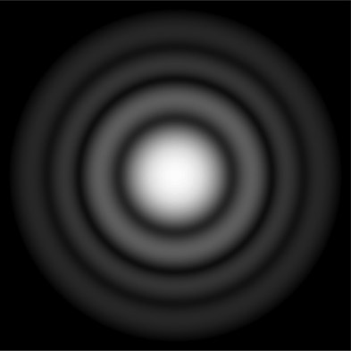
When the light from a very bright source passes through the aperture of a lens assembly it can diffract and produce a glow around the light. The diffraction of light waves with constructive and destructive interference is just a bit outside the scope of this book, but it produces the phenomenon that photographers and other lens enthusiasts call an “airy disk” like Figure 11.21. While we are not concerned with the physics of this we are concerned with its effect on the photographed image, which is to produce a glow around a strong light source. This glow is different to the soft glow around a light source from atmospheric hazing (see Chapter 10: Sweetening the Comp). So here we will see how to create a diffraction glow for your photorealistic composites.
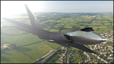
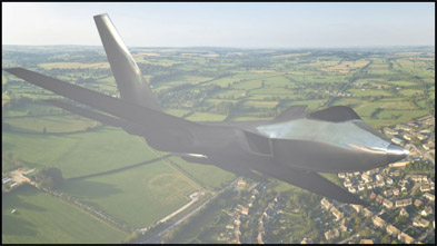
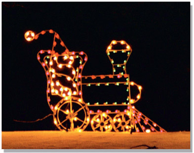
First, pull a luma key on the item in question – the jet in this case – and dial it down so that just the hot spots are left. Second, add a blur to the luma key (Figure 11.22) then shift it from the alpha channel to the RGB channels and add (sum) it to the comp (Figure 11.23). The jet fighter scene in Figure 11.23 has been recolored to a night scene in order to make the diffraction glows noticeable in print.
In order to increase the visual complexity and resulting photorealism the diffraction glows in Figure 11.22 are actually three separate glows summed together. Each one had a different blur radius and was offset a few pixels just to mix things up a bit. If you want to go crazy with this you could even give each glow a slightly different color. Cool.
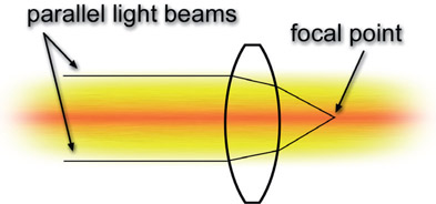
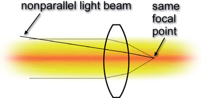
Remember all of those nifty little lens diagrams from school like Figure 11.24 that showed straight little parallel light beams entering the lens and neatly converging at the focal point? Did you ever wonder about the non-parallel light beams? Where did they go? They never showed them to you in school because it made the story too messy. Well, the real world is a messy place and you’re a big kid now so it is time you learned the ugly truth. The non-parallel light beams fog up the picture and introduce what is called veiling glare. There are also stray light beams glancing off of imperfections in the lens assembly as well as some rays not absorbed by the light absorbing black surfaces within the lens and camera body. These random rays all combine to add to the veiling glare.
Figure 11.25 shows a non-parallel light beam from some other part of the scene entering the lens and landing on the same focal point as the parallel light beams. The rogue non-parallel light beam has just contaminated the focal point of the proper parallel light beams. This adds a slight overall “fogging” to the shot. Figure 11.26 illustrates a regional veiling glare that only hits one corner of the screen. This might happen if there is a large light bright source such as the Sun just out of frame, so that the flare just hits that area. In other situations the veiling glare will literally cover the entire frame like the global veiling glare example in Figure 11.27. Global veiling glare is most notorious for showing up on your greenscreen shots because of all the green photons flying around the set.
It is very easy to create a veiling glare effect. For the regional glare (Figure 11.26) you can just make a circular white shape, blur the heck out of it, then shift its position to a corner or side of the frame then add (sum) it to the comp. Note that this time I did not overdo it for illustration purposes. Veiling flare can overwhelm the picture. For global veiling glare you could use a solid white, but that would not introduce any visual complexity. You might use a gradient, either horizontal, vertical or diagonal, or draw some irregular white shape and blur the living heck out of it till it smears all over the entire frame, then add it in. If the camera is moving it will change the relationship between the camera and the light source so the veiling glare could be animated in position, brightness, shape – or all three.
WWW Flares.exr – this is a high dynamic range EXR file of the image in Figure 11.26 for you to try out the various flare techniques cited above.
Grain and grain management are covered in detail in Chapter 10: Sweetening the Comp. It is mentioned here simply to document its place in the order of operations, which is dead last. Apply your grain after all of the above camera lens effects, as it is the very last thing that happens to the light rays in the camera.
Things can get a little confusing when compositing layers with different lens distortions such as a CGI element with no lens distortion over a live action layer with lens distortion. This section is about the proper workflows for managing lens distortion for all four cases of live action and CGI. I can’t tell you how to do it with your software because this book is software agnostic, but any professional visual effects compositing program will be able to perform all of the steps outlined below.
There are two nettlesome facts that must be correctly managed for your lens distortion workflow to be correct. The first is that undistorting a live action plate will necessarily soften it. This is because the warping operation filters the pixels, and filtering softens. The second issue is that the same undistortion operation will also scale the element up in size so the new undistorted version will actually be larger than the original plate. Being larger than the original frame means that the plate will again become even softer. The workflows below correctly manage both of these issues.
Managing lens distortion is a non-trivial issue so wisdom dictates that the possibility of ignoring it should always be at least considered. Reasons to ignore it would include that the amount of lens distortion is minor, the foreground character never approaches the edges of the screen where the lens distortion of the background is most severe, or the two layers essentially match in lens distortion to begin with.
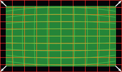
It was mentioned above that when a plate is undistorted it will get larger, like the illustration in Figure 11.28, which shows the original green plate being undistorted and expanding to the red grid in size. The converse is also true – applying lens distortion to a plate will shrink it in frame and make it smaller like in Figure 11.29, which shows the green flat plate being warped to the red frame. These size changes must be managed carefully or the results will be wrong. Be sure to move carefully through the workflow steps below because any mistake will ruin the results.
For the sake of clarity and brevity, in the following workflow examples I use the term “flatten” for the process of removing lens distortion, and “flat” to refer to an image that has had the lens distortion removed. I also use the term “warp” for the process of introducing lens distortion, and “warped” to refer to an image that has had the lens distortion added.
CGI is rendered with a mathematically perfect lens so when working with CGI over live action the CGI must be lens warped to match the live action plate. A mistake that many make is to flatten the live action plate, comp the CGI over it, then rewarp the comp. The background plate will have gone through two filtering operations – one to unwarp, the other to rewarp – which will severely soften it and therefore must not be done.
The correct workflow is to provide a flattened background plate to the CGI department to use for lineup and color match of the CGI. Then the compositor warps the rendered CGI to match the background plate lens distortion, before compositing the warped CGI over the pristine original background plate – no filtering, no softening of the background plate. However, the exact steps to correctly manage this are a bit tricky so here is the step-by-step workflow for managing lens distortion for a CGI over live action shot. In this example we are using a 2k DCP (Digital Cinema Package) image format with a resolution of 2048 × 1080.
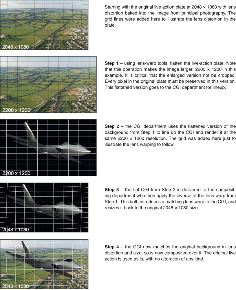
Figure 11.30
Lens distortion management workflow
WWW Lens Distortion – this folder contains the CGI jet and background plate from above, along with a lens chart. Use the lens chart to flatten the background plate, resize the jet image to match the flattened background, lens warp the jet to match the background, then comp the warped jet over the original background.
This is the case where live action is to be composited over CGI, either in the form of a greenscreen character over a CGI environment, or a CGI set-extension for the live action plate. Again, the CGI department needs an undistorted version of the live action to line up to so the first few steps are similar to the “CGI over live workflow” above.
Step 1 – the live action is undistorted with the lens-distortion tool then the flattened, larger version is sent to the CGI department for lineup and color match.
Step 2 – the CGI department lines up to the flattened plate then renders the CGI at the larger size and sends it to the compositing department.
Step 3 – the compositing department applies the inverse of the lens distortion derived in step 1 to warp the CGI. It now matches the live action in both size and distortion.
Step 4 – the original live action plate is composited over the warped CGI. Again, no warping or filtering of the live action plate.
A key artistic question must be answered by your comp super – is lens distortion to be added to these shots or not? The answer could be yes if there were surrounding scenes with noticeable lens distortion that needed to be matched, or if there was simply a general production design decision to add lens distortion for artistic reasons. If no, then we are done. If yes, then the lens distortion parameters need to be provided to the compositors. The CGI in this case could also mean a digital matte painting, which would normally be created without lens distortion.
Assuming that lens distortion is to be added to the shots, all of the CGI would be composited, color corrected, and whatever other artistic treatments were required, then at the last step the lens distortion would be applied. Note that regraining would be done after the lens distortion was added. Remembering from the workflows above that when an image receives lens distortion it shrinks in size and pulls away from the edges of the frame. This can be managed two possible ways:
- Render the CGI at the larger unwarped size then apply lens distortion to the final comp, which shrinks it in the frame to the show size, then crop to the show size.
- Render the CGI at the show size then apply the lens distortion to the final comp. The comp will shrink in the frame, so add a small scale-up operation to just fill the frame. This small scale will slightly soften the CGI, which can actually be a good thing because CGI renders are much sharper than photographic images anyway, so this could actually be a virtue.
This is the case of a greenscreen layer being comped over a live action background. Usually lens distortion is ignored in this situation because often the lens distortion of the two layers will be similar enough to ignore. There are two cases where this may not be true – first, when the lens distortion of the two layers is noticeably different, and second, when the greenscreen character is seriously repositioned in the frame. An example would be if the greenscreen character were filmed in the center of the frame but composited way over at the edge of frame where the background lens distortion is most severe.
Should it become necessary to correct for lens distortion keep in mind that the layer that is flattened then rewarped will also be softened. With this in mind, an argument can be made to rewarp the background layer as it is the least offensive to be softened. For the following workflow, however, let us assume that it is the foreground that is to be flattened then rewarped to match the background. Here is the workflow:
Step 1 – flatten both the foreground and background layers. The foreground needs to be flattened in order to be rewarped to match the background, but from the background what we need are the lens-distortion warp parameters.
Step 2 – picking up with the flattened foreground, after it is sized and positioned in the comp, apply the background lens-distortion parameters to it so that the foreground distortion now matches the background distortion. Watch out for any size changes. You might have to scale up or down here a bit.
Step 3 – do all keying and compositing on the rewarped foreground. Should there be noticeable softening of the foreground due to the flatten/rewarp operations then a gentle sharpening might be applied.
Another possible solution to the softening problem could come from the resolution of the layers. Some shows are shot at a higher resolution than the show deliverable. Perhaps the greenscreen was shot at 5k on a RED Dragon but the final show deliverable is 2k DCP. In this case the flatten/rewarp operations could be done on the 5k version then resized down to 2k. All filtering effects would then disappear.
A theoretical solution is to determine the lens distortion of the foreground and background layers then figure out the difference between them – which should be rather modest. This modest lens distortion difference could then be applied to a layer with very little filter softening. But I have never heard of any app that could do this.
While there are algorithms that will effectively simulate a defocus operation on an image, many software packages don’t have one so the diligent digital compositor must resort to a blur operation. At first glance, under some circumstances, a simple blur seems to simulate a defocus fairly well. But in fact it has serious limitations, and under many circumstances the blur fails quite miserably. This section explains why the blur alone often fails and offers more sophisticated approaches to achieve a better simulation of a defocused image, as well as methods for animating the defocus for a focus pull. Sometimes the focus-match problem requires an image to be sharpened instead, so the pitfalls and procedures of this operation are also described.
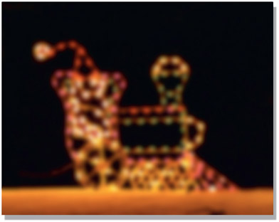
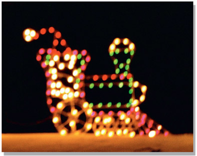
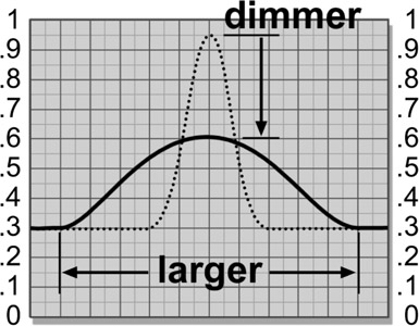
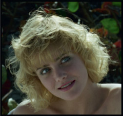
Photographing a picture out of focus will make it blurry, but blurring a picture does not make it out of focus. The differences are easy to see with side-by-side comparisons using the festive outdoor lighting element in Figure 11.31. The stark lights over a black background give an extreme example that helps to reveal the defocus behavior clearly. In Figure 11.32 a blur was used to create an “out-of-focus” version, while Figure 11.33 is a real out-of-focus photograph of the same subject. The lights did not simply get fuzzy and dim like the blur, but seem to “swell up” or expand while retaining a surprising degree of sharpness. Increasing the brightness of the blurred version might seem like it would help, but the issues are far more complex than that, as usual. Clearly the simple blurred version is a poor approximate of a real defocused image.
With the blur operation each pixel is simply averaged with its neighbors, so while bright regions seem to get larger, they get dimmer as well. Figure 11.35 illustrates the larger and dimmer tradeoffs that occur when a blur is run over a small bright spot. The original bright pixels at the center of the bright spot (the dotted line) have become averaged with the darker pixels around it, resulting in lower pixel values for the bright spot. The larger the blur radius, the larger and dimmer the bright spots will become. The smaller and brighter an element is, the less realistic it will appear when blurred.
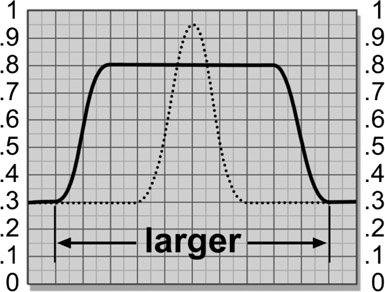
When a picture is actually photographed out of focus, however, the brighter parts of the picture expand to engulf the darker regions. Compare the size of the bright lights between Figure 11.32 and Figure 11.33. The lights are much larger and brighter with the true defocus. Even midtones will expand if they are adjacent to a darker region. In other words, a defocus favors the brighter parts of the picture at the expense of the darker. The reason for this can be seen in Figure 11.36. The light rays that were originally focused onto a small bright spot spread out to cover a much larger area, exposing over any adjacent dark regions. If the focused bright spot is not clipped then the defocused brightness will drop a bit, as shown in Figure 11.36, because the light rays are being spread out over a larger area of the image sensor, exposing it a bit less. The edges will stay fairly sharp, however, unlike the blur. If the original bright spot is bright enough to be clipped then its defocused version may well be clipped too.
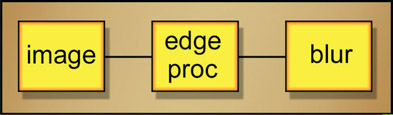
Some software packages don’t have a serious defocus operation so you may have to use a blur. The key to making a blurred image look more like a defocus is to also simulate the characteristic expansion of the brights. This can be done with a dilation operation that expands the bright pixels in an image at the expense of their darker neighbors, rather like the illustration in Figure 11.36. A flowgraph of the sequence of operations to simulate a defocus is shown in Figure 11.37. After the dilate operation is used to expand the brights, the image is then blurred to introduce the necessary loss of detail. The results of this “faux defocus” process are shown in Figure 11.34. While not a perfect simulation of the out of focus photograph, it is much better than a simple blur.
One last thought here. The wise digital artist always tries the simplest solution to a problem first, and if that doesn’t work, only then moves on to the more complex solutions. For some normally exposed shots with limited contrast range the simple blur might produce acceptable results and should always be tried first. High-contrast shots will fare the worst, so if the simple blur doesn’t cut it, only then move up to the more complex solution outlined here.
WWW Defocus.jpg – use this image to try your hand at creating a faux defocus using the techniques described above.
Occasionally an element you are working with is too soft to match the rest of the shot, in which case image-sharpening is the only answer. Virtually any compositing software package will have an image-sharpening operation, but it is important to understand the limitations and artifacts of this process. There are many.
Sharpening operations do not really sharpen the picture in the sense that they actually reverse the effects of being out of focus. Reversing the effects of defocus is possible to do, but it requires Fourier transforms – complex algorithms not found in compositing software. What, mathematically, our sharpening operations do is simply increase the difference between adjacent pixels. That’s all. Increasing the difference between adjacent pixels has the effect of making the picture look sharper to the eye, but it is just a perception trick. The image is not really sharper.
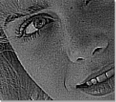
One consequence of this digital chicanery is that the sharpening will start to develop artifacts and look “edgy” if pushed too far. A particularly hideous example of an over-sharpened image can be seen in Figure 11.40. However, the original image in Figure 11.38 has been nicely sharpened in Figure 11.39, so sharpening can work fine if not overdone.
Why the sharpening operation produces that “edgy” look can be seen in Figure 11.41, which is one channel of a seriously over-sharpened image. You can actually see the behavior of the algorithm as it increases the difference between adjacent pixels, but at the expense of introducing the “contrasty” edges. Notice also that the smooth pixels of the skin have also been “sharpened” and start taking on a rough look.
Now you see what I meant when I said that it does not actually increase the sharpness of the picture, it just increases the differ ence between adjacent pixels, which tends to look sharper to the eye. Cheap trick. The other thing to keep in mind is that as the image is sharpened, so is the film grain or video noise. It is these artifacts that limit how far you can go with image sharpening.
Now that we have bemoaned the shortcomings of the sharpening operations we now consider their big brother, the “unsharp mask”. It is a bitter irony of nomenclature that sharpening operations sharpen, and unsharp masks sharpen. (For example, I guess it’s rather like the word “flammable”, which means that something is easily set on fire, as also does the word “inflammable”. Anyway, back to our story!)
The unsharp mask is a different type of image-sharpening algorithm, but many compositing software packages don’t offer it. The unsharp mask is worth a try because it uses different principles and therefore has a different look. And sometimes different is better. The more tools in your tool belt the more effective you will be as an artist. The unsharp mask does, however, have several parameters that you get to play with to get the results you want. What those parameters are and how they are named are software dependent, so you will have to read and follow all label directions for your particular package. However, if you’ve got one, you should become friends with it because it is very effective at sharpening images.
Many compositing packages do not offer the unsharp mask operation so you might find it useful to be able to make your own. It’s surprisingly easy. The basic idea is to blur a copy of the image, scale down the RGB values in brightness, subtract it from the original image (which darkens it), then scale the RGB results back up to restore the lost brightness. By the way, it is the blurred copy that is the “unsharp mask” which gives this process its name.
The same RGB scale factor that was used to scale down the unsharp mask is also used to scale up the results to restore the lost brightness. Some good starting numbers to play with would be a blur radius of 5 pixels for a 1k-resolution image (increase or decrease if your image is larger or smaller) and an RGB scale factor of 20%. This means that the unsharp mask will be scaled down to 20% (multiplied by 0.2) and the original image will be scaled up by 20% (multiplied by 1.2). These numbers will give you a modest image sharpening that you can then adjust to taste.
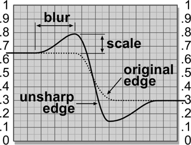
Figure 11.42 shows the edge characteristics of the unsharp mask and how the blur and RGB scale operations affect it. The unsharpened edge obviously has more contrast than the original edge, which accounts for the sharper appearance. Again, it does not really sharpen a soft image, it only makes it look sharper. The scale operation affects the degree of sharpening by increasing the difference between the unsharp edge and the original edge. The blur operation also increases this difference, but it also affects the “width” of the sharpened region. So, increasing the RGB scale or the blur will increase the sharpening. If a small blur is used with a big scale, edge artifacts can start to appear. If they do, then increase the blur radius to compensate.
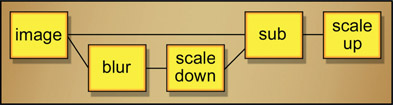
Figure 11.43 shows the unsharp mask operation implemented with discrete nodes. A blurred version of the image is scaled down using a Gain-down operation. The scaled and blurred version is then subtracted from the original image in the “sub” node, and the results are scaled up to restore lost brightness, again using a Gain operation.
With the dazzling new digital cameras has come a baffling new artifact – rolling shutter. This artifact causes some or all horizontally moving objects in the frame to become horizontally skewed and it may fall upon the poor compositor to fix it. This is a non-trivial problem to fix so it warrants understanding what causes it and what goes wrong in the picture.
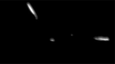
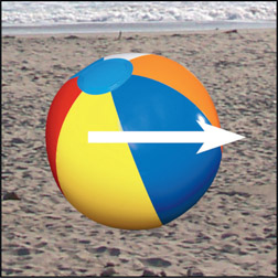
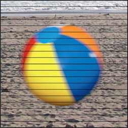
Digital cameras will have one of two different types of electronic shutters – global or progressive. We can understand how these shutters work, starting with Figure 11.44 depicting a beach ball moving horizontally across the screen. A global shutter exposes all of the pixels of the image sensor at the same instant in time. As a result, it produces the kind of motion blur we are all familiar with as depicted in Figure 11.45. The progressive shutter, however, exposes one scan line at a time in rapid succession so each scan line records a slightly different moment in time. Should something (or everything) in the scene be moving then it will be exposed in slices with each slice in a slightly different position like Figure 11.46, resulting in the temporal skewing that we call rolling shutter (somewhat exaggerated here for illustration purposes). It is the progressive scan that produces the rolling shutter, so why do they do it? Because it’s cheaper.
The type of distortion will depend on the type of motion vs. the type of progressive scan (left/right, top/bottom). The amount of distortion will depend on the shutter speed and the speed of the action in the scene. The results can be rather bizarre like the example in Figure 11.47 showing a rotating propeller photographed with a rolling shutter. Suffice it to say, this artifact is so complex it cannot possibly be fixed. The only solution is to make a clean plate without the propeller and totally replace it with CGI propeller. However, other rolling shutter artifacts are often fixable.
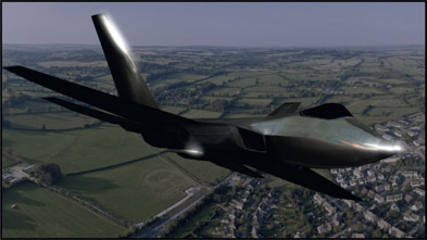
An example of a global shutter is shown in Figure 11.48, which depicts a jet traveling left to right. The global shutter produces a nicely motion-blurred jet, as expected. However, if the jet is photographed with a progressive shutter it produces the skewed jet shown in Figure 11.49. This is fixable, if painful, as it would require isolating the jet with a roto, applying a skew in the opposite direction, then creating a clean plate to comp the corrected jet over. All very tedious and time consuming, but doable.
If the camera is traveling such as when shooting out of a car window then something completely different happens. Objects close to the camera are moving a lot but objects further away are moving much less. As a result, the foreground objects would be skewed a lot, mid-ground objects a little, and distant objects not at all. The example in Figure 11.50 shows the foreground jet tail in the lower left corner and its nearby objects heavily skewed from the camera travel.
This type of distortion is also fixable using the same general approach outlined above for the traveling object, but it is more complicated because of the multiple layers with different distortions. It may simply not be practical to fix it.
And yet another type of rolling shutter distortion is shown in Figure 11.51, where the camera is doing a horizontal pan. With this type of camera motion all objects in the scene, near or far, move the same distance per frame, so the entire frame gets a single global skew. This is easily fixed with a counter-skew but the new image will be a bit smaller than the original so will need to be scaled back up to the original size. As a result the corrected image will be pushed in a bit and a little softer from all the filtering.
The examples herein are representative of the typical types of rolling shutter problems you will encounter, but as the wacky propeller shot in Figure 11.47 indicates there are lots of surprising rolling shutter effects waiting for you out there. Rolling shutter is such a devilish problem to fix that there are actually specialized plug-ins available designed to deal with it. Failing that, you can always fix it by hand, but be prepared to spend some time on the shot.
Next up is a fascinating chapter on digital color where we take a look at what color spaces are and are not. I call it “fascinating” because color science is a favorite hobby of mine. We will also get the real story on why we need to work in linear, take a look at metadata, and get a quick overview of OpenColorIO. Finally, there is a section on the awesome ACES color management system that was invented just for us compositors and the world of visual effects in general.