WWW To download the web content for this chapter go to the website www.routledge.com/cw/wright, select this book then click on Chapter 10.
You have made your best key, your finest spill suppression, expert color correction and most excellent composite. Now the real work begins – sweetening the comp. Here is where we see how to add all those things, large and small, that make the shot more photorealistic to “sell” the shot. The focus in this chapter is on techniques that will visually integrate the various layers of the comp into a single visual whole. The key to achieving this “visual whole” is subtle blending and layering of the comp elements in a natural way.
Layer integration adds elements to the foreground object to “sandwich” it into the background plate. The edge blending and light wrap operations integrate the foreground with the background more naturally. The addition of shadows, including the all-important contact shadow, further help to integrate the layers, as does the addition of atmospheric haze for those big outdoor shots. Regardless of content, grain management is a critical function that must be mastered for a variety of compositing situations so there are detailed workflows for all cases. And finally, we will see how to sweeten the comp by managing clipping. A clipped comp is a bad comp.
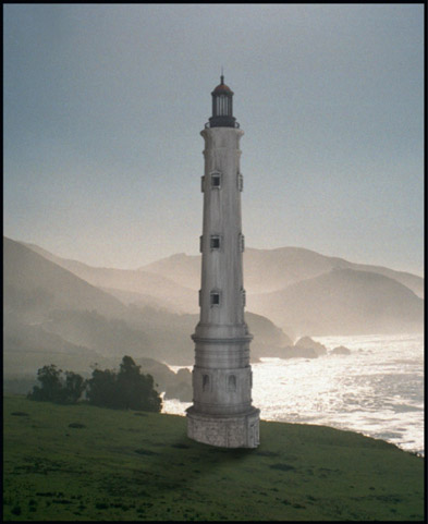
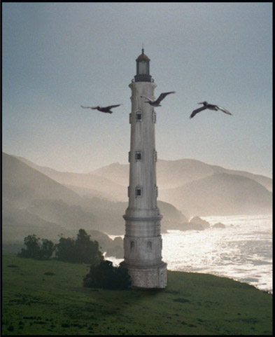
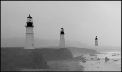
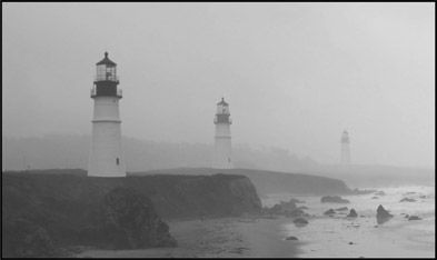
Figure 10.1
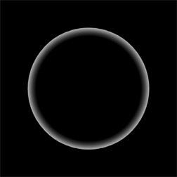
Foreground over background without integration
Layer integration is the process of looking around the shot for things that might be layered on top of the composited item in order to visually “sandwich” it into the overall scene. Figure 10.1 illustrates simply pasting the foreground layer over the background. In this example the lighthouse is the foreground layer that has been created as a 3D CGI element, then composited over the live-action background. While the composite looks fine, the shot itself can be made even more convincing by integrating the lighthouse into the background layer by “sandwiching” it between elements of the background.
In this example a bush from the background plate has been isolated then laid back over the lighthouse at its base in Figure 10.2. In addition to that, a flight of pelicans was lifted from another live action plate and placed in the foreground to further the sense of depth and integration of the lighthouse into the scene. Of course, none of this is a substitute for properly color correcting the layers to match, but by layering the foreground element into the background it will appear to the eye to be more of a single integrated composition. It’s a perception thing.
One of the most compelling things that you can add to your comps is interactive lighting. It’s one of those things that really helps to integrate the foreground element with the background. The more attributes that the foreground and background can share, the more integrated the comp looks. The key to compelling interactive lighting is even though you are working on a 2D comp, think 3D. Think of the 3-dimensional lighting environment that the character is in, then try to bring that lighting onto it in a natural way. Be careful not to overdo it, however.
It is actually fairly difficult to add 3D lighting to 2D elements. You have to imagine how the light would behave based on the texture, curvature and angle of the surface to the light. Masks must be drawn that will have the appropriate falloff and they will have to be animated to follow the character’s movements. While this will be tedious, don’t fall into the trap of just hitting the character with a light wrap, because that tends to put a constant width rim of light around the character that looks unnatural because it does not reflect the curvature of the surface. Here are some “before” and “after” case studies in interactive lighting to make it easier to see the lighting effect.
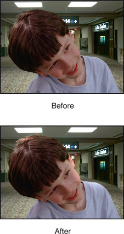
Figure 10.3 has some obvious overhead lighting. Thinking 3D, there would be a couple of lighting panels overhead of the character so there are two distinct lighting effects, one on his head for the left light and one on his cheek and shoulder for the right light.
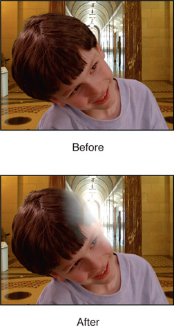
Figure 10.4 is a strongly backlit scene so we will need some backlighting on the character with lots of a glow, but only in the area of the backlight. Such a strong backlight will blow out the character’s edges in the immediate vicinity, then wrap around the head and cheek.
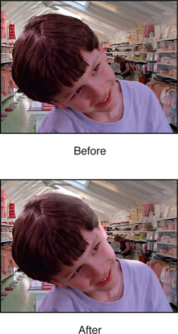
Figure 10.5 has an overhead skylight that will be letting in strong light from the sky that is bluish in color. Although the only skylight in frame is far to the rear, thinking 3D will tell you that there would be one just about overhead of the character. It is a single large soft light source so the character has a broad light hit from head to cheek to shoulder.
You also should think about animating your interactive lighting. As a character walks through a room he might get either closer or further from an open window for example. Perhaps a door to the outside opens and closes. There might also be a colored bounce-light if the character approached a brightly colored wall or red fire truck. In the case of open fires your software might have the tools to sample the flame luminance on a frame-by-frame basis and use that data to drive an animated color correction. Failing that, you could crop a window around the flickering fire then hit it with a large blur that you could add (sum) with the character – appropriately masked off to the affected regions, of course.
WWW Interactive Lighting – this folder contains copies of the color correcting images from Chapter 9 (in case you did not download them) so that you can try adding your own interactive lighting to each one. Great fun.
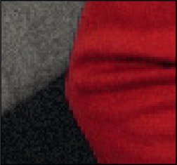
In 35mm film a “sharp” edge may be 3 to 5 pixels wide, and soft edges due to depth of field or motion blur can be considerably wider. Note that the digital cinema cameras do have sharper edges then film, so always inspect the shot for clues as to a naturally “sharp” edge. A convincing composite must match its edge softness characteristics to the rest of the picture. Very often the matte that is pulled has edges that are much harder than other edges in the shot. This is especially true of CGI composites over live action, as the CGI edge-softness is typically one pixel. While blurring the edges of the matte is very often done, that has the down side of blurring out fine detail in the matte edge. A different approach that gives a better look is “edge blending” which blends the edges of the foreground object into the background plate after the comp. It results in a very natural edge that helps the foreground to blend into the scene. Of course, your fine artistic judgment must be used for how much the edge should be blended, but you will find that virtually all of your composites will benefit from this refinement – especially feature film work.
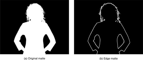
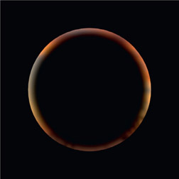
Figure 10.6
Edge-blending matte created from original compositing matte
The procedure is to use an edge-detection operation or the edge-mask technique from Chapter 4, Section 4.5 on the original compositing key (or CGI alpha channel) to create a new matte of just the matte edges like the example in Figure 10.6. The width of the edge matte must be carefully chosen, but typically 2 to 4 pixels wide will work for high-resolution shots like 2k film, digital cinema or Hi-Def video. The width of the edge matte combined with the amount of blur applied to the comp controls the final look of the blended edge.
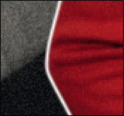
The edge matte itself needs to have soft edges so that the blur operation does not end with a sharp edge. If your edge-detection operation does not have a softness parameter, then run a gentle blur over the edge matte before using it. Another key point is that the edge matte must straddle the composited edge of the foreground object like the example in Figure 10.8. This is necessary so that the edge-blending blur operation will mix pixels from both the foreground and background together, rather than just blurring the outer edge of the foreground.
Figure 10.7 is a close-up of the original composite with a hard matte edge line. Figure 10.9 shows the resulting blended edge after the blur operation. Be sure to go light on the blur operation and keep the blur radius small (1 or 2 pixels) to avoid smearing the edge into a foggy outline around the entire foreground. If the blended edge is noticeably lacking in grain, the same edge mask can be used to regrain it.
Figure 10.10 is a flowgraph of the sequence of operations for the edge-blending operation on a typical bluescreen composite. An edge matte is generated using either an edge detection op or the edge mask technique from Chapter 4. This edge matte is then used to mask a small radius blur around the edges of the foreground element after the comp.
In the real world when a foreground object is photographed in its actual environment some of the light from that environment will have spilled onto the edges of the foreground object. This adds a wisp of environmentally colored light all around the edge of the foreground object that will be missing in a composite. The photorealism of the composite (whether bluescreen or CGI) can be enhanced by synthetically spilling some light from the background around the edges of the foreground object. This can be done using the “light wrap” technique, where light from the background plate is “wrapped” around the edges of the foreground object.
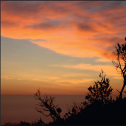
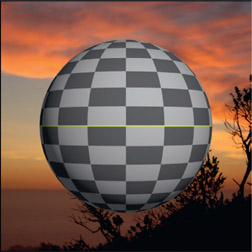
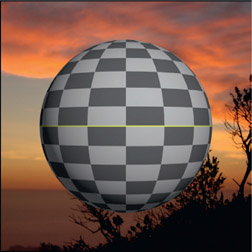
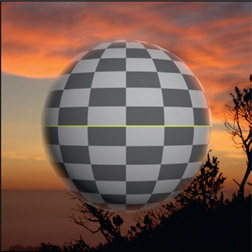
The basic idea is to create an inside soft edge mask from the foreground object’s matte, then use that to create the light wrap element. The light wrap element is then added (summed) or screened with the foreground. Use Add if working on a high dynamic range shot for film or use Screen if working in a limited dynamic range shot for video. Here is the step-by-step procedure starting with the background plate in Figure 10.11 and the composited shot in Figure 10.12:
Step 1 – create the light wrap mask (Figure 10.15). Invert and blur the alpha channel (Figure 10.14) then multiply it by the original alpha channel (Figure 10.13).
Step 2 – create the light wrap element (Figure 10.16). Apply a big blur to the background plate (Figure 10.11) to remove all details, then multiply it by the light wrap mask (Figure 10.15).
Step 3 – add (or screen) the light wrap element (Figure 10.16) to the original comp (Figure 10.17). The results are shown in Figure 10.18 so they can be compared side-by-side to the original comp in Figure 10.17.
The “depth” of the light wrap is controlled by how large a blur is applied to the inverted alpha channel in Figure 10.14. The falloff of the light wrap element can be control with a color curve applied to the light wrap mask in Figure 10.15. The intensity of the light wrap effect can be controlled by gaining the light wrap element in Figure 10.16 up or down. And to be honest, the light wrap element could be added to the foreground layer either before or after it has been composited over the background. It makes no real difference. This example is with a simple CGI object but it works equally well on keyed elements like greenscreen shots.
In the previous section we saw how to do edge blending, and here we have the light wrap. So in what order should they be done? Do the light wrap first, followed by the edge blend second, because you want to lay down the light wrap then blend those treated edges with the background. Keep in mind that both of these operations are to be subtle, so don’t overdo it. We don’t want to suddenly see a bunch of fuzzy composites with glowing edges out there.
WWW Light Wrap – this folder contains the sunset background and the 4-channel CGI sphere from above for you to try your hand at producing your own light wrap.
When compositing CGI you will normally be given shadows that were rendered along with all the lighting passes. But when you are keying a greenscreen you will have to synthesize shadows for a convincing composite. Adding shadows, and especially the all-important contact shadow, are essential enhancements to any composite. It is one of those things that “bridges” between the foreground and background to integrate the disparate elements of a shot into a single visual whole. Without a contact shadow the composited character can look like he is floating above the ground.
Shadows are actually fairly complex creatures. They are not simply a dark blob on the ground. We all learned about the shadow’s umbra, penumbra, and core in art school, but not how they get there. Shadows have edge characteristics, their own color, and a variable interior density (darkness). Clearly, the first approach is to observe any available shadow characteristics of the background plate and match them. Failing that, the guidelines below can be helpful for synthesizing a plausible-looking shadow based on careful observations of the scene content and the lighting environment.
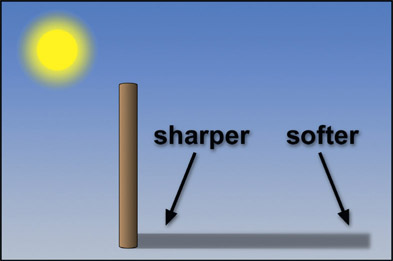
The edge characteristics stem from a combination of the sharpness of the light source, the distance between the object edge and the projected shadow, and the distance from the camera. A large light or a diffuse light source will produce a soft-edged shadow, a small light a sharp shadow. At a distance from the shadow-casting object, even a sharp shadow gets soft edges. The shadow from the tall pole, illustrated in Figure 10.19 will have a sharper edge near the base of the pole that will get softer the further from the pole you get. The distance from the shadow to the camera causes the shadow to appear sharper as the distance is increased. If there are no shadows in frame to use as reference these general rules can be used to estimate the appropriate edge characteristics of your synthetic shadow.
The density (darkness) of a shadow results from the amount of infalling ambient light, not the key light source (the light casting the shadow). If the key light is held constant and the ambient light decreased, the shadow will get denser. If the ambient light is held constant and the key light increased, the density of the shadow will not change. However, it will appear denser relative to its surroundings simply because of the increased brightness of the surrounding surface, but its own density is unaffected.
Due to interactive lighting effects the interior density of a shadow is not uniform. The controlling factors are how wide the shadow-casting object is and how close it is to the cast shadow surface. The wider and closer the object is, the more ambient light it will block from illuminating the shadow. Observe the shadow of a car. The portion that sticks out from under the car will have one density, but if you follow it under the car the density increases. Look where the tires contact the road and it will turn completely black at the contact shadow. This is some serious interactive lighting effect in action. Amazingly, many of the synthesized car shadows for TV commercials are one single density, even at the tires!
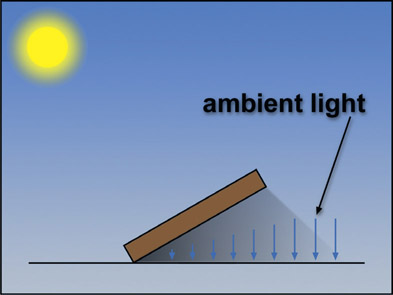
Figure 10.20 illustrates a shadow-casting object that is far enough away from the cast shadow surface that the ambient light is free to fall over the entire length of the shadow, indicated by the ambient light arrows remaining the same length over the length of the shadow. Figure 10.21 shows the same object and light source, but the object is now laid over so that it gets closer to the cast shadow surface at its base. The shadow gets progressively darker towards the base because the object is blocking progressively more incoming ambient light, indicated by progressively smaller ambient light arrows.
In truth, Figure 10.20 technically oversimplifies the situation. Very near the base of the object the density of the shadow would actually increase because the object is blocking progressively more ambient light coming from the left. The effect is small, and can often be ignored if the object is thin, like a pole. However, when the shadow-casting object is close to the cast-shadow surface, the effect is large. For example, if a person were standing three feet from a wall we would not expect to see a variable density shadow. If they were leaning against it, we would.
The most extreme example of increasing shadow density due to object proximity is the all-important contact shadow. At the line of contact where two surfaces meet, such as a vase sitting on a shelf, the ambient light gets progressively blocked which results in a very dark shadow at the line of contact. This is a particularly important visual cue that one surface touches another. Omitting it in a composite can result in the foreground object appearing to be just “pasted” over the background.
If you were standing on a flat surface in outer space far enough from the Earth, Moon, and any significant light sources other than the Sun, your shadow would be absolutely black. But this is about the only place you will find a truly black shadow. On Earth, shadows have both a density and a color. The density and color of a shadow is the result of the spectral interaction of the color of the surface it is projected onto, plus the color of the ambient light sources. Figure 10.22 illustrates how a shadow is created by a key light, but inherits its density and color from the ambient light.
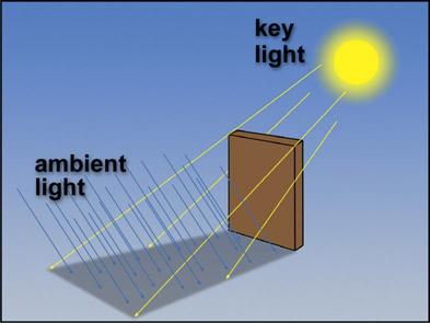
Figure 10.22
Density and color of a shadow from the ambient light
For an outdoor shadow there are two light sources – a bright yellow Sun and a dim blue sky. The skylight is showering blue ambient light down on the ground, so when something blocks the yellow light of the Sun it is free to illuminate and tint the shadow blue. You can think of outdoor lighting as a 360-degree dome of diffuse blue light with a single yellow light bulb shining through a hole in it. Now, if you imagine blocking the direct sunlight, the skylight will still provide quite a bit of scene illumination, albeit with a very blue light. This we call shade.
Interior lighting is more complex because there are usually more than the two light sources of the outdoors, but the physics are the same. The shadow is blocking light from the key light, call it light source “A”, but there is always a dimmer light source “B” (and usually also light sources “C”, “D”, “E”, etc.) that is throwing its own colored lighting onto the shadow. In other words, the color of the shadow does not come from the light source that is casting it, but from the ambient light, plus any other light sources that are throwing their light onto the shadow.
The oldest shadow gag in the known universe is to use the foreground object’s own matte to create its shadow. With a little warping or displacement mapping it can even be made to appear to drape over objects in the background plate. There are limitations, however, and you don’t want to push this gag too far. The thing to keep in mind is that this matte is a flat projection of the object from the point of view of the camera that photographed it. The effect will break down if you violate that point of view too much.
For example, the shadow in Figure 10.23 looks pretty good, until you think about the shadow’s right shoulder ruffles. From the angle of the shadow, the light is clearly coming from the upper left of the camera. If that were really true, then the head’s shadow would be covering the right shoulder ruffle shadow. Of course, technical details like this are usually not noticed by the audience as long as the shadow “looks” right – meaning color, density, and edge characteristics – so as not to draw attention to itself and invite analysis.
The technically ideal location for the faux shadow’s light source is in exactly the same place that the camera is located, which puts the shadow directly behind the foreground object where it cannot be seen at all. This being a somewhat unconvincing effect, you will undoubtedly want to offset the shadow to some degree, implying a light source that is offset a bit from the camera position. Just keep in mind that the further from the technically correct location the faux light source is the more the effect is being abused and the more likely it will be spotted.
The shadow itself can be created with a color-correction operation using the shadow matte to limit its area of affect. However, a shadow can also be created from a solid plate of dark blue (for example), then use the shadow matte to composite it over the background. The hue and saturation of the shadow can easily be refined by adjusting the color of the blue plate, and the density can be adjusted separately by changing the degree of transparency. This arrangement also makes it easier to incorporate sophisticated interactive lighting effects. The solid color plate could instead be a gradient, its color and density can be animated, and the shadow matte could be given an increase in density as it approaches the body.
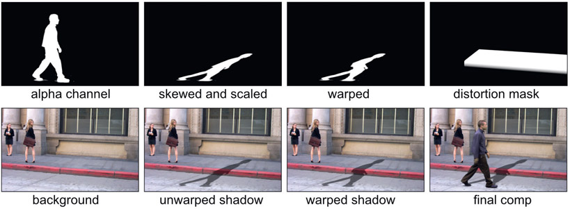
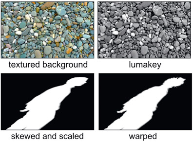
Often the shadow is not laying on a perfectly flat surface so the faux shadow gag will not look right until the shadow warps convincingly over the features of the local terrain. This can be done with a common image-displacement tool applied to the shadow. This image-displacement tool distorts an RGB image based on a second image, the displacement mask. The key is to make a convincing displacement mask to drive the image displacement tool. In the following demonstration we will see how to wrap the shadow of a moving keyed character over the street curb in the background plate.
The workflow for this nifty trick is shown in Figure 10.24. Starting at the top row left with the keyed character’s original alpha channel it is scaled and skewed to give it a basic perspective slant. The picture below it is how the unwarped shadow would look if it were just comped over the curb. The next picture shows the warped shadow and below that is how the warped shadow looks warped over the curb. The last image shows the displacement mask used to introduce the shadow warp and below that is the final comp with the keyed character and his warped shadow. The cool thing here is that as the character walks along his shadow will warp convincingly over the curb.
Often the faux shadow will be moving across a lumpy or textured surface, so the shadow will have to be warped similarly to sell the shot. You can use the textured surface itself (Figure 10.25) to warp the shadow by first pulling a luma key, then using that as the displacement mask for the image distort tool. Here you can see the original skewed and scaled shadow mask and next to that is the warped version that was distorted by the textured background’s luma key. It is very impressive to watch the keyed character walk by as his shadows flows over and around the textured background in a most compelling manner.
The simple displacement mask in Figure 10.24 only took a few minutes to make with a gradient and roto mask. The texture-warped shadow in Figure 10.25 was even easier because it used a simple luma key of the background. In some cases, however, the background will be more complicated than a simple curb or rocky terrain so you may have to break out your paint program and hand paint an appropriate displacement mask. The good news is that you normally only need the one displacement mask for the entire shot. If the camera is moving then the displacement mask will have to be tracked to the background, but you will still only need the one displacement mask.
WWW Light Wrap – this folder contains a 24-frame walk cycle of the character in Figure 10.24 already keyed and ready to cast shadows, which you get to wrap over the curb in the background plate. Good luck!
The contact shadow is an essential component of a convincing shadow for objects that come into contact with a surface. Without it the object appears to float over the surface, even with a proper shadow. Here we will look at three key issues for a convincing contact shadow – its density, falloff, and ambient occlusion. An over-arching principle here is to be able to adjust all three items individually without affecting each other.
Again, the assumption for CGI is that shadows will be rendered for you so this discussion is about keyed objects such as greenscreens, or an object you have isolated with a key or roto. Of course, there is always the absent-minded CGI artist that forgot to render your contact shadow, so we can save his bacon here too.
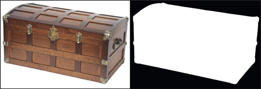
The steamer trunk in Figure 10.26 represents some object that has been keyed and composited so now needs a contact shadow. The mask used to isolate the trunk is shown on the right.
The basic idea is to take the same mask that was used to key the trunk, crop it down to the area we want to use for the contact shadow, blur it then use it as a mask for a color correction operation that will produce the contact shadow. The density of the contact shadow comes from the color-correction operation and the falloff will come from a color curve that we will use to dial in the falloff we want in the mask. Again, no inter-dependencies allowed.
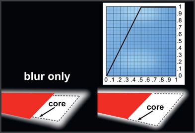
Figure 10.27 shows what happens when a copy of the trunk mask is blurred to be used as the contact shadow mask. The red region is a piece of the trunk mask from Figure 10.26 that was added to show the relationship between the trunk mask and the blurred shadow mask. On the left is the blur only, and the core has been pulled well inside the red trunk mask as a blur will always do. On the right a color curve has been applied that moved the core back out to match the edge of the trunk mask. If this is not done the contact shadow will start well inside the edge of the trunk, rather than right at the edge. The color curve required to do this simply has a control point at 0.5 to pull those code values up to 1.0, so now the core of the contact shadow mask aligns with the edge of the trunk mask. Since the shadow mask is at 100% density right at the edge of the trunk the color correction will set the shadow density right at the edge, falling off with distance.
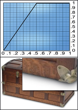
Now we can look at the falloff as a separately controlled parameter. Keep in mind that these illustrations share exactly the same color-correction and blur setting. The only thing we will change is the falloff from the color curves. Figure 10.28 illustrates the appearance of the contact shadow with a simple linear curve. The main picture shows the entire trunk and the insert is a close-up of the contact shadow detail. Figure 10.29 illustrates the effect of adding a “shoulder” to the color curve. The main control point is still set for 0.5 as before. And Figure 10.30 shows the effect of adding an “S” curve to the color curve, which causes the contact shadow to fall of more quickly. The idea here is to adjust the shape of the color curve to “sculpt” the shadow falloff to match the other contact shadows in the comp.
The third and final issue is the whole ambient occlusion thing. As the side of the trunk approaches the contact edge with the floor, less and less ambient light will be bouncing off the floor back up to the trunk. As a result, the side of the trunk will grow somewhat darker as it nears the contact edge. So use a bit of a gradient mask with another color correction applied to the edge of the trunk to introduce your own faux ambient occlusion.
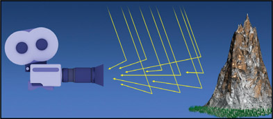
Atmospheric haze (depth haze, aerial perspective) is a fundamental attribute of most outdoor shots and all smoky/dusty indoor shots. It is one of the visual cues to the depth of an object in a scene, along with relative size and occlusion (in front or behind other objects). While the effects of atmospheric haze stem from the scattering effects of the particles in the intervening atmosphere, there are actually two different light sources to consider.
The first light source is the intervening atmosphere between the camera and the mountain, shown in Figure 10.31. Some of the sunlight and skylight raining down is scattered in mid-air and some of that scattered light enters the camera. This has the effect of laying a colored filter over the scene. The density of this “filter” is a function of the distance to each object, and its color is derived from the color of the atmosphere.
The second light source is the distant object itself, like the mountain in Figure 10.32. Some fraction of the light reflecting from the mountain hits particles in the atmosphere and gets scattered before reaching the camera. This has a softening effect on the mountain itself that reduces detail, like a blur operation. It is the sum of these two effects, the atmospheric light-scattering and the object light-scattering, that creates the overall appearance of the atmospheric haze.
An example of the sequence of atmospheric haze operations can be seen starting with the original plate, Figure 10.33. The mission is to add a new butte in the background and color correct it for atmospheric haze. The big butte on the left was lifted out, flopped, and resized to make an addition to the background butte on the right side of the frame. Figure 10.34 shows the initial comp of the new butte with no color correction. Without proper atmospheric haze it sticks out like a sore thumb. Figure 10.35 shows just a color-correction op to lower the contrast to simulate the scattered “atmospheric” light (per Figure 10.31). It now blends in better with the original butte, but it has too much sharp detail compared to its other half. A gentle blur has been added in Figure 10.36 to allow for the loss of detail due to the scattering of the “mountain” light (per Figure 10.32).
It is certainly possible to adjust the color of the foreground element to match the background plate by adding a simple color-correction operation, but there is another approach that can be more effective, especially if there are several elements to be composited at different depths. The procedure is to make a separate “haze” plate that is the color of the atmospheric haze itself, and do a semi-transparent composite over the foreground element. The initial color of the haze plate should be the color of the sky right at the horizon, which can be refined if needed. Three copies of a lighthouse were comped in Figure 10.37, which desperately needs some atmospheric haze to sell the shot. Figure 10.38 shows three different haze treatments by only varying the transparency of the haze plate.
There are several advantages to this approach. First of all, the color of the haze and the degree of transparency can be adjusted independently. Second, in certain cases the haze plate could be a gradient, giving a more natural match to any gradient in the real atmospheric haze. And third, if there is more than one element to comp in, by giving each object its own matte density the density of the haze can be customized for each element. If the shot shows terrain a few miles deep the matte can be given a gradient that places very little depth haze in the foreground and progressively more into the distance, like in Figure 10.38.
WWW Atmospheric Haze – this folder contains the lighthouses and background from Figure 10.37 so you can have your own atmospheric-haze fun.

Figure 10.40
Glow element created with blur
Adding a glow to an element is wondrously simple with computer graphics. Just make a heavily blurred version of the element then sum it together with the original like the example in Figure 10.39 through Figure 10.41. Done. Well, perhaps not quite. You may want to increase or decrease the presences of the glow in the lights or the darks, which is easily done by adding a color LUT to the glow element prior to summing it with the original element. In the LUT you can raise or lower the lights or darks for maximum control over the final appearance. Some may wish to composite the glow in, but this would not be right. A composite is for things that use an alpha channel to block the light from the background, and a glow simply adds light to the background light without obscuring it. Add in your glows with a plus operation, please. If you are working in the limited dynamic range of video then you could screen in the glow – just don’t tell anybody I said that.
In the past when all that mankind had for making movies was film cameras, if an aging actress needed a flattering close-up they would smear Vaseline on the lens to give her what I like to call the “Doris Day glow” effect. Today, we can apply our digital glow technology with good effect to erase the years from any aging dowager. An example of this magical treatment can be seen in Figure 10.42 and Figure 10.43. A bit overdone for illustration purposes, the ageless Marcie is now all glowed up. Doesn’t she look lovely?
In Chapter 3: Working with Keyers we talked about the important of degraining footage prior to keying for the smoothest key edges. But grain (and noise) is a fundamental character of our images and oddly, it is considered a desirable aesthetic – people like it. If it is missing the picture looks too smooth and sharp – some would even say it looks like video – and in the movie industry video is a dirty word. So we are forced to retain and manage the grain correctly for our visual effects shots. Here we will look at several strategies for grain management and their workflows.
Each capture device (digital cameras, 35mm film, etc.) will introduce a different grain character and this grain character has to be matched in the final comp. To make things even more exciting, these days we will have to mix clips that come from completely different sources – maybe the background plate was shot on 35mm film, the bluescreen shot with a RED camera, and a second character that is all CGI. So one question immediately pops up: which grain to match? That is ultimately the call of the comp supervisor, but lacking any information to the contrary I would normally use the background plate as the reference and match any greenscreens to that. If compositing CGI over live action then obviously the CGI will get regrained to match the live action plate.

Figure 10.44
Grain samples for film, digital cinema and video
So let’s take a moment to appreciate the variety of grain characteristics from a variety of cameras illustrated in Figure 10.44. Each sample has been cropped from a frame and set to a 50% gray for easy comparison. The point of this comparison is to appreciate each grain structure is different in size, amplitude, and shape. Note also that the grain structure for each channel is also unique. You cannot use the same grain pattern on all 3 channels. It must be a 3-channel grain pattern, each channel unique and dialed in for that channel.
Remember that degrain tools will soften the image so this issue must be watched closely. You may have to dial back the aggressiveness of your degrain tool or perhaps just degrain the blue channel, the worst offender. If your degrain tool is not adjustable then do a cross-dissolve between the degrained and original images to dial in the best results.
There are three ways to apply grain. First, a regrain tool that creates new grain based on the settings in the tool. Second, lift the grain from scanned frames of 50% gray and apply it to your shot. Third, what I call “grain rescue” – lift the grain out of the source plate then re-apply that same grain at the end of the comp to restore it. Here we will look at all three approaches.
Professional software will have a “dial-a-grain” tool that will generate grain based on the settings you choose. The question becomes what settings to use. There are two approaches here – parametric and eyeball. The parametric approach can be used when you have a grain-analysis tool that reports statistics about the grain. After collecting those readings, you can use that same grain-analysis tool on your regrained plate, then dial in the parameters until it reports the same reading you got off the original plate. Some regrain tools will sample another clip then use those statistics to regrain your clip. Others will have a library of pre-sets like “Kodak VISION3 250D” or “RED Dragon” that you can choose from. Whatever procedural method you use, trust nobody. Always confirm with an eyeball check against a reference clip using the grain check procedure here.
Grain Check Procedure
- Compare the grain at full frame rate – crop a window if your machine cannot keep up
- Compare the grain at full resolution – never a proxy
- Compare one channel at a time – remember, each channel is different
- Choose a reasonably featureless region for comparison
- Choose similar color and density region for comparison
This is the 50% gray film scan or digital camera capture used as the reference clip, from which you lift the grain out and apply it to your clip. There are two ways this might be done. The first is that some regrain tools can look at one clip for grain structure then apply a copy of it to your clip. The second is for you to lift the grain yourself and apply it to your clip. Here is the do-it-yourself workflow:
- Degrain the reference clip.
- Subtract the degrained clip from the original reference clip to get the lifted grain. (NOTE: this subtraction will generate negative numbers. It is essential that they be preserved and not clipped to zero.)
- Add (sum) the lifted grain with your comp.
This is where the grain is lifted out of the bluescreen plate, for example, then this “rescued grain” is re-applied to the finished comp. This approach obviously guarantees a match between the comp and the original bluescreen simply because it is actually the self-same grain that has been rescued then re-applied. This workflow would be used when the background plate of the comp has no grain of its own to match to, such as a digital matte painting or a CGI background. But there are issues to be aware of, naturally. Following is the step-by-step procedure:

Figure 10.45 Grain-rescue procedure
Should you want to use this procedure but only apply the rescued grain to the keyed character, then simply mask the rescued grain with the character’s key before adding it to the comp.
Some recommend rescuing the grain from the original bluescreen, which obviously produces very blue-spilled grain that you don’t want to add back to your comp. Their fix is to desaturate the rescued grain before adding it back in. Don’t do this. The desaturation operation alters the red, green and blue channels of the rescued grain such that it is no longer correct. The procedure above performs spill suppression before lifting the grain (Step 1) so the grain structure is preserved without adding spill when it is restored.
One gotcha here. Notice that the rescued grain picture in Step 3 has an image of the character embossed in it. This is not a problem if it is laid precisely on top of the original image. But, if the grain is lifted from one image and placed onto an unrelated image, the embossed details could become visible.
Now that we have the tools and techniques for grain management sorted out we can consider how to use them for our own grain management. Following are the four cases that you will likely encounter, with recommendations for how to manage the grain for each case.
This is the typical case of a bluescreen or greenscreen live-action plate keyed and composited over another live-action plate. The first issue is to choose which one is the reference – the one to match to. As mentioned above, this is normally the background plate, but that is not always written in stone. Perhaps everything needs to be degrained then regrained to some completely different standard provided by the comp super or the nice client.
If the greenscreen is to match the background then it will need to be degrained then regrained to the background. You could use the procedural approach to characterize the background grain, then use that data to regrain the greenscreen. Or you could use the eyeball approach and dial in your regrain tool to match. Like color correction operations, the regrain should be done to the unpremultiplied foreground.
If the grain from the greenscreen is to be retained in the comp then the workflow is to degrain a side copy of the greenscreen and use it for keying, but use the original green-screen for despill, color correction, premultiply and compositing.
This case is where you have (say) a greenscreen to key and comp over a CGI plate, or a digital matte painting that doesn’t have its own grain. The mission here is to add grain to the CGI that matches the keyed greenscreen plate. If there is some external grain reference to match then the greenscreen layer would be completely degrained and composited, and the entire finished comp regrained to the reference using either the procedural or eyeball method.
The CGI (or digital matte painting) has no grain, so simply has to be grained to match the live action background. This could be done using either the procedural or eyeball method.
There will invariably be a grain reference that all the CGI shots are to match to. The finished composite is grained to the reference using either the procedural or eyeball method.
On occasion you may have a still photo to use in a comp. The problem being that it already has grain in it – frozen grain. The best approach is to use your good degrain tool on it then regrain it with moving grain. However, if for some reason you don’t get good results there is a cheat that can work. Apply a “light dusting” of grain on top of the frozen grain – again, very light – then dial it in for the best look. Not an optimal solution, but it could work well enough.
Many of the correct image-blending operations entail using the add operation, not a screen. Adding images together as well as many color correction operations can easily raise the code values above 1.0. If you are working on a feature film it is an HDR medium so your super-whites will be fine. However, if you are working in video you have to carefully manage your pixels to avoid clipping.
There are two strategies for managing clipping. One is to avoid clipping altogether by using the screen operation instead of the add operation. The screen operation by definition will not go over 1.0 so you are protected from clipping for image ops, but keep in mind that there could be color-correction ops somewhere that go over 1.0. If working in video then using the screen operation for merging CGI lighting passes will be wrong, but perhaps not so wrong as to incur the wrath of your comp supervisor or the client. It is a cheat and I did not tell you to do it, but it might be OK in some situations where budgets are small and schedules are short. Just don’t tell anybody I said that.
The right and true way of managing clipping is to go ahead and add all your lighting passes, other effects and color corrections regardless of how high the code values climb. Then, at the very end of your comp script apply a soft clip to bring things within range of your deliverable medium, be that film or video. There are a few choices for how to do that.
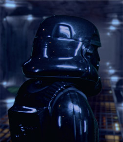
Figure 10.46 shows an HDR image that is supposed to have lovely blue highlights, which have been clipped so now the blue highlights are just flat blobs of white. Figure 10.47 shows the same HDR image with the exposure dropped way down to show the blue highlights before they were clipped to white. A soft clip should lower the code values down to 1.0 such that the intended color is retained like the example in Figure 10.48. Compare this to Figure 10.46.
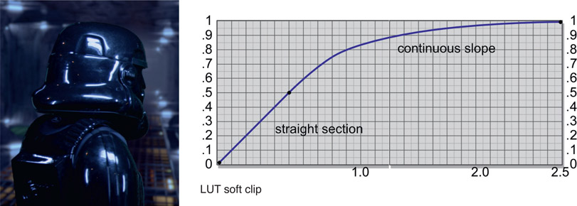
If your software has such a soft clip that will retain the color in the highlights then you are good to go. If you don’t, or you don’t like the results, you may be tempted to use an HDR LUT (color curve) to bring the high code values down. Figure 10.49 shows why that won’t work.
The highest code value is the blue channel peaking out at 2.5 so one might be tempted to place a control point at 2.5 on a color curve and bring it down to 1.0 – being careful to retain a straight line section between say, zero and 0.5 so that the rest of the image isn’t affected. The soft clip curve must maintain a continuous slope at the right end so the code values don’t go flat. The problem is that all three color channels will be converging towards the same values which means the resulting color is white again. Perhaps a kinder, gentler white than the hard clip, but still no blue color.
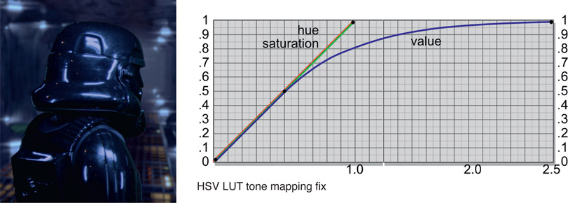
Figure 10.50 shows the right approach. This uses an LUT to lower the tone map in the highlights, which lowers their brightness but retains their color. To do this, first convert the image from RGB to HSV then add the LUT – but only adjust the V (Value) curve, leaving the HS (Hue, Saturation) curves at default. Last, convert the corrected HSV image back to RGB and you will have retained the color in the highlights like Figure 10.50. Lovely.
WWW Soft clip.exr – this is the high dynamic range image shown in Figure 10.46 in an EXR file, so you can try some soft-clipping techniques.
We have sweetened the comp with edge blending, light wraps and other refinements, so now it is time to turn our attention to camera effects. These are the things that the photographing camera has introduced that we must account for in our comps. They include lens effects such as distortion, chromatic aberration and various types of flares. There is also an extensive section on managing lens distortion with step-by-step workflows.