The objective of this chapter is to help you to make photo-realistic color corrections for your composites. You have pulled your best key, done a great spill suppression, and executed a fine composite, but if the color correction is not photorealistic you do not have a shot. Color correction is probably the most critical aspect of producing a photorealistic composite. It is also the thing that eludes most beginning visual effects artists.
When color correcting a shot we are trying to convincingly recreate the behavior of the light in the scene onto the various objects in the scene. The problem becomes knowing what the item in question “should look like”. Very often there is no convenient reference in the scene to match to so we have to use our best guess. Your guesses will be much better if you have an understanding of the behavior of light – in this section we will look at how light behaves under different circumstances so that you may apply these insights to color correcting the elements of your comp.
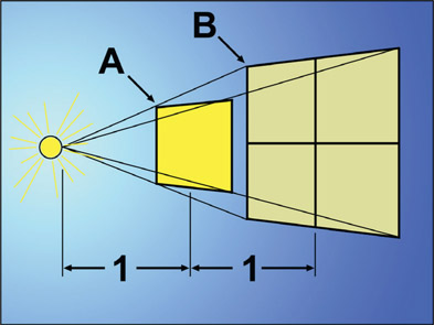
The rule that describes how the brightness of light falls off with distance from the source is called the inverse square law. Simply put, if the amount of light landing on a surface was measured, then that surface was moved twice as far from the light source, the amount of light at the new distance would be a quarter as strong. Why this is so can be seen in Figure 9.1. The area marked “A” is one unit from the light source and has a certain amount of light within it. At area “B”, also one unit from “A”, the same amount of light has been spread out to four times the area, diluting it and making it dimmer. The distance from the light source was doubled from “A” to “B”, but the brightness has become a quarter as bright.
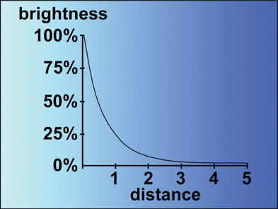
Figure 9.2
Graph of inverse square law brightness falloff
This tells you nothing about the actual brightness of any surface. It simply describes how the brightness of a surface will change as the distance between it and its light source changes, or how the brightness will differ between two objects at different distances from a light source.
This underscores the importance of working in linear light space. In linear light space if the distance from the light to the object were doubled you could in fact cut the code values to ¼ and achieve realism. However, if working in an sRGB color space, you have gamma values baked into the image that make it impossible to determine with mathematical precision what to do, so you will just have to eyeball it.
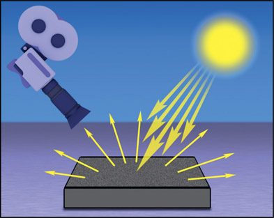
Figure 9.3
Diffuse reflections scatter incoming light
There are two types of light reflections off of surfaces – diffuse and specular. Here we will start with the diffuse reflections.
Diffuse reflections are given off by diffuse surfaces, which are flat, matte, dull surfaces like the green felt of a pool table. The vast majority of the pixels in a typical shot are from diffuse surfaces because they make up what we think of as the “normal” surfaces such as clothes, furniture, trees, and the ground. When light hits a diffuse surface it “splashes” in all directions, like pouring a bucket of water on a concrete surface (Figure 9.3). As a result, only a small fraction of the in-falling light actually makes it to the camera, so diffuse surfaces are much, much dimmer than the light sources that illuminate them.
At grazing angles a diffuse surface will suddenly become a specular reflector. Witness the “mirage” on the normally dull black pavement of an asphalt road. This is the sky reflecting off of what becomes a mirror-like surface at grazing angles, like laying a half-mile of Mylar on the pavement. This grazing angle reflectivity is referred to as the “Fresnel angle” (fray-NELL) and some CGI studios actually render a fresnel pass that compositors can use to replicate this natural phenomena.
For all practical purposes, a 2% black diffuse reflective surface is the darkest object we can make. To make a 1% reflective surface you have to actually build a black box, line it with black velvet, and punch a hole in it and shoot into the hole! On the bright side, a 90% white diffuse reflective surface is the brightest object we can make. This is about the brightness of a clean white T-shirt. It seems that any more reflective than 90% and things start to become shiny, which makes them a specular surface.
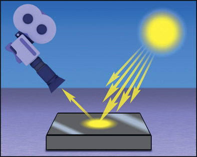
Figure 9.4
Specular reflections mirror light sources
If diffuse reflections are like water splashing in all directions, then specular reflections are like bullets ricocheting off a smooth, solid surface like in Figure 9.4. The surface is shiny and smooth, and the incoming light rays bounce off like a mirror so that you are actually seeing a reflection of the light source itself on the surface. What makes a reflection specular is that the light rays reflect off of the surface at the same angle that they fell onto the surface. Technically speaking, the angle of reflection equals the angle of incidence.
Specular reflections have several key features. Most importantly, they are much brighter than the regular diffuse surfaces in the picture due to the fact that they are a reflection of the actual light source, which is many times brighter than the diffuse surfaces they illuminate. Specular reflections are usually so bright that they get clipped when working in a limited dynamic range scenario.
Another difference between specular and diffuse reflections is that the specular reflection will move with even slight changes in the position of the light source, angle of the surface, or point of view (location of the camera). Once again this is due to the mirror-like source of specular reflections. The same moves with diffuse reflections may only result in a slightly lighter or darker appearance, or even no change at all. Specular reflections are often polarized by the surfaces they reflect from, so their brightness can be reduced by the presence and orientation of polarizing filters on camera lenses.
When light hits a diffuse surface some of it is absorbed and some is scattered, but where does the scattered light go? It goes to the next surface, where some more is absorbed and some scattered, which goes to the next surface, and the next, and so on until it is all absorbed. This multiple bouncing of the light rays around a room is called (surprise!) “bounce light”, and is a very important component of a truly convincing composite. In the world of CGI this lighting model is called Global Illumination.
The net effect of all this bouncing light is that every object in the scene becomes a low-level diffuse colored light source for every other object in the scene. Since the bouncing light rays pick up the color of the surfaces that they reflect from, the result is a mixing and blending of all of the colors in the scene. This creates a very complex light space, and as a character walks through the scene he is being subtly re-lit from every direction each step of the way. If a character were to stand next to a red wall, for example, he would be given a slight red cast from the direction of the wall.
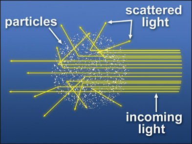
The scattering of light is a very important light phenomenon that is frequently overlooked in composites. It is caused by light rays ricocheting off particles suspended in the air. Of course, the same phenomenon occurs under water. Figure 9.5 illustrates how the incoming light collides with particles in the atmosphere and scatters in all directions. Because the light scatters in all directions it is visible from any direction, even from behind the light source. Some of the illustrations below are simplified to suggest that the light just scatters towards the camera, but we know that the light scattering is omni-directional, like in Figure 9.5.
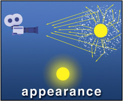
Light-scattering accounts for the glowing halo around light sources, visible cones of light such as flashlight beams, and depth haze effects. If a light bulb were filmed in a perfectly clear vacuum the light rays would leave the surface of the light source and head straight into the camera, illustrated in Figure 9.6. Without any atmospheric scattering the light bulb would appear to have a stark, clean edge.
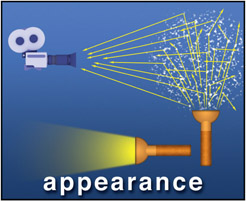
If there are particles in the intervening medium, however, some of the light is scattered and some of the scattered light gets to the camera. What happens is that a light ray leaves the light source and travels some distance, ricochets off a particle and heads off in a new direction towards the camera (Figure 9.7). The point that it scattered from becomes the apparent source of that light ray, so it appears to have emanated some distance from the actual light source. Multiply this by a few billion trillion and it will produce the “halo” around a light source in a smoky room. For a flashlight beam the point of view is from the side of the beam. The light rays travel from the flashlight until some hit a particle then scatter in all directions. A small fraction of the scattered rays bounce in the direction of the camera shown in Figure 9.8. Without the particles to scatter the light towards the camera the flashlight beam would be invisible.
Since there are normally more light rays that travel the straight line to the camera compared to the ones that scatter, the surrounding glow is not as bright as the light source. But this is just a question of degree. If the particle count were increased enough (really dense smoke, for example), there could be more scattered rays than straight ones. In extreme cases the light source itself could actually disappear within the fog, resulting in just a vague glow.
The most common scattering particles are the smog, water vapor, and dust particles found in the atmosphere that produce the familiar atmospheric haze. For techniques on creating atmospheric haze effects see Chapter 10: Sweetening the Comp. For interior shots the most common scattering particles are smoke and dust. The scattering particles can impart their own color to the light source as well because they also selectively absorb some colors of light and reflect others, like a diffuse surface. In fact, the sky is blue due to the fact that the atmosphere scatters blue light more effectively than any other wavelength (Rayleigh scattering). As a result, there is less red and green light coming from the sky, hence the sky appears blue. If there were no atmospheric scattering, the light from the sun would shoot straight through the atmosphere and out into space leaving us with a black, star-filled sky during the day.
Before we talk about the effect of color operations on images in the next section we need to pause to understand gamma. Gamma is different than the other color ops in that it applies a power function (defined below) and cannot be replicated with a simple color curve. Many artists find gamma baffling so we shall de-baffle gamma right now.
Gamma is actually a power function, meaning that the source image pixels are raised to some power to produce the output image. For the few math enthusiasts out there the equation would be:
| Equation 9.1 |
For example, if the input image pixel had a value of 0.5 and a gamma of 2 is to be applied then the output pixel would be 0.52 (0.5 squared), which is 0.5 × 0.5 = 0.25. Notice that the input pixel was 0.5 and the output pixel is 0.25, much darker. So if you raise a floating-point number between 0 and 1 to a power greater than one you get a smaller number, hence a darker image. I know this flies in the face of your experience with gamma adjustments so we will circle back to that in a bit. Remember, we are talking about pure math at the moment, not color correction.
Now, if a pixel code value were raised to a power less than one, say 0.7, it will get larger. So using the same example of 0.5, if we raised 0.5 to the power of 0.7 (0.50.7) we would now get 0.62, a larger number. So raising a pixel to a power of less than one makes it brighter.
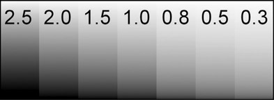
Figure 9.9 shows a “wedge” of gammas applied to a simple gradient so you can see the affect of different gammas. The original linear grad is in the centered labeled “1.0” meaning that it was raised to a power of 1.0, which is no change. Going to the left the gamma values get larger so the grads get darker as mentioned above. Going to the right, the power values get smaller so the grads get lighter.
Now let’s circle back to the issue of my explanation of larger gamma numbers making the image darker, but your experience is of larger gamma numbers making the image brighter… The answer to this riddle is that the gamma op on all color correctors is in fact the inverse of the number you enter. If you enter a gamma of 2 then the code values are raised to the power of 1 ÷ 2, or 0.5. And as we have seen, raising the code values to a power of 0.5 will lighten them. I suspect this custom – which is universally used by all color-correcting tools – is to make it more intuitive to the artist. If you Gain up an image by 2 it will get brighter, so if you Gamma up an image by 2 it should get brighter too, right?
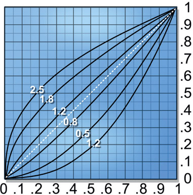
Figure 9.10 illustrates the shape of the gamma curve for various gamma settings. The white dashed line represents a gamma of 1.0, which is no change. Keep in mind that the numbers you see in this illustration are actually inverted internally by the gamma operation so that gamma values greater than 1.0 brighten, and less than 1.0 darken.
So why do we use gamma and why is it present in virtually every single color-correcting tool in the known universe? Because of monitors. The physics of the old CRT monitors was such that when they were fed the video signal their display was way too dark. Upon engineering analysis in the early days of TV, the nature of the darkening was determined to be a gamma function.
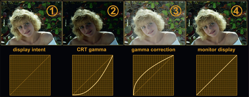
The complete story is told here in Figure 9.11. Image (1) on the left indicates the display intent – this is what the picture should look like. Image (2) shows what that picture would look like if displayed on a naked CRT monitor, showing the gamma of the monitor seriously darkening the display. Image (3) shows the image from (1) given a gamma correction that makes it over-bright to exactly compensate for the CRT darkening. Image (4) shows the results of taking the over-bright image from (3) and displaying it on the darkening monitor in (2), which now displays the picture correctly.
To avoid having to put this gamma correction in every television set in the world it was decided to bake this gamma correction into every television camera so the signal would display correctly on the TV sets of the day. So today, every video camera, SLR camera, cell-phone camera – anything that clicks or takes a picture – bakes this gamma correction into their images so the output images really look like (3) in Figure 9.11. Gamma was established to make the images look right on CRT monitors so now gamma adjustments are needed to dial in the look because every image has a gamma correction baked into it.
But we don’t use CRT displays anymore so what about your great big flat-panel display? Flat-panel displays do not share the physics of CRT displays so they do not have a built-in gamma darkening – so they add one at the factory! The reason for this is backward compatibility with the several trillion videos and photos already in existence that have a baked-in gamma correction. We are stuck with it for legacy purposes. If your flat panel did not have a gamma LUT built into it then all the images you displayed on it would look like (3) in Figure 9.11 and you would return your monitor to the store thinking it defective. Some day, 100 years in the future, aspiring visual effects students will puzzle over why we have displays with an artificial gamma curve added to them and images with compensating gamma correction to fix it. They will think we were demented – unless they read this story in the 32nd edition of this book.
So what images don’t have a baked in gamma correction? All images intended to be displayed on a monitor have gamma baked in – video, jpg, tif, targa, png – all of them. The ones that don’t are EXR files which, by definition, are linear and the log images from digital cinema cameras. We have already looked at linear EXR files but we will have an entire section later on log images. In case you can’t wait the log image discussion is in Chapter 15: Digital Images.
One of the biggest questions in the minds of visual effects compositors trying to color-correct their comps is “what color operation should I use?”. Some color ops affect mostly the darks, others the lights, some both. In this section we will take a close look at the common color ops of Lift, Gamma, Gain, Offset, and Saturation to understand how they affect both the appearance of the image and the RGB code values. You must know both to be an effective compositor.
The test image is my trusty desert plate as it has great dynamic range with nice dark shadows between the rocks, lovely midtones, and bright clouds that approach code values of 1.0. For each color op there will be small version of the original image perched above the two examples for each color op, one showing what happens if that color op goes up and the other when it goes down. I use “up” and “down” as shorthand here rather than “increase” or “decrease” because we like to say in salty comp-speak “let’s gain up the image” rather than “let’s increase the gain on the image”.
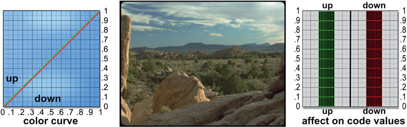
Figure 9.12 shows the setup we will be using to demonstrate the effects of each of the color ops. For each one there are two examples, one with the color op dialed up and the other dialed down – for example, Gain up and Gain down. In the real world you would use some color-editing tool for this but I have included an example on the left of how you would implement the color op in a color curve. Note that the “up” curve is green and the “down” curve is red. The center will show the original image along with the two versions created with the color op dialed up and down. On the right is a graph that will show how the code values are affected for both versions, again green for “up” and red for “down”. This setup is designed to allow you to see how each type of color op affects both the image appearance and the code values. It is essential that you also understand what is happening to the code values, not just the image appearance.
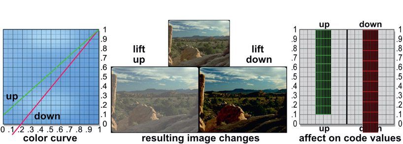
The lift color op scales the code values up or down, but the pivot point for the scaling operation is at 1.0 (white). The color curve in Figure 9.13 helps to illustrate this as both curves are still anchored at the top at 1.0. Starting with the green “up” color curve, code value 0 has been lifted to 0.1. While it is a small numerical change the impact on the “lift up” image is huge and has fogged up the plate horribly compared to the reference image above it. Checking the green “up” code values on the right (the effect on code values), the image data has been “squeezed” upwards towards 1.0.
The “down” color curve goes below zero and off the chart and it is pulling down on the blacks. The “lift down” image has gone very dark and we can see why with the “down” code values on the right. All of the picture data from code value zero to 0.1 are now below zero. Note that going down with the lift op can introduce negative code values into the image.
When to use it – the primary use for a lift operation is when the black point for one image needs to be shifted to match another image. The amount is usually very small – maybe 0.02 to 0.05 – and can be either positive or negative depending on which way the black point needs to be shifted. You might also use a lift (down) if the blacks of your image were too light and you wanted to lower them closer to zero. If you used gamma to do this you would alter the contrast of the entire image. Lowering the lift value will impact mostly the very darkest pixels and leave the rest of the picture relatively unchanged.
The effect of gamma is shown in Figure 9.14. The “gamma up” image is all fogged up while the “gamma down” image has gone very dark. The up and down color curves reveal a very important point to remember about the gamma operation – unlike any other color op, gamma does not affect code values zero or 1.0, only those in between. The up and down code values on the right both still touch the zero and 1.0 lines, but you can see how the vertical spacing on them has been altered. The gamma-up code values become stretched apart in the darks and squeezed together in the lights. Try mapping that idea to the “up” color curve and the gamma-up image until all three make sense to you.
The gamma-down color curve shows the code values being compressed in the darks and stretched in the lights which is reflected in the “down” code values graph on the right. The gamma-down image has become dark and “contrasty” in the midtones while the brights are much less affected. Again, compare this image with the gamma-down color curve and the code values-down graph until you can map all three together in your mind. Then, and only then, will you “get” gamma.
When to use it – when you want to raise or lower the darks and midtones while leaving the brights relatively untouched. In addition to increasing the contrast, a gamma-down operation will also make the colors in the darks appear richer and more vibrant while a gamma-up will make them faded and foggy.
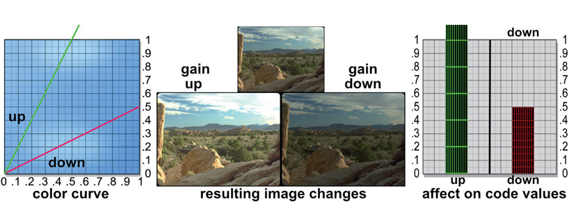
The gain color op scales the RGB code values up or down with zero as the pivot point of scale. This is illustrated in the color curve of Figure 9.15, showing both curves anchored at the zero point. The “up” curve has gone off the chart as have the “up” code values on the right. In fact, they should be twice as high as the chart but are clipped by the book illustration window. Note that the gain-up image is much brighter than the reference image, however the clouds in the sky are now clipped. The gain-down image is much darker then the reference and you can see how it happened with the gain-down color curve. The effect on the code values is as we might expect.
When to use it – use gain-up or gain-down to increase or decrease brightness, which is equivalent to increasing or decreasing exposure. The major visual impact will be to make the image look uniformly brighter or darker overall as all code values are affected equally. Note that the gain-up image looks a lot brighter than the reference, but does not look more contrasty. Again, to increase contrast use a gamma-down with a gain-up. And always watch out for clipping when you gain-up an image. Of course, to avoid clipping altogether use the “S” color curve for increasing contrast (see Section 9.3.7: Increasing Contrast with the “S” Curve).
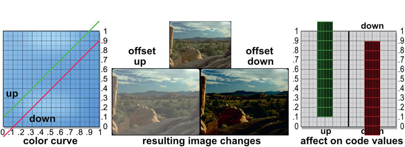
The offset color op shifts all code values in the image up or down by a constant value. It literally adds the offset value (say, 0.1 for example) to every pixel in the image. This is made apparent in Figure 9.16 by the code values graph on the right. The color curve shows how you would do such an offset operation.
When to use it – the offset op is not really a color correction operation but rather an image-processing operation that would be used whenever you wanted to shift the entire range of code values up or down. Its utility for color correction is limited because it affects the darks, mids, and brights equally and you usually want to affect these zones differently.
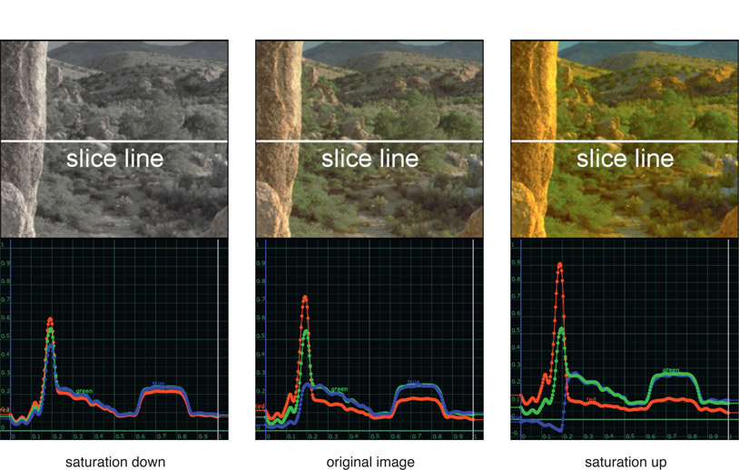
The saturation color op is different than all the previous color ops we have looked at because it uses math between the color channels rather than a color curve that operates on the individual channels like a gain op. As you know, to achieve a gray, the most de-saturated color possible, all three code values are made equal for each pixel. So the idea of desaturation is to move the RGB code values closer together for each pixel, while increasing saturation moves them further away from each other.
This is nicely illustrated in Figure 9.17. To make the slice curves easier to follow a small window has been cropped out of the original desert shot and a slice line plotted across the crop using Nuke’s version of the slice tool. Starting with the “original image” in the middle, you can see the amount of separation between the red, green, and blue lines in the graph. The left image, saturation down, has been seriously desaturated and below that you can see how the RGB lines have moved much closer together. If completely desaturated they would be right on top of each other. Looking over to the “saturation up” image on the right the RGB lines have moved further apart, the very definition of increased saturation. Note that the code values have been pushed so far away from each other that the blue line has actually gone negative. This is important to remember.
In some situations you may hear artists referring to “color grading” but at another time refer to “color correcting”. So what’s the difference? Plenty. Color grading is done on the raw image fresh out of the camera to correct exposure problems and prep it for use in visual effects or DI (Digital Intermediate). Maybe it was over-exposed or has a blue tint due to the lack of proper white balance. The color-correcting tool, however, is specifically designed to alter image A to visually match image B in a comp, such as a greenscreen keyed and composited over a background plate.
The grade tool will have far fewer and different color adjustments than a full-up color correcting tool. The grade tool will typically have a global Lift, Gamma, Gain, Offset and perhaps even Black and White Point settings. These color ops affect the entire range of the image so are ideal for the exposure type problems cited above. Keep in mind, if you just want to brighten up your image you can certainly use the Gain adjustment in a grade tool. No need to open up a big clunky color-correcting tool for a simple fix like that.
A color-correcting tool is much more complicated. It will have “zone” controls to adjust the image in the darks, midtones, and highlights separately. You might see “brightness” rather than “gain” and you might see “contrast” and “saturation” adjustments – again, for each zone individually – that you won’t find in a grade tool. As you can see, the nature of these adjustments is more visual (i.e. Brightness) than mathematical (i.e. Gain). You need this type of precise zone control and appearance-based adjustments in order to visually match two different images in a comp.
The problem with increasing contrast in an image is the risk of introducing clipping in the whites or the blacks, or both. Contrast adjustments drive the whites up and the blacks down and you don’t know if it pushed some pixels over the edge when working in an 8-bit system. When working in float if the whites go above 1.0 and blacks below zero no problem. But the ultimate delivery format might need to stay between 0 and 1.0, so the clipping will have to be addressed.
The best way to address clipping is to not introduce it in the first place, by using the famous “S” curve shown in Figure 9.18. The contrast of the picture is increased in the long center section, but, instead of clipping the blacks and whites, the curved sections at the ends gently squeeze them rather like the shoulder and toe of print film. When decreasing contrast there is no danger of clipping so it can be done safely with the simple linear color curve or a contrast node.
A rather stark example of contrast clipping can be seen starting with the original image in Figure 9.19. Figure 9.20 had the contrast increased using a typical contrast color op, resulting in severe clipping. The hair and shoulders are clipped in the whites and the background foliage is clipped in the blacks. Compare that with Figure 9.21, which had the contrast adjusted with the elegant “S” curve. The highlights in the hair are no longer clipped and there is much more detail in the blacks of the bushes in the background.
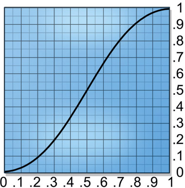
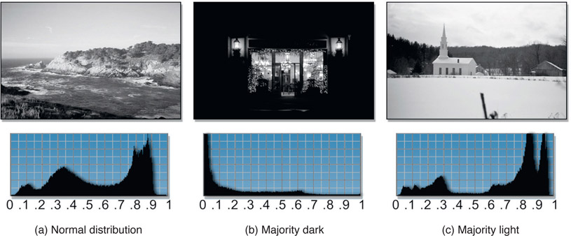
A histogram creates a graph of the distribution of pixels in an image based on their brightness, but some histograms also show RGB channels. Histograms do not tell you the brightness of any particular area of the image. Instead, it is a statistical representation of how the pixel brightness is distributed between the minimum and maximum code values. The code values are on the horizontal axis and their percentage of the picture are plotted on the vertical axis which is auto-scaling – meaning the vertical axis changes scale automatically to keep the graph within the chart. This also means that you cannot read specific percentages off of the graph but instead it just gives you an overall sense of how the brightness is distributed throughout the code values.
Figure 9.22 shows three examples of histograms covering normal, dark, and light image content. Starting with the normal distribution image in Figure 9.22(a), there is a large peak in the graph around code values 0.8–0.9. This is the sky region of the picture and the graph is saying that there are a lot of pixels in the image with this brightness value, which is not surprising because the sky covers a lot of the picture. Note that the white surf will also fall into this brightness region and be included in the same peak. Conversely, there are not very many pixels with a brightness of 0.1, which are the dark rocks in the foreground.
So what good is all this? One of the main uses is histogram equalization. That is, if an image does not completely fill the available data range it can be detected with the histogram because it reveals the lightest and darkest pixels in the image. The image can then be adjusted to pull the maximum pixel values up and the minimum pixel values down to completely fill the available data range. To see a histogram reflect the change from a color op the normal distribution example in Figure 9.22(a) has had the blacks lifted in Figure 9.23 and a new histogram was plotted which shows the reduced contrast range.
You can immediately see two big differences in the histogram for Figure 9.23 compared to Figure 9.22(a). First of all the graph has been “squeezed” to the right. This reflects the blacks in the image having been “squeezed” up towards the whites. This has left a large void between zero and 0.3, so this image no longer fills the available data range. If the contrast were adjusted to pull the blacks back down to or near zero it would “equalize” the histogram. You can use the histogram to monitor the image while you adjust the contrast until it fills the color space. You may even have a histogram equalization color op available that will adjust the image for you automatically. Keep in mind, though, that not every image should have its histogram equalized. Some images are naturally light or dark and should stay that way.
The second difference between the histogram in Figure 9.23 compared to Figure 9.22(a) is the addition of the data “spikes”. These are introduced whenever an image has been resampled in 8 bit integer systems – which is why we love float. What has happened is that several nearby pixel values have become merged to the same value, which piles them up into these statistical “spikes”. The spikes can become gaps if the image is resampled in the other direction, stretching pixel values apart. Either way, these data anomalies are a tip-off that an 8-bit image has been digitally manipulated.
The second use of the histogram is histogram-matching. Many compositing programs have color ops for histogram matching designed to make picture A match picture B. For these to work, though, the two images must have very similar image content. They are really only effective, for example, if you have two shots of basically the same scene, but the exposure is off on one of them. However, you cannot match a picture of a car to a picture of your mom with histogram matching!
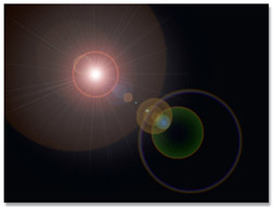
Occasionally you will be given an element to work with that is very far away from the target color so it will require major color correction. Take, for example, the lens flare in Figure 9.24 which is basically red, but let’s say you need a blue one. If you are working in an 8-bit system and start cranking on the color channels to recolor the lens flare you will have to totally crush the red channel and dramatically Gain-up the blue channel. The image will fall apart quickly. Better to start with channel swapping to get you in the ballpark first, then refine that with a more modest color correction.
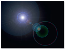
The idea is to perform a channel-swapping operation to switch the red and blue channels. The red dominant version will suddenly become blue dominant like Figure 9.25. Then just refine it with a minor color correction. Should you want a green one, just swap the red and green channels like in Figure 9.26. And of course, it goes without saying that channel swapping can be used in any situation where you need to make a huge color change on an element, not just lens flares.
In Chapter 6: The Composite, I gravely intoned that “all color correction operations must be performed on the unpremultiplied image”. Here we shall see why.
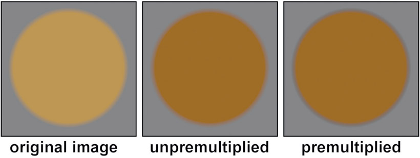
Figure 9.27
Color correction with unpremultiplied images
Figure 9.27 illustrates the issue. The left image is the original, which is a simple brown disc with a soft edge that was composited over a gray background. The middle image has a gamma-down operation applied on an unpremultiplied version of the brown disc, then it was comped over the same gray background. All looks good. The right image had a gamma-down op applied to a premultiplied version then comped, which resulted in the dark edge – and that is very wrong.
Why did this dark edge happen? The answer lies in both the anti-aliased edge pixels and the nature of the gamma operation. Referring to the series of gamma curves illustrated back at Figure 9.10, you can see how the gamma operation affects darker pixels more than lighter pixels. With the premultiplied version the code values of the edge pixels get progressively darker as they move towards the outer edge. So when the gamma op is applied to the premultiplied version the darker pixels get hit harder and go even darker. With the unpremultiplied image the edge pixels are restored to their original values, get the gamma op, then are premultiplied afterwards, thus retaining their relative brightness correctly. So the order of operations is:
- Unpremultiply
- Color correct
- Premultiply
How your compositing software handles this issue is, of course, up to the software developer. But follow this rule you must, or risk edge-discoloring artifacts. By the way, edges are not the only thing at risk here. All semi-transparent regions in the image are at risk for exactly the same reason.
To be honest, not all color correcting operations will introduce a color artifact. But rather than trying to memorize a list of safe vs. risky color ops just unpremultiply everything. And this does not apply to just CGI or digital matte paintings. Keyed greenscreen objects are also at risk if they are premultiplied at the time of the color correction. You will note that in my recommended compositing workflow in Chapter 6: The Composite, Figure 6.26, I placed the bluescreen color correction before the premult so that it would be applied to the unpremultiplied image. Now you know why.
Note that the heading for this section is Matching the Light Space, even though we are now going to talk about color-correction workflows. This is to draw your attention to the fact that even though the process is color correction, the real objective is to match the light space.
This section outlines production procedures and techniques designed to help you to achieving the ultimate objective – making two pictures that were photographed separately appear to be in the same light space when composited together. By combining the technical understanding of the behavior of light plus the study of the effect of the different color ops from the sections above, these good procedures will augment your already considerable artistic ability to color match two layers. The idea is to inspect each shot and think about the lighting environment that they share. Once a mental model of the lighting environment is developed it can be used to suggest the effects that will enhance the realism of the composite.
From a workflow standpoint I always start by working with a black-and-white luminance version first, in order to get the “tone scale” correct – that being the luminance component of the comp without any chrominance, or color. The reason this is a good way to work is that the eye is fooled and distracted by color so it is harder to judge your brightness and contrast with the color present. So the over-arching approach is first to get the tone scale correct, then restore the color and deal with it separately – in a way that does not alter the tone scale, of course. The approach in this section is to assume that the background has already been color graded and we are trying to color correct the foreground to match.
As mentioned above, the first step is to view a luminance version of the comp. Some systems can do this directly in the viewer with no color ops required. Other systems may require that you put the image through a color op to create the luminance version. But beware – there is a trap here. Creating a luminance version of an image requires the use of a specific math expression to correctly represent the brightness of different colors to the human eye. If you just grab a saturation op and de-saturate your image, depending on your software, you may not have a true luminance image. Be very certain that you are correctly converting your shot to a luminance version before proceeding.
There are three things to get right for the brightness and contrast to match – the blacks, the whites, and the midtones. The blacks and whites are among the few things that can be set “by the numbers” – in other words, there are often measurable parameters within the background plate that can be used as a reference to correctly set the blacks and whites of the foreground layer. The midtones and color matching, however, usually require some artistic judgment, since they often lack useable references within the picture.
The working example for the discussion below is Figure 9.28, which shows an initial comp with a badly matching foreground layer. The luminance version in Figure 9.29 shows how it can help reveal the mismatch in brightness and contrast. The foreground layer is clearly “flatter” than the background and badly in need of some refinement. Again, starting off by getting the luminance version properly set will take you a long way towards a correct result. It is certainly true that if the luminance version does not look right the color version cannot look right.
The black point of a picture is a very specific thing – it is the darkest pixels in the image. Not zero. It is bad form to have the black point of photographic images (digitized live action, as opposed to CGI or digital matte paintings) actually at zero, for a variety of reasons. Photographic images have natural variation in the blacks, so you run the risk of ending up with large flat “clipped” black regions in the picture if the average code values are set to zero. It is also important to have a little “foot room” for the grain or noise to chatter up and down.
The white point is the pixel value that a 90% diffuse reflective white surface would have. In a limited dynamic-range scenario like video or print the white point would normally be set to about 90% of the maximum code value in order to leave “headroom” for specular highlights or super-whites (code values above 1.0). I say “normally” because in some situations the white point might be lowered if the scene contained a lot of super-whites that were important to the story, such as a nighttime fireside scene. The white point might be higher if there are no specular highlights but the artistic intent is to achieve the greatest possible contrast, such as in a bright outdoor scene.
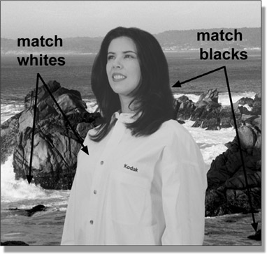
Figure 9.30 Luminance version of raw comp showing black and white points
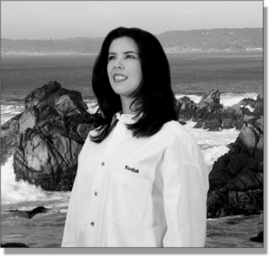
Figure 9.31
Resulting luminance version after correcting black and white points
Figure 9.30 is a luminance version of the image with black and white points indicated for both the foreground and background. The basic idea is to adjust the blacks of the foreground layer until they match the blacks of the background layer. This is usually easily done by simply measuring the black values in the background then adjusting the foreground levels to match. They can often be set “by the numbers” this way. To find the blackest region you can gain up the luminance image to make it easier to spot.
The whites of the two layers are similarly matched. Locate a white reference in the foreground plate and one in the background plate (Figure 9.30), then adjust the foreground white to match the background white value. A word of caution when selecting the white reference: make sure that you don’t pick a specular highlight as a white point. We are trying to match the brightness of the regular diffuse surfaces, and specular highlights are much brighter, so they are not the right reference. To find the white point, gamma-down hard on the luminance image and the white points will be the last pixels to disappear.
Literally using brightness and contrast adjustments to match the blacks and whites can be problematic because the two adjustments interact and alter each other. If you get the blacks set with a brightness adjustment, then try to match the whites with a contrast adjustment, you will disturb the black setting. You can eliminate these annoying interactions by using a color curve to set both the blacks and whites in one operation. The procedure is to use a pixel-sampling tool on the foreground and background layers to find the values of their blacks and whites, then use a color curve to fix the foreground black and white points at once. Let’s assume that after the pixel samples you get numbers like this:
Table 9.1
|
|
Foreground |
Background |
| blacks |
0.15 |
0.08 |
| whites |
0.83 |
0.94 |
What is needed, then, is to map the foreground’s black value of 0.15 to the background’s black value of 0.08, and, for the whites, the foreground value of 0.83 needs to map to the background’s 0.94.
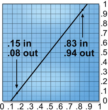
Figure 9.32
Black and white points adjusted with color curve
Figure 9.32 shows the color curve with both the blacks and whites corrected based on the sampled numbers in Table 9.1. The foreground values are set on the “image in” axis and the target values of the background are set in the “image out” axis. If some manual refinement is still needed, the blacks or whites can be individually refined without disturbing each other. Figure 9.31 shows the luminance version of the composite with the foreground layer corrected for the black and white points. It now visually integrates much better with the background layer.
So what do you do if your background and foreground plates lack convenient black and white points? Look for something that is close to the black point in density (blackness) that can be found in both layers and use it instead. Very often you can identify similar-type black elements in both plates that should be the same density, based on an analysis of the picture content.
For example, let’s say that the background has an obvious black point (a black car, for example) but the foreground does not. Perhaps the darkest thing in the foreground layer is a deep shadow under a character’s arm. Search the background plate for a similar deep shadow and use it as the black point for matching the foreground. Of course, there will not be a handy character in the background plate with a convenient deep shadow under his arm for an ideal match, but there may be a tree with what appears to be a very similar shadow to the foreground’s deep shadow. Since we are working with the luminance version of the picture, our black point is essentially unaffected by the fact that the two shadows are slightly different colors. A good understanding of the behavior of light allows you to make informed assumptions about the picture content that can help you with color matching.
The whites are a more difficult problem when there are no clear 90% white points to use as reference. The reason is that it is much more difficult to estimate how bright a surface should be since its brightness is a combination of its surface color plus the light falling on it, neither of which you can know. The blacks, on the other hand, are simply the absence of light and are therefore much easier to lock down. Further, when you just have midtones to work with they will be affected by any gamma changes made after the white point is set.
Even though the black and white points have been matched between the foreground and background layers there can still be a mismatch in the midtones due to dissimilar gammas in the two layers. This can be especially true if you are mixing mediums – a film element as the background with a video or CGI element as the foreground, or a film element from a greenscreen as the foreground over a matte painting from Adobe Photoshop. Regardless of the cause, the midtones must also be made to match in order to sell the comp.
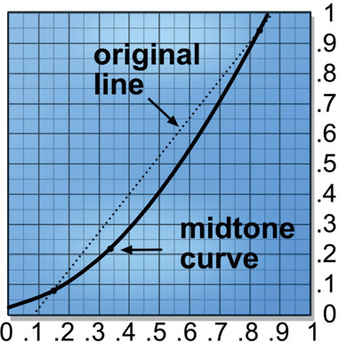
Figure 9.33
Using black and white point color curve to set midtones
The problem with the standard fix for mid-tones of gamma correction is that it will disturb the black and white points that have just been carefully set. The reason is that the gamma adjustment will alter all pixel values that are not exactly zero or 1.0, and hopefully your black and white points are not exactly zero or 1.0. For this reason some gamma tools may permit you to set an upper and lower limit on the range that it will affect, in which case you can set the range equal to the black and white points and use the gamma node without disturbing them.
However, few gamma nodes offer such elegant controls. The same color curve used to set the black and white points, however, can also be used to alter the midtones without disturbing the original black and white points. The reason is that you already have a control point set at the black and white points, and it is just a matter of “bending” the middle of the color curve to adjust the midtones like the example in Figure 9.33. Note that the control point and resulting curvature are designed to give the curve a gamma-like shape.
Figure 9.34 Black point, white point and midtones corrected
Bending the color curve like this is not a true gamma correction, of course, because a gamma correction creates a particular shaped curve, which this will not exactly match. This is not terribly important, however. Nothing says that any mismatch in the midtones is actually due to a true gamma difference requiring specifically a gamma op to fix. It is simply that gamma corrections are what we traditionally use to adjust the midtones, so we can use a color curve just as well. At this point we have entered the zone of “what looks right, is right”. Once the black, white, and midtone corrections have been developed for the luminance version of the comp the color can be turned back on as shown in Figure 9.34. While nicely matched for overall density, the color balance is still seriously off with way too much red. Now it is time for the actual color matching.
Before leaving the tone scale with the luminance version I strongly recommend some gamma slamming when you finish with your color corrections. By slamming the viewer gamma up to say, 3.0 you will pull the blacks apart making it easier to see any mismatches between the layers. Pulling the gamma way down to say, 0.1 the whites will be similarly “stressed” and pull apart if they don’t match well.
There is a second reason to do some gamma slamming with your shot when working on a feature film, and that is that your shot is headed for the DI (Digital Intermediate) process where it will get color corrected to fit into the overall movie color palette. One of the things colorists love to do is increase the contrast of the scenes. Add to that your workstation monitor is not a high dynamic display like the projectors in the DI suite, which have a MUCH greater dynamic range. As a result of this double-whammy, your shot will be pulled apart if there are even small differences in the layers. By doing the gamma slamming on your workstation you can spot these problems and fix them before the shot gets sent back from DI – with your name on it.
Using the luminance version of the image, the black point, white point, and gamma have been set. Now it is time to look at the issue of the color itself. Unfortunately, there are so many variables in the overall color of a plate that an empirical approach is usually not possible. It’s an eyeball thing. But there are a number of tips, tricks, and techniques that can be used to get better results that we will look at here.
There is a situation where an empirical approach can be used, and that is if there are gray elements in the shot. If there are objects in the picture that are known (or can reasonably be assumed) to be true gray, you have a giant clue to the color correction. In this context, gray includes its extremes, black and white. Knowing that gray surfaces reflect equal amounts of red, green and blue provides a “calibration reference” that no other color can.
Let’s say that you were presented with two different plates, each with a red object in the picture. You would have no way of knowing whether the differences in the two reds were due to surface attributes, lighting differences, filters on the camera, or film stock. With gray objects we know going in that all three channels should be equal, and if they are not, it is due to some color balance bias somewhere in the imaging pipeline. By simply making all three channels equal we can cancel it out. Fortunately, there are lots of objects out there that can be black (tires, ties, hats), gray (suits, cars, buildings) or white (paper, shirts, cars), so there is often something to work with.
However, the reference grays in the background plate will not likely be true grays with equal values of red, green and blue. There will likely be some color bias due to the artistic color grading of the background plate. What needs to be done first is to measure and quantify the color bias of the grays in the background plate, then adjust the grays in the foreground plate to have the same color bias. The grays in the foreground plate will not be the same brightness as the grays in the background plate either, so the color bias becomes a “universal correction factor” that can be used to correct any gray in the foreground, regardless of its relative brightness. This is the swell thing about grays.
The idea is to use the green channel of both images as the reference for the red and blue channels. Let’s say that the grays in the background plate have a red channel that is 5% brighter than the green channel. So we go to the foreground grays and set their reds to 5% brighter than its green channel. Back to the background plate and measure the blues to find them 10% darker than the green channel, so set the foreground blues to 10% darker than the greens.
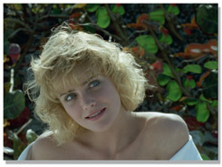
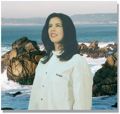
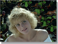
Flesh tones can be another useful color reference. The background plate rarely has flesh tones in it, but if it does, they can often be used as a color reference for any foreground layer flesh tones. Getting the flesh tones right is one of the key issues in color matching. The audience may not remember the exact color of the hero’s shirt, but any mismatch in the flesh tones will be spotted immediately. Setting the flesh tones was the technique used for the final color-matching step in Figure 9.35.
Table 9.2
"Constant green" color corrections
| to increase |
adjust |
| RED |
R↑ G B |
| GREEN |
R↓ G B↓ |
| BLUE |
R G B↑ |
| CYAN |
R↓ G B |
| MAGENTA |
R↑ G B↑ |
| YELLOW |
R G B↓ |
Altering the RGB values of an image more than a little bit will alter the apparent brightness as well. This often means that you have to go back and revise the black and white points, and perhaps the gamma adjustments. However, it is possible to minimize or even eliminate any brightness changes by using the “constant green” method of color correction. It is based on the fact that green makes up most of the brightness of an image, so any changes to the green value have a large impact on brightness while red and blue have much less. In fact, in round numbers, about 60% of the apparent brightness of a color comes from the green, 30% from the red, and only 10% from the blue. This means that even a small green change will cause a noticeable brightness shift, while a large blue shift will not.
The idea, then, of the constant green color correction method is to leave the green channel alone and make all color changes to the red and blue channels. This requires “converting” the desired color change into a “constant green” version, as shown in Table 9.2. For example, if you want to increase the yellow in the picture, lower the blue channel instead. Of course, if you want to lower something instead of increase it then simply invert the operation in the “adjust” column. For example, to lower the cyan, raise the red. Think green.
Objects lit outdoors by daylight have two different colored light sources to be aware of. The obvious one, the sun, is a yellow light source, but the sky itself also produces light, and this “skylight” is blue in color. An object lit by the sun takes on a yellowish cast from its true surface color, and a surface in shadow (skylight only with no sunlight) takes on a bluish cast from its true surface color. Foreground greenscreen elements shot on a stage are really unlikely to be lit with lights of these colors, so we might expect to have to give a little digital nudge to the colors to give them a more outdoor daylight coloration.
Depending on the picture content of the greenscreen layer, you may be able to pull a luma key for the surfaces that are supposed to be lit by direct sunlight. By inverting this matte and using it to raise the blue level in the “shady” parts of the foreground the sunlit areas will appear yellower by comparison without affecting brightness or contrast. This can help to sell the layer as being lit by actual outdoor sunlight and skylight. A color corrector that discriminates darks from midtones and highlights might also do the trick.
There will usually be specular highlights in the foreground element that need to match the specular highlights of the background plate. Of course, the specular highlights in the foreground layer came from the lights on the greenscreen stage instead of the lighting environment of the background plate. Very often, little attention is paid to matching the lighting of the greenscreen element on set to the intended background plate, so serious mismatches are common.
The good news is that specular highlights are often easy to isolate and treat separately simply because they are so bright. In fact, they will normally be the brightest thing in the frame unless there is an actual light source such as a light bulb (rare for a greenscreen layer). You can pull a luma key on the specular highlights in the foreground plate and use it to isolate and adjust them to match the specular highlights in the background plate. If you have a color corrector that can operate on just the highlights that would work too.
There is one thing to watch out for when darkening specular highlights and that is that they tend towards a dull gray when darkened. You may have to either dial up the saturation or actually do a color adjustment on the highlights so they match the background plate.
If the foreground layer of a composite is supposed to be in the same light space as the background layer then the direction that the light is coming from should obviously be the same for both layers. Interestingly, this is the one lighting mistake that the audience will often overlook – but the client may not. If the density, color balance, or light quality is wrong, the eye sees it immediately and the entire audience will notice the discrepancy. But the direction of the light source seems to require some analytical thinking to notice, so it escapes the attention of the casual observer if it is not too obvious.
This is also one of the most difficult, if not impossible, lighting problems to fix. If the background clearly shows the light direction coming from the left but the foreground object clearly shows it from the right, there is no way you can move the shadows and transfer the highlights to the other side of the foreground object.
There are only a few possibilities here, none of them particularly good. On rare occasions one of the layers can be “flopped” horizontally to throw the light direction to the other side, but this is a long shot. A second approach is to try to remove the largest clues to the wrong lighting direction in one or the other layers. Perhaps the background plate could be cropped a bit to remove a huge shadow on the ground that screams “the light is coming from the wrong direction!” Yet another approach is to select one of the layers to subdue the most glaring visual cues that the light source is wrong. Perhaps some very noticeable edge-lighting on a building in the background could be isolated and knocked down a few stops in brightness, making the light direction in the background plate less obvious. Maybe the shadows can be isolated and reduced in density so that they are less noticeable. If you can’t fix it, try to minimize it.
The quality of a light source refers to whether it is small and sharp or large and diffuse. The two layers of a composite may not only have been photographed separately under totally different lighting conditions, they may have even been created in completely different ways. For example, a live action foreground layer over a CGI background, or a CGI character over a miniature set, or any of the above over a digital matte painting. When elements are created in completely different imaging pipelines they have an even greater chance of a major mismatch in the quality of light. To some degree, one of the layers is sure to appear harsher and more starkly lit than the other layer. It may be objectionable enough to require one of the layers to be adjusted to look softer or harsher in order to match the light quality of the two layers.
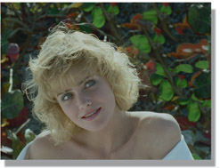
Figure 9.37
Original image
The general approach is to decrease the contrast, of course, but having a few small light sources can cause more “hotspots” on the subject and deeper shadows than broad, diffuse lighting. The highlights may be still be too stark relative to the midtones, so it may also be necessary to isolate them with a luma key and bring them down relative to the midtones, and perhaps even isolate the deep shadows and bring them up, which was done in the example in Figure 9.36. Again, be on the alert for highlights turning gray as they are dimmed.
If the element needs to be adjusted to appear to have harsher lighting then the first thing to do is increase the contrast. If there is any danger of clipping in the blacks or the whites be sure to use the “S” curve in a color curve as described in Section 9.3.7: Increasing Contrast with the “S” Curve. If the lighting needs to be made even harsher than the contrast adjustment alone can achieve then the highlights and shadows may need to be isolated and pulled away from the midtones, like the example in Figure 9.38. The more that the highlights and shadows move away from the midtones the harsher the lighting will appear.
Gradients are often used as a mask to mediate (control) a color-correction operation. Where the gradient is dark the effect of the color correction is reduced and where the gradient is light the color correction is more pronounced. Common examples would be when applying depth haze to a shot or adding (or removing) a color gradient in a sky. When a gradient is created it is linear, so it goes from dark to light uniformly. A slice graph of such a gradient would naturally show a straight line. But a color-op mediating gradient need not be linear, and using a non-linear gradient will give you an extra degree of control over the results. Besides, Mother Nature is virtually never linear, so a non-linear grad often looks more natural.
A non-linear gradient is made by adding a color curve to a linear gradient so that its falloff (how quickly it changes from one extreme to the other) can be adjusted, which in turn controls the falloff of the color correction operation. The color curve is added to the grad (gradient) before it is connected to a color correction node as a mask. Figure 9.39 shows a flowgraph of how the nodes would be set up. The grad can now be refined with the color curve to alter its falloff from light to dark either faster or slower, which in turn causes the color correction operation to falloff faster or slower.
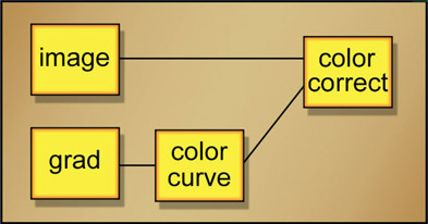
Figure 9.39
Flowgraph of non-linear gradient for color correction operation
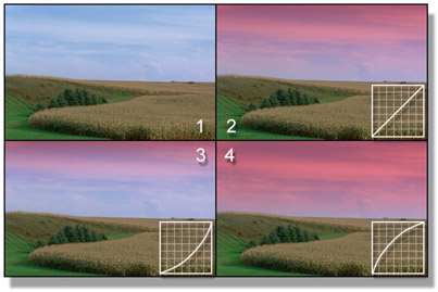
Figure 9.40
Color correction controlled by adjusting the falloff of a gradient
Figure 9.40 shows a series of pictures that illustrate how a non-linear grad can affect the falloff of a color gradient added to a sky. In all cases the color correction operation is left constant and only the falloff of the grad has bean changed. Picture 1 is the original image and picture 2 shows the color correction applied using the original linear grad. A little graph of the slope of the grad is included in each example. Picture 3 has the grad darkened in the middle by the color curve so the color effect falls off more quickly. Picture 4 has the grad brightened in the middle so the color effect falls off much more slowly, which now takes the color effect almost to the horizon.
WWW The download for this chapter contains the image of a boy that is already keyed and ready to comp over the series of very different background plates shown below for you to practice the color-correction techniques outlined in this chapter. Enjoy!
Since the year 65 B.C. (Before Computers) film was color corrected in the film lab by timing the exposure to RGB lights – hence the term “color timing” for the processes of the final coloring of a film. The type of film stock used in that process was called an “intermediate” film stock as opposed to the camera negative to shoot the film and the print film for projection. When Kodak invented film-scanning they referred to the scanned frames as the “digital intermediate” because it served the exact same function as the intermediate film stocks – color timing. So the term “Digital Intermediate” was invented by Kodak to replace the conventional intermediate film stock with a digital intermediate for color timing. I know. I was there in 1998 working with the Kodak color scientists while they set up the first DI suite at Cinesite, Hollywood.
When working on a feature film your visual effects shots will go out to the Digital Intermediate (DI) studio to get their final color timing, now called “color grading” in the digital age. Today color grading is done by a colorist on a computer in a DI suite. The colorist first evens out the exposure and color of the shots so no one shot “pops out”, then goes back and applies a creative “look” to the film. A colorist makes more money then you, me, and your best friend combined. And why is that? Because a talented colorist gives the movie its final “look” which is a critical creative component of the finished film – along with the cinematography, editing, sound, music, and, of course, visual effects. The director may become very fond of a colorist’s style so requests – or demands – that particular colorist for his movies. And when the director demands your talents you earn the big bucks. Color grading a movie is that important.
As the visual effects artist you are not responsible for color grading your shots. In fact, the raw footage you have been given should have already been given a preliminary grade and your mission is to add the effects and return the shot to the nice client with no color changes whatsoever, except for the effects you added. The base plate should be totally unchanged, and we have an inspection step to double check that the base plate of the final comp is indeed identical to the original.
But here’s the part you do care about. When your shot goes in to DI the colorist will invariably increase the contrast. If you have even slight discrepancies in the color correction of the various layers of your comp the shot may “pull apart” and be kicked back to your studio for you to rework. Having your shot kicked back from DI is not a job-keeper.
But it gets worse. Beyond habitually increasing the contrast of every shot to make it “punchier” it is also being viewed in the DI suite on a big cinema quality digital projector, not on a monitor like your workstation. These projectors have vastly more dynamic range and contrast ratio than your workstation monitor, plus they are viewing it in a dark surround – not the dim surround of your cubicle – so their eyes are hyper-acute. The tiniest flaw will leap off the screen and claw at the eyes of the colorist and the director. Not good. This is the reason we want to do the gamma-slamming on all of our comps to pre-stress them and make sure that the layers maintain visual integrity even when the contrast is dramatically increased.
One other thing to know about your visual effects shot going to DI is that some colorists will want the keys and masks that you used to isolate various elements of the shot so they can use them to fine-tune the color correction item-by-item. Beyond that they may apply “power windows” which are simple masks created on the color grading system to apply special color correction to various parts of the frame.
When working on a video job like a TV episodic (i.e. Game of Thrones) or a commercial your shots will be color-timed by an editor on the editing system in video. Since they will be working in video their displays will be similar to your workstation so there is nowhere near the danger of your comps pulling apart. But check them anyway.
Here is a checklist of points that you may find helpful to run through when you finish the color correction of a shot to make sure you have hit all of the issues:
- 1) Brightness and Contrast
- Do the black and white points match? (check with a luminance version)
- Does the gamma match? (check with a luminance version)
- Do the layers still match with the display gamma set way up? Way down?
- 2) Color Matching
- Do flesh tones look right?
- Does the overall color of light match?
- Do the shadow colors match?
- Do the specular highlights match?
- 3) Light Direction
- Does the light all seem to come from the same direction?
- If not, can the most obvious clues be eliminated or subdued?
- 4) Light Quality
- Do all layers appear to be lit with the same quality (soft/harsh) of light?
- 5) Atmospheric Haze
- Does this shot require atmospheric haze or depth haze?
- Is the color of the haze a convincing match to the natural haze?
- Is the density of the haze appropriate for the depth of each hazed object?
- Do any of the hazed objects need softening?
Skillful color correction is, of course, an essential component of the competent compositing of visual effects. However, there are many other issues to get right. We will look at these in the next chapter, which will further sweeten the comp. Techniques for adding interactive lighting, light wrap, shadows, and grain management are just some of the topics coming up.