Chapter 3. Using Animation Presets
Chapter Objectives
Chapter Learning Objectives
 Set up a project.
- Preview and apply an effects preset.
- Animate text.
- Apply a text animation preset.
- Trim footage.
- Draw a path with the Pen tool.
- Animate text along a path.
- Apply a shape preset.
- Adjust color and tone using the Lumetri Color effect.
- Apply a lightning animation preset.
- Export a composition to Adobe Media Encoder for rendering to one or more final files.
- Create and manage workspaces.
Chapter ACA Objectives
For more information on ACA Objectives, see pages 294–299.
DOMAIN 1.0 Working in the Visual Effects and Motion Graphics Industry
1.4
DOMAIN 2.0 Project Setup and Interface
2.1, 2.2
DOMAIN 4.0 Creating and Modifying Visual Elements
4.1, 4.2, 4.3, 4.5, 4.6
DOMAIN 5.0 Publishing Digital Media
5.1, 5.2
In Chapters 1 and 2, you worked on projects that resemble typical animation jobs you might execute using Adobe After Effects CC. In this chapter, you get to loosen up and have some fun with the animation presets in After Effects, and you’ll also animate text along a path. To help you make the most efficient use of the screen space available, you’ll learn how to take advantage of workspaces.
![]() Video 3.1
Video 3.1
Applying and Adjusting Visual Effects
Starting the Project
![]() ACA Objective 2.1
ACA Objective 2.1
To start learning the effects in this chapter, first set up the project:
Create a new After Effects project as you’ve learned in previous chapters, and save it in the ch3 folder as preset.aep.
Create a new composition as shown in Video 3.2.
Import the two video files in the lesson files folder for Chapter 3. Remember to keep your files organized as you build this project. You can start by moving the two video files into their own folder in the Project panel. In Video 3.2, the folder is named media.
 Video 3.2
Starting the Project
Create a new composition. In Video 3.2, the composition is named preset bg and uses the NTSC DV preset, but you can use a different name and preset if you want.
The NTSC DV preset used in Video 3.2 is an older standard that was widely used in North America for early standard definition, non-widescreen digital video in the 2000s. Today, NTSC DV has been replaced by HDTV standards.
Tip
To create a folder for multiple files in one step, select the files in the Project panel and drag them to the Create A New Folder button at the bottom of the Project panel.
Put the composition in its own folder in the Project panel.
Tip
The keyboard shortcut for the Layer > New > Solid command is Ctrl+Y (Windows) or Command+Y (macOS).
Create a new solid at the default size (the composition size) with a white color, and name it Background (Figure 3.1).
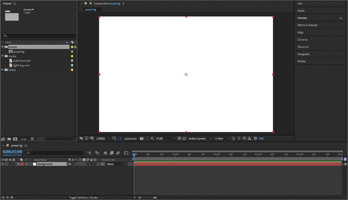
Figure 3.1 The new project, composition, and solid set up in After Effects
As you learned in Chapter 2, a solid is commonly chosen to create a layer for use as a background for effects.
Note
If you’re unable to create a solid, make sure the Composition or Timeline panel is active.
Start Adobe Bridge. You can use any of the methods suggested in Chapter 1 to start Bridge, such as using the application launchers, shortcuts, or search features of your operating system.
Previewing and Applying an Effects Preset
![]() ACA Objective 4.6
ACA Objective 4.6
One of the types of effects available to you in After Effects is the background preset, which does what it says: It applies an effect that’s set up to be used as a background for a composition.
![]() Video 3.3
Video 3.3
Previewing Effects Presets with Adobe Bridge
You’ve already learned how to quickly locate an effect in the Effects & Presets panel by typing the effect name into the search field in that panel. But how would you know which background effect you want if you don’t know what they look like? To help you with this, After Effects can use Bridge as a visual browser for certain types of effects.
You’ve applied effects earlier in this book. Now you’re working on something called an effects preset. What’s the difference? When you apply an effects preset, it can contain multiple effects that already use specific settings and may be a combination of effects that produce a specific result. That potential complexity is a big reason why it’s so important and useful to be able to browse effects presets visually in Bridge.
To browse background effects visually:
In After Effects, choose Browse Presets from the Effects & Presets panel menu (Figure 3.2).

Figure 3.2 Choosing Browse Presets
Choosing Browse Presets switches to Bridge and takes you straight to the Presets folder for After Effects, which exists on your desktop along with other support files that were installed with After Effects.
Note
If Bridge doesn’t properly play back After Effects presets, make sure Bridge is up to date. You can do this by using the same Creative Cloud desktop application that you used to install After Effects and Bridge.
Double-click the Backgrounds folder to open it.
Inside the Backgrounds folder are thumbnail images of the various background effects that are available. Now you can browse them visually.
Select one of the effects presets.
At first glance, Adobe Bridge may appear to simply duplicate browsing files on your Windows or macOS desktop. But the desktop is often inadequate for browsing visual or dynamic media, because desktop folder windows are typically limited to showing filenames and static thumbnail images. Adobe provides the Bridge application as a way of more effectively browsing items such as graphics files, video files, and some types of effects.
In this lesson, you learn how you can see animated previews of effects presets in Bridge. You can also use Bridge to play a selected video file.
When you select some document types saved by other Adobe applications, you can take advantage of similar enhanced browsing in the Metadata panel. For example, selecting a video file displays some of its properties, and selecting an Adobe Illustrator file lists the color plates and swatches in use in that file.
If the Preview panel isn’t visible, click its tab to bring it forward; it may be grouped with the Publish panel. If you can’t see the Preview panel, it may be grouped with the Publish panel. Click the Preview panel. If you can’t even see the Preview panel tab, choose Window > Preview.
The Preview panel should show a preview of the selected effects preset (Figure 3.3). You can use the controller in the Preview panel to start, stop, scrub, and loop the preview.
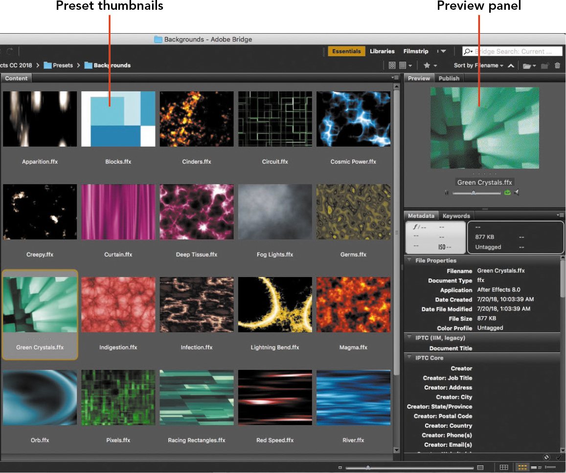
Figure 3.3 Browsing presets visually in Adobe Bridge
Tip
If double-clicking an effects preset in Bridge doesn’t automatically apply it to the selected layer in After Effects, try selecting the effects preset in Bridge before double-clicking it. If that doesn’t work, apply the effects preset from the Effects & Presets panel in After Effects.
Double-click the selected effects preset, and switch back to After Effects. The effects preset should be applied to the solid layer that was selected when you chose the Browse Presets command in the Effects & Presets panel.
Use the Preview panel to play back the composition so that you can see how the animated background looks in the composition.
This workflow is a variation on the standard effects workflow you read about in “Applying an Effect to a Layer,” in Chapter 2. In that section, you learned how to apply an effect from the Effects & Presets panel and how to edit and animate the properties of that effect in the Effect Controls panel (or the Timeline panel). The variation here is that you use Adobe Bridge as a visual browser for effects presets.
Animating Text
As you learned in Chapter 2, text in After Effects is set up with a wide range of properties that you can animate. In this chapter, you’ll explore a few more text animation techniques.
![]() ACA Objective 4.2
ACA Objective 4.2
![]() ACA Objective 4.6
ACA Objective 4.6
To follow along with the videos, first add a solid layer to the existing composition as demonstrated in Video 3.4. You created a solid layer earlier in this book, so you already know what to do. As you create this solid layer, use the default settings except for the following differences:
![]() Video 3.4
Video 3.4
Working with Solids
 Set the Height to 200 pixels.
- Set the Color to a blue color.
- After you create the solid, lower its Opacity value.
In Video 3.4, the blue color is set using hexadecimal (hex) color values. Using hex color values isn’t a requirement for animation or video editing in After Effects. You can specify color values using any of the color models that you find in the color picker (Figure 3.4).

Figure 3.4 Entering color values in the color picker shows you the equivalent color values in other color models.
You’ll probably find that the RGB color model is more commonly used for specifying color values for animation and video. Hexadecimal color is commonly used in web design. If a client or art director gives you color values in any of the color models available in the color picker, you can enter those values in the color picker to see the equivalent color values in any of the other available color models.
Note
When you create a new solid layer, the default settings are based on the composition containing it.
What are hexadecimal color values? Unlike values expressed using the ten digits (0–9) of a decimal number system or the two digits (0 and 1) of a binary number system, a hexadecimal number system uses 16 digits (0–9 and then A through F). Hex values are common in web design because computer programmers are accustomed to working with numbers using hex values.
Adjusting Text Spacing
The text animation exercise shown in Video 3.5 is similar to the text animation you created in Chapter 2. Set it up by adding two separate text layers, such as a first and last name, over the blue solid layer as shown in Video 3.5, formatting the text as needed to make it fit within the blue layer (Figure 3.5).

Figure 3.5 Setting up text layers for the animation.
![]() Video 3.5
Video 3.5
Working with Text Presets
If you need to review the text formatting options available in the Character panel, see “Exploring the Character Panel” in Chapter 2.
Note
If you apply the Justify All option in the Paragraph panel, it stretches the last line of a paragraph across the width of a text layer by adding space between letters, even if there’s only one line of text in the paragraph.
One possible area of confusion is how to control spacing. There’s more than one kind of spacing that you can apply to text in the Character panel. Here’s a quick review:
- Tracking. When you want to add or subtract the same amount of space across all selected characters, adjust tracking. This is the option adjusted in Video 3.5.
- Kerning. When you want to adjust the spacing between two characters, click the Horizontal Type Tool between them and adjust the Kerning value.
- Leading. When you want to adjust the spacing between lines of text on the same text layer, select them and adjust the Leading value. Note that this doesn’t apply to the text set up in Video 3.5, because the two lines of text that you see are actually two separate text layers of one line each. To adjust the spacing between those lines of text, you can change the vertical Position value of each text layer.
Applying a Text Animation Preset
By now, you know that you can animate the characters in a text layer by setting up keyframes for the property you want and changing the value of that property over time. For example, you could animate the Tracking property so that characters move closer together or farther apart over time.
![]() Video 3.6
Video 3.6
Using Text Animation Presets
Fortunately, it isn’t always necessary to animate properties manually. Remember the background presets you tried earlier? After Effects also offers text animation presets, and they work in a similar way.
To apply a text animation preset:
Set the current time to the time when you want the animation to start.
Select a text layer.
Tip
If double-clicking an effects preset in Bridge doesn’t automatically apply it to the selected layer in After Effects, try selecting the effects preset in Bridge before double-clicking it. If that doesn’t work, apply the effects preset from the Effects & Presets panel in After Effects.
Choose Browse Presets from the Effects & Presets panel menu to open the Presets folder in Adobe Bridge.
In Adobe Bridge, open the Text folder.
Open the folder for the text animation preset category containing the effect you want. In Video 3.5, the Animate In folder is opened in order to apply the Characters Shuffle In animation preset.
Double-click the effect you want to apply, such as Characters Shuffle In.
The animation preset should now be applied to the selected text layer in After Effects (Figure 3.6).

Figure 3.6 The Characters Shuffle In text animation preset applied to a text layer
Apply a different text animation preset to the other text layer.
Tip
Remember that you can edit the properties and keyframes of a preset that you’ve applied to a layer.
Animating Text Both In and Out
Notice that the text animation presets include both Animate In and Animate Out preset groups. So far, you’ve applied different Animate In presets to each layer. You can also apply Animate Out presets to the same text layers. All you have to do is make sure you set the current time to a frame after the last keyframe of the Animate In preset—in other words, after the Animate In preset stops playing.
If there isn’t enough composition time remaining to accommodate an Animate Out preset, you can extend the composition time as demonstrated in Video 3.6.
Trimming Footage
A standard task for video editing is to trim footage to a desired duration before adding it to a program. In After Effects, you can trim footage before you add it to a composition, and the workflow is similar to how it works in a video editing application such as Adobe Premiere Pro CC.
![]() ACA Objective 4.3
ACA Objective 4.3
![]() Video 3.7
Video 3.7
Trimming Footage
The basic trimming workflow is to open a footage item in its own window, and then set an In point and Out point to it. Those mark the new starting and ending frames for the footage. The trimmed footage is then ready to be added to a composition.
To trim footage as demonstrated in Video 3.7:
In the Project panel, double-click the colorFlow.mp4 footage item.
It opens in the Footage panel. While this looks a lot like the Composition panel, it’s important to notice that you’re looking only at a single footage item and not a composition.
Tip
If you’re ever unsure as to whether you’re looking at a composition or footage, just look at the tab for the panel you’re viewing. The tab will start with the word Composition or Footage before the name of that item.
Change the current time to when you would like the footage to begin playing.
Click the Set In Point To Current Time button.
Change the current time to when you would like the footage to stop playing.
Click the Set Out Point To Current Time button (Figure 3.7).
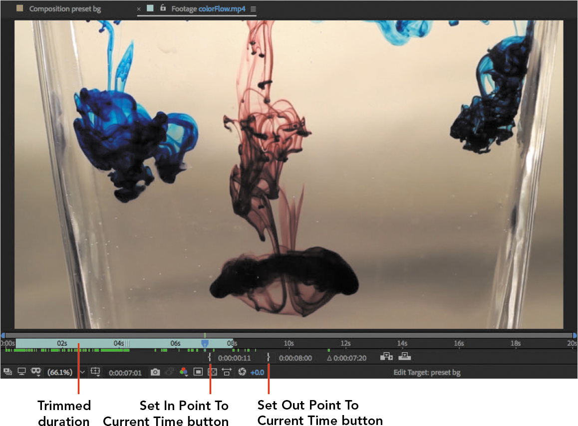
Figure 3.7 Media trimmed in the Footage panel
When this footage is added to a composition, it will include only the frames between the In point and Out point that you set.
To adjust the In point or Out point:
- In the Timeline panel, drag the left edge or right edge, respectively, of a layer. In this example, you’re trimming a layer in the Footage panel, but you may remember from Chapter 2 that the same technique works for adjusting the In point and Out point in the Timeline panel for a layer in a composition.
Practicing with Effects Presets
![]() ACA Objective 4.6
ACA Objective 4.6
![]() Video 3.8
Video 3.8
Applying Effects Presets to a Video Layer
Now that you’ve learned the basics of using effects presets, it’s time to explore them further. So far, you’ve tried applying an effects preset that generates a background and a text animation preset, but it’s just as useful to apply an effects preset to a video layer. You’ll try this by applying an effects preset to the colorFlow video layer.
To apply an effects preset to a video layer as shown in Video 3.8:
Tip
Notice that the Colorize - gold dip preset has its own Blending Mode property. This is separate from the Blending Mode property for the entire layer, so you can adjust the blending mode at both levels if it helps.
If you haven’t already added the colorFlow.mp4 to the preset bg composition, add it now.
Use the same steps you learned earlier for browsing presets and applying an effects preset to a layer, but this time apply the Colorize - gold dip preset to the colorFlow layer.
The only difference this time is that when you browse presets in Adobe Bridge, you’ll find the Colorize - gold dip preset effects preset in the Image – Creative subfolder of the Presets folder.
After applying the preset to the colorFlow layer, look at the Effect Controls panel. The properties of the effects preset are there, and you can edit them as you like (Figure 3.8).
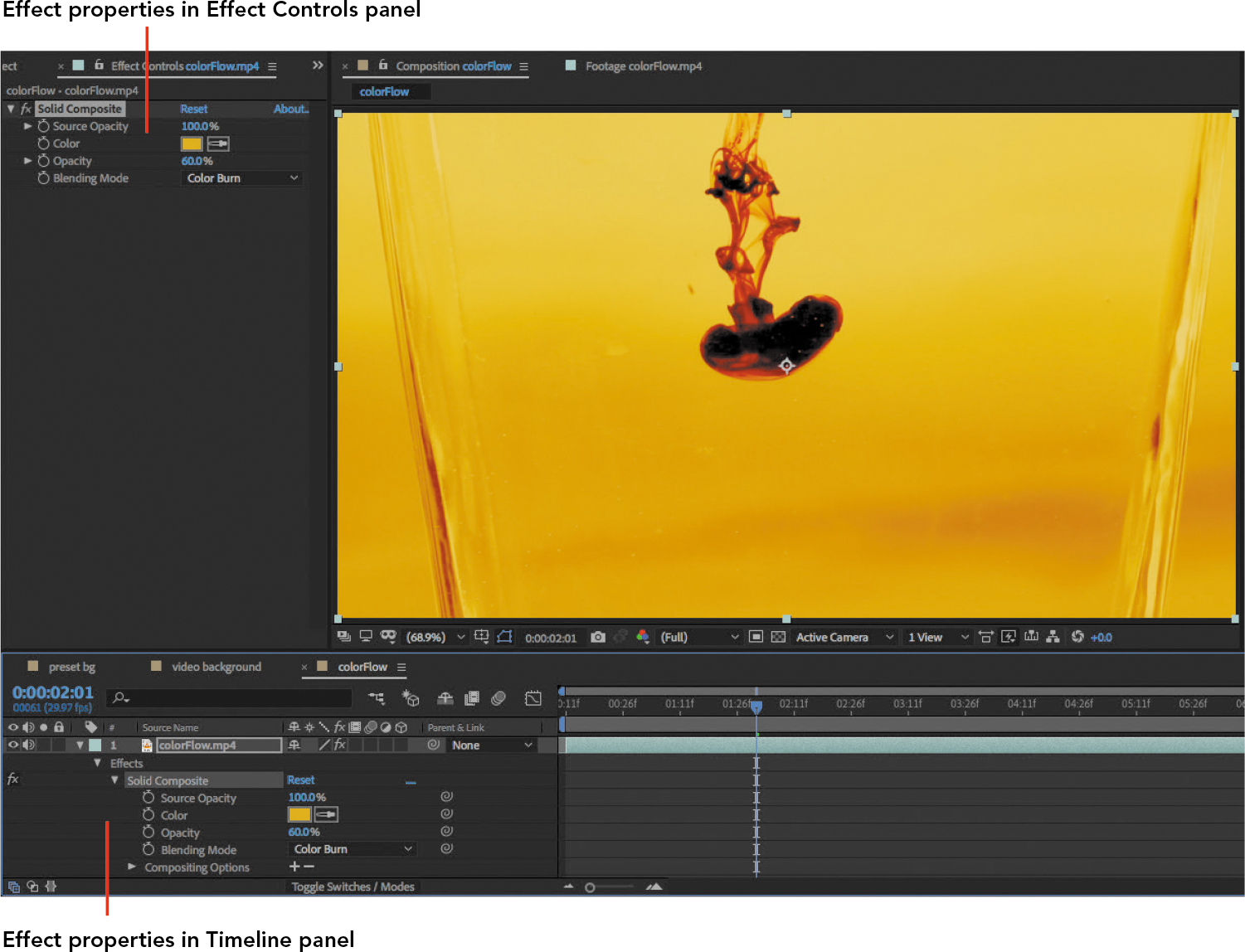
Figure 3.8 Effect properties for a selected layer
The effect properties also appear in the Effects properties group for the colorFlow layer. In either panel, you can set up keyframes to animate the effect properties.
Animating Text Along a Path
Making a line of text flow along a path adds an element of fun or surprise to a composition, since we’re used to seeing text in a straight line.
![]() ACA Objective 4.2
ACA Objective 4.2
![]() Video 3.9
Video 3.9
Animating Text Along a Path
Flowing Text Along a Path
Creating text on a path requires bringing together multiple elements that might not seem related at first. It’s easy to remember how to create text on a path when you understand how all of the elements fit together.
To flow text along a path:
Select a layer.
Draw a path with any shape tool or the pen tool.
In After Effects, drawing when a layer is selected creates a mask for the selected layer.
In the Timeline panel, expand the properties for the selected layer to find the Mask property. The Mask property did not exist until you drew a shape with the layer selected.
The last step is to tell the path to flow the text along the mask.
Expand the Path Options for the selected text layer and choose the name of the mask you just created (Figure 3.9).
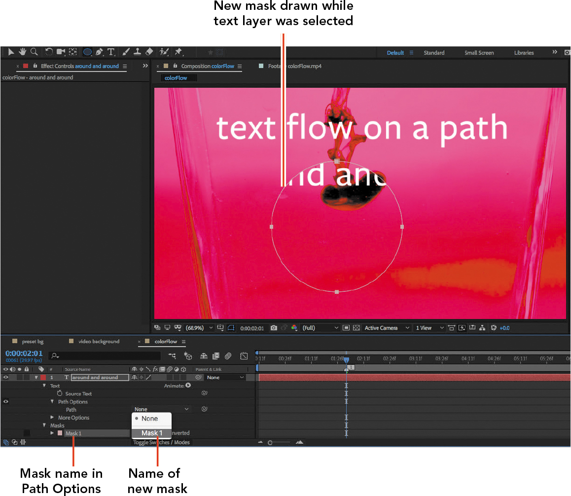
Figure 3.9 Choosing a mask name for text to flow along
After you select the mask, several options appear so that you can customize how the text appears on the path. For example, if you wish the text started at a different position along the path, adjust the First Margin option.
You can also continue to use the Character panel to adjust the properties of the characters on the path. For example, you can use the Tracking option in the Character panel to adjust the spacing between letters.
Tip
A quick way to select all of the characters on a text layer is to double-click the T icon next to the layer name in the Timeline panel.
Animating the Text
Even though you may not have animated text along a path before, by now you should be able to guess that the basics are the same as for the layers you’ve animated before: Figure out which properties you want to animate, set keyframes for them, and change the values of those properties at each keyframe.
For example, to move the text along the path:
Change the current time to the frame where you want animation to start.
For the layer of text on a path, modify the value of the First Margin property to change where the text starts.
Click the stopwatch icon for the First Margin property to enable keyframe animation and to add a keyframe at the current frame that has the current First Margin values.
Tip
Remember that you can create smoother motion by enabling Easy Ease for keyframes, as you learned earlier.
Change the current time to the frame where you want the animation to stop or change.
Change the value of the First Margin property (Figure 3.10).

Figure 3.10 Animating the First Margin property of text on a path
If the text is on a closed shape, as in the circle in Video 3.9, you can make the text move around the shape repeatedly by setting a sufficiently large difference in values between two First Margin keyframes.
Drawing a Path with the Pen Tool
Video 3.9 demonstrates animating text along a wavy line drawn with the Pen tool. At first glance, you might think that the Pen tool works like a pen on your desk, but be careful—it works differently. That’s for a good reason, which you can read about in the sidebar “Drawing Lines Precisely with the Pen Tool.” Here, you’ll use the Pen tool to quickly create a wavy path along which you’ll flow text.
![]() ACA Objective 4.5
ACA Objective 4.5
Because you want to attach a line of text, first make sure that you’ve created a text layer and that it’s selected.
To draw the wavy path:
In the Composition panel, change the magnification so you can see a little of the area outside the frame.
In the Tools panel, select the Pen tool.
Position the Pen tool just outside the left edge of the frame.
Drag the Pen tool a short distance up and to the right.
Two lines with dots extend from the anchor point as you drag (Figure 3.11). Those lines are not the path you’re drawing. They are direction lines that indicate the curvature of the segment that’s going to appear when you add the next path point. That may sound confusing, but it will become clearer after the next step.
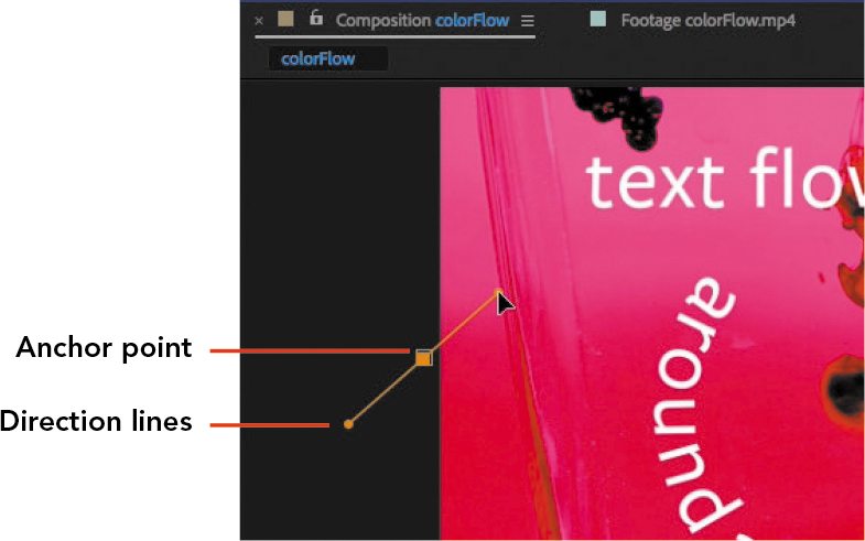
Figure 3.11 Extending direction lines from an anchor point by dragging with the Pen tool
Position the Pen tool about a quarter of the way inside the frame, at about the same vertical position as before, and this time slowly drag a short distance down and to the right (Figure 3.12).
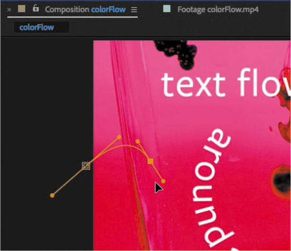
Figure 3.12 A curved path segment formed by the direction lines extending from the segment’s anchor points
As soon as you start dragging, a curved path segment appears between the two anchor points you’ve created. Notice that as you drag, you’re shaping the curvature of the segment. This is how you know when to release the mouse button; drag until it looks good, then release the mouse button.
Continue holding down the mouse button as you drag to shape the curve so that it makes a good first wave segment, and when it looks right, release the mouse button.
Position the Pen tool about halfway across the frame at roughly the same vertical position and drag a short distance up and to the right.
Repeat steps 5 and 6 to create more waves, ending just outside the right edge of the frame (Figure 3.13).
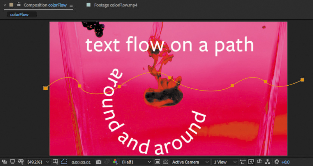
Figure 3.13 Waves drawn using the Pen tool
The other nice thing about drawing paths with anchor points is that they’re easy to precisely edit later.
To edit the path:
Switch to the Selection tool.
If the path is not selected, click it with the Selection tool.
Tip
You can reshape a curved segment by dragging it with the Selection tool.
Do one of the following:
- To change the position of an anchor point, drag it.
- To change the curvature of a curved segment, select one of the anchor points that controls it, and drag either of the control point handles that appears. If this doesn’t give you the control you expected, try selecting the segment’s other anchor point and drag its direction handles.
In the Timeline panel, the path you just drew has been added as a new numbered mask in the Masks property. You can now select it from the Path Options property to attach the text to it (Figure 3.14), as you did for the text around a circle. Once that’s done, you can then add keyframes and animate the text along the path.

Figure 3.14 Mask path in Timeline panel
Using a pen on paper, it can be difficult to draw a perfectly straight line or a smooth curve. The Pen tool is designed so that you don’t have that problem when you draw on your computer. The Pen tool is capable of quickly drawing flawless straight lines and curves. This is why the Pen tool is standard in many graphics applications, including Adobe Photoshop and Adobe Illustrator. In those applications, the Pen tool is used to draw shapes for graphics. In After Effects, the Pen tool has additional value for creating paths that serve as masks and motion paths.
The idea behind the Pen tool may not be intuitive. You don’t draw, as you do with a real pen, by dragging to form the shape you want. Instead, drawing with the Pen tool is kind of like laying down pushpins and then connecting them with straight and curved segments of wire. The pushpins mark where you want to change the direction of the line.
With the Pen tool, the line you create is called a path, and a path can have straight and curved segments. The segments are defined by anchor points, which function like the pushpins in the analogy, marking where you want to change the direction of the path.
Using the Pen tool comes down to two basic actions: clicking and dragging. If you want to create a straight path segment, you click the Pen tool to set the start and end of the path, and the Pen tool creates the straight segment connecting them. If you want to create a curved segment, drag to create an anchor point with curved path segments extending from it. The shape of the curved segments depends on how far and in which direction you drag the Pen tool (Figure 3.15).
Tip
If your're already comfortable using the pen tool in other Adobe applications such as Adobe Illustrator or Adobe Illustrator or Adobe Photoshop, or the Free Draw Bezier tool in Premiere Pro,you already know how to use the pen tool in After Effects.
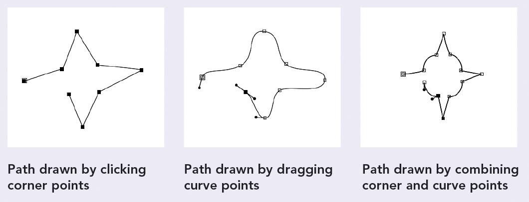
Figure 3.15 Drawing paths with the Pen tool
The clicks and drags can be changed using modifier keys such as Shift, Alt/Option, Control, and the spacebar. They do things like constrain angles, toggle a point between creating a corner or a curve, and repositioning a point as you draw. If that sounds like a lot to remember, it is. Partly because the Pen tool is so powerful and precise, it can be challenging to learn and takes practice to master. But once you learn the Pen tool, you can use that knowledge in many Adobe Creative Cloud applications.
A full tutorial of the Pen tool is outside the scope of this book, but the Pen tool is such a traditional mainstay of digital graphics that many resources are available. Because the Pen tool is fundamental to the Adobe Illustrator drawing application, you may find the best Pen tool tutorials in videos and books about Adobe Illustrator.
Using Shape Presets
You’ve learned how background presets and text animation presets can be great time-saving shortcuts for achieving appealing effects. In the same way, shape presets save you time in two ways: They come with prebuilt shapes, and those shapes are already animated. All you have to do is adapt them for your needs.
![]() ACA Objective 4.1
ACA Objective 4.1
![]() ACA Objective 4.6
ACA Objective 4.6
![]() Video 3.10
Video 3.10
Working with Shape Presets
As the name implies, shape presets are based on vector paths. When you add a shape preset to a composition, the preset appears as a new shape layer.
As with other After Effects presets, you can preview shape presets in Bridge. When you open the Shapes presets folder in Bridge, you’ll find that shape presets come in four categories:
- Backgrounds. Earlier in this chapter you saw the Backgrounds presets folder; that Backgrounds folder contains video-based (pixel-based) backgrounds. This Backgrounds folder, within the Shapes folder, is different because it contains shape-based (vector-based) backgrounds.
- Elements. In this folder are examples of static and animated graphics.
- Sprites - Animated. A sprite is an icon that can represent a player in a game or a location on a map.
- Sprites - Still. This folder contains non-animated versions of sprites.
To add a shape preset to a composition as demonstrated in Video 3.10:
Use the same steps you learned earlier for browsing for and applying an effects preset to a layer, but this time go into the Sprites – Animated folder, select SpiroMandala.ffx, and double-click it (Figure 3.16). Or select a different shape preset to add.
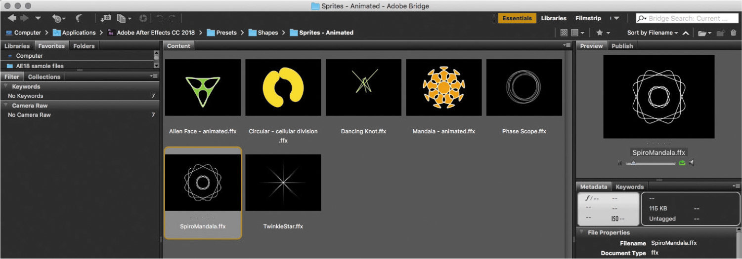
Figure 3.16 Selecting the SpiroMandala shape preset in Bridge
Note
Remember that you can reveal the properties and keyframes of any effects preset to discover how it works and customize it to your needs.
If the shape preset wasn’t automatically added to the composition when you double-clicked it in Bridge, switch to After Effects and apply it from the Effects & Presets panel.
The shape preset is added to the composition as a shape layer (Figure 3.17).

Figure 3.17 The SpiroMandala shape preset added to the composition
Using Lumetri Color
In the past, the tools for correcting color in After Effects required some familiarity with traditional tools for video color correction, or with Photoshop-style color tools such as Curves. More recently, Adobe added a set of color controls that may appear familiar and easy to learn if you’ve used photo editing tools such as Adobe Lightroom or Adobe Camera Raw; this newer set of tools is called the Lumetri Color effect.
![]() ACA Objective 2.1
ACA Objective 2.1
![]() Video 3.11
Video 3.11
Using Lumetri Color
The Lumetri Color effect is generally organized with options similar to contemporary photo editing programs. In addition, Lumetri Color is a GPU-accelerated effect, so if your computer has compatible graphics hardware, corrections you apply using Lumetri Color may render faster than older After Effects color correction features that don’t support GPU acceleration.
Tip
How do you know if an effect is GPU-accelerated? Look in the Effects & Presets pane for effects that show a GPU-accelerated effects icon (![]() ) next to the effect name.
) next to the effect name.
To correct color using the Lumetri Color effect:
In the Effects & Presets panel, find the Lumetri Color effect using the search feature or by expanding the Color Correction effects group.
Drag the Lumetri Color effect to the Timeline panel and drop it on the layer you want to correct (Figure 3.18).
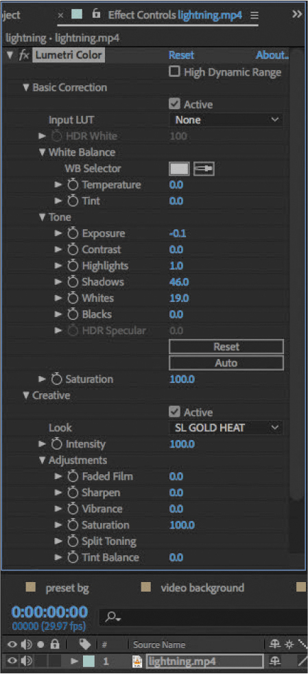
Figure 3.18 Lumetri Color effect applied to a layer
In the Effect Controls panel, adjust Lumetri Color properties as needed.
The next section is a quick overview of the Lumetri Color settings you’re most likely to use, especially in the beginning. Lumetri Color also has advanced options that you might use later for advanced color correction. For more complete descriptions of each option, visit helpx.adobe.com/after-effects/using/color-correction-effects.html#lumetri.
Looking at Lumetri Color Properties
The nice thing about Lumetri Color properties is that basic options are presented first and advanced options later, so if you’re just getting started, you can concentrate on the fundamentals. As you learn more about color correction and grading, you can then take advantage of the more advanced options.
Exploring Basic Correction Properties
You’ll probably be more comfortable adjusting the Basic Correction properties if you already have experience with the basic color controls in Adobe Lightroom or Adobe Camera Raw. The options described next (Figure 3.19) are a good starting point if you’re a beginner; understand that traditional professional video color correction typically uses a different and more complex set of color correction effects.
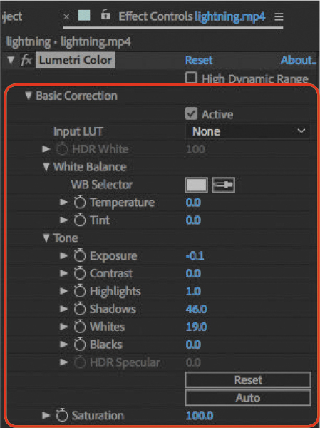
Figure 3.19 Lumetri Color Basic Correction properties
In general, you can start at the top of the list of Lumetri Color properties and work your way down the following properties:
- Input LUT. You may be used to cameras that record video that looks great out of the camera. In advanced cameras, some modes record video in a way that optimizes dynamic range more effectively for color grading, but the footage may appear washed out at first. Applying a lookup table (LUT) matched to the camera mode should produce a more natural appearance ready for color correction and grading.
- WB Selector, Temperature, and Tint. This group of tools adjusts white balance, the neutrality of image colors. When image colors are not neutral, we may perceive that the image has a color cast. For example, a warm looking image may have a yellow color cast. Temperature adjusts white balance along a blue-yellow axis, whereas Tint adjusts along a green-magenta axis. The WB selector is a quick way of setting white balance; you click the eyedropper on an area of the image that should be neutral.
- Exposure. Set the overall brightness of a layer using Exposure.
- Contrast. Adjust the difference between light and dark areas using Contrast. This Contrast property concentrates its effect on the midtones, which may be different than how contrast works in other applications.
- Highlights. Control the level of detail in very light areas using the Highlights property. For example, in a bright overcast sky, you may be able to bring out details by lowering the Highlights value.
Note
The HDR White and HDR Specular properties are available only when HDR video is selected. The video clips used in this chapter are not HDR footage.
- Shadows. Control the level of detail in very dark areas using the Shadows property. For example, in a scene with dark trees, you may be able to make details in the trees more visible by raising the Shadows value.
- Whites. Set the level at which highlights clip. Clipped highlights appear pure white (no detail).
- Blacks. Set the level at which shadows clip. Clipped shadows appear solid black (no detail).
- Saturation. Control the intensity of color with the Saturation property. As you increase this value, don’t go too far; make sure colors and especially flesh tones still look natural.
Color correction is about adjusting color, exposure, and contrast to achieve balanced color and optimal tonal range. In other words, if an image is too green and too dark, color correction addresses these problems.
Color grading is a creative process that achieves a certain look, or visual style. For example, a dark and bluish look can imply early morning or moonlight, whereas a desaturated warm-toned look can imply that a scene is from the past.
Exploring Creative Properties
When you finish color-correcting, you have the option of moving on to creative adjustments or color grading. Although you can also create a custom look by applying other color effects or making further adjustments to the Basic corrections, there is quite a bit you can do with the provided Creative options (Figure 3.20):
- Look. Apply a visual style to a layer using the Look menu. Because looks are intended to create an impression, such as a mood or time of day, applying a look is an optional step. For example, you might not want to apply a look to an instructional video. Many of the looks are based on traditional film stocks or color filter types.
- Intensity. Adjust the strength of a look using the Intensity property. For example, if you like a look but it seems too strong, you can lower the Intensity value.
- Adjustments. Use the Adjustments group of properties to make additional creative changes to a layer. You can use these to refine a look, but they also work independently of the look. In other words, you can use the Adjustments properties even if you didn’t apply a look.
- Faded Film. When you want to make a layer of video footage appear to be aged, like footage shot to appear to be from a past decade, you can increase the Faded Film value.
- Sharpen. If a layer of video footage seems a little soft, you can increase the Sharpen value.
- Vibrance. The Vibrance property is similar to the Saturation property discussed next. The difference is that Vibrance is designed to avoid clipping as colors approach maximum saturation and to protect flesh tones from over saturation. For these reasons, adjusting Vibrance is often preferable to adjusting Saturation.
- Saturation. Adjust the intensity of layer colors. You probably noticed that Saturation also exists in the Basic Correction group of properties, where it’s used for color correction; in the Creative group it’s used for color grading.
- Split Toning. Some creative or color grading effects depend on the color of highlights being different from the color of shadows; the Split Toning property lets you make those separate adjustments.
- Curves. Adjust the Curves property to tune contrast over specific ranges of a layer’s tonal range. If you’re experienced with Adobe Photoshop, the Curves property serves the same function as the Curves command in Photoshop.
- Vignette. When you want to darken the corners and edges of a frame, adjust the Vignette option.
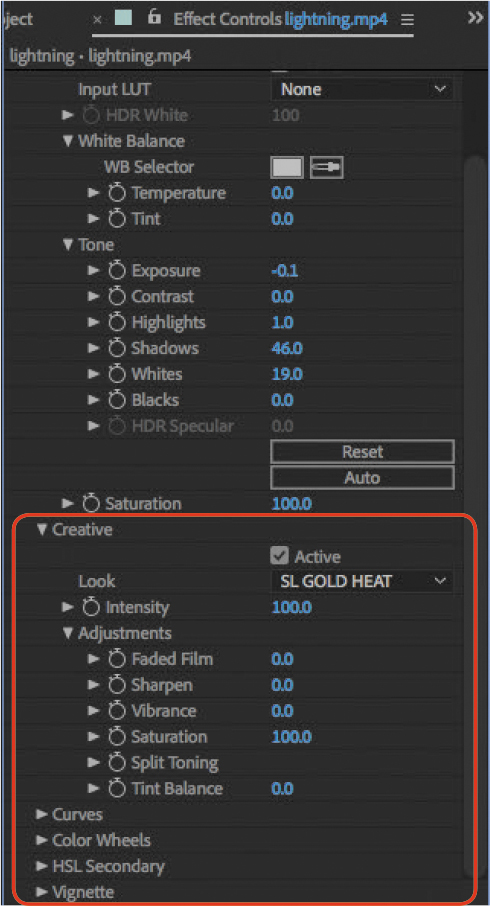
Figure 3.20 Lumetri Color Creative properties
Many of the other options you see in the Creative properties group are not within the scope of this book because they’re more advanced. If you want to learn more about them, visit https://helpx.adobe.com/premiere-pro/using/color-workflows.html.
Applying a Lightning Animation Preset
With most of the effects you’ve tried so far, you’ve edited them by changing values in the Effect Controls panel or Timeline panel. This time you can try an effect that has interactive controls. Instead of having to figure out what numbers to change to get the effect you want, you manipulate the effect directly and visually.
![]() ACA Objective 4.6
ACA Objective 4.6
Several lightning effects are available in After Effects. The specific effect used in Video 3.12 is the Lightning - Horizontal animation preset, which is based on the Advanced Lightning effect.
![]() Video 3.12
Video 3.12
Applying a Lightning Animation Preset
To apply the Lightning - Horizontal animation preset as demonstrated in Video 3.12 (Figure 3.21):
Set the current time to the frame where you want the lightning effect to begin. It should be at the time after the woman removes her eyeglasses, when she begins to stare at the watermelon.
Tip
Remember that you can use the search field in the Effects & Presets panel to find an effect name instantly.
Choose Layer > New > Solid, name it Lightning, and click OK to create it using default settings that match the composition.
In the Effects & Presets panel, find the Lightning - Horizontal effect in the Animation Presets > Synthetics effects group.
Drag the Lightning - Horizontal animation preset from the Effects & Presets panel and drop it on the Lightning solid you created.

Figure 3.21 Lightning - Horizontal animation preset applied to a layer, but not yet adjusted
In the Effect Controls panel or the Timeline panel, you can see that the Lightning - Horizontal animation preset is based on the advanced Lightning effect.
If you play back the composition now, you’ll find that the lightning effect isn’t properly lined up with the face and the watermelon. This is where you can adjust the effect using interactive controls.
To edit the Lightning - Horizontal animation preset visually:
In the Effect Controls panel, make sure the properties for the Advanced Lightning effect are expanded.
Notice that there’s a position icon to the left of the position values for the Origin and Direction properties.
In the Effect Controls panel, click the position icon (
 ) for the Origin property.
Crosshairs appear in the Composition panel to let you know that you’ve activated an interactive position control and to visually indicate the current position of that property.
In the Composition panel, click where you want the lightning to start, such as one of the eyes on the face.
After you click the crosshairs, you should see a small circular red target icon (
 ) where the crosshairs intersect. Whenever you see the small circular icon, you can drag it to reposition the Origin property of the effect.
In the Effect Controls panel, click the position icon for the Direction property.
In the Composition panel, click where you want the lightning to end, such as on the watermelon. If it isn’t quite in the right place, drag the red circle to reposition it (Figure 3.22).
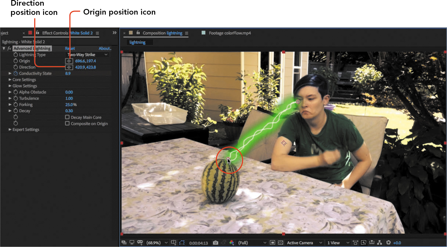
Figure 3.22 Dragging to adjust the Direction position
Tip
If you prefer, you can adjust the Origin and Direction properties by editing or scrubbing the values. The interactive controls are simply another option for you.
As shown in Video 3.12, you can enhance the effect in the following ways, using techniques you’ve already learned:
- Add keyframes to animate the Direction property so that it starts out positioned over the face and extends the lightning bolt until it hits the watermelon.
- Change the glow color by clicking the color swatch next to the Glow Color property.
- Make two lightning bolts extend from both eyes by duplicating the Lightning layer and adjusting the Origin and Direction properties on the duplicate layer.
Exporting the Composition
A composition isn’t complete until you’ve made sure that it exports as you expected. It’s now time to export this composition.
![]() ACA Objective 1.4
ACA Objective 1.4
![]() ACA Objective 5.1
ACA Objective 5.1
![]() ACA Objective 5.2
ACA Objective 5.2
![]() Video 3.13
Video 3.13
Exporting Your Composition
This isn’t the first time you’ve exported a composition, and Chapter 2 provided an overview of the options in each panel. Video 3.14 discusses several options in more detail.
Frame Dimensions
In the Video tab of the Export Settings dialog box, the Width and Height options set the dimensions of the exported video frame in pixels.
Although in many cases you’ll want the Width and Height values to match the frame dimensions of the composition you’re exporting, they don’t have to. For example, you can create a composition at UHD 4K dimensions (3840x2160 pixels) and export a version of it at 2K 1080p (1920x1080 pixels) or 720p (1280x720 pixels).
When you export at frame dimensions that are different than the composition, you’ll typically want to make sure that the export frame dimensions maintain the same aspect ratio as the composition so that the exported frame doesn’t appear distorted.
Aspect Ratio
The ratio of width to height is called the aspect ratio of a frame. Aspect ratio is another way of saying the proportions of a frame (Figure 3.23).
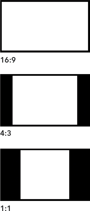
Figure 3.23 Examples of some common aspect ratios
Today’s high-definition televisions typically have an aspect ratio of 16:9, meaning they are 16 units wide by 9 units tall. When you want to maintain that aspect ratio, all you have to do is make sure the frame dimensions are an even multiple of or produce the same ratio as 16 and 9. For example, if you have a 1920x1080 pixel frame, 1920 divided by 1080 is 1.77, and 16 divided by 9 is also 1.77, so a 1920x1080 pixel frame is consistent with a 16:9 aspect ratio.
Old standard definition televisions had an aspect ratio of 4:3. Although 4:3 is no longer a common aspect ratio for televisions, 4:3 screens are still used for some devices, so at times you may need to design and export video for a screen with a 4:3 aspect ratio.
A 1:1 aspect ratio means the width and height are the same. In other words, the frame is a square. Square videos are not common, although they do turn up on social media sites such as Instagram.
If there is a mismatch between the composition aspect ratio and the export aspect ratio, the resulting empty space will be filled by black bars. If you unexpectedly get black bars in exported video, compare the pixel dimensions of the composition and the export settings and make sure their aspect ratios are consistent.
Audio Specifications
As with exporting video, in many cases audio export settings are determined by the preset you chose, so you often don’t have to think about them. Still, it’s good to know the basics of audio export settings. Video 3.13 discusses two settings in particular:
- Sample Rate. The sample rate of audio is how many times per second the recorded sound was sampled as it was digitized. The sample rate works the same way as resolution for a video frame: More samples per second results in a more detailed digital representation, which generally results in higher quality. The two most common sample rates are 48000Hz and 44100Hz; these are sometimes expressed as 48kHz and 44.1kHz.
- Bitrate. The bitrate is how much audio data is transferred per second. As with the video bitrate, a higher audio bitrate results in higher quality, but also a higher file size and requiring more bandwidth for streaming or downloading. But keep in mind that audio is a relatively small proportion of file size compared to the video component.
What video and audio settings should you use? As with your composition settings, start with the delivery requirements set by your final output or your client. If there is a preset that represents those requirements, such as YouTube 1080 HD, choose that preset. An appropriate preset will set both video and audio options properly for you (Figure 3.24).
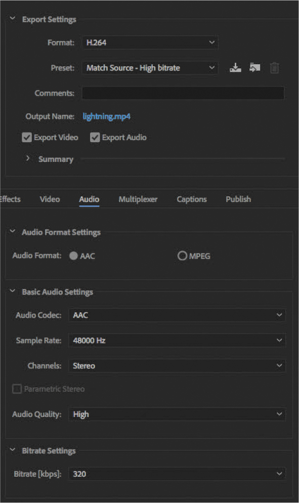
Figure 3.24 Export options for audio
Diving Deeper into Workspaces
Being able to customize your workspace can help you achieve maximum productivity in After Effects, so Video 3.14 takes a more detailed look at panels and workspaces.
![]() ACA Objective 2.2
ACA Objective 2.2
![]() Video 3.14
Video 3.14
Panels and Workspaces
Take this opportunity to review and practice what you learned about After Effects workspaces in Chapter 1. At this point, you should know how to do the following:
- Open a panel that is not currently visible.
- Resize a panel.
- Rearrange panels by docking.
- Rearrange panels by grouping.
- Restore the last saved version of a workspace.
- Choose a different workspace.
Experiment and practice selecting, modifying, saving, and restoring workspaces. Remember how to use drop zones to control where a dragged panel will fall.
If you have not yet worked with the workspace bar on the right side of the Tools panel (Figure 3.25), take a moment to explore it. It’s a convenient alternative to managing workspaces with the Window menu, because the workspace bar can be visible at all times. To use the workspace bar:
If the workspace bar isn’t visible, choose Window > Tools.
To switch to another workspace, click its name in the workspace bar.
If the list of workspaces is too long for the width of the workspace bar, click the overflow menu to choose a workspace name that isn’t visible on the bar.
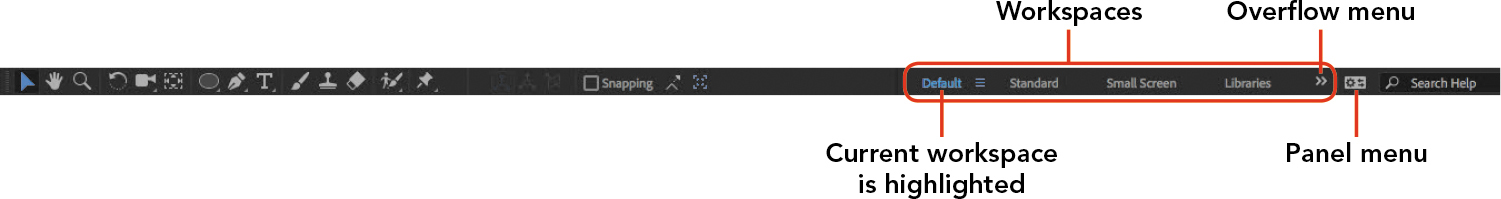
Figure 3.25 Workspace bar
To customize the Workspaces bar, use the Edit Workspaces dialog box.
To open the Edit Workspaces dialog box, do one of the following:
- Click the overflow menu in the workspace bar and choose Edit Workspaces.
- Click the panel menu next to the name of the current workspace in the workspace bar and choose Edit Workspaces.
- Choose Window > Workspace > Edit Workspaces.
In the Edit Workspaces dialog box (Figure 3.26), drag to organize the names of workspaces in the list:
- To change the order of the workspaces, drag them up or down in the list. For example, you might drag your favorite workspace to the top of the list so that it appears first in the Workspaces bar.
- To make a workspace appear on the Workspaces bar, drag it into the Bar group.
- To make a workspace appear in the overflow menu, drag it into the Overflow Menu group.
- To hide a workspace from both the Workspaces bar and the overflow menu, drag it into the Do Not Show group.
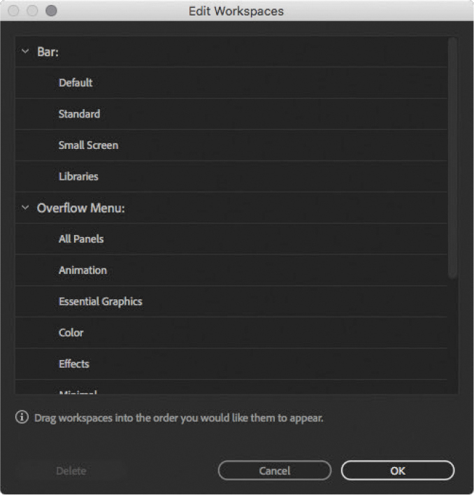
Figure 3.26 The Edit Workspaces dialog box
Click OK.
You can create your own workspace and add it to the list.
Tip
Can’t see all of the workspaces at once in the Edit Workspaces dialog box? Instead of scrolling, you can make the dialog box bigger by dragging any corner or edge.
To create a workspace:
Show and hide panels so that only the panels you want to see are visible.
Arrange panels as you prefer.
Choose Window > Workspace > Save As New Workspace.
Enter a name for the new workspace and click OK.
The workspace is added to the list, so you can now manage it along with the other workspaces.
Challenge
Now that you’ve played with a wide range of effects and effects presets, try a few more of them. Consider revisiting the Baxter Barn project from Chapter 1 or the Ruby’s Diner project from Chapter 2 and enhancing them with some effects presets and animation presets of your own choosing.