Chart Your Course
In This Chapter
From Graphical to Geo-graphical

We live in a world today where image is everything. Color and graphics are used to add interest and convey meaning. This is true not only for TV, newspapers, and magazines, but also for some of the reports you create.
Reports going to managers or executives need to provide the quick, concise communication of charts and graphics. Reports shared with customers need the polish provided by a well-placed image or two. Reporting Services has the tools you need to effectively communicate and impress in each of these situations.
In this chapter, we explore the chart and the gauge data regions and how they can be used to summarize and express data. We also use the image report item to add graphics to our reports. Throughout the chapter, we look at properties that can be used to format the report output and creative ways to control those properties.
In many cases, the best way to convey business intelligence is through business graphics. Bar charts, pie charts, and line graphs are useful tools for giving meaning to endless volumes of data. They can quickly reveal trends and patterns to aid in data analysis. They compress lines upon lines of numbers into a format that can be understood in a moment.
In addition, charts can increase the reader’s interest in your information. A splash of color excites the reader. Where endless lines of black on white lull people to sleep, bars of red and blue and pie wedges of purple and green wake people up.
You create charts in Reporting Services using the chart report item. The chart report item is a data region like the tablix. This means the chart can process multiple records from a dataset. The tablix enables you to place other report items in a row, a column, or a list area, which is repeated for every record in the dataset. The chart, on the other hand, uses the records in a dataset to create bars, lines, or pie wedges. You cannot place other report items inside a chart item.
In the next sections of this chapter, we explore the many charting possibilities provided by the chart report item.
Creating a report using the chart report item
Using multiple series
Copying an existing report
Using scale breaks
Using a secondary value axis
Business Need Galactic Delivery Services (GDS) needs to determine if there is a correlation between the number of deliveries in a month and the number of lost packages in that same month. The best way to perform this analysis is by creating a chart of the number of deliveries and the number of lost packages over time.
1. Create a New Report and Two Datasets
2. Place a Chart Item on the Report and Populate It
3. Explore Alternative Ways to Present the Deliveries and Lost Packages Together
 SSDT and Visual Studio Steps
1. Create a new Reporting Services project called Chapter06 in the MSSQLRS folder. (If you need help with this task, see Chapter 5.)
2. Create a shared data source called Galactic for the Galactic database. (Again, if you need help with this task, see Chapter 5.)
3. Add a blank report called DelvLostPkgChart to the Chapter06 project. (Do not use the Report Wizard.)
4. In the Report Data window, click the New drop-down menu. Select Data Source from the menu that appears. The Data Source Properties dialog box appears.
5. Enter Galactic for the name.
6. Select the Use shared data source reference radio button, and select Galactic from the drop-down list. Click OK.
7. In the Report Data window, right-click the entry for the Galactic data source, and select Add Dataset from the context menu. The Dataset Properties dialog box appears.
8. Enter TransportList for the name.
9. Click the Query Designer button. The Query Designer window opens displaying the Graphical Query Designer.
10. We do not need the aids provided by the Graphical Query Designer, so we will switch to the Generic Query Designer. Click the Edit as Text button to make this switch.
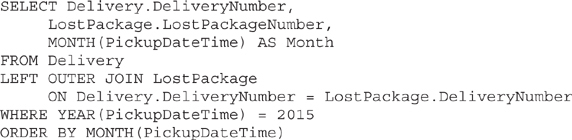
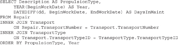
11. Enter the following in the SQL pane of the Generic Query Designer window:
12. Click the Run Query (red exclamation point) button on the Generic Query Designer toolbar to run the query and make sure no errors exist. Correct any typos that may be detected. Click OK to exit the Query Designer window. Click OK to exit the Dataset Properties dialog box.
 Report Builder Steps
1. Using the web portal, create a new folder in the Galactic Delivery Services folder. Enter Chapter06 as the name of this folder. (If you need help with this task, see Chapter 5.)
2. Launch Report Builder from the web portal.
3. With New Report highlighted in the left column, click Blank Report. The Report Builder shows a new blank report.
4. In the Report Data window, click the New drop-down menu. Select Data Source from the menu that appears. The Data Source Properties dialog box appears.
5. Enter Galactic for the name.
6. Make sure the Use a shared connection or report model radio button is selected, and select Galactic from the area below it. Click OK. An entry for the Galactic data source appears in the Report Data window.
7. In the Report Data window, right-click the entry for the Galactic data source, and select Add Dataset from the context menu. The Dataset Properties dialog box appears.
8. Enter TransportList for the name.
9. Click the Query Designer button. The Query Designer window opens displaying the Graphical Query Designer.
10. Click the Edit as Text button to switch to the Generic Query Designer.
11. Enter the following in the SQL pane (upper portion) of the Generic Query Designer window:
12. Click the Run Query (red exclamation point) button on the Generic Query Designer toolbar to run the query and make sure no errors exist. Correct any typos that may be detected. Click OK to exit the Query Designer window. Click OK to exit the Dataset Properties dialog box.
Task Notes We created the dataset for this report by typing a query in the SQL pane of the Generic Query Designer. The graphical tools of the Graphical Query Designer are helpful if you are still learning the syntax of SELECT queries, or if you are unfamiliar with the database you are querying. However, it is more efficient to simply type the query into the SQL pane or the Dataset Properties dialog box. In addition, some complex queries must be typed in because they cannot be created through the Graphical Query Designer.
Throughout the remainder of this book, we type our SELECT statements rather than create them using the Graphical Query Designer. This enables us to quickly create the necessary datasets and then concentrate on the aspects of report creation that are new and different in each report. As you create your own reports, use the interface—Graphical Query Designer or Generic Query Designer—with which you are most comfortable.
In the query for this report, we join the Delivery table, which holds one record for each delivery, with the LostPackage table, which holds one record for each package lost during delivery. Because only some Delivery table records have associated LostPackage table records (at least we hope so), we need to use the LEFT OUTER JOIN to get all of the Delivery records joined with their matching LostPackage records. In our chart, we can count the number of DeliveryNumbers and the number of LostPackageNumbers to determine the number of deliveries and the number of lost packages.
SSDT, Visual Studio, and Report Builder Steps
1. Drag the edges of the design surface to make it larger so the design surface fills the available space on the screen.
2. If you are using Report Builder, select the Click to add title text box and delete it. (The title will be contained within the chart itself.)
3. If you are using SSDT or Visual Studio, select the chart report item in the Toolbox window. If you are using Report Builder, click on Chart in the Insert ribbon, and select Insert Chart. Click and drag to place the chart on the design surface. The chart should cover almost the entire design surface because it will be the only item on the report.
4. After you place the chart on the report, the Select Chart Type dialog box appears. As you can see, the chart report item is extremely flexible. Click the first item in the Line row as shown here. This creates a simple line graph.

5. Click OK to exit the Select Chart Type dialog box. You will see a representation of the chart on the design surface.
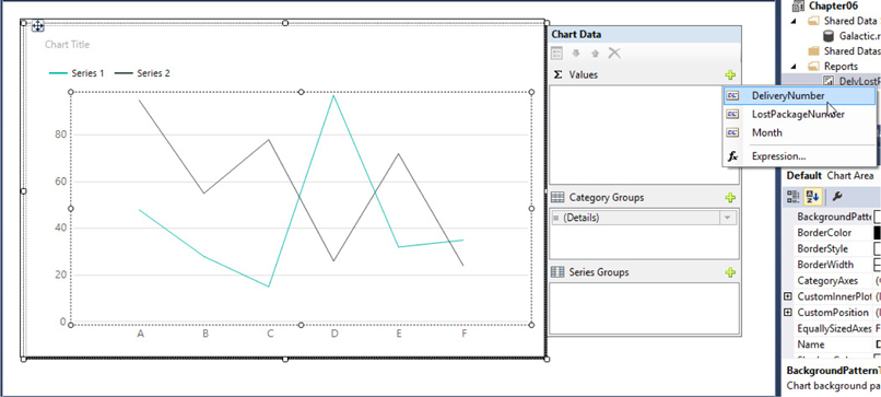
6. Double-click anywhere on the chart. The Chart Data window with three field areas appears to the right of the chart. (You may have to scroll to see it.) The three field areas are Values, Category Groups, and Series Groups.
 NOTE
NOTE
You make the Chart Data window disappear by clicking somewhere on the Design tab that is not covered by the chart. Clicking the chart once will select the chart so you can move and size it. Clicking the chart a second time will cause the Chart Data window to reappear.
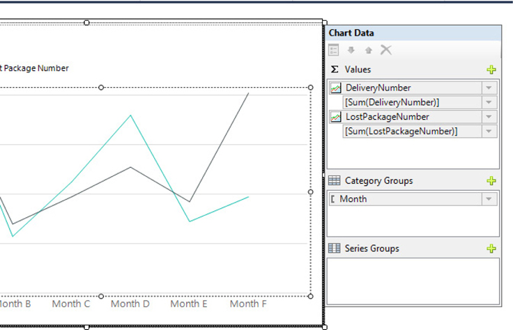
7. Click the plus sign next to the Values area. A field selector drop-down list appears. Select DeliveryNumber as shown.
8. Click the plus sign next to the Values area again. A field selector drop-down list appears. Select LostPackageNumber.
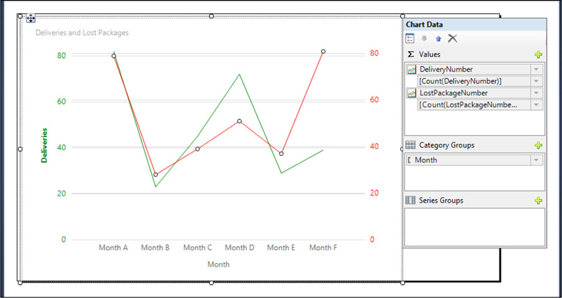
9. Click the plus sign next to the Category Groups area. A field selector drop-down list appears. Select Month. The report layout should appear similar to the following illustration.
10. Select the drop-down arrow next to the [Sum(DeliveryNumber)] item in the Values area, and select Aggregate | Count from the context menu. The entry will change to [Count(DeliveryNumber)].
11. Right-click the [Count(DeliveryNumber)] entry and select Series Properties from the context menu. The Series Properties dialog box appears.
12. Select the Legend page of the Series Properties dialog box. Type Deliveries in the “Custom legend text” text box.
13. Select the Fill page of the Series Properties dialog box. Select Green from the Color drop-down color picker.
14. Click OK to exit the Select Properties dialog box.
15. Select the drop-down arrow next to the [Sum(LostPackageNumber)] item in the Values area, and select Aggregate | Count from the context menu. The entry will change to [Count(LostPackageNumber)].
16. Right-click the [Count(LostPackageNumber)] item in the Values area, and select Series Properties from the context menu. The Series Properties dialog box appears.
17. Select the Legend page of the Series Properties dialog box. Type Lost Packages in the “Custom legend text” text box.
18. Select the Fill page of the Series Properties dialog box. Select Red from the Color drop-down color picker.
19. Click OK to exit the Select Properties dialog box.
20. Double-click the words “Chart Title” to edit the text of the chart title. Replace the words “Chart Title” with Deliveries and Lost Packages.
21. Right-click the horizontal axis across the bottom of the chart. Select Show Axis Title from the context menu to check this item. The title for the horizontal axis appears.
22. Double-click the words “Axis Title” below the horizontal axis (the axis with Month A, Month B, etc.). Replace the words “Axis Title” with Month.
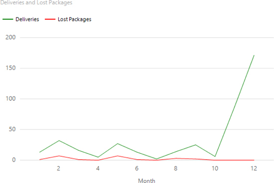
23. If you are using SSDT or Visual Studio, click the Preview tab. If you are using Report Builder, click the Run button. Your report appears similar to the illustration.
Task Notes You have now seen how easy it is to create a chart using the chart report item. Simply select the type of chart you want, select the fields from your dataset into the appropriate areas of the Chart Data window, and you have a functioning chart. In the next sections, we explore ways to manipulate the properties of the chart to create more complex results.
The fields you select in the Values area, DeliveryNumber and LostPackageNumber in this report, provide the values for the data points on the chart. Each field creates a series of data points—in this case, a single line—on the graph. The scale for these values is along the vertical axis in this line chart. Therefore, the vertical axis is known as the value axis.
The fields you select in the Category Groups area, Month in this report, provide the labels for the horizontal axis of the chart. This axis is called the category axis. These category fields also group the rows from the dataset into multiple categories. One data point is created on the category axis for each category in each series.
Because the category fields create groups, we need to use aggregate functions with the values we are charting. Because the DeliveryNumber and LostPackageNumber fields are numeric data types, the Sum() aggregate function was chosen by default. Of course, the sum of the Delivery Numbers or the Lost Package Numbers makes no sense. Instead, we want to count the number of deliveries and the number of lost packages. For this reason, we changed both to the Count() aggregate function.
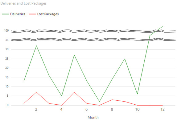
Notice in our graph the number of deliveries jumps up to over 150 in month 12. This makes it difficult to see the line for the lost packages. In Task 3, we explore three alternatives for dealing with this issue. We will make three copies of this report to try out these three alternatives.
SSDT, Visual Studio, and Report Builder Steps
1. Return to design mode.
2. If you are using SSDT or Visual Studio, click Save All in the toolbar. If you are using Report Builder, save the report under the name “DelvLostPkgChart” in the Chapter06 folder you created on the report server.
3. If you are using SSDT or Visual Studio, right-click the DelvLostPkgChart.rdl entry in the Solution Explorer window, and select Copy from the context menu. Then, right-click the Chapter06 entry in the Solution Explorer window, and select Paste from the context menu. A copy of the DelvLostPkgChart report is added to the project. Repeat this twice more so the project contains the original report plus three copies.
4. If you are using SSDT or Visual Studio, close the DelvLostPkgChart report. Double-click the Copy of DelvLostPkgChart.rdl entry in the Solution Explorer window. The Design tab for this report is displayed.
5. Right-click the value axis on this chart, and select Vertical Axis Properties from the context menu. The Vertical Axis Properties dialog box appears, as shown here.
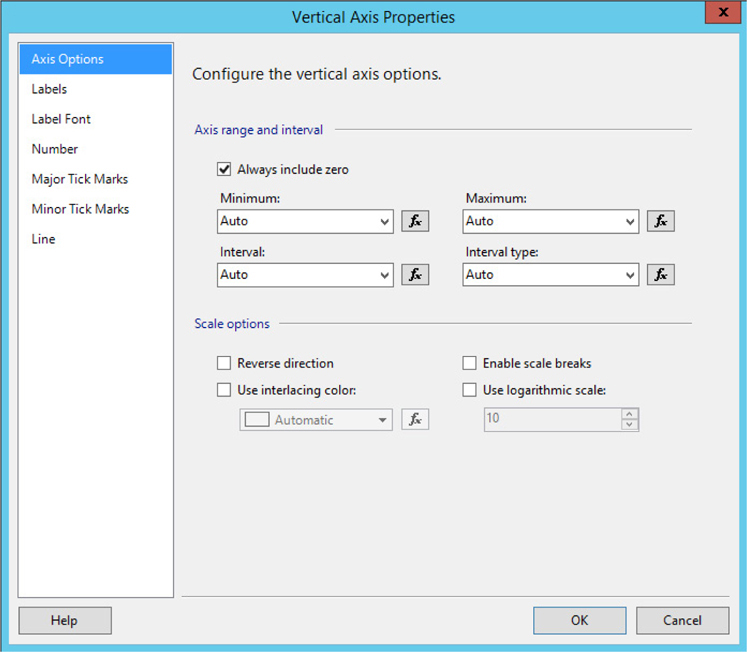
6. Check the Enable scale breaks check box.
7. Click OK to exit the Value Axis Properties dialog box.
8. Preview/run the report. The value axis now contains two scale breaks, as shown.
9. If you are using SSDT or Visual Studio, click Save All in the toolbar. Close the Copy of DelvLostPkgChart report.
10. If you are using Report Builder, click the File tab on the ribbon, and select Save As from the menu. Save the report as “Copy of DelvLostPkgChart” in the Chapter06 folder.
11. If you are using SSDT or Visual Studio, double-click the Copy (2) of DelvLostPkgChart.rdl entry in the Solution Explorer window. The Design tab for this report is displayed.
12. If you are using Report Builder, click the File tab of the ribbon, and select DelvLostPkgChart from the Recent Documents area to reopen the DelvLostPkgChart report.
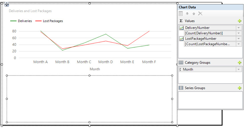
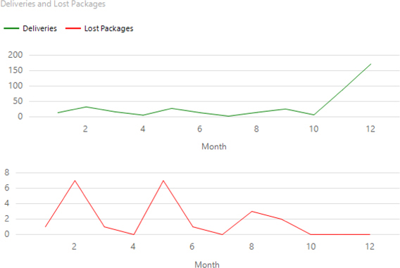
13. Right-click the center of the chart, and select Chart | Add New Chart Area from the context menu. The chart splits into two regions: one above and one below. The lower portion appears as an empty rectangle, as shown. The upper chart area is known as the Default area, and the lower chart area is given the name Area1.
14. Right-click the Count(LostPackageNumber) entry in the Values field area of the Chart Data window. (It may be cut off so it appears as “Count(LostPackageNumbe…”) Select Series Properties from the context menu. The Series Properties dialog box appears.
15. Select the Axes and Chart Area page of the dialog box.
16. The Chart area drop-down list determines which chart area this series will appear in. Select Area1 from the Chart area drop-down list. This is shown in the following illustration.

17. Click OK to exit the Series Properties dialog box.
18. Preview/run the report. The report appears as shown.
19. If you are using SSDT or Visual Studio, click Save All in the toolbar. Close Copy (2) of DelvLostPkgChart report.
20. If you are using Report Builder, click the File tab on the ribbon, and select Save As from the menu. Save the report as “Copy (2) of DelvLostPkgChart” in the Chapter06 folder.
21. If you are using SSDT or Visual Studio, double-click the Copy (3) of DelvLostPkgChart.rdl entry in the Solution Explorer window. The Design tab for this report is displayed.
22. If you are using Report Builder, click the File tab on the ribbon, and select DelvLostPkgChart from the Recent Documents area to reopen the DelvLostPkgChart report.
23. Click twice on the chart so the Chart Data window is displayed.
24. Right-click the Count(LostPackageNumber) entry in the Values area. Select Series Properties from the context menu. The Series Properties dialog box appears.
25. Select the Axes and Chart Area page of the dialog box.
26. Select Secondary from the Vertical axis radio buttons.
27. Click OK to exit the Series Properties dialog box. A secondary value axis appears on the right side of the chart, as shown here.
28. Right-click the new secondary axis. Select Show Axis Title from the context menu to check this item. Double-click the words “Axis Title” that just appeared.
29. Replace the words “Axis Title” with Lost Packages. Press enter.
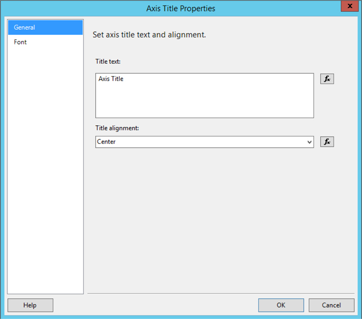
30. Right-click the words “Lost Packages” and select Axis Title Properties from the context menu. The Axis Title Properties dialog box appears.
31. Select the Font page of the Axis Title Properties dialog box.
NOTE
If you ended up with a different default color scheme for your chart and the deliveries line is a color other than green or the lost packages line is a color other than red, simply adapt the following steps to pick the appropriate colors for the two axes.
32. Select Red from the Color drop-down color picker.
33. Check the Bold check box.
34. Click OK to exit the Axis Title Properties dialog box.
35. Right-click the secondary vertical axis itself (the axis on the right side). Select Secondary Vertical Axis Properties from the context menu. The Secondary Vertical Axis Properties dialog box appears.
36. Select the Label Font page of the dialog box.
37. Select Red from the Color drop-down color picker.
38. Select the Major Tick Marks page of the dialog box.
39. Select Red from the Line color drop-down color picker.
40. Select the Line page of the dialog box.
41. Select Red from the Line color drop-down color picker.
42. Click OK to exit the Secondary Vertical Axis Properties dialog box.
43. Right-click the vertical axis on the left side of the chart. Select Show Axis Title from the context menu to check this item. The title for the primary axis on the left side appears.
44. Double-click the words “Axis Title” associated with the primary axis.
45. Replace the words “Axis Title” with Deliveries. Press enter.
46. Right-click the word “Deliveries” that you just added, and select Axis Title Properties from the context menu. The Axis Title Properties dialog box appears.
47. Select the Font page of the Axis Title Properties dialog box.
48. Select Green from the Color drop-down color picker.
49. Check the Bold check box.
50. Click OK to exit the Axis Title Properties dialog box.
51. Right-click the vertical axis next to the Deliveries label (the axis on the left side). Select Vertical Axis Properties from the context menu. The Vertical Axis Properties dialog box appears.
52. Select the Label Font page of the dialog box.
53. Select Green from the Color drop-down color picker.
54. Select the Major Tick Marks page of the dialog box.
55. Select Green from the Line color drop-down color picker.
56. Select the Line page of the dialog box.
57. Select Green from the Line color drop-down color picker.
58. Click OK to exit the Vertical Axis Properties dialog box.
59. Right-click the legend area where “Deliveries” appears next to a green line and “Lost Packages” appears next to a red line. Select Delete Legend from the context menu. The legend disappears.
60. Preview/run the report. The report appears as shown.

61. If you are using SSDT or Visual Studio, click Save All in the toolbar.
62. If you are using Report Builder, click the File tab on the ribbon, and select Save As from the menu. Save the report as “Copy (3) of DelvLostPkgChart” in the Chapter06 folder.
Task Notes In this task, we see three methods for analyzing two series with different value ranges on the same chart. In the first copy of the DelvLostPkgChart, we enabled scale breaks. Scale breaks allow portions of the scale that do not contain any values to be skipped over in the chart. On our chart, there are no values between 32 and 86, nor between 86 and 172, so these portions of the scale are eliminated from the chart.
In the second copy of the DelvLostPkgChart, we use a second chart area to display one of the two series. Each chart area has its own vertical axis, so each axis can size itself appropriately. Of course, a similar effect could be achieved by placing two chart items on a single report, one below the other. Using a single chart report item with two chart areas enables us to label both series in a single legend and ensures the category axes of both chart areas will stay aligned.
For the third copy of the DelvLostPkgChart, we use a secondary value axis to display the scale for one of the two series. As with the second chart area, this approach allows each series to have its own scale that will adapt to its own range of values. Using a secondary axis can make the chart confusing unless we provide enough visual cues to tell the user which series goes with which axis. This is why we took the time to color-code all of the various parts of the two vertical axes.
In the previous chapter, you saw the tablix has a single property dialog box that allows you to manipulate most of the important properties of the tablix. Now we see the chart report item works differently. It has multiple property dialog boxes that correspond to its various parts. To change the properties of the chart title, we right-click the chart title and select Title Properties; to change the properties of a vertical axis, we right-click that vertical axis and select Vertical Axis Properties; and so on. When you want to modify a particular item in a chart, right-click that item, and odds are there will be a property dialog box available right there that will enable you to make the change.
Using a series group
Refining the look of the chart to best present the information
Business Need Galactic Delivery Services needs to analyze the fluctuations in the price of fuel from month to month. The best way to perform this analysis is by creating a chart of the price over time. The user needs to be able to select the year from a drop-down list.
1. Create a New Report and Two Datasets
2. Place a Chart Item on the Report and Populate It
3. Refine the Chart
SSDT and Visual Studio Steps1. Add a blank report called FuelPriceChart to the Chapter06 project. (Do not use the Report Wizard.)
2. In the Report Data window, click the New drop-down menu. Select Data Source from the menu that appears. The Data Source Properties dialog box appears.
3. Enter Galactic for the name.
4. Select the Use shared data source reference radio button, and select Galactic from the drop-down list. Click OK.
5. In the Report Data window, right-click the entry for the Galactic data source, and select Add Dataset from the context menu. The Dataset Properties dialog box appears.
6. Enter FuelPrices for the name.
7. Click the Query Designer button. The Query Designer window opens displaying the Graphical Query Designer. Click the Edit as Text button to switch to the Generic Query Designer.
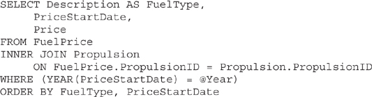
8. Enter the following in the SQL pane (upper portion) of the Generic Query Designer window:
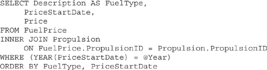
9. Click the Run Query button in the Generic Query Designer toolbar to run the query and make sure no errors exist. Correct any typos that may be detected. When the query is correct, the Define Query Parameters dialog box appears. Enter 2014 as the Parameter Value for the @Year parameter, and click OK.
10. Click OK to exit the Query Designer window. Click OK to exit the Dataset Properties dialog box.
11. The business needs for the report specified the user should select the year from a drop-down list. We need to define a second dataset to populate this drop-down list. In the Report Data window, right-click the entry for the Galactic data source, and select Add Dataset from the context menu. The Dataset Properties dialog box appears.
12. Enter Years for the name of the dataset.
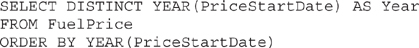
13. Galactic is selected for the data source by default. Enter the following in the Query entry area of the Dataset Properties dialog box:
14. Click OK to exit the Dataset Properties dialog box. The Years dataset will appear in the Report Data window along with the FuelPrices dataset.
15. We did not have a chance to test the query, so let’s see how to go back and do that. In the Report Data window, right-click the Years dataset, and select Query from the context menu. The Query Designer window opens with the Graphical Query Designer containing the dataset query.
16. Run the query to make sure it is correct. You see a list of the distinct years from the FuelPrice table.
17. When the query is working properly, click OK to exit the Query Designer window.
Report Builder Steps1. Click the File tab on the ribbon, and select New from the menu. The New Report or Dataset dialog box will appear. With New Report selected on the left, click Blank Report on the right.
2. In the Report Data window, click the New drop-down menu. Select Data Source from the menu that appears. The Data Source Properties dialog box appears.
3. Enter Galactic for the name.
4. Make sure the Use a shared connection or report model radio button is selected, and select Galactic from the area below it. Click OK. An entry for the Galactic data source appears in the Report Data window.
5. In the Report Data window, right-click the entry for the Galactic data source, and select Add Dataset from the context menu. The Dataset Properties dialog box appears.
6. Enter FuelPrices for the name.
7. Click the Query Designer button. The Query Designer window opens displaying the Graphical Query Designer.
8. Click the Edit as Text button to switch to the Generic Query Designer.
9. Enter the following in the SQL pane (upper portion) of the Generic Query Designer window:
10. Run the query to make sure no errors exist. Correct any typos that may be detected. When the query is correct, the Define Query Parameters dialog box appears. Enter 2014 for the @Year parameter, and click OK.
11. Click OK to exit the Query Designer window. Click OK to exit the Dataset Properties dialog box.
12. The business needs for the report specified the user should select the year from a drop-down list. We need to define a second dataset to populate this drop-down list. In the Report Data window, right-click the Galactic entry, and select Add Dataset from the context menu. The Dataset Properties dialog box appears.
13. Enter Years for the name of the dataset.
14. Galactic is selected for the data source by default. Enter the following in the Query entry area of the Dataset Properties dialog box:
15. Click OK to exit the Dataset Properties dialog box. The Years dataset will appear in the Report Data window along with the FuelPrices dataset.
16. We did not have a chance to test the query, so let’s see how to go back and do that. In the Report Data window, right-click the Years dataset, and select Query from the context menu. The Query Designer window opens with the Generic Query Designer containing the dataset query.
17. Run the query to make sure it is correct. You see a list of the distinct years from the FuelPrice table.
18. When the query is working properly, click OK to exit the Query Designer window.
19. Select the “Click to add title” text box, and delete it. (The title will be contained within the chart itself.)
Task Notes We created two datasets in the FuelPriceChart report: one to populate the Year drop-down list and the other to provide data for the chart. For the previous report, we created our query without the aid of the Graphical Query Designer. Here we are even more daring. We entered our second query right in the Query entry area of the Dataset Properties dialog box. This is the fastest way to enter a straightforward query when creating a dataset.
SSDT, Visual Studio, and Report Builder Steps
1. Expand the Parameters item in the Report Data window. You see an entry for the Year parameter. This report parameter was created to correspond to the @Year parameter in the FuelPrices dataset.
2. Double-click the Year parameter entry. The Report Parameter Properties dialog box appears.
3. Go to the Available Values page of the dialog box.
4. Select the Get values from a query radio button.
5. In the Dataset drop-down list, select Years. Select Year from both the Value field drop-down list and the Label field drop-down list. Your screen should appear similar to the illustration shown here.
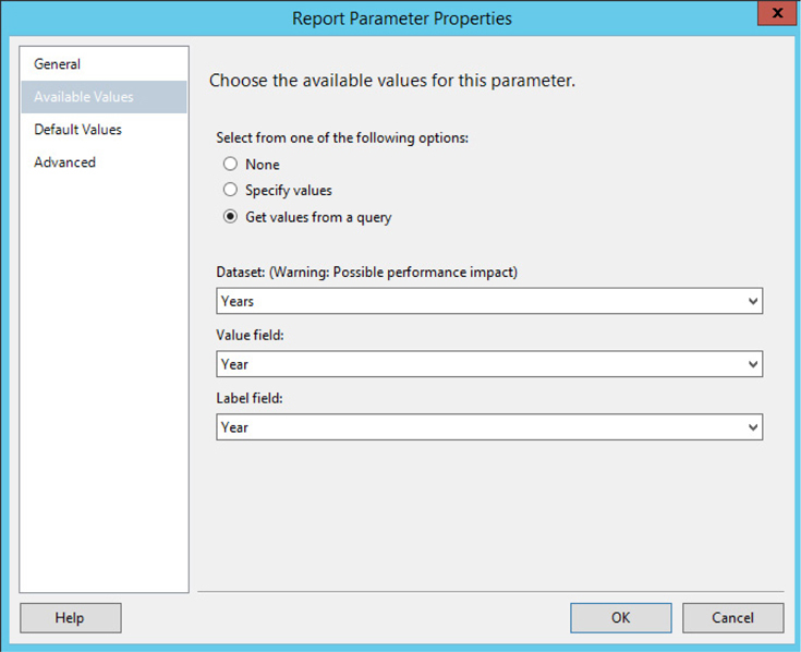
6. Click OK to exit the Report Parameter Properties dialog box.
7. Drag the edges of the design surface so it fills the available space on the screen.
8. Select the chart report item in the Toolbox window/Insert ribbon, and place it on the design surface. The chart should cover almost the entire design surface because it will be the only item on the report. The Select Chart Type dialog box appears.
9. Select the Line with Markers graph, as shown here.
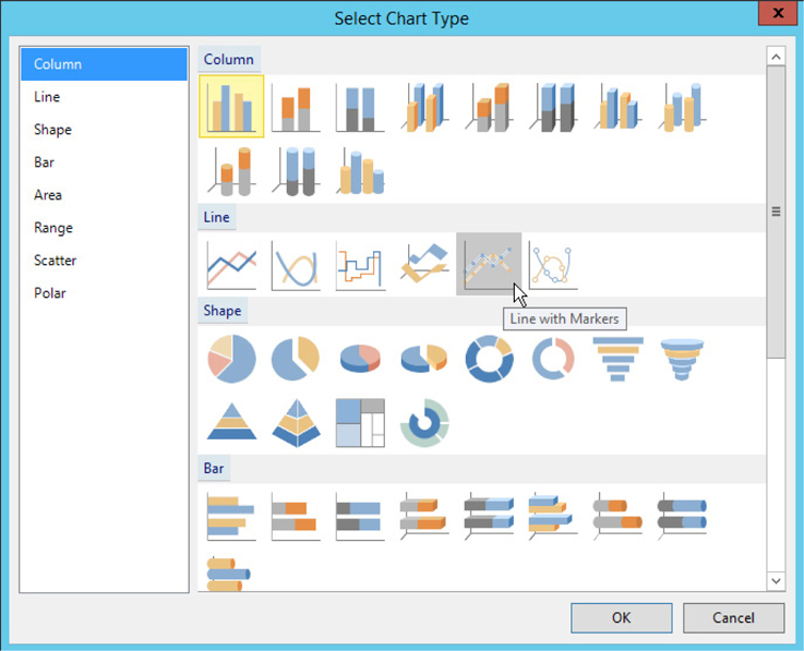
10. Click OK to exit the Select Chart Type dialog box. You will see a representation of the chart on the design surface.
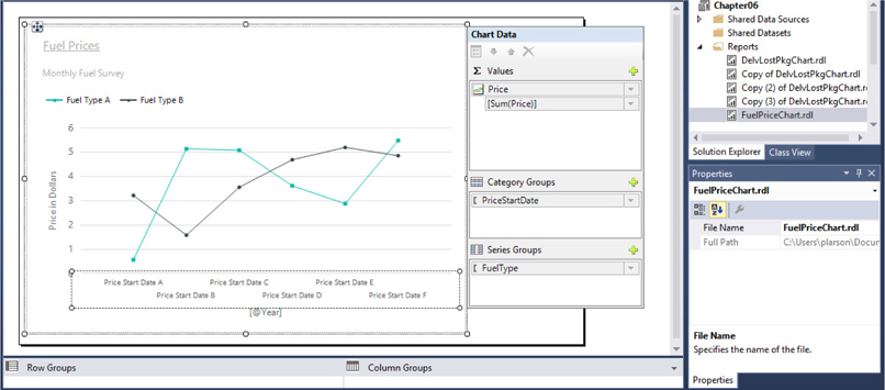
11. Click anywhere on the chart to activate the Chart Data window.
12. Click the plus sign next to the Values area, and select Galactic | FuelPrices | Price as shown.
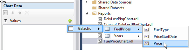
13. Click the plus sign next to the Category Groups area, and select PriceStartDate.
14. Click the plus sign next to the Series Groups area, and select FuelType.
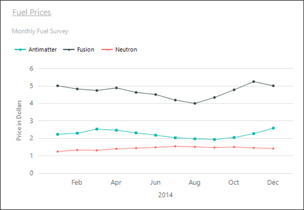
15. Preview/run the report. Select 2014 from the Year drop-down list, and then click View Report. Your report appears similar to the illustration.
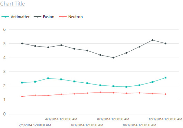
Task Notes For the previous report, we used multiple series values to create multiple lines on our graph. For this report, we use a different approach. The FuelType field in the Series Groups area serves as the grouping value to create a series group. In the tablix report item, we get one group for each distinct value in the grouping field. Similarly, in the chart we get one series—one line on the graph in this case—for each distinct value in the grouping field. We get one series for the fuel used in the antimatter engines, one series for the fuel used in the fusion engines, and one series for the fuel used in the neutron engines.
SSDT, Visual Studio, and Report Builder Steps
1. Return to design mode.
2. Double-click the words “Chart Title” to edit the text of the chart title. Replace the words “Chart Title” with Fuel Prices. Press enter to leave the text edit mode. The blinking text cursor will disappear and the chart itself will be selected.
3. Right-click the Fuel Prices title, and select Chart | Add New Title from the context menu. A second title line is added to the chart.
4. Click on this new title so the edit cursor appears. Replace “New Title” with Monthly Fuel Survey.
5. Right-click the Fuel Prices title, and select Title Properties from the context menu. The Chart Title Properties dialog box appears.
6. Select the Font page of the Chart Title Properties dialog box.
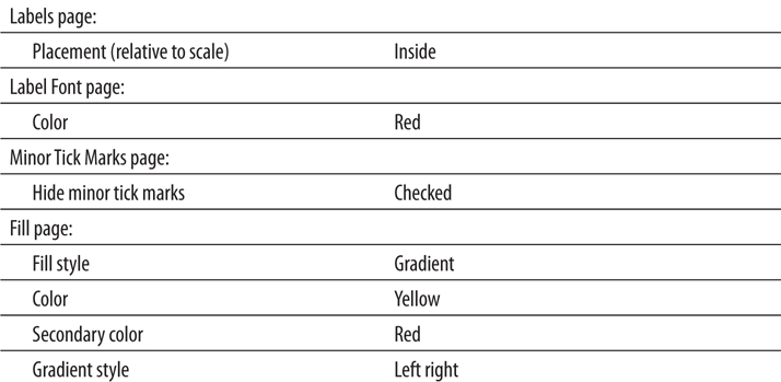
7. Set the following properties:

8. Click OK to exit the Chart Title Properties dialog box.
9. Right-click the horizontal axis, and select Show Axis Title from the context menu to check this item. Right click the words “Axis Title” that just appeared, and select Axis Title Properties from the context menu. The Axis Title Properties dialog box appears.
10. Click the FX button next to the Title text entry area as shown in the previous illustration. The Expression dialog box appears.
11. Replace the words “Axis Title” in the Set expression for: Caption entry area with the following:
=
12. Select Parameters in the Category tree view. The report parameters appear in the Values pane of the dialog box. (Year is the only report parameter defined for this report.)
13. Double-click the Year parameter entry in the Values pane of the dialog box. The dialog box should appear as shown.
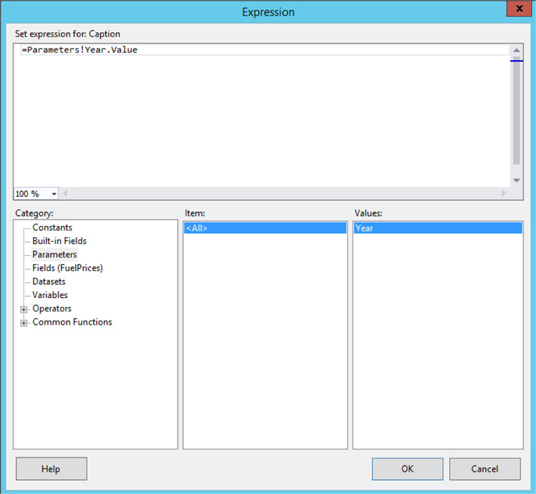
14. Click OK to exit the Expression dialog box. The expression we just created for the Title text is symbolized by the shorthand: [@Year].
15. Click OK to exit the Axis Title Properties dialog box.
16. Select the horizontal axis. When selected, the axis will be surrounded by a dashed rectangle and Chart Axis will be displayed at the top of the Properties window as shown.
17. In the Properties window, set the following property:

18. Right-click the vertical axis, and select Show Axis Title from the context menu to check this item. Double-click the words “Axis Title” that just appeared, replace them with Price in Dollars and press enter.
19. Right-click the vertical axis, and select Vertical Axis Properties from the context menu. The Vertical Axis Properties dialog box appears.
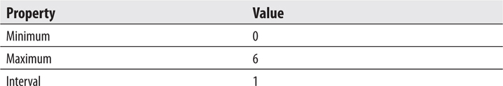
20. Set the following properties in the Axis range and interval area on the Axis Options page:
21. Click OK to exit the Vertical Axis Properties dialog box.
22. Preview/run the report. Select 2014 from the Year drop-down list, and then click View Report. Your report appears similar to the illustration.
23. If you are using SSDT or Visual Studio, click Save All on the toolbar. If you are using Report Builder, save the report under the name “FuelPriceChart” in the Chapter06 folder on the report server.
Task Notes The format code MMM is a date-formatting code. It causes the chart to use only the first three characters of the month name for the category axis labels.
Using the union operator in a SELECT statement
Using a WHERE clause to return records of one type or of all types
Business Need GDS would now like to be able to select a single fuel type or all fuel types from a drop-down list to view in the report.
1. Create a New Dataset for the Second Drop-Down List and Revise the FuelPrices Dataset to Allow for Fuel Type Selection
SSDT, Visual Studio, and Report Builder Steps
1. Reopen the FuelPriceChart report, if you closed it. If the FuelPriceChart report is open and being previewed/run, return to design mode.
2. Right-click the entry for the Galactic data source in the Report Data window. Select Add Dataset from the context menu. The Dataset Properties dialog box appears.
3. Enter FuelTypes for Name.
4. Galactic is selected for the Data source by default. Click the Query Designer button. The Graphical Query Designer appears. Click the Edit as Text button to switch to the Generic Query Designer.
5. Type the following in the SQL pane:

6. Run the query to make sure it is correct. You see a list of the distinct fuel types from the FuelPrice table. There is also a record for “All.”
7. Click OK to exit the Query Designer window. Click OK to exit the Dataset Properties dialog box.
8. Right-click the entry for the FuelPrices dataset in the Report Data window. Select Query from the context menu.
9. Change the SELECT statement to the following (the only change is in the second half of the WHERE clause, shown in bold):
10. Run the query to make sure it is correct. The Define Query Parameters dialog box appears. Enter 2014 for the Parameter Value of the @Year parameter, All for the Parameter Value of the @PropulsionType parameter, and click OK.
11. Click OK to exit the Query Designer window.
12. Expand the Parameters item in the Report Data window, if it is not expanded already. A report parameter called PropulsionType is created to correspond to the @PropulsionType parameter from the FuelPrices dataset. Double-click the PropulsionType entry in the Report Data window. The Report Parameter Properties dialog box appears.
13. Select the Available Values page.
14. Select the Get values from a query radio button.
15. In the Dataset drop-down list, select FuelTypes. In the Value field drop-down list, select FuelType. In the Label field drop-down list, select FuelType. Click OK to exit the Report Parameter Properties dialog box.
16. Preview/run the report. Select 2014 from the Year drop-down list, select Antimatter from the Propulsion Type drop-down list, and then click View Report. Your report appears similar to the illustration.

17. If you are using SSDT or Visual Studio, click Save All on the toolbar. If you are using Report Builder, click the File tab and select Save.
Task Notes The query that creates the FuelTypes dataset is two SELECT statements combined to produce one result set. The first SELECT statement returns a single row with the constant value “All” in the FuelType column and a constant value of “_All” in the SortField. The underscore is placed in front of the word “All” in SortField to make sure it sorts to the top of the list. The second SELECT statement returns a row for each record in the Propulsion table. The two result sets are unified into a single result set by the UNION operator in between the two SELECT statements.
When result sets are unioned, the names of the columns in the result set are taken from the first SELECT statement in the union. That is why the FuelTypes dataset has two columns named FuelType and SortField rather than Description. When SELECT statements are unioned, only the last SELECT statement can have an ORDER BY clause. This ORDER BY clause is used to sort the entire result set after it has been unified into a single result set.
The UNION operator can be used with any two SELECT statements as long as the following is true:
The result set from each SELECT statement has the same number of columns.
The corresponding columns in each result set have the same data type.
In fact, the UNION can be used to combine any number of SELECT statements into a unified result set as long as these two conditions hold true for all the SELECT statements in the UNION.
Creating a report using a pie chart
Using the Data Label property
Changing the chart palette
Using the 3-D effect
Business Need The Galactic Delivery Services marketing department needs to analyze what types of businesses are using GDS for their delivery services. This information should be presented as a pie chart.
1. Create a New Report and a Dataset
2. Place a Chart Item on the Report and Populate It
SSDT and Visual Studio Steps1. Reopen the Chapter06 project, if it was closed. Close the FuelPriceChart report.
2. Add a blank report called BusinessTypeDistribution to the Chapter06 project. (Do not use the Report Wizard.)
3. In the Report Data window, click the New drop-down menu. Select Data Source from the menu that appears. The Data Source Properties dialog box appears.
4. Enter Galactic for the name.
5. Select the Use shared data source reference radio button, and select Galactic from the drop-down list. Click OK.
6. In the Report Data window, right-click the entry for the Galactic data source, and select Add Dataset from the context menu. The Dataset Properties dialog box appears.
7. Enter CustomerBusinessTypes for the name.
8. Click the Query Designer button. The Query Designer window opens displaying the Graphical Query Designer. Click the Edit as Text button to switch to the Generic Query Designer.
9. Enter the following in the SQL pane (upper portion) of the Generic Query Designer window:
10. Run the query to make sure no errors exist. Correct any typos that may be detected.
11. Click OK to exit the Query Designer window. Click OK to exit the Dataset Properties dialog box.
Report Builder Steps1. Click the File tab on the ribbon, and select New from the menu. The New Report or Dataset dialog box will appear. With New Report selected on the left, click Blank Report on the right.
2. In the Report Data window, click the New drop-down menu. Select Data Source from the menu that appears. The Data Source Properties dialog box appears.
3. Enter Galactic for the name.
4. Make sure the Use a shared connection or report model radio button is selected, and select Galactic from the area below it. Click OK. An entry for the Galactic data source appears in the Report Data window.
5. In the Report Data window, right-click the entry for the Galactic data source, and select Add Dataset from the context menu. The Dataset Properties dialog box appears.
6. Enter CustomerBusinessTypes for the name.
7. Click the Query Designer button. The Query Designer window opens displaying the Graphical Query Designer.
8. Click the Edit as Text button to switch to the Generic Query Designer.
9. Enter the following in the SQL pane (upper portion) of the Generic Query Designer window:
10. Run the query to make sure no errors exist. Correct any typos that may be detected.
11. Click OK to exit the Query Designer window. Click OK to exit the Dataset Properties dialog box.
12. Select the Click to add title text box, and delete it. (The title will be contained within the chart itself.)
Task Notes The CustomerBusinessTypes dataset simply contains a list of customer names and their corresponding business type. Remember, some customers are linked to more than one business type. That means some of the customers appear in the list more than once.
This dataset is used to populate a pie chart in the next task. The BusinessType field is used to create the categories for the pie chart. The items in the CustomerName field are counted to determine how many customers are in each category.
SSDT, Visual Studio, and Report Builder Steps
1. Drag the edges of the design surface larger so it fills the available space on the screen.
2. Select the chart report item in the Toolbox window/Insert ribbon, and place it on the design surface. The chart should cover almost the entire design surface because it will be the only item on the report. The Select Chart Type dialog box appears.
3. Select the pie chart from the Shape area.
4. Click OK to exit the Select Chart Type dialog box. You will see a representation of the pie chart on the design surface.
5. Click anywhere on the chart to activate the Chart Data window.
6. Click the plus sign next to the Values area, and select CustomerName.
7. Click the plus sign next to the Category Groups area, and select BusinessType.
8. Right-click BusinessType in the Category Groups area of the Chart Data window, and select Category Group Properties from the context menu. The Category Group Properties dialog box appears.
9. Click the fx button next to the Label drop-down list. The Expression dialog box appears.
10. Enter the following in the Set expression for: Label entry area:

Remember you can select the fields using the Fields (CustomerBusinessType) entry in the Category pane along with the Field list in the lower-right pane of the dialog box.
11. Click OK to exit the Expression dialog box.
12. Click OK to exit the Category Group Properties dialog box.
13. Change the Chart Title to Customer Business Types.
14. Right-click the pie chart itself, and select 3D Effects from the context menu. The Chart Area Properties dialog box appears.
15. Check the Enable 3D check box.
16. Set Rotation to 50.
17. Set Inclination to 50.
18. Click OK to exit the Chart Area Properties dialog box.
19. Preview/run the report. Your report appears similar to the illustration.

20. If you are using SSDT or Visual Studio, click Save All on the toolbar. If you are using Report Builder, save the report as “BusinessTypeDistribution” in the Chapter06 folder on the report server.
Task Notes By default, the pie chart uses a legend, located to the side of the chart, to provide labels for each wedge in the pie. The Label item in the Category Group Properties dialog box determines what is displayed as the legend for each category group (pie wedge). In the Business Type Distribution chart, we added to the label expression so it not only showed the name of the category—the business type—but also the number of customers in that category. The expression concatenates the business type and the count of the number of customers with a carriage return/linefeed (vbCrLf) in between. The carriage return/linefeed causes the business type and the count to each appear on its own line.
In this chart, we are also using the 3-D effect. The 3-D effect can help to add interest to a chart by taking a flat graphic and lifting it off the page. However, 3-D effects should be used with caution. They can distort the chart and lead to misleading interpretations of the data.
Now let’s try one more complex chart.
Creating a report using a stacked column chart
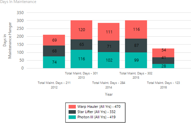
Business Need The Galactic Delivery Services transport maintenance department is looking to compare the total maintenance downtime for each year. They would also like to know how that maintenance time is distributed among the different transport types. They would like a graph showing the number of days that each type of transport spent “in for repairs.” This information should be presented as a stacked column chart. The underlying data should be displayed as a label on each column in the chart.
1. Create a New Report, Create a Dataset, Place a Chart Item on the Report, and Populate It
SSDT, Visual Studio, and Report Builder Steps
1. If you are using SSDT or Visual Studio, reopen the Chapter06 project, if it was closed. Close the BusinessTypeDistribution report, and add a blank report called DaysInMaint to the Chapter06 project. (Do not use the Report Wizard.)
2. If you are using Report Builder, create a new blank report, and delete the Click to add title text box.
3. In the Report Data window, click the New drop-down menu. Select Data Source from the menu that appears. The Data Source Properties dialog box appears.
4. As we have done previously, create a new data source named Galactic that references the Galactic shared data source. Click OK to exit the Data Source Properties dialog box.
5. In the Report Data window, right-click the entry for the Galactic data source, and select Add Dataset from the context menu. The Dataset Properties dialog box appears.
6. Enter DaysInMaint for the name.
7. Click the Query Designer button. The Query Designer window opens.
8. Click the Edit as Text button to switch to the Generic Query Designer.
9. Enter the following in the SQL pane (upper portion) of the Generic Query Designer window:
10. Run the query to make sure there are no errors. Correct any typos that may be detected.
11. Click OK to exit the Query Designer window. Click OK to exit the Dataset Properties dialog box.
12. Click the design surface. The body of the report will be selected in the Properties window. Set the following properties of the body in the Properties window:
13. Select the chart report item in the Toolbox window/Insert ribbon, and place it on the report layout. Size the chart so it almost covers the entire report layout because it is the only item on the report. The Select Chart Type dialog box appears.
14. Select the Stacked Column chart from the Column area.
15. Click OK to exit the Select Chart Type dialog box. You will see a representation of the stacked column chart on the design surface.
16. Click anywhere on the chart to activate the Chart Data window. You may need to scroll right to see it.
17. Click the plus sign next to the Values area, and select DaysInMaint.
18. Click the plus sign next to the Category Groups area, and select Year.
19. Click the plus sign next to the Series Groups area, and select PropulsionType.
20. Change the chart title to Days In Maintenance.
21. Right-click the PropulsionType entry in the Series Groups area. Select Series Group Properties from the context menu. The Series Group Properties dialog box appears.
22. Click the fx button next to the Label drop-down list. The Expression dialog box appears.
23. Enter the following in the Set expression for: Label entry area:

24. Click OK to exit the Expression dialog box. Click OK to exit the Series Group Properties dialog box.
25. Right-click the Year entry in the Category Groups area. Select Category Group Properties from the context menu. The Category Group Properties dialog box appears.
26. Click the fx button next to the Label drop-down list. The Expression dialog box appears.
27. Enter the following in the Set expression for: Label entry area:

28. Click OK to exit the Expression dialog box. Click OK to exit the Category Group Properties dialog box.
29. Right-click one of the bars in the chart area. Select Show Data Labels from the context menu. Numbers will appear on the columns.
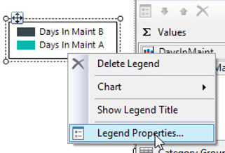
30. Right-click the chart legend. Select Legend Properties as shown here.
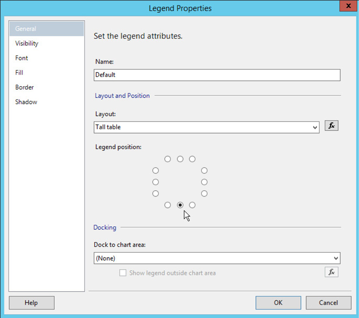
31. In the Legend Properties dialog box, select Tall table from the Layout drop- down box.
32. Select the legend position in the center-bottom area of the Legend position circle as shown.
NOTE
You can also change the position of the legend by selecting it and using the positioning handle to drag it to the desired location.
33. Select the Border page of the Legend Properties dialog box.
34. Select Solid from the Line style drop-down box.
35. Select the Shadow page of the dialog box.
36. Click the up arrow of the Shadow offset entry area until the shadow offset is set to 1 pt.
37. Select Silver from the Shadow color drop-down color picker.
38. Click OK to exit the Legend Properties dialog box.
39. Show the horizontal axis title and change it to Year.
40. Right-click the vertical axis title, and select Axis Title Properties from the context menu. The Axis Title Properties dialog box appears.
41. Click the fx button next to the Title text entry area. The Expression dialog box appears.
42. Enter the following in the Set expression for: Title area:

43. Click OK to exit the Expression dialog box. Click OK to exit the Axis Title Properties dialog box.
44. Preview/run the report. Your report appears similar to the illustration.
45. If you are using SSDT or Visual Studio, click Save All on the toolbar. If you are using Report Builder, save the report as “DaysInMaint” in the Chapter06 folder on the report server.
Task Notes The stacked column chart is a good choice to fulfill the business needs for this report, because it can graphically illustrate two different pieces of information at the same time. Each colored section of the graph shows the number of maintenance days for a given propulsion type. In addition, the combined height of the three sections of the column shows the fluctuations in the total maintenance days from year to year.
Above and beyond the graphical information provided in the chart, several additional pieces of information are provided numerically. This includes the category labels along the horizontal axis, the legend at the bottom of the graph, and the detail data displayed right on the column sections themselves. The values on the columns are the result of the expression being charted, which is SUM(DaysInMaint).
This expression uses the SUM() aggregate function to add up the values from the DaysInMaint field. It may seem this sum should give us the total for the DaysInMaint field for the entire dataset. After all, there is nothing in this expression that references the category or series groups. The reason this does not occur is because of the scope in which this expression is evaluated. The scope sets boundaries on which rows from the dataset are used with a given expression.
The data label expression operates at the innermost scope in the chart. This means expressions in the data label are evaluated using only those rows that come from both the current category group and the current series group. For example, let’s look at the column section for Star Lifters for the year 2012. This column section is part of the Star Lifter series group. It is also part of the year 2012 category group. When the report is evaluating the data label expression to put a label on the Star Lifter/year 2012 column section, it uses only those rows in the result set for the Star Lifters in the year 2012. Using this scope, the report calculates the sum of DaysInMaint for Star Lifters in the year 2012 as 68 days.
Next, let’s consider the summary data that appears in the labels along the horizontal axis. These entries are the result of the expression entered for the label in the category groups. This expression also uses the SUM() function to add up the values from the DaysInMaint column. However, it calculates different totals because it is operating in a different scope.
In this case, the calculations are being done in the category scope, which means the expression for the label in the category group is evaluated using all the records from the current category group. For example, let’s look at the category label for the year 2012 column. This column is part of the year 2012 category group. When the report is evaluating the label expression to put a label below this column, it uses all the rows in the result set for the year 2012. The propulsion type of each row does not make a difference because it is not part of this scope. Using the year 2012 category scope, the report calculates the sum of DaysInMaint for the year 2012 as 211 days.
Finally, we come to the summary data that appears in the legend below the chart. These entries are the result of the expression entered for the label in the series groups. Yet again, this expression uses the SUM() function to add up the values from the DaysInMaint column. And yet again, we get different numbers because it is working in a different scope. Here, the calculations are being done in the series scope. That means the expressions are evaluated using all the records from the current series group. For example, let’s look at the entry in the legend for the Star Lifter series. When the report is evaluating the series group label expression, it uses all the rows in the result set for Star Lifters. The year of each row does not make a difference because it is not part of this scope. Using the Star Lifter series scope, the report calculates the sum of DaysInMaint for the Star Lifters as 332 days.
In several expressions used in this chart, we are concatenating several strings to create the labels we need. This is done using the Visual Basic string concatenation operator (&). You may notice several of the fields being concatenated are numeric rather than string fields. The reason these concatenations work is the & operator automatically converts numeric values to strings. In this way, we can take “Total Maint. Days -” and concatenate it with 211 to get the first lines of the year 2012 column label. The 211 is converted to “211” and then concatenated with the rest of the string.
The final noteworthy item on this report is the expression used to create the label on the vertical axis. To have this label fit nicely along the vertical axis, we used our old friend the carriage return/linefeed to split the label on to two lines. Because the text is rotated 90 degrees, the first line of the label is farthest from the vertical axis and the second line is to the right of the first line.
Creating a report using a Tree Map chart
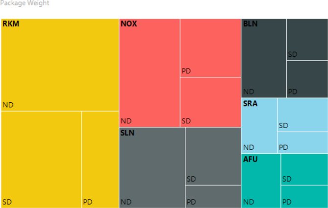
Business Need The Galactic Delivery Services marketing department would like to analyze the total package weight shipped using each of the three delivery types. They would like to analyze this by the planet where the delivery originates.
1. Create a New Report, Create a Dataset, Place a Chart Item on the Report, and Populate It
SSDT, Visual Studio, and Report Builder Steps
1. If you are using SSDT or Visual Studio, reopen the Chapter06 project, if it was closed. Close the DaysInMaint report, and add a blank report called PkgWtByPlanet to the Chapter06 project. (Do not use the Report Wizard.)
2. If you are using Report Builder, create a new blank report, and delete the Click to add title text box.
3. In the Report Data window, click the New drop-down menu. Select Data Source from the menu that appears. The Data Source Properties dialog box appears.
4. As we have done previously, create a new data source named Galactic that references the Galactic shared data source. Click OK to exit the Data Source Properties dialog box.
5. In the Report Data window, right-click the entry for the Galactic data source, and select Add Dataset from the context menu. The Dataset Properties dialog box appears.
6. Enter PkgWeight for the name.
7. Click the Query Designer button. The Query Designer window opens.
8. Click the Edit as Text button to switch to the Generic Query Designer.
9. Enter the following in the SQL pane (upper portion) of the Generic Query Designer window:

10. Run the query to make sure there are no errors. Correct any typos that may be detected.
11. Click OK to exit the Query Designer window. Click OK to exit the Dataset Properties dialog box.
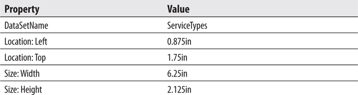
12. Click the design surface. The body of the report will be selected in the Properties window. Set the following properties of the body in the Properties window:

13. Select the chart report item in the Toolbox window/Insert ribbon, and place it on the report layout. Size the chart so it almost covers the entire report layout because it is the only item on the report. The Select Chart Type dialog box appears.
14. Select the Tree Map chart from the Shape area as shown.

15. Click OK to exit the Select Chart Type dialog box. You will see a representation of the tree map chart on the design surface.
16. Click anywhere on the chart to activate the Chart Data window. You may need to scroll right to see it.
17. Click the plus sign next to the Values area, and select PkgWeight.
18. Click the plus sign next to the Category Groups area, and select ServiceTypeCode.
19. Click the plus sign next to the Series Groups area, and select PickupPlanetAbbrv.
20. Change the chart title to Package Weight.
21. Right-click the legend on the chart layout and select Delete Legend from the context menu. The legend disappears.
22. Preview/run the report. Your report appears similar to the illustration.
23. If you are using SSDT or Visual Studio, click Save All on the toolbar. If you are using Report Builder, save the report as “PkgWtByPlanet” in the Chapter06 folder on the report server.
Task Notes Bar charts, column charts, and line graphs provide a one-dimensional visualization of a quantity. The magnitude of the quantity is represented by distance of the bar, column, or line from the category axis of the chart. A tree map chart, like a bar chart, is a two-dimensional visualization of a quantity. The area of the tree map rectangle or pie chart wedge represents the magnitude of the quantity. So, the tree map provides an alternative to the pie chart for those who prefer rectangles to circles.
Creating a report using a Sunburst chart
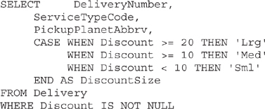
Business Need The Galactic Delivery Services sales department would like to analyze the size of the discounts given to customers by planet hub where the discount was given (the pickup planet where the delivery originated). They would like to look at how discounts break down across the different types of delivery services. They want to analyze the discounts in three groups:
1. Small discounts – less than $10
2. Medium discounts – less than $20
3. Large discounts – $20 or more
1. Create a New Report, Create a Dataset, Place a Chart Item on the Report, and Populate It
SSDT, Visual Studio, and Report Builder Steps
1. If you are using SSDT or Visual Studio, reopen the Chapter06 project, if it was closed. Close the PkgWtByPlanet report, and add a blank report called DiscountAnalysis to the Chapter06 project. (Do not use the Report Wizard.)
2. If you are using Report Builder, create a new blank report, and delete the Click to add title text box.
3. In the Report Data window, click the New drop-down menu. Select Data Source from the menu that appears. The Data Source Properties dialog box appears.
4. As we have done previously, create a new data source named Galactic that references the Galactic shared data source. Click OK to exit the Data Source Properties dialog box.
5. In the Report Data window, right-click the entry for the Galactic data source, and select Add Dataset from the context menu. The Dataset Properties dialog box appears.
6. Enter Discounts for the name.
7. Click the Query Designer button. The Query Designer window opens.
8. Click the Edit as Text button to switch to the Generic Query Designer.
9. Enter the following in the SQL pane (upper portion) of the Generic Query Designer window:
10. Run the query to make sure there are no errors. Correct any typos that may be detected.
11. Click OK to exit the Query Designer window. Click OK to exit the Dataset Properties dialog box.
12. Click the design surface. The body of the report will be selected in the Properties window. Set the following properties of the body in the Properties window:
13. Select the chart report item in the Toolbox window/Insert ribbon, and place it on the report layout. Size the chart so it almost covers the entire report layout because it is the only item on the report. The Select Chart Type dialog box appears.
14. Select the Sunburst chart from the Shape area as shown.
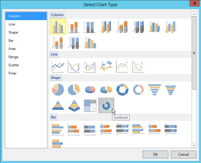
15. Click OK to exit the Select Chart Type dialog box. You will see a representation of the sunburst chart on the design surface.
16. Click anywhere on the chart to activate the Chart Data window. You may need to scroll right to see it.
17. Click the plus sign next to the Values area, and select DeliveryNumber.
18. Click the drop-down arrow next to the new entry that says “[Sum(DeliveryNumber)]” in the Values area and select Aggregate | Count.
19. Click the plus sign next to the Category Groups area, and select PickupPlanetAbbrv.
20. Click the plus sign next to the Category Groups area again, and select ServiceTypeCode.
21. Click the plus sign next to the Series Groups area, and select DiscountSize.
22. Right-click somewhere in the outermost ring on the sunburst chart, and select Show Data Labels from the context menu. Data labels appear on the sunburst chart.
23. Right-click on one of the data labels, and select Series Label Properties from the context menu. The Series Label Properties dialog box appears.
24. Click the drop-down arrow for Label data and select #AXISLABEL from the list. Click Yes in response to the pop-up message.
25. Click OK to exit the Series Label Properties dialog box.
26. Change the chart title to Discounts.
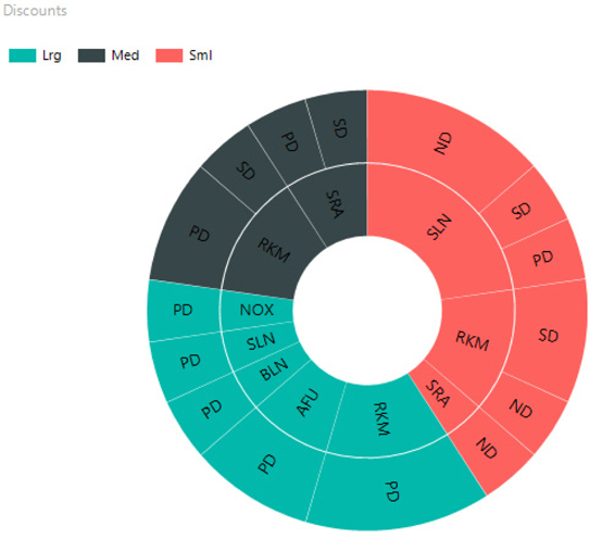
27. Preview/run the report. Your report appears similar to the illustration. If the labels are not showing in all of the chart sections, make the chart larger.
28. If you are using SSDT or Visual Studio, click Save All on the toolbar. If you are using Report Builder, save the report as “DiscountAnalysis” in the Chapter06 folder on the report server.
Task Notes The Sunburst chart is essentially a multilevel drilldown all in one visualization. Each field added to the Category Groups area creates another ring on the chart. Each ring provides a more detailed breakdown of the inner ring that it encloses. The Series Group field provides the color-coding and creates the legend.
This sunburst chart is showing us three levels of information simultaneously. First, the color differentiates deliveries which received a small discount (red), deliveries which received a medium discount (dark gray), and deliveries which received a large discount (teal). Of the small discounts, we can see the majority were on deliveries to Stilation (SLN). Of the Stilation deliveries receiving a small discount, we can see the majority of these were for Next Day service (ND).
One of the current trends in business intelligence is the digital dashboard. The dashboard on a car tells the driver the current state of the car’s operations: current speed, current amount of gas in the tank, and so on. The gauges and displays on the dashboard allow the driver to take in this current information at a glance.
In the same manner, the digital dashboard tells a decision maker the current state of the organization’s operations. This digital dashboard also uses gauges and other easy-to-understand displays. The digital dashboard makes it easy for the decision maker to get current information at a glance.
Reporting Services provides the gauge data region for building reports that serve as digital dashboards.
Using the gauge data region
Business Need Three key indicators of the health of Galactic Delivery Services are the number of deliveries in the past four weeks, the number of lost packages in the past four weeks, and the number of transport repairs in the past four weeks. The GDS executives would like a digital dashboard showing these three key performance indicators using easy-to-read gauges.
1. Create a New Report Along with a Dataset and Present the Data on a Gauge
2. Refine the Appearance of the Gauge
3. Modify the Dataset and Add a Second Gauge
SSDT, Visual Studio, and Report Builder Steps
1. If you are using SSDT or Visual Studio, reopen the Chapter06 project, if it was closed. Close the DiscountAnalysis report, and add a blank report called DigitalDashboard to the Chapter06 project.
2. If you are using Report Builder, create a new blank report, and delete the Click to add title text box.
3. In the Report Data window, click the New drop-down menu. Select Data Source from the menu that appears. The Data Source Properties dialog box appears.
4. As we have done previously, create a new data source named Galactic that references the Galactic shared data source. Click OK to exit the Data Source Properties dialog box.
5. In the Report Data window, right-click the entry for the Galactic data source, and select Add Dataset from the context menu. The Dataset Properties dialog box appears.
6. Enter PickupsAndLost for the name.
7. Click the Query Designer button. The Query Designer window opens.
8. Click the Edit as Text button to switch to the Generic Query Designer.
9. Enter the following in the SQL pane (upper portion) of the Generic Query Designer window:
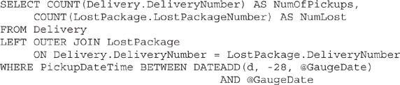
10. Click the Run Query button on the Generic Query Designer toolbar to run the query and make sure no errors exist. Correct any typos that may be detected. When the query is correct, the Define Query Parameters dialog box appears. Enter 3/1/2015 for the Parameter Value of the @GaugeDate parameter, and click OK.
11. Click OK to exit the Query Designer window. Click OK to exit the Dataset Properties dialog box.
NOTE
The following uses a more abbreviated format for specifying which properties need to be changed in a given dialog box. A table is provided for each dialog box with the page names and properties along with the desired property values. Simply select the appropriate page of the dialog box and change the items specified.
12. Click the design surface. The body of the report will be selected in the Properties window. Set the following properties of the body in the Properties window:
13. Select the gauge report item in the Toolbox window/Insert ribbon, and place it on the report layout. The gauge should cover almost the entire report layout because it is the only item on the report. The Select Gauge Type dialog box appears.
14. Select the Radial gauge as shown here.
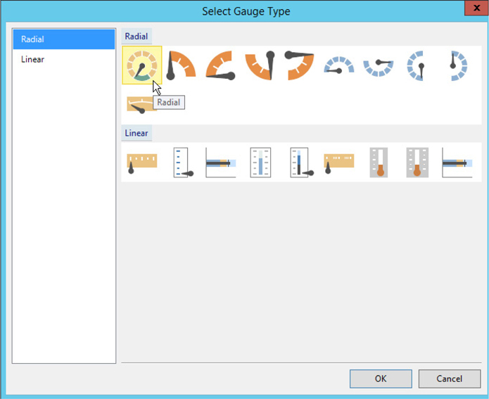
15. Click OK to exit the Select Gauge Type dialog box. You will see a representation of the gauge on the design surface.
16. Click anywhere on the gauge to activate the Gauge Data window. You may have to scroll right to see it.
17. There is an item in the Values area labeled RadialPointer1. This item allows you to associate a dataset field with the gauge. Below the RadialPointer1 item is a second item with “35” for its label. A constant has been specified as a default value for the gauge. Click the drop-down arrow to the right of the “35” entry. A field list appears as shown.

18. Select the NumOfPickups field.
19. Right-click the large “35” in the center of the gauge and select Delete Label from the context menu.
20. Right-click the white area in the center of the gauge, and select Add Scale from the context menu.
21. Right-click the white area in the center of the gauge, and select Add Pointer For | RadialScale2.
22. A second item, labeled RadialPointer2, appears in the Gauge Data area with an item labeled (Unspecified) underneath it. In addition, a new green gauge bar-type pointer appears on the gauge outlined by a dotted square as shown here. Click the drop-down arrow to the right of this new (Unspecified) item in the Gauge Data area, and select NumLost. This field will be associated with the second pointer on the gauge.
23. Right-click the green bar inside the dotted square, and select Pointer Properties from the context menu. Set the following properties of the pointer in the Radial Pointer Properties window:
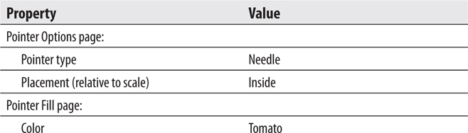
24. Click OK to exit the Radial Pointer Properties dialog box.
25. Preview/run the report. Type 3/1/2015 for Gauge Date, and click View Report. Your report should appear as shown here.
Task Notes Unlike the chart, which presents values grouped into categories, often days, months, or years, the gauge presents a single value. Well, in this task, it actually presents two values because our gauge has two scales and two indicators: one indicator is a needle and one is the bar that wraps around the outside scale. So, more precisely, the gauge presents one value per needle or other indicator.
Most often, a gauge is going to present the current value of some field. Therefore, the query that creates the dataset for the gauge will use the GETDATE() function to calculate the time period to report on. However, to make this report more interesting with our static database, it has a parameter so you can enter a date and view the gauge as it changes from month to month.
Obviously, we still have some work to do to get this gauge in shape. Let’s get to it.
SSDT, Visual Studio, and Report Builder Steps
1. Return to design mode.
2. Right-click the very outer edge of the gray semicircle, and select Scale Properties from the context menu. The Radial Scale Properties dialog box appears.
3. Set the following properties of the dialog box:
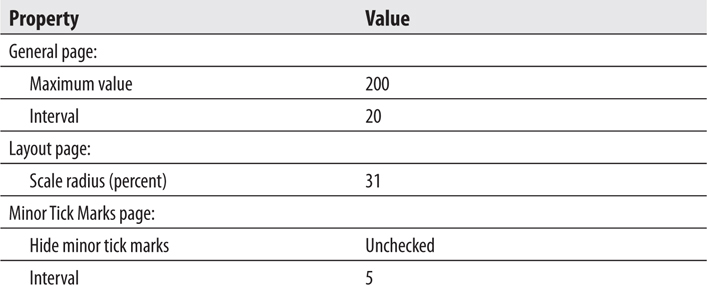
4. Click OK to exit the Radial Scale Properties dialog box.
5. Right-click the very inner edge of the gray semicircle and select Scale Properties from the context menu. The Radial Scale Properties dialog box appears.
6. Set the following properties of the dialog box:
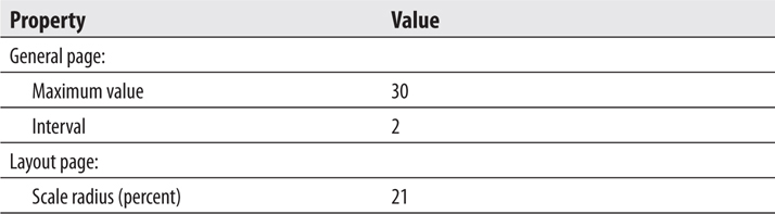
7. Click OK to exit the Radial Scale Properties dialog box.
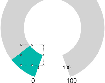
8. Right-click the white area in the center of the gauge, and select Add Range For | RadialScale1 from the context menu. A range appears on the gauge as shown.

9. Right-click the new range in the selection rectangle, and select Range Properties from the context menu. The range must be selected for Range Properties to appear in the context menu. The Radial Scale Range Properties dialog box appears.
10. Set the following properties in the dialog box:
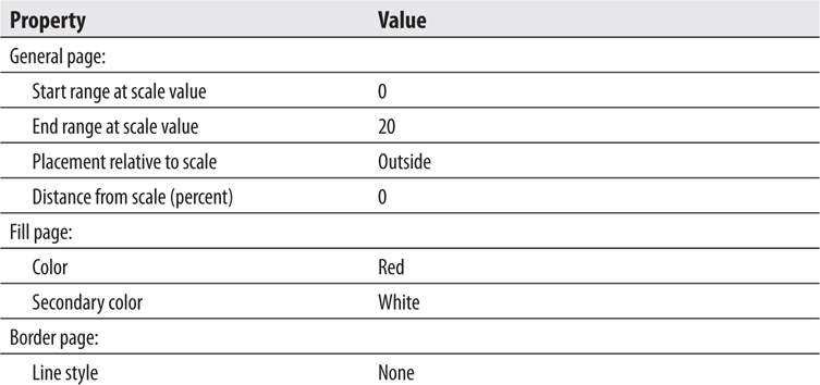
11. Click OK to exit the Radial Scale Range Properties dialog box.
12. Right-click the white area in the center of the gauge, and select Add Label from the context menu. The word “Text” will appear on the gauge.
13. Right-click the word “Text” and select Label Properties from the context menu. The Label Properties dialog box appears.
14. Set the following properties of the dialog box:
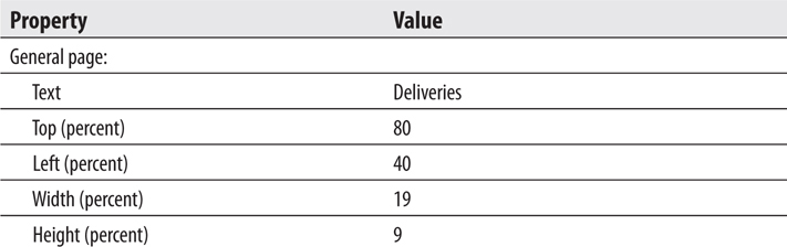
15. Click OK to exit the Label Properties dialog box.
16. Right-click the white area in the center of the gauge, and select Add Label from the context menu.
17. Right-click the new label, and select Label Properties from the context menu. The Label Properties dialog box appears.
18. Set the following properties of the dialog box:
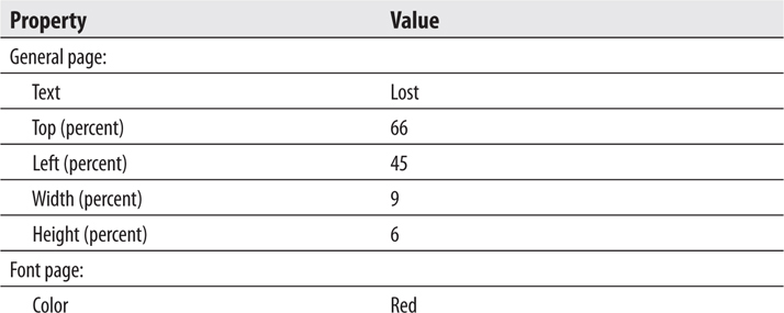
19. Click OK to exit the Label Properties dialog box.
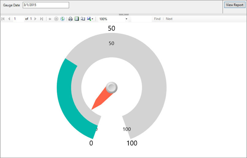
20. Preview/run the report.
21. Enter 3/1/2015 for Gauge Date, and click View Report. Your report should appear as shown.

Task Notes As with the chart report item, the gauge uses several properties dialog boxes, which enable you to change its configuration. There are properties dialog boxes to configure each pointer, each scale, each range, and one for the gauge itself. The chart and the gauge are also similar in that we can add new items to build a rich data presentation for the user. On the chart, we can add titles and legends, and even new chart areas. On the gauge, we can add scales, pointers, ranges, labels, and, as we will see in the next task, even new gauges.
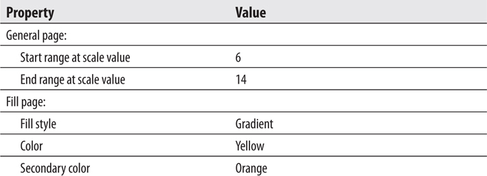
On a gauge, it is often helpful to provide the user with visual clues for interpreting the data. We do this in two ways on our gauge. First, we use the range with the outer scale to indicate when deliveries are getting to be too few and far between. If the number of deliveries is in the red range, we are not making enough deliveries to be profitable. Second, the gradient shading from yellow to red—the bar with the inner scale—aids the user in determining when the number of lost packages approaches an unacceptable level.
SSDT, Visual Studio, and Report Builder Steps
1. Return to design mode.
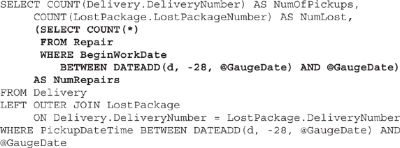
2. In the Report Data window, expand the Datasets folder, if it is not expanded. Right-click the entry for PickupsAndLost, and select Query from the context menu. The Query Designer window opens.
3. Change the SELECT statement to the following (the only change is the subquery in the field list along with the comma preceding it, shown in bold):
4. Run the query and make sure no errors exist. Correct any typos that may be detected. When the query is correct, the Define Query Parameters dialog box appears. Enter 3/1/2015 for the Parameter Value for the @GaugeDate parameter, and click OK.
5. Click OK to exit the Query Designer window.
6. Right-click the white area in the center of the guage, and select Add Gauge | Adjacent from the context menu. The Select Gauge Type dialog box appears.
7. Select the Three Color Range gauge from the Linear list as shown here.

8. Click OK to exit the Select Gauge Type dialog box.
9. Right-click the new gauge, and select Gauge Properties from the context menu. The Linear Gauge Properties dialog box appears.
10. Set the following properties of the dialog box:
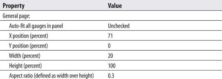
11. Click OK to exit the Linear Gauge Properties dialog box.
12. Click the red portion of the scale range on the new linear gauge to select it. Now right-click the red portion of the scale range, and select Range Properties from the context menu. The Linear Scale Range Properties dialog box appears.
13. Set the following properties in the dialog box:
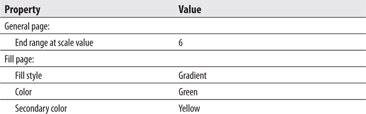
14. Click OK to exit the Linear Scale Range Properties dialog box.
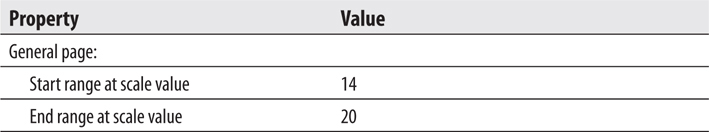
15. Right-click the yellow portion of the scale range, and select Range Properties from the context menu. The Linear Scale Range Properties dialog box appears.
16. Set the following properties in the dialog box:
17. Click OK to exit the Linear Scale Range Properties dialog box.
18. Right-click the green portion of the scale range, and select Range Properties from the context menu. The Linear Scale Range Properties dialog box appears.
19. Set the following properties in the dialog box:
20. Click OK to exit the Linear Scale Range Properties dialog box.
21. Right-click the scale, and select Scale Properties from the context menu. The Linear Scale Properties dialog box appears.
22. Set the following property in the dialog box:
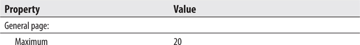
23. Click OK to exit the Linear Scale Properties dialog box.
24. Right-click the white area around the gauge, and select Add Label from the context menu. The word “Text” is added to the gauge.
25. Right-click the word “Text” and select Label Properties from the context menu. The Label Properties dialog box appears.
26. Set the following properties in the dialog box:
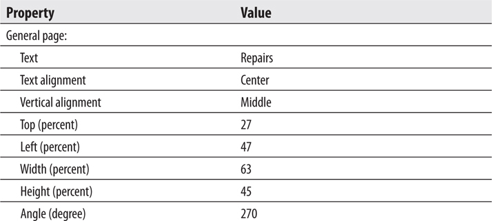
27. Click OK to exit the Label Properties dialog box.
28. In the Gauge Data window there is a new entry for LinearPointer1 and a new (Unspecified) item below it. Click the drop-down arrow to the right of the (Unspecified) entry, and select the NumRepairs field.
29. Preview/run the report.
30. Enter 3/1/2015 for Gauge Date, and click View Report. Your report should appear as shown.

31. If you are using SSDT or Visual Studio, click Save All on the toolbar. If you are using Report Builder, save the report as “DigitalDashboard” in the Chapter06 folder on the report server.
Task Notes The modification we made to the SELECT statement may look a bit strange. We are adding the count of repairs to the result set. However, repairs are not related to deliveries. The only thing they have in common is the fact that we are using the same date range. Therefore, we add the count of repairs by simply adding a subquery in the field list. This works in this case because we are only expecting a single row in the result set.
You have seen in the previous sections that charts and gauges allow us to create some pretty flashy output in a short time. Now it is time to turn our attention to two other methods for adding color to a report. One way is through the use of borders and background colors. Almost all report items have properties you can use to specify borders and background colors.
The other way to add color to your reports is through the use of images. Images can be placed on a report using the image report item. They can serve as a background for other report items. They can even serve as the background to the main body of the report itself.
In addition to determining where an image is placed on the report, you have to determine where the image will come from. Images can be stored in the report project, embedded in the report itself, pulled from a binary field in a database, or obtained from the Web using a Uniform Resource Locator (URL). Each image location has its own benefits and drawbacks.
Images stored in the report project are, of course, saved as separate files. They are not stored as part of the report definition. This means when the report is rendered, the renderer must find each of these image files to render the report correctly.
Images stored in the report project are easier to update if they have to be changed in the future. You can simply modify the image file because it is not embedded in a report definition file. These images can also be shared among several reports. However, because the report and its required images exist as separate files, some care has to be taken to ensure that the renderer can always locate the images when it is rendering the report.
Embedded images are stored right in the report definition file. With embedded images, only one file is required for rendering the report. There is no risk of the renderer being unable to find a required image. The downside of embedded images is it is more difficult to update an image. To change an embedded image, you need to modify the source image, re-embed the modified image, and redeploy the report. Also, it is impossible to share an embedded image between reports. The image can only be used by the report in which it is embedded.
Images stored in a database file can be shared among reports and are easy to track down when a report is rendered. In addition, when images are stored with the data in the database, it is possible to use a different image in your report for each row in the dataset. This is more difficult to do with project or embedded images.
Images in the database do pose two concerns. First, retrieving images from the database puts an additional load on your database server. Care must be taken to make sure your server can handle this additional load without degradation in response time. Second, managing large binary objects, such as images, in database records is not always a trivial task.
Images obtained through the Internet have a number of advantages. They can be easily shared among tens or even hundreds of reports; all the reports simply reference the same URL. They can be updated easily; just post a new image to the web server, and all the reports will reference this new version. In addition, web servers are designed for serving images, so there should not be an issue with additional load on the web server, unless it is extremely busy already.
The downside to obtaining images from a web server is this: the renderer must take the time to make a Hypertext Transfer Protocol (HTTP) request for each image it needs to put in the report. If the image’s URL points to the report server itself or if it points to another server on the same internal network, this may not be a big deal. If, on the other hand, the URL points to a server across the Internet from the report server, the time required for rendering will increase. You also need to ensure that the report server can always connect to the web server hosting the image.
As a rule of thumb, images to be shared among many reports, such as company logos, should be kept either in the report project or accessed through a URL. These shared images should be put in one central location so they can be accessed by the reports when they are needed. Images that have a strong association with data in a particular record in a database table should be stored in the database itself. For example, a picture of a particular employee has a strong association with that employee’s record in the Employee table. We are only interested in displaying the picture of a particular employee when the row in the dataset for that employee is being processed. Any images that do not fall into these two categories should be embedded in the report to ease deployment issues.
Using background colors on report items
Using borders on report items
Placing an image on a report
Business Need Galactic Delivery Services is preparing for its annual customer conference. The billing contact for each customer has been invited to the conference. As part of the preparations, the GDS art department must create nametags for the conference attendees. Because the names of all the billing contacts are available in the Galactic database and this database can be accessed easily from Reporting Services, the art department has decided to use Reporting Services to create the nametags.
The conference nametags should include the name of the attendee and the name of the company they work for. The art department would like the nametags to be bright and colorful. They should include the GDS logo.
NOTE
The image files used in the reports in this chapter are available for download from the McGraw-Hill Professional website at www.mhprofessional.com. Simply enter the book’s title or ISBN in the search box and then click the Downloads & Resources tab on the book’s home page.
1. Place the GDS.gif File in the Appropriate Location
2. Create a New Report, Create a Dataset, and Place the Report Items on the Report
SSDT and Visual Studio Steps1. Find the GDS.gif file in the materials downloaded for this book. (It is in ImagesFiles.Zip inside of the main Zip file.) Copy this to a location on your computer.
2. Reopen the Chapter06 project, if it was closed. Close the DigitalDashboard report.
3. Right-click the Reports entry in the Solution Explorer window, and select Add | Existing Item from the context menu. The Add Existing Item - Chapter06 dialog box appears.
4. Select All Files (*.*) from the drop-down list right above the Add and Cancel buttons.
5. Browse to the copy of the GDS.gif file you just saved. Select the GDS.gif file, and click Add. The GDS.gif file is added to the Chapter06 project.
6. Add a blank report called Nametags to the Chapter06 project.
Report Builder Steps1. Find the GDS.gif file in the materials downloaded for this book. (It is in ImagesFiles.Zip inside of the main Zip file.) Copy this to a location on your computer.
2. Using the web portal, navigate to the Chapter06 folder.
3. Click Upload from the menu. The Choose File to Upload dialog box appears.
4. Browse to the copy of the GDS.gif file you just saved. Select the GDS.gif file, and click Open.
5. In the View menu, check the Resources item. You will see the GDS.gif file in the Chapter06 folder along with all of the reports you have created for this chapter.
6. Return to the Report Builder and create a new blank report.
7. Delete the Click to add title text box.
8. Right-click in the page footer area of the report (the area below the dashed line), and select Remove Page Footer from the context menu.
Task Notes We will use the GDS.gif image as an external image in the following steps. If you are using SSDT or Visual Studio, this means we just added the image to the project. If you are using Report Builder, this means we just uploaded the image to the report server.
SSDT, Visual Studio, and Report Builder Steps
1. In the Report Data window, click the New drop-down menu. Select Data Source from the menu that appears. The Data Source Properties dialog box appears.
2. As we have done previously, create a new data source named Galactic that references the Galactic shared data source. Click OK to exit the Data Source Properties dialog box.
3. In the Report Data window, right-click the entry for the Galactic data source, and select Add Dataset from the context menu. The Dataset Properties dialog box appears.
4. Enter BillingContacts for the name.
5. Click the Query Designer button. The Query Designer window opens.
6. Click the Edit as Text button to switch to the Generic Query Designer.
7. Enter the following in the SQL pane (upper portion) of the Generic Query Designer window:

8. Run the query to make sure no errors exist. Correct any typos that may be detected.
9. Click OK to exit the Query Designer window. Click OK to exit the Dataset Properties dialog box.
10. Select the list report item in the Toolbox window/Insert ribbon, and place it on the design surface. This will create a tablix report item using the list template. Modify the following properties of the tablix in the Properties window:

We are using the list template to create the tablix for this report because it is going to have a freeform layout rather than the rows and columns of a table or matrix.
11. In the Report Data window, drag the BillingContact field onto the tablix. Click the BillingContact text box to select it, and use the Properties window to modify the following properties:
12. Drag the Name field from the Report Data window onto the tablix. Click the Name text box to select it, and using the Properties window, modify the following properties:
13. Place a text box from the Toolbox/Insert ribbon onto the tablix. Click the resulting text box to select it, and modify the following properties:
14. Click this text box again so the blinking edit cursor appears. Type GDS Conference 2016.
15. Place a line from the Toolbox/Insert ribbon onto the tablix. Click the resulting line to select it, and modify the following properties of the line in this order:
16. Place an image report item from the Toolbox/Insert ribbon onto the list. The Image Properties dialog box appears.
17. In the Select the image source drop-down list, select External.
18. If you are using SSDT or Visual Studio, in the Use this image drop-down list, select GDS.gif. This is the image file you added to the project in the previous task.
19. If you are using Report Builder, click the Browse button. Navigate to the GDS.gif image you uploaded to the report server in the previous task. Select GDS.gif and click Open.
20. Click OK to exit the Image Properties dialog box.
21. Click the image to select it, if it is not selected already, and modify the following properties using the Properties window:
22. Check to make sure the tablix is still the correct size. Select the tablix, and then use the Properties window to change the dimensions to match the following, if necessary:
NOTE
Clicking the orange background will select the rectangle in the tablix cell, not the tablix itself. To select the tablix, click the gray square in the upper-left corner of the tablix.
23. Click in the design surface outside of the tablix. This causes the report body to be selected in the Properties window. Modify the following properties of the report body:
24. Preview/run the report. The nametags are ready to be printed, cut apart, and placed in nametag holders, as shown here.
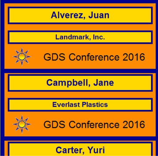
25. If you are using SSDT or Visual Studio, click Save All on the toolbar. If you are using Report Builder, save the report as Nametags in the Chapter06 folder on the report server.
Task Notes We used several properties of the report items in our Conference Nametags report to add color. The BackgroundColor property controls the color in the background of the report item. This defaults to Transparent, meaning that whatever is behind the item shows through. When the BackgroundColor property is set to a color rather than Transparent, that color fills in and covers up everything behind the item.
The BorderColor property controls the color of the border around the outside of the report item. BorderColor works in cooperation with two other properties: BorderStyle and BorderWidth. The BorderStyle property defaults to None. When BorderStyle is None, the border is invisible. No matter what color you set for BorderColor, it does not show up when the BorderStyle is set to None.
To have a visible border around an item, you must change the BorderStyle property to a solid line (Solid), a dotted line (Dotted), a dashed line (Dashed), a double line (Double), or one of the other settings in the BorderStyle drop-down list. Once you select one of these visible settings for the BorderStyle property, you can set the color of the border using the BorderColor property and the thickness of the border using the BorderWidth property.
The border settings for each side of a report item can be controlled separately or altogether. If you expand any of the three border properties, you can see they have separate entries for Default, Left, Right, Top, and Bottom. The Default property is, as it says, the default value for all four sides of the report item. When the Left, Right, Top, or Bottom property is blank, the setting for that particular side is taken from the Default property. For example, if the BorderStyle: Default property is set to None and BorderStyle: Left, BorderStyle: Right, BorderStyle: Top, and BorderStyle: Bottom are all blank, then there is no border around the report item. If the BorderStyle: Bottom property is set to Double, this overrides the default setting, and a double line appears across the bottom of the item. The borders on the other three sides of the item (left, right, and top) continue to use the default setting.
The Color property controls the color of the text created by a report item. There is a Color property for each text box, which is expected, because the main purpose of a text box is to create text. You also find a Color property for the tablix data region. The tablix can create a text message when no rows are in the dataset attached to it. The Color property specifies the color of the text in this special “no rows” message when it is displayed. (We discuss the “no rows” message more in Chapter 8.)
The final color property we used in the Conference Nametags report is the LineColor property. This property exists only for line report items. It should come as no surprise that this property controls the color of the line.
We used the TextAlign property to adjust the way text is placed horizontally inside a text box (left, center, or right). In this report, we also used the VerticalAlign property to adjust the way text is placed vertically inside a text box (top, middle, or bottom). The vertical alignment of text in a text box is only important if the border of the text box is visible and you can see where the text is being placed relative to the top and bottom of the text box.
Using background images on report items
Using an embedded image
Using the WritingMode property of a text box
Business Need Galactic Delivery Services is continuing its preparations for the annual customer conference. In addition to the nametags, the GDS art department must create place cards for the conference attendees. The place cards are going to be put on the table in front of each attendee during roundtable discussions. As with the nametags, place cards should be created for all the billing contacts.
The conference place cards should include the name of the attendee and the name of the company they work for. The art department would like the place cards to continue the color scheme set by the nametags, but with a more intricate pattern. They should include the GDS logo.
1. Create a New Report, Create a Dataset, and Place the Report Items on the Report
SSDT, Visual Studio, and Report Builder Steps
1. Find the GDSBackOval.gif, GDSBackRect.gif, and GDSBig.gif files in the materials downloaded for this book. (They are in ImagesFiles.Zip inside of the main Zip file.) Copy these files to a location on your computer.
2. If you are using SSDT or Visual Studio, reopen the Chapter06 project, if it was closed. Close the Nametags report, and add a blank report called PlaceCards to the Chapter06 project.
3. If you are using Report Builder, create a new blank report, delete the Click to add title text box, and remove the page footer.
4. In the Report Data window, click the New drop-down menu. Select Data Source from the menu that appears. The Data Source Properties dialog box appears.
5. As we have done previously, create a new data source named Galactic that references the Galactic shared data source. Click OK to exit the Data Source Properties dialog box.
6. In the Report Data window, right-click the entry for the Galactic data source, and select Add Dataset from the context menu. The Dataset Properties dialog box appears.
7. Enter BillingContacts for the name.
8. Click the Query Designer button. The Query Designer window opens.
9. Click the Edit as Text button to switch to the Generic Query Designer.
10. Enter the following in the SQL pane (upper portion) of the Generic Query Designer window:
11. Run the query to make sure no errors exist. Correct any typos that may be detected.
12. Click OK to exit the Query Designer window. Click OK to exit the Dataset Properties dialog box.
13. In the Report Data window, right-click the Images entry, and select Add Image from the context menu. The Open dialog box appears.
14. Select GIF files from the drop-down list above the Open and Cancel buttons. Navigate to the location where you stored the images in Step 1. Select the GDSBackOval.gif file, and click Open. This image is now embedded in the report. It will be encoded as part of the Report Definition Language (RDL) file.
15. In the Report Data window, right-click the Images entry again, and select Add Image from the context menu. The Open dialog box appears.
16. Select GIF files from the Files of type drop-down list. Navigate to the location where you stored the images in Step 1. Select the GDSBackRect.gif image file, and click Open. This image is also embedded in the report.
17. In the Report Data window, right-click the Images entry again, and select Add Image from the context menu. The Open dialog box appears.
18. Select GIF files from the Files of type drop-down list. Navigate to the location where you stored the images in Step 1. Select the GDSBig.gif image file, and click Open. This image is also embedded in the report.
19. Click the design surface. This causes the report body to be selected in the Properties window. Modify the following properties of the report body:
20. Place a list from the Toolbox window/Insert ribbon onto the report layout. Modify the following properties of the resulting tablix:
21. In the Report Data window, drag the BillingContact field onto the tablix. Click the BillingContact text box to select it, and use the Properties window to modify the following properties:
22. Drag the Name field from the Report Data window onto the tablix. Click the Name text box to select it, and, using the Properties window, modify the following properties:
23. In the Report Data window, select the entry for the GDSBig image. Drag this item onto the tablix near the top. The Image Properties dialog box appears.
24. Click OK to exit the Image Properties dialog box.
25. Click the image to select it, and modify the following properties of the image in the Properties window:
26. Make sure the rectangle in the tablix is selected, and then place a text box from the Toolbox window/Insert ribbon onto the tablix.
27. Double-click the text box so the blinking edit cursor appears. Type GDS Conference 2016 and then press esc.
28. The text box should be selected. Modify the following properties of this text box:
29. Make sure the rectangle in the tablix is selected, and then place a second text box from the Toolbox window/Insert ribbon onto the tablix.
30. Double-click this text box so the blinking edit cursor appears. Type GDS Conference 2016 and then press esc.
31. The text box should be selected. Modify the following properties of this text box:
32. Preview/run the report. The place cards are ready to be printed, cut apart, folded, and placed on the tables, as shown here.
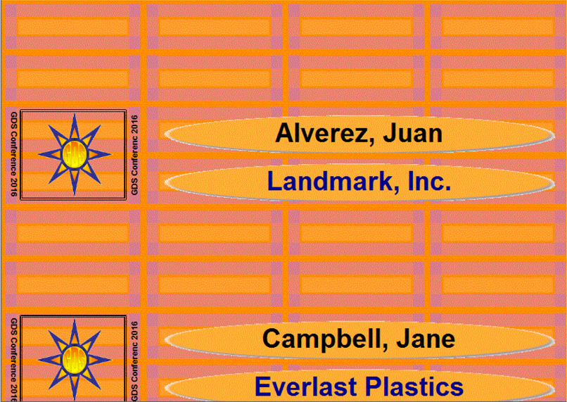
33. If you are using SSDT or Visual Studio, click Save All on the toolbar. If you are using Report Builder, save the report as PlaceCards in the Chapter06 folder on the report server.
Task Notes In this report, we used embedded images instead of external images, as we did in the previous report. Remember, the method of storing the image has nothing to do with the way the image is used in the report. External images can be used as background images. Embedded images can be used in image report items.
The Images entry in the Report Data window enables you to manage the images embedded in the report. Remember, an embedded image remains in the report even if no report item is referencing it. The only way to remove an embedded image from a report is to delete it from the Report Data window. Always remove embedded images from the report if they are not being used. This way, the report definition does not become any larger than it needs to be.
In this report, we also used the WritingMode property to rotate the content of one text box by 90 degrees and the content of another text box by 270 degrees. The normal writing mode for English text in a text box is horizontal. We changed this default writing mode and told these two text boxes to output our text vertically. The WritingMode property was implemented to allow Reporting Services to work with languages written from top to bottom and right to left, a vertical writing format rather than the horizontal format that is used for English. However, that does not prevent us from using the WritingMode property to produce a fancy effect with our English text.
Using database images
Using rectangle report items within table cells
Business Need The Galactic Delivery Services marketing department needs to produce a new rate sheet. The rate sheet needs to include a description of each type of delivery service provided by GDS. Each type has its own image to help customers remember the three types of services. The rate sheet also includes the name of each service type with a longer description below it and the cost of each service type off to the right side of the page.
Because all the information on the three types of services is available in the database, the marketing department wants to produce the rate sheet from a report rather than creating or updating a document each time the rates change.
1. Create a New Report, Create a Dataset, and Place the Report Items on the Report
2. Refine the Report Layout
SSDT, Visual Studio, and Report Builder Steps
1. If you are using SSDT or Visual Studio, reopen the Chapter06 project, if it was closed. Close the PlaceCards report, and add a blank report called RateSheet to the Chapter06 project.
2. If you are using Report Builder, create a new blank report.
3. In the Report Data window, click the New drop-down menu. Select Data Source from the menu that appears. The Data Source Properties dialog box appears.
4. As we have done previously, create a new data source named Galactic that references the Galactic shared data source. Click OK to exit the Data Source Properties dialog box.
5. In the Report Data window, right-click the entry for the Galactic data source, and select Add Dataset from the context menu. The Dataset Properties dialog box appears.
6. Enter ServiceTypes for the name.
7. Click the Query Designer button. The Query Designer window opens.
8. Click the Edit as Text button to switch to the Generic Query Designer.
9. Enter the following in the SQL pane (upper portion) of the Generic Query Designer window:

10. Run the query to make sure no errors exist. Correct any typos that may be detected.
11. Click OK to exit the Query Designer window. Click OK to exit the Dataset Properties dialog box.
12. Make the design surface larger, and then place an image report item from the Toolbox window/Insert ribbon onto the report layout. The Image Properties dialog box appears.
13. In the Select the image source drop-down list, select External.
14. If you are using SSDT or Visual Studio, select GDS.gif from the Use this image drop-down list.
15. If you are using Report Builder, click Browse. Navigate to the Chapter06 folder. Select the GDS.gif image file, and click Open.
16. Click OK to exit the Image Properties dialog box.
17. Modify the following properties of the image:
18. If you are using SSDT or Visual Studio, drag a text box from the Toolbox onto the report layout. If you are using Report Builder, select the Click to add title text box.
19. Modify the following properties of this text box:
20. Click this text box again so the blinking edit cursor appears. Type Galactic Delivery Services.
21. Place a text box from the Toolbox window/Insert ribbon onto the report layout. Modify the following properties of this text box:
22. Click this text box again so the blinking edit cursor appears. Type Type of Service.
23. Place a text box from the Toolbox window/Insert ribbon onto the report layout. Modify the following properties of this text box:
24. Right-click the last text box added to the report, and select Expression from the context menu. The Expression dialog box appears.
25. Click Built-in Fields in the Category pane.
26. Double-click ExecutionTime in the Item pane.
27. Click OK to exit the Expression dialog box.
28. Place a table from the Toolbox window/Insert ribbon onto the report layout to create a tablix.
29. Click the tablix to activate the gray sizing rectangles.
30. Right-click in the gray rectangle to the left of the header row. Select Delete Rows from the context menu. This removes the header row.
31. Click the gray square in the upper-left corner of the tablix. This selects the tablix. Modify the following properties of the tablix:
32. Place an image report item from the Toolbox window/Insert ribbon in the leftmost table cell. The Image Properties dialog box appears.
33. In the Select the image source drop-down list, select Database.
34. In the Use this field drop-down list, select [PriceSheetImage].
35. In the Use this MIME type drop-down list, select image/gif.
36. Click OK to exit the Image Properties dialog box.
37. Click the center table cell, and then select the Description field from the Field Selector. Modify the following properties of the text box in this cell:
38. Click the rightmost table cell, and then select the Cost field from the Field Selector. Modify the following properties of the text box in this cell:
39. Preview/run the report. Your report appears similar to the illustration.
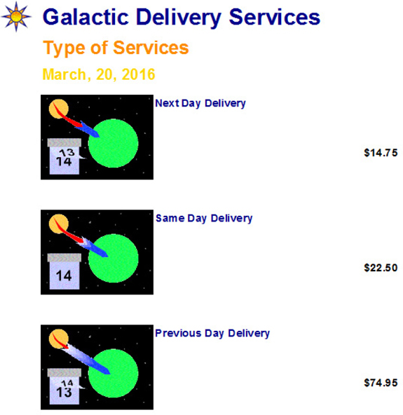
Task Notes In the Rate Sheet Report, we used image data stored in a database table. As we discussed earlier in the chapter, this allows the report to have a different image for each row in the table report object. The Next Day Delivery row, the Same Day Delivery row, and the Previous Day Delivery row each have their own unique image on the report.
We have one requirement left to fulfill. The business needs specified that the long description of the service type should come below the name of that service type. Let’s reformat our report to include the long description in the report.
SSDT, Visual Studio, and Report Builder Steps
1. Return to design mode.
2. Click the center table cell. This selects the text box in the cell.
3. Press delete to remove the text box.
4. Place a rectangle from the Toolbox window/Insert ribbon in the center table cell. A rectangle report item is now in the center table cell.
5. Drag the Description field from the Report Data window onto the rectangle you just created.
6. Click the resulting text box to select it and modify the following properties:
7. Drag the LongDescription field from the Report Data window onto the same rectangle that contains the text box for the Description field. Click the resulting text box to select it, and modify the following properties:
8. Preview/run the report. Your report appears similar to the illustration.
9. If you are using SSDT or Visual Studio, click Save All on the toolbar. If you are using Report Builder, save the report as RateSheet in the Chapter06 folder on the report server.
Task Notes In reviewing this task, you can see the rectangle allowed us to do some creative formatting within a table cell. The business needs specified the long description of the service type should appear below the name of the service type. We could accomplish this by putting a rectangle in the center table cell and then putting two text boxes inside the rectangle.
This is similar to what happens when we use the list template to create a tablix. The tablix has a single cell, which is filled with a rectangle. This rectangle then enables the freeform layout we expect from a list.
The Rate Sheet report is ready to go.
In this chapter we looked at adding charts and graphics to our reports to let the data better tell its own story. In the next chapter, we look at another way for our reports to present data through a visual representation—that is, by using maps.