Chapter 3
Introducing Excel Tables
IN THIS CHAPTER
 Figuring out tables
 Building tables
 Analyzing tables with simple statistics
 Sorting tables
 Discovering the difference between using AutoFilter and filtering
One of the secrets of data-analysis success is being organized. I’m not talking about your desk or your office (insert sigh of relief here), but your data. If you have a worksheet with numbers and text inserted haphazardly, analyzing that data will be next to impossible. Why? Because Excel is the neat freak of the software world. If data is strewn around the worksheet any old way, Excel throws up its hands and says “I can’t work under these conditions!”
Fortunately, Excel understands that the rest of us aren’t so orderly, so it offer the table — a powerful tool designed not only to get your data lined up like soldiers on parade but also to help you analyze that data and extract useful information. In this chapter, you discover what tables are and why they’re so darned useful in the data-analysis world. You also dive in to building, analyzing, sorting, and filtering a table.
What Is a Table and Why Should I Care?
In Excel, a table is a rectangular range of cells used to store data; it includes special tools for entering, editing, and analyzing that data. A table is designed to store a collection of related information. For example, one table might store business data such as customers, invoices, or inventory, whereas another might store personal data such as contacts, movies, or household items. You can use Excel tables to create, retrieve, and manage large or small collections of information.
To get the most out of Excel tables, you need to understand a few basic concepts:
- A table is a kind of database: Microsoft Access is a powerful database management tool that lets you work with large, complex databases. If your needs are simpler, however, you can use a table as a database in which the data is organized into columns and rows. In this case, each column is the equivalent of a database field, which contains a single type of information, such as a name, address, or phone number; and each row serves as the equivalent of a database record, which holds a set of associated field values, such as the information for a specific contact.
- A table has its advantages: Because a table is a collection of rows and columns on a worksheet, it looks very much like a regular Excel range. However, a table is actually a special type of range because Excel provides some tools that help you work more easily with the data in the table. These tools enable you to convert existing worksheet data into a table, select the rows and fields you want to work with, add new records and fields to the table, delete existing records and fields, and insert rows to show totals.
- A table makes data analysis easier: Tables are also useful tools for analyzing your data. For example, you can sort the table data, both on a single field and on multiple fields. You can also make the table data easier to manage by filtering the data to show only the subset of records you want to work with. In addition, you can use a table as the basis of a PivotTable, which is a powerful tool for summarizing and analyzing data that I discuss in Part 2 of this book.
Before creating your tables, you should spend some time deciding what type of data each table should contain, which involves thinking about what purpose your tables will serve, which fields you will need in each table, and how you’ll differentiate between each record in the table. Each table should have a single, well-defined purpose. For example, a table might store customer contact information, product inventory, or personnel records. Combining multiple purposes in a single table results in needless duplication and increases the chance of data-entry error. If you think you might need to sort or filter the data by a certain type of information, put that information in a separate field. Finally, having at least one field that is unique to each record to differentiate between them is usually a good idea.
To help you work with Excel tables, here’s a list of table terms, all of which are pointed out in Figure 3-1:
- Table column: A single type of information, such as names, addresses, or phone numbers. In an Excel table, each column is the equivalent of a database field.
- Table row: A set of associated table cells, such as the data for a single contact. In an Excel table, each row is the equivalent of a database record.
- Table cell: An item in a table column that represents a single instance of that column's data, such as a name, address, or phone number. In an Excel table, each cell is equivalent to a database field value.
- Headers: The unique names you assign to every table column that serve to label the data in each column. These names are always found in the first row of the table.
- Sort & Filter buttons: An Excel feature that gives you access to a set of commands that perform various actions on a column, such as sorting or filtering the column data.
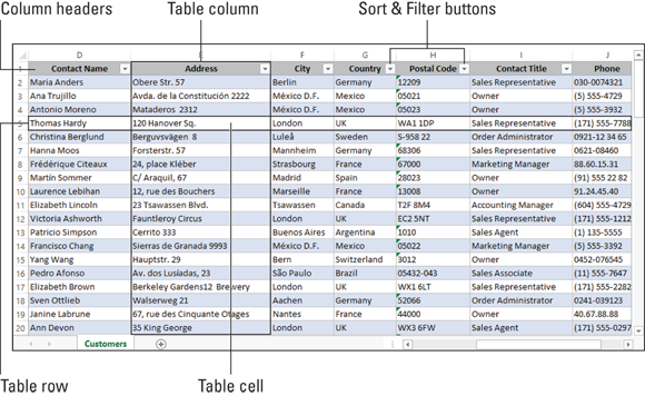
FIGURE 3-1: Some table terminology you should know.
Building a Table
You build an Excel table in one of two ways:
- Get the data from an external source, such as a database.
- Convert an existing range to a table.
Getting the data from an external source
The usual way to create an Excel table is to import the information from an external source, such as another workbook, an Access database, a text file, or even a web page. Importing data is such an important — and time-saving — method of getting data into Excel that I devote all of Chapter 4 to it. There, I describe the process of getting the external data into a format that Excel can use and then importing the data into Excel so that you can analyze it. Hop over to that chapter for more on creating a table by importing its data.
Converting a range to a table
If the data you want to use already exists on your worksheet, you might be able to convince Excel to convert that range into an honest-to-goodness table. I say “convince” here because not all ranges are candidates for table-hood. Fortunately, getting your data ready doesn’t require elaborate planning or modifications, but you should follow a few guidelines for best results. Here are some pointers:
- Decide whether you want your table to have column headers. This is an excellent idea because it makes your table much easier to read and to analyze, but the headers are optional, if that works for you.
- If you do use column headers, always place them in the top row of the range.
- Column headers must be unique and must be text or text formulas. If you need to use numbers, format them as text. (That is, select the headers and then use the Home tab’s Number Format list to select Text.)
- Excel can often automatically identify the size and shape of the range that contains your data. To avoid confusing Excel, make sure that you have no blank rows or columns in your range.
- If the same worksheet contains data that you don’t want to appear in your table, leave at least one blank row or column between the data and the range. The blank row or column helps Excel identify the correct table range without also including the nontable data.
Note that you don’t need to enter all your data before converting the range to a table. After you have the table, you can add new rows and columns as needed. Okay, I think you’re ready to find out how to convert a range to a table:
- Select a cell within the range that you want to convert to a table.
-
Choose Insert ⇒ Tables ⇒ Table or press Ctrl+T.
The Create Table dialog box appears. As shown in Figure 3-2, Excel makes its best guess about the extent of the range that it will convert to a table.
- If Excel got it wrong, drag over the correct range.
- If your range has labels that you want to use as column headers, make sure that the My Table Has Headers check box is selected.
- Click OK.
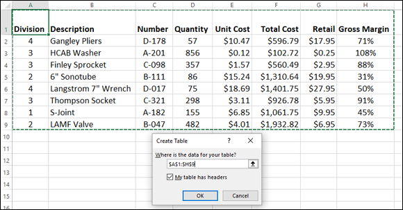
FIGURE 3-2: Excel takes a stab at the full range you want to convert.
Excel converts the range to a table, which, as you can eyeball in Figure 3-3, also means that Excel does the following:
- Applies a table format to the range.
- Shoehorns a Sort & Filter button into each column header.
- Displays the Design tab whenever you select a cell anywhere inside the table. The Design tab is chock-full of useful table tools.
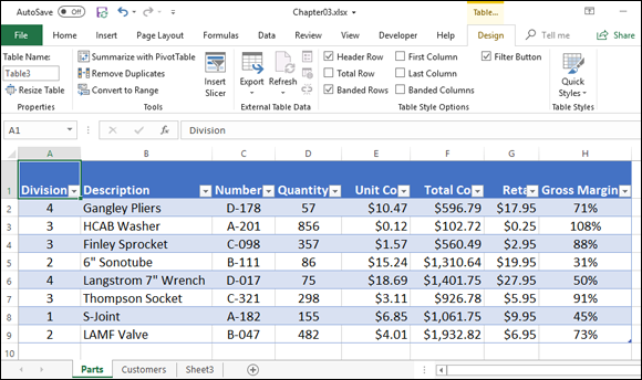
FIGURE 3-3: The range is now a full-fledged table, just like that.
Basic table maintenance
After you’ve converted your range to a table, the data isn’t set in stone. In fact, you can perform all kinds of actions to keep your table up-to-date. Here’s a quick summary:
- Selecting a row: Right-click any cell in the row and then choose Select ⇒ Table Row.
- Selecting a column: Right-click any cell in the column and then choose Select ⇒ Table Column Data. If you want the selection to also include the column header, choose Select ⇒ Entire Table Column instead.
- Inserting a row: Right-click the row above which you want the new row to appear; then choose Insert ⇒ Table Rows Above. If you select cells in two or more rows, Excel inserts the same number of new rows.
- Inserting a column: Right-click the column to the left of which you want the new column to appear; then choose Insert ⇒ Table Columns to the Left. If you select cells in two or more columns, Excel inserts the same number of new columns.
- Deleting a row: Right-click the row you want to delete and then choose Delete ⇒ Table Rows. If you select cells in two or more rows, Excel deletes those rows.
- Deleting a column: Right-click the column you want to delete and then choose Delete ⇒ Table Columns. If you select cells in two or more columns, Excel deletes those columns.
- Resizing the table: Select any cell in the table; then choose Design ⇒ Resize Table to open the Resize Table dialog box. Drag over the new range and then click OK.
- Converting the table back to a range: Select any cell in the table; then choose Design ⇒ Convert to Range. When Excel asks you to confirm, click Yes.
Analyzing Table Information
Now that your data is nicely arranged inside a table, a whole new world of data analysis opens right before your eyes. That’s because Excel offers quite a few useful data-analysis tools that were designed with tables in mind. In the rest of this chapter, I introduce you to these handy table tools.
Displaying simple statistics
If your table includes a column that contains numeric values or prices, you might want to perform a quick analysis on that column by generating some basic statistics, such as the column’s sum or average. Happily, one of Excel’s slickest and quickest tools enables you to effortlessly calculate not only the sum or average for a column, but also other stats such as the count, the minimum value, and the maximum value.
To get these stats, you take advantage of the fact that a table is still a range, and Excel automatically displays statistics in the status bar when you select a range. For example, if you select the range D2 to D9 in Figure 3-4 (that is, all the items in the table’s Quantity column), Excel calculates the column’s average, count, and sum, and then displays this useful information in the status bar:
Average: 295.75 Count: 8 Sum: 2366

FIGURE 3-4: Select a column’s cells, and Excel displays a few stats in the status bar.
To display some other statistical calculations for the selected table column, right-click the status bar to show the Customize Status Bar menu. Near the bottom of that menu, Excel provides six statistical measures that you can add to or remove from the status bar: Average, Count, Numerical Count, Minimum, Maximum, and Sum. In Table 3-1, I describe each of these statistical measures briefly, but you can probably guess what they do. Note that if a statistical measure is displayed on the status bar, Excel places a check mark in front of the measure on the Customize Status Bar menu. To remove the statistical measure from the status bar, select the measure.
TABLE 3-1 Quick Statistical Measures Available on the Status Bar
|
Measure |
What It Displays |
|
Average |
The average of the cells in the selected range. |
|
Count |
The number of cells that hold labels, values, or formulas. In other words, use this statistical measure when you want to count the number of cells that are not empty. |
|
Numerical Count |
The number of cells in a selected range that hold values or formulas. |
|
Minimum |
The smallest value in the selected range. |
|
Maximum |
The largest value in the selected range. |
|
Sum |
The total of the values in the selected range. |
These basic statistical measures are often all you need to gain useful insights into data that you collect and store in an Excel table. True, by using an example parts table that contains just nine items, the power of these quick statistical measures doesn't seem all that earthshaking. But with real data, these measures often produce interesting insights that you can use.
Adding a column subtotal
The quick statistical measures that I talk about in the previous section are handy and useful, but they suffer from two problems:
- Excel displays the status bar statistics when you select any range, so you can get those stats without bothering to convert a range to a table.
- The stats appear in the status bar only when you’ve selected the data. If you select another cell or range, the stats disappear or change.
Because you’ve gone to the trouble of converting a regular range to a table, you can take advantage of the data’s “table-ness” by summarizing a column with a subtotal that appears full time at the bottom of the column.
Although the word subtotal implies that you’re summing the numeric values in a column, Excel uses the term more broadly. That is, a subtotal can be not only a numeric sum but also an average, a maximum or minimum, or a count of the values in the field. You can also choose more advanced subtotals such as the standard deviation or the variance.
Follow these steps to add a subtotal to a table column:
- Select the data in the column you want to total.
-
Click the Quick Analysis smart tag or press Ctrl+Q.
The Quick Analysis options appear.
- Click the Totals tab.
-
Select the type of calculation you want to use.
Excel adds a Total row to the bottom of the table and inserts the result of the calculation you selected in Step 4. In Figure 3-5, you can see that I’ve added a calculation for the average of the Quantity column. Notice that when you select the result, its cell displays a drop-down arrow to the right. You can click the drop-down arrow to choose a different calculation.
![A spreadsheet displaying a table with columns for division, description, number, and quantity. Under quantity is a selected cell (D10) labeled 295.75. =SUBTOTAL(101,[Quantity]) is indicated in the formula bar.](images/9781119518167-fg0305.png)
FIGURE 3-5: Excel adds a total row to the bottom of the table and displays the result of the calculation.
Sorting table records
Another way to analyze your table data is to sort the data based on the values in a column, which means arranging that column’s numeric values from highest to lowest or from lowest to highest. (You can also sort text values alphabetically and date values from oldest to newest or newest to oldest, but these techniques are less useful for data analysis.) How does sorting help you analyze your data? Here are some ideas:
-
 Sorting enables you to get a feel for how your data is distributed overall. For example, you might notice that most of the values cluster around the low end of the range of values.
 - Sorting enables you to identify certain types of trends in the data. For example, you might notice that records (that is, rows) with low values in the sorted column all come from the same geographic area, or that high values in another table all come from the same division of the company.
- Sorting enables you to identify outliers, which are data points that are significantly outside the norm for your data. For example, if your sort shows that most of your column values lie between 1 and 100, but one row contains the value 250, you’ll want to investigate why that value is so much greater than the others.
To sort a table based on the values in a column, follow these steps:
-
Click the Sort & Filter button for the column you want to sort.
Excel displays the Sort & Filter menu. Figure 3-6 shows the top part of the Sort & Filter menu that appears when selecting the Sort & Filter button for the Quantity column.
- Select the sort option you want:
- Sort Smallest to Largest: Sorts the column values in ascending numeric order.
- Sort Largest to Smallest: Sorts the column values in descending numeric order.
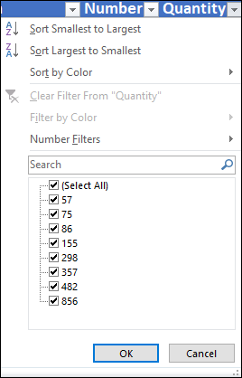
FIGURE 3-6: Selecting the Quantity column’s Sort & Filter button displays this menu.
When you can’t sort table information exactly the way you want by using the Sort Smallest to Largest and Sort Largest to Smallest commands, use the Custom Sort command.
To use the Custom Sort command, follow these steps:
-
Click any Sort & Filter button in the table.
Excel displays the Sort & Filter menu.
-
Choose Sort by Color ⇒ Custom Sort.
Excel displays the Sort dialog box.
- Use the Sort By drop-down list to select the field that you want to use for sorting.
-
Use the Sort On list to select Cell Values.
If you’re using conditional formatting, as described in Chapter 1, you can also choose to sort on Cell Color, Font Color, or Conditional Formatting Icon.
-
Use the Order list to select a sort order.
For numeric data, select either Smallest to Largest or Largest to Smallest. If you sort by color or icons, you need to tell Excel how it should sort the colors by using the options that the Order list provides.
 Typically, you want the sort to work in ascending or descending order. However, you might want to sort records by using a chronological sequence, such as Sunday, Monday, Tuesday, and so on, or January, February, March, and so forth. To use one of these other sorting options, choose the Order list’s Custom List command and then choose one of these other ordering methods from the Custom Lists dialog box that Excel displays. You can also create your own custom lists if, say, you need to sort your data by department or job title.
 -
(Optional) Specify one or more secondary sort levels by clicking Add Level and then repeating Steps 3 to 5 for the new sort level that appears.
A secondary sort level means that Excel first sorts the table based on the data in the primary sort level, and it then further sorts the table based on the data in the secondary sort level. For example, in the parts table, you can first sort the table based on the Division column, and then sort based on the Quantity column. Figure 3-7 shows the Sort dialog box set up for such a two-level sort.
If you add a level that you later decide you don’t want or need, select the sort level and then click the Delete Level button. You can also duplicate the selected level by clicking Copy Level. Finally, if you create multiple sort levels, you can move the selected sort up or down a level by clicking the Move Up or Move Down button.
Note: The Sort dialog box also provides a My Data Has Headers check box that enables you to indicate whether the worksheet range selection includes the row and field names. If you’ve already told Excel that a worksheet range is a table, however, this check box is disabled.
-
Click OK.
Excel sorts your list.
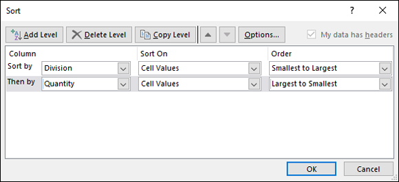
FIGURE 3-7: The Sort dialog box set up for a two-level sort.
Filtering table records
When you’re generating statistics, adding subtotals, and sorting data, you’ll most often want to work with all the table data. However, working with just a subset of the table data can sometimes be beneficial. In the parts database, for example, you might want to see only the records from Division 3 or only those items whose Retail price is greater than ten dollars.
To help you work with subsets of your table data, Excel provides an AutoFilter command that’s pretty cool. When you use AutoFilter, you produce a new view of your table that includes only those records that match whatever criteria you specify, such as the Division value being equal to 3 or the Retail value being greater than 10.
To apply an AutoFilter to a table, follow these steps:
-
Click the Sort & Filter button for the column you want to filter.
Excel displays the column’s Sort & Filter menu. Above the OK and Cancel buttons, you see a list of check boxes, where the name of each check box is a unique value from the column.
- Deselect the Select All check box to deselect all the check boxes.
-
Select the check box for each column value you want to see in the filtered table.
Figure 3-8 shows the Sort & Filter menu for the Division column, with only the 3 check box selected.
-
Click OK.
Excel filters the table to show only those values you selected in Step 3. Figure 3-9 shows the filtered parts table, which now displays only the records from Division 3. The Sort & Filter button of the Division column header now sports a tiny funnel icon, which gives you a visual heads-up that the column is filtered.
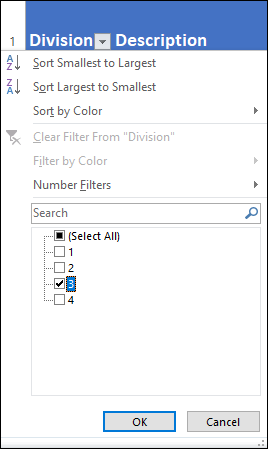
FIGURE 3-8: Select the check box beside each column value that you want to include in your filtered table.

FIGURE 3-9: The Parts table filtered to show only the records from Division 3.
Clearing a filter
To remove an AutoFilter, you have a couple ways to go:
- To clear a filter from a single column, select the column’s Sort & Filter button and then select the Clear Filter From “Column” command from the menu (where Column is the name of the filtered column).
- If you have multiple filters applied to the table, you can clear all the filters in one fell swoop by choosing Data ⇒ Clear (look for it in the Sort & Filter group).
Turning off AutoFilter
If you find that you don’t use AutoFilter and so those Sort & Filter buttons just cramp your style, no problem: The AutoFilter command is actually a toggle switch. When AutoFilter is turned on, Excel adds the Sort & Filter buttons to each cell in the table’s header row; when you turn off AutoFilter, Excel removes the Sort & Filter buttons.
To turn off AutoFilter and remove the Sort & Filter buttons, choose Data ⇒ Filter (or press Ctrl+Shift+L). If you change your mind and decide to reinstate AutoFilter, choose Data ⇒ Filter again (or do the Ctrl+Shift+L thing again).
Applying a predefined AutoFilter
A basic AutoFilter creates a subset of the table by showing only those rows in which the filtered column contains the value or values you selected using the check boxes in the Sort & Filter menu. That’s pretty useful, but what if your filtering needs (I bet you didn’t even know you had filtering needs) are more complex? For example, you might want to see only those records in which the Quantity column is greater than or equal to 100, or in which the Gross Margin column is above the average for that column.
These more complex filters sound like more work, and I won’t lie to you: They do take a few extra steps. Ah, but only a few, I promise you, because Excel comes with quite a few predefined filter operators, including Greater Than Or Equal To and Above Average. Here are the steps to follow to apply one of these predefined filters to a column in your table:
-
Click the Sort & Filter button for the column you want to filter.
Excel displays the column’s Sort & Filter menu.
-
Choose the X Filters command, where X refers to the type of data in the column.
You have three possible commands:
- Number Filters: Appears when the column contains numeric data.
- Date Filters: Appears when the column contains date values, time values, or both.
- Text Filters: Appears when the column contains text data.
-
Select the filter operator you want to apply.
Excel displays a menu of predefined filter operators. The contents of the menu depend on the data type of your column. For example, if your column contains numeric data, you see the following operators:
- Equals: Filters the column to show only those rows whose column value equals a number you specify.
- Does Not Equal: Filters the column to show only those rows whose column value does not equal a number you specify.
- Greater Than: Filters the column to show only those rows whose column value is greater than a number you specify.
- Greater Than or Equal To: Filters the column to show only those rows whose column value is greater than or equal to a number you specify.
- Less Than: Filters the column to show only those rows whose column value is less than a number you specify.
- Less Than or Equal To: Filters the column to show only those rows whose column value is less than or equal to a number you specify.
- Between: Filters the column to show only those rows whose column value lies between (and including) two numbers you specify.
- Top 10: Filters the column to show only those rows whose column value is in the top 10 of all the values in the column. Note that this filter is slightly misnamed because you can pick a number other than 10 (such as 5 or 25), you can show the bottom 10 (or 20 or 30 or whatever), and you can filter based on the percentage (for example, the top 10 percent) instead of the values.
- Above Average: Filters the column to show only those rows whose column value is greater than the average value of the column.
- Below Average: Filters the column to show only those rows whose column value is less than the average value of the column.
- Custom Filter: Displays the Custom AutoFilter dialog box, which enables you to create your own filter condition. In particular, you can specify two separate filter conditions, and you can then select the And option to have Excel filter the table to show only those rows with column values that match both filter conditions, or you can select the Or option to have Excel filter the table to show only those rows with column values that match one or both filter conditions.
In most cases, you see the Custom AutoFilter dialog box with the operator you selected already filled in in the drop-down list. For example, Figure 3-10 shows the Custom AutoFilter dialog box that appears when you select the Greater Than Or Equal operator. Note that some operators — such as Above Average and Below Average — don’t require more information from you, so Excel applies the filter right away.
-
Complete the AutoFilter condition.
How you complete the condition depends on the operator you chose. For most numeric filters, you specify a number. For example, in Figure 3-11, you can see that I’ve entered the number 100 in the text box, which means that this filter will show the subset of the table when the Quantity column value is 100 or more.
-
Click OK.
Excel filters your table according to your custom AutoFilter. Figure 3-11 shows the filter from Figure 3-11 applied to the Parts table.

FIGURE 3-10: The Custom AutoFilter dialog box.

FIGURE 3-11: The filter shown in Figure 3-10 applied to the Parts table.
Applying multiple filters
The predefined AutoFilter operators described in the previous section enable you to filter your table based on a condition applied to a single column. What if your filtering needs (there are those needs again) are such that you want to filter the table using multiple columns? In the Parts table, for example, you might want to filter the table to show only those rows where the Quantity field is greater than or equal to 100, and you might want the resulting rows to themselves be filtered to show only those where the Gross Margin column is less than 75%.
The good news is that Excel doesn’t mind in the least if you apply an AutoFilter to one column and then apply another AutoFilter to a second column. In fact, you can apply AutoFilters to as many columns as you need. In each case, just follow the same steps as those outlined in the previous section.
Applying advanced filters
Most of the time, you’ll be able to filter table records by using the Sort & Filter menu’s check boxes or the Filter command. However, in some cases, you might want to gain more control over your filters, and that requires applying Excel’s advanced filters.
Before you can create advanced filters in Excel, you need to know how to construct comparison expressions, through which you compare the items in a column with a value you specify. To construct a comparison expression, you enter a comparison operator from Table 3-2 and then a value used in the comparison.
TABLE 3-2 Excel’s Comparison Operators
|
Operator |
Name |
|
|
Equals |
|
|
Not equal to Greater than |
|
|
Greater than or equal to |
|
|
Less than |
|
|
Less than or equal to |
For example, if you want to filter the parts table so that it shows only those items where the Unit Cost is less than $10, you use the following comparison expression:
< 10
Hmm, okay, I hear you musing, but where does the expression appear?
Surprisingly, it goes on the worksheet itself. To get this set up, first insert three or four blank rows above the table headers. Now copy your table headers and then paste them above your table.
With that done, enter your comparison expression in the cell immediately below the copied header of the column you want to work with. In my example, I want to filter based on the Unit Cost column, so I enter < 10 in the cell below the copied Unit Cost header. In Figure 3-12, you can see the expression in cell E2.
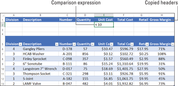
FIGURE 3-12: A table set up for an advanced filter.
So far, this “advanced” filtering doesn’t seem all that different than using one of Excel’s predefined operators. True! But the real power of advanced filters is that you’re free to enter as many comparison expressions as you need. There are three ways to go about this:
- Enter the comparison expressions on the same row: This tells Excel to filter the table to show only those rows that match all the comparison expressions you enter. In Figure 3-13, for example, I’m asking Excel to filter the Parts table to show only those rows in which the Unit Cost is less than 10 (cell E2), the Quantity is greater than 300 (cell D2), and the Division equals 3 (cell A2; notice that you don’t need to use Equals (=) when you want to match a value exactly).
- Enter the comparison expression on separate rows: This tells Excel to filter the table to show only those rows that match at least one of the comparison expressions you enter. In Figure 3-14, for example, I’m asking Excel to filter the Parts table to show only those rows in which either the Total Cost is greater than 1,000 (cell F2) or the Quantity is greater than 400 (cell D3).
- Mix and match the preceding as needed: Feel free to add as many comparison expressions as you need, and don’t be shy about using multiple columns and multiple rows. Hey, it’s your filter!
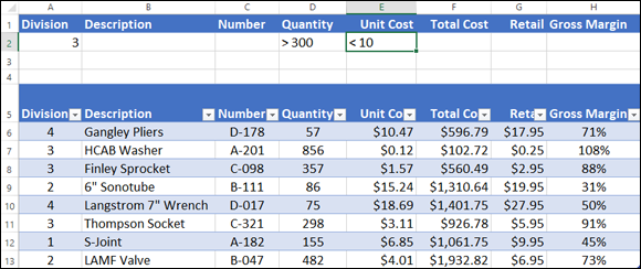
FIGURE 3-13: Put the comparison expressions on one row to match them all.
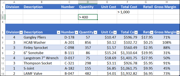
FIGURE 3-14: Put the comparison expressions on separate rows to match one or more.
The extra column headers that you copied and the rows below where you enter your comparison expressions are known as the criteria range. Note, however, that just setting up the criteria range doesn’t do any filtering. Only after you’ve set up your criteria range — as was done for Figures 3-13 and 3-14 — are you ready to run the advanced filter operation. Here’s how it works:
- Select any cell in the table.
-
Choose Data ⇒ Advanced.
Excel displays the Advanced Filter dialog box.
-
Tell Excel where to place the filtered table.
Use the Action radio buttons to specify where you want the filtered records to appear:
- Filter the list, in-place: Excel hides the records in the table that don’t meet the filtering criteria. (Note that “list” is just another word for “table.”) This is the most common way to go, because it means that you can work with the filtered data and whatever changes you make will remain when you remove the filter.
- Copy to another location: Excel copies the records that meet the filtering criteria to a new location. Take this route if you want to include the filtered data as part of a report or you want to manipulate the filtered data and don’t want those changes to appear in the original table.
-
Use the List Range box to verify the table range.
Because you selected a cell in the table in Step 1, Excel should correctly identify the table and display its range coordinates in the List Range box. If the text box doesn’t show the proper worksheet range for your table, either enter or select the correct range.
-
Use the Criteria Range box to select the criteria range.
The criteria range consists of the copied headers plus the row or rows below the copied headers that you’re using to enter the comparison expressions. In Figure 3-14, for example, the criteria range is $A$1:$H$3.
-
(Optional) If you’re copying the filtered records, use the Copy To box to specify the destination.
Because you don’t know in advance how many records will be in the results, you don’t need to specify a range in the Copy To box. Instead, enter or select the address of the cell that you want to be the top-left cell of the destination.
Figure 3-15 shows the completed Advanced Filter dialog box, which I use to apply the advanced filter (refer to in Figure 3-14).
-
Click OK.
Excel filters your table. Figure 3-16 shows what the filtered list looks like. Note that the table now shows only those parts where the Total Cost is greater than $1,000 or the Quantity is greater than 400.
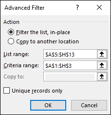
FIGURE 3-15: An advanced filter all set to go.
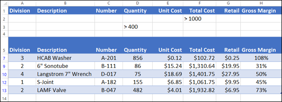
FIGURE 3-16: The results of the advanced filter from Figure 3-15.
If you filtered your table in-place, you can remove the advanced filter and restore the Sort & Filter buttons by selecting any cell in the filtered results and then choosing Data ⇒ Filter in the Sort & Filter group.
Yep, advanced filters take a bit of work to set up, but after you have your criteria range in place, you can entertain yourself for hours by adding comparison expressions to different columns and different rows. Before you know it, that once ornery table data will be like putty in your hands.