PHOTO: COLBY LYSNE
WORST-CASE SCENARIO: A CLIENT CALLS IN YOUR BOOK AND YOU DON’T HAVE ONE. YOU SCRAMBLE AND SEND A BOTCHED BOOK.
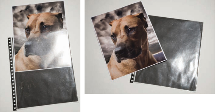
WORST-CASE SCENARIO: YOU DESIGN A REALLY COOL, UNIQUELY SIZED PORTFOLIO, BUT IT DOESN’T FIT INTO A FEDEX BOX OR OTHER STANDARD SHIPPING CASE. IT COMES BACK MANGLED.
WORST-CASE SCENARIO: YOU WANT YOUR IMAGES TO STAND OUT, SO YOU ORDER A 16" x 20" PORTFOLIO. VIEWERS HATE IT.
You should have a portfolio that reflects your style prepared and ready for the moment when a client calls. If the call comes and you don’t have a book ready, try to buy some time. Say, “All my books are out, but I’ll try to retrieve one. What is your deadline?”
If a client asks for specific imagery, create a gallery on your website or submit a mini-portfolio of prints to be viewed alongside your “style book.”
Think about how your portfolio will ship. One super-cool book with “fins” like a Cadillac lasted for only one shipment. An assistant preparing your portfolio for return may not consider how precious it is.
Size does matter. The average art director, buyer, or designer works in a cubicle. When your opened portfolio spans 32" and knocks over everything on the desk, you have not made a good first impression.
There was a time when photographers presented themselves exclusively with portfolios—formal book presentations of their most representative work. But that was before the Internet became a driving influence in all of our lives.
Websites are a must in today’s market. Having a printed portfolio is secondary, but the answer—after much debate—is that it is still a necessity. We have talked to hundreds of your potential clients, and they all say a book is crucial, especially for presenting you to their clients as they try to assign a project.
And one other thing is certain: Today, a photographer without a website is at a distinct disadvantage. About 90 percent of the time photographers are being hired from their websites, so having one is crucial—it’s not an option, it’s a must.

PHOTO: JEFF MOORE
Jeff Moore used a blanket template Web design that was boring and didn’t showcase his work as it should be seen. We call this lost real estate.
A website allows viewers to view your work and identify you as a potential vendor before calling in your book (if needed). Usually these days if your book is called in, it means you are a good contender for an assignment.
Beginning photographers often ask, “How much similarity should there be between my website and my portfolio?” The answer is that the two should complement one another stylistically and show similar content and images, but they do not have to be identical.
A website portfolio should contain between 15 and 30 photographs per gallery (you have only a matter of seconds to sell yourself on your site, which a viewer can click out of in an instant), while a book portfolio can contain more—anywhere from 40 to 80 images.
Opening a portfolio book is more of a commitment—someone who sits down with your book will probably stick with it for the amount of time it takes to page or flip through a few dozen of your photographs.
And, of course, both types of portfolio—Web and book—should display the best of your work.

PHOTO: JEFF MOORE/DESIGN BY LIVEBOOKS
Jeff invested in liveBooks (www.livebooks.com), and look at the difference. His image is now bold and inviting and makes the viewer want to see more.
PHOTO: RICHARD RADSTONE
On his old site, Richard Radstone wanted to show a lot of everything and ended up choosing categories that confused the viewer. Be specific about what you are showing, and don’t use titles and icons for the various subsections that only you would understand.

PHOTO: RICHARD RADSTONE/DESIGN BY BRAND ENVY/NADINE STELLAVATO BROWN
Richard worked with Nadine Stellavato Brown, an amazing designer, who branded Richard and, together with Suzanne, streamlined the presentation of what he does best.
PHOTO: RICHARD RADSTONE/DESIGN BY BRAND ENVY/NADINE STELLAVATO BROWN
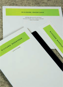
PHOTO: RICHARD RADSTONE/DESIGN BY BRAND ENVY/NADINE STELLAVATO BROWN
Nadine continued the branding from Richard’s website to his portfolio. The new branding is a part of all of Richard’s materials—from stationery, mailers, portfolio, and website to his portfolio case.

PHOTO: RICHARD RADSTONE/DESIGN BY BRAND ENVY/NADINE STELLAVATO BROWN
Richard’s brand was designed to cross over into other marketing arenas. The graphic shown here was Richard’s portfolio as it appeared on workbook.com (see Online Source Books).
Before we get into the nitty-gritty of creating your website and portfolio, let’s look at how much these things cost.
Portfolio covers, paper, and ink typically cost anywhere from $850 to $1,500, but you could spend up to $5,000 for a fancy book or as little as $350 for an off-the-shelf portfolio.
We recommend spending the money and doing it right: Have a designer lay out your book. We highly recommend Nadine Stellavato Brown at Brand Envy (go to www.lost-luggage.com’s Brand Envy section). Because she and her husband own a successful portfolio business, she understands interior and exterior portfolio development. Nadine is the “portfolio whisperer.”
Estimate somewhere between $1,500 and $6,000. The number will depend on what you are looking for. Some companies may offer the same navigational program to all their clients (a template); www.bludomain.com, for example, offers very inexpensive website templates. Other design firms or website programmers can create a customized site just for you.
A good estimate for the cost of producing a no-frills mailer (design and printing, including bulk-rate postage) is $1 per card. The price goes up for multipart cards, bi-fold or tri-fold panels, expensive die-cuts, oversize cards, etc.
When deciding what to spend for your marketing, make a yearly budget for yourself. You need to have a good basis for deciding where your marketing dollars should go, so as you read on in this book, think about the activities you may want to invest in.
Once you’ve determined the yearly costs for marketing activities you’d like to do, divide the total by 12 months to make it easier to see whether you can afford what you want to do.
You’ve considered the financial angle. Now you have to decide whether you have the time it will take to create a website and a portfolio. Here are our estimates for the amount of time you’ll probably have to spend on four different activities.
> Ordering Books and Printing Your Images Yourself: Two Weeks to Six Months
You’ll need to take some time to look over the portfolio book and shipping case options. You can buy one off the shelf, ready to use. If you choose to order the book, you’ll have to wait for it and the shipping case to arrive. Likewise, deciding on and ordering paper and waiting for it to arrive takes time.
| Estimate | |
| Website revamp | $2,000.00 |
| Online resources | $0.00 |
| Organization memberships - ASMP | $350.00 |
| Web hosting | $100.00 |
| Brand design | $3,000.00 |
| Portfolio | $600.00 |
| Support portfolio (mini-portfolio) | $200.00 |
| Agency Access membership | $925.00 |
| Agency Access 12k bundle | $600.00 |
| Printed mailer (estimate $1 per name min.) | $0.00 |
| Follow-up mailer (2% of database x mailings) | $500.00 |
| Campaign manager | $550.00 |
| Wise Elephant (calling service) | $500.00 |
| Holiday gifts | $1,000.00 |
| Consulting | $850.00 |
| Stock consultant | $400.00 |
| Travel | $1,000.00 |
| Dream clients | $500.00 |
| Contests | $200.00 |
| TOTAL | $13,275.00 |
THESE NUMBERS ARE SHOWN AS EXAMPLES ONLY. PLEASE RESEARCH PRIOR TO SELLING YOUR BUDGET.
Here’s a sample budget. The numbers are hypothetical and do not reflect everyone’s budget, and of course vendors’ costs may vary. See Appendix B.
Once you receive the materials, you have to get your printer and programs set up to work together perfectly. (If you don’t have a printer that can perform with the quality you want for your portfolio, companies like www.pushdotstudio.com can print your portfolio pages for you.)
Printing a series of images, including full drying time, or having them printed, takes a while. Then you have to put the book together.
> Online Design and Printing: Overnight to Two Weeks
This is a great solution if you have a limited budget or don’t have enough time to sit down and print a traditional book. There are many vendors who can create many different types of books; these volumes are usually perfect-bound books, with the option of a hard or soft cover (see here for more on ordering these books.
While working with a designer can be a lot of fun, it can also be daunting. A designer can help you select the images you will include, the sequence in which they will appear, and the look of the cover, including color, fabric, and the type treatment for your name and contact info.
A good designer will give you multiple options to select from. Deciding on the final design can be difficult. But in the end, a good designer will deliver the look and feel that your work deserves. Generally, a book that has been shaped by a designer allows you to quickly and successfully speak (visually and conceptually) to your potential creative clients.
> Creating a Website
Creating a website can take anywhere from two weeks (for a simple template site, if the images have been edited and are ready to upload) to six months to a year (for a custom design and image editing and sequencing). Make sure your site reflects the work you are doing now and that it is flexible enough to allow easy editing for the future. We strongly recommend that you be able to do routine editing of your site yourself without needing to go back to the site designer.
If you hire a designer (more on this at the end of the chapter), he or she should edit your photographs. If you edit your images yourself, either review your work by mounting it on a wall and looking at it for at least a week, or view it in a slide show presentation to get the feel that someone would when flipping through a book.
Most Mac computers come with iPhoto, which allows you to create a digital mock-up “portfolio” (with a PC, use PowerPoint). This program allows you to review your images as spreads with single or multiple images. The only downside is that iPhoto will crop your images, so use it just for reference and reviewing your images in a sequence.
Another editing tip is to find your “hero” or “killer” shot (your best shot). Ask an industry contact to make this recommendation, and then use that image as the standard for your entire body of work. If a shot equals or comes near to the hero shot, then it’s a keeper. If a shot does not compare to your best work, then you know to throw it out of your portfolio.
Photographers have a hard time letting go of images because each one is personal. Appreciate the shot and the moment that created it and feel free to keep the image in your personal portfolio, but do not let emotion dictate your editing. You must try to be neutral.
Look at your work as a whole, not as individual images. Taken as a whole, your book should tell the story of who you are stylistically.

PHOTO: JUSTIN GUARIGLIA/NATIONAL GEOGRAPHIC ASSIGNMENT
This contact sheet shows a portion of Justin Guariglia’s work and the successful flow of images he created. Each image complements the next, and they all work together to build a cohesive portfolio that looks amazing.
Your website is effectively the key to whether your printed portfolio will be called in. Here are a few basic tips for setting up an attractive and compelling site.
The first five images that appear on your site must be strong enough to define and sell your style. Within the first five images, you have either won or lost your potential client.
Your website needs to load quickly. Too many bells and whistles will slow it down, and you will lose potential viewers.
It’s annoying to ask the viewer to agree to your terms. A website is one place where the two-second rule definitely applies: Creative people want to go to your site and see work within two seconds. Seconds in cyber time equal minutes in real time. Use those seconds wisely.
Make sure your site’s home page will load in its entirety on one screen, within the frame of a standard 15" monitor. The viewer should not have to scroll down to see your images or your entire home page. The majority of your potential client viewers use laptops. Although some may have access to an additional monitor to view files, you can’t be sure of this, so prepare accordingly.
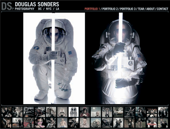
PHOTO: DOUG SONDERS
You can make a great site on your own. Doug Sonders used his computer skills with Adobe Dreamweaver and Fireworks to create his own website. Doug uses thumbnails along the bottom of the screen; as you “mouse” over them individual images are enlarged in the space above.

PHOTO: DOUG SONDERS
Test your site using all browsers—Internet Explorer, Safari, Netscape, Mozilla Firefox, Flock, Opera, AOL Explorer, Google Chrome, and others as they become popular—that are compatible with Macs and PCs.
You want every computer user to have access to your site, and it is important that every computer display your site in the best possible presentation.
While a website may look good on your computer, it can look very different on another. Have many people test your site before you officially launch it.
Here are other important rules of thumb as you plan your website.
» It should be user-friendly—clean (that is, simple, not “busy,” with not too much visual noise or wording) and fast, with quick downloading. Navigational elements need to be easy to find. Using strange icons will confuse viewers, who should be able to proceed to the next image, choose another section, or get “home” from wherever they are on the site with just one click.
» It should have an aesthetically pleasing design. Remember: You are appealing to creative people who are designers themselves. They like to look at something that’s pleasing to the eye.
» Try to make your site speak the language of your potential clients. Don’t include weird categories. Clients are going to your site to look at images for a certain project, and strange categories will just make it harder for them to find what they are looking for—and easy for them to decide to click out of your site.
» Make sure you show images that represent the work you want to be hired to shoot. Throwing everything you have shot onto your site will confuse the viewer about who you are as a photographer.
» Provide accurate contact information, and make your phone number and e-mail address easy to find. Include a quick, one-click, direct e-mail link. Don’t make a potential client cut and paste in order to contact you.
» Do not use music. Imagine having someone go to your site only to have music suddenly blare through all the cubicles in the office. Viewers who hear loud or jarring music may quickly close out of your site to stop the music, and you may have just lost a potential client. Music may be acceptable on the sites of wedding or certain kinds of consumer photographers, but in general, music creates an emotion, and you do not want to try to control your viewers’ emotions.
» Don’t include “commitment pages,” sections where readers have to agree not to steal your images. People who do not accept the copyright laws are going to steal no matter what. You are not targeting thieves, so do not insult art buyers and design directors by cautioning them not to steal from you.

INDUSTRY FEEDBACK
In a recent nationwide survey about websites, art buyers and art directors unanimously agreed that music, terms, and slow loading are major deal breakers.
PHOTO: LYLE OWERKO/DESIGN BY LIVEBOOK
Companies like liveBooks help photographers create and manage websites. liveBooks has raised the bar for excellence in the features that viewers look for—fast loading, easy navigation, and large images. liveBooks allows you to upload and edit your images as you need to, which is essential for maintaining a successful website.
There are many affordable templates available that are much more cost-effective than a customized site. But do in-depth research—those that are the least expensive may be also be limiting in their scope.
Building a website may mean that you’ll need to sharpen your computer skills. If you need to learn a new program or two, we recommend www.lynda.com.
> Custom Sites
Representing yourself with a custom site allows you to show your distinctive style while allowing the viewer to navigate through a fresh perspective—yours—and experience a new navigational journey.
Three of the companies we recommend for creating custom websites are Brand Envy (www.brand-envy.com), pH3 (www.pH3.us), and Bliss Design Boutique (www.blissdesignboutique.com).
PHOTO: BOB CROSLIN/DESIGN BY PH3
pH3 offers custom websites. We like the scroll bar element of this site. This feature is great for fashion photography; it allows viewers to look at your work as a story, which in the fashion world is crucial for getting assignments.
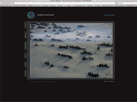
PHOTO: CAMERON DAVIDSON/DESIGN BY BRAND ENVY/NADINE STELLAVATO BROWN
Brand Envy offers custom websites that allow you the flexibility to create the design you want in your branding of your work.
Using a template site allows you to get your site up within a week or two. Template sites also usually provide very easy navigation. It’s also great to have another feature they typically offer—“back-end access,” meaning easy updating of images and other content.
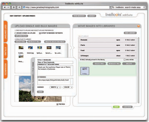
PHOTO: LIVEBOOKS
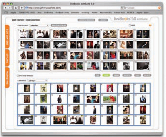
PHOTO: LIVEBOOKS

PHOTO: LIVEBOOKS
Always make sure you can edit your website. The liveBooks edit suite lets you drag and drop images from your libraries to the portfolio section of your site.
There are many template companies out there for you to research. If you’re diligent you’ll find the one with the best options for you. The companies whose templates we like best to date are liveBooks (www.livebooks.com) and A Photo Folio (www.aphotofolio.com). There are also less expensive template sites—for example, www.bludomain.com and www.clickbooq.com.
Here are a few basic rules of thumb for finding the right website template:
» Does it have an easy updating system/program (also called the “back end” of the site)?
» Does it allow your images to be displayed large? You want to take advantage of the “real estate” of the screen.
» Is the navigation easy to understand? Is there a constant toolbar for easy navigation?

PHOTO: LOST LUGGAGE
Lost Luggage has changed the way portfolios are made. They use metal hinges rather than the typical cloth hinges. They also stand out in the industry for their use of other innovative materials—felt, acrylic, carbon fiber, and others.
Despite the growing importance of websites, clients are still calling in books, which are used especially in client meetings, when final decisions are being made, so be sure to always have a book ready.
Make sure your portfolio is put together properly and attactively. It should be well designed, but the design should not be overdone and take attention away from your images. And remember that your book is usually called in after a client sees your website. Nothing is more frustrating to an art buyer than to call in a book that looks nothing like the artist’s website.

PHOTO: LOST LUGGAGE
This Lost Luggage carrying case protects your portfolio during shipping. Be sure your book fits into a FedEx box or a self-shipping Tenba case.
A few rules of thumb for a viable portfolio:

PHOTO: YAHIRO BOOK ARTS
Eriko Yahiro creates beautiful, handmade, custom portfolios using traditional bookbinding methods and striking fabrics for an amazing presentation vehicle.
» It should be viewer-friendly—nice on the eye and easy on the arms and hands, not too heavy (no more than 5 pounds) and not too big (11" × 14" is perfect). If you must stray from these guidelines, go only a bit smaller or larger. If your portfolio is 16" × 20" closed, it is 32" wide when opened, a size that takes up a lot of desk space, which is limited at most agencies and design firms.
» Whatever size you choose, make sure it fits into a shipping case or standard carrier box (Federal Express or UPS).
» Last but not least, try to make your portfolio stand out from the crowd. Would you be inspired to grab the 11" x 14" black faux leather portfolio or the red suede one or even the cool black carbon-fiber material portfolio?
Photographers always ask this question, and the answer is that there is no set number of images per portfolio. Each portfolio is different. Your images should dictate what you show, how many images you include in your portfolio, and the portfolio’s size. If we are pressed for a number, we usually say that a typical portfolio might include somewhere between 40 and 80 photos.
The images in the portfolio should flow, and overall the book should increase the viewer’s interest in seeing what comes next. Many photographers think that the way to make a good impression is to show their best work up front. But this may set the standard for the book too high, and the rest of the book can feel “diluted” or anticlimactic.
We recommend that you spread your “hero” shots throughout your book so viewers see your strongest work throughout, leaving them with an overall experience of strong photography. Many creative people review a portfolio “Japanese style”—starting at the back and moving through to the beginning—so be sure that your book is strong from back to front as well as from front to back.
Your portfolio needs to have “hero” (or “killer”) images at the front, middle, and end as you never know how someone will review your portfolio. On the other hand, your website should have the “hero” shots up front—on your site you have about five images to make an impression.
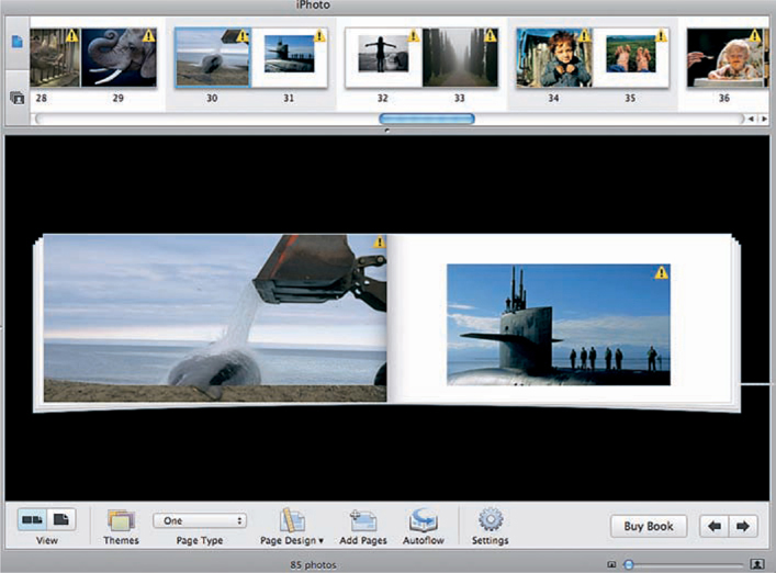
PHOTO: JOEL SARTORE
A great way to see if your images are flowing well is to put them into a template (in iPhoto on a Mac only; with a PC, use Powerpoint). iPhoto will crop your images, but it allows you to see them together, as if laid out in a portfolio. You can “flip” through the book with the arrows or print a PDF in Adobe and review it on paper.
» Question
How often do you call in books for jobs?
» Answer
I don’t call in portfolios until the photographer’s website links have run through the art director. I call in the books when they are the final selects. I call in books 100 percent of the time for new projects and only for jobs that are being produced.
—ANGELA LEWIS REID,
Senior Art Buyer, Draft FBC Group, New York
I work 100 percent from websites, unless a photographer is local and doesn’t mind stopping by. I don’t like to take the responsibility for handling portfolios (they cost a pretty penny), and my clients can’t afford the hefty shipping costs. I’d much rather that money go into the actual shoot. Lord knows, my budgets are small enough.
—TIFFANY CORREA,
Art Buyer, Push, Colorado
The majority of the art directors at Bravo won’t shoot with a photographer unless they see the book.
—JACKIE CONTEE,
Freelance Art Byer; Formerly Art Buying Manager for Bravo, New York
We are still calling in books, but we are seeing a trend of many projects coming from websites.
—DOUG TRUPPE,
International Agent, New York
Earlier in this chapter we talked about budgeting your time and money. Once you decide how much of each you have available for your portfolio, you’ll need to decide what type to create.
Don’t be discouraged if you don’t have as much budgeted time or money as you’d like. Start out with what you can afford, and perhaps in six months to a year you’ll have saved up enough to create the portfolio of your dreams.
> Customized Portfolio with a Personal Logo
Visit a store that sells portfolios to see the product up close. Do thorough research, comparing the overall product and its components: size, material, design, styling options, etc. For the cover, you can select a material and a binding in various fabrics, with your name and/or logo embossed.

KAT DALAGER
Once art buyers have been on the job for a while, all portfolios start to look alike. How can you make yours stand out from the group?
If you can go to stores that offer custom portfolios—or to PhotoExpo (www.photoplusexpo.com), where vendors show samples of their products—look at the samples closely. Most off-the-shelf portfolios are returnable, which gives you the opportunity to look at a book closely and return it if needed.
A custom portfolio maker should be able to send you samples of the materials you are considering. Some material samples will be for review only and will need to be returned to the portfolio maker.
A portfolio cover can cost between $100 and $500. Then factor in the costs of any embossing ($100 and up), a shipping case ($100 and up), and paper and ink ($100 and up; see Paper and Printing for more).
Or you can do your research and buy online. Some of the best custom-ized portfolio companies are:
» Lost-Luggage. www.lost-luggage.com
» The House of Portfolios. www.houseofportfolios.com
» Brewer-Cantelmo. www.brewer-cantelmo.com
» Eriko Yahiro. e-mail eriko@yahirobookarts.com
» Advertisers Display Binders. www.adbportfolios.com
» Mullenberg Designs. www.mullenbergdesigns.com
» Roswell Bookbinding. www.roswellbookbinding.com
WHAT’S IN A NAME?
If your portfolio has a separate shipping case, make sure it has your name on it. If you can’t afford to have your name embroidered or embossed on the case itself, then have one of your business cards laminated and create a luggage tag out of it.
A quick and inexpensive option is to buy a portfolio right off the shelf. You won’t get custom features, such as embossing or etching of your name. But you will get an affordable, professional-looking book.
Off-the-shelf portfolios come in a relatively limited number of materials and sizes. Most are common sizes like 8" x 10", 9" x 12", and 11" x 14"; they can be horizontal or vertical. Many come with professional carrying and shipping cases. Materials range from acrylic and plastic to fake leather. With most off-the-shelf portfolios, the retailer does not emboss your logo on the cover; you can have a third party emboss, etch, or silk-screen it, but depending on the material, this may be difficult to do.
There’s an interesting option that addresses the issue of your name on the cover: Portfolios from Case Envy (a line from Lost Luggage) have clear covers that allow your name to be seen before the viewer opens the book, but without the need to pay for an embossed cover.
Even if you are on a tight budget, avoid selecting a book that looks like a “student portfolio”—a black plastic zipper portfolio with multiple rings and shiny plastic pages, a book that you carry like a briefcase, or one with pages you can remove. Fair or not, portfolios like this will tend to “cheapen” your work in the eyes of the viewer.
These are good places to find off-the-shelf portfolios:
» Rex Art (www.rexart.com). On this site you’ll find off-the-shelf portfolios and presentation cases by Case Envy as well as Tenba cases designed for shipping.
» Paper Haus (www.paperhaus.com). Again, check out the Case Envy products; Paper Haus offers the “Ice Nine” from Lost Luggage—a professional and affordable portfolio.
» Kate’s Paperie (www.katespaperie.com). This New York City retailer offers screw-post portfolios by smaller companies, like Molly West, as well as other hand-bound portfolios. Kate’s also offers many materials you can use if you’re making your own portfolio.
» Molly West (www.mollywest.com). Hand-bound books.
> Making Your Own Portfolio
We have seen many handmade books that are fantastic. If you want to make your own portfolio, first decide what you like and dislike about the different presentations you’ve seen. Consider everything from the overall type of book you would like to have represent you and the paper you’ll use to the types of sleeves, if any, and the hinges that will keep the book together.
For those of you who want to investigate making your own portfolio in greater detail, these are four excellent books:
» Books, Boxes and Portfolios, by Franz Zeier. McGraw-Hill, 1990.
» Hand-made Books, by Rob Shepherd. Search Press, 1995.

PHOTO: JOEL SARTORE/DESIGN BY BRAND ENVY/NADINE STELLAVATO BROWN
Make sure you allow for gutters if your images will “gutter jump” from one page to a facing page. This is a final PDF version, created in iDesign, of how the image will look when printed. When bound in the finished book, the two parts of the image will bleed nicely into one another.
PHOTO: JOEL SARTORE/DESIGN BY BRAND ENVY/NADINE STELLAVATO BROWN
After you review your work in iPhoto or PowerPoint, you can have a designer (in this case it was Nadine Stellavato Brown) design your portfolio in InDesign, a program by Adobe. It will show what the viewer will actually see.
» The Essential Guide to Making Hand-made Books, by Gabrielle Fox. North Light Books, 2000.
» Pages: Innovative Book Making Techniques, by Linda Fry Kenzle. Krause Publications, 1998.
Talas (www.talasonline.com) sells all the materials you need to make a book yourself, from chipboard and screw posts to fabrics. The company is also a professional printer; it creates perfect-bound, printed portfolios that look like coffee-table art books, which is another option for people who don’t want or can’t afford a customized book or one off the shelf.
Following are other companies that provide high-quality printing of perfect-bound books that you can use as your portfolio:
» www.paperchase.net offers high-quality printing for portfolios (and mailers). They can produce “coffee table” books for customers who don’t need a large press run. This is high-end printing, and the books are finished with hand-stitched seams.
» www.asukabook.com and www.blurb.com provide high-quality printing at a reasonable price.
» iPhoto is an application for printing books, calendars, and cards that is built in on Mac computers. It can also be purchased with iLife, an Apple program. The print quality isn’t as good as what Asuka and PaperChase provide, but iPhoto is very affordable for fun and quick printing.

PHOTO: JOSH BLUMENTAL/PORTFOLIO BY ASUKA
Asuka makes great leave-behind or small-run portfolios.
» Aperture is a more expensive and higher-end version of iPhoto, but it is a more versatile Mac program.
> Sealing the Inside of the Cover of Your Handmade Book
When a portfolio cover is bound in fabric, it must be “sealed” on the inside of the cover with a “blotter panel” that conceals the seams. You can have fun with some great specialty papers that will make those panels stand out. Here are some good suppliers of specialty papers:
PHOTO: WWW.SANJAY KOTHARI.COM PRINTED BY PAPERCHASE
A printed piece like this from PaperChase has the “Wow!” factor. You can have them print one or several books that really impress the viewer.
Following are the most common types of binding for portfolios:
» Screw-post. The metal posts are in two parts—one male, one female; once hole-punched printed images or sleeves are in place, you screw the posts tight.
» European-bound. Bound plastic pages stitched or glued so you cannot add or remove pages. Use in consumer photo albums or lower-end portfolios.
» Self-published. A perfect-bound book (meaning it’s stitched and/or glued) that has the look and feel of a published book.
» Handmade. Images that you print and then place in a book that is put together with any number of types of materials to form a portfolio-like presentation.
» Loose prints. Images that are printed on paper and put into a box to be viewed individually. Once you send this type of presentation, you lose control of the order in which viewers may see your work; since the prints are not bound, they usually get shuffled around.

PHOTO: LOST LUGGAGE
With a screw-post portfolio, one of our favorite types, it’s easy to add and remove pages based on what you want to include. This design creates a nice gutter that allows your images to turn over comfortably.
PHOTO: MOAB BY LEGION PAPER AND LOST LUGGAGE

PHOTO: MOAB BY LEGION PAPER AND LOST LUGGAGE
Moab paper has teamed up with Lost Luggage to create two-sided, pre-scored paper that lets you avoid a lot of the hassle of adding hinges yourself. The paper has pre-scored hinges and a leader stripe that fits into your portfolio for a professional presentation. The paper’s triple scoring gives it flexibility for viewing.
It’s best to buy a screw-post portfolio (custom or off-the-shelf), which allows you to edit the pages and expand if needed. A screw-post portfolio can be used with acetate sleeves or printed pages with hinges or pre-scored. This type of binding can be hard to find or create if you are doing it on your own, but it is worth it for a really professional presentation.
Papers absorb ink and reflect light differently. It’s important to choose the right paper to show your images in the best light, literally and figuratively.
When choosing a paper for the photographic prints in your portfolio, make sure to always test for consistency and compatibility with your images and your printer. While papers and weights can vary considerably, a 90-pound inkjet paper generally looks good and works well in a portfolio—it accepts color well and is sturdy enough to remain intact when hole-punched. And 90-pound pages turn more easily than those of a heavier weight; many viewers flip through a portfolio, so you don’t want the pages to be too thick.
Which finish to use is a matter of personal taste, but matte finishes usually look better under all conditions. A glossy finish can create a glare on your images that interferes with the viewing process, like sunlight coming into the room and falling on the TV screen. Today a glossy finish is viewed as amateurish, and most portfolios are not printed on glossy paper. As a general rule of thumb, matte paper looks more elegant and shows your work better.
Good sources for papers that are often used in portfolios include Moab (www.moabpaper.com; also available through www.lost-luggage.com under products/accessories, www.epson.com, and www.lumijet.com).
If you don’t want to or cannot print your own work, Pushdot Studio (www.pushdotstudio.com) is the answer. They can handle all of your printing needs at a reasonable cost.
There are benefits to using acetate (thinner) or plastic (thicker) sleeves to hold your photographs within your portfolio. They keep dirty fingers from smudging your photographs; they make it easy to edit—add and remove images—quickly; and since they use two separate prints, each made on a single side of a piece of paper and inserted back to back into the sleeve, they allow for easier printing when you want to make a change.
PHOTO: CHRIS CASLER/PHOTOGRAPHY FEATURED BY ANDREW KORNYLAK
A plastic or acetate sheet protects your images but will scratch and shows reflections. You have to decide if the tradeoff (the reflection) is worth protecting your work. Another downside: Some sleeves can lower your exposure half a stop or more.
However, acetate or plastic sleeves look kind of dated, and they add the potential for glare. Another downside is that they have the effect of taking an image down (that is, darkening the exposure) by half a stop or more.
If you use sleeves, always use the same brand and style. Nothing makes a book look more amateurish than mismatched sleeves. Also, acetate or plastic sleeves will eventually get scratched, so you must replace them when that happens. When you order sleeves, always order a lot of extras for replacing sleeves when they become worn.
If you present your images in sleeves, be sure to label the back of the photographs as well. Many art directors pull out single images and later deliver them loose back to the art buyer, and unless the images carry the photographer’s name the buyer won’t know which portfolio the image belongs to.
Printing on double-sided paper allows you to avoid acetate sleeves and thus get a cleaner and more “organic” look, but printing photos in this way takes careful advance planning; you’ll need to have the portfolio’s pagination worked out in order to do the printing correctly. Also, changes will be cumbersome, as changing one photo really involves two images; when you change one image you also have to reprint the one on the back.
What is our recommendation? Double-sided printed pages make your images stand out and show them to their best advantage, without any glare from sleeves. Most people who will look at your work would rather see the prints directly, not through acetate or plastic. It’s true that editing is a pain, what with the double-sided printing that’s involved. But what you get is a more pure and more sophisticated product.
Test types of paper to find those that work best with your images. Some papers “drink” ink and can make your images bland. Most people have good luck with Hahnemühle’s (www.hahnemuhle.com) double-sided Photo Rag. You can find pre-scored double-sided printable paper to fit into a Lost Luggage portfolio from Moab at www.lost-luggage.com (look under products/accessories).
Sleeves get scratched and paper gets frayed—these and other small damages are an unavoidable aspect of showing your work. We urge you to take this in stride. Consider it part of the price you pay to get assignments. What it costs to replace the sleeves or the prints is a lot less than the money you can make on one assignment.
If you want to hinge your favorite paper into your portfolio so the pages lie flat, there are two good sources:
» www.lost-luggage.com. Look under products/accessories/hinges.
» www.lightimpressionsdirect.com. Look under tapes & adhesives/ tapes/archival grade tapes/tyvek tape.
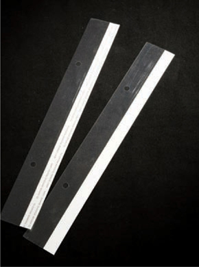
PHOTO: CHRIS CASLER
The hinge shown here is from Lost Luggage.
We recommend that you have a minimum of four books, but if you’re financially strapped you should be able to get by with two. It used to be more, but in today’s electronic world, many projects are assigned without the need for a conventional portfolio. Yet you must have some books on hand for those who require a portfolio for client presentations and for one-on-one meetings.

PHOTO: SUZANNE SEASE
If the paper that works best with your images is not pre-scored, you will need to add your own hinges. Tyvek tape (available through Light Impressions) is both adhesive and durable.
PHOTO: AUGUST BRADLEY
August Bradley used PaperChase both to create a stunning promotional mini-portfolio mailer and to make a smaller, leave-behind portfolio that caught the attention of people who would eventually hire him. It said to the market, “This guy means business.”
These are printed booklets that represent a smaller sampling from your portfolio. Usually about 6" x 9" or somewhat larger, these mini-books are great for showing off an alternative style that you can offer or a personal project that may not fit into your traditional portfolio.
See Making Your Own Portfolio for a list of companies that can produce both larger portfolios and smaller, more specialized leave-behind books.
iPads are great for those people who will never print a book and use it. But our recommendation, if you can afford it, is have both. To date, 75 percent of the market still likes printed books. The iPad is great for showing new work, additional imagery organized by category, and/or video. Be smart with your iPad edit, just as with a book, and keep it short, like your website. Show no more than 25 images per gallery on your iPad.
If you have also invested in good branding for your logo and/or type treatment, be sure to use it on your iPad. You can even get a custom skin for it at Skin It (www.skinit.com).
You should also make sure you’re using appropriate software to present your digital portfolio. Here are two options:
• Use Photos on your iPad. This is the program that comes on your iPad. To get images into Photos, first upload your images into iPhoto on your computer, and organize them into individual albums that mirror your website categories. Make sure the photos are in the order you want in iPhoto before loading them to your iPad, as you can no longer edit them once they are transferred. Then, connect your iPad to your computer and transfer the images. (Here’s an extra tip: We recommend you create a file with your name and logo on it as the opening image for each album, and then another with your contact info to use as the closing image so that people know when the gallery is over.)
• Download a portfolio program, such as Folio Book (www.foliobook.mobi) or PadPort (padportapp.com).
Virtual portfolios are another option. Everyone asks what the difference is between a virtual portfolio and a website. The virtual portfolio is the virtual version of your printed portfolio. Virtual portfolios remove the limitations of your geographic location and give you a way to show buyers and creatives your most recent work without having to buy a plane ticket.
Here are some programs that can be used to create virtual portfolios, each paired with an example:
• FlippingBook (www.page-flip.com). As an example, see http://www.lukecopping.com/portfolio/.
• issuu (www.issuu.com). See http://www.caseytempleton.com/lifestyle.
• Instant Flipbook (http://www.instantflipbook.com). See http://alistairtutton.com/web/portfolio/architecture_photography_portfolio/.
A designer can add a tremendous amount of value to your presentation of yourself as a professional photographer. You can hire a designer to do anything from a logo and type treatment (the font you use for your brand and materials; see much more about this in the following chapter) to a full brand design covering all your marketing materials—logo and type treatment, business card and letterhead, website and portfolio design, printed promotional materials, etc.
» Question
What do you think of leave-behind mini-books?
» Answer
I love leave-behind mini-portfolios.
—KAT DALAGER, SENIOR ART PRODUCER,
CAMPBELL-MITHUN, MINNEAPOLIS
I don’t have much room for a lot of books, but I will keep a mini-book if there is something great about the work.
—JESSICA HOFFMAN,
Senior Intergrated Art Producer, Crispin Porter + Bogusky, Boulder
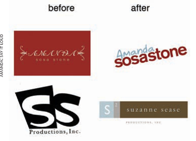
PHOTO: Image 1: AMANDA: SAY IT LOUD; Image 2: AMANDA: NICK ONKEN; SUZANNE: NADINE STELLAVATO BROWN
All design professionals—including photographic consultants—need to take the time to work with a designer. Evaluate your logo every few years to see if it needs to be updated.
If the design firms in your area are too expensive, shop around. The good news is that our current technology allows you to hire a designer from anywhere. Consider freelance designers, art directors from ad agencies who may want to do some work on the side, and design students. Ask your friends and colleagues if they know any designers.
A word of caution to those who have a family member or friend who is a designer: Working with family or friends can often mean that you are not able to be 100 percent honest in your reactions to the work they do for you. And if they are doing the design work for free or at a deep discount, their other projects may take precedence and you may have difficulty getting the work done in a timely way.

PHOTO: FRED GREAVES
Fred Greaves’s logo and mailers looked dated. The type treatment and colors needed a facelift.

PHOTO: FRED GREAVES/DESIGN BY BRAND ENVY/NADINE STELLAVATO BROWN
Fred worked with Nadine Stellavato Brown to create a fresh logo with traditional type but presented with fresh colors and style. Fred’s first new mailer was a several-page booklet that announced his new look and his new website. The front, back, and interior of the new mailer are shown in the first images here, and the opening page of the website is seen in the image that follows.
Universities and art schools can be terrific sources of talented, young graphic artists willing to do design work for low or no cost in order to get printed work for their portfolios.

PHOTO: FRED GREAVES/DESIGN BY BRAND ENVY/NADINE STELLAVATO BROWN
Try the following exercise as a first step in deciding what you might talk about in an initial conversation with a designer. In her book Successful Self-Promotion for Photographers, Elyse Weissberg recommended coming up with five key words about yourself—your identity and your work—and letting those words help you decide on the style you want to present to the world.
On a small scale, if you were to choose “honest,” “creative,” “hip,” “smart,” and “funny,” this  may fit four out of the five key words. But if it doesn’t fit all five, then you know it’s not the right font. The next step is to ask everyone you know which one to use. A way to avoid analysis paralysis—or what Amanda calls “analyzation paralyzation”—this exercise can help not only with type treatments but also with website, portfolio, and marketing design.

PHOTO: ROBERT SEVERI/DESIGN BY BRAND ENVY/NADINE STELLAVATO BROWN
No matter whether Robert Severi shows his logo and his work horizontally or vertically, his branding is consistent.
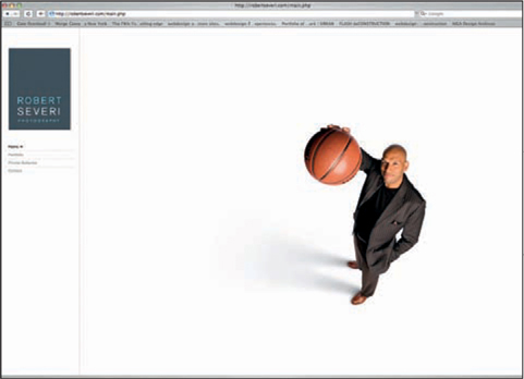
PHOTO: ROBERT SEVERI/DESIGN BY BRAND ENVY/NADINE STELLAVATO BROWN
Bob worked with Nadine Stellavato Brown to create a clean-looking website that attracts viewers. It is branded with elements that appear on all of his marketing materials.
PHOTO: ROBERT SEVERI/DESIGN BY BRAND ENVY/NADINE STELLAVATO BROWN
Working with Nadine Stellavato Brown to create a branded mailer campaign, Bob Severi sent Modern Postcard’s tri-fold mailers to potential clients.

PHOTO: AMANDA SOSA STONE
If you can’t afford or don’t want to work with a designer, become one yourself. Type your name in a Word document and try several typefaces (fonts) to see which one looks best with your name and is a type style you would want to represent you. Save the treatment as a jpeg so that all computers can view it even if they don’t have that font.
When working with a designer, always outline your expectations up front. We recommend that you ask for three totally different designs in order to see a variety of options.
Once you select a basic design approach (which may consist of elements from each of those three very different designs), be sure to agree with the designer that he or she will provide three revisions, if necessary. Some design is good from the start and needs little or even no revision. You will know when a good design has hit its mark when your gut tells you or when it meets the five-adjective exercise noted previously.
Different designers may have varying ways of working, but always ask up front what you are agreeing to pay for. Most designers will agree to three designs and three revisions in return for the price you agree on. Revisions after the third revision may be at an additional cost; again, ask about this up front.
Working with a designer who understands photographers and the types of designs they require is crucial to creating a great logo for your branded image. Your logo is a reflection of you and your business. Even if you already have a logo, you need to update and evaluate it every three to five years.
Type treatments or icons with consistent branding become visuals rather than words. Take the word “Nike.” You automatically see the type treatment in your head. When you see the word “Nike,” you no longer just read it—you see the visual, the swoosh. It’s the same with Apple Computers—you see the apple. When you think of Target department stores, a bull’s-eye or target comes to mind. Think about Herb Ritts or Richard Avedon—you might actually be able to see their type treatments in your head. This is what you want people to do with your name—see it and associate it with your particular style and imagery.
Your identity as a photographer needs to stand out from the crowd, to be memorable and unique. This idea calls to mind the power of the first impression. In a business saturated with talent, standing out is crucial to getting work.

PHOTO: TAMERA HANEY/BLISS DESIGN BOUTIQUE
When Scott Smith worked with designer Tamera Haney, owner and designer of Bliss Design Boutique, she gave him several choices and asked him to select the one he felt worked best for him. Make sure your designer gives you plenty of options. Discuss this up front so it is included in the estimate.

PHOTO: TAMERA HANEY/BLISS DESIGN BOUTIQUE
Scott Smith’s final selection.
When I work with a photographer, I make the following requests:
» Give me five to ten adjectives that describe you in a creative nutshell—your work, your personality, and your style.
» Give me a list of colors and color combinations you are attracted to. I am usually pretty good at this, but if you feel that a certain color combination—say, a neutral tone paired with a rich red—works well with your images, then let me know. Think about iPod and its memorable campaign with primary colors and black. Now Apple is building on that original idea and evolving into more colors, but initially it was the color, the graphics, and the brand identity that helped ignite their campaign. Colors are more important than most people think. They evoke emotions.

PHOTO: MELISSA CASTRO/DESIGN BY SARAH FIGUEROA, FIGARO DESIGN
This is Melissa Castro’s old logo—a very classic look, but it needed to be updated to match Melissa’s current look and style.

PHOTO: MELISSA CASTRO/DESIGN BY TAMERA HANEY/
Tamera Haney gave Melissa Castro a choice of several styles that she thought represented her work. This was Melissa’s final selection. She is an architectural photographer, so the graphic elements fit well as part of her logo design.
» Send me examples—jpegs, PDFs, links, names, places—of anything you find inspiring: artwork or an ad or a CD cover or a website that has that certain something you connect with. This may take you a while, but be on the lookout as you move about your day. And tell me why it grabbed you, what it was about it that moved you. This will help me to get an idea of what inspires you.
Your brand or identity needs to complement your photography without overpowering it. It needs to accentuate it. You need to keep it clean, modern, and timeless.
Nadine, owner and head designer of Brand Envy, a division of Lost Luggage, says, “Our credo at Brand Envy is: The cumulative effect of a consistent brand is the most important thing you can do to build your business.”
In other words, do not create ten promos that all look different.

PHOTO: TUCKER & HOSSLER/DESIGN BY BRAND ENVY/NADINE STELLAVATO BROWN
Tucker & Hossler worked in many different styles and needed to send out mailers that captured them all. When working with a consultant and designer (Nadine Stellavato Brown) to create mailers, they worked with colors to create unified looks.
» Never hire a friend or family member to do your design, primarily because you cannot be truly objective and tell them if you don’t like something for fear of hurting their feelings. Also, you may want to rush to make sure you are not a burden, which could compromise the final design. Last but not least, if your job is either discounted or free, you will not see the value in the brand since you have not had to pay real money to make it happen.

PHOTO: DOUG SONDERS/DESIGN BY BRAND ENVY/NADINE STELLAVATO BROWN
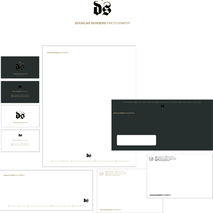
PHOTO: DOUG SONDERS/DESIGN BY BRAND ENVY/NADINE STELLAVATO BROWN
Make sure your designer shows you samples of how your work will look in all of your stationery elements. The three samples shown here, by Nadine Stellavato Brown, are the designs that were first presented to photographer Doug Sonders. In the end Doug did not choose one of these samples. Even though others may like a certain look, you have to make sure the branding treatment is right for you.
» Your design firm or designer must be current and must understand the ad market. Why? You are creating a brand to sell. Outdated design style will not sell. Firms understand how to create promos and marketing materials that are outside the box—or, in this case, the “postcard.” You are creative and so is your target audience. Do not insult them with promos that ignore this simple fact. Find a designer who can show you a lot of design examples, so you have a clear understanding of his or her design style.

PHOTO: DOUG SONDERS/DESIGN BY BRAND ENVY/NADINE STELLAVATO BROWN
» Find a designer who is willing to work with a photographic consultant. In today’s market, it takes a village to launch a photographer. You need the best people to help you get noticed by your desired audience, and a team is far better than an individual going it alone. Working with a team also allows you to see the designer’s ego, which helps to determine if your career is the priority or if it is their portfolio. (It should be both.) Good design work gets you noticed, and a designer with an openness to work with your consultant marries the right design with the right image. Keep in mind that this partnership works both ways. Be sure to work with a consultant who is open to an outside designer and who recognizes good design.
» To begin, give your designer examples of your current design and the marketing items you currently use, as well as examples of designs you like—from printed restaurant cards or detailed explanations of your personal design style to examples of your personal furniture (do you like Eames or classical Louis XIV style?). Designers need to have a launching point. A brand is effectively a new skin, and you should feel comfortable with it. Not as comfortable as in your favorite flip-flops, but you must be as proud of your new brand as you are of a nice piece of furniture.

PHOTO: DOUG SONDERS/DESIGN BY BRAND ENVY/NADINE STELLAVATO BROWN
Here is the logo branding treatment Doug Sonders chose. It felt right for him and his business.