In 2002, I was approached by the European Central Bank in Frankfurt, Germany, for assistance in producing Divisia monetary aggregates for the European Monetary Union (the EMU, also called the “euro area” or the “euro zone”). I gave a seminar there and then was employed as a consultant to work out the relevant theory. I traveled there a few times in 2002 to 2003 to meet with the relevant people and to assist in producing a Divisia database for the EMU. The opportunity presented interesting, theoretical problems I had not previously addressed. In addition, the inertia produced by a long-established history had not yet become as entrenched as at older central banks. The ECB seemed very receptive to doing it right despite, as explained to me, the political constraints within Europe.1
The most challenging theoretical problem was extending the Divisia monetary aggregates to the case of multilateral aggregation, by which money could be aggregated first within countries and then over countries. That two-stage aggregation would permit the distribution effects of policy across countries to be tracked, where “distribution effects” are different effects within different countries. This ability was particularly important in merging the current euro data with the older national currencies prior to the euro. In the United States the Fed gives little consideration to the differential effects of policy across different states. Fed data normally are supplied only for the entire country in aggregate. Because of the high mobility of Americans, all speaking the same language and all being within the same country, changes in relative regional prosperities are viewed as reasons for Americans to move to the states where the best opportunities exist.
But in Europe, where protection of the separate cultures of the countries is valued, the ECB cannot ignore differential “distribution effects” of its policy. My resulting theory for multilateral Divisia monetary aggregation was published in the 2004 ECB Working Paper 260, available on the website of the European Central Bank. A more tightly written, more formal, Journal of Econometrics version subsequently appeared in Barnett (2007). Much of that multilateral aggregation theory, equally relevant for other multi-country economic unions, is provided in appendix C.
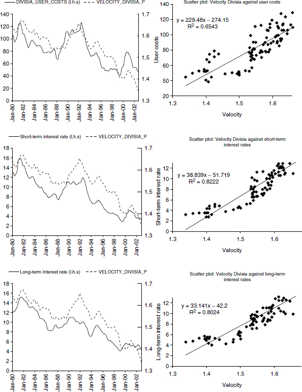
During my last visit to the European Central Bank, one of their economists, who had assisted in setting up the Divisia database, printed out some figures using those data. Those figures are collected together and reproduced as figure 4.1, exactly as provided to me. The plots are for three of the countries in the EMU. I don’t recall the countries. The plots on the right-hand side are of monetary velocity in those three countries, plotted against an interest rate or the user-cost price. Note that velocity increases with interest rates and user costs, exactly as demand-for-money theory would suggest. Clearly, the Divisia data were working very well.2
I had no way of knowing to whom the database was being made available, since the ECB, unlike the Bank of England and the National Bank of Poland, was not making the data available outside the central bank. Recently I was invited to give a seminar at the Bank of Greece in Athens, on May 26, 2010. Of course my seminar had a lot to say about the mysterious ECB Divisia data, if they existed anymore at all. To my astonishment, a high-ranking officer of the Bank of Greece, who sometimes sat on the ECB’s Governing Council, informed me of the following: the Divisia monetary aggregate data are provided to the ECB Governing Council at its policy meetings along with analysis of its implications for policy. Yet the data are not provided to the public, and the public has not been informed Divisia monetary aggregates exist for the EMU. This is policy transparency?
Figure 4.1
European Central Bank monetary velocity. Figures exactly as provided to me.
Highly relevant recent research on the subject of this book is in Barnett, Chauvet, and Tierney (2009), which uses an area of time-series econometric research beyond the scope of this book.3 What that research does is to remove the common trend movement of multiple data paths to reveal the data variations specific and unique to each. The resulting extracted part, specific to a data series, is called the “idiosyncratic term.” The approach is used to provide pairwise comparisons of Divisia versus simple-sum monetary aggregates quarterly from 1960:2 to 2005:4.
Figure 4.2 below is from that paper. The figure displays the idiosyncratic terms specific to Divisia M3 and simple-sum M3. The shaded areas are the time periods declared officially to have been recessions by the National Bureau of Economic Research (NBER). That figure and the associated published paper not only compare Divisia with simple sum over time but also over the business cycle and across high and low inflation and interest rate phases. Information about monetary growth becomes particularly relevant for policy makers, when inflation enters a high-growth phase or the economy begins to weaken. Compare Divisia M3’s idiosyncratic downward spikes in figure 4.2 with simple-sum M3’s idiosyncratic behavior, and then compare the relative predictive ability of the two extracted idiosyncratic terms with respect to NBER recessions. Figure 4.2 speaks for itself and clearly identifies the value of Divisia data in explaining unemployment and higher interest periods. The data, available at the time the paper was produced, was from the early 1960s to the date that the St. Louis Fed froze the Divisia data in 2006—at the start of the real-estate bubble collapse.4 The behavior of Divisia follows much more closely the expected behavior predicted by monetary theory across high and low interest rates and around recessions. Divisia is much to be preferred to simple sum.
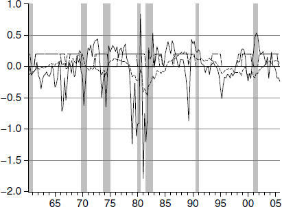
Figure 4.2
Idiosyncratic terms for M3 (dashed line) and Divisia M3 growth (solid line), high interest rate phases and high inflation phases (horizontal flat dashed), and NBER recessions (shaded posts). Units of billions of dollars plotted against the year.
Consider these most recent results along with the many others surveyed in this book, and also keep in mind the relevant aggregation theory, based solidly on microeconomic aggregation theory. You might find it worthwhile to compare those empirical and theoretical results with the most recent behavior of the Fed’s reputed approach to monetary policy. That approach, although not officially adopted, is the “Taylor rule,” which does not use money at all, not even as a long-run anchor.5 Monetary policy without money? That might seem to be puzzling to you, perhaps even negligent. The Taylor rule provides a target range for the federal-funds interest rate, which then is supposed to be kept within that range. The range is produced in a manner designed to take into account inflation and unemployment, but in a manner making no use at all of monetary quantity data. During the Great Recession, the federal-funds rate was nearly zero for many months—hardly an effective tool to stimulate the economy further. In fact, during the years of the Great Recession, Federal Reserve policy was the most volatile in its history, while the federal-funds rate hardly varied at all. As an indicator of Fed policy, the federal-funds rate, contrary to official pronouncements, was a nearly useless indicator of monetary policy.

Figure 4.3
Taylor rule federal-funds rate
But prior to the time that the federal-funds rate became nearly zero, we can look at what the Taylor rule was saying about policy. Figure 4.3 is reproduced from the St. Louis Fed’s publication, Monetary Trends. That figure displays the Taylor rule range for the federal-funds rate target along with the actual federal-funds interest rate, where the actual funds rate is the dark solid line.6 Notice the actual interest rate was off target for more than three successive years. Yet the associated “Taylor principle” was largely credited by Ben S. Bernanke with the success of the Great Moderation. He was very clear about that view in his speech at the meetings of the Eastern Economic Association, in Washington, DC, on February 20, 2004.7
To an economist, figure 4.3 would be self-explanatory. But if you feel you need further explanation, this paragraph presents it. The dark line shows the actual path of the federal-funds interest rate, as the Fed conducted monetary policy between 1999 and 2008. The other lines show paths for that funds rate under implied objectives for monetary policy, as if the goal of monetary policy had been an inflation rate between 0 and 4 percent. The top line represents an objective of zero inflation for policy, and the lowest of the five lines represents a policy objective of 4 percent inflation. The actual path of the federal-funds rate, between 2003 and 2006, lies below the lowest of the five lines, and the gap appears to be several percentage points during this interval. We are left to draw one of several conclusions: (1) the Taylor rule does not describe the Fed’s approach to monetary policy, (2) the Fed made a series of policy errors over a number of years, or (3) during this period the Fed abandoned its commitment to price stability and implicitly allowed its target for the inflation rate to rise to somewhere in the range of 6 to 8 percent. Whatever the explanation might be, this episode reveals one glaring instance where transparency—in the form of publication of competently produced monetary statistics—would have allowed the Congress and the public to be more acutely aware of the consequences of the Fed’s overly stimulative policy actions.
This book has documented the fact that the “paradoxes,” which had dominated monetary economics research for over three decades, are not paradoxes at all. They are just consequences of the use of the official simple-sum monetary aggregate data. But perhaps we now have a real paradox: the evident “instability” of the Taylor rule, which makes no use of monetary data. Perhaps the literature on monetary paradoxes has been looking in the wrong places.
As documented in this book, monetary policy and monetary research have been plagued by bad monetary aggregates, resulting from simple-sum aggregation. In addition we have shown that the puzzles since the early 1970s were produced by simple-sum aggregation and would have gone away, if reputable index-number formulas had been used. With so much history and evidence and so much research documenting the data problems, central banks might be expected now to be taking more care to provide high-quality data, consistent with economic theory.
Figure 4.4
Nonborrowed reserves of depository institutions (BOGNONBR). Source: Board of Governors of the Federal Reserve System.
If that is what you would expect, then look at figure 4.4, which was downloaded from the St. Louis Fed’s website and is produced from official FRB data. Recall from section 3.3 of chapter 3 that Volcker’s Monetarist Experiment used nonborrowed reserves as the instrument of policy. Hence it is particularly interesting to look at figure 4.4, which displays official, recent data on nonborrowed reserves from the Federal Reserve Board. As mentioned in section 2.7.5 of chapter 2, good reason exists to look at this recent data very carefully.
To make the implications of that figure clear, let us provide some formal definitions:
Definition 5 “Total reserves” are the sum of all borrowed and nonborrowed bank reserves.
Definition 6 “Borrowed reserves” are those funds held by banks in reserve, but borrowed by banks for that purpose.
What else could total reserves and borrowed reserves possibly mean? It follows immediately from elementary logic and definition 5 that nonborrowed reserves cannot be negative, since borrowed reserves in definition 6 cannot possibly exceed total reserves. Clearly, everything included in borrowed reserves must be held by banks in reserves, and everything contained in nonborrowed reserves must also be held by banks in reserves. Hence neither borrowed reserves nor nonborrowed reserves can possibly exceed total reserves. For nonborrowed reserves to be negative would be an oxymoron. They certainly never were, when being used by Paul Volcker as his instrument of policy during the period of the monetarist experiment.
Figure 4.5
Updated nonborrowed reserves of depository institutions (BOGNONBR). Source: Board of Governors of the Federal Reserve System.
Now look again at figure 4.4. Observe that nonborrowed reserves crashed to about minus 50 billion dollars during early months of the financial crisis. Nonborrowed reserves subsequently recovered to positive values, as seen in figure 4.5, but that is beside the point. How can anyone take seriously nonborrowed reserves data that became negative? The Fed’s explanation is banks’ new auction borrowing from the Federal Reserve is included in nonborrowed reserves, even though those borrowings need not be reserves at all. According to this data, the instrument of monetary policy during Volcker’s Monetarist Experiment period was recently driven to very negative values, although impossible by the logical definition of nonborrowed reserves. Clearly, Fed data on nonborrowed reserves are terrible measures of bank reserves not borrowed.8
We might hope that perhaps this example of extremely bad accounting is the exception to the rule, so other Fed data can be trusted. Sad to say, that is not the case. Consider, for example, the monetary aggregate, M1, which contains currency and demand deposits. This monetary aggregate is important since its components are legal means of payment. But to avoid reserve requirements on regular checking accounts, banks are “sweeping” a large fraction of demand deposits into money-market-deposit savings accounts. I have previously discussed sweeps in less detail in section 2.7.5 of chapter 2. Banks have complete data on their demand deposits, since they need to service them and to do so as checking accounts, not as savings accounts. But to camouflage the evasion of reserve requirements on checking accounts, banks report sweeps to the Federal Reserve as being in money-market deposit savings accounts (MMDAs), rather than in the demand-deposit checking accounts. But since the swept funds are serviced as fully checkable demand deposits, their liquidity services to the economy are those of demand deposits. The sweeps are just an accounting trick. By subtracting sweeps from demand deposits, banks are severely biasing downward the data on demand deposit services. Demand deposits, not MMDAs, are in the Fed’s M1 monetary aggregate, as supplied to the public and the Congress. As a result M1 is severely biased downward.9
Checking account “demand deposits” data are thereby under reported by about 50 percent, rendering M1 monetary aggregate data nearly useless. The Federal Reserve is fully capable of requiring banks to provide the correct data on demand deposits, including the amounts swept. In fact the Board might have those data on its protected “reserves file,” which is not made public. Recall that the last time someone on the FRB’s staff provided data to the public from the reserves file, that person was hunted down by the FBI and fired.
Also recall the Fed has terminated reporting the broad monetary aggregates, M3 and L. During decades of increasingly sophisticated monetary instruments and money markets, the private sector of the economy needs increasing quantity and quality of data about financial instruments. What has the Fed done? The exact opposite! Some of the most liquid money-market assets are no longer considered to provide liquidity to the economy and thereby are completely excluded from “money,” including negotiable certificates of deposit, commercial paper, banker’s acceptances, and Treasure bills, while demand-deposit checking accounts are undervalued by about 50 percent. Is it surprising that banks, Wall Street professionals, home buyers, and almost everyone else were unable accurately to assess the risks they were taking and instead became entranced with “the Maestro,” from whom unreasonable expectations arose?
The highly leveraged investment, borrowing, and lending, which led up to the current crisis, were not irrational—relative to the widespread views about the presumably tamed business cycle. Clearly, the financial crisis and Great Recession are not consistent with the views that produced the high-risk behavior precipitating the crisis. The primary objective of this book is not to emphasize that policy errors contributed to the crisis, although this book does provide substantial evidence that policy was disturbingly less effective than might have been hoped. In fact, the primary objective of this book is to suggest that poor Federal Reserve data unnecessarily complicated private decision-making and interfered with the abilities of the private sector to recognize the extent of the systemic risk existing at the time. That is the primary message.
Nevertheless, relevant evidence most definitely does exist about possible policy errors. In particular, monetary policy in recent decades might have been more expansionary than was realized by the Federal Reserve and thereby might have fed the bubbles. Also policy more recently might have been more contractionary than realized by the Federal Reserve at the start of the crisis. During those periods of time, the evidence was not clear, largely as a result of the Fed’s data limitations, most conspicuously the lack of availability of the Divisia monetary aggregates since April 14, 2006 until very recently. Nevertheless, we feel it is worthwhile providing the evidence we had at those times. In accordance with the design of this book to provide results in chronological order, and relative to the data availability at the time, we continue in that manner now.
There is a strain of thought that maintains the current US financial crisis was prompted by excessive money creation fueling the bubbles. Evidence exists supporting that point of view. The process started in early 2001 when money supply was increased substantially to minimize the economic recession begun in March of that year. However, in contrast with previous recessions, money supply growth remained expansionary for over three years after the recession’s end in November 2001. How long the policy remained expansionary depends on the monetary aggregate used. Monetary expansion led to both speculation and leveraging, especially in housing-sector lending. This monetary expansion is argued to have made it possible for marginal borrowers to obtain loans with lower collateral values. When money creation slowed, housing prices began to decline, leading many to own negative equity and inducing a wave of defaults and foreclosures. If this were the case, what would have motivated the policy that had this outcome?
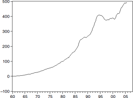
Figure 4.6
Deviation of the Divisia M1 monetary aggregate (MSI1) from the common trend shared by the simple-sum M1 monetary aggregate and its corresponding Divisia monetary aggregate. Units in billions of dollars, relative to 1960. The deviation was set equal to zero in 1960. Source: Board of Governors of the Federal Reserve System.
We see no reason to believe that the Fed would have adopted, as a goal, the creation of “excessive” money growth. Had the Fed known the amount of money circulating in the economy was excessive and could generate an asset bubble, monetary policy could have been reverted long before it was. We review in figure 4.6 the data on money supply, as measured by simple-sum M1 and by the corresponding Divisia monetary aggregate, using the St. Louis Fed’s Divisia MSI M1 aggregate for this period. In figure 4.7 the data at the M2 level of aggregation is provided. These figures plot deviations from the common trend shared by the two monetary indexes, with the deviation normalized to equal zero in 1960.10 The Divisia monetary-aggregates’ growth rates were increasingly higher than those of the simple sums, a trend that started most conspicuously in the late 1980s and continued until the end of the sample, available to us at the time of the study. In figure 4.6 the level of the MSI (Divisia) M1 index was about 500 billion dollars higher in 2005 than the common trend, relative to the difference that existed in 1960. While the deviation had increased by 100 billion dollars during the 20 years from 1960 to 1980, that deviation increased by an additional 400 billion dollars during the next 25 years from 1980 to 2005. In figure 4.7 the level of the MSI (Divisia) M2 index was about 2,500 billion dollars higher in 2005 than the common trend, relative to the difference in 1960. While the deviation had increased by 500 billion dollars during the 20 years from 1960 to 1980, that deviation increased by an additional 2 trillion dollars during the next 25 years from 1980 to 2005. This rise in the difference between the simple-sum and Divisia indexes’ growth rates could have distorted perceptions of monetary policy by inducing underestimation of the real amount of money available in the economy, as correctly measured by the Divisia index.11 The Federal Reserve could have been feeding the asset bubbles without the Fed’s being aware of it.
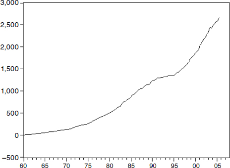
Figure 4.7
Deviation of the Divisia M2 monetary aggregate (MSI2) from the common trend shared by the simple-sum M2 monetary aggregate and its corresponding Divisia monetary aggregate. Units in billions of dollars, relative to 1960. The deviation was set equal to zero in 1960. Source: Board of Governors of the Federal Reserve System.
The evidence provided above suggests there may be some truth to the view that the recent bubble economy was accommodated by years of excessively expansionary monetary policy. Since all bubbles eventually burst, the subsequent problems may have been unavoidable. Whether or not that view is correct, it is interesting to ask what broke the bubble, even if it eventually would have burst anyway. Inspection of Fed data provides relevant information.
By conventional measures, the Fed has been easing its monetary policy stance by reducing its target value for the federal-funds interest rate from over 4 percent at the start of the crisis to the level of near zero within the Great Recession. Has the Fed thereby been engaging in stimulative actions to economic activity? Low interest rates do not an expansionary monetary policy make.12
It is helpful to illustrate the problem with a different central bank activity: sterilized exchange rate intervention. When the Fed decides to intervene in foreign exchange markets, its foreign desk swaps dollar-denominated assets for assets denominated in a foreign currency. Left unchecked at this point, the reserves of the US banking system (and the US money supply) would change, as would the market value of the federal-funds interest rate. To sterilize the foreign exchange transaction, the domestic desk of the Fed, in a subsequent operation, either buys or sells US Treasuries in a magnitude sufficient to offset the impact of the foreign desk’s activity and thereby keeps the US money supply, the federal-funds rate, and the reserves of the US banking system unchanged. On net, two things are accomplished by these offsetting transactions by the Fed’s foreign and domestic desks: creating the symbolic gesture of “doing something” about the dollar’s value and exposing the US taxpayer to potential losses, if subsequent changes in the exchange rate cause losses in the market value of the foreign assets now on the Fed’s books.
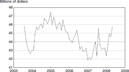
Figure 4.8
Total reserves until very recently, adjusted for changes in reserve requirements (TRARR). Source: Board of Governors of the Federal Reserve System.
Similarly much Fed activity early in the crisis, including its role in bailouts, was sterilized and had little effect on bank reserves.13 To illustrate the point, the Federal Reserve chart, reproduced in figure 4.8, shows the total amount of reserves in the US banking system during the five years leading up to and entering the crisis. Note that reserves—the raw material from which loans and spending are created—were lower in mid-2008 than in August of 2003! But changes in the funds rate are usually interpreted in the media as the product of Fed policy actions. According to that view, if the funds rate declines, the decline must be the result of an expansionary monetary policy action. Missing from this analysis is the other side of the reserves market: those who demand reserves have some ability to affect the price—namely the federal-funds interest rate—at which reserves trade. Those demanders are banks, which see the demand for reserves rise and fall along with the demand for loans. When the demand for loans falls, the demand for reserves by banks declines. Hence the federal-funds rate can decline because of declines in the demands for loans and reserves, without the Fed taking any policy action. While a decline in the funds rate is usually interpreted as “evidence” of an easy policy stance, the real signal in the market may be the economy is weakening. As David Laidler, at the University of Western Ontario, has pointed out, this appears to be what happened in Japan during the 1990s. The Bank of Japan thought its monetary policy was “easy,” because interest rates were low. The Japanese economy did not begin its recovery, after a decade of stagnation, until the quantity of money began to expand.
The Great Depression and the recent history of Japan’s long stagnation reveal that low interest rates per se are ambiguous indicators of the relative ease of monetary policy. The missing ingredient is the flow of bank reserves, the ultimate source of credit from which all other lending ultimately grows. For better or for worse, intentional or unintentional, herein may lie the pin that pricked the recent bubble. But I need to qualify this conclusion. If Federal Reserve data were produced in a manner that permits clear interpretation of policy implications, I would not need to hedge on the interpretation of figure 4.8. As currently defined by the Fed, “total reserves” equal the sum of bank reserve balances and “service-related balances.” While decline in bank reserve balances can be interpreted to be contractionary on the economy, the policy consequences of service-related balances is far less clear. As a result the policy implications of a decline in total reserves are ambiguous. You want to know what “service-related balances” are? Don’t ask.14
Figure 4.9
Total reserves including recent surge, adjusted for changes in reserve requirements (TRARR). Source: Board of Governors of the Federal Reserve System.
Subsequent to the Fed’s publication of the discouraging figure 4.8 chart, which displays declining bank reserves from 2005 to 2008, an enormous surge of reserves was injected into the banking system. That injection operated through the Fed’s lender-of-last-resort function at its discount window, as well as through the new credit facilities, such as the Primary Dealer Credit Facility and Term Auction Facility, and also through the long overdue payment of interest on reserves—an important new reform that provides an incentive for banks to increase their holdings of reserves.15 See the Federal Reserve chart, reproduced in figure 4.9, regarding the astonishing surge in reserves. Although uncertainty in financial markets remained high, the dramatic injection of reserves by the Fed seemed encouraging.16The official Federal Reserve Board data leave us with a feeling of ambiguity and uncertainty about monetary policy in recent years.
In contrast, let us look at the Bank of England (BOE) data. As explained above, the BOE officially provides to the public the Divisia monetary aggregate for a broad aggregate, M4—exactly what a central bank should do. Since the BOE is one of the world’s few central banks publishing Divisia money officially, looking at UK data is especially interesting. As the current recession developed, the BOE adopted a policy of “quantitative easing,” focusing on expanding the supply of monetary services rather than lowering interest rates, which already were at very low levels. Following that change in policy, little evidence appeared of positive consequences. While this puzzled many, who were following the BOE’s simple-sum monetary aggregates, figure 4.10 displays simple sum M4 and Divisia M4, both from the official BOE source. Clearly, Divisia M4 reflects a tightening of policy, rather than the intended loosening, implied by simple sum M4. For further details of this phenomenon, see Rayton and Pavlyk (2010). With these data officially available at the BOE and to the public, policy has adapted and the gap is closing.
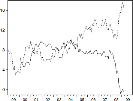
Figure 4.10
Percentage growth rate in M4 simple sum (solid line) and M4 Divisia aggregate (dashed line) for the United Kingdom
As stated above, the Divisia monetary aggregates data for the United States, called the MSI (monetary services index) by the St. Louis Fed, were frozen at the start of the troubles in the real estate market in 2006 and remained frozen during the financial crisis and the Great Recession with no MSI updates published during that period. The data revisions in MSI’s Divisia index most certainly did not need to take five years to complete. At the time of delivery of this book’s manuscript to MIT Press, the revised Divisia data were available within the St. Louis Fed, but withheld from the public. Nevertheless, graphs using the newly revised data were provided to me by Marcelle Chauvet, who had access to those data as a coauthor with the economists maintaining the data at the St. Louis Fed.17
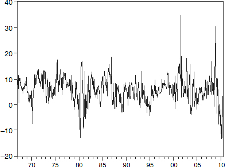
Figure 4.11
Annualized monthly growth rates of the United States: MSI Divisia over forty years for the broadest available monetary aggregate
What was made available to me by Professor Chauvet is in figure 4.11, exactly as provided to me for the entire time period during which the data were available. The figure plots the monthly growth rate of the Divisia monetary aggregate for the broadest available aggregate, called ALL, which is M2 plus institutional money market funds.18 Notice the disturbing decline in money growth rate during the past two years.19 This clearly demonstrates the importance of data on properly measured money growth, instead of interest rates. While interest rates were very low during those two years, money was very tight, as shown by Divisia growth—declining to negative levels. The money growth rate recently had declined to minus 10 percent per year, but seems to be recovering.20 The last time this happened was during the Monetarist Experiment period leading up to the recession that followed. As we have seen in section 3.2 of chapter 3, that recession was produced by distortions in the target used by the Federal Reserve, as a result of simple-sum aggregation.
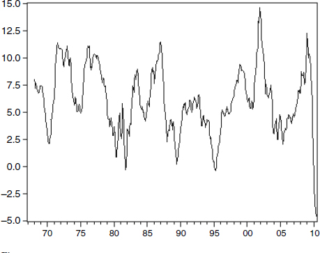
Figure 4.12
Year over year growth rates of MSI Divisia during forty years for the broadest available monetary aggregate
While monthly growth rates are informative about current policy, smoothing those data by computing “year-over-year” growth rates can also be useful. Instead of computing growth rate in monetary services during a month, the year-over-year growth rate computes the growth rate from the same month last year to the current month this year. Such year-over-year growth rates are commonly used in the retail business as a means of adjusting for seasonal effects. Figure 4.12 provides the year-over-year growth rates. While that figure does smooth some of the high-frequency oscillations, the resulting information about current monetary tightness is even more disturbing than the figure 4.11 monthly growth-rate information. The monetary tightening, leading into the financial crisis and recession, is the largest and most precipitous that has occurred over the entire 42-year period for which the data were available—from 1968 to 2010!
As the IMF, the BOE, the National Bank of Poland, the Bank of Israel, the Bank of Japan, and the ECB have moved to improve their data quality in recent years, and as the need for competently produced data has increased with the explosion in financial instrument complexity, it would be comforting to be able to say that Fed data quality and quantity, along with policy transparency, also have been increasing. Unfortunately, that is not what has happened. Data quality from the FRB has gotten worse—much worse. We have seen in this chapter that competently produced data provide evidence that Fed policy fueled the bubbles preceding the financial crisis. That best-practice data also show, after the real estate bubble broke, that monetary policy became more contractionary than indicated by interest rates, and thereby likely aggravated the severity of what followed.
Here are the facts. (1) Years of published research have demonstrated that Divisia M3, or even better the broader Divisia L, were the most informative monetary aggregate. By terminating publication of the severely distorted and thereby useless simple-sum M3 and L aggregates, the Federal Reserve has eliminated availability of many of the consolidated, seasonally adjusted, monthly component quantities and their interest rates needed to facilitate direct production of Divisia M3 and Divisia L. The Fed “threw the baby out with the bath water.”21 (2) The publication of checking-account deposits as post-sweep deposits, to cover up reserve requirement evasion, is a scandal. (3) The publication of negative nonborrowed reserves is an oxymoron. (4) While the St. Louis Fed computes Divisia monetary aggregates, using the remaining components still available from the Board, the Board does not supply those aggregates in its official releases. (5) Finally, the Divisia data contain disturbing explanatory power about repeated Fed policy errors, leading up to and including the most recent. Transparency? Not a chance.
At this point, I have provided the book’s empirical research along with an informal discussion of the relevant theory. Part II provides the formal economic theory for the benefit of the professionals having the relevant mathematical background. You now have the evidence. Should monetary policy be credited with producing the Great Moderation, such that the Great Moderation could reasonably have been viewed to be permanent? Do you see any reason to believe that monetary policy had improved during the Great Moderation? I find—none.
It is now time to conclude.
1. For example, it was explained to me that much German money in Luxembourg, French money in Monaco, and Italian money in Switzerland are in banks that will not reveal the country of origin of the depositors and treat those deposits as domestic. As a result the data on money supply in individual countries are distorted. I was told that these data distortions are politically untouchable and are motived by tax evasion. I also was informed French banks were paying a savings-deposit interest rate exceeding that available to residents in other countries of the EMU, while residents of other countries are not permitted to deposit money in those accounts in France. This violates the intended “convergence” objectives of the EMU. But that violation also was untouchable, since the higher interest rate was subsidized by French income taxes to encourage savings within France.
2. I have not been asked to assist in working out the extensions to incorporate exchange rate risk among the old currencies or among the euro-and the foreign-denominated bank accounts sometimes held by EMU residents. As a result the ECB Divisia data probably do not include the risk extension, which evidently is not a major concern. The theory for that extension to risk, which could be incorporated into multilateral aggregation, is now available from Barnett and Wu (2005). The need for risk adjustment in monetary aggregation was first made clear in Poterba and Rotemberg (1987). Appendix D deals with that subject.
3. It is a latent-factor Markov-switching approach, which separates out common dynamics from idiosyncratic terms. The dynamic factor measures the common cyclical movements underlying the observable variables. The idiosyncratic term captures movements peculiar to each index. In that paper, we introduced the connection between the state-space time-series approach to assessing measurement error and the aggregation-theoretic concept, with emphasis on the relevancy to monetary aggregation and monetary policy.
4. Barnett and Chauvet (2011b) subsequently pursued that approach further to look more closely at the data since 1987 in their figure 24 and since 1999 in their figure 25. Again the high explanatory power of money growth is lost, when the monetary aggregates are improperly constructed as simple sum, but very clear when constructed as Divisia indexes.
5. The Taylor rule equation is intended to put upward pressure on interest rates as inflation increases and downward pressure on interest rates as unemployment (or more formally the “output gap”) increases, with the net effect on interest rates depending upon the formula’s weighting on the two pressures. The output gap is the difference between the output of the economy and what it would have been at full employment.
6. This figure is not from a Federal Reserve Board publication, since the Board does not have an “official” federal-funds rate range. But this chart, published by the Federal Reserve Bank of St. Louis, is the closest I could come to finding a Federal Reserve defined target range for its funds rate. Clearly, it also is the closest that the St. Louis Fed could come.
7. In that speech Bernanke stated very clearly that improved monetary policy-making should be credited for much of the improved economic performance during the Great Moderation. However, his emphasis was less clearly on the full Taylor rule than on the Taylor principle, which is a derivable implication of the Taylor rule. The Taylor rule produces the Taylor principle, when the coefficient is positive on the gap between the inflation rate and the desired inflation rate. The Taylor rule conclusion then is that the real interest rate should not be allowed to fall during periods of rising actual or expected inflation. But this book finds little evidence of significantly improved monetary policy over the past forty years, or reason to credit such improved policy for the Great Moderation.
8. The Fed’s justification is that under recent operating procedures, including “sterilizing loans” by selling bonds to keep the federal-funds rate close to target, accounting for bank borrowing held as reserves has become very difficult. While this justification may not be a problem for the Fed’s own recent policy procedures, the resulting published data can be severely misleading to the public.
9. It might appear that the damage to monetary aggregation from misclassification of sweeps is offset by using the broader monetary aggregate, M2, since simple sum M2 includes MMDA’s as well as regular checking accounts. The sweeps improperly removed from checking accounts are added back into the MMDAs in the sum. But checking accounts and MMDA’s are not perfect substitutes and are not treated as such in properly weighted monetary aggregates, such as Divisia M2. The misclassification of sweeps damages all properly constructed monetary aggregates.
10. I am indebted to Marcelle Chauvet for producing and supplying those two figures. The data she used are the data that were available at the time this plot was produced, and are the data that were online from the St. Louis Fed at the time this book was complete. The revised MSI data were not yet available at that time and had not yet been made public at the time of completion of this book. Judging the difference of the Divisia data relative to the common trend is consistent with the use of the idiosyncratic term in her work on figure 4.2, as is consistent with the modern state-space factor-analysis approach to time-series inference. While comparison with the common trend may seem excessively complicated to noneconomists, the approach has become standard in state-space econometric time series for reasons beyond the scope of this book.
11. We have no way of knowing the pattern of the broader aggregates, M3 and L, since collection of both has been terminated by the Federal Reserve. Regarding M1, the method of aggregation is not the only problem. For example, there are the serious issues regarding sweeps. See, for example, Jones, Dutkowsky, and Elger (2005). But to the degree that policy may have been influenced by M1 growth, the relevant index to evaluate policy intent is the official Federal Reserve Board simple-sum index, unadjusted for sweeps or for other problems.
12. If you are not a native English speaker, this sentence structure may appear to be in error, as was pointed out to me by many of the manuscript’s readers. But it is a common usage, which began in 1546 with John Heywood’s Proverbs, including “one swallow does not a summer make.” Earlier usages of that sentence structure appeared in Greek over 2,500 years ago in Aristophanes and Aesop.
13. I am indebted to Steve Hanke for the following further explanation, which he documented with a graph he provided to me. The Federal Reserve introduced the TAF (“term auction facility”) in December 2007. Any Fed credit created through the TAF, or through other newly instituted means, was initially counteracted or “sterilized” by sales of US Treasury securities, until mid-2008. Treasuries declined, while other Fed credit increased, but the overall total remained pretty much unchanged until the Lehman Brothers bankruptcy. The total assets of the Fed did not change significantly until after the Lehman bankruptcy, and then they soared from around $920 billion to over $2,000 billion within a few weeks. The Fed was already making substantial loans prior to the Lehman episode, but the Fed’s overall balance sheet was kept under control through the “sterilizing” sales of Treasuries. The intent was to prevent TAF loans from affecting the stance of monetary policy.
14. Even Federal Reserve staff economists often become uncomfortable about such questions of accounting “details.” If you are an advocate of the monetary base, the complications are even worse. The Board has three different definitions of the monetary base, depending on whether or not the data are adjusted for the effect of changes in statutory reserve requirements, and whether or not the data are seasonally adjusted. Oh, and of course, those messy service-related balances are also within the base that includes total reserves, not just bank reserve balances.
15. There is no question that payment of interest on required reserves is long overdue, at least so long as reserve requirements continue to exist. The payment of interest on excess reserves is more controversial. Why should the federal government be paying interest to banks for not lending? Why was this incentive not-to-lend begun during a credit crunch, while the Fed was pumping reserves into the system with the opposite objective? To my way of thinking, the interest rate paid on involuntary required reserves should be higher than on excess reserves.
16. That surge was at least partially motivated by a shortage in Treasury bonds available to the Federal Reserve for sterilization.
17. Marcelle Chauvet at the University of California-Riverside produced and provided the plots to me with permission to include them in this book. She had access to the revised St. Louis Fed data for her research.
18. The discontinued Divisia M3 or Divisia L monetary aggregates would be more informative. The Federal Reserve’s discontinuation of M3 data is particularly incomprehensible.
19. The growth rate is annualized to be the rate of growth per year during each month.
20. The precipitous decline to minus 10 percent is disappointing, in light of the enormous positive surge in reserves. There is no simple explanation for this failure of the normal transmission mechanism of monetary policy, but Federal Reserve payment of interest on excess reserves may have been a contributing factor.
21. This is actually a German proverb, “das Kind mit dem Bade ausschütten,” going back to 1512.