> Bindings
> Extras
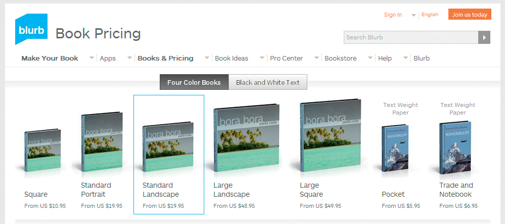
The first step in designing a book layout is choosing the overall format. Generally, the term “format” is used to describe the absolute size and the ratio of width to height of a book. Popular formats include square (for example, 12″ × 12″ with a width-to-height ratio of 1:1) and rectangular portrait or landscape formats, often with a width-to-height ratio of 4:5 or 5:4 (for example, 8″ × 10″ or 10″ × 8″), respectively. Most photo book providers offer a range of up to ten different formats. Some allow you to alter your chosen format after you have created your basic layout, but it is better to work with a fixed size from the outset.

Figure 4.1: If you want to produce your book in multiple formats, check out the range of sizes that have identical height-to-width ratios. Blurb’s Square and Large Square (1:1) or Landscape and Large Landscape (5:4) are good examples of different sized but compatible formats.
TIPS & TRICKS If you want to change the format of your layout, make sure that you actually click the Change Size button (or similar). Simply selecting a new format in a drop-down menu doesn’t necessarily apply the change. 
Consider which format(s) you want to use for your book before you start creating your layout. For a wedding, you might want to print a large coffee-table book for the happy couple, a smaller version for the couple’s parents, and a mini-version for the other guests. If you approach your project with different variations in mind, it will be simpler to convert your book to other formats later.
If you decide to go for more than one book size, check out the range offered by your service provider and select sizes with identical width-to-height ratios. It is extremely complex and time-consuming to shoehorn a layout that was designed for a 5:4 format into a 1:1 format later on. SmileBooks, for example, simply doesn’t allow format changes that involve a change of width-to-height ratio.
Other factors that will influence your choice of format are the price, the types of photos you want to include, and your intended use for the finished product. If you have a limited budget, this will dictate the maximum size of your book. If your source photos are small or have low resolution, a small format will provide the best results. If you want to produce a coffee-table book or one with a lot of detail photos, you should use high-resolution photos, preferably shot with a DSLR.
The most important factor governing size is your intended use for the finished book. Generally, a good photo looks better the larger it is printed; so, if you want to present your best photographic work, you should go for a coffee-table format. Large formats are great for portfolios because several people can view them at once. But remember: the larger a book, the less practical it becomes—a 16.5″ × 11″ book is nearly three feet wide when it is lying open. Medium sizes in the region of 11″ × 8″ are the most popular offered by many service providers. Smaller, handbag-sized formats are often used for family albums.
Most providers offer standard sizes with width-to-height ratios of 1:1, 2:3, and 4:3, as well as special panoramic formats for wider photos. The best size for your project will depend on the aspect ratio of your photos. A square format can be a useful option if your photos are a mixture of portrait and landscape shots, but you will have to crop them if you want to print them at full-page size. It can be tricky to design a pleasing layout that fits into a square format.
Not all bindings are available for all page counts and formats. For example, a staple (saddle-stitch) binding cannot be used to bind 200 pages. Spiral bindings are often only available for 8″ × 11″ (or smaller) formats. If you want your book to have a particular sort of binding, make sure in advance that it is available for your desired format.
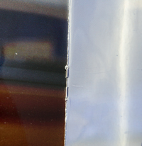
Also called saddle-stitching, this is the simplest type of binding and it allows you to lay the pages almost flat when the book is opened. This means that you lose little (if any) visual information between the pages. This is a low-cost binding that gives a book a magazine-like feel. It is not especially strong and is only suitable for low page counts. Staple bindings can only be used with soft covers, and the staples can rust over time.
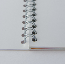
Like a staple binding, a spiral binding (sometimes also called “Wire-O”) can only be used for a limited number of pages. Most providers offer this type of binding for books with 150 pages or less. Spiral bindings are only suitable for use with soft covers. Spiral-bound books can be laid completely flat when open—a really useful feature for cookbooks, for example.
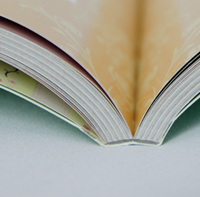
This is the most commonly used binding type for photo books. In this case, the “block” (i.e., all of the inner pages) is glued together at the inside edge. The type of glue used, and therefore the strength of the binding, varies from service to service, although, in general, quality is improving all the time and it is rare that glued bindings fall apart. Importantly, this type of binding cannot be laid flat, so there is some loss of visual information in the center of each spread. Adhesive techniques can be used to bind both soft- and hardcover books, as well as large formats and high page counts. This is the most universal of the currently available binding techniques. The so-called “perfect bound” books offered by many providers typically use adhesive bindings.
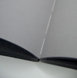
With a sewn binding the pages are physically sewn into the book using binder’s thread and may be further reinforced with fabric backing and adhesive to create the most durable of books. Traditional sewn bindings are only available from a few specialist book production services.
Also known as “Chicago Screw” or post binding, this is a special type of binding not offered by all service providers. Hollow aluminum screws with an internal thread are used to join the pages, and a second screw is inserted into the thread to complete the binding. Such a binding requires no special machinery and is therefore often used by specialty publishers for small print runs. Screw bindings are strong and can be used in conjunction with all sorts of cover materials, including leather. They also make it simple to add, remove, or alter the order of pages in the book, and are often used to bind photo portfolios or fine art coffee-table books.
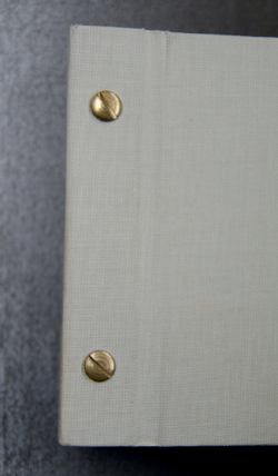
Like adhesive bindings, screw-type bindings take up a fair amount of the space at the center of each spread and have wide hinges that preclude printing on the outer spine. The lay-flat binding options offered by some providers are a variation on this type, with the binding posts hidden beneath the cover.
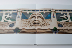
In leporello binding, each double-page spread is a single, unbroken sheet of paper with each following page glued back-to-back to the previous page (resulting in thick pages). Unlike other layflat systems that use two separate pieces of paper hinged at the center, this type of binding allows the page spreads to lay completely flat when open, avoiding any gutter or seam in the center. Therefore, it is ideal for images that span across a double-page spread.
Hard or soft is the decision you have to make when selecting a cover for your book. Hard covers are usually made of robust cardboard but are also available in metal as a special option from some providers. Soft covers are generally made of thinner cardstock or thick paper and cost less than hard covers. Soft covers give photo books a magazine-like, flexible feel.
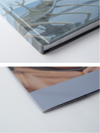
Figure 4.2: Hard covers are made of thicker card-stock than soft covers and can take more knocks in everyday use
Hard covers can usually be decorated with a single large-format photo across the front and back (called ″image wrap“ by most providers) or covered with leather or linen. Picaboo and PhotoBox offer hard covers with cutouts (called ″die cuts“) that allow the photo on the first page to show through the front cover. Some providers also offer hard covers with a photo affixed (often called ″debossed“). Hard covers give an impression of value and are definitely recommended for books that will receive a lot of use.
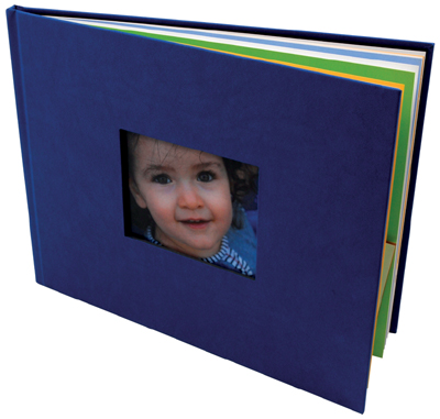
Figure 4.3: Picaboo and PhotoBox offer die-cut hard covers that allow the photo beneath to show through
(Photo: PhotoBox)
Blurb and Apple’s iPhoto offer dust jackets for hardcover books like the ones you see on commercial coffee-table books. Proponents of dust jackets say that they help amateur photo books take on a professional look, while others find that they simply get in the way and are too easy to crease or tear.
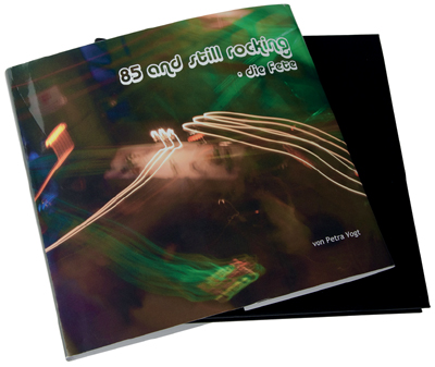
Figure 4.4: Dust jackets are available at Blurb and Apple
GIVING A BOOK A NEW COVER
If you can’t find the exact type of cover you’re looking for, you can always go to a bookbinder and have your book custom bound. This can be quite expensive but may be worth the extra cost and effort. However, make sure that the cover you choose suits the contents of your book so it doesn’t end up looking like a Porsche with a Ford engine. 
Some services offer high-grade paper as an option—Blurb, for example, offers a 30 percent heavier Premium paper at extra cost. Viovio offers matte Satin and semi-matte Silk paper. High-gloss paper, too, is an option at a number of sites. The heavier high-gloss papers are usually more robust than the paper used for conventional photo prints, with a tough coating that can be wiped clean.
Some providers, such as Blurb and MyPublisher, even offer a choice of end sheets (the sheets glued to the inside of a book’s cover, which also form the first and last unprinted pages of a book). MyPublisher’s range includes different designs and qualities, with names like “Classic Marble Blue” or “Florentine Peacock.” They also offer a vellum flyleaf as an extra.
Viovio also prints individual sheets of photos that you can add to existing scrapbooks or have individually bound.
MyPublisher and PhotoBox offer slipcases as an accessory at additional cost, while Apple’s iPhoto provides dust covers as standard with its larger formats.
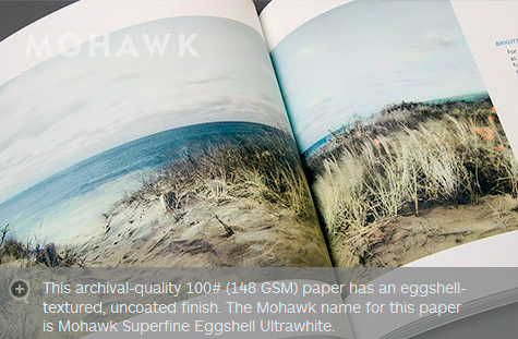
Figure 4.5: Blurb offers a range of different paper types, including ProLine Uncoated
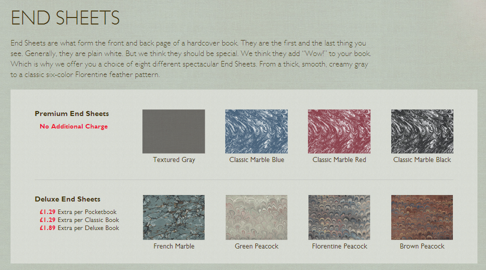
Figure 4.6: MyPublisher offers a choice of end sheets
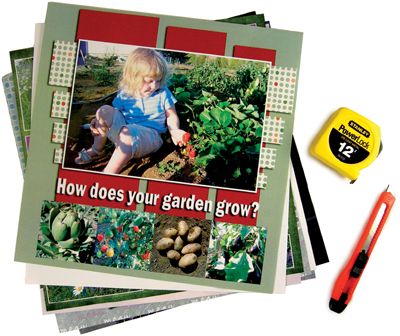
Figure 4.7: Viovio prints photos on single pages that you can assemble into albums in any order you wish
(Photo: Viovio)
Figure 4.8: Slipcases are an extra-cost accessory at some providers like MyPublisher and PhotoBox. Dust covers are delivered free by Apple’s iPhoto when you order a large-format book.
(Photo: PhotoBox)
You don’t have to decide exactly how many pages your book is going to have right at the start. You do have to enter a number to create a book, but you can always add or delete pages during the course of the project.
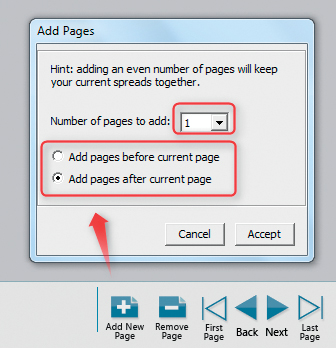
Figure 4.9: Most providers have an Add Pages tool, like the one at MyPublisher shown here
Before you proceed, make sure that your planned page count fits within your budget. Blurb and AdoramaPix have price brackets rather than per page prices, making it tempting to use the maximum number of pages in the bracket you are considering. MyPublisher and Picaboo charge a base price for the first 20 pages and additional fees per page thereafter.
You can usually get a fair idea of the number of pages your book will have once you have made a rough selection of images. The minimum number of photos per double-page spread is, of course, one. If you choose to have your book printed on photo paper, the maximum number of pages you can order is often less than 100.
TIPS & TRICKS Adjust the number of pages to fit the purpose of your book: 200 pages is simply too many for a portfolio, and books given as gifts shouldn’t have more than 100 pages if you don’t want to exhaust the recipient. Thick books are best suited to projects that people take plenty of time to view or that they will return to time and again. 
Blurb, Picaboo, and MyPublisher allow you to add single pages, while others, such as Smile-Books and AdoramaPix, only allow you to add blocks of eight or twelve additional pages. Such limitations are usually due to the practical and technical considerations of print processes, whereby multiple book pages are printed on very large sheets of paper and later cut to size. This approach avoids waste and makes it simpler for the provider to calculate the thickness of a book’s spine as well as the costs involved in production.
TIPS & TRICKS If you have too few photos for your chosen number of pages, you can always spread them out within your layout or enlarge them to cover entire pages. Large photos or a little extra space between images can improve the look of a book. You could can also consider leaving some space for extra design elements. For example, at the back of the book, you could add a CD or DVD of the image files, or include space for the people mentioned in the book to add comments.
If you have too many photos, you can either reduce their size or simply weed some out. A few carefully chosen images are often easier to digest than a mass of photos that appear to have been thrown together. Always increase the number of pages rather than including too many photos in too little space. 
A storyboard is a cimematic term used to describe a graphic organizer in the form of illustrations or images displayed in sequence for the purpose of providing an overview and previsualization of a project. The same organizational technique can be used for an illustrated book.
A photo book becomes really interesting if it tells a story. This doesn’t have to be an obvious narrative, like the story of a journey; it can be something quite simple, like visual relationships among the photos. The basic idea is to make each photo or set of photos so interesting that the reader feels compelled to turn the page. To achieve this, a book has to have a recognizable inner harmony—for example, a set of images covering the period between sunrise and sunset, or a series of photos that contain similar colors or shapes.
Sometimes the correlation is not obvious from the start, and you need to consider what kind of structure will best allow you to build up tension within your book. There are two levels of connections among images: a basic “macro” level that embodies a central theme, and a “micro” level that ensures each double-page spread looks good in its own right.
The macro level usually incorporates one of four structural patterns to associate the images:
 Chronological: e.g., according to days or hours
 Geographical: e.g., by country or city
 Thematical: e.g., by mood or event
 Optical: e.g., according to shape or color
You can, of course, combine these structures—for example, by creating a subnarrative covering a particular day at a particular place as part of a travel book.
TIPS & TRICKS A detail photo that accentuates part of a page within the overall structure of the book can be a very effective design element.
This can be a small map at the top right of every page or the beginning of every chapter, or a calendar or a clock face that accompanies the narrative. 
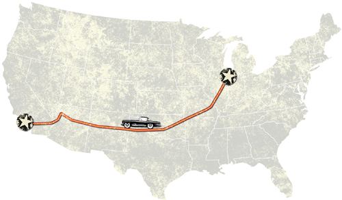
Figure 4.10: This book about Route 66 includes a small map to better illustrate each location along the way
Some projects have obvious intrinsic structures such as the following:
 Travel books are often geographically or chronologically organized and serve as an aid to memory
 Family themes, such as a child’s development, are best arranged chronologically
 Unique events such as a wedding lend themselves to being structured around the various phases throughout the day
 Portfolios benefit from structures that emphasize the visual relationships between the individual images
Other projects aren’t as obviously structured. Book designer Mat Thorne (see the Expert Advice box) recommends that you ask yourself whether your chosen structure plays a role in the central theme of your book. In a wedding book, for example, it is more important to be able to tell which photos relate to a chosen theme rather than the exact time at which they were taken. But, as always, the exception confirms the rule. A family album arranged according to color or a wedding album arranged around the time can provide a refreshing take on a familiar theme.
TIPS & TRICKS If your image management software has color coding functionality, you can use it to give photos for each major section of your book a different color code. For example, you can divide wedding photos into green for the preparations, red for the ceremony, and blue for the reception. This way, you can easily retain an overview of which photo belongs where. If your software doesn’t support color codes, you can still use tags to mark photos for the different sections.
If you are working with a large number of photos, it can help to store them chapter by chapter in separate folders, making it easier to find the appropriate images when you are creating your layout. 
Once you have decided on the overall structure for your book, it’s time to take a closer look at the photos for each section and begin designing the individual pages. This process is quicker if you have already sorted your photos into basic categories according to your chosen structure (for example, pre-wedding preparation, wedding ceremony, banquet, etc.).
EXPERT ADVICE FROM MAT THORNE: STRUCTURING A PHOTO BOOK

Sequencing the photographs for your book can be a daunting task, and doing it digitally can become confusing and frustrating. For that reason, I always recommend that you make small prints of all the photographs that you are considering for inclusion and lay them out in front of you on a large table.
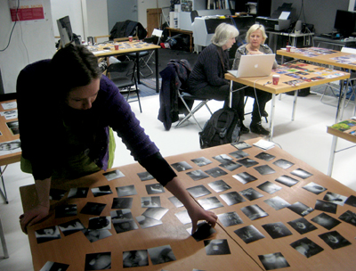
(Photo: Mat Thorne)
Seeing your images in this manner allows you to get a more objective view and can help you to envision how the book will come together. Images that don’t belong will jump out immediately, making for an easier first edit, and you can start to see relationships among photos that will aid you in constructing your final sequence.
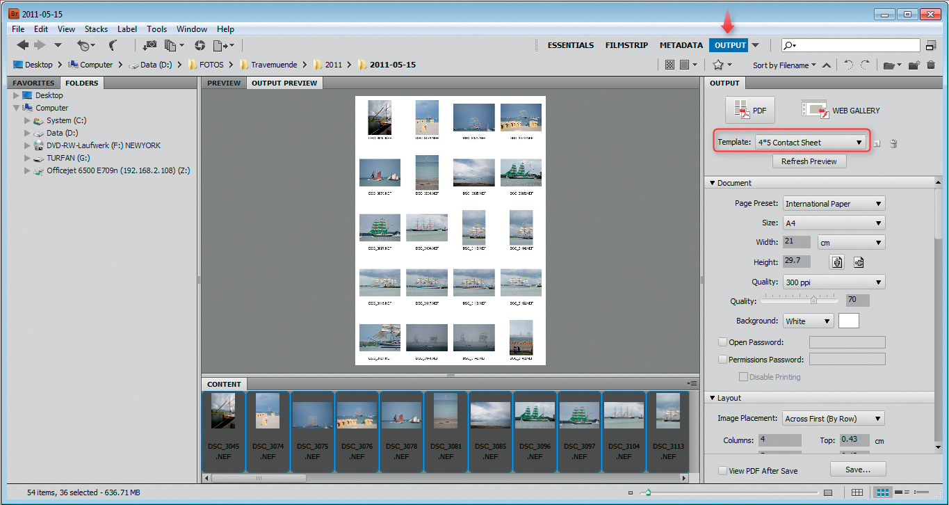
Figure 4.11: Adobe Bridge includes functionality that makes it simple to print contact sheets
I prefer this method to any computer software as you can see all of the work at once, and it makes it much easier to see how images look when paired together. It is also more fun than staring at a computer screen. ☺ 
To put Mat Thorne’s tip into practice, I recommend that you make contact sheets of all your photos. This is easy to do using the print dialog built into Lightroom, Picasa, or Photoshop, or using built-in operating system tools. Windows has a command for printing contact sheets directly from the Explorer folder view, although the function does crop photos automatically if you are printing a lot of them at once. You can also print your photos at their original size, but you will then require a very large surface for sorting. [Fig. 4.11, 4.12]
Cut up your contact sheets into small indiviudal images and spread them out on a table or the floor. If you have presorted your images, you may find that you can select them simply by drawing a ring around groups of photos that belong together. You can shuffle around the individual images and look for the visual and contextual relationships among them. Visual relationships can be based on similar colors or shapes, and it is easy to resort printed images accordingly.
If this all sounds too complicated, you can still group your photos on your computer using layout software and fine-tune the individual pages later. However, as already mentioned, working with actual prints on a large surface makes creating a layout much easier than it is with tiny preview images on a computer screen.
Figure 4.12: Contact sheets can also be produced using the tools built into most operating systems
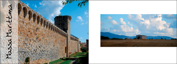
Figure 4.13: The photos on a double-page spread should be visually related
Figure 4.14: An accessible subject, such as an open door or a broad landscape, makes a great opening image in a photo book. Conversely, a sunset or an evening scene makes a perfect closing shot. The same principle is used with these photos of an old-time auto race in Hamburg: the cars initially approach and then recede from the viewer. This choice of photos automatically suggests a beginning and an end.
(Race photos: Werner Pluta)
For technical reasons, most binding types make it impossible to print on the first and last inside pages, so photo books typically begin and end with single-page images. This gives special emphasis to the first and last images, regardless of how the other photos in the book have been arranged. It’s like listening to an orchestral symphony: the first few bars set the mood and the last few help you remember it, while everything in between serves to build interest and hold your attention. [Fig. 4.14]
Varying not only the content of the photos but also the layout can help to keep your book interesting. Movies do the same thing and can serve as a source of inspiration. A movie director uses different angles of view to increase the dramatic effect and retain the viewer’s attention. Scenes are often initially depicted using wide shots that don’t show much detail before zooming in to close-ups that reveal more. In fact, this is how human perception works: we generally try to gain an overview of a place or situation before we look at the details.
Figure 4.15: In this example, the first page of the spread shows a wide shot of the city of Pisa, while the following pages zoom in to details of the scene. The page that documents the Leaning Tower uses this zoom principle to accentuate its subject.
However, the opposite can also be true: some films begin by showing us an obscure detail whose meaning only becomes clear during the course of the story that follows. Both of these basic structures can be used to create successful photo books. [Fig. 4.15]
GOING DEEPER FRONT AND BACK MATTER
Professional books include various subsidiary pages before and after the actual content. These pages are called “front matter” and “back matter.”
Front matter may include:
 Flyleaf
A blank sheet at the beginning of a book
 Half-title
A page that carries the title and sometimes the author’s name in a simple, unembellished form
 Frontispiece
An illustration preceding and usually facing the title page
 Title Page
A page that contains the title, the author, and the name of the publisher in highly visible type
 Copyright Page
A page with the publisher’s contact details, the year of publication, the ISBN number, copyright information, and any legal considerations (“All rights reserved,” etc.). This page may also include the name of the printer and the number of copies printed.
 Contents
Optional, depending on the nature of the book Other optional items for front matter include a dedication, epigraph, preface, foreword, or introduction. Like the rest of the front matter options, these may be added at your discretion, depending on the exact nature of your book.
Back Matter
Examples of back matter include acknowledgments, appendices, an index, and/or a bibliography. In the case of art books, a page at the back may include references covering the titles, dates, and techniques of the depicted works.
The sequence of front and back matter is not set in stone. Check out the books on your own shelves for examples of how different publishers arrange their front and back matter.
While you don’t need front or back matter in a self-published book, you do need to include at least the ISBN number, the title, and the author if you want to sell your book commercially (see section 12.4, “Selling Your Work″).
It’s a good idea to include a contents page—or, at least a preview page with a map or the route of a journey for books that you want to show to others or give as gifts. This helps the reader understand the context of the photos that follow. 

Figure 4.16: Professional publishers include a number of subsidiary pages (”front matter”) at the beginning of a book
Once you have established the right structure for your book, you can record it in various ways—for example, by photographing your cut up, rearranged contact sheets or by creating a hand-drawn, written, or multimedia storyboard. [Fig. 4.17, 4.18]
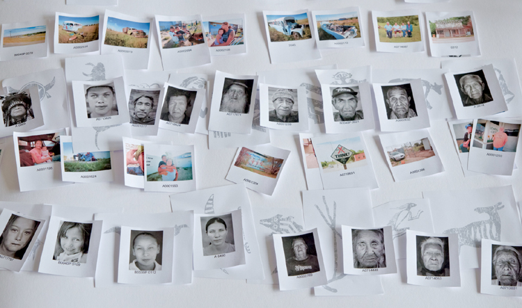
Figure 4.17: If you use the contact sheet method to structure your book, it’s a good idea to take a photo of the final arrangement. Our example shows part of the structure for Christian Popkes’s book Indianer (“Indians”).
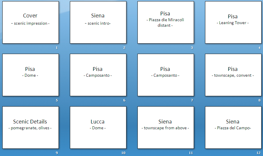
Figure 4.18: A storyboard can be drawn, written, or turned into a multimedia presentation, as shown here