Tom Wesselmann, Still-Life #30, 1963. Oil, enamel and synthetic polymer paint on composition board with collage of printed advertisements, plastic artificial flowers, refrigerator door, plastic replicas of 7-Up bottles, glazed and framed colour reproduction, and stamped metal, 123.1 x 167.6 x 10.1 cm. The Museum of Modern Art, New York, gift of Philip Johnson. Art © 2006 Estate of Tom Wesselmann/ Licensed by VAGA, New York, NY
Tom Wesselmann was born in Cincinnati, Ohio in 1931. After studying psychology at the University of Cincinnati, he went into the army, where he took up cartooning. He then attended the Art Academy of Cincinnati in 1955-6, and also studied painting at the Cooper-Union School of Art in New York between 1956 and 1959. At that time he created small, non-representational collages, and Abstract Expressionist works very much in the style of Willem de Kooning. In 1960 he turned to painting representationally. He held his first one-man exhibition at the Tanager Gallery in New York in 1961 and subsequently exhibited in many American group shows. His works were displayed in São Paulo, Brazil in 1967, and in Germany in 1968 and 1977. Many other exhibitions followed, both in the United States and beyond. Wesselmann died in 2004.
The artificiality of the American Dream, as represented by its foods, artefacts and the associations they generate, was the central subject of much of Wesselmann’s work painted during his first mature phase throughout the 1960s, as the present piece makes particularly apparent. Arrayed before us in a gleaming manner are the comestibles and appurtenances of an ideal consumerist existence. On the wall a framed Picasso print brings art into the realm of the good life while usefully reminding us that such works are also objects of mass-consumption. Wesselmann makes everything very glossy, bright and ultra-perfect, and therein lies his subversion of the truth, for in reality things are just not like this, although the advertising men always promise they will be.
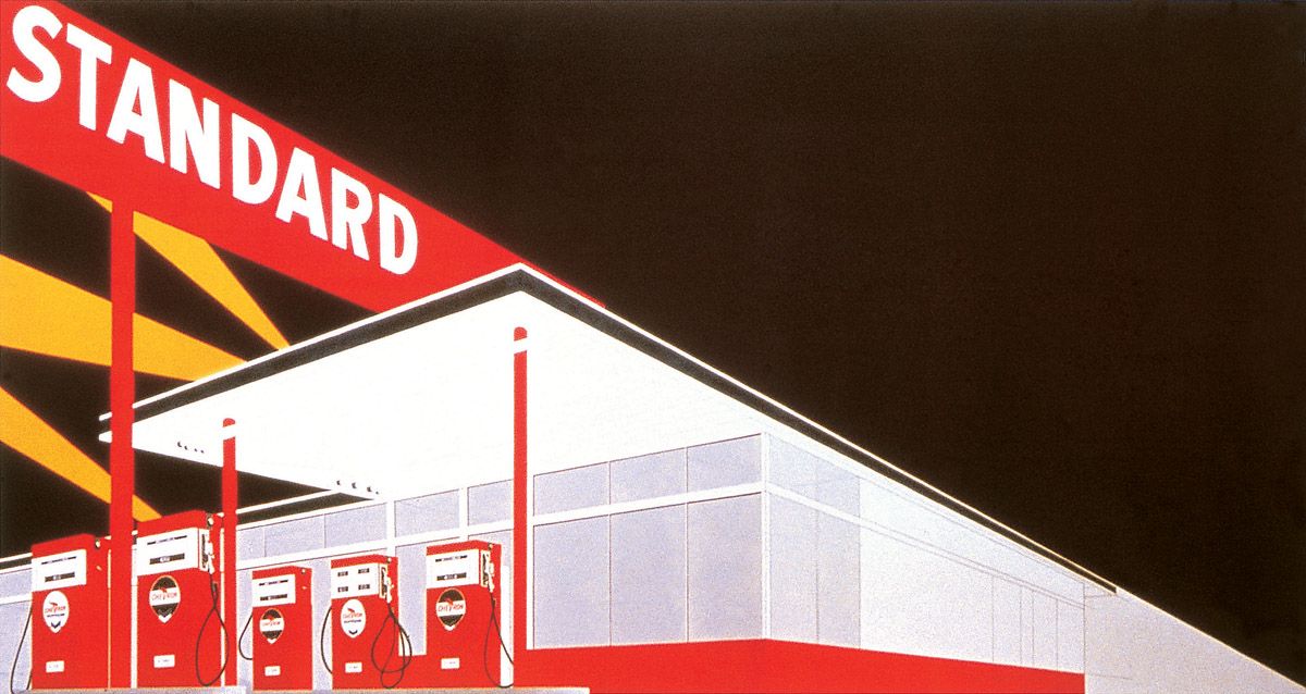
Edward Ruscha, Standard Station, Amarillo, Texas, 1963. Oil on canvas, 165.1 x 308.9 cm. Hood Museum of Art, Dartmouth College, Hanover, New Hampshire.
Edward Ruscha was born in Omaha, Nebraska in 1937 and grew up in Oklahoma City. At nineteen he moved to Los Angeles where he became a commercial artist, worked in the Walt Disney school for illustrators, studied fine arts at the Chouinard Art Institute, learned about book printing and was employed in an advertising agency. In 1958 he became aware of the work of Robert Rauschenberg and Jasper Johns. He made his first pictures of words in the early 1960s, and in 1963 published a book, Twenty-six Gasoline Stations, which grew out of his general interest in the American environment. Ruscha produced many books and paintings throughout the 1960s, mainly of words and of buildings, but by the end of that decade he had moved towards Conceptual Art, and in 1969 he gave up painting altogether, although he returned to it later. In the interim he also made films. Large retrospective exhibitions of his oeuvre have been held in Lyons, Nassau and Münster.
Ruscha’s training as a designer is apparent in all his output, and in this representative work his graphic skills impart a simplicity and immediacy to the image. The gasoline station looms out of the darkness, with searchlights moving across the sky beyond it. Because the gas station is lit up, it seems welcoming, although it is curiously deserted.
Richard Smith was born in Letchworth, Hertfordshire, England, in 1931. He studied at Luton School of Art between 1948 and 1950. Following his military service he attended St Albans School of Art between 1952 and 1954, before going on to the Royal College of Art between 1954 and 1957. As a result of being awarded a Harkness Fellowship, he spent 1959-61 in the USA. He held his first exhibition at the Green Gallery, New York in 1961. Thereafter he resided for periods both in New York and London, until finally settling in the American city in 1976. He was awarded the Grand Prize at the São Paulo Bienale in 1967 and represented Britain at the 1970 Venice Biennale. Among his many shows around the world were retrospectives in London in 1966 and 1975, and in Cambridge, Massachusetts in 1977.
Although Smith has always been a non-representational painter, his connection with mass-culture was at its closest during the 1960s when he took many of his pictorial starting-points from the packaging of products such as Lucky Strike cigarettes, as here. The work is about visual rhythm, with the red roundels and white rectangular shapes staggering across the canvas, an implied movement furthered by the shape of the support. Naturally, the repetition not only creates visual dynamism but simultaneously introduces associations of the mechanical repetition by which industrial products such as cigarette packets are produced.
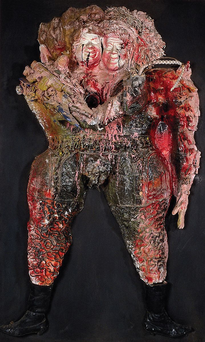
Niki de Saint Phalle, Kennedy-Khrushchev, 1963. Mixed media, 202 x 122.5 x 40 cm. Sprengel Museum, Hanover, New Hampshire.
Niki de Saint Phalle was born in Paris in 1930 but spent her childhood in New York. Self-taught as an artist, she took up painting in 1950. In 1952 she returned to Paris. After 1960 she lived with the sculptor Jean Tinguely. In 1961 she began creating ‘shot-reliefs’, works in which she used a rifle to pierce receptacles of paint suspended above relief assemblages of found materials; as the paint spilt from the bags it completed the works beneath. She held her first solo exhibition at the Alexander Iolas Gallery in New York in 1961. By that time she had joined the Nouveaux Réalistes group of artists in Paris and also begun making slightly more conventional sculptures, many of which enjoy a politicised bias, as here. She went on to create some extremely large works, including the 1966 She, a reclining female whose innards contained film shows, installations and machines, and which was entered through an aperture between its legs. Subsequently de Saint Phalle has written plays, made films, created architectural projects and continued to sculpt. A large retrospective of her work was mounted in Munich in 1987.
Here de Saint Phalle has commented acidly upon aspects of Cold War politics. Soviet Premier Nikita Khrushchev and United States President John F. Kennedy were never likely to have embraced as closely as we see them doing here, for in October 1962 they had brought the world to the brink of nuclear disaster during the Cuban missile crisis. But by presenting them in such tight proximity de Saint Phalle attains a number of things simultaneously: she projects the dualism of the two major superpowers; she reminds us of the puffed-up nature of vast military machines; she introduces associations of the space race, for because the overall form sports just two legs it looks rather like a single man dressed in a space suit; she suggests a grotesque fusion of two bodies, as might be wrought by a nuclear explosion; and she evokes the hideously bloated and discoloured appearance of a corpse, such as might be encountered in some post-apocalyptic wasteland.
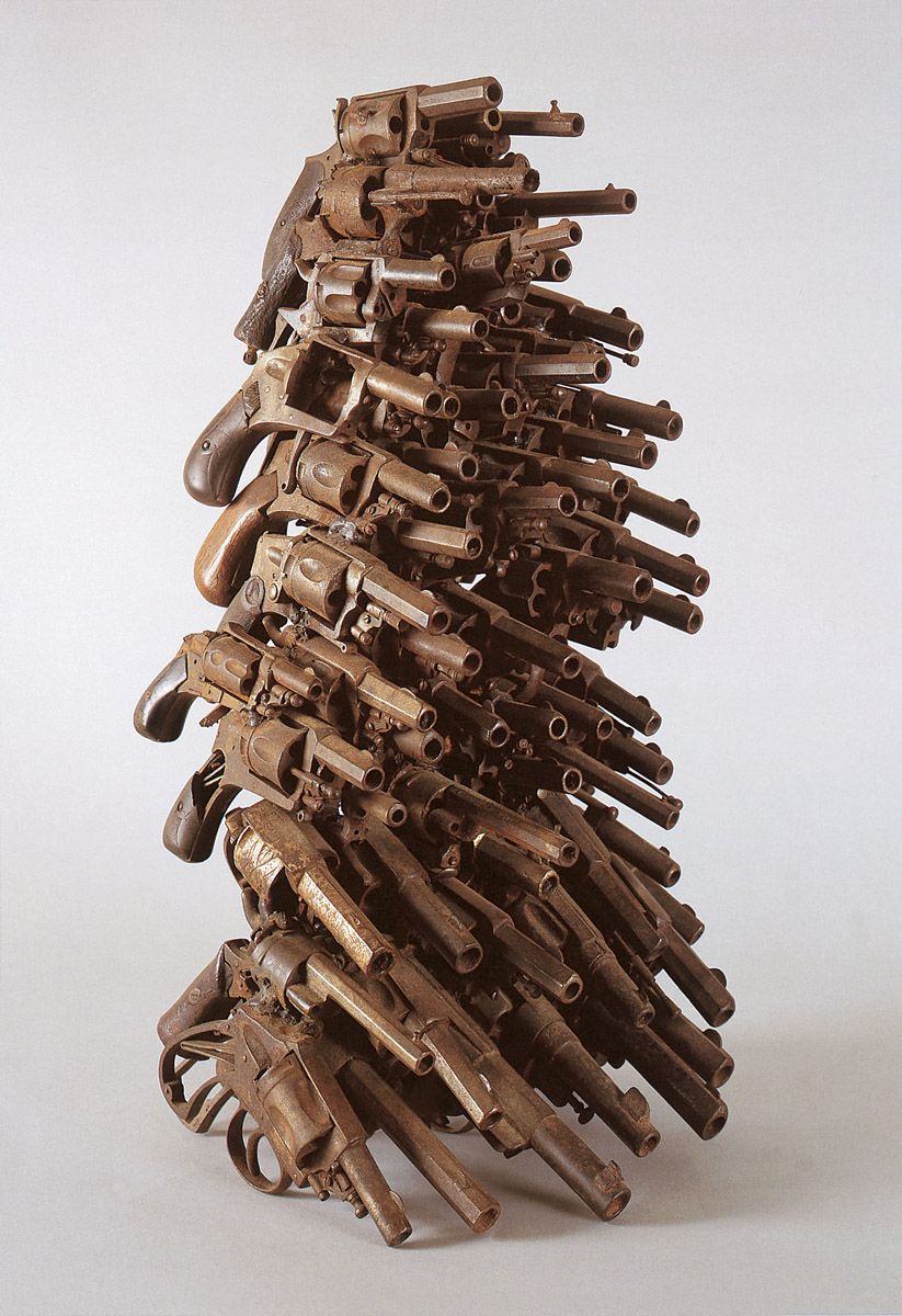
Arman, Nail Fetish, 1963. Group of revolvers glued together, 50.8 x 22.8 x 25.8 cm. Private collection, Courtesy Galerie Vallois, Paris.
Mass-culture can mean mass-guns, especially in America. By the time Arman made this work he had settled in New York, and thus was living in a more weapons-orientated culture than Paris. The mountain of small arms stands as a mini-monument to human aggression and clearly points the way to the huge war memorial Arman would create three decades later in war-torn Beirut, Lebanon.
Martial Raysse, Souviens-toi de Tahiti, France en 1961, 1963. Photograph, acrylic and screenprint on canvas, parasol, ball, 180 x 170 cm. Louisiana Museum of Modern Art, Humblebaek, Denmark.
Martial Raysse was born in Golfe-Juan, France in 1936. In 1954 he attended the University of Nice. His first solo exhibition was held at the Gallery Longchamp in Nice in 1957. In 1960 he was one of the founders of the Nouveaux Réalistes group of artists in Paris. His first American exhibition took place at the Dwan Gallery, Los Angeles in 1963; he made his New York debut at the Alexander Iolas Gallery the following year. Several European and American shows followed, with a retrospective at the Pompidou Centre, Paris in 1981, a survey at the Palazzo Grassi, Venice, in 1983; and an exhibition touring Scotland, France, Denmark and Belgium in 1985. In 1966 Raysse began making films and soon afterwards gave up painting entirely, although he returned to it in the mid-1970s.
Raysse’s first mature works were assemblages of banal consumer products with which he underlined the pointless range of choice within modern society. In 1962 he turned to painting, producing images saturated with garish colours to underline the gaudiness of contemporary life, while a little later he also began employing neon lighting to further that same end, as is seen on page.
In 1962 Raysse participated in a group exhibition held at the Stedelijk Museum in Amsterdam. His contribution was Raysse Beach, an assemblage made up of photographs of women, store mannequins dressed in bikini bathing costumes, plastic and rubber beach toys, parasols, a working jukebox and the like. Obviously the present piece was an offspring of that ensemble.
Some of the same colours visible on the parasol and beach ball appear on the woman, thereby suggesting she is just another artificially-coloured industrial product.
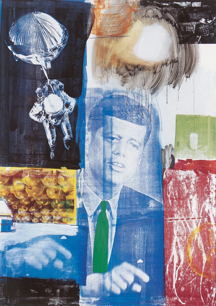
Robert Rauschenberg, Retroactive I, 1964. Oil and silkscreen on canvas, 213 x 152.4 cm. Wadsworth Athenaeum, Hartford, Connecticut. Art © 2006 Robert Rauschenberg/ Licensed by VAGA, New York, NY
Among its various meanings the word ‘retroactive’ denotes the extension of things to the past. By the time this work was created John F. Kennedy was dead, and so a portrait that brings him back to life is necessarily ‘retroactive’.
By repeating the dead President’s hand-gesture, Rauschenberg stressed the man’s decisiveness. Clearly the astronaut alludes to the fact that Kennedy had been largely responsible for expediting the American space programme, as the artist was well aware. The nude woman seen walking in multiple positions at the lower-right might equally serve to remind us that the human drive towards the exploration of space has its roots in very primal aspirations indeed: biologically, our species first crawled out of the swamp, then we stood upright and learned to walk, and as a result sooner or later we might conquer the stars.
This is another of the crowded pictures Rauschenberg created not long after discovering the visual immediacy afforded by photo-silkscreen. The apparently arbitrary organisation of the blocks of imagery strongly parallels the randomness of life itself, and certainly the density of imagery parallels the overload we receive daily through the media. Rauschenberg exploits to the full the graininess that results from using silkscreen on a fairly open-weave canvas, as well as the drips that flow from extremely thinned paint. These differing ways of mark-making add to the vivid sense of spontaneity throughout.
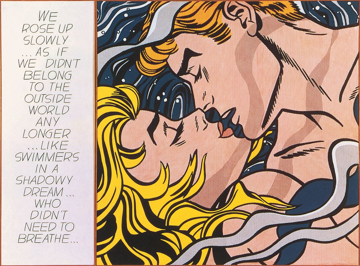
Roy Lichtenstein, We Rose Up Slowly, 1964. Oil and magna on canvas, overall 174 x 235 cm. Museum für Moderne Kunst, Frankfurt am Main.
Lichtenstein did not have to work hard to make these glamorous young lovers look trite, for they appeared idealised, dreamy and saccharine in the original comic-strip picture from which he developed the painting. Moreover, the wording on the left also takes us deep into the territory of the banal. The enormous magnification of both image and words further stresses the inflation of cheap emotions in the contemporary world.
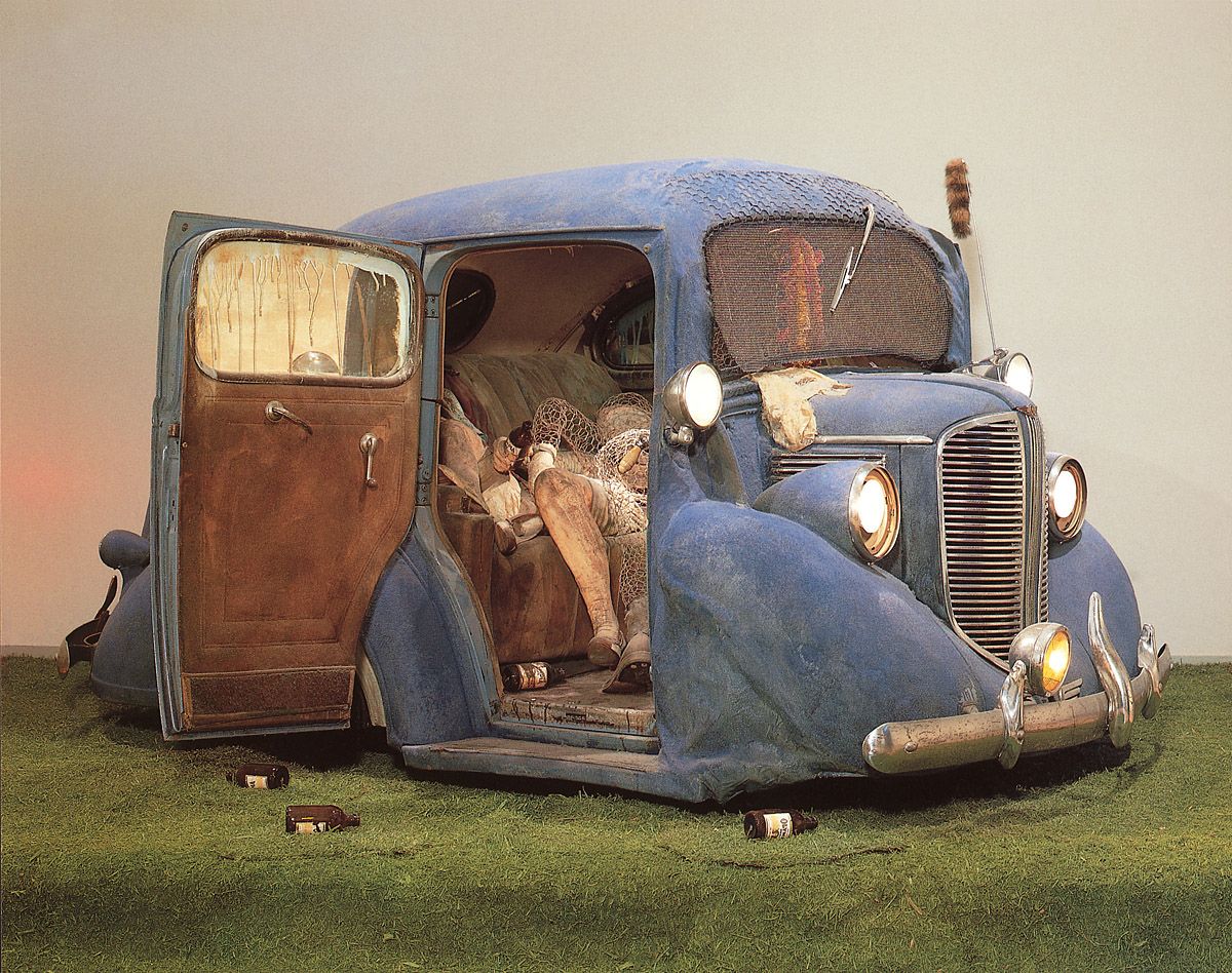
Ed Kienholz, Back Seat Dodge ‘38, 1964. Polyester resin, paint, fibreglass, truncated 1938 Dodge automobile, clothing, chicken wire, beer bottles, artificial grass and plaster cast, 167.6 x 609.6 x 365.8 cm. Los Angeles County Museum of Art, California.
For this sculpture Kienholz took a 1938 Dodge automobile, cut out a section between its engine and passenger compartment (including its front wheels) and then joined up the severed elements, disguising their linkage with filler and paint. The result of such compression is to place more emphasis upon the open compartment and its occupants making love. Kienholz was very precise about his choice of car, requiring a Dodge dating from around 1938 because it would remind him of a vehicle owned by his father which he had borrowed for an identical purpose way back in 1944. The racoon’s tail hanging from the car aerial and the empty Olympia beer bottles littering the scene also bore associations of that era for Kienholz.
The body of the man inside the car is made from chicken wire, while beneath him lies a girl whose form is composed of mannequin body-parts; the two figures share a head because, as Kienholz made clear, “…they both have the same thing on their mind.” The sculptor christened the man Harold and the girl Mildred, names he took respectively from an engraved watch and a pin he found in a junk shop and attached to the figures. Mildred wears a real dress, stockings and suspenders, while a female undergarment adorns the car bonnet; presumably it belongs to her also. A phallic object placed near the top of Harold’s legs obviously denotes his sexual arousal.
Inside the vehicle a radio plays continuously, although the music broadcast is necessarily contemporary rather than dating from the late-1930s. By this means Kienholz bridged the temporal gap between then and now, thereby making the point that young people still make love in the backs of cars. By placing the words ‘Everywhere, U.S.A.’ on the car’s rear number plate, the sculptor transformed a singular incident into a more universal statement about the furtive search for sexual thrills and spills in a modern junk-filled environment.
Kienholz added extra lights to the front of the vehicle; they are on full beam, as are the regular lamps. This bright light not only suggests that the action is taking place at night (to which end the sculptor directed that the surrounding gallery lights be dimmed), and that Harold has forgotten to turn them off in his sexual eagerness, but also that the couple are all lit up by their sexual arousal. Naturally, by giving his car a working radio and lights, Kienholz suggested that Harold has recently driven here. Yet simultaneously the sculptor further ignored the constraints of time, for by placing the partially wheel-less vehicle on artificial grass he equally suggested it has been abandoned in a field somewhere.
This ensemble was first displayed in the Kienholz retrospective mounted at the Los Angeles County Museum of Art in 1966, where it generated indignation among some narrow-minded members of the museum’s board of supervisors. Fortunately, the museum’s controlling board stood its ground and the work remained on display, although incredibly the car door was kept closed and only opened during exhibition tours. Naturally the controversy was reported by the media and the sculpture consequently acted as an enormous crowd-puller, turning the retrospective into the most successful contemporary art exhibition ever mounted at the museum (which subsequently purchased the piece). Now, of course, the projection of sexual activities that might take place after a Saturday night hop seems very tame when compared to the far more sexually-explicit works that are frequently encountered in art galleries, let alone everywhere else.
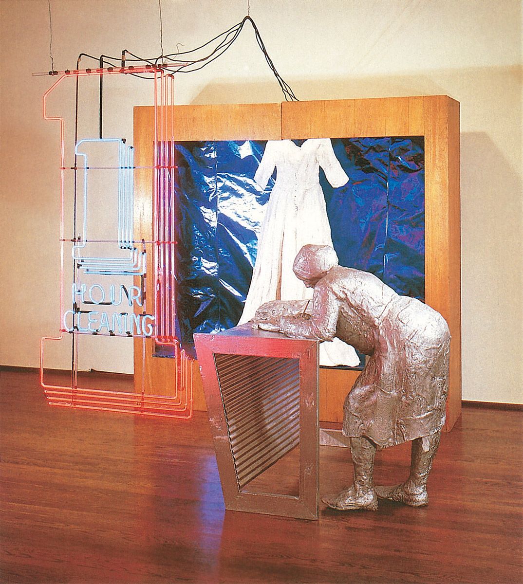
George Segal, The Dry-Cleaning Store, 1964. Plaster, wood, metal foil and neon light, paper and pencil, 243.8 x 274.3 x 218.4 cm. Moderna Museet, Stockholm. Art © 2006 The George and Helen Segal Foundation/ Licensed by VAGA, New York, NY
George Segal was born in New York in 1924. Between 1942 and 1946 he studied at the Cooper-Union School of Art in Manhattan, as well as at Rutgers University in New Jersey. He then studied between 1947 and 1949 at the Pratt Institute of Design in New York, and at New York University, from where he graduated with a teacher’s degree. He first exhibited at the Hansa Gallery, New York in 1956 (although on that occasion he displayed paintings rather than sculptures). As a result of the technical breakthrough detailed below, in 1961 he moved over almost completely to sculpture. Throughout the rest of that decade and subsequently he has exhibited his sculptures and sculptural ensembles to growing acclaim throughout America, Europe and the Far East.
What transformed Segal’s art in 1961 was the drawing of his attention to a new type of medical bandage which was coated with plaster and which therefore only needed to be wetted to solidify; by wrapping such dressings around real people and then using the hardened casts to constitute his figures, he could very quickly close the gap between actuality and art. This freed him up from representation per se, and allowed him to think more intensely about how to present his figures. The strange disparity between people depicted in white plaster and the multicoloured objects and environments that often surround them serves to stress the insubstantiality, anonymity, insularity, loneliness and alienation of those figures, thus making telling comments about our age.
Here an unpretentious dry-cleaning establishment becomes a place of isolation and loneliness as a solitary woman stands at her counter writing out a receipt and awaiting customers. The figure is coated in metallic paint and she holds a real pencil poised above a real piece of paper. Nearby a display-cabinet is lined with purple-coloured metal foil. This reflects the neon light in dazzling reds and blues, thereby offsetting the whiteness of the wedding dress made out of plaster which hangs at the centre of the case.
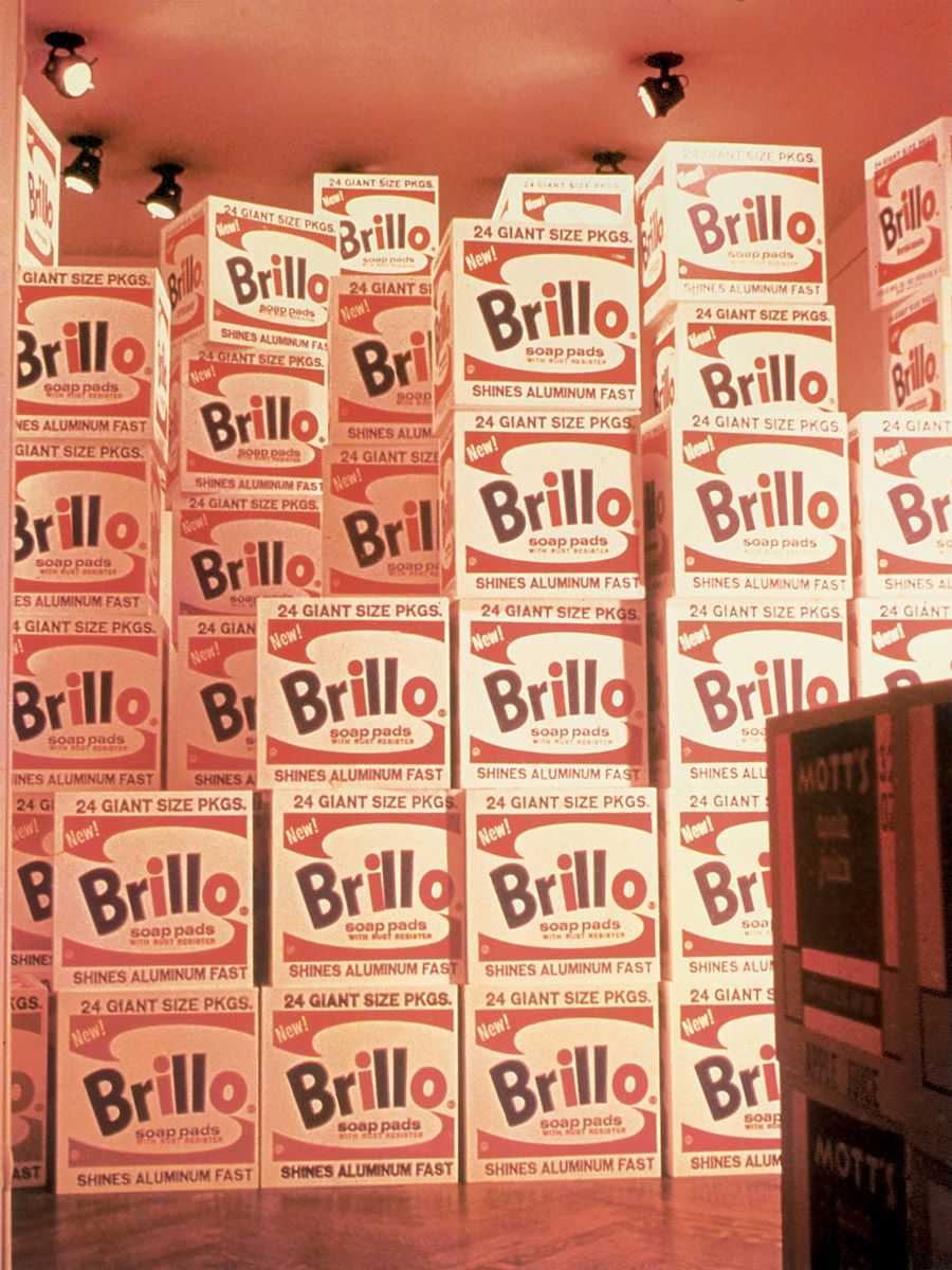
Andy Warhol, Brillo Boxes, 1964. Silkscreen ink on synthetic polymer paint on wood, each box 51 cm high x 51 cm wide x 43 cm deep. The Andy Warhol Foundation for the Visual Arts, Inc., New York.
This is a colour photograph of part of Warhol’s packing carton sculptures exhibition held at the Stable Gallery, New York, in April 1964. Warhol probably derived the idea for the display from being greatly impressed by one or other of the two The Store exhibitions held by Claes Oldenburg in 1961-2 which were made up of emulations of everyday objects of mass-consumption. However, here he gave us a somewhat more subversive and relentless project than Oldenburg’s witty comment upon consumerism.
For his sets of sculptures Warhol and his assistant, Gerard Malanga, silkscreened the designs of the cardboard outer packing cartons of Campbell’s Tomato Juice, Del Monte Peach Halves, Mott’s Apple Juice, Brillo Soap Pads, Heinz Ketchup and Kellogg’s Cornflakes on all six sides of over 400 wooden boxes that had been made to order by a team of carpenters. Naturally the boxes took to a logical conclusion the cultural implications of the 1960 painted bronze replica of two Ballantine beer cans by Jasper Johns. By being created and displayed en masse, Warhol’s boxes raise pointed questions about the nature of appearance and reality, as well as the commercial value of a work of art versus the object it represents. And by almost filling the Stable Gallery with these sculptures, Warhol thereby converted the space into a glorified supermarket stockroom, thus reminding us that art galleries are usually only glorified supermarket stockrooms anyway.
Although Warhol had visions of purchasers carting away large numbers of the sculptures, sales were poor, for people were loath to spend good money on cheap-looking objects when they could obtain the real thing for nothing behind a supermarket. As a result, the owner of the Stable Gallery withdrew her backing from the painter, who moved elsewhere as a result.
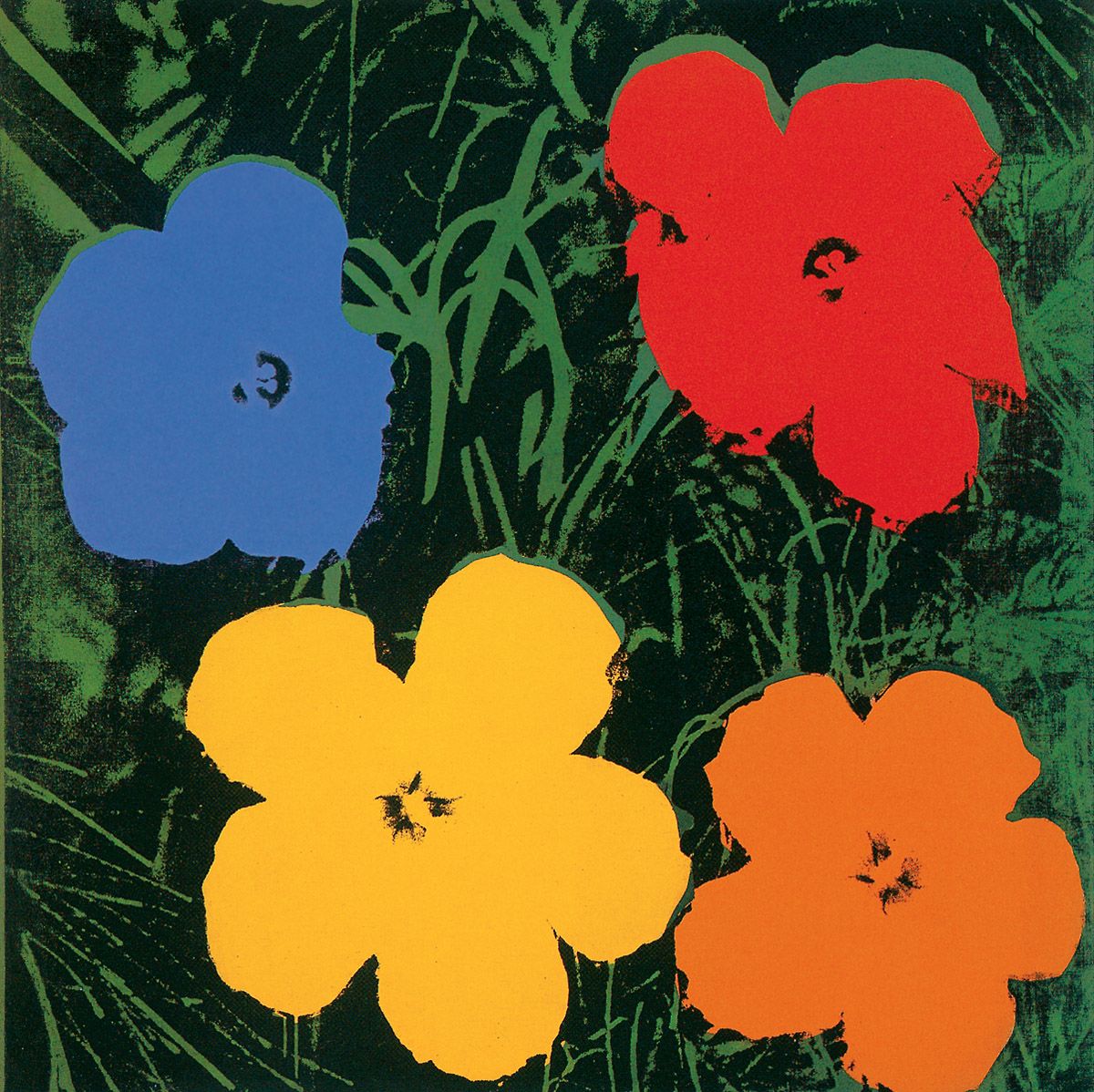
Andy Warhol, Flowers, 1964. Silkscreen ink on synthetic polymer paint on canvas, 293.4 x 293.4 cm. The Andy Warhol Foundation for the Visual Arts, Inc., New York.
In his Flowers paintings Warhol covered yet another major area of life and art, for flowers form a principal component of the natural world and there is a long and hallowed tradition of depicting them in western art. The series came about at the suggestion of a curator friend who met up with Warhol in April 1964 at the New York World’s Fair and suggested that instead of producing yet more death and disaster pictures, he should instead paint flowers. Warhol thereupon had sets of silkscreens made up from a photograph of some hibiscus flowers that he cropped and rearranged from the June 1964 edition of Modern Photography magazine. Assisted by Gerard Malanga, he then made over 900 flower paintings throughout that summer, although he forgot to obtain permission to reproduce the original flower photograph before doing so. As a consequence he was successfully sued for breach of copyright by the photographer, Patricia Caulfield. The vast replication of images makes the clear point that the natural world has become prettified, commodified and marketed on a mass scale during the present era. Naturally, this prettification, commodification and marketing were paralleled by Warhol himself, for the first exhibition of the Flowers paintings at the Leo Castelli Gallery in November 1964 completely sold out.
The original picture in Modern Photography magazine illustrated an article on variations in colour printing, so Warhol’s many colour variations are very apt. Because of the formal repetitiveness and colour variation, the works almost function simultaneously as investigations into the ways that such stresses and changes alter our perceptions of form, which could conceivably have been one of Warhol’s intentions, given his highly developed visual sensibility. As usual, the painter’s alertness to the intrinsic properties of forms made him push the shapes of the flowers to the interface with abstraction. That effect is heightened by the repetitiousness, crowding and colour variation of the flowers when they are seen en masse, as they were both in the Castelli Gallery and at the Ileana Sonnabend Gallery in Paris in May 1965. Warhol chose to display these pictures in the French capital at that time because, as he commented later, “In France they weren’t interested in new art; they’d gone back to liking the Impressionists mostly. That’s what made me decide to send them the Flowers; I figured they’d like that.”
Wayne Thiebaud, Lunch Table, 1964. Oil on canvas, 91.4 x 152.4 cm. Stanford University Museum of Art, Palo Alto, California. Art © 2006 Wayne Thiebaud/ Licensed by VAGA, New York, NY
Unlike Warhol, with whom he shared a preoccupation with the abundance, repetitiousness, replication and artificiality of modern life, Thiebaud dealt with things in traditional spatial terms. He was therefore able to invest his images with a great variety of shapes, as here. By arraying the dishes in strict perspective he pulls us into the image.
The colours of most of the foodstuffs, as well as those of the tabletop, foreground and background, are fairly bland, and by contrast they make the rich reds of the shadowed sides of the watermelons virtually leap off the canvas. Thiebaud’s use of the edges of the support to cut off the rank of layer cakes at the left, and the line of cottage cheese salads on the right, furthers the suggestion that we are merely seeing a portion of what is on offer, and that the food stretches away to infinity.
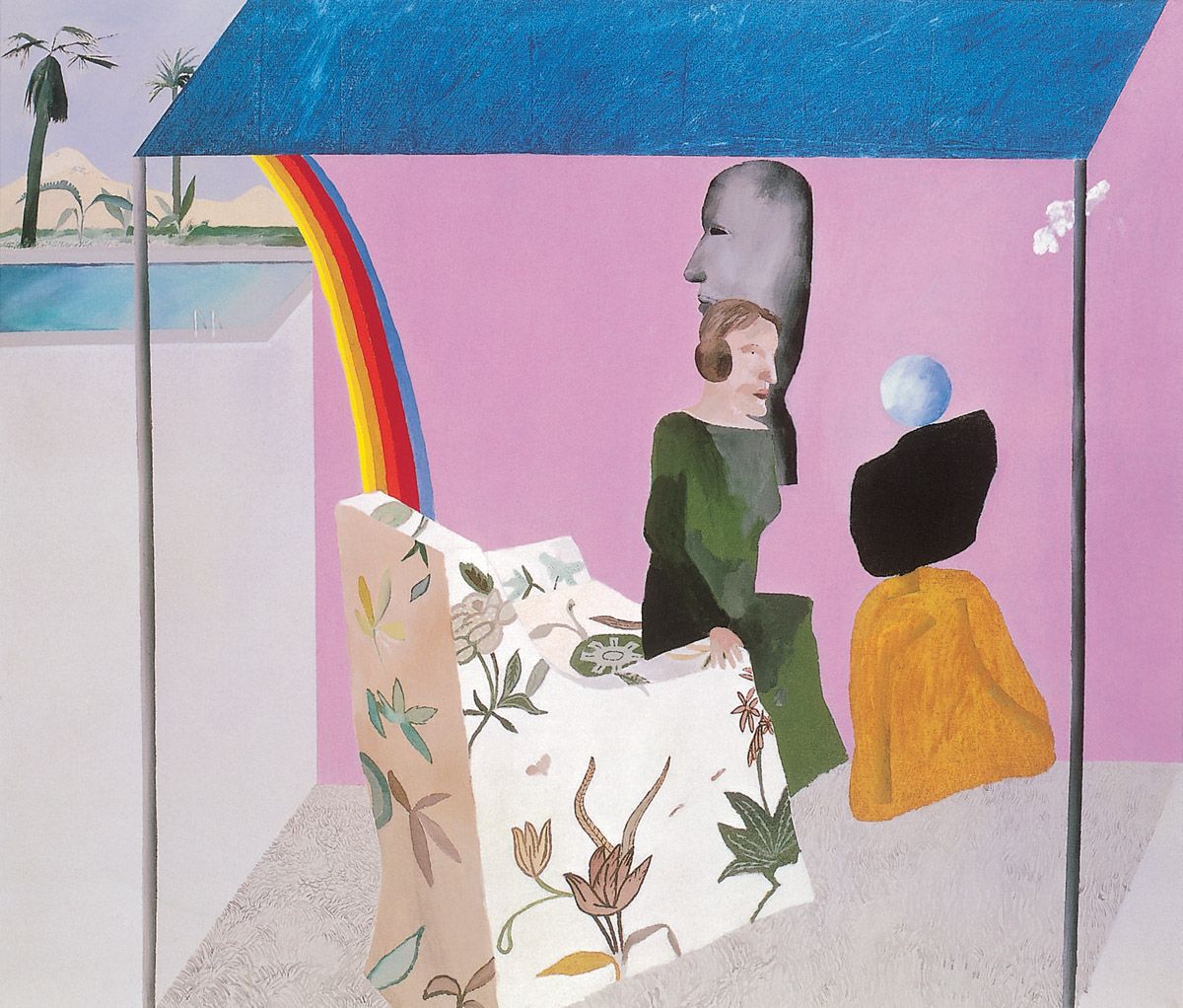
Hockney painted this picture shortly after touring Los Angeles with his art dealer in 1964 on prospective selling trips to various wealthy ladies who collected art. He found the women fairly ignorant but was impressed by their homes, especially their open-plan living spaces and large picture-windows which opened directly on to their gardens. From that experience, and also with art-historical associations in mind, he created this spatially ambiguous image.
The work is a parody of a traditional Italian Renaissance Annunciation scene, with the Californian art collector seated on the edge of her armchair occupying the position often taken by the Virgin in such religious paintings, and a tripartite abstract sculpture by the British artist William Turnbull standing in for the angel Gabriel in those pictures. Within the base of the Turnbull sculpture, bent, stylised legs are drawn in slightly darker tones of the surrounding golden brown, and they allude to the genuflection of the angel. The collector’s ignorance of art is externalised immediately beyond her by another, larger but monochromatic head painted in a somewhat primitive manner. Up to the right a small white cloud drifts away, pretty much as the Holy Dove that often appears above the Madonna in Annunciation scenes might presumably fly away after the proceedings are concluded. Instead of providing the white lily and stone floor that also normally appear in Annunciation scenes, Hockney respectively covers the armchair in flowers and the floor with a white, fluffy rug. All of this is contained within a room whose roof rests upon two poles. In one of Hockney’s typical spatial contradictions, the depth of the roof does not match that of the carpet beneath it. Very evidently the wide but shallow roof derives from the covering of the manger that appears in the background of a nativity scene of around 1470 by Piero della Francesca in the National Gallery, London.
Another allusion to art – albeit to contemporaneous painting – is embodied in the rainbow, for its colour stripes are reminiscent of the colour stripes painted by the American artist Kenneth Noland whose work was all the rage in avant-garde circles in 1964. And beyond the rainbow is a ubiquitous Californian swimming pool with accompanying palm trees. In time Hockney would make such typifications of the high life an important part of his art, as we shall see.
Martial Raysse, America America, 1964. Neon lighting and metal paint, 240 x 165 x 45 cm. Musée national d’art moderne, Centre Georges Pompidou, Paris.
The pointed shapes held by this giant hand evoke stars, which is most apt, given the title of the work. Yet at the same time those forms are extremely reminiscent of the pictorial devices employed by cartoonists to denote explosions, as Raysse would certainly have been aware from the work of Roy Lichtenstein. And then there are the associations brought into play by the Statue of Liberty in New York, where the female figure with head encircled by a pointed, starry crown grasps a torch that symbolised the hope America represented for Europe’s ‘huddled masses’ when the monument was created in 1886 and, indeed, still does for others. By encircling the hand with neon, Raysse reminds us of the artificial advertising techniques that are integral to America.
George Segal, The Diner, 1965. Plaster, wood, chrome, formica, masonite and fluorescent light, 259 x 274.3 x 220.9 cm. Walker Art Center, Minneapolis. Art © 2006 The George and Helen Segal Foundation/ Licensed by VAGA, New York, NY
This is a three-dimensional offspring of Edward Hopper’s famous 1942 painting Nighthawks (Art Institute of Chicago) which shows three customers and a barman in a café in the dead of night. Here, a lone diner waits while a barmaid draws hot water from an urn. The man’s entire body is expressive of solitariness and boredom.
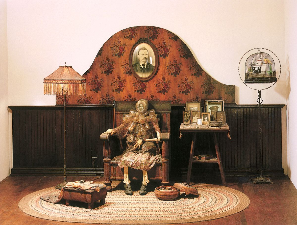
Ed Kienholz, The Wait, 1964-65. Wood, polyester resin, paint, flock wallpaper, furniture, bones, clothing, stuffed cat, live bird, photographs and glass, 203.2 x 375.9 x 198.1 cm. Whitney Museum of American Art, New York.
Loneliness in old age is a central problem of modern, atomised societies, as Kienholz made clear in this work. The skeletal figure of an elderly lady sits in her armchair, with her sewing strewn across her footstool and sewing-basket. Except for the (stuffed) cat that she fondles upon her lap and her pet bird – which is a live creature kept fed and watered daily by the museum staff – she is utterly alone with her memories and knick-knacks. The former are represented by the numerous framed photos on her table and on the wall behind her, while the latter cram the numerous jars hanging from her neck. They include an assortment of toys, figurines, mementos, small coins, thimbles and similar utilitarian household objects.
The head of the lady is represented by a large jar bearing a photo of a young woman on its lid. This bottle points outwards, and clearly we are expected to surmise that the picture shows the lady as she had looked when young. Behind the photo, filling the large jar, is the skull of a deer, with staring eyeballs. The skull and eyes remind us of our shared animal fate and that one day we too will stare death fully in the face.
James Rosenquist, F-111, 1964-65. Oil on canvas with aluminium, 304.8 x 2621.3 cm. The Museum of Modern Art, New York. Art © 2006 James Rosenquist/ Licensed by VAGA, New York, NY
With its vast scale, richness of imagery, pictorial variety and confident handling, this is both Rosenquist’s masterpiece and one of the finest works to have emerged from the entire Pop/Mass-Culture Art dynamic during the 1960s. Because the painter was unable to create the work on a single support due to the lack of studio space, he created it in 51 panels, which he later joined together in four sections. The picture was first shown in the Leo Castelli Gallery in New York in April 1965, ranged around the walls of the gallery in its four sections.
Rosenquist always avoided making direct statements about politics in his work and, indeed, about almost everything else for that matter. An oblique, fragmentary approach was his preferred means of dealing with the world, and so it proved here. Rather than directly attack the growing American involvement in Vietnam, with its military manpower, advanced technology and waste, he created a vast work that hints at that war, as well as at larger issues.
Underlying everything is the form of the General Dynamics F-111 fighter-bomber of the title. This machine first flew in December 1964, so it was the most advanced American attack plane of the day when Rosenquist painted this picture (in fact it would not actually come into use until the end of 1967). Over, through and behind the plane are ranged the images of a consumer society, some of which relate in an associative manner to the machine. Thus the parasol appearing in front of the word ‘FORCE’ and the nuclear mushroom cloud behind it clearly links to the idea of the nuclear ‘umbrella’ supposedly afforded by atomic weapons. Similarly, the winsome child under her pointed hairdryer is the only human in the image and she is located directly before the area of an F-111 where the only humans would be located within such a machine, namely the cockpit which was placed just in front of the leading edge of the wing and its nacelle. The fact that a child is situated here does not seem insignificant in symbolic terms either. Her hairdryer somewhat resembles both a huge crown and a large military shell, both of which seem very meaningful within a political-military context. And the spaghetti might allude to political and military entanglement, of the type that America was learning about extensively and expensively in human and logistical terms in Vietnam in 1964-5.
According to Rosenquist himself, the slice of cake to the left is reminiscent of a sunken missile silo by dint of its low pictorial position and its shape. Above it the tyre somewhat amplifies its circularity and adds a staccato rhythm by way of its jagged tread. The wallpaper pattern apparent towards the nose and tail of the airplane was likened by the artist to a veil hanging in the atmosphere like radioactive dust. Clearly the light bulbs and broken eggshell in front of the bomb-bay allude to bombs, the way that light bulbs can make a loud bang when shattered, and to the fragility of life when bombs are around. In a clear visual simile, the shape of the atomic cloud is echoed by the large air bubble given off by a swimmer to the right of it. Associations of the materials used to create an F-111 are introduced by the aluminium panels located in front of the nose and around the tail of the airplane.
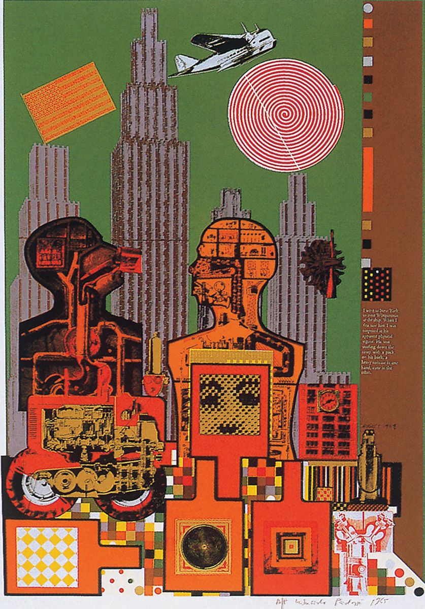
Sir Eduardo Paolozzi, Wittgenstein in New York, 1965. Screenprint on paper, 76.3 x 53.8 cm. Tate, London.
This complex image forms part of the ‘As is When’ set of twelve screenprints which has justly been called “the first masterpiece of [that] medium.” Ludwig Wittgenstein (1889-1951) was arguably the most important philosopher of the twentieth century, his Tractatus Logico-Philosophicus being his most influential work. Paolozzi was a long-time admirer of the philosopher and, indeed, once stated “I wanted to identify myself with Wittgenstein through [these] prints; to make a kind of combined autobiography.”
Wittgenstein visited the United States between July and October 1949 as the guest of the Professor of Philosophy at Cornell University, Norman Malcolm (1911-1990). In 1958 Malcolm published Ludwig Wittgenstein, A Memoir, from which the following passage on page of the book is quoted on the print itself:
I went to New York to meet Wittgenstein at the ship. When I first saw him I was surprised at his apparent physical vigour. He was striding down the ramp with a pack on his back, a heavy suitcase in one hand, cane in the other.
That vigour certainly comes across pictorially. New York looks wholly mechanistic, as do both Wittgenstein and Malcolm. We see inside the two, with electrical, plumbing and medical diagrams forming the basis of their innards. Across the stomach of the man on the right, the upper part of a face appears in photo-mechanical dots that resemble computer pixels. Even the Stars and Stripes, near the top-left, is represented rather like an electronic circuit board. An antique flying boat and an aircraft engine, complete with propeller, add to the overall sense of technology, much of which dates from Wittgenstein’s day. The rich colours include polarised orange and silver near the lower-right.
Peter Phillips, Custom Painting #3, 1965. Oil on canvas, 213.4 x 152.4 x 22.9 cm. Private collection.
Peter Phillips was born in Birmingham, England, in 1939. Between 1953 and 1955 he studied at the Moseley Road Secondary School of Art where he was taught a variety of fine and applied art techniques. He then went on to Birmingham College of Art between 1955 and 1959, and the Royal College of Art between 1959 and 1962. Like Allen Jones, he too was punished by the college authorities in order to discourage radical artistic thinking amongst his peers, although unlike Jones he was not expelled but simply moved to the television school; he just went on painting. Like Jones, Hockney and others, he was a moving force within the Young Contemporaries exhibiting group which first brought Pop/Mass-Culture Art to the attention of the British public. Further ‘Pop Art’ shows held on the Continent in 1963-4 also helped spread his reputation. In 1964 Phillips received a Harkness Fellowship which led him to move to New York for two years. His first one-man show was held in New York, at the Kornblee Gallery in 1965, and retrospectives of his work were mounted in Münster in 1972, in London in 1976 and in Liverpool in 1982.
During the early 1960s Phillips became aware of the Flags paintings of Jasper Johns and accordingly made pictures that unite the formal patterning of flags with the type of graphics encountered on the fasciae of pinball machines. He also created disparate types of portraits whose subjects ranged from American Civil War veterans to pin-ups and film stars (including Marilyn Monroe, painted a year or so before Warhol did so). By a little later he began creating larger pictures of consumer objects, including the working parts of cars and motorcycles, as the canvas reproduced here demonstrates.
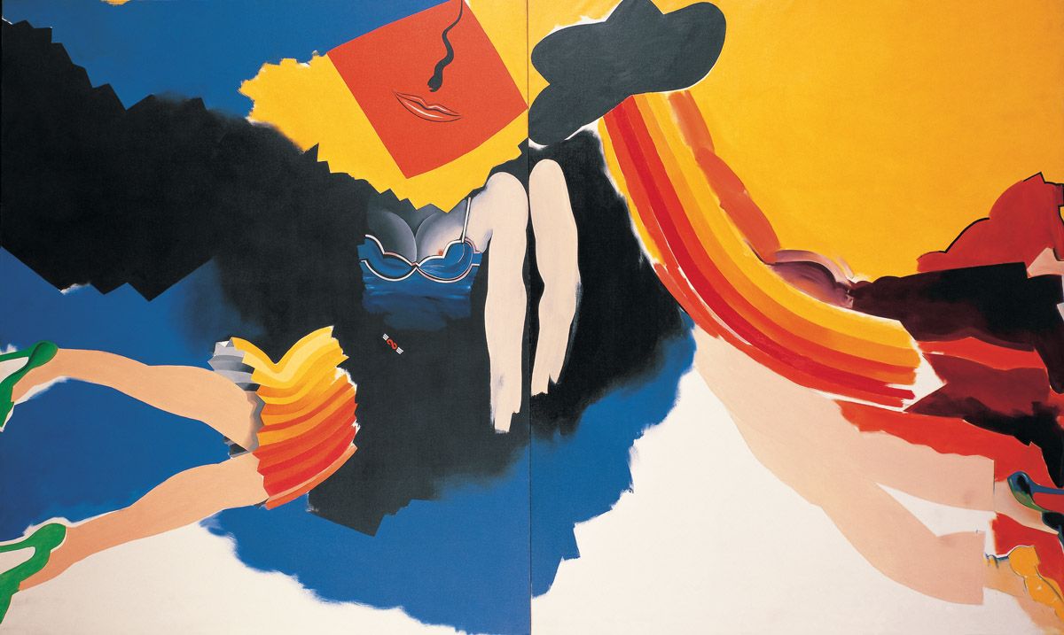
Allen Jones, Female and Male Diptych, 1965. Oil on canvas, 365.7 x 304.8 cm, each panel 182.8 x 152.4 cm. Hirshhorn Museum and Sculpture Garden, Smithsonian American Art Museum, Washington, D.C.
Allen Jones was born in Southampton, England, in 1937. After studying at Hornsey College of Art in 1958-9 he attended the Royal College of Art between 1959 and 1960. Unfortunately he was then expelled, not for anything he had done but simply to warn his fellow-students not to be too radical artistically, a ludicrous move that predictably backfired. From 1960 Jones exhibited with the Young Contemporaries group in London, and he also displayed work at the Paris Biennale in 1961 and 1963. He held his first solo show at the Arthur Tooth Gallery in London in 1963. A multitude of exhibitions at important venues have followed down the years. Outstanding among these were his first New York show in 1965; a survey of his prints in Rotterdam in 1969; a large one-man show in London in 1972; and a retrospective in Liverpool in 1979 that subsequently travelled to Sunderland, Baden-Baden and Bielefeld. Jones has taught in London, New York, Hamburg, Tampa, Los Angeles and elsewhere, although London has always remained his base.
This painting was begun when Jones was living in New York in 1964-5; it was completed back in London. At that time he was still working at the interface between semi-abstraction and figuration, with a pronounced emphasis upon colour, a concern that would only grow with time. The division between the female and male halves of the image are self-evident, as is the large phallic sweep on the right, a shift that takes us up from the legs of the male to his hat. Opposite the hat a visual pun is enacted by a squiggly line which suggests both a nose above a female mouth, and a sperm cell in motion. The two arms at the centre lock the pictorial halves together. Towards the lower-right are five legs; judging by the shoes worn, all but one of these are male. Collectively they balance the dress, legs and shoes on the left.
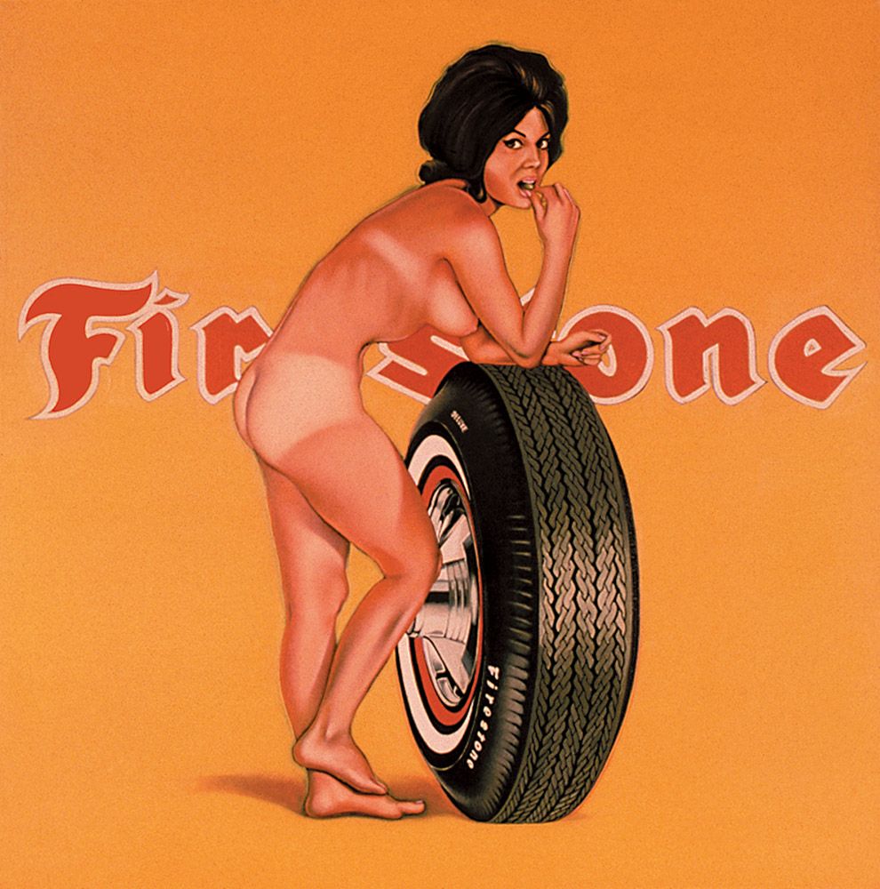
Mel Ramos, Miss Firestone, signed, titled and dated 1965 on the stretcher. Oil on canvas, 177.8 x 177.8 cm. Collection of Louis K.Meisel. Art © 2006 Mel Ramos/ Licensed by VAGA, New York, NY
Mel Ramos was born in Sacramento, California in 1935. He studied at various colleges in Sacramento and San Jose between 1954 and 1958, following which he taught in schools and colleges throughout his home state. He held his first New York show at the Bianchini Gallery in 1964. He has exhibited throughout America and Europe, while retrospectives of his work were mounted in Krefeld in 1975 and Oakland in 1977.
Ramos’s mature work has passed through several main phases. Among other subjects, he has painted comic-strip heroes, combined glamorous pin-ups with commercial artefacts (as here), and linked nudes with animals. The combination of attractive young women and industrial products, in particular, has always proven central to marketing in the modern technological epoch, and here Ramos took matters to a conclusion unrivalled by most advertisers. Doubtless a Freudian analyst could really go to town on the amplification of the girl’s breast by the rotundity of the tyre, as well as the fact that she seems to be rubbing her right knee against a wheel-hub that somewhat resembles an unextended phallus.
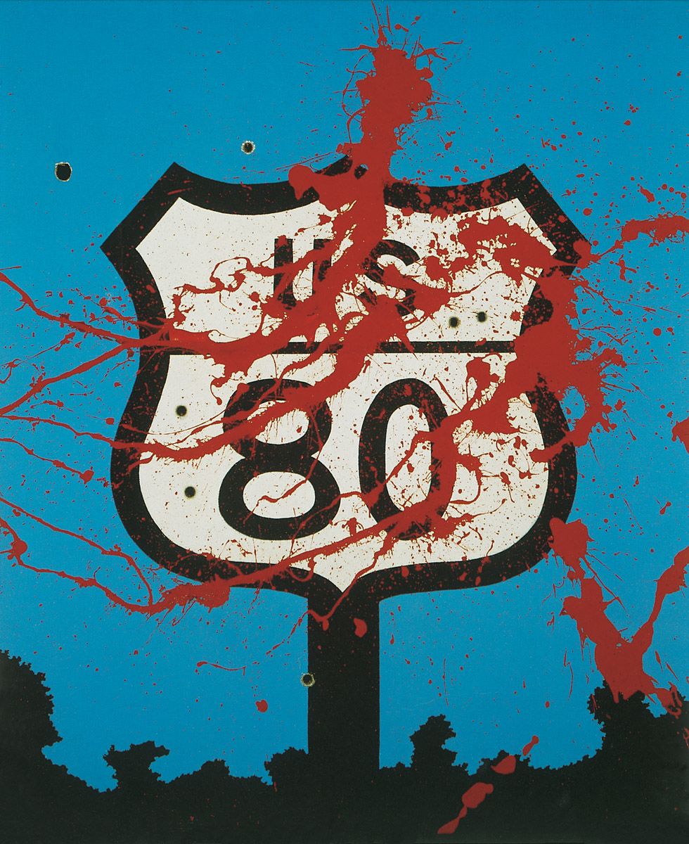
Allan D’Arcangelo, U.S. 80 (In Memory of Mrs Liuzzo), 1965. Acrylic on canvas, 60.9 x 60.9 cm. Collection of the artist. Art © 2006 Estate of Allan D'Arcangelo/Licensed by VAGA, New York, NY
Viola Liuzzo, to whose memory this painting is dedicated, was a Detroit housewife and mother of five married to a trade union official. In March 1965 she learned of the struggle for black civil rights then taking place in Alabama. Accordingly, she drove down to the southern state where an important protest march was being led by Martin Luther King along Route 80 from Selma to Montgomery. On 25 March 1965, while driving along Route 80, Mrs Liuzzo was shot and murdered by three Klu-Klux-Klansmen. They were immediately apprehended, having unknowingly been accompanied by an FBI informer. At their Alabama State trials they were all acquitted, although they were also prosecuted for conspiracy in the federal courts where they were convicted and sentenced to ten years in prison (however, one of them died of natural causes in 1966).
Given this context, the highway sign doubles as a memorial monument, with paint standing in for blood. The holes in both sign and sky were made by real bullets.
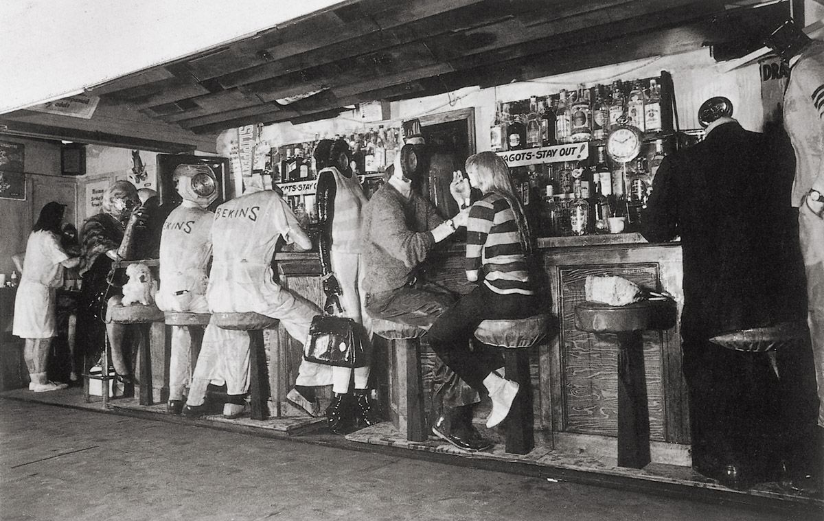
Ed Kienholz, The Beanery, 1965. Mixed media environment, 213.4 x 182.9 x 55.9 cm. Stedelijk Museum, Amsterdam.
The inspiration for this work was a 28 August 1964 Los Angeles Herald-Examiner newspaper headline ‘CHILDREN KILL CHILDREN IN VIET NAM RIOTS’. From that stimulus Kienholz first fashioned a small sculpture showing a hand clamping a television-like screen over the headline, as though television might blot out all consciousness of the horror aroused (as probably it did). A blotting-out of life’s ugly realities is the underlying theme of this work too.
‘Barney’s Beanery’ is a cheap eating place and bar on Santa Monica Boulevard (which doubles as Route 66) near La Cienaga in West Hollywood, California. The business was founded by John ‘Barney’ Anthony in Berkeley, California in 1920 and it moved to the Los Angeles site in 1927. Now considerably expanded and modernised, when Kienholz lived in LA it was still the ‘little wooden shack’ it had been for decades. The bar was frequented by both film people and artists. In addition to Kienholz, the latter included Mel Ramos and Ed Ruscha, painters already discussed in this book. For Kienholz the bar represented the kind of unpretentious watering hole he liked and, indeed, he exhibited this work for the very first time in its parking lot.
The sculpture reproduces the entirety of the bar-restaurant, including its exterior walls. The outer wall incorporates a simulacrum of the street facade of the shack, including its porch, window, street sign and stand carrying copies of the newspaper bearing the Vietnam riots headline that initially inspired Kienholz. The doors in this facade permit us to enter the bar and squeeze past its sixteen figures and a toy poodle. The majority of these characters were cast from real people by means of plaster-impregnated bandages, a technique first employed by George Segal, as we have seen. Behind the bar are two signs bearing the misspelt message ‘FAGOTS - STAY OUT’; these used to hang in Barney’s until greater tolerance forced their removal in the 1970s (although gays had always been welcomed in the Beanery in actuality).
A hidden tape recorder plays a continuously running soundtrack of people chatting and drinking, with a juke box operating continuously, and with the noise of clattering dishes and washing-up emanating from the kitchen. (When the work was displayed in Chicago in 1966, it is said to have been sprayed daily with stale beer to augment the sense of authenticity even further.) At the end of the bar stands Barney, whose head is represented in conventional terms, unlike all the customers (and the two other staff). Their faces each sport clocks with their hands set at exactly the same moment, ten minutes past ten; by such symbolic means the artist denoted the freezing of time and the arresting of the sense of mortality that establishments such as Barney’s frequently provide – as Kienholz stated, virtually all of the Beanery’s occupants are “…postponing the idea that they’re going to die.”
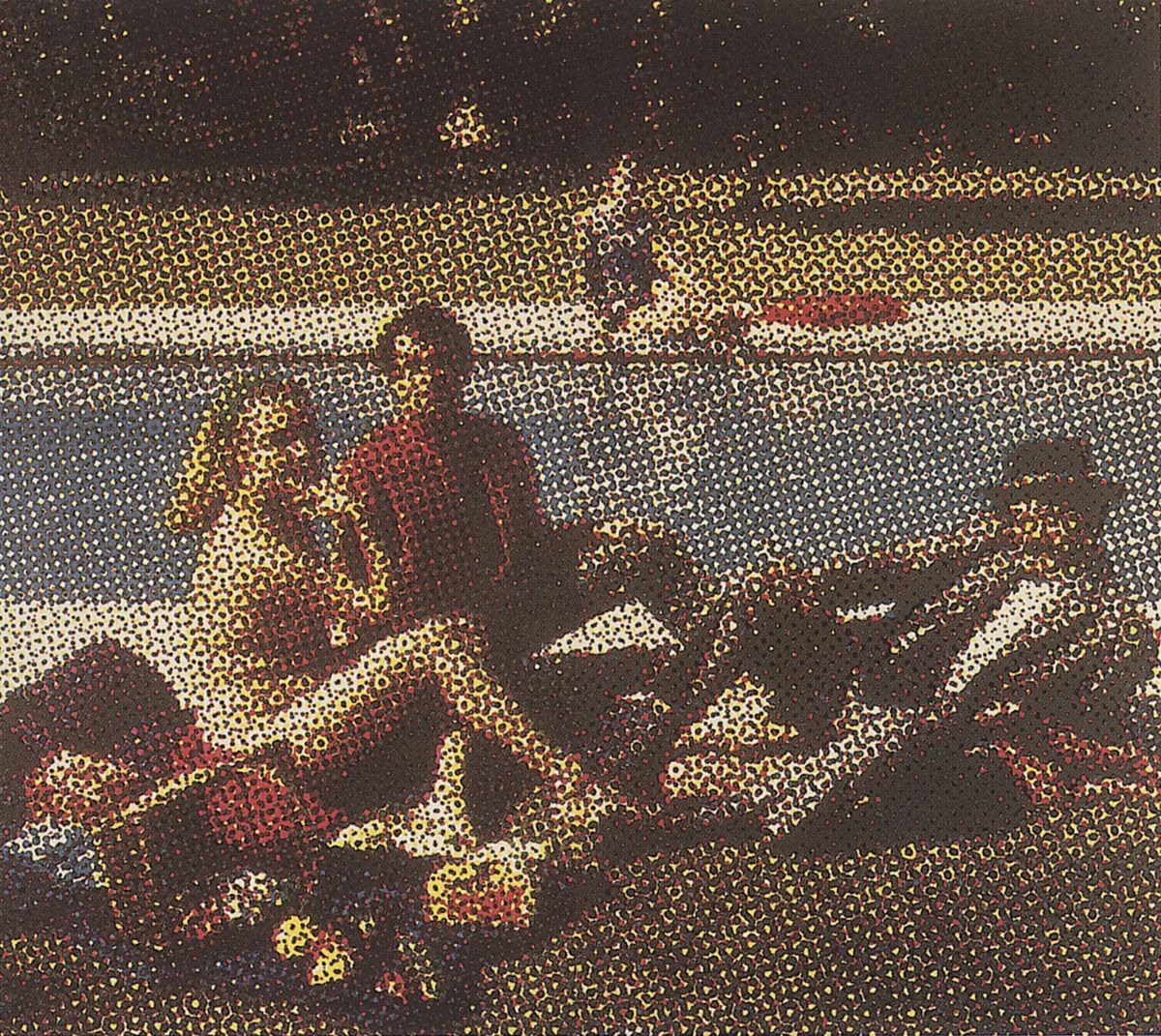
Alain Jacquet, Déjeuner sur l’herbe, 1965. Silkscreen on canvas, 175 x 195 cm. Arts Council of Great Britain, South Bank Centre, London.
Alain Jacquet was born in Neuilly-sur-Seine, France in 1939. He graduated from the University of Grenoble in 1959, and then studied architecture at the École des Beaux-Arts in Paris where he also came into contact with the Nouveaux Réalistes. He held his first solo exhibition at the Gallery Breteau in Paris in 1961, and his initial American show at the Alexander Iolas Gallery in New York in 1964, when he first visited the city. After 1969 he began to live in New York as well as in Paris. Numerous exhibitions of his work have been held in Paris and throughout Europe. He has also shown in South America. In 1976 his work was displayed at the Venice Biennale.
For about three years before making this picture Jacquet had been creating what he called ‘Camouflages’ or paintings and sculptures in which he superimposed banal imagery upon reproductions of works of art. For example, in 1963 he superimposed a Shell petroleum sign and the image of a petrol pump over a simulation of Botticelli’s Venus. But by 1965, when he made the present work, he had begun to create what he termed ‘MEC Art’. This involved the photo-mechanical reproduction of images by means of silkscreen printing. Like Roy Lichtenstein, who since 1961 had been mainly exploring the mechanical breakdown of images familiar from newspaper and magazine reproductions, Jacquet applied his imitation of a mass-media technique to famous works of art, as is demonstrated by this take on Manet’s Dejeuner sur l’Herbe of 1863 (Musée d’Orsay, Paris). Jacquet had friends substitute for the models used by his predecessor, thereby updating what had already constituted a complex statement about sexuality and gender. However, unlike Lichtenstein, Jacquet enlarged the constituent dots so as to make us work harder at apprehending what is visible in overall terms. He also created his imitative images in theoretically endless variations, and with intentional mis-registrations, in order to make the works look improvised. They could be very much enlarged, as proved the case with one version of this re-invented Manet picnic that appeared on the side of a building. Jacquet also produced multiple editions of his images, which naturally made them more economically accessible. Until 1969, when he moved towards the relative minimalism of Arte Povera, he was often engaged in such a dialogue between the art of the past and the visual language of modern mass-communications.
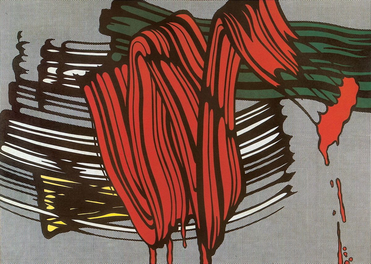
Roy Lichtenstein, Big Painting VI, 1965. Oil and magna on canvas, 233 x 328 cm. Kunstsammlung Nordrhein-Westfalen, Düsseldorf.
Here Lichtenstein emulated the appearance of four typical Abstract Expressionistic brushstrokes, complete with drips, except that he did so on a vast scale in comparison with such marks in reality. He also set them against a background of Benday dots which brings into play the notion that we are not looking at an imitation of real brushstrokes, but at a reproduction of such an imitation. We are therefore two stages removed from the originals (and of course the reproduction in this book takes us yet another stage from that source).
A further pictorial witticism arises from the fact that in their original form Abstract Expressionist brushstrokes would have been created in seconds, whereas Lichtenstein’s marks took days to create because of their size, detailing and relative complexity.
Michelangelo Pistoletto, Vietnam, 1965. Graphite pencil, oil and transparent paper on polished stainless steel, 220 x 120 x 2.2 cm. The Menil collection, Houston.
Michelangelo Pistoletto was born in Biella, Piedmont, Italy, in 1933. Between 1947 and 1958 he worked with his father as a restorer of paintings. He began making his own pictures in the 1950s; mainly these were portraits of single figures set against flat gold, silver or black backgrounds. Such works formed the basis of his first exhibition, which was mounted in the Galleria Galatea, Turin, in 1960. His first solo show in the USA was held at the Walker Art Center, Minneapolis, in 1966. The following year he won a prize at the São Paulo Bienale, as well as the Belgian Art Critics’ Award. After 1968 Pistoletto became involved in Happenings, film, video and theatre as part of the Zoo Group, which he founded. From 1967 onwards he was also involved in the Arte Povera movement. He took up sculpture in the 1970s. Retrospectives of his work have been mounted in Venice in 1976; in Madrid in 1983; in Florence in 1984; in Rome in 1990; and in Barcelona in 2000.
By 1961 Pistoletto had begun covering his canvases with grounds made from metallic paint, and from there it was a short step to using polished stainless steel for his supports. One such base coating was used for the work discussed here. By pasting or photo-silkscreening life-size images of people on to these mirror-like reflective surfaces, Pistoletto was able to blur the boundaries between image and reality, thereby drawing the viewer into the space and thus hopefully involving us further in the visual and thematic dialogue. For example, in the present work – which was made when the Vietnam War was seriously heating up, as was the opposition to that conflict – we become part of the protest simply by appearing within the image. If we protest against being a protester – well, that is incorporated into the statement too. Ultimately Pistoletto’s work is completely democratic.
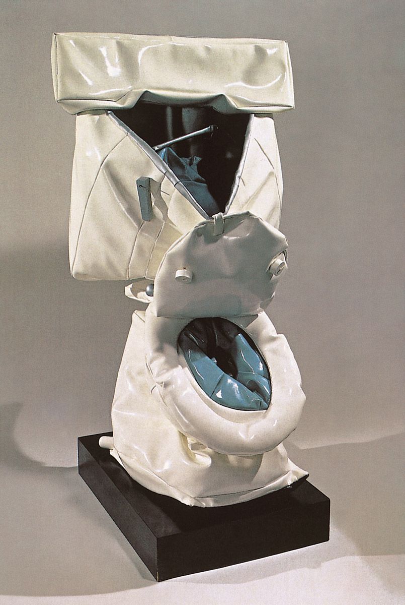
Claes Oldenburg, Soft Toilet, 1966. Vinyl, plexiglass and kapok on painted wood base, 144.9 x 70.2 x 71.3 cm. Whitney Museum of American Art, New York.
This is a brilliantly witty update of the artefact chosen by Marcel Duchamp in 1917 to demonstrate how anything can be a work of art, no matter how common or ‘low’ it may be. Just as Duchamp forced us to see beauty in a pedestrian object, so Oldenburg does so as well, albeit by transforming a toilet into something almost as appropriately pliant as the material it would dispose of in reality.
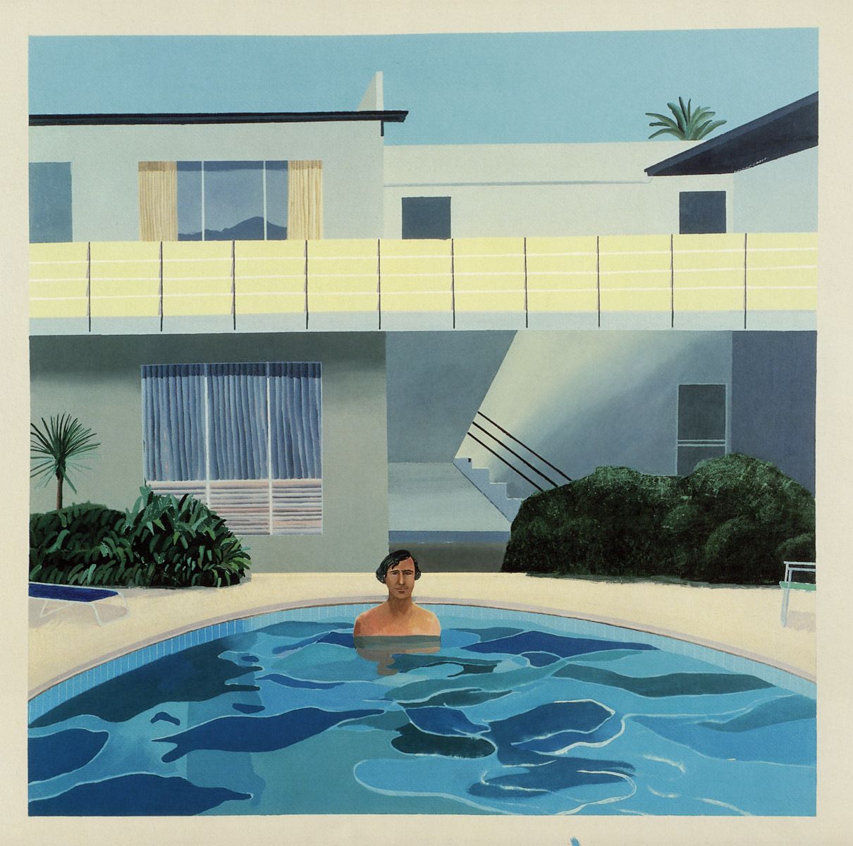
David Hockney, Portrait of Nick Wilder, 1966. Acrylic on canvas, 183 x 183 cm. Fukuoka Sogo Bank, Japan.
As we have seen with Hockney’s ‘The Rake’s Progress’ series of etchings and his California Art Collector, during the first phase of his maturity he had generally renounced traditional ways of representing space in favour of a more freewheeling, ambiguous or even contradictory approach, with the figures depicted in an intentionally naive or crudely-formed manner.
However, by 1966 he had begun to adopt a more conventional attitude to space and the figure, to which he carried over his deep knowledge of Old Master painting. The results can be witnessed here. Spatially the foreground, middleground and background are just as recessional as they would be in a Dutch Old Master painting. This reference is not accidental, for by 1966 Hockney had clearly been looking at works by Jan Vermeer, especially his Lady Standing at the Virginals of 1673-5 in the National Gallery, London. He would introduce that image into a canvas of 1977 and a poster of 1981.
In the present work the assimilation of Vermeer is apparent in the way that most of the vertical and horizontal lines of the house beyond the pool parallel the edges of the canvas, just as lines similarly do so in the Vermeer. Even Nick Wilder stands in a frontal position parallel to the picture-plane. The net result of this parallelism is the impartation of stability to the image, a quality shared with the Vermeer. That stability greatly heightens the suggested movement of the water by contrast. At this time Hockney was exploring different ways of representing such movement, and the solution reached here is very successful. The rich blues and blue-greens of the water and sky set off all the other colours to perfection, and demonstrate Hockney’s growing powers as a colourist.
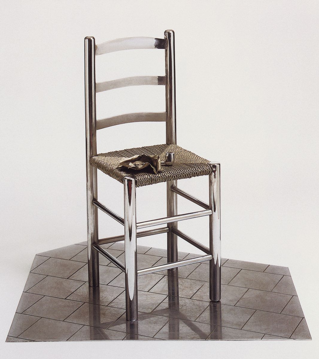
Clive Barker, Van Gogh’s Chair, 1966. Chrome-plated steel, 86.4 cm high. Sir Paul McCartney collection.
Clive Barker was born in Luton, Bedfordshire, England, in 1940. He studied painting at Luton College of Technology between 1957 and 1959 but dropped out from the course because of its shortcomings; instead he worked in a nearby car plant and then continued to paint after moving to London in 1961. The familiarity with chrome-plated metal and with leather he accrued from working on cars first led him to create sculptures, although after 1963 he employed specialist craftsmen to make most of his objects; he did so as a form of post-Duchampian rejection of the notion that art and the ability to make things are necessarily related. As well as replicating consumer artefacts, such as Coca-Cola bottles, cameras, torches, toy ray-guns and the like, Barker also made objects bearing artistic associations, as with the present work and a number of sculptures based on imagery by Magritte, Francis Bacon and Eduardo Paolozzi. Barker’s first solo exhibition was held at the Robert Fraser Gallery in London in 1968, and further shows in the city followed in 1969, 1974, 1978, 1983 and 2000. A retrospective was mounted in Sheffield and other British towns in 1981-2. Barker also participated in many group exhibitions, notably in New York in 1968 and 1969. From the 1970s onwards he turned increasingly to portraiture, and an exhibition of his heads was held at the National Portrait Gallery in London in 1987. Jeff Koons (q.v.) has openly acknowledged his debt to Barker’s work.
Vincent van Gogh’s 1888 painting of a chair bearing his pipe and tobacco (National Gallery, London) was indirectly based upon a best-selling 1870 print by the British artist and illustrator, Luke Fildes. That portrays the empty chair of the writer Charles Dickens on the morning after his death. In his portrayal of his own chair, van Gogh was equally attempting to associate a piece of much-used furniture with mortality. It seems unlikely that Barker was aware of this background to van Gogh’s painting, but of course he knew that the Dutchman had died virtually unappreciated and penniless; the irony that van Gogh’s work would one day accrue enormous financial value is the entire point of this sculpture. By being made in chrome-plated steel, the piece looks both very suave and extremely expensive, thereby stressing the humble ordinariness of van Gogh’s chair and its owner’s humility in contrast.
As we shall see, the irony that van Gogh died poor but that his works would later fetch a fortune has held great appeal to contributors to the Pop/Mass-Culture Art tradition, for justifiably it allows them to attack the economic exploitation of art.
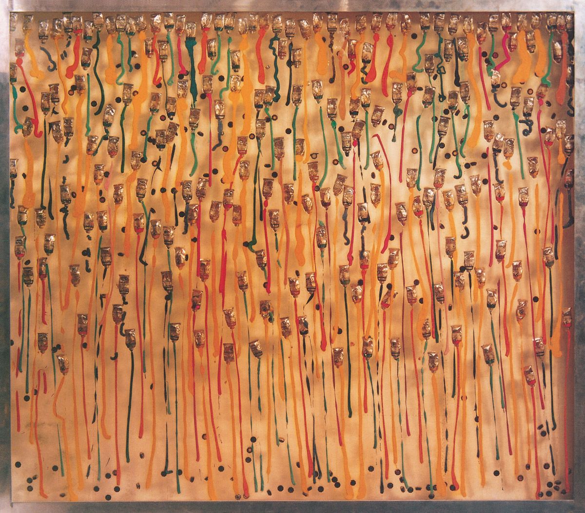
Arman, Bonbons anglais, 1966. Paint tubes and paint in synthetic resin, 141 x 161 x 5 cm. Private collection.
This is one of a large group of accumulations made in 1966 in which Arman explored paint and its receptacles as a way of commenting upon the abundance of painting in the world, as well as the longevity of art. Like a waterfall, the paint spills from a group of tubes, to be arrested forever and most aesthetically within the resin surround.
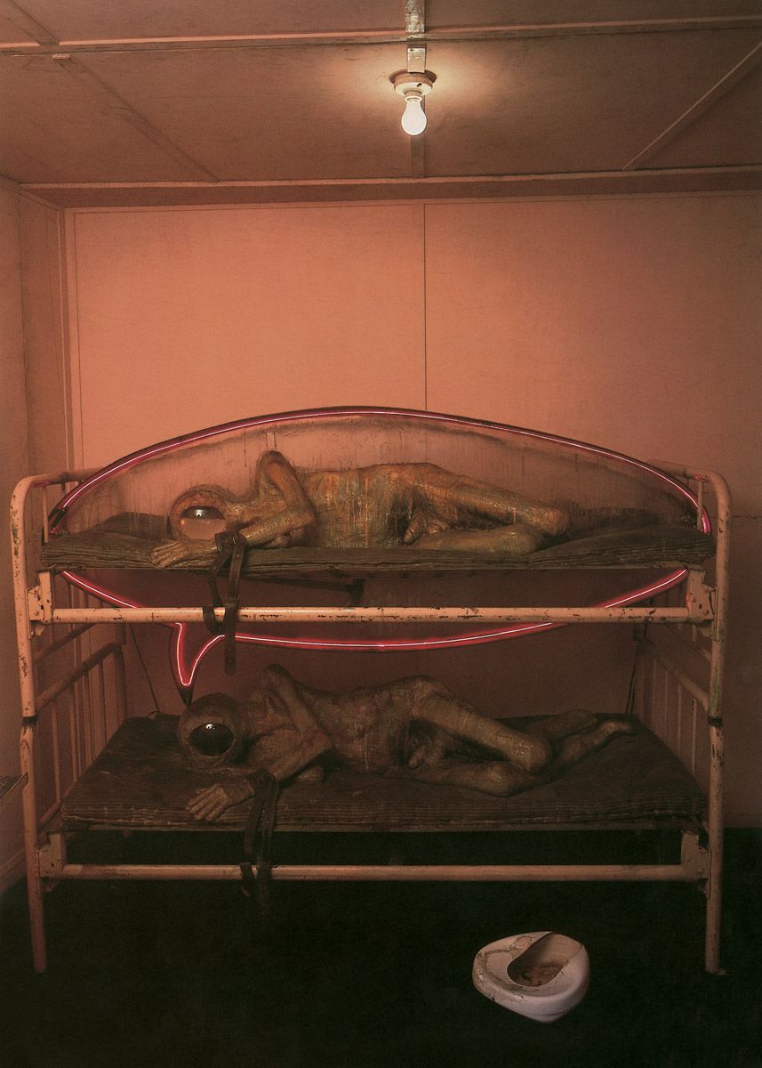
Ed Kienholz, The State Hospital, 1966 (interior view). Plaster casts, fibreglass, hospital beds, bedpan, hospital table, goldfish bowls, live black fish, lighted neon tubing, steel hardware, wood and paint, 243.8 x 365.8 x 304.8 cm. Moderna Museet, Stockholm.
In 1947 Kienholz worked for a time as an orderly in a state-run mental institution at Lake Medicine, Washington. His memories of the episode remained painful, and they received expression here. The sculpture comprises a large rectangular container which resembles an isolated prison cell. A sign affixed to an outside corner of the box identifies it as Ward 19, while a door into the box bears a small barred window, a handle and an external sliding bolt and catch; we step through the door into the cell. In advance of making the piece, Kienholz vividly explained what he intended it to signify:
This is a tableau about an old man who is a patient in a state mental hospital. He is in an arm restraint on a bed in a bare room….There will be only a bedpan and a hospital table (just out of reach). The man is naked. He hurts. He has been beaten on the stomach with a bar of soap wrapped in a towel (to hide tell-tale bruises). His head is a lighted fish bowl with water that contains two live black fish. He lies very still on his side. There is no sound in the room….Above the old man is his exact duplicate, including the bed (beds will be stacked like bunks). The upper figure will also have the fish bowl head, two black fish etc. But, additionally, it will be encased in some kind of lucite or plastic bubble (perhaps similar to a cartoon balloon), representing the old man’s thoughts….His mind can’t think for him past the present moment. He is committed there for the rest of his life.
To add to the horror, wet pigment poured across both of the figures and their bare mattresses powerfully suggests dropped food, vomit, urine and excrement. As in The Wait, the live creatures in The State Hospital are fed daily and replaced when they die. The constant mindless movement of the black fish suggests human mindlessness, while the neon-lit thought-bubble emanating from the patient on the lower bunk suggests that the upper figure exists only in his mind.
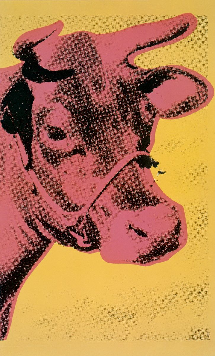
Andy Warhol, Cow Wallpaper, 1966. Silkscreen on paper, 115.5 x 75.5 cm. The Andy Warhol Foundation for the Visual Arts, Inc., New York.
Here we see just one section of a printed design that was originally repeated vertically in strips, as in wallpaper. That wallpaper developed logically from the wallpaper effect that Warhol’s Flowers paintings had created when shown en masse in New York in 1964 and Paris in 1965. The Cow Wallpaper was used to cover one of two rooms in the exhibition Warhol held in April 1966 at the Leo Castelli Gallery, New York. Unfortunately only a few of the rolls of wallpaper were sold, thus bringing about a break between artist and dealer (and also now making the few surviving rolls very rare and pricey indeed). However, the wallpaper could never have functioned as a proper wallpaper, for as Charles F. Stuckey has pointed out, “Its left side does not interlock graphically with its right side as repeat patterns must. Instead, Warhol’s Cow Wallpaper is like a printed film strip of a close-up shot for one of his motionless movies.”
Warhol derived the notion of making images of cows from the dealer Ivan Karp, who felt that nobody dealt with pastoral imagery any more. Like the Flowers paintings, the Cow Wallpaper operates on a variety of levels: it links with – and perhaps sums up – the pastoral tradition in western art; it points up the repetitiousness of, say, television programmes on ‘nature’ by which we generally now experience the natural world ‘in the comfort of our own homes’; it makes the point that in the modern era, man-made, fixed images usually become just so much cultural wallpaper (and often rather dumb wallpaper at that); and it connects very strongly with the Dada tradition of subverting our notion of what constitutes a work of art, let alone the validity of art itself.
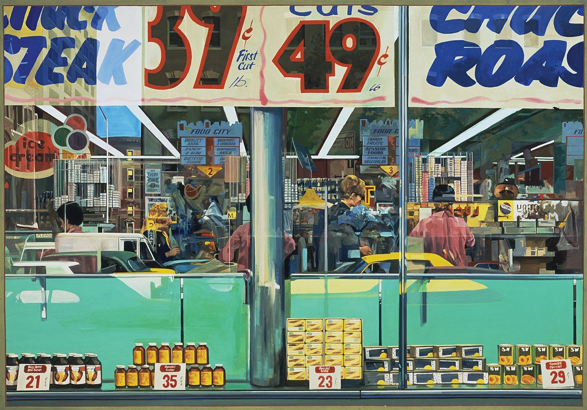
Richard Estes was born in Kewanee, Illinois in 1936. He studied at the Art Institute of Chicago between 1952 and 1956, after which he worked for some ten years in advertising and publishing, making illustrations and arranging layouts. He began to paint full time in 1966 and held his first solo exhibition at the Allan Stone Gallery, New York, in 1968. Subsequently his works have been displayed all over the world.
Estes was a member of a loose confederation of artists known as photorealists. They all made their paintings by copying blown-up colour prints, or by projecting slides directly on to their supports and then painting over the cast images, or by utilising both approaches. These techniques permitted selective editing and the seeing of things that might well have been overlooked or psychologically suppressed. Very frequently photorealist artists displayed as much concern with consumerism and the banality of mass-culture as did other creative figures working within the Pop/Mass-Culture Art dynamic. This is especially true of Estes, as can be seen here.
Estes was especially interested in the spatial ambiguities arising from the views through windows and from their reflections. Thus we see here the interior of a store beyond the stacked goods and placards that line its window, and the buildings and parked vehicles reflected back from that glass. As was the case with many of the American photorealists, the title of the painting derived from one of its minor details, in this case a couple of small flyers fixed to the window.
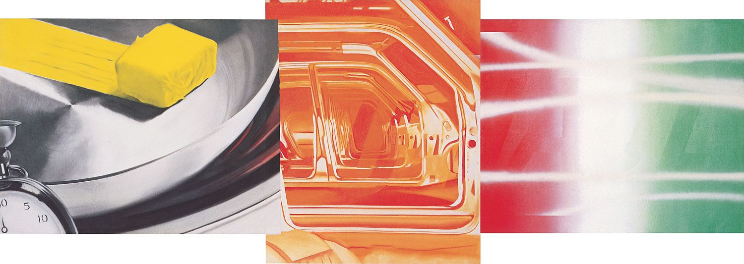
James Rosenquist, U-Haul-It, 1967. Oil on canvas, 152.4 x 429.3 cm. Whitney Museum of American Art, New York. Art © 2006 James Rosenquist/Licensed by VAGA, New York, NY
The basis for this painting was a collage made by Rosenquist (collection of the artist). That work is also divided into three areas but instead of the fob watch, frying-pan and pat of butter seen here on the left, it shows tyre treads both from the outside and inside. The right-hand area is also different, being the side of a U-Haul-It van with its brand name written across it.
Probably Rosenquist found all this imagery too automotive. By changing the left-hand section, and presenting just a sheen of reflective metalwork on the right, the artist broadened the consumerist range of the picture and intensified its visual integration. The eye moves across all the reflective metalwork with ease.
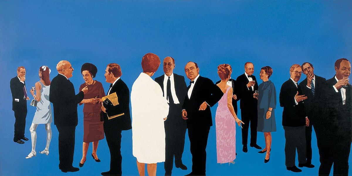
Howard Kanovitz, The Opening, signed, inscribed and dated 1967 on the reverse. Acrylic on canvas, 212 x 426 cm. Kunsthalle, Bremen.
Howard Kanovitz was born in Fall River, Massachusetts, in 1929. He studied at the Rhode Island School of Design between 1945 and 1951. Thereafter he moved to New York where he studied at the New School for Social Research in 1951-2, and then at New York University between 1959 and 1962. For a time he worked for the Abstract Expressionist painter Franz Kline. He held his first one-man exhibition at the Stable Gallery, New York, in 1962. Photography formed the basis of his paintings after 1963. In 1966 a large show of his work featured at the Jewish Museum, New York, and subsequently he has often exhibited in that city. His work has proven especially popular in Germany, and he has also shown in Holland.
This is arguably Kanovitz’s best-known work. It captures all the glamour of an important 1960s New York art world launch party by depicting people who were renowned within that milieu. They include the editor of Art News, Thomas Hess, on the extreme left; the painter Barnett Newman, third from the left; then Dorothy Miller who had been the first curator of the Museum of Modern Art, New York, and who was arguably the person ‘who did the most for post-war American art’; Kanovitz himself, facing Newman; the critic Sam Hunter looking out at the centre; a partner in the influential Marlborough Gallery, Frank Lloyd, standing glass in hand between the ladies to the right; and the art-historian Irving Sandler smoking a cigarette at the right. The fact that all the figures are placed within a flat space heightens the sense of informality and of jockeying for position within that arena. This is entirely appropriate, for of course competing for status is a marked feature of the art world in social, intellectual, cultural and economic terms.
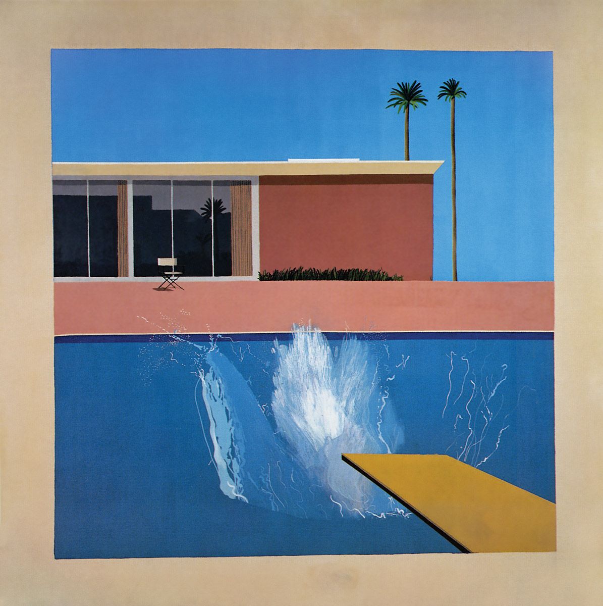
This is justifiably Hockney’s most popular picture, not least of all because the scene depicted typifies the hedonistic lifestyle towards which so many people aspire within contemporary mass-culture. By the time Hockney painted the canvas he had already created two pictures of splashes in swimming pools, one of which he named The Little Splash. That explains the title of the present work.
All is heat and light in the garden of the American Dream. The fairly strident yellow, pink and puce colours of, respectively, the diving board, patio and wall stand at the opposite end of the spectrum to the cool blues of water and sky, thereby generating an immense torridity. That intensity is increased by the climactic white at the heart of the image and by the warm colour of the large, empty surround to the painted area. Hockney created this to reinforce our awareness that we are looking at a fictive space within the canvas, rather than an actual one. He had already been using this device for some time when he created A Bigger Splash, as can be seen in the Portrait of Nick Wilder of 1966.
On the patio stands a chair, of the type we often associate with Hollywood movie directors; its presence suggests that the swimmer, who has presumably just vacated it, is a person of some importance. It is not difficult to imagine the sound of the splash breaking the apparent silence. Because we do not see the swimmer, the vacancy of the scene remains intact.
As in the portrait of Nick Wilder, the influence of Vermeer is apparent, with many lines running parallel to the edges of the image. These create a sense of pictorial rigidity against which the diagonal of the diving board and the free forms of the splash contrast greatly. The unseen swimmer has surely just been physically liberated and refreshed by his dive, as presumably we all would be in such baking surroundings.
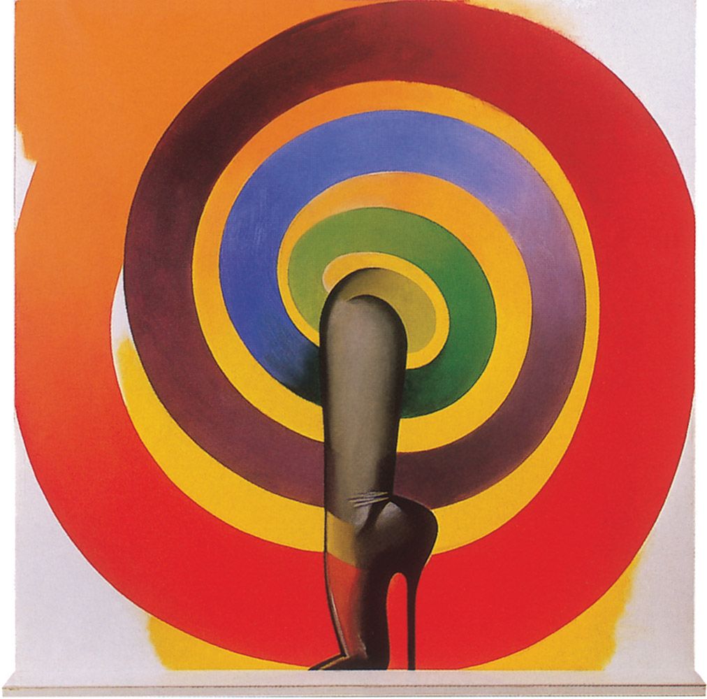
By the time he created this work, Jones was frequently addressing the clichéd fantasies of female sexuality beloved by many men: huge breasts, long legs, sheer stockings, enormously elevated high-heeled shoes and the like. But simultaneously the artist used these pictorial constituents and fetishistic props as starting points for explorations of rich colour balances and shifts, as well as vivid sweeps of line, as this painting makes very evident.
Allen Jones, Sheer Magic, 1967. Oil on canvas with wooden shelf faced with plastic, 91.4 x 91.4 cm. Private collection.
A stockinged leg and shiny shoe with its lengthy heel emerges from a spiral of shifting colour, to rest daintily upon a small ledge placed at the bottom of the image. That base is reminiscent of a stage, and it therefore brings into play associations of some kind of sexually fetishistic public presentation, such as might be encountered in a striptease joint, which was surely the artist’s intention. Admittedly, the woman whose leg we see is implicitly reduced to the status of a sex object. Yet on the other hand the work does project a joyous sense of colour – sheer magic indeed, if only in purely visual terms and maybe for men alone.
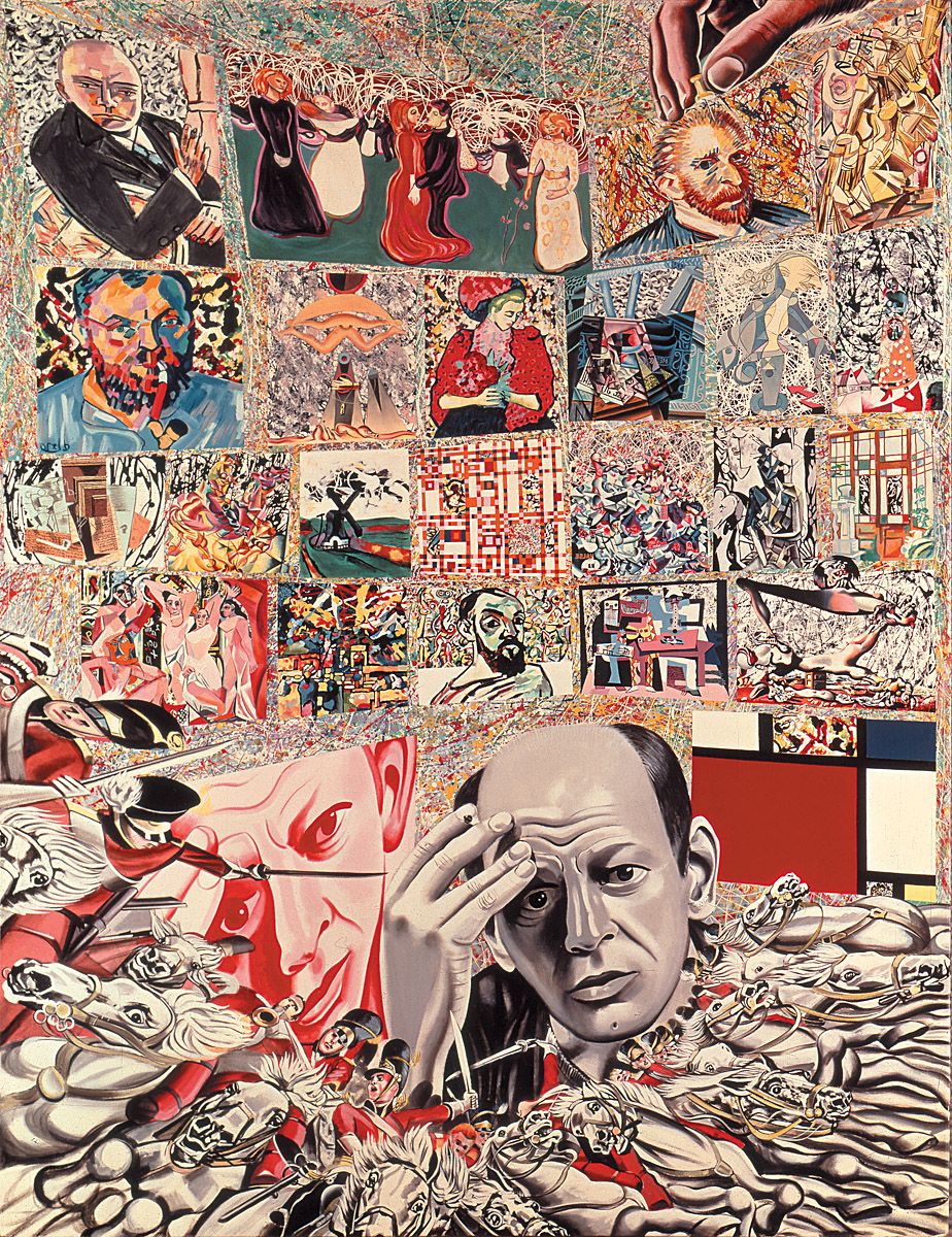
Erró, The Background of Jackson Pollock, 1967. Oil on canvas, 250 x 200 cm. Musée national d’art moderne, Centre Georges Pompidou, Paris.
Erró was born Gudmundur Erró in Olafsvik, Iceland in 1932. Between 1952 and 1958 he studied in Reykjavik, Oslo and Florence where he learned mosaic; subsequently he created several mosaic floors in Reykjavik. After a short sojourn in Israel, in 1958 he moved to Paris where he began exhibiting in 1960. By the mid-1960s he was involved in Happenings and film while continuing to paint. In 1969 he exhibited in Paris, Essen and Karlsruhe. Heavily committed to a politicised art, he often introduced slogans into his surrealistic, poster-like pictures.
This is perhaps Erró’s most well-known image. Jackson Pollock looks out at us, with his head again portrayed in red to the side of him. Near the top-left a hand pins down a van Gogh self-portrait, while everywhere else a mélange of artistic quotations ranges from Duchamp, Munch and Beckmann to Chagall, Klee and Ernst, and from Mondrian, Gris and Dalí to Lady Butler, Picasso and Matisse. By underpinning everything with the linear skeins of Pollock’s work, Erró imparts an acute sense of restlessness to the proceedings. In overall terms the work not only explores the American painter’s modernist background but equally it projects the bombardment of artistic images that besets the world in an age of mass-culture.
David Hockney, American Collectors (Fred and Marcia Weisman), 1968. Acrylic on canvas, 214 x 305 cm. The Art Institute of Chicago, Chicago.
This work was commissioned by the Weismans, who were important art collectors in Los Angeles. Just as he had done in his Portrait of Nick Wilder of 1966, and A Bigger Splash of 1967, Hockney drew upon Vermeer to underpin a composition by means of a multitude of horizontals and verticals running parallel with the edges of the canvas, thereby binding everything together. Yet perhaps these careful alignments and the evidently self-conscious positioning of the figures were intended to suggest the social alignments and very self-conscious positioning that were integral to art collecting in the 1960s and remain so today. After all, the title Hockney gave this work makes it clear he was primarily concerned with American art collectors and only secondarily with portraying the couple that commissioned the painting. As we have seen with California Art Collector of 1964, Hockney did not really care for some of the people who buy art in America, and that seems to have been the case here, for why else would he have made Marcia Weisman so cruelly ape the smile of the nearby totem pole, and Fred Weisman necessarily stare blankly into space?
The sculpture in front of Fred Weisman is by William Turnbull, the piece further off by Henry Moore. As in other Hockney paintings already examined, the overall orchestration of colour is quite masterful. Amid all the fairly pale yellows and blue-greys, the hot pinks of Marcia Weisman’s shift fairly leaps out at us, not only contrasting with the dark greys and blacks of her soberly-suited husband but also projecting a sense of aggression that is heightened by the collector’s patently false smile. Hockney, the admirer of William Hogarth, had clearly learned a great deal from his illustrious predecessor.
Perhaps unsurprisingly, the Weismans felt stung by this attack, and accordingly they got rid of the painting fairly quickly.
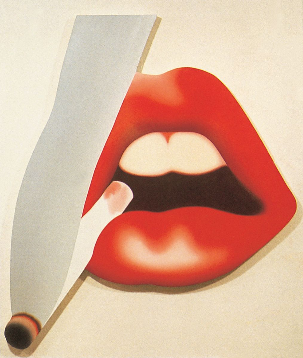
Tom Wesselmann, Mouth #18 (Smoker #4), 1968. Oil on canvas, 224.8 x 198.1 cm. Courtesy Sidney Janis Gallery, New York. Art © 2006 Estate of Tom Wesselmann/ Licensed by VAGA, New York, NY
Shaped canvases were all the rage in the 1960s, and here Wesselmann put one to good use by giving us what advertising men, at least, might have wanted us to think of as the quintessence of sexual allure.
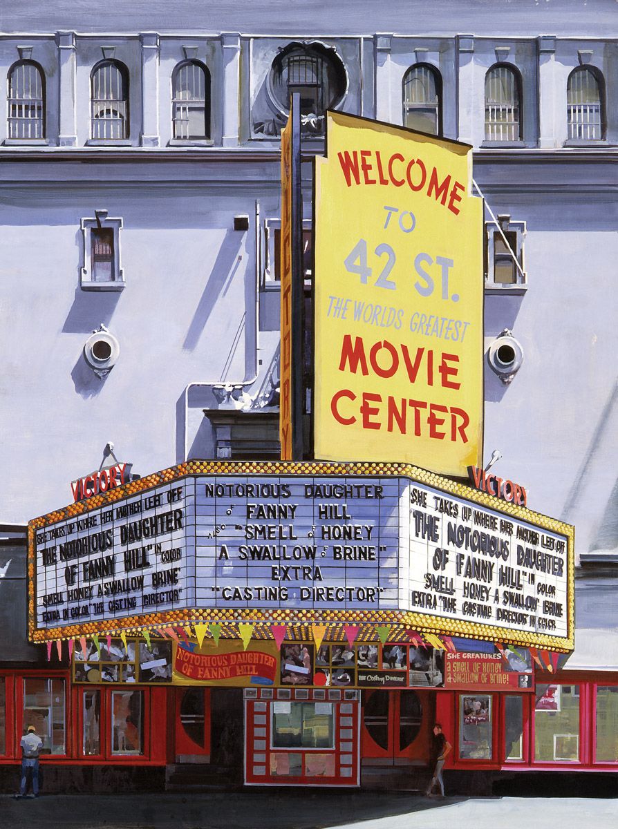
Richard Estes, Welcome to 42nd Street (Victory Theater), 1968. Oil on masonite, 81.2 x 60.9 cm. The Detroit Institute of Arts, Michigan.
The banal exploitation of sexuality that has often proven integral to the growth of mass-culture is the clear underlying theme of this painting. By the 1960s, 42nd Street in Manhattan had become one of the sleaziest streets in New York City, being filled with a plenitude of strip joints, sex shops, cinemas showing porno flicks and the like. Clearly, Estes had great artistic fun there, judging by this highly detailed and loving analysis of the Victory Theater in all its sunlit glory.
The frontal approach to the subject lends a degree of objectivity to the proceedings, and that emotional distancing is heightened by the fact that the scene is so depopulated, the two men on the sidewalk merely serving to establish the scale of things. By surrounding the large advertising hoarding with so much mauve and dark red, Estes really made its yellow colouring stand out.
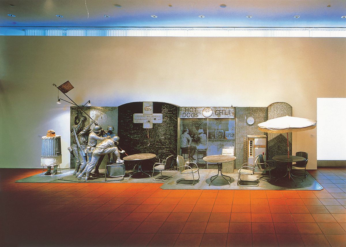
Ed Kienholz, The Portable War Memorial, 1968. Plaster casts, tombstone, blackboard, flag, poster, restaurant furniture, trashcan, photographs, working vending machine, stuffed dog, dog-leash, wood, metal, fibreglass, chalk and string, 289.6 x 975.4 x 243.8 cm. Museum Ludwig, Cologne.
By 1968 the Vietnam War was at its height. With this work Kienholz undoubtedly created the finest anti-war artistic protest of the time, not least of all because he used wit and irony to attack the conflict rather than simply vent his anger.
As the sculptor specified in 1969, the ensemble needs to be examined from left to right. First we see a caricatured portrayal of the patriotically-minded American singer Kate Smith who appears within an upturned trashcan, which also makes Kienholz’s attitude to her rather clear. A tape of her rendition of ‘God Bless America’ by Irving Berlin plays continuously as aural background to the entire work. Behind her, on the wall, is a First World War Uncle Sam ‘I WANT YOU’ poster. Before it stands Kienholz’s parody of the sculpture that Felix de Weldon made between 1951 and 1954 to act as the US Marine Corps War Memorial just outside the Arlington cemetery near Washington DC; in turn that piece derived from a renowned photograph by Joseph Rosenthal taken atop Mount Suribachi on the Pacific island of Iwo Jima on 23 February 1945. Kienholz’s parody arises from the fact that his heroes are faceless and are moving their flagpole towards a garden table, as though they were attempting to insert a parasol through its central aperture. By alluding to both of the world wars in 1968, Kienholz was surely reminding his viewers of the importance of such violent confrontations during the twentieth century.
Beyond the table is a huge blackboard. According to Kienholz it contains “457 chalk-written names of independent countries that have existed here on earth but no longer [do so].” The implication of the piece of chalk dangling in front of the blackboard is that we should use it to add the name of the next country to disappear from the map (i.e. The Republic of South Vietnam). The chalk is suspended from an inverted cross which makes its own comment upon the inverted values of an institutionalised Christianity that can permit war to happen. Upon the cross a small box containing a mini-blackboard allows the insertion of a ‘V’ day acronym, of the kind that had been created in 1945 with the acronyms for the ‘Victory in Europe’ and ‘Victory in Japan’ days (e.g. VE Day and VJ Day respectively). Another board permits the insertion of the twentieth century year of any such triumph.
Next we encounter the world of popular mass-consumption. In human terms this is represented photographically by two figures seated at a hot dog and chilli bar; one has a real dog leash fixed to his arm, with its other end tied to a stuffed mastiff. Also apparent are two more sets of garden furniture, which includes a parasol supported by another garden table; a plastic trashbin; a clock; and a functioning drinks vending machine. In conjunction with the references to hostilities on the left, this part of the ensemble both enforces a juxtaposition of consumerism with war, and simultaneously reminds us that during any war the people who stay at home often enjoy life’s pleasures while others die ostensibly to defend them (as was especially proving to be the case in Vietnam).
The presence of death is evoked by the final part of the ensemble. This is the huge granite tombstone on the extreme right. At the base of the slab is a tiny, semi-nude, youthful and well-built male figure whose outstretched arms and ankles are pinioned to the stone, while both of his hands and lower arms are eroded, as if burnt by fire. The meaning of his linkage to the tombstone and of his wounds surely requires no explanation.
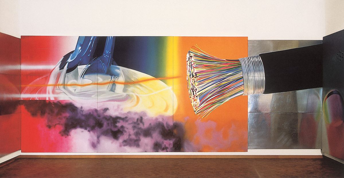
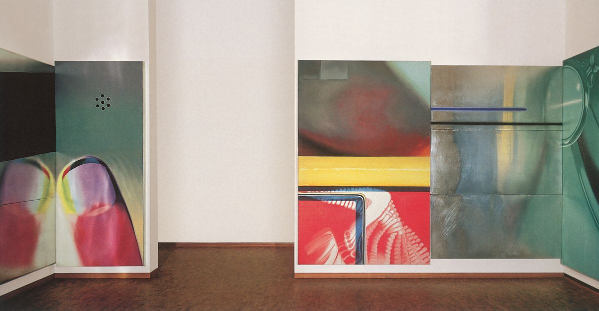
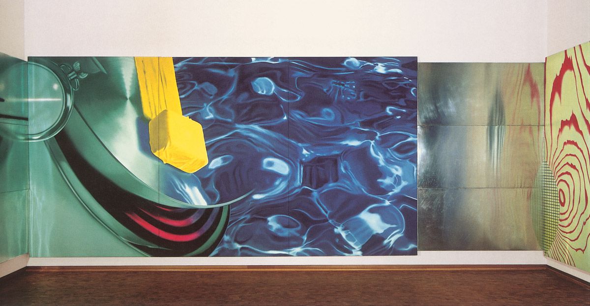
James Rosenquist, Horse Blinders, 1968-69. Oil on canvas with aluminium, 304.8 x 2575.6 cm. Museum Ludwig, Cologne. Art © 2006 James Rosenquist/ Licensed by VAGA, New York, NY
According to Rosenquist himself, the title of this work refers to the blinkers worn by horses to curb their peripheral vision, and thus prevent them from being startled by what takes place on either side of them.
Rosenquist was very taken with the idea that, instead of putting up a number of pictures around a room with empty wall spaces appearing between them, he could create a single work to wrap around a space, within which those inactive intervals would be wholly integrated pictorially. He had already moved towards the realisation of that aim with the F-111 of 1964-5, but here he achieved it fully.
In the Museum Ludwig this gigantic painting takes up almost an entire room; were it not for the gap through which we enter and exit the space, the picture would entirely surround us. Naturally the eye gravitates towards the active sectors of the image, thereby forcing the relatively inactive areas to function as the ‘Horse Blinders’ that concentrate our attention. The imagery of the active zones imitates external reality: a bunch of severed telephone cables, a fob watch, a human thumb, some beautifully blue water and the same pat of butter seen sliding across a frying pan in U-Haul-It. However, the inactive areas are fairly abstractive and in several stretches not dependent upon external reality at all, as with the sections of dully reflective aluminium. In sum the painting projects speed, a variety of densities, vivid colour shifts and a vague sense of high technology – in other words, it incorporates many of the physical and visual dynamics of modern existence.
James Rosenquist, Horse Blinders, 1968-69. Oil on canvas with aluminium, 304.8 x 2575.6 cm. Museum Ludwig, Cologne. Art © 2006 James Rosenquist/Licensed by VAGA, New York, NY
James Rosenquist, Horse Blinders, 1968-69. Oil on canvas with aluminium, 304.8 x 2575.6 cm. Museum Ludwig, Cologne. Art © 2006 James Rosenquist/Licensed by VAGA, New York, NY
James Rosenquist, Horse Blinders, 1968-69. Oil on canvas with aluminium, 304.8 x 2575.6 cm. Museum Ludwig, Cologne. Art © 2006 James Rosenquist/Licensed by VAGA, New York, NY
George Segal, The Subway, 1968. Plaster, metal, rattan, incandescent light, electrical parts, 228.6 x 292.1 x 134.6 cm. Mrs Robert B. Mayer collection. Art © 2006 The George and Helen Segal Foundation/ Licensed by VAGA, New York, NY
The sadness communicated by the solitary woman staring vacantly into space is heightened by the fact that everything is drably coloured and bleakly lit by a solitary light. Originally Segal wanted an 8mm film he had shot in the New York subway to be seen through the window. However, the indistinctness of his footage led him to abandon it in favour of an apparatus he devised, whereby revolving lights throw beams to suggest the passage of stations and tunnels beyond the subway car.
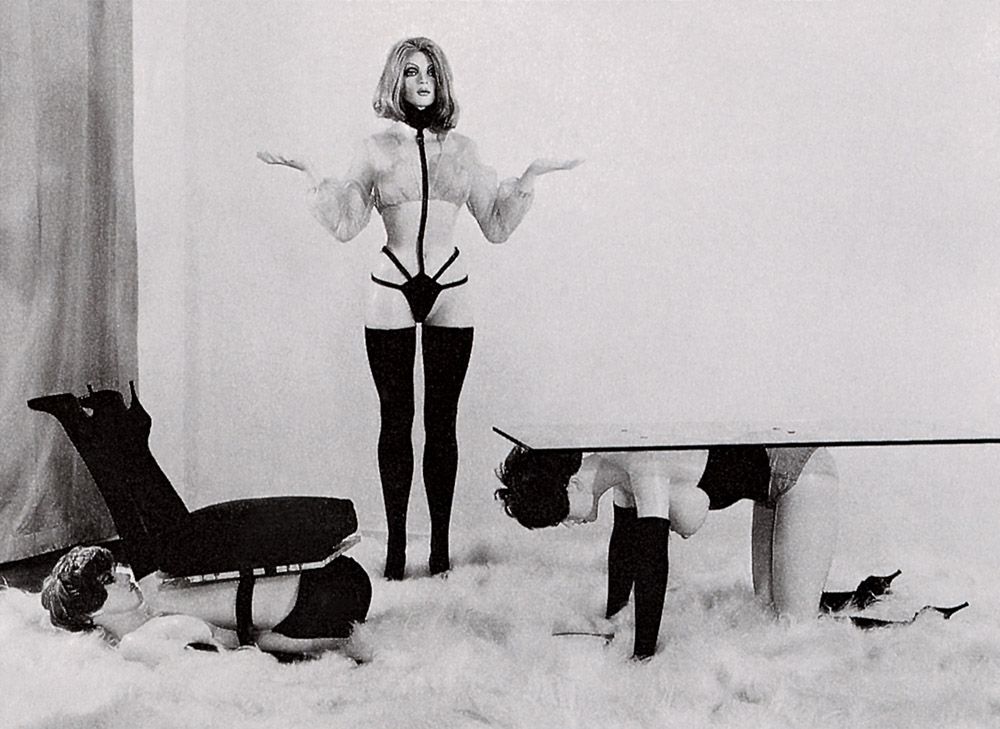
Allen Jones, Chair, Hatstand and Table, 1969. Acrylic painted fibreglass and leather accessories, various dimensions. Collection of the artist.
Jones created this group of sculptures in 1969. Naturally they are very anti-feminist, not least of all because they reduce women to the status of sex-objects, rather than express the reality of their experience. On the other hand, what could be more anti-bourgeois and shocking than sculptures in the form of semi-naked girls dressed provocatively? In fact what we are witnessing here is a familiar modernist assault upon accepted social and sexual morés, or at least the narrow-minded values that were still widespread in the late 1960s.
The sculptures were made to Jones’s specifications by a professional sculptor, Dick Beech, who first modelled them in clay, from which the moulds required to cast the works in fibreglass were taken. The sexual apparel was then purchased from a company specialising in such attire.

