Although I have been formally trained in color theory and could tell you all about different color schemes, I’m not going to. I used to stick much more closely to well-defined color schemes, but eventually I realized that this approach was holding me back. I find that my favorite fabric choices come from simply dumping fabrics onto my sewing room floor and moving them around to create new and fun combinations. I end up putting together colors and fabrics that I had never thought of putting together before. I encourage you to branch out and do the same. If the colors and fabrics look good to you—that’s what matters most. It took me awhile to learn this lesson. Even though knowing color theory helps me understand why a color scheme might look good after I’ve created it, I don’t need this knowledge to decide. Yes, I like how that looks, or, Oh, that’s horrendous. Go with your gut instinct and have plenty of fun playing around with your fabric.
The term ombré refers to the gradation from one hue (color) to another (such as from blue to red) or from one value to another (such as from light to dark). I really like to use ombré in my quilts and used this effect in several projects in this book. It creates movement and interest—using it with purpose can help lead the eye in a specific direction.
For all the patterns using ombré, I have helped you by indicating the number of fabrics you need to create this effect. Where possible, I have even listed the exact fabrics I used. When creating ombré with fabric, you won’t be gradating seamlessly—fabric isn’t paint. There will be jumps as you move from one fabric to another. The key is to try to make each jump similar so that none of the changes look abrupt or stand out in a negative way.
When working with fabric to create ombré, you can use solids, prints, or a combination of the two. When using prints, the best fabrics will be ones that read as a single color overall. They could even have small amounts of colors from the neighboring fabrics. Whether or not you choose to allow small amounts of other colors into your fabrics depends on your personal preference.

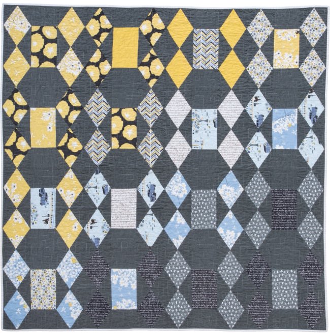
In Diamonds and Emeralds I: Madrona Road, the eye is pulled from the upper left to the lower right.

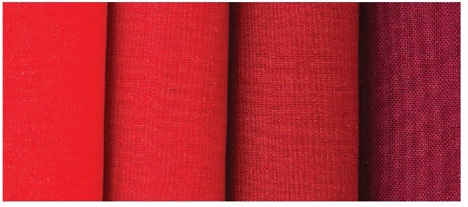
These are the fabrics I used for The Bachelor. I used color cards from two fabric manufacturers to select a variety of solid reds that blended well from one to another. I highly suggest using color cards or purchasing fabric in person to create a precise ombré effect like this.
Shopping online for fabric is very common now. The benefit of this is that a huge selection of fabric is readily available. This is especially helpful if you don’t have any quilt shops nearby. The downside of shopping online is that you cannot physically see the fabric for color accuracy before buying it. You also can’t bring in fabrics or make stacks of fabric bolts in the store to see how they interact with each other.
I do both kinds of shopping—at my local quilt store and online—as needed. I value the help that a good salesperson can offer when looking for different fabric combinations. I look online only if my local quilt shop doesn’t have what I’m looking for. Online shopping is best when I attempt to make my online shopping experience more like that of walking into a quilt store—I use color cards to make accurate color selection easier, and I only shop at e-stores that have well-lit photographs of their merchandise. I add extra fabrics to my shopping cart so that I can look at them all on the same web page—like auditioning them next to each other in a physical store—and whittle down my selection from there.
If you’re in the Midwest, consider stopping by my favorite local quilt store, Crimson Tate. They are located in downtown Indianapolis and carry only modern fabrics.
Looking to shop online? Here are a few of my favorite online shops:
The Internet is an excellent source not only for regular quilting cottons, but also for specialty fabrics. If you’re looking for something that’s unique, out of print, hard to find, or hand printed, try looking at etsy.com. The printed fabrics I used for Diamonds and Emeralds II were limited stock, out-of-print Japanese fabrics, but I was able to find them at the Etsy shop Blije Olifantje. (This shop has since moved to zibbet.com.)
The Dear Stella Tiny Diamonds print in Jumping Jacks was also an Internet find. I had one small piece, but it was out of print. After several hours trying different word combinations in search engines, I was able to locate enough for this quilt.
If you’re looking for something specific, you can often find it online.