A categorical variable is a variable in which the possible responses consist of a set of categories rather than numbers that measure an amount or quantity of something on a continuous scale. For instance, a person might describe his or her gender in terms of male or female, or a machine part might be classified as acceptable or defective. More than two categories are also possible. For instance, a person in the United States might describe his political affiliation as Republican, Democrat, or independent.
Categorical variables may be inherently categorical (such as political party affiliation), with no numeric scale underlying their measurement, or they may be created by categorizing a continuous or discrete variable. Blood pressure is a measure of the pressure exerted on the walls of the blood vessels, measured in millimeters of mercury (Hg). Blood pressure is usually measured continuously and recorded with specific measurements such as 120/80 mmHg, but it is often analyzed using categories such as low, normal, prehypertensive, and hypertensive. Discrete variables (those that can be taken only on specific values within a range) may also be grouped into categorical variables. A researcher might collect exact information on the number of children per household (0 children, 1 child, 2 children, 3 children, etc.) but choose to group this data into categories for the purpose of analysis, such as 0 children, 1–2 children, and 3 or more children. This type of grouping is often used if there are large numbers of categories and some of them contain sparse data. In the case of the number of children in a household, for instance, a data set might include a relatively few households with large numbers of children, and the low frequencies in those categories can adversely affect the power of the study or make it impossible to use certain analytical techniques.
Although the wisdom of classifying continuous or discrete measurements into categories is sometimes debatable (some researchers refer to it as throwing away information because it discards all the information about variability within the categories), it is a common practice in many fields. Categorizing continuous data is done for many reasons, including custom (if certain categorizations may have become accepted in a professional field), and as a means to solve distribution problems within a data set.
Categorical data techniques can also be applied to ordinal variables, meaning those measured on a scale in which the categories might be ranked in order but do not meet the requirement of equal distance between each category. (Ordinal variables are discussed at more length in Chapter 1.) The well-known Likert scale, in which people choose their responses to questions from a set of ordered categories (such as Strongly Agree, Agree, Neutral, Disagree, and Strongly Disagree) is a classic example of an ordinal variable. A special set of analytic techniques, discussed later in this chapter, has been developed for ordinal data that retain the information about the order of the categories. Given a choice, specific ordinal techniques are preferred over categorical techniques for the analysis of ordinal data because they are generally more powerful.
A host of specific techniques has been developed to analyze categorical and ordinal data. This chapter discusses the most common techniques used for categorical and ordinal data, and a few techniques for these types of data are included in other chapters as well. The odds ratio, risk ratio, and the Mantel-Haenszel test are covered in Chapter 15, and some of the nonparametric methods covered in Chapter 13 are applicable to ordinal or categorical data.
When an analysis concerns the relationship of two categorical variables, their distribution in the data set is often displayed in an R×C table, also referred to as a contingency table. The R in R×C refers to row and the C to column, and a specific table can be described by the number of rows and columns it contains. Rows and columns are always named in this order, a convention also followed in describing matrixes and in subscript notation. Sometimes, a distinction is made between 2×2 tables, which display the joint distribution of two binary variables, and tables of larger dimensions. Although a 2×2 table can be thought of as an R×C table where R and C both equal 2, the separate classification can be useful when discussing techniques developed specifically for 2×2 tables. The phrase “R×C” is read as “R by C,” and the same convention applies to specific table sizes, so “3×2” is read as “3 by 2.”
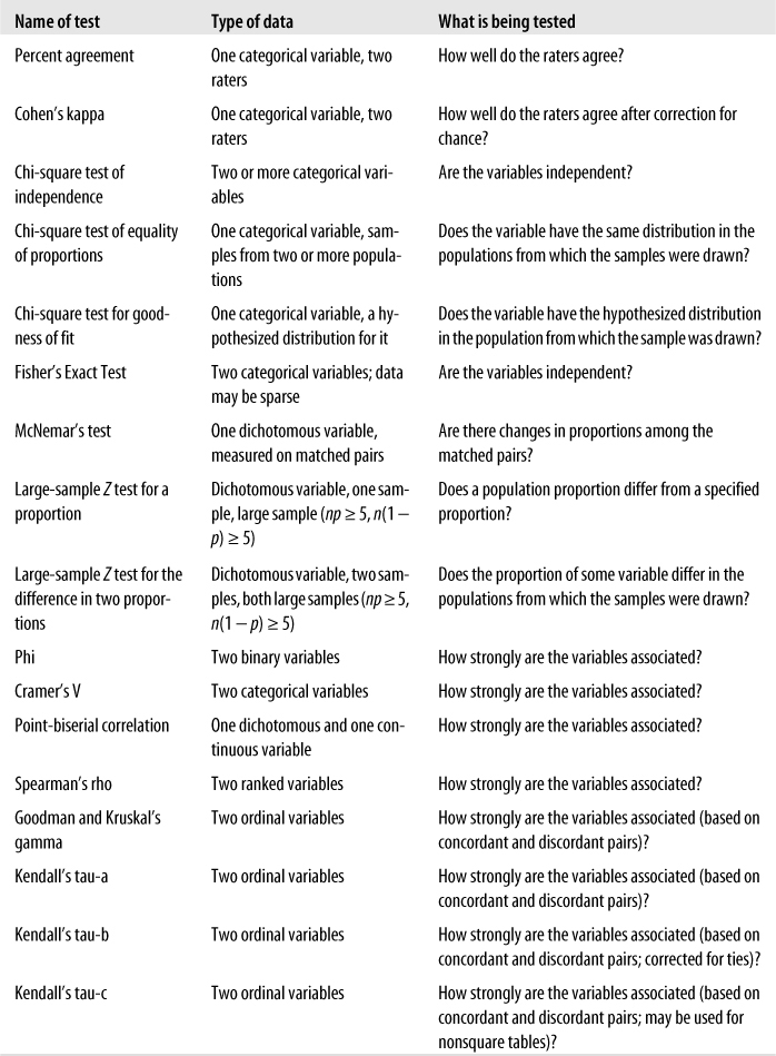
Suppose we are interested in studying the relationship between broad categories of age and health, the latter defined by the familiar five-category general health scale. We decide on the categories to be used for age and collect data from a sample of individuals, classifying them according to age (using our predefined categories) and health status (using the five-point scale). We then display this information in a contingency table, arranged like Figure 5-1.
This would be described as a 4×5 table because it contains four rows and five columns. Each cell would contain the count of people from the sample with the pair of characteristics described: the number of people under 18 years in excellent health, the number aged 18–39 years in excellent health, and so on.
The types of reliability described here are useful primarily for continuous measurements. When a measurement problem concerns categorical judgments, for instance classifying machine parts as acceptable or defective, measurements of agreement are more appropriate. For instance, we might want to evaluate the consistency of results from two diagnostic tests for the presence or absence of disease, or we might want to evaluate the consistency of results from three raters who are classifying the classroom behavior of particular students as acceptable or unacceptable. In each case, a rater assigns a single score from a limited set of choices, and we are interested in how well these scores agree across the tests or raters.
Percent agreement is the simplest measure of agreement; it is calculated by dividing the number of cases in which the raters agreed by the total number of ratings. For instance, if 100 ratings are made and the raters agree 80% of the time, the percent agreement is 80/100 or 0.80. A major disadvantage of simple percent agreement is that a high degree of agreement can be obtained simply by chance; thus, it is difficult to compare percent agreement across different situations when agreement due to chance can vary.
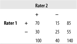
This shortcoming can be overcome by using another common measure of agreement called Cohen’s kappa, the kappa coefficient, or simply kappa. This measure was originally devised to compare two raters or tests and has since been extended for use with larger numbers of raters. Kappa is preferable to percent agreement because it is corrected for agreement due to chance (although statisticians argue about how successful this correction really is; see the following sidebar for a brief introduction to the issues). Kappa is easily computed by sorting the responses into a symmetrical grid and performing calculations as indicated in Figure 5-2. This hypothetical example concerns the agreement of two tests for the presence (D+) or absence (D−) of disease.
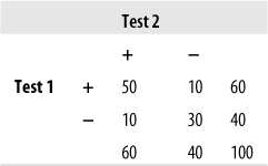
The four cells containing data are commonly identified as follows:
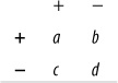
Cells a and d represent agreement (a contains the cases classified as having the disease by both tests, d contains the cases classified as not having the disease by both tests), whereas cells b and c represent disagreement.
The formula for kappa is:
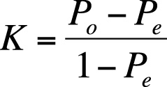
where Po = observed agreement, and Pe = expected agreement.
that is, the number of cases in agreement divided by the total number of cases. In this case,
| Po = 80/100 = 0.80 |
| Pe = [(a + c)(a + b)]/(a + b + c + d)2 + [(b + d)(c + d)]/(a + b + c + d)2 |
and is the number of cases in agreement expected by chance. Expected agreement in this example is:
(60*60)/(100*100) + (40*40)/(100*100) = 0.36 + 0.16 = 0.52
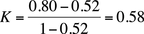
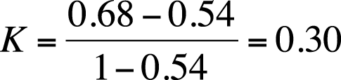
Kappa, in this case, is therefore calculated as:
Kappa has a range of −1 to +1; the value would be 0 if observed agreement were the same as chance agreement and 1 if all cases were in agreement. There are no absolute standards by which to judge a particular kappa value as high or low; however, some researchers use the guidelines published by Landis and Koch (1977):
| < 0 Poor |
| 0–0.20 Slight |
| 0.21–0.40 Fair |
| 0.41–0.60 Moderate |
| 0.61–0.81 Substantial |
| 0.81–1.0 Almost perfect |
By this standard, our two tests exhibit moderate agreement. Note that the percent agreement in this example is 0.80, but kappa is 0.58. Kappa is always less than or equal to the percent agreement because kappa is corrected for chance agreement.
For an alternative view of kappa (intended for more advanced statisticians), see the following sidebar.
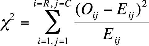
When we do hypothesis testing with categorical variables, we need some way to evaluate whether our results are significant. With R×C tables, the statistic of choice is often one of the chi-square tests, which draw on the known properties of the chi-square distribution. The chi-square distribution is a continuous theoretical probability distribution that is widely used in significance testing because many test statistics follow this distribution when the null hypothesis is true. The ability to relate a computed statistic to a known distribution makes it easy to determine the probability of a particular test result.
The chi-square distribution is a special case of the gamma distribution and has only one parameter, k, which specifies the degrees of freedom. The chi-square distribution has only positive values because it is based on the sum of squared quantities, as you will see, and is right-skewed. Its shape varies according to the value of k, most radically when k is a low value, as appears in the four chi-square distributions presented in Figure 5-3. As k approaches infinity, the chi-square distribution approaches (becomes very similar to) a normal distribution.
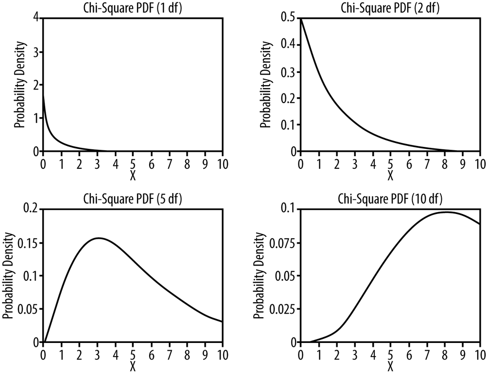
Figure D-11 contains a list of critical values for the chi-square distribution, which can be used to determine whether the results of a study are significant. For instance, the critical value, assuming α = 0.05, for the chi-square distribution with one degree of freedom is 3.84. Any test result above this value will be considered significant for a chi-square test of independence for a 2×2 table (described next).
Note that 3.84 = 1.962 and that 1.96 is the critical value for the Z-distribution (standard normal distribution) for a two-tailed test when α = 0.05. This result is not coincidental but is due to a mathematical relationship between the Z and chi-square distributions.
Stated formally: if Xi are independent, standard normally distributed variables with µ = 0 and σ = 1, and the random variable Q is defined as:
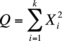
Q will follow a chi-square distribution with k degrees of freedom.
Two important points to remember are that you must know the degrees of freedom to evaluate a chi-square value and that the critical values generally increase with the number of degrees of freedom. If α = 0.05, the critical value for a one-tailed chi-square test with one degree of freedom is 3.84, whereas for 10 degrees of freedom, it is 18.31.
The chi-square test is one of the most common ways to examine relationships between two or more categorical variables. Performing the chi-square test involves calculating the chi-square statistic and then comparing the value with that of the chi-square distribution to find the probability of the test results. There are several types of chi-square test; unless otherwise indicated, in this chapter “chi-square test” means the Pearson’s chi-square test, which is the most common type.
There are three versions of the chi-square test. The first is called the chi-square test for independence. For a study with two variables, the chi-square test for independence tests the null hypothesis that the variables are independent of each other, that is, that there is no relationship between them. The alternative hypothesis is that the variables are related, so they are dependent rather than independent.
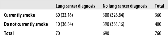
For instance, we might collect data on smoking status and diagnosis with lung cancer from a random sample of adults. Each of these variables is dichotomous: a person currently smokes or does not and has a lung cancer diagnosis or does not. We arrange our data in a frequency table as shown in Figure 5-4.

Just looking at this data, it seems plausible that there is a relationship between smoking and lung cancer: 20% of the smokers have been diagnosed with lung cancer versus only about 2.5% of the nonsmokers. Appearances can be deceiving, however, so we will conduct a chi-square test for independence. Our hypotheses are:
| H0: smoking status and lung cancer diagnosis are independent. |
| HA: smoking status and lung cancer diagnosis are not independent. |
Although chi-square tests are usually performed using a computer, particularly for larger tables, it is worthwhile to go through the steps of calculation for a simple example by hand. The chi-square test relies on the difference between observed and expected values in each of the cells of the 2×2 table. The observed values are simply what you found (observed) in your sample or data set, whereas the expected values are what you would expect to find if the two variables were independent. To calculate the expected value for a given cell, use the formula shown in Figure 5-5.
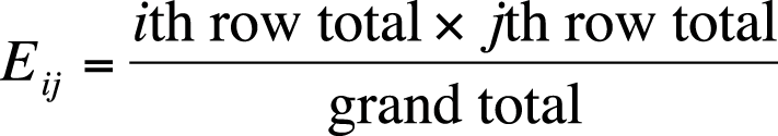
In this formula, Eij is the expected value for cell ij, and i and j designate the rows and columns of the cell. This subscript notation is used throughout statistics, so it’s worth reviewing here. Figure 5-6 shows how subscript notation is used to identify the parts of a 2×2 table.
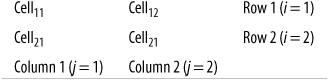
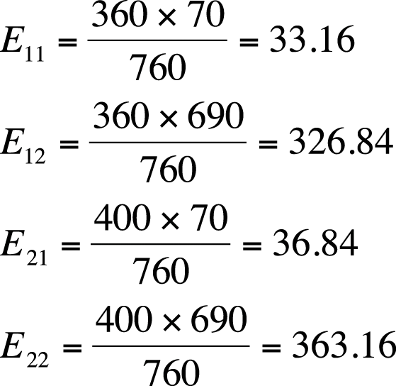
Figure 5-7 adds row and column totals to our smoking/lung cancer example.

The frequency for cell11 is 60, the value for cell12 is 300, the total for row 1 is 360, the total for column 1 is 70, and so on. Using dot notation, the total for row 1 is designated as 1., the total for row 2 is 2., the total for column 1 is .1, and .2 is the total for column 2. The logic of this notation is that, for instance, the total for row 1 includes the values for both columns 1 and 2, so the column place is replaced with a dot. Similarly, a column total includes the values for both rows, so the row place is replaced by a dot. In this example, 1. = 360, 2. = 400, .1 = 70, and .2 = 690.
The values for column and row totals are called marginals because they are on the margin of the table. They reflect the frequency of one variable in the study without regard to its relationship with the other variable, so the marginal frequency for lung cancer diagnosis in this table is 70, and the marginal frequency for smoking is 360. The numbers within the table (60, 300, 10, and 390 in this example) are called joint frequencies because they reflect the number of cases having specified values on both variables. For instance, the joint frequency for smokers with a lung cancer diagnosis is 60 in this table.
If the two variables are not related, we would expect that the frequency of each cell would be the product of its marginals divided by the sample size. To put it another way, we would expect the joint frequencies to be affected only by the distribution of the marginals. This means that if smoking and lung cancer were unrelated, we would expect the number of people who smoke and have lung cancer to be determined only by the number of smokers and the number of people with lung cancer in the sample. By this logic, the probability of lung cancer should be about the same in smokers and nonsmokers if it is true that smoking is not related to the development of lung cancer.
Using the preceding formula, we can calculate the expected values for each of the cells as shown in Figure 5-8.
The observed and expected values for the lung cancer data are presented in Figure 5-9; expected values for each cell are in parentheses. We need some way to determine whether the discrepancies can be attributed to chance or represent a significant result. We can make this determination using the chi-square test.
The chi-square test is based on the squared difference between observed and expected values in each cell, using the formula shown in Figure 5-10.
The steps for using this formula are:
Calculate the observed/expected values for cell11.
Square the difference, and divide by the expected value.
Do the same for the remaining cells.
Add the numbers calculated in steps 1–3.
Continuing with our example, for cell11, this quantity is:
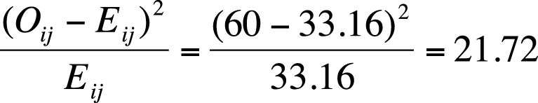
Continuing with the other cells, we find values of 2.2 for cell12, 19.6 for cell21, and 2.0 for cell22. The total is 45.5, which is within rounding error for the value we found using the SPSS statistical analysis program, (45.474).
To interpret a chi-square statistic, you need to know its degrees of freedom. Each chi-square distribution has a different number of degrees of freedom and thus has different critical values. For a simple chi-square test, the degrees of freedom are (r − 1)(c − 1), that is, (the number of rows minus 1) times (the number of columns minus 1). For a 2×2 table, the degrees of freedom are (2 − 1)(2 − 1), or 1; for a 3×5 table, they are (3 − 1)(5 − 1), or 8.
Having calculated the chi-square value and degrees of freedom by hand, we can consult a chi-square table to see whether the chi-squared value calculated from our data exceeds the critical value for the relevant distribution. According to Figure D-11 in Appendix D, the critical value for α = 0.05 is 3.841, whereas our value of 45.5 is much larger, so if we are working with α = 0.05, we have sufficient evidence to reject the null hypothesis that the variables are independent. If you are not familiar with the process of hypothesis testing, you might want to review that section of Chapter 3 before continuing with this chapter. Computer programs usually return a p-value along with the chi-square value and degrees of freedom, and if the p-value is less than our alpha level, we can reject the null hypothesis. In this example, assume we are using an alpha value of 0.05. According to SPSS, the p-value for our result of 45.474 is less than 0.0001, which is much less than 0.05 and indicates that we should reject the null hypothesis that there is no relationship between smoking and lung cancer.
The chi-square test for equality of proportions is computed exactly the same way as the chi-square test for independence, but it tests a different kind of hypothesis. The test for equality of proportions is used for data that has been drawn from multiple independent populations, and the null hypothesis is that the distribution of some variable is the same in all the populations. For instance, we could draw random samples from different ethnic groups and test whether the rates of lung cancer diagnosis are the same or different across the populations; our null hypothesis would be that they are the same. The calculations would proceed as in the preceding example: people would be classified by ethnic group and lung cancer status, expected values would be computed, the value of the chi-square statistic and degrees of freedom computed, and the statistic compared to a table of chi-square values for the appropriate degrees of freedom, or the exact p-value obtained from a statistical software package.
The chi-square test of goodness of fit is used to test the hypothesis that the distribution of a categorical variable within a population follows a specific pattern of proportions, whereas the alternative hypothesis is that the distribution of the variable follows some other pattern. This test is calculated using expected values based on hypothesized proportions, and the different categories or groups are designated with the subscript i, from 1 to g (as shown in Figure 5-11).
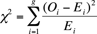
Note that in this formula, there are only single subscripts, for instance Ei rather than Eij. This is because data for a chi-square goodness of fit is usually arranged into a single row, hence the need for only one subscript. The degrees of freedom for a chi-square test of goodness of fit is (g − 1).
Suppose we believe that 10% of a particular population has low blood pressure (hypotension), 40% normal blood pressure, 30% prehypertension, and 20% hypertension. We can test this hypothesis by drawing a sample and comparing the observed proportions to those of our hypothesis (which are the expected values); we will use alpha = 0.05. Figure 5-12 shows an example using hypothetical data.
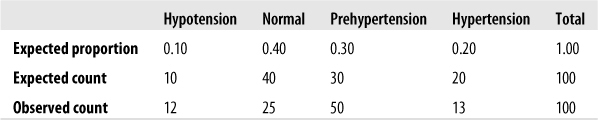
The computed chi-square value for this data is 21.8 with 3 degrees of freedom and is significant. (The critical value for α = 0.05 is 7.815, as can be seen from the chi-square table in Figure D-11 in Appendix D.) Because the value calculated on our data exceeds the critical value, we should reject the null hypothesis that the blood pressure levels in the population follow this hypothesized distribution.
The Pearson’s chi-square test is suitable for data in which all observations are independent (the same person is not measured twice, for instance) and the categories are mutually exclusive and exhaustive (so that no case may be classified into more than one cell, and all potential cases can be classified into one of the cells). It is also assumed that no cell has an expected value less than 1, and no more than 20% of the cells have an expected value less than 5. The reason for the last two requirements is that the chi-square is an asymptotic test and might not be valid for sparse data (data in which one or more cells have a low expected frequency).
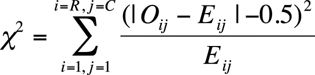
Yates’s correction for continuity is a procedure developed by the British statistician Frank Yates for the chi-square test of independence when applied to 2×2 tables. The chi-square distribution is continuous, whereas the data used in a chi-square test is discrete, and Yates’s correction is meant to correct for this discrepancy. Yates’s correction is easy to apply. You simply subtract 0.5 from the absolute value of (observed – expected) in the formula for the chi-square statistic before squaring; this has the effect of slightly reducing the value of the chi-square statistic. The chi-square formula, with Yates’s correction for continuity, is shown in Figure 5-13.
The idea behind Yates’s correction is that the smaller chi-square value reduces the probability of Type I error (wrongly rejecting the null hypothesis). Use of Yates’s correction is not universally endorsed, however; some researchers feel that it might be an overcorrection leading to a loss of power and increased probability of a Type II error (wrongly failing to reject the null hypothesis). Some statisticians reject the use of Yates’s correction entirely, although some find it useful with sparse data, particularly when at least one cell in the table has an expected cell frequency of less than 5. A less controversial remedy for sparse categorical data is to use Fisher’s exact test, discussed later, instead of the chi-square test, when the distributional assumptions previously named (no more than 20% of cells with an expected value less than 5 and no cell with an expected value of less than 1) are not met.
The chi-square test is often computed for tables larger than 2×2, although computer software is usually used for those analyses because as the number of cells increases, the calculations required quickly become lengthy. There is no theoretical limit on the number of columns and rows that may be included, but two factors impose practical limits: the possibility of making a coherent interpretation of the results (try this with a 30×30 table!) and the necessity to avoid sparse cells, as noted earlier. Sometimes, data is collected in a large number of categories but collapsed into a smaller number to get around the sparse cell problem. For instance, information about marital status may be collected using many categories (married, single never married, divorced, living with partner, widowed, etc.), but for a particular analysis, the statistician may choose to reduce the categories (e.g., to married and unmarried) because of insufficient data in the smaller categories.
Fisher’s Exact Test (often called simply Fisher’s) is a nonparametric test similar to the chi-square test, but it can be used with small or sparsely distributed data sets that do not meet the distributional requirements of the chi-square test. Fisher’s is based on the hypergeometric distribution and calculates the exact probability of observing the distribution seen in the table or a more extreme distribution, hence the word “exact” in the title. It is not an asymptotic test and therefore is not subject to the sparseness rules that apply to the chi-square tests. Computer software is usually used to calculate Fisher’s, particularly for tables larger than 2×2, because of the repetitious nature of the calculations. A simple example with a 2×2 table follows.
Suppose we are interested in the relationship between use of a particular street drug and sudden cardiac failure in young adults. Because the drug is both illegal and new to our area, and because sudden cardiac death is rare in young adults, we were not able to collect enough data to conduct a chi-square test. Figure 5-14 shows the data for analysis.
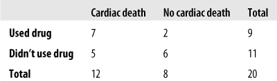
Figure 5-14. Fisher’s Exact Test: calculating the relationship between the use of a novel street drug and sudden cardiac death in young adults
Our hypotheses are:
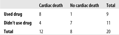
Fisher’s Exact Test calculates the probability of results at least as extreme as those found in the study. A more extreme result in this study would be one in which the difference in proportion of drug users versus nondrug users suffering sudden cardiac death was even greater than in the actual data (keeping the same sample size). One more extreme result is shown in Figure 5-15.
The formula to calculate the exact probability for a 2×2 table is shown in Figure 5-16.
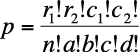
In this formula, ! means factorial (4! = 4×3×2×1), and cells and marginals are identified using the notation shown in Figure 5-17.
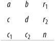
In this case, a = 8, b = 1, c = 4, d = 7, r1 = 9, r2 = 11, c1 = 12, c2 = 8, and n = 20. Why is this table more extreme than our observed results? Because if there were no relationship between use of the drug and sudden cardiac death, we would expect to see the distribution in Figure 5-18.
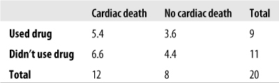
In our observed data, there is a stronger relationship between using the drug and cardiac death (more deaths than the expected value for drug users), so any table in which that relationship is even stronger than in our observed data is more extreme and hence less probable if drug use and cardiac death are independent.
To find the p-value for Fisher’s Exact Test by hand, we would have to find the probability of all the more extreme tables and add them up. Fortunately, algorithms to calculate Fisher’s are included in most statistical software packages, and many online calculators also can calculate this statistic for you. Using the calculator available on a page maintained by John C. Pezzullo, a retired professor of pharmacology and biostatistics, we find that the one-tailed p-value for Fisher’s Exact Test for the data in Figure 5-12 is 0.157. We use a one-tailed test because our hypothesis is one-tailed; our interest is in whether use of the new drug increases the risk for cardiac death. Using an alpha level of 0.05, this result is not significant, so we do not reject our null hypothesis that the new drug does not increase the risk of cardiac death.
McNemar’s test is a type of chi-square test used when the data comes from paired samples, also known as matched samples or related samples. For instance, we might use McNemar’s to examine the results of an opinion poll on some issue before and after a group of individuals viewed a political advertisement. In this example, each person would contribute two opinions, one before and one after viewing the advertisement. We cannot treat two opinions on the same issue as independent, so we can’t use a Pearson’s chi-square; instead, we assume that two opinions collected from the same person will be more closely related than two opinions collected from two people. The McNemar’s test would also be appropriate if we collected opinions from pairs of siblings or husband–wife pairs on some issue. In siblings and husband–wife examples, although information is collected from different individuals, the individuals in each pair are so closely related or affiliated that we would expect them to be more similar than two people chosen at random from the population. McNemar’s can also be used to analyze data collected from groups of individuals who have been so closely matched on important characteristics that they can no longer be considered independent. For instance, medical studies sometimes look at the occurrence of a particular disease related to a risk factor among groups of individuals matched on multiple characteristics such as age, gender, and race/ethnicity, and use paired data techniques such as McNemar’s because the individuals are so closely matched that they are considered related rather than independent samples.
Suppose we want to measure the effectiveness of a political advertisement in changing people’s opinions about capital punishment. One way to do this would be to ask people whether they are for or against capital punishment, collecting their opinions both before and after they view a 30-second commercial advocating the abolition of capital punishment. Consider the hypothetical data set in Figure 5-19.
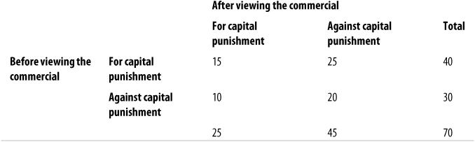
Figure 5-19. McNemar’s test of opinions on capital punishment before and after viewing a television commercial
More people were against capital punishment after viewing the commercial as compared to the same people before viewing the commercial, but is this difference significant? We can test this using McNemar’s chi-square test, calculated using the formula in Figure 5-20.
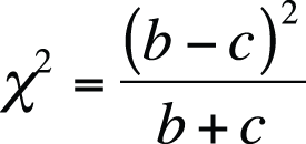
This formula uses a method of referring to cells by letters, using the plan shown in Figure 5-21.

Note that this formula is based exclusively on the distribution of discordant pairs (b and c), in this case those in which a person changed his or her opinion after viewing the commercial. McNemar’s has a chi-squared distribution with one degree of freedom. The calculations are shown in Figure 5-22.
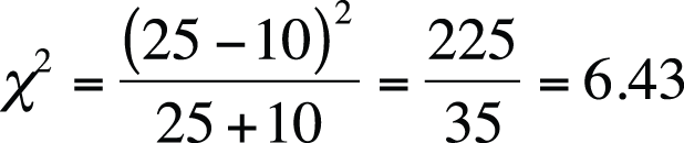
As you can see from the chi-square table (Figure D-11 in Appendix D), when alpha = 0.05, the critical value for a chi-square distribution is 3.84, so this result provides evidence that we should reject the null hypothesis that viewing the commercial has no effect on people’s opinions about capital punishment. I also determined from a computer analysis that the exact probability of getting a chi-square statistic with one degree of freedom at least as extreme as 6.43 is 0.017 if people’s opinions did not change before and after viewing the commercial, reinforcing the fact that the result from this study is significant, and we should reject the null hypothesis.
A proportion is a fraction in which all the cases in the numerator are also in the denominator. For instance, we could speak of the proportion of female students in a particular university. The numerator would be the number of female students, and the denominator would be all students (both male and female) at the university. Or we could speak of the number of students majoring in chemistry at a particular university. The numerator would be the number of chemistry majors, and the denominator all students at the university (of whatever major). Proportions are discussed in more detail in Chapter 15. Data that can be described in terms of proportions is a special case of categorical data in which there are only two categories: male and female in the first example, chemistry major and non-chemistry major in the second.
Many of the statistics discussed in this chapter, such as Fisher’s Exact Test and the chi-square tests, can be used to test hypotheses about proportions. However, if the data sample is sufficiently large, additional types of tests can be performed using the normal approximation to the binomial distribution; this is possible because, as discussed in Chapter 3, the binomial distribution comes to resemble the normal distribution as n (the sample size) increases. How large a sample is large enough? One rule of thumb is that both np and n(1 − p) must be greater than or equal to 5.
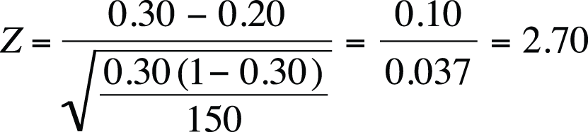
Suppose you are a factory manager, and you claim that 95% of a particular type of screw produced by your plant has a diameter between 0.50 and 0.52 centimeters. A customer complains that a recent shipment of screws contains too many outside the specified dimensions, so you draw a sample of 100 screws and measure them to see how many meet the standard. You will conduct a one-sample Z-test to see whether your hypothesized proportion of 95% of screws meeting the specified standard is correct with the following hypotheses:
where π is the proportion of screws in the population meeting the standard (diameter between 0.50 and 0.52 centimeters). Note that this is a one-tailed test; you will be happy if at least 95% of the screws meet the standard and happy if more than 95% meet it. (You would be happiest, of course, if 100% met the standard, but no manufacturing process is perfectly precise.) In your sample of 100 screws, 91 were within the specified dimensions. Is this result sufficient, using the standard of alpha = 0.05, to reject the null hypothesis that at least 95% of the screws of this type manufactured in our plant meet the standard?
The formula to calculate the one-sample Z-test for a proportion is given in Figure 5-23.
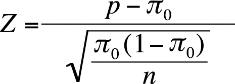
| In this formula, π0 is the hypothesized population proportion, |
| p is the sample proportion, and |
| n is the sample size. |
Plugging the numbers into this formula gives us a Z-score of −1.835, as shown in Figure 5-24.
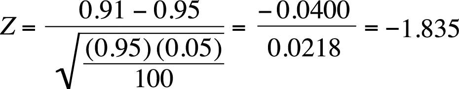
The critical value for a one-tailed Z-test, given our hypotheses and alpha-level, is −1.645. Our value of −1.835 is more extreme than this value, so we will reject our null hypothesis and conclude that less than 95% of this type of screw, as manufactured in our plant, meet the specified standard.
We can also test for differences in population proportions in the large-sample case. Suppose we are interested in the proportion of high school students who are current tobacco smokers and want to compare this proportion across two countries. Our null hypothesis is that the proportion is the same in both countries, so this will be a two-sided test with the hypotheses:
Assuming that our assumptions about sample size are met (np ≥ 5, n(1 – p) ≥ 5 for both samples), we can use the formula in Figure 5-25 to compute a Z-statistic for the differences in proportions between two populations.
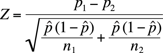
Suppose we drew a sample of 500 high school students from each of two countries; in country 1, the sample included 90 current smokers; in country 2, it included 70 current smokers. Given this data, do we have sufficient information to reject our null hypotheses that the same proportion of high school students smoke in each country? We can test this by calculating the two-sample Z test, as shown in Figure 5-26.
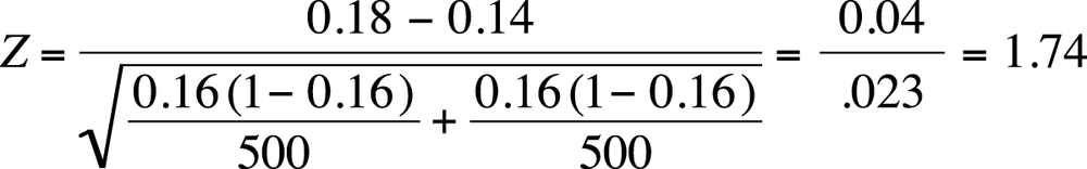
Note that our pooled proportion is:
This Z-value is less extreme than 1.96 (the value needed to reject the null hypothesis at alpha = 0.05; you can confirm this using the normal table [Figure D-3 in Appendix D]), so we fail to reject the null hypothesis that the proportion of smokers among high school students in the two countries is the same.
The most common measure of association for two variables, Pearson’s correlation coefficient (discussed in Chapter 7) requires variables measured on at least the interval level. However, several measures of association have been developed for categorical and ordinal data, and they are interpreted similarly to the Pearson correlation coefficient. These measures are often produced using a statistical software package or an online calculator, although they can also be calculated by hand.
As with Pearson’s correlation coefficient, the correlation statistics discussed in this section are measures of association only, and statements about causality cannot be supported by a correlation coefficient alone. There is a plethora of these measures, some of which are known under several names; a few of the most common are discussed here. A good approach if you’re using a new statistical software package is to see which measures are supported by that package and then investigate which of those measures are appropriate for your data because there are so many correlation statistics.
Phi is a measure of the degree of association between two binary variables (two categorical variables, each of which can have only one of two values). Phi is calculated for 2×2 tables; Cramer’s V is analogous to phi for tables larger than 2×2. Using the method of cell identification described in Figure 5-17, the formula to calculate phi is shown in Figure 5-27.
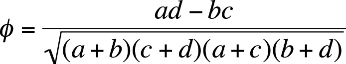
We can calculate phi for the smoking/lung cancer data in Figure 5-4 as shown in Figure 5-28.
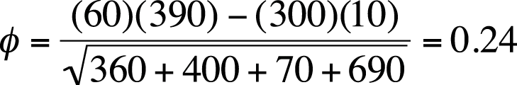
Phi can also be calculated by dividing the chi-square statistic by n and then taking the square root of the result as shown in Figure 5-29.
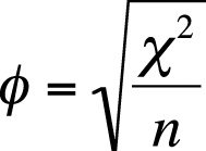
Note that in the first method of calculation, the result can be either positive or negative, whereas in the second, it can only be positive because the chi-square statistic is always positive. The value of phi using the chi-square statistic found using the second formula can be thought of as the absolute value of the value found using the first formula. This is clear from considering the data in Figure 5-30.

Calculating phi by the first method, we get −0.33, and by the second method, 0.33. You can confirm this using a statistical computer package or an online calculator, or by performing the calculations by hand. Of course, if we changed the order of the two columns, we would get a positive result using either method. If the columns have no natural order (e.g., if they represent nonordered categories such as color), we might not care about the direction of the association but only its absolute value. In other cases, we might, for instance if the columns represent the presence or absence of disease. In the latter case, we need to be careful about how we arrange the data in the table to avoid producing a misleading result.
Interpreting phi is less straightforward than interpreting the Pearson’s correlation coefficient because the range of phi depends on the marginal distribution of the data. If both variables have a 50-50 split (half one value, half the other), the range of phi is (−1, +1), using the first method, or (0, 1), using the second method. If the variables have any other distribution, the potential range of phi is less. This is discussed further in the article by Davenport and El-Sanhurry listed in Appendix C. Keeping this limitation in mind, the interpretation of phi is similar to that of the Pearson correlation coefficient, so a value of −0.33 would indicate a moderate negative relationship (also keeping in mind that there is no absolute definition of “a moderate relationship” and that this result might be considered large in one field of study and rather small in another).
Cramer’s V is an extension of phi for tables larger than 2×2. The formula for Cramer’s V is similar to the second method for calculating phi, as shown in Figure 5-31.
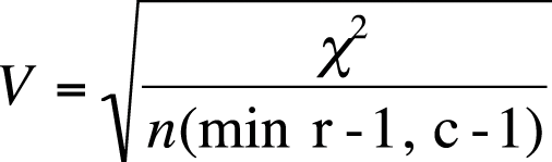
where the denominator is n (sample size) times the minimum of (r − 1) and (c − 1), that is, the minimum of two values: the number of rows minus 1, and the number of columns minus 1. For a 4×3 table, this number would be 2, that is, 3 − 1. For a 2×2 table, the formula for Cramer’s V is identical to the formula for the second way of calculating phi.
Suppose the chi-square value for a 3×4 table with an n of 200 is 16.70. Cramer’s V for this data is shown in Figure 5-32.
The point-biserial correlation coefficient is a measure of association between a dichotomous variable and a continuous variable. Mathematically, it is equivalent to the Pearson correlation coefficient (discussed in detail in Chapter 7), but because one of the variables is dichotomous, a different formula can be used to calculate it.
Suppose we are interested in the strength of association between gender (dichotomous) and adult height (continuous). The point-biserial correlation is symmetric, like the Pearson correlation coefficient, but for ease of notation we designate height as X and gender as Y and code Y so 0 = males and 1 = females. We draw a sample of men and women and calculate the point-biserial correlation by using the formula shown in Figure 5-33.
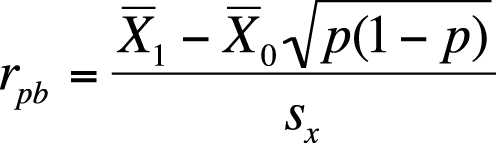
In this formula,  1 = the mean height for females and 0 =the mean height for males 1 = the mean height for females and 0 =the mean height for males |
| p = the proportion of females |
| sx = the standard deviation of X |
Suppose in our sample, the mean height for males is 69.0 inches, for females 64.0 inches, the standard deviation for height is 3.0 inches, and the sample is 55% female. We calculate the correlation between gender and adult height as shown in Figure 5-34.
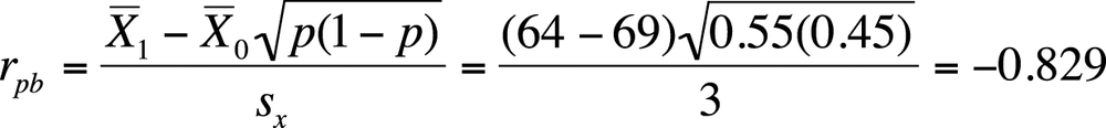
A correlation of −0.829 is a strong relationship, indicating that there is a close relationship between gender and adult height in the U.S. population. The correlation is negative because we coded females (who are on average shorter) as 1 and males as 0; had we coded our cases the other way around, our correlation would have been 0.829. Note that the means and standard deviation used in this equation are close to the actual values for the U.S. population, so a strong relationship between gender and height exists in reality as well as in this exercise.
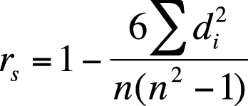
The most common correlation statistic for ordinal data (in which data is ordered but cannot be assumed to have equal distance between values) is Spearman’s rank-order coefficient, also called Spearman’s rho or Spearman’s r, and also designated by rs. Spearman’s rho is based on the ranks of data points (first, second, third, and so on) rather than on their values. Class rank in a school is an example of ratio-level data; the person with the highest GPA (grade point average) is ranked first, the person with the next-highest GPA is ranked second, and so on, but you don’t know whether the difference between the 1st and 2nd students is the same as the difference between the 2nd and 3rd. Even if you have data measured on a ratio scale, such as GPA in high school, class ranks are sometimes used in college admissions and scholarship decisions because of the difficulty of comparing grading systems across different classes and different schools.
To calculate Spearman’s rho, rank the values of each variable separately, averaging the ranks of any tied values. Then calculate the difference in ranks for each pair of values, and calculate Spearman’s rho by using the formula shown in Figure 5-35.
Suppose we are interested in the relationship between weekly hours of study and score on a final exam. We collect data for both variables as shown in Figure 5-36 (a data set for illustrative purposes to minimize the hand-calculations needed):
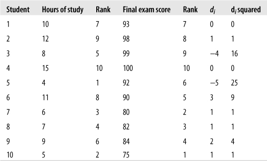
It looks like more studying is associated with a higher grade, although the relationship is not perfect. (Student #3 got a high grade with only an average amount of studying, and student #5 got a good grade with a relatively low amount of studying.) We will calculate Spearman’s rho to get a more precise estimate of this relationship. Note that because we square the rank difference, it doesn’t matter whether you subtract study rank from exam rank (as we did) or the other way around. The sum of di2 is 58, and Spearman’s rho for this data is shown in Figure 5-37.
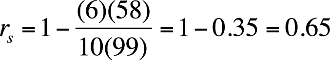
This confirms what we guessed from just looking at the data: there is a strong but imperfect relationship between the amount of time spent studying and the outcome on a test.
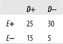
Goodman and Kruskal’s gamma, often called simply gamma, is a measure of association for ordinal variables that is based on the number of concordant and discordant pairs between two variables. It is sometimes called a measure of monotonicity because it tells you how often the variables have values in the order expected. If I tell you that two variables in a data set have a positive relationship and that case 2 has a higher value on the first variable than does case 1, you would expect that case 2 also has a higher value on the second variable. This would be a concordant pair. If case 2 had a lower value on the second variable, it would be a discordant pair. To calculate gamma by hand, we would first create a frequency distribution for the two variables, retaining their natural order.
Consider a hypothetical data set relating BMI (body mass index, a measure of weight relative to height) and blood pressure levels. In general, high BMI is associated with high blood pressure, but this is not the case for every individual. Some overweight people have normal blood pressure, and some normal-weight people have high blood pressure. Is there a strong relationship between weight and blood pressure in the data set shown in Figure 5-38?
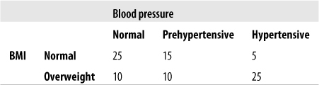
The equations to calculate gamma rely on the cell designations shown in Figure 5-39.

First, we have to find the number of concordant pairs (P) and discordant pairs (Q), as follows:
| P = a (e + f) + bf = 25(10 + 25) + 15(25) = 875 + 375 = 1250, |
| Q = c (d + e) + bd = 5(10 + 10) + 15(10) = 100 + 150 = 250 |
Gamma is then calculated as shown in Figure 5-40.
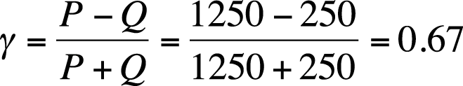
The reasoning behind gamma is clear: if there is a strong relationship between the two variables, there should be a higher proportion of concordant pairs; thus, gamma will have a larger value than if the relationship were weaker. Gamma is a symmetrical measure because it does not matter which variable is considered the predictor and which the outcome; the value of gamma will be the same in either case. Gamma does not correct for tied ranks within the data.
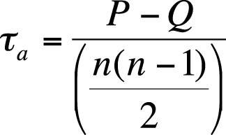
Maurice Kendall developed three slightly different types of ordinal correlation as alternatives to gamma. Statistical computer packages sometimes use more complex formulas to calculate these statistics, so the exact formula any particular program uses should be confirmed with the software manual. All Kendall’s tau statistics, like gamma, are symmetrical measures.
Kendall’s tau-a is based on the number of concordant versus discordant pairs, divided by a measure based on the total number of pairs (n = the sample size), as shown in Figure 5-41.
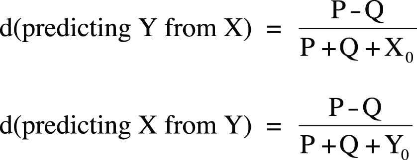
Kendall’s tau-b is a similar measure of association based on concordant and discordant pairs, adjusted for the number of ties in ranks. Assuming our two variables are X and Y, tau-b is calculated as (P − Q) divided by the geometric mean of the number of pairs not tied on X (X0) and the number of pairs not tied on Y (Y0). Tau-b can approach 1.0 or −1.0 only for square tables (tables with the same number of rows and columns). The formula for Kendall’s tau-b is shown in Figure 5-42.
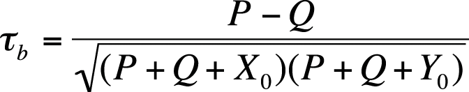
In this formula, X0 = the number of pairs not tied on X, and Y0 = the number of pairs not tied on Y.
Kendall’s tau-c is used for nonsquare tables and is calculated as shown in Figure 5-43.
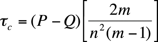
In this formula, m is the number of rows or columns, whichever is smaller, and n is the sample size.
Somers’s d is an asymmetrical version of gamma, so calculation of the statistic varies depending on which variable is considered the predictor and which the outcome. Somers’s d also differs from gamma because it is corrected for the number of pairs tied on the predictor variable. If the study is set up with the hypothesis involving X predicting Y, Somers’s d is corrected for the number of pairs tied on X. If the hypothesis is that Y predicts X, it is corrected for the number of pairs tied on Y. As in tau-b, in Somers’s d, tied pairs are removed from the denominator. Using the notation that X0 = the number of pairs not tied on X and Y0 = the number of pairs not tied on Y, Somers’s d is calculated as shown in Figure 5-44.
A symmetric value of Somers’s d can be calculated by averaging the two asymmetric values calculated with these formulas.
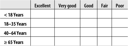
Several types of scales have been developed to measure qualities that have no natural metric, such as opinions, attitudes, and perceptions. The best known of these scales is the Likert scale, introduced by Rensis Likert in 1932 and widely used today in fields ranging from education to health care to business management. In a typical Likert scale question, a statement is presented and the respondent is asked to choose from an ordered list of responses. For instance:
My classes at Lincoln East High School prepared me for university studies.
1. Strongly agree
2. Agree
3. Neutral
4. Disagree
5. Strongly disagree
This is a classic ordinal scale; we can be reasonably sure that “strongly agree” represents more agreement than “agree,” and “agree” represents more agreement than “neutral,” but we can’t be sure whether the increment of agreement between “agree” and “strongly agree” is the same as the increment between “neutral” and “agree” or if these increments are the same for each respondent.
Categorical and ordinal methods, as described in this chapter, are appropriate for the analysis of Likert scale data, and so are some of the nonparametric methods described in Chapter 13. The fact that Likert scale responses are often identified with numbers has sometimes led researchers to analyze the data as if it were collected on an interval scale. For instance, you can find published articles that report the mean and variance for data collected using a Likert scale. A researcher choosing to follow this path (treating Likert data as interval) should be aware that this is a controversial approach that will be rejected by many editors and that the burden is on the researcher to justify any departure from ordinal or categorical methods of analysis for Likert scale data.
Five levels of response are commonly used with Likert scales because three is thought not to allow sufficient variation of response, whereas seven is believed to offer too many choices. There is also some evidence that people are reluctant to select the extreme values of a scale when a large number of choices is offered. However, some researchers prefer to use an even number of responses, usually four or six, to avoid a middle category that might be chosen by default by some respondents.
The semantic differential scale is similar to the Likert scale except that individual data points are not labeled, merely the extreme values. The preceding Likert question could be rewritten as a semantic differential question as follows:
Please rate your academic preparation at Lincoln East High School in relation to
the demands of university study.
Excellent preparation 1 2 3 4 5 Inadequate preparation
Because individual data points do not have to be labeled, semantic differential items often offer more data points to the respondent. Ten data points is a popular choice because people are familiar with a 10-point judging scale (hence the popular phrase “a perfect 10”). Like Likert scales, semantic differential scales are by nature ordinal, although when a larger number of data points is offered, some researchers argue that they can be analyzed as interval data.
Here are some review questions on the topics covered in this chapter.
Problem
What are the dimensions of Tables 5-45 and 5-46? What would be the degrees of freedom for an independent-samples chi-square test calculated from data of these dimensions?


Solution
The table dimensions are 3×4 (table a) and 4×3 (table b). Remember, tables are described as R×C, that is, (number of rows) by (number of columns). The degrees of freedom are 6 for the first table [(3 − 1)(4 − 1)] and 6 for the second [(4 − 1)(3 − 1)] because degrees of freedom for chi-square is calculated as [(r − 1)(c − 1)].
Problem
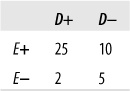
Given the distribution of data in the following table, calculate percent agreement and kappa.
Solution
| Percent agreement = 95/140 = 0.68, |
| Kappa = 0.30, |
| Po = (70 + 25)/140 = 0.68, |
| Pe = (85*100)/(140*140) + (40*55)/(140*140) = 0.54 |
Problem
What is the null hypothesis for the chi-square test of independence?
Solution
The variables are independent, which also means that the joint probabilities may be predicted using only the marginal probabilities.
Problem
What is the null hypothesis for the chi-square test for equality of proportions?
Solution
The null hypothesis is that two or more samples drawn from different populations have the same distribution on the variable(s) of interest.
Problem
What is an appropriate statistic to measure the relationship between the two independent variables displayed in Figure 5-49? What is the value of that statistic, and what conclusion would you draw from it?
Solution
Because this is a 2×2 table and two of the cells have expected values of less than five (cells c and d), Fisher’s Exact Test should be used. The value is 0.077 (obtained using computer software), which does not provide sufficient evidence to reject the null hypothesis of no relationship between E and D.
Problem
What are the expected values for the cells in Figure 5-50? What is the value of the chi-square statistic? What conclusion would you draw about the relationship between exposure and disease, given this data?
Solution
The expected values are given in Figure 5-51.
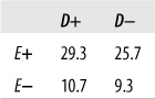
Chi-square (1) = 5.144, p = 0.023. This is sufficient evidence to reject the null hypothesis that exposure and disease are unrelated. We draw the same conclusion by using the chi-square table (Figure D-11) in Appendix D: 5.144 exceeds the 0.025 critical value (5.024) for a single-tailed chi-square test with one degree of freedom, indicating that we should reject the null hypothesis if α = 0.05.
Problem
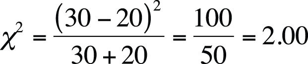
Figure 5-52 represents political affiliations of married couples. Compute the appropriate statistic to see whether the affiliations of husbands and wives are independent of those of their spouses.
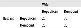
Solution
McNemar’s test is appropriate because the data comes from related pairs. The calculations are shown in Figure 5-53. The value of McNemar’s chi-square is 2.00, which is not above the critical value for chi-square with one degree of freedom, at alpha = 0.05, so we do not have evidence sufficient to reject the null hypothesis that the political affiliations of spouses are independent of the affiliation of the other spouse.
Problem
Which of Kendall’s tau statistics would be appropriate for the data in Figure 5-54?
Solution
Kendall’s tau-c should be used because the table is not square (it has four rows and three columns).
Problem
What is the argument against analyzing Likert and similar attitude scales as interval data?
Solution
There is no natural metric for constructs such as attitudes and opinions. We can devise scales that are ordinal (the responses can be ranked in order of strength of agreement, for instance) to measure such constructs, but it is impossible to determine whether the intervals among points on such scales are equally spaced. Therefore, data collected using Likert and similar types of scales should be analyzed at the ordinal or categorical level rather than at the interval or ratio level.
Problem
In what circumstance would you compute the Cramer’s V statistic?
Solution
Cramer’s V is an extension of the phi statistic and should be calculated to determine the strength of association between two categorical variables that have more than two levels. For binary variables, Cramer’s V is equivalent to phi.
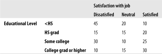
Problem
You read about a national poll stating that 30% of university students are dissatisfied with their appearance. You wonder whether the proportion at your local university (enrollment 20,000 students) is the same, so you draw a random sample of 150 students and find that 30 report being dissatisfied with their appearance. Conduct the appropriate test to see whether the proportion of students at your university differs significantly from the national result.
Solution
This question calls for a one-sample Z-statistic with a two-tailed test (because you are interested in whether the proportion at your school differs from the national figure in either direction). The test statistic is shown in Figure 5-55.
Using the standard of alpha = 0.05 and a two-tailed test, the critical Z-value is 1.96 (as you can find using Figure D-3 in Appendix D). The Z-value from your sample is more extreme than this, so you reject the null hypothesis that the proportion of students dissatisfied with their appearance at your school is the same as at the national level.
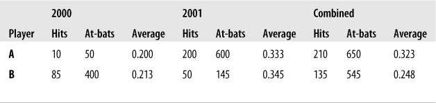
Simpson’s Paradox
Simpson’s paradox is a circumstance in which the direction of an association reverses when data from several groups is combined. This paradox is well known among baseball fans. For instance, it is possible for player A to have a higher batting average (proportion of hits) than player B in each of two years, yet player A may have a lower batting average than player B when data from the two years are combined. Consider the example in Figure 5-56.
Player B had a higher batting average each year yet, over both years combined, a lower average. This phenomenon occurs due to the different number of cases observed for each player in each year.
Simpson’s paradox was at the root of a controversy about gender discrimination in university admissions a few years ago. A lawsuit filed against the University of California was denied when it was shown that apparent gender discrimination (a lower percentage of women than men admitted overall to the university) could be explained by the fact that admissions were determined on a department-by-department basis and that most women applied to departments in which the percentage of applicants accepted was low, whereas most men applied to departments in which the percentage of applicants accepted was higher. In fact, in most departments, a slightly lower percentage of men than women were accepted, but this distinction was reversed when admissions data from all departments was combined.
Simpson’s paradox is also apparent in the evaluation of medical treatments when treatment A might be superior to treatment B in each of two samples yet inferior when the samples are combined. Some statisticians argue that circumstances such as this should not be called a paradox at all because to do so implies that there is a causal relationship between the two variables.