

This chapter used to be called “Lightroom Mobile” because the app itself used to be called Lightroom Mobile, but Adobe renamed the app “Lightroom CC,” probably because they realized that it was too descriptive, too obvious, and made too much sense. Actually, the full name of the app is not Lightroom CC, it’s “Adobe Photoshop Lightroom CC,” which is what you see on the splash screen that appears for a moment when you first launch the app. But, if you click on the LR icon in the top-left corner, it takes you to the developer credits page, and only there do you see the full and complete name for “the app previously known as Lightroom Mobile,” which is (and this is its legal name, and I only know this because a Lightroom rumors site pointed this out and it was listed on a trademark registration page made public by the Freedom of Information Act) “Adobe Photoshop Tito Jermaine Jonathan Livingston Seagull Gordon Lightfoot Keanu Cher Longoria Bailey Hutchinson The Rock Sergio Mendes Marlon Lightroom CC, Sr., III, Esq.” It’s right there on the registration papers; you can look for yourself. That’s a little long if you ask me, and if it were me, personally, I’d drop Gordon, The Rock, and Mendes, making it the shorter, and easier to remember, “Adobe Photoshop Tito Jermaine Jonathan Livingston Seagull Lightfoot Keanu Cher Longoria Bailey Hutchinson Sergio Marlon Lightroom CC, Sr., III, Esq.” Apparently, also in that same trademark registration, Adobe is planning on adding a couple additional sliders to Lightroom CC, and the names of these two new sliders would be “Ointment” and “Curd.” I can’t imagine what those new sliders would actually do, but I know this: I’m not using them during dinner.
You can extend Lightroom’s power to your smartphone and tablet using Lightroom mobile (now officially called “Lightroom CC,” but we’ll call it Lightroom mobile here, for clarity’s sake), giving you the option to edit your images pretty much anywhere. Here are four really cool things about the whole “mobile” part of your Lightroom experience:
#1: It Has a Killer Camera App!
Lightoom mobile has its own built-in camera and it’s pretty darn awesome. It has a Pro mode where you can manually choose your f-stop, shutter speed, ISO, and white balance, and it even has effect presets you can apply before you take an image. If your camera supports it (like recent iPhones or Samsung phones), you can shoot in RAW. It has a great HDR feature (using the same math from Lightroom Classic on your desktop), and the high-res RAW photos you take with the camera are automatically synced back to your computer. Plus, it has a built-in leveling feature, highlight clipping warnings, and the easiest-to-use Exposure Compensation feature ever (see page 434 for more on using the camera).

#2: You Can Sync Collections from Your Computer
When you first turn on Sync, nothing happens—all your images don’t try to stuff their way onto your phone (who has that much free space on their phone, right?). You’ll choose which collection(s) in Lightroom Classic (on your desktop) you want synced over to your mobile devices (if any). You turn on a checkbox and it goes over—easy as that. Once it’s there, you can do most of the same stuff you do on your desktop, but now on your mobile device—everything from editing your photos to ranking, sorting, and sharing them. By the way, it doesn’t sync the full high-res images over, instead it sends smart previews, which look and act like the high-res originals, but only take up around 1 megabyte of space on your mobile device.

#3: You Already Know How to Use It
That’s right. It’s based off the features in Lightroom Classic, so when you open it and go to edit your images, you’ll see all the same familiar sliders you’re already used to working with—Exposure, Contrast, Shadows, Highlights, Whites, Blacks, Clarity, Dehaze, and White Balance Temp and Tint. It’s the same stuff, using the same math, so really it’s just about learning some of the simple interface stuff, and you’re off and running. Best of all, the current version of Lightroom mobile’s interface is the most like Lightroom Classic on your desktop, so you’ll have no trouble getting up to speed fast (well, especially after this chapter).

#4: Your Changes Go Everywhere
When you make an edit on your mobile device or on your computer, that change is automatically updated everywhere. It all stays in sync, so it doesn’t really matter where you edit your images—on your phone, tablet, or on your computer—all your changes are reflected everywhere, and it’s all handled for you automatically. So, it’s pretty much Lightroom wherever you are. Beyond that, your synced images aren’t just on your phone, tablet, and desktop, they are also on the web, ready for you to share. Don’t worry—it’s all password protected, so only you can access them. But, if you want, you can share any collection with friends, family, or the public—all they need is a web browser to see them.

This is really easy, but kind of “pain-in-the-butt,” stuff because you might have to log into your Adobe account in a couple different places. But, what’s nice is, once you’ve done it, you’re done, and it really doesn’t get in the way again. Here’s how to get up and running quickly:
Step One:
You start in regular ol’ Lightroom on your desktop (Lightroom Classic): just click where the Lightroom logo lives (up in the top-left corner of the interface) and a menu will pop down asking if you want to Sync with Lightroom CC. Click on Start. If you’re not already, you’ll need to sign in with your Adobe ID and password. Simple enough.

TIP Three Ways to Get Images into Lightroom Mobile
(1) You can sync collections from Lightroom Classic on your desktop or laptop computer; (2) you can import photos already on your mobile device from your camera roll; or, (3) you can use Lightroom’s built-in camera to take photos and, of course, they go straight into Lightroom on your mobile device.
Step Two:
Now, go to the App Store (on your iPhone or iPad), or Google Play (on your Android phone or tablet), and download the Lightroom CC app (it’s free). Once you download it, launch the app and sign in with your Adobe ID and password (this is how it knows Lightroom Classic on your computer and Lightroom on your mobile device are linked to each other). At this point, you won’t see any photos in Lightroom mobile (errr, I meant “CC”) because you haven’t chosen any collections from Lightroom Classic on your desktop to sync over to your mobile device yet (but there will be in a page or two). For now, I just wanted you to get up and running.

You’ll notice I said “Collections”—that’s a key point because you can’t sync folders in Lightroom Classic over to Lightroom mobile; it only syncs collections. So, if you don’t have the images you want in Lightroom mobile in a collection, now would be an ideal time to do that (see page 37 for more on how to make a collection out of a folder).
Step One:
Once you turn syncing on in Lightroom Classic on your desktop (we’ll just call it “Lightroom desktop” from here on out), you’ll see a new little checkbox appear to the far left of each collection’s name. To sync one of your collections over to Lightroom mobile, just click on that checkbox, and a little sync icon will appear (as seen here).

Note: Like I mentioned, Lightroom mobile only works with collections from Lightroom desktop, not folders. So, if you have a folder in Lightroom desktop you want synced, you have to make it a collection first by Right-clicking on it in the Folders panel and choosing Create Collection from the pop-up menu. You can now sync that collection.
Step Two:
Now, head over to your mobile app (doesn’t matter on which device—it syncs to any mobile device you have Lightroom mobile installed on), and you’ll see that collection appear in Albums view (as seen here). That’s really all there is to it. If you decide you don’t want a particular collection synced to Lightroom mobile any longer, just go back to Lightroom desktop and click on that little sync icon to the left of your collection’s name, and it no longer syncs.
Note: Adobe no longer calls them “collections” once they hit Lightoom mobile. They now call them “albums,” so from here on out, that’s what we’re callin’ ‘em, too! Albums.
Here’s how to get around the main screen (kind of your Library module in the mobile version), and how to use a new type of Grid view that I wish Adobe would add to the desktop version. Note: As luck would have it, the Android version of Lightroom CC for your mobile device was developed quite a bit after the iPhone/iPad version, so it has always lagged behind on features. It’s nearly caught up now, and much of it is exactly the same, but don’t let it throw you that on an Android device, here and there, things are sometimes just different enough to drive us both mad.
Step One:
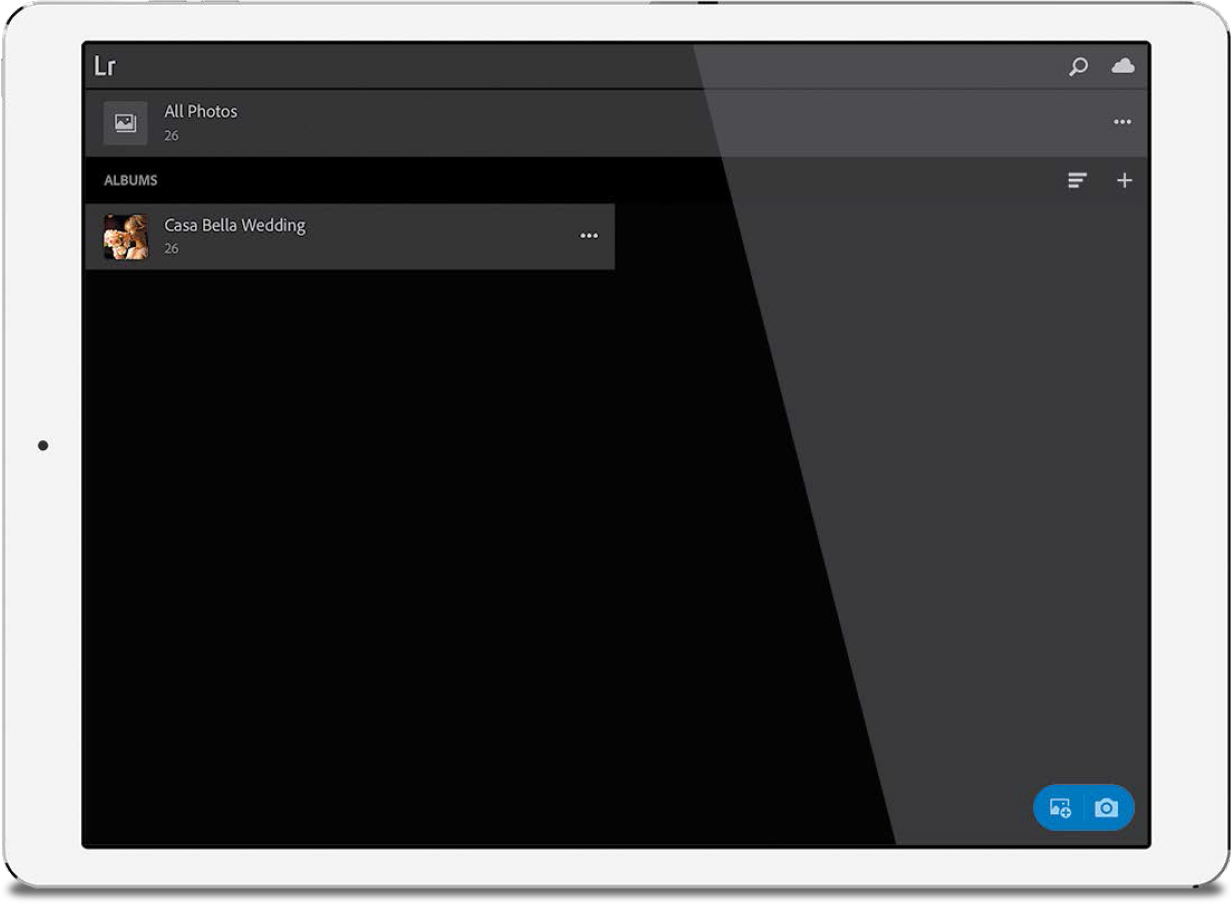
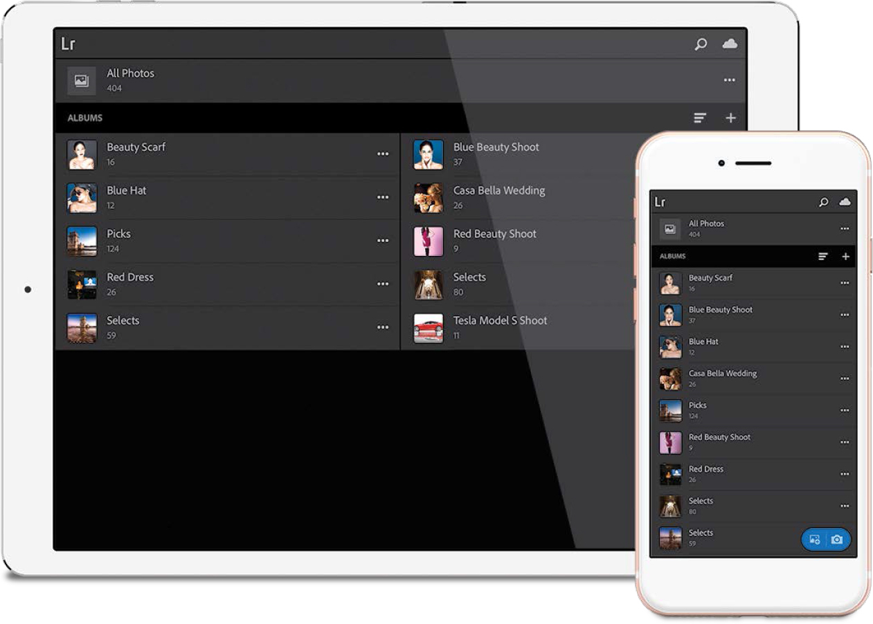
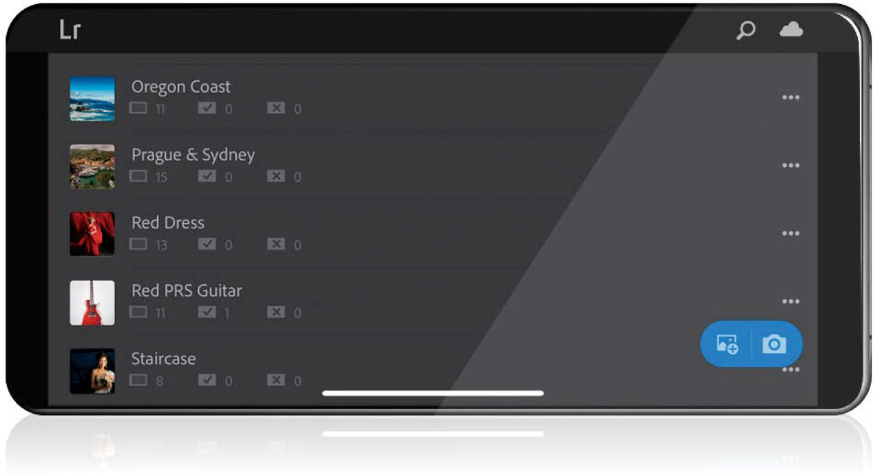
When you launch Lightroom CC (just a reminder, that’s what the Lightroom mobile app is now called) on your mobile device, you’re in Albums view. In this view, small thumbnails for all your collections appear in a tall vertical column, or if you’re using a tablet, they appear in two side-by-side columns (as seen here).
TIP: Automatically Add Photos
You can automatically have any photos added to your mobile device’s camera roll added to an album by tapping on the three dots to the right of an album’s name and tapping Enable Auto Add.
Step Two:
To see the images inside any album (collection), just tap on a thumbnail and it shows you the images in the standard Grid view (as seen here). You can change the size of the thumbnails in Grid view by pinching out/in to zoom in/out. I will tell you, though, that this “pinch to zoom to resize thumbnails” is a bit finicky, so you might have to try it a couple of times before they actually change size (not sure why it’s so finicky, but that’s been my experience on multiple mobile devices, so I guess that’s just how it is).

Step Three:
There are actually two different Grid views: the standard Flat view (seen in Step Two), and a Segmented view (seen here), which separates your photos by date or time. To enter Segmented view, tap the three dots in the top right, then in the pop-up menu, tap Grid View, and then tap Segmented to give you the date-based layout you see here (tap the three-dots again to hide the pop-up menu). You can set it to segment your photos by year, month, day, or the hour the images were taken by tapping-and-holding on the date displayed near the top left, and a list of choices will appear (as seen here in the inset).

TIP: Reordering Your Thumbnails
If you want to change the order of your photos, in Flat Grid view, tap the three dots in the top right, tap on Sort By, then tap Custom, and then tap directly on the little pencil icon to the right, which takes you to the Reorder screen, where you can tap-and-drag your photos into the order you want them (seems like an awful lot of work to do this, but that’s how it is. Whew).
Step Four:
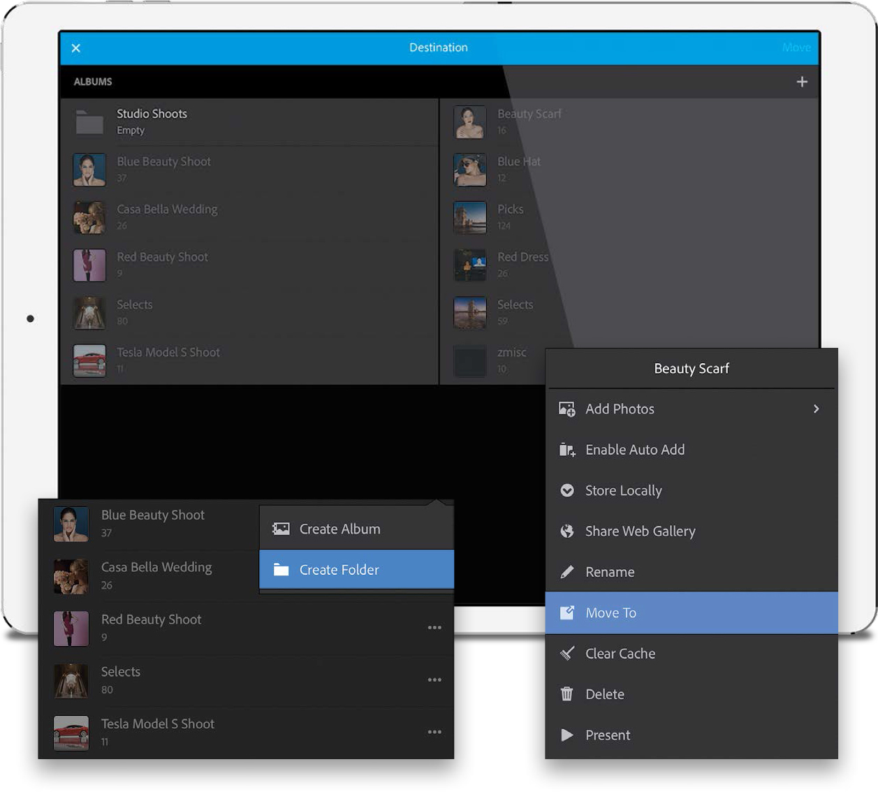
Lightroom mobile doesn’t support collection sets created in Lightroom desktop, but you can create a mobile version of a collection set that acts exactly like a collection set, just with a different name—here in Lightroom mobile, it’s called a ‘“folder.” You can move albums right into these folders, just like you do with collection sets on your desktop. To create a folder, in Albums view, tap the + (plus sign) icon near the top right, and in the pop-up menu that appears, tap Create Folder. Now, just tap on the three dots to the right of an album’s name, tap Move To, then tap on the new folder in the Destination screen, and then tap Move in the top right. So, if you have a collection set in Lightroom desktop that you want in mobile, start by creating a folder in mobile, and then when those albums are synced over, move them into that folder.
Step Five:
There is a bunch of hidden information you can display on the thumbnails in Grid view—just tap with two fingers on the screen and it will cycle through the various displays. For example, by default, you see a small badge with the file type (RAW, JPEG, etc.) in the top right of the thumbnail. Tap with two fingers, and it will display any flags or star ratings you assigned to the photos in this album. Two-finger tap again, and it displays the capture date and time, pixel dimensions, and filename of each image. Two-finger tap again, and it displays the f-stop, ISO, and shutter speed for each image (as seen here). Two-finger tap again, and it shows any “likes” or comments for these images (more on this part later), and one more two-finger tap hides all the data and just shows you the thumbnails (that’s the view I stick with— I just want photos, not a bunch of data, but hey, that’s just me).

Step Six:
If you want to add a photo to your existing album, go to the bottom-right corner of the screen and tap either the Add Photos icon to add an image from your camera roll (or from all the photos you have synced in Lightroom mobile), or tap the camera icon to take a photo using Lightroom mobile’s built-in camera (the photo you take will be added to the currently visible album).

Step Seven:
To see an image larger, just tap on it and it zooms to the Loupe view size you see here. To hide any extra onscreen info and the toolbars, and just see your image presented full screen, tap once on your image and it all quickly hides away. To return to regular Loupe view, just tap the screen once again. To see a filmstrip of the rest of the images in your album across the bottom of the screen:
iPad: Tap the Filmstrip icon in the bottom right of the screen.
Android Tablet: Tap the star icon near the bottom right of the screen.
iPhone/Android Phone: Tap on the Panels pop-up menu in the top left, then tap on Rate & Review.
TIP: Seeing Your Photo’s Metadata
To see everything from copyright info to title, caption, and file info, on a phone, tap on the Panels pop-up menu in the top left, then tap Info. On an iPad/Android tablet, tap the round “i” icon in the bottom right.
Step Eight:
If you want to copy or move images from one album to another, or even remove images from an album or delete them altogether, in Grid view, tap the three dots in the top right, then tap on what you want to do in the pop-up menu, and then tap on the image(s) you want to do it to (select multiple images by just tapping on them). For example, if you’ve chosen to move images, tap on them, then tap the arrow in the top right to see a list of albums. Now, just tap the box beside the album where you want to move them to, and then tap Move in the top right. To cancel the move (or copy), tap the “X” in the top left. The other functions (Remove from Album and Delete) work similarly. Note: Remove from Album removes the image(s) here, and back in the collection in Lightroom desktop, but it does not delete the original file—that’s still in the original folder on your computer.

Adding Pick flags and star ratings is definitely more fun here in Lightroom mobile than it is in Lightroom desktop. Plus, it’s nice to just sit back after a shoot, get comfy on the couch, pour a glass of Silver Oak (er, I mean VitaminWater, or tea…yeah…tea), and just swipe through your images, tagging your favorites.
Step One:
You add Pick flags and star ratings in the Rate & Review panel. To get there, you start by tapping once on a photo to enter Loupe view, then:
iPad/Android Tablet: Tap the star icon (circled here in red) near the bottom right of the screen.
iPhone/Android Phone: Tap the Panels pop-up menu in the top left (to the right of the back arrow icon), and then tap on Rate & Review.
This adds a row of stars and a flag (or two on an iPad/Android tablet, as seen here below the Filmstrip) that you can tap to add a star rating or Pick flag (or Reject flag), but there’s actually a faster way—it’s called “Speed Rating.”

Step Two:
To flag an image as a Pick, just swipe up/down on the right side of the screen and a pop-up display will appear in the center, where you can choose which flag (Pick, Unflagged, or Reject) you want (as seen here). To add a star rating, just swipe up/down on the left side of the screen and a pop-up display will appear in the center with 5 stars (as seen here in the inset). Just stop on the star you want. Now, swipe to the right to bring up the next image and do it all again. It’s a really quick way to go through a shoot.

Step Three:
To see just your Picks (or just your star-rated images), tap the back arrow icon (in the top left) to return to Grid view, and then tap the little funnel-like icon in the top right to bring up a filtering pop-up menu. You’ll see Unflagged (and the number of images you didn’t flag listed to the right of it), Picked (and how many images you flagged as Picks), and Rejected (and how many rejects you have, which I’m hoping is not many because if it’s a lot, we might need to have an entirely different discussion, but I digress). Tap on any one of those and just your Picks, Unflagged images, or Rejects are displayed. At the bottom of the menu are your star ratings, where you can just tap on the star rating for the images you want to see (hopefully, you’re tapping the fifth star because there are so many awesome shots with that rating). To turn all these filters off, just tap No Filter (or Show All) at the top of the menu, and now all your images in that album are visible again.

Step Four:
If you want to put your Picks, or maybe your 5-star images, into their own separate album, first turn on the Picked (or star rating) filter, then tap the three dots in the top right, choose Copy To in the pop-up menu, then tap on all your Picks (or 5-stars) to select them (on an Android device, you’ll select them first, then tap Copy to Album). Now, tap the right arrow icon in the top right to choose their destination. This will bring up the Destination screen with all of your albums, but you’ll want to tap the + (plus sign) icon in the top right and then tap Create Album in the pop-up menu. Name your new album, tap OK, then tap Copy in the top right to copy your Picks into this new album. When you tap the back arrow icon in the top left, it returns you to Albums view, and you’ll see your new Picks album listed there alphabetically.

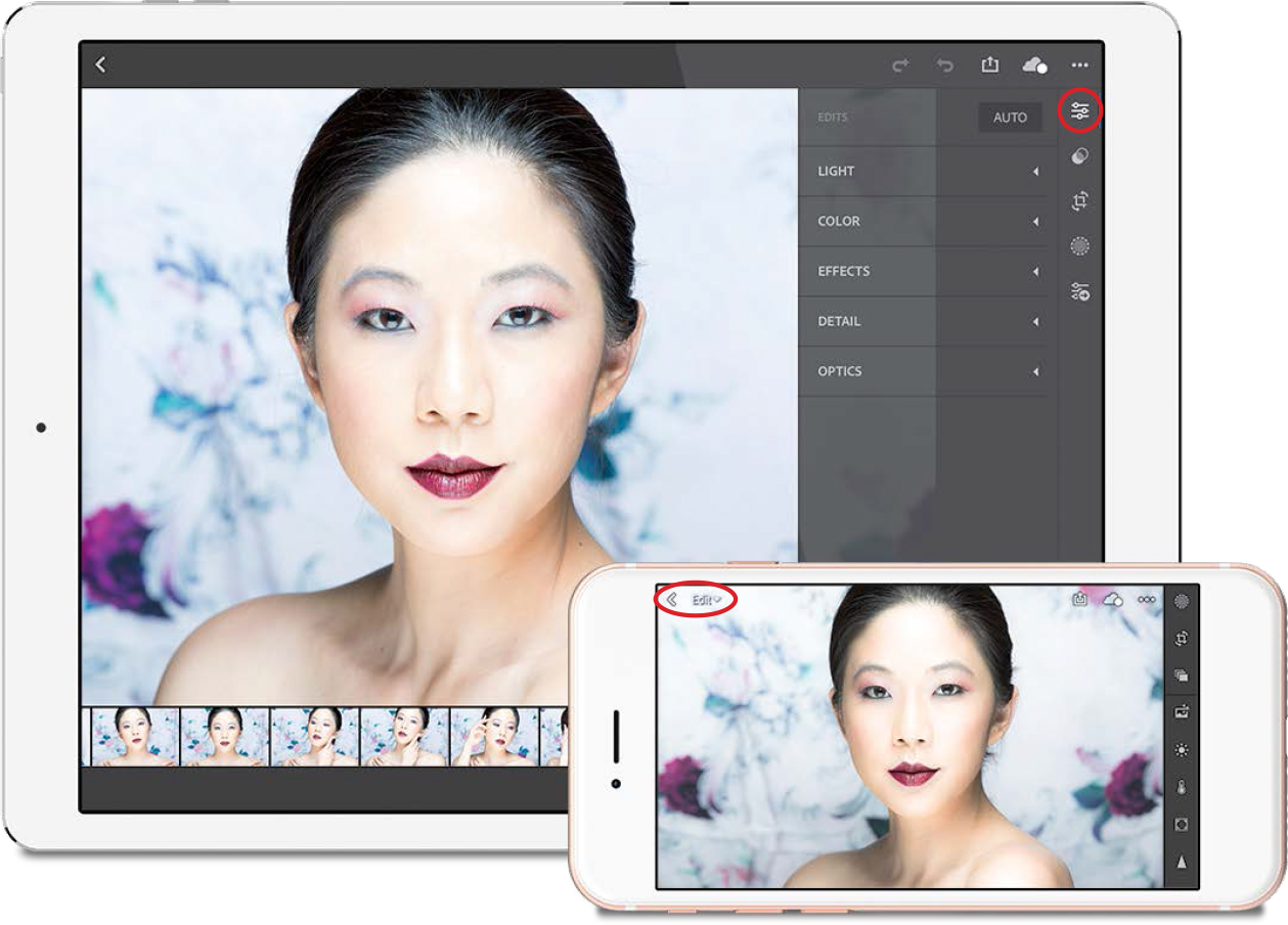
Good news: you already know this stuff—it’s the same sliders that do the same things, using the same math. The interface is slightly different if you turn the screen sideways (it’s more like Lightroom desktop, with your panels and sliders on the right side), than if you use it tall (it’s a more mobile-like interface, with the sliders along the bottom), but either way, you’re already most of the way there, bunky.
Step One:
To edit an image, first tap on the image to enter Loupe view, and then:
iPad/Android Tablet: Tap the Edit icon near the top right of the screen (shown circled here in red) and the Edits panel pops-out on the right.
iPhone/Android Phone: Tap the Panels pop-up menu in the top left (to the right of the back arrow icon), then tap on Edit and a row of icons appears across the bottom of the screen. If you turn your phone sideways, the icons move to the right side of the screen, and it’s more like Lightroom desktop.
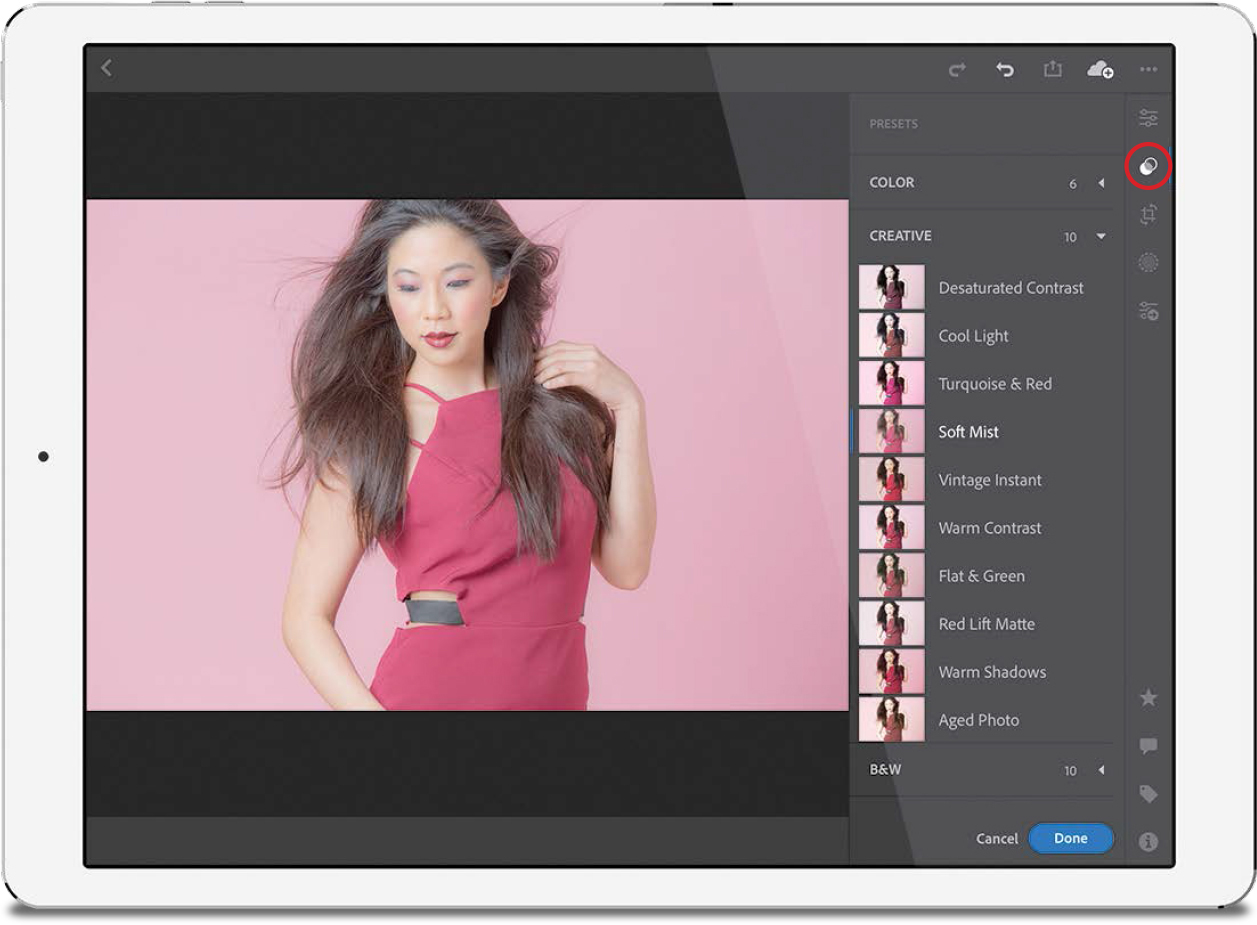
Step Two:
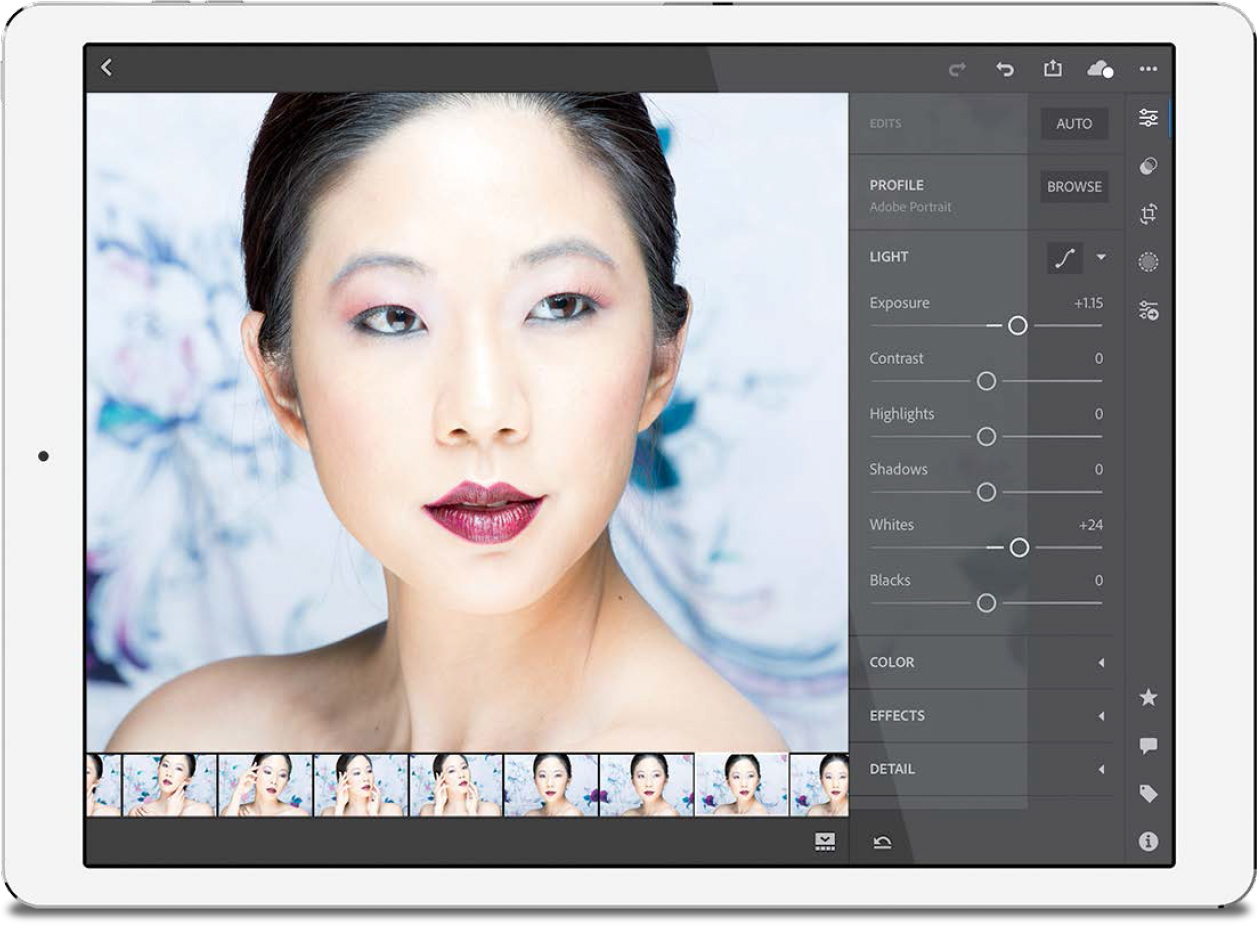
The color and creative profiles (see Chapters 5 and 7) are all here in Lightroom mobile. Tap the Browse button (its icon looks like three photos stacked on one another), and the Profiles browser pops out. As in Lightroom desktop, these thumbnails give you a preview of your image with each look applied. There is no live preview for your image, though—tap to see one applied. If you don’t like the look, tap on a different profile. If you don’t like any of them, tap the curved left-facing arrow at the top right of the screen or the little X at the top right of the browser (the checkmark at the bottom is the “done” button). To change to a different set of profiles, tap on a different set or tap the menu at the top of the browser where you can choose the same ones from Lightroom desktop. An Amount slider appears below your image for those profiles that allow you to adjust the amount of the effect.

Step Three:
In the Edits panel, Adobe rearranged the sliders in each section, so they make more sense together. Each section (or icon, if you’re using a phone) you tap on brings up another set of sliders. For example, tap on Light (or the icon that looks like the sun) and all the sliders that have to do with light (Exposure, Contrast, Highlights, Shadows, Whites, and Blacks) appear (as seen here). At the top of this section is a button for Curves. Just tap along the diagonal line to add a point to the Curve, then drag up to brighten, or down to darken the tones in that area. To remove a point from the Curve, double-tap on it.
Step Four:
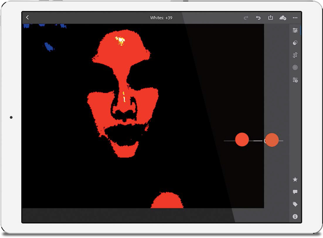
One of my favorite features from Lightroom desktop is here in mobile—it’s just kind of hidden—and that’s the ability to get a clipping warning if you’re blowing out your highlights. You can see this warning onscreen when adjusting the Exposure, Shadows, Highlights, Whites, and Blacks by just pressing two fingers anywhere on the slider you’re adjusting. The image will turn black and only display any areas that are clipping the highlights. Here, cranking up the Whites too much clipped her skin in just the Red channel, but clipped all three channels on her forehead, which is some pretty serious damage, and now I know to back down the Whites (or lower the Highlights) to avoid this clipping.
Step Five:
The vastly improved Auto tone button made its way over to mobile, as well (it’s at the top right of the Edits panel. On a phone, its icon looks like a photo with little sparkles on the top right). Just one tap on it and it either looks good or you’ll tap the Undo button up top to undo it (like, in this case, where it looks bad—well for beauty-style post-processing anyway).

TIP: There’s an Undo button
If you make a mistake, tap the curved left-facing arrow in the top right of the screen to undo your last step. Luckily, you can tap it again and again to keep undoing your last steps.
Step Six:
To change your white balance, tap on Color (its icon looks like a thermometer) and the Temp, Tint, Vibrance, and Saturation sliders appear. Near the top center of this section is a pop-up menu of White Balance presets (it’s a longer list if you shot in RAW; quite short if you shot in JPEG). The White Balance Selector tool that you know and love (see page 137) is also here (to the right of the WB pop-up menu)—tap on it and it brings up a loupe that you can drag over your image. The preview is live, so as you move it over your image, you’ll see how it affects the color as you drag-and-release. When you find an area where the white balance looks good, tap the checkmark on the loupe and it returns to base. To cancel, just tap the eyedropper icon again.

Step Seven:
While we’re still in the Color section, there’s a B&W button here to convert your image to black and white, but I would avoid this button because it creates a very flat black-and-white. Instead, use the B&W profiles in the Profile browser (seen in Step Two). To the right of the B&W button is an HSL Color Mix button that brings up the HSL sliders to adjust individual colors in your images. (Note: The Targeted Adjustment Tool, or “TAT” as it’s known, is here, too, once you tap the HSL Color Mix button. It’s at the top of the Color Mix section—tap on it to activate it, then tap-and-drag up/down over the area of color in your image you want to adjust.)

TIP: Resetting and Starting Over
If you really mess up and want to reset and start over from scratch, just tap the Reset icon (the downward-facing arrow with a line beneath it) beneath the panels. A pop-up menu will appear asking how much you want to reset: tap Adjustments for just the adjustments you’ve made; tapping All reverts you back to the original image; To Import takes it back to how it looked when you first opened the image in Lightroom mobile (so it undoes what you did here in mobile, but not stuff you did to it in Lightroom desktop); and To Open will reset it back to when you last opened it.
Step Eight:
The Effects section has sliders like Clarity, Dehaze, and Vignette Amount, and they work the same way they do in Lightroom desktop. There’s also a button here for adding color Split Tone effects (hey, shouldn’t that be in the Color section? [Insert sound effect of crickets here]). Tapping Detail (the triangle icon) will bring up the same Sharpening sliders you’re used to using in Lightroom desktop (as seen here), along with the Noise Reduction sliders. Nothing much to see here, folks. Move along.

Step Nine:
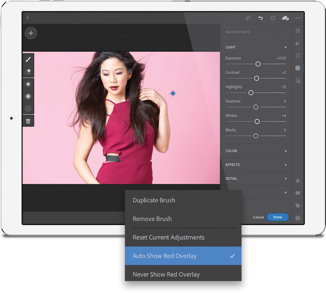
Besides all the sliders, three of the awesome adjustment brushes and filters made it over to mobile (the Adjustment Brush, the Graduated Filter, and the Radial Filter), and applying them with your finger is actually pretty great. Tap the round Selective Edits icon (the one with the dotted circle around it, shown circled here in red) and a big + (plus sign) icon appears in the top-left corner of the screen. Tap on it and the three adjustment tools appear. Tap on the one you want (we’ll tap on the Adjustment Brush here), and a menu pops out from the left center for brush size, feather (softness), and flow. Tap on one, and then drag up/down to change the setting.

TIP: Seeing a Before/After
To see what your image looked like before you started adjusting it, just tap-and-hold on it (you’ll see “Before” appear above the image).
Step 10:
Once you tap one of these tools on your image, you’ll then need to “Set Adjustments for Your Selection,” so tap the adjustment for what you want to do (Light, or Color, or Effects, and so on), then start painting with your finger to adjust that area (if you’re using the Graduated Filter, you can tap-and-drag down with your finger, or if you’re using the Radial Filter, you can just tap-and-drag outward to create your pool of light). A pin will appear where you first tapped, and if you tap-and-hold on that pin, a menu will appear with options, like for showing the mask as you paint, duplicating the brush edits, or removing the brush edit altogether. When you’re done with your adjustments, tap the Done button (or the checkmark icon, if you’re using a phone) to apply your edits, or tap Cancel (or the small “X”) to cancel your selective edits.
Step 11:
Tapping the Presets icon (the two over-lapping circles) gives you access to a ton of Develop module presets, and each one has a tiny preview beside it. These presets are literally just one-tap effects—tap one and it applies a look. If you like the look, tap the Done button (or checkmark icon)—boom—done! There are seven sections of presets—Color, Creative, B&W, Curve, Grain, Sharpening, and Vignetting—and all you have to do is tap on any one, then tap the Done button to apply it. Of course, once we apply a preset, we can still make adjustments with our sliders (Exposure, Contrast, etc.). Note: Currently, you cannot import custom presets you bought or created in Lightroom desktop into Lightroom mobile. Don’t shoot the messenger.
Step 12:
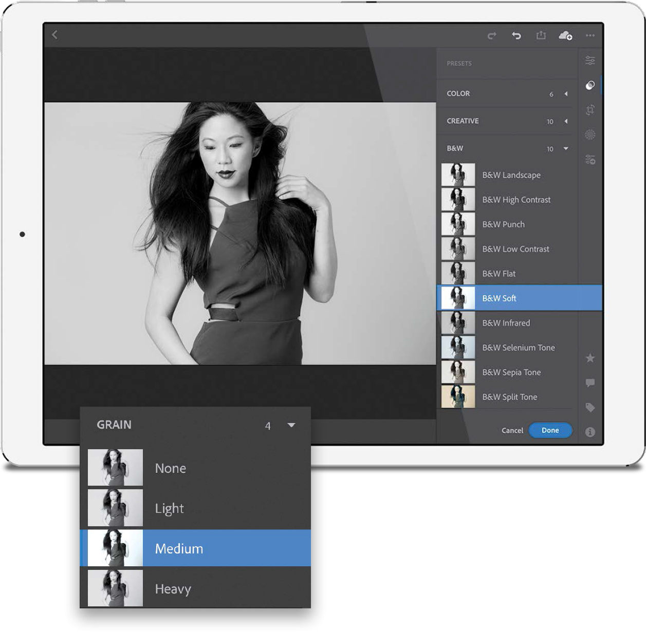
In some cases you can “stack” presets— having one add its effect on top of another—and a great place to see this in action is when you use presets that add things like vignette looks (darkening the outside edges of your image) or noise (grain), or apply Curve adjustments. The reason these add on is that most of them don’t use the Split Tone sliders or the Color Mix sliders or any other options that might get changed by applying another preset. For example, if you apply a B&W preset, then apply a Color preset, the color overrides the black and white and changes the image back to color. But, adding noise (grain) or a vignette adds on to the look you applied with the first preset because it doesn’t use any of the same sliders. Here, I started by applying the B&W preset, B&W Soft. Then, in the overlay, I tapped on the Grain presets and added Medium to enhance the grainy film look.
Step 13:
One of the most powerful time savers from Lightroom desktop is here, too: the Apply Previous button. It takes the adjustments you made to the previous image and applies them to the current image with one tap (super handy and fast!). To use it, tweak a photo the way you like it, then bring up the Filmstrip, swipe to the image you want to apply this look to, and tap on it. Now, in the Edit panel, tap on the Previous icon (it looks like three sliders with a right-facing arrow) and a pop-up menu appears (seen here), asking if you want just the basic tonal edits you applied, or everything you did to the previous photo, including cropping, rotating, etc. Make your choice and the edits are applied immediately.

Step 14:
There’s one more way to get edits from one image applied to another (or a bunch of other images): you can literally copy-and-paste the edits you’ve made. Once you’ve applied the edits you want to copy, tap the three dots in the top right and, from the pop-up menu that appears, choose Copy Settings. Turn on/off the settings you want to copy in the Copy Settings dialog, and tap OK. Now find an image where you want to apply those same settings, tap the three dots again and, from the pop-up menu, choose Paste Settings. That’s all there is to it. You can paste those settings to as many images as you’d like.

Step 15:
If you have an image with lens issues, you can apply a lens correction profile by tapping on Optics (the lens icon) and then turning on Enable Lens Corrections. It will choose a built-in lens profile for your particular lens make and model (if one is available, of course). If it doesn’t find one, well…you’re out of luck. Well, I guess not entirely—you could go on to the next step.

Step 16:
Tap on Geometry (its icon looks like…well…geometry), and you’ll find the Upright features, which are automated one-tap fixes for common lens problems (like buildings leaning back, or not being horizontally centered in your image). Upright will even fix a crooked image for you. You’ll see the manual sliders in this panel (Distortion, Vertical, Horizontal, Rotate, and Aspect, just like in Lightroom desktop), but at the top, to the right of Upright, you’ll see “Off.” Tap this to bring up the Upright menu (Auto, Level, Vertical, etc. See page 252 for more on the Upright features). Also in this menu is Guided, which lets you tap-and-draw out lines along parts of your image that are supposed to be straight (for more on Guided Upright see page 256). This feature works really well on mobile devices—it feels more natural than on your desktop. You can draw out up to four lines. If you don’t like the results, just tap the trash icon. If you’re happy with the results, tap the Done button. Easy as that. There’s also a Constrain Crop button near the top of the panel that auto crops away white gaps that may be created when applying either Upright or Guided Upright (I usually leave this turned on. It’s a big timesaver most of the time).

If there’s one thing that really translated well on a mobile device, it’s cropping and I gotta tell you, I’m not sure if I don’t like this better here, than in Lightroom desktop. It really feels quick and intuitive, and you can pretty much do all of the same stuff you do on your computer. But, somehow, it seems smoother and easier here. In short, you’ll dig it.
Step One:
If you need to crop your image, just tap on the Crop tool icon. You’ll know it’s active because it puts a cropping border around your entire image (as seen here), and the Crop and Rotate panel pops out (or if you’re using your phone, a row of icons appears along the bottom, or the side, depending on if you have your phone tall or turned sideways). Here, you’ll find all the different cropping options from Lightroom desktop.

Step Two:
To apply any of the preset cropping ratios (1x1 Square, 4x3, 16x9, and so on), just tap on the Aspect pop-up menu (or on the icon with the stacked rectangles, if you’re using your phone), then tap any preset and your image is cropped to that ratio. Here, I tapped on 16x9 and the cropping border updated to the new ratio. The areas that will be cropped away are still visible, but they’re shown in dark gray (you can see here a horizontal strip would be cropped off along the top and bottom if I were to go with this cropping ratio). Now that you’ve applied a crop, you can reposition your image within that cropping border by just tapping-and-dragging the image right where you want it.

TIP: Resetting the Crop
To return to the original uncropped image, just double-tap anywhere within the cropping border.
Step Three:
Besides just cropping ratios, there’s a Locked icon, which gives you a free aspect option. This means you’re not constrained to any preset ratio, so once you tap on it to unlock it, you can tap on any corner or side of the cropping border and drag just that part right where you want, without affecting the other three sides (it’s like clicking on the Unlock icon for the Crop Overlay tool in Lightroom desktop). Here, I tapped on it to unlock it, and then just tapped-and-dragged each side of the cropping border right where I wanted them. In the Rotate & Flip Image section, if you tap the Flip H icon (the one with the two horizontal triangles), it flips your image horizontally (like I did here—her arm is now on the right side of the image), and of course, tapping the Flip V icon (the one with the two vertical triangles) flips your image upside down.

TIP: Changing the Crop Overlay
When you choose the Crop tool, you can have it temporarily display a Rule of Thirds overlay grid by just two-finger tapping within the cropping border.
Step Four:
If you want to rotate your image within the cropping border, just tap-and-hold outside the cropping border and drag up/down and the image will rotate within the cropping border (so you’re rotating the image, not the border). Here, I tapped-and-dragged outside the border and rotated her a little to the left.

TIP: Flipping the Crop to Tall
By default, a crop is applied wide (landscape), but if you want to flip it to the same ratio, but tall (portrait), tap the icon with the rectangle and upward- (or downward-) facing arrow in the Aspect section (or in the top-left corner), and it flips to a tall crop.
When you sync albums (collections) from Lightroom desktop, of course they are synced to your phone and/or your tablet, but those same albums also appear on a special, private website (that only you have access to). The advantage of having “Lightroom Web” is that you can use it to share your albums with any individual (or the public on social media, if you choose), and it has lots of interesting options and features wrapped around it.
Step One:
While this is an extension of Lightroom mobile (because it’s based on syncing one or more albums [collections] from your desktop), you actually don’t access this feature through mobile—you access it from a web browser on your desktop (well, I guess you could technically launch a browser on your phone or tablet and see it there, but you already have access to those albums on your mobile device). To see your synced albums, in Lightroom desktop, go under the Help menu and choose View Your Synced Collection on the Web (as shown here). If you don’t see that option under the Help menu, just go to http://lightroom.adobe.com.

Step Two:
That launches your web browser and takes you to Lightroom Web (your images are password protected, so you might need to sign in with your Adobe ID and password). Here, you’ll see all your synced albums right on the web. So, what’s the advantage of having them here? Sharing! It makes sharing your albums with any-one really easy. For example, let’s say you shot a high school football game and you wanted to share the images with the other parents. You could share that album individually (by emailing or texting the parents), or publicly (by sharing the album directly to Facebook, Twitter, or Google+).

Step Three:
To share any album, click on it and then click on Share near the top of the page (as shown here). This brings up a window asking if you want to Share This Album or Create a New Share (which is a page where you add text and tell a story with your photos). For now, just choose Share This Album. That brings up another window, letting you know it’s private, blah, blah, blah, so just click the Share This Album button.

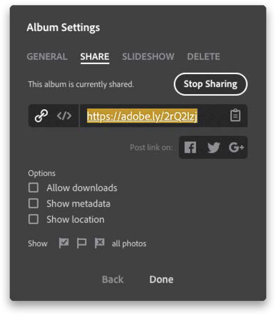
Step Four:
This brings up the Album Settings window. There are four tabs here, but by default, the Share tab will be visible because that’s the one you’ll use the most. In this tab, it shows you the web address where this album is posted. Click on the clipboard icon to the right of that web address to copy it into memory, so you can email or text this address to a friend or client. If you want to share it publicly, click the Facebook, Twitter, or Google+ icon. Below that are some options for this posted album: you can allow downloads (if you shot that football game, this would allow other parents to download low-resolution photos of their kids); turning on Show Metadata would include your f-stop, shutter speed, camera info, etc., for each image; and turning on Show Location would share any embedded GPS added by your camera. If you only want to show the Picks, unflagged images, or Rejects in this album, click on the flag option (I’m interested in finding the photographer who wants to share their Rejects. They’d make a great Oprah guest).
Step Five:
When someone types that web address into their browser, they’ll see what you see here on the right. They can click on any image to see it larger, they can scroll through the images using the arrow keys on their keyboard, and they can hit the Play icon in the top-right corner to see a slide show, complete with transitions (you can choose your slide show options in the Slideshow tab in that Album Settings window seen back in Step Four). When they’re viewing a larger image (as seen in the next step), they can see any metadata or GPS info by clicking on the little “i” icon on the right side of the page, and a panel will slide out with those details. That’s pretty much all they can do—they can view your images in any web browser, but that might be enough.

Step Six:
If you want the person/client you shared this album with to be able to choose their favorite images or even leave comments to you about a particular shot, then they’ll need an Adobe user account (with a user ID and password). Luckily, they are free, so they could just sign up for one. But, what I do is create an account for my clients (just one generic account—like access@KelbyPhoto.com—with a simple password—like “client”). This isn’t banking info, so simpler is better, and they’ll only see the shoot I’m sharing at that web address, so they can all use the same user ID and password. Now they can log in, and if they see an image they like, they can click the heart icon, and if they want to leave a comment, they can click the comment icon (both in the bottom left), and their comments will appear right within Lightroom desktop.

Step Seven:
When the person you shared your album with marks a photo as a favorite or leaves you a comment, Lightroom lets you know by adding a yellow comment icon to your collection in Lightroom desktop (you’ll also see it as a thumbnail badge, like the one shown circled here). To see their written comments (or even respond back), go to the Comments panel at the bottom of the Library module’s right side Panels area (as seen here).

TIP: Editing Images in Web
If you want to make edits to your images while you’re in Lightroom Web, no problem—the Basic panel adjustments are available right online. Just click on a photo to select it, then tap on the Edit This Photo button in the top-left corner, and the Edit sliders pop-out from the right side.
Step Eight:
If, instead of just sharing an album, you want to use that Create a New Share feature (so you can add text and do some storytelling, like sharing your vacation photo story with friends and family), then back in the Share Options window, click on Create a New Share, give your story a title, and choose a cover photo. Luckily, Adobe has done a great job of putting buttons where you can add text, so you’ll have no trouble with that part, but one thing that is kind of hidden is how to create a divider between photos, so you can separate them and add more text. You have to hold your cursor between two images and a break appears, like the images are opening a door to a little + (plus sign; as shown here). Click on it, and it creates a separation at that point, and a new text block button appears, so you can add text. When you’re done formatting your story, the share link is already visible in the top-left corner of the page, ready for you to text, email, or post to social media.

I think this is one of the coolest features of Lightroom mobile, and it really impresses clients because the technology here is really pretty cool. We’re going to set things up so that, during a live shoot, we can hand our client our tablet and not only can they see the images coming in live as we shoot, they can make their own Picks, comments, and even share the link with someone at a different location, so they can be part of the shoot, and the approval process, too!
Step One:
You’re going to need to shoot tethered, so when you take a shot with your camera, it goes directly into Lightroom desktop (well, in this case, it’s going to my laptop, but you know what I mean. See Chapter 3 for how to set up to shoot tethered). Here’s a behind-the-scenes shot from a fashion shoot, and as I shoot the images, they come straight into Lightroom Classic on my laptop. I want to be able to hand my client my iPad (or Android tablet) and let them see the images from the shoot on that iPad as I take them, but I also want control over which images my client sees (more on why in a moment).

Step Two:
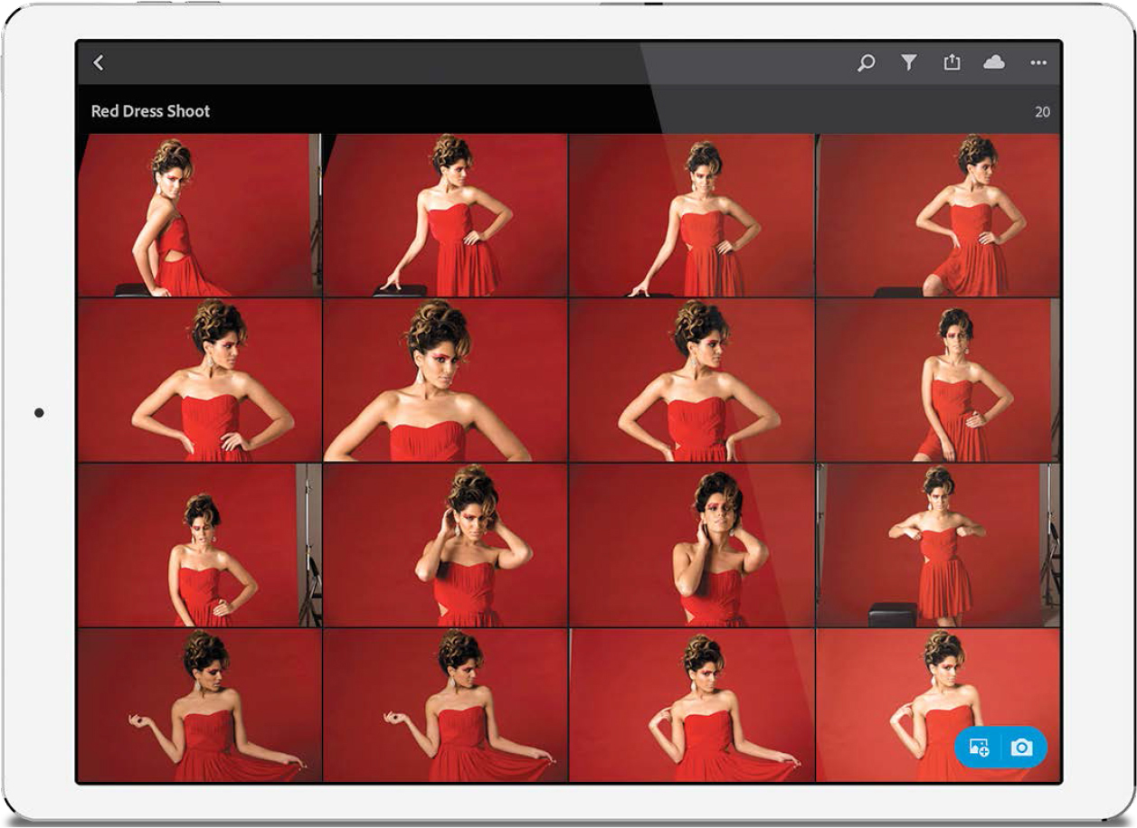
First, create a new collection in Lightroom desktop/laptop, and when the Create Collection dialog appears, give it a name (I named mine “Red Dress Shoot”), then turn on the Set as Target Collection checkbox (a very important checkbox for this all to work). Also, turn on the Sync with Lightroom CC checkbox (also very important). What that “target collection” stuff means is this: any time I see a photo from this live shoot that I want my client to see on the iPad they’re holding, I press the letter B on my keyboard. That takes the photo and adds it to that collection (my target collection). I only want my client to see my best shots—not the ones where my subject’s eyes are closed, or the flash didn’t fire, or my timing was off—so I only tap the B key when I see a good shot.

Step Three:
Now that everything’s set up and ready to go, I launch Lightroom CC (mobile) on my iPad and there’s my newly synced collection (well, it’s an “album” in Lightroom mobile on my iPad). I tap on that album and hand it to my client, or art director (or friend, assistant, guest, etc.), who is there on the set, well behind the position where I’m shooting from (most photographers don’t like someone looking over their shoulder when they’re trying to shoot).
Step Four:
Now I start the shoot, and when I see a shot a like (one I want the client to see), I simply reach over and tap the letter B on my laptop. That image now goes to that targeted collection on my laptop, is synced to the iPad my client is holding, and right there in Lightroom mobile they see the shot. I let my client (friend, family member, etc.) know that if they like the shot, they can tap the Pick flag at the bottom of the screen. Now, if for any reason, you’re uncomfortable with handing your client your iPad/tablet, or if you don’t have one yet, then instead you’ll use Lightroom Web (see page 426), share that synced album, and just text them the album’s web address (the one you targeted), and it will work pretty much the same way, but they’ll see the images in their web browser, rather than on your iPad. Also, they will use the heart icon to mark their favorites, instead of a Pick flag. They can also leave comments, if they have (or you give them) an Adobe user ID and password (mentioned on page 428). The cool thing about doing it this way is that they can now share that web address with other people (maybe folks back in their office), so they can watch the shoot live, too, right from their web browser. How cool is that?!

As a country, as a world, we can’t agree on many things these days, but one thing we all can agree on, regardless of our background, is that having to do keywording stinks (and, of course, I wanted to use a stronger term, but you get the gist). Anyway, Adobe knows you hate keywording and that’s why you’ll love their keywording-free, magical-unicorn-style search feature, which lets you search by describing what you’re looking for, like “cars,” “guitars,” “pizza,” or “the kids,” and so on. It’s another feature powered by Adobe Sensei, and the weird thing is, for the most part, it works pretty darn well.
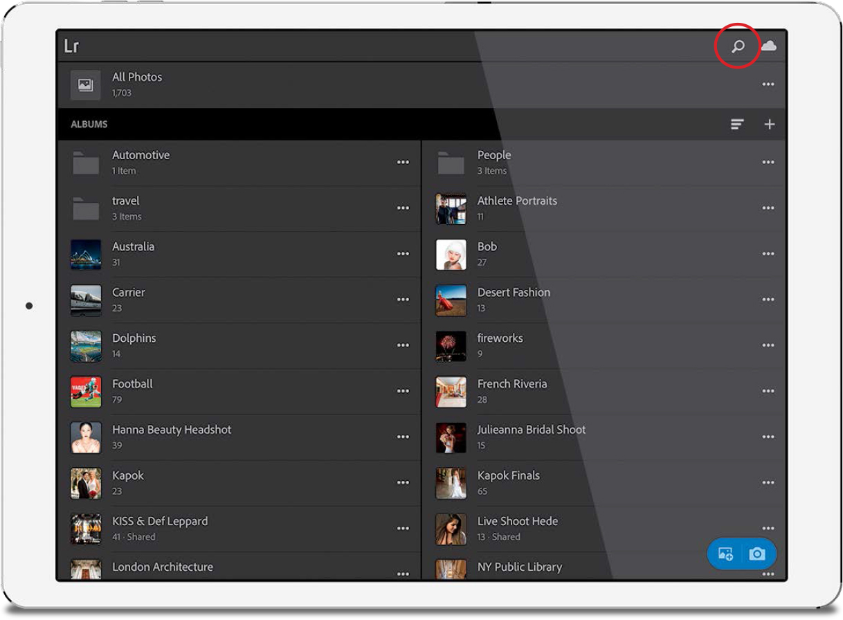
Step One:
In Albums view, tap on the magnifying glass icon (shown circled here) up in the top-right corner to bring up the Sensei-powered search field. You’ll type in a description of what you’re looking for and it will use its artificial intelligence to visually search for images that contain that object (no keywording necessary).
TIP: Safe In-Person Sharing
If you want to hand someone your mobile device, so they can see your images, but without accidentally adding or changing anything (Pick flags, star ratings, edit sliders, etc.), before you hand them your device, turn on Present mode—it disables all that stuff, so you don’t have to worry about them accidentally changing anything. Tap the three dots (…) in the top-right corner, then tap on Present in the pop-up menu. When they hand your mobile device back to you, just tap the X in the upper-left corner to exit Present mode.
Step Two:
In this case, I wanted to find all my football images, so I typed “football” in the search field, then tapped the Search button on the keyboard. In literally just a second or two it displayed all my images that visually matched that search term, as seen here where it found a bunch of football photos, all from different albums.

Step Three:
Once your results appear (and they will appear almost immediately), you have a few sorting options. Tap the three dots in the top-right corner and in the menu that pops-up, you’ll see that, by default, it sorts by relevancy. Tap on Sort by Relevancy to bring up the other Sort options. If you choose to sort by Capture Date (as I did here), it puts your most-recent images at the top. To reverse the order (and see the oldest shots appearing first), tap the icon to the right of Capture Date (the three lines with the down-facing arrow).

TIP: Save RAW Photos Taken with Lightroom Mobile’s Camera App to Your Camera Roll
By default, RAW photos taken with Lightroom mobile’s built-in camera app go directly into Lightroom mobile, not into your cell phone’s Camera Roll (or Gallery). But, if you want to save one of those RAW images to your Camera Roll (apparently, a lot of folks want to do this), here’s how: Tap on the image you want to save to your Camera Roll, then tap on the Share icon up top. In the pop-up menu, tap on Export Original, then tap on Camera Roll (or Gallery) and the RAW image will be saved to your Camera Roll. Easy as that.
Step Four:
When you start a search from Album view (where all your collections…er… I mean “albums” appear), by default, the Sensei find feature searches through all the images you have in Lightroom mobile. However, if you just wanted to search within a particular album, first tap on that album to display its contents (as I did here), then tap on the magnifying glass icon up top. Now, type in your search term (in this case, I typed in “bouquet”) and the results that appear (shown in the inset) display the only two shots in this album where you can see a bouquet.

I mentioned at the beginning of this chapter that Lightroom mobile has a pretty killer built-in camera feature, and once you start using it, you won’t be able to go back to the regular camera app that comes with your phone. Here’s how to unlock all those features that take it over-the-top when it comes to usability and results.
Step One:
If you’re in Albums view, or if you’re in an album, you’ll see a blue pill-shaped button in the bottom-right corner of the screen. Tap the camera icon on the right side of that button to bring up Lightroom mobile’s camera. If you click on the camera button when you’re in an album, the images you shoot with the camera will appear in that album. Otherwise, they will appear in All Photos at the top of Album view.
Step Two:
When the camera appears, it’s in Automatic mode, by default, which works like the camera app on your phone (boooo!)—it makes all the exposure decisions for you; you just point-and-shoot (snore). However, if you want full control over the white balance, ISO, shutter speed, and aperture, individually, like you would on a DSLR or mirrorless camera, tap on Auto just below the shutter button and a menu will pop-up with different choices, including High Dynamic Range (more on this in a moment), but for now just choose Professional mode (as shown here).

Step Three:
All the Pro adjustment icons will now appear to the left of the shutter button (as seen here). Tap on any one of them and a slider will appear (or icons if you choose White Balance). Also, by default, your camera will be shooting in JPEG format, but if your camera can shoot in RAW format (like the iPhone 6 and up, and many high-end Android phones), just tap on JPG on the left side of the screen and the File Format options will appear (as shown here). Just tap on the button to toggle over to shoot in DNG (Adobe’s RAW image format).

Step Four:
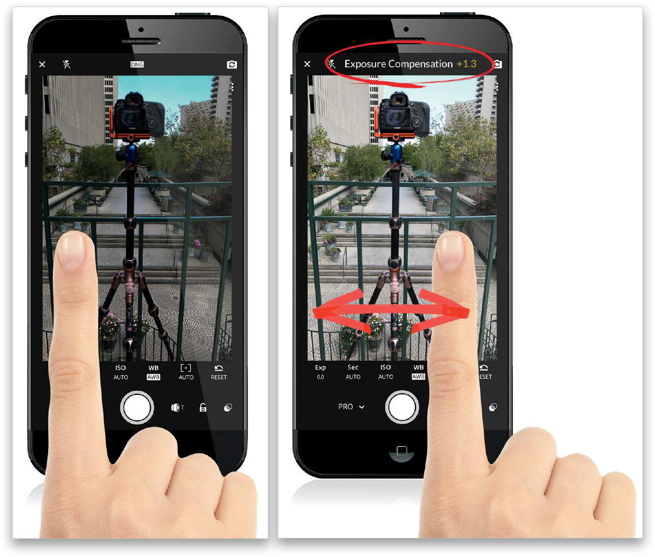
When it comes to focusing, it works pretty much like every other camera—you tap-and-hold on the thing you want in-focus and a square focus area box appears. If you want to adjust the exposure (using Exposure Compensation), you can do that easily by tapping-and-dragging left (to darken the exposure) or to the right to brighten it (as seen here). It’s quick and easy, and it shows you (in stops) how much Exposure Compensation has been applied by your swiping.
Step Five:
The three icons above (or to the right of, if you’re holding your phone vertically) the shutter button give you (from top to bottom/right to left): live shooting effects (more on this in a moment); an Exposure Lock feature (just tap on the lock icon to lock your exposure, as you recompose your image); and a way to toggle between wide angle and telephoto (if you have a phone that has this two-lens feature built-in, like on an iPhone with two lenses). The live shooting effects feature is cooler than it sounds, because it lets you see and apply a preset effect before you even take the shot. So, you can see, before you even tap the shutter button, if a particular image would look good as a black and white, or with a contrast effect, or creative look applied. When you tap on this option (its icon [circled here] looks like two circles overlapping), a row of live effects appear at the bottom of your image preview area. Tap on one to apply it to your image before you shoot. Note: These are non-destructive, so if after you take the shot you change your mind, you can reset the image to the normal look without an effect.

Step Six:
If you tap the three dots in the top left (or top right) of the screen, additional options pop out from the side (or down from the top): Tap on the gear icon for some capture setting preferences for the camera app. The triangle icon turns on/off the Highlight Clipping warning (clipped highlight areas appear with a moving zebra pattern over them). Tap on the grid icon for Grid & Level overlay options (seen here) or to turn on auto level (with haptic feedback on newer iPhones). There’s also a self-timer icon, and the last icon lets you choose the aspect ratio of images taken with the camera.

Step Seven:
At the bottom left (or at the top left) is an icon for turning on/off your built-in flash. Just tap on it and the menu you see here pops up. You can choose Auto mode (it senses low-light situations and turns itself on automatically), On (the flash always stays on regardless of the lighting situation), or Off. For the sake of your photography’s quality, the right answer is always “Off.” (Yes, really.) If you want to take a selfie, there’s a camera icon with a circular arrow in the top-left (or top-right) corner and tapping that switches you to the back camera, so you can take your selfie.

Step Eight:
One of my personal favorite features is the built-in HDR mode, which uses the same technology as Lightroom Classic, so you can capture a wider tonal range in situations where you need it. Take, for example, this image I took inside a restaurant. With my Lightroom mobile camera set to Pro mode (seen at the top here), the detail in the textured/glazed glass is gone, and the highlights are blown out so much you can’t even make out anything outside the windows. When I switch it to shoot in HDR mode instead, look at the difference (seen here below)—you can see the patio outside, and the texture/glaze in the glass. Even look at the lamp on the table—the detail is back there, too, and the shadow areas are brighter where the champagne bottles are on the far right. It captured a much wider range of tones by combining multiple exposures into one image automatically.

Okay, now that you’ve learned how to use Lightroom mobile, I wanted to give you a quick look at the desktop version of the mobile app, called “Lightroom CC,” which has the same limited number of features, it uses nearly the same layout (no modules—everything’s in one place), and even uses albums and folders, just like Lightroom mobile. Lightroom CC on the desktop is the cloud-storage-based version of Lightroom that I mentioned back in the book’s introduction (on page xii). Here are the basics:
Step One:
Importing in Lightroom CC on the desktop is the one area that’s somewhat different than Lightroom mobile. This is about as simple as it gets because there are hardly any decisions to make here. You don’t have to choose where to store your images—they ‘re going to Adobe’s cloud storage (there really are barely any options here, well at least compared to Lightroom Classic’s Import window). In fact, the only two things you can do here are either uncheck any photos you don’t want imported or choose which existing album to add your images into (at the top center, click on Add to Album). You can choose to put them into a new album (as shown here) and that just brings up a naming dialog. That’s pretty much it.

Step Two:
This window should look familiar, because it’s pretty much the same as Lightroom mobile’s main screen, with your folders and albums on the left side, and if you click on an album it shows you the images inside it, just like mobile. At the bottom center are your Pick flags and star ratings. Below the bottom left of your thumbnails, you can choose your different views and sorting options. There’s also a Search bar at the top that uses the same Sensei searching that mobile uses.

Step Three:
Just like on mobile, the tools are along the right side—click on one of those icons (here, I clicked on the Edit icon) and your panels pop out. These are the same ones that are in mobile, in the same order, in the same groupings, and they do exactly the same thing (as you can guess). It’s literally the same stuff (and it works exactly like the sliders and controls that you learned about in this chapter and in the Develop chapter, starting on page 127). The difference is you tap on the screen in mobile, and you click with a mouse in Lightroom CC on your desktop. Take a look at the iPad version in the inset shown here. It’s the same app, with some minor user-interface changes to accommodate a mobile touch screen.

TIP: Don’t Use Classic and CC
Adobe recommends using either Lightroom Classic or Lightroom CC—not both at the same time. One reason is if you use Lightroom CC, and then use the mobile app with it, those changes won’t sync back to Lightroom Classic, only to Lightrom CC, and confusion will reign as things are out of sync. So, just stick with Classic, and then Lightroom mobile will keep your collections in sync with no issues.
Step Four:
In case you were wondering, yes the Adobe color, camera, B&W, and creative profiles are all here, as well (they’re in everything now—in Classic, CC, and mobile). Here, I clicked on one of the B&W profiles to convert my color image to black and white. There are no other modules to choose in Lightroom CC (no Map module, no Print module—in fact, there’s just no printing at all—no Slideshow, no Web, no Book module, among lots of other things). Over time, it will get more features, but at this point, it’s just what’s in the mobile app (with a limited feature set), in a desktop version.
