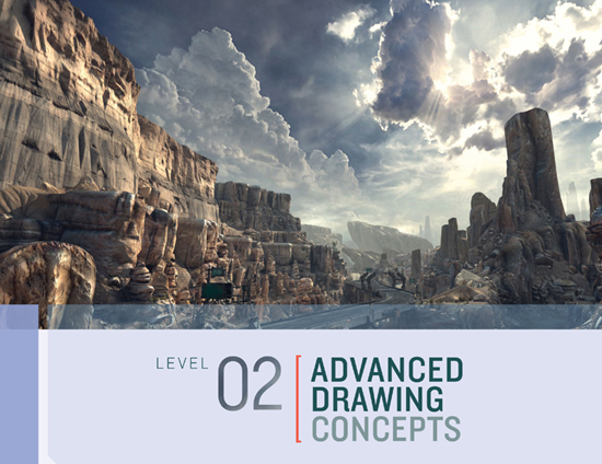

RAGE
IN LEVEL 1 WE COVERED THE FUNDAMENTALS of drawing through exercises that gave us confidence in pencil strokes, light, and perspective. We also learned about the correct process of observation and drawing, which requires focus and self-discipline but also makes drawing accurate and easier. In Level 2 we will explore more advanced concepts for volumes and lighting that will wrap up all the tools and techniques you’ll need to tackle any subject. This section primarily focuses on landscape drawing, but you’ll see that all objects, including human figures, can be reduced to a common set of basic shapes and volumes. While you can learn the techniques of landscape drawing through these exercises, I recommend that you take your sketchbook and pencils outdoors and have a go at drawing the real thing as well.

Having a command of drawing spheres in perspective is essential in both landscape and figure drawing because you almost never see perfect circular forms in nature. Circular shapes are usually distorted to look like ovals due to the effect of foreshortening. The exercise on this page is an extension of the process we used to find the midpoint of a box’s plane (this page) and will allow you to draw circles with a convincing sense of depth.
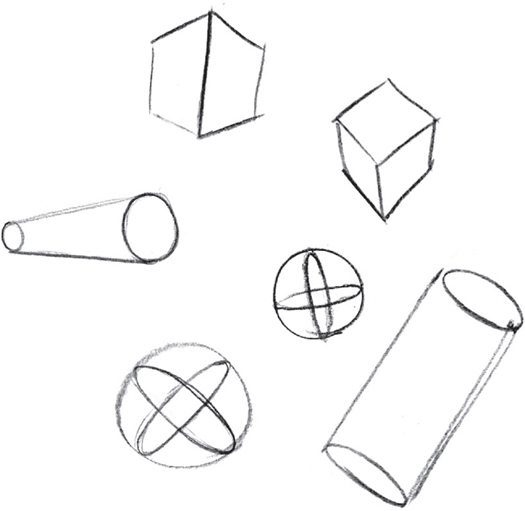
FREEHAND VOLUMES In this section, you will amass the skills to draw a range of basic volumes, including the box form, sphere, and cylinder. Continue to practice drawing these volumes freehand from various angles until the process becomes instinctive.

Clockwise from top: Big Daddy (BioShock), Sackboy/Sackgirl (Little Big Planet); character from Journey (BioShock artwork courtesy of Irrational Games)
Some of the video game industry’s most iconic and memorable characters are modifications of the volumes you’ve been practicing. Make pencil studies of each character above, using only the box, sphere, cylinder, and pyramid volumes in various combinations. You may wish to search for alternative views of these characters to get a better understanding of their volumetric concept. Once you know a character’s volumetric concept, you’ll be able to redraw it from any angle with ease using the perspective techniques that we explored in Level 1. (photo credit 2.1)

We looked at the way lighting describes form in Basic Lighting and Values. When we draw from life there are more varieties of volumes and lighting conditions to consider, which require more advanced concepts.

The two cylinders in the above left illustration demonstrate the difference between shadow on a form and cast shadow. The shadow on the upright cylinder (A) shows its form as the surface slowly turns away from the imaginary light source, nicely modeling its shape. This same form also casts a shadow (B) by preventing some of the light from reaching the horizontal cylinder in the background. This is called a cast shadow.
Cast shadows help to communicate spatial relationships between objects, as demonstrated by situation (C). Without the cast shadow connecting the two cylinders we cannot determine the relative proportions of these objects or whether they sit on the same plane.
Cast shadows were not discussed in Level 1 because they often have the effect of visually confusing the modeling of forms or flattening the sensation of form altogether. One of our primary goals is to create the illusion of depth, so cast shadows should therefore be used judiciously. Notice how the cast shadow of the foreground cylinder (D) has eliminated the form shadow of the middle cylinder and, hence, the illusion of depth. The Old Masters were very careful in using cast shadow for this reason, often subduing or removing them altogether to maintain a strong sense of depth.

THE FIVE-VALUE SCALE From right to left: (0) white of the paper or light, (1) highlight, (2) middle values, (3) core shadow, and (4) cast shadow.
While a two-value scale was sufficient for modeling simple box forms, you must expand the scale to render more complex, rounded forms as well as cast shadows. Artists traditionally use a scale composed of ten values, the lightest value being the white of the drawing surface, but a five-value scale is, in fact, sufficient for all your needs and reduces the number of elements to consider while drawing. A five-value scale may seem limiting, but it is really only a conceptual simplification. More subtle variations of values will appear naturally once you begin drawing and blending values together in subsequent exercises.
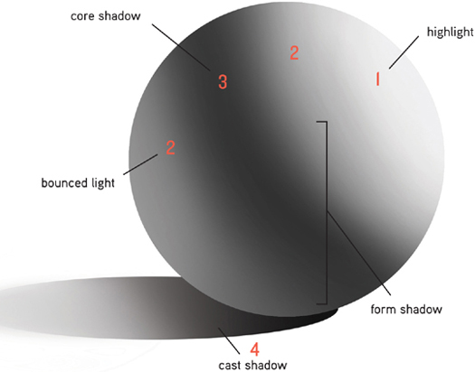
FIVE-VALUE SCALE This illustration demonstrates how a five-value scale is used to model a spherical form. The shadows are ordered in a 1-2-3-2-4 value system in which values 1 to 3 represent form shadow and 4, the cast shadow.
The darkest value on the form, known as the core shadow or terminator is located at 90 degrees from the light source, where light and shadow planes meet. The reason the middle and not the furthest point from the light is darkest is because the away-facing planes receive bounced light from the environment, such as a table surface.
Characteristic of the cast shadow (4) is that it’s always one value darker than the core shadow (3). Cast shadow edges are generally harder than those of the form shadow.
The cast shadow becomes lighter and its edges softer as it falls away from the shadow-casting object. This happens because the further away a cast shadow is from the shadow-casting object, the more light it receives from the surrounding environment and ambient light sources.

BOUNCED LIGHT The danger of disregarding bounced light is that forms appear flatter without it, as in the above example. According to the lighting situation in this scene, the left side of the sphere is missing the bounced light that is vital to creating the illusion of a form turning in space.
Bounced light is a detail often lost in photo references, as the values are usually too subtle for cameras to capture. So be careful when studying photographs, making sure to suggest bounced light in your drawing even if none is visible in your photo reference.
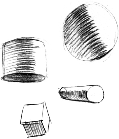
HATCH LINES Every pencil stroke should be as descriptive as possible when shading forms per the five-value system. Straight lines best describe the angle and orientation of flat planes, as in a box form. Rounded hatch lines better describe rounded forms. The sense of form is destroyed if you use straight lines to describe a spherical form and vice versa.
Keep perspective in mind when deciding on which way to curve or angle your hatch lines. For instance, if you’re looking up at a cylindrical object, the hatch lines should curve downward to reinforce the illusion of perspective.
We can also see the difference between soft and hard edges in the transition between light and shadow. The speed of transition reflects whether the form is spherical, in which case the transition is soft and gradual. If the transition is sudden, the edge is described with a sharp transition (often referred to as a plane break) between light and shadow.
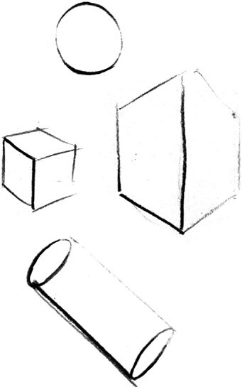
CONTOUR LIGHTING The five-value system can even be suggested with contours alone by varying the weight of the lines themselves. If the surface you’re describing is in light, the contour line should be light; if the surface is in shadow, the line should be thick and heavy. Resist the temptation to fully enclose objects with a solid, dark line—as is common with comic-book drawings—as this effectively flattens the form.
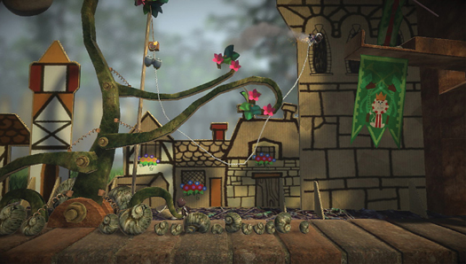
Little Big Planet 2
Cast shadows can also be used to suggest objects outside the visible frame. It’s not always clear what objects are casting the shadows in Little Big Planet 2, which creates the illusion that parts of the environment exist beyond the confines of the screen, encroaching into our reality and increasing our sense of immersion in the game.
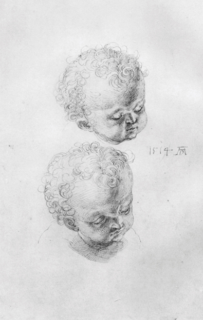
Study sheet with children’s heads by Albrecht Dürer
The Old Masters used the concept of basic volumes and light whenever they wanted to communicate form. The spherical volume that Dürer had in mind when drawing the head of this child could hardly be more explicit.
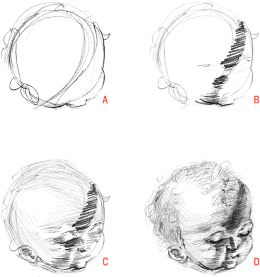
Do a quick study of Dürer’s drawing: Start with a circle (A), and refine it to suggest the contour of the head. The next step is to draw the core shadow (B). You can see how effective the core shadow is in creating the illusion of light and in describing the surface of the spherical form turning in space. You can finish the study by laying down a general layer of shading to map out the remaining form shadow (C) before adding details (D).
Notice how Dürer reduced details in the highlights to give a stronger sense of light. This effect is known as light bloom in computer graphics. In drawings it’s a tool to compensate for the limitations of traditional media in translating the range of values witnessed in reality.
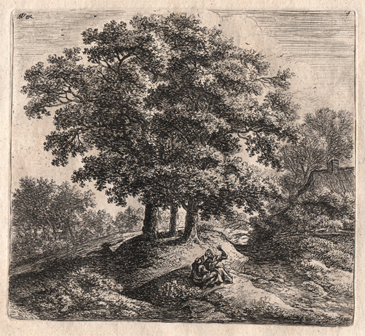
Man and a Woman on a Hummock (ca. 1688) by Antonie Waterloo (1609–1690)
Basic volumes modeled with core shadows and bounced light are so good at creating the illusion of depth and form that classical artists used them repeatedly as conceptual foundations for their subjects, even for objects that are not perceived as solid forms, like the trees in Waterloo’s etching. Though tree forms are largely composed of empty space defined by an external layer of leaves, Waterloo conceptualized the combined mass of the trees as one large spherical form and modeled it with light accordingly.
The etching is filled with intricate details that make this concept difficult to decipher until you squint at it to reduce light and shadow masses to simpler shapes that reveal the lighting concept of the artist.

Sketching on location is the first real test of how well you’ve grasped the various concepts covered so far in the book. There are literally millions of elements to distract you, not the least of which are the constantly shifting light and weather conditions. Outdoor drawing is the yardstick against which to measure your progress. If you remain focused on drawing the bigger, simpler forms under such changeable conditions, then you’re doing well. Given the short development time for most games, firsthand research is not always possible. By mastering the classical concepts of art landscapes, you’ll have a repertoire of real-life skills to apply to imaginary video game landscapes.
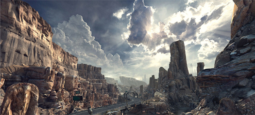
RAGE
One valuable experience of drawing outdoors is the sense of distance and depth you develop. Atmospheric perspective is a great tool to create this illusion of depth, and one much used by classical artists. The effect is caused by water vapor in the air, which creates a diminishing level of contrast and blurring of forms with distance.
The environments of RAGE perfectly demonstrate the concept of atmospheric perspective. Compare the furthest ridges with those in the foreground and notice how shadows become lighter with distance until the landscape and sky begin merging together. The background elements additionally have softer edges and fewer details than those in the foreground. You’ll also find this effect applied to classic figurative drawings, such as Michelangelo’s Study for the Battle of Cascina (this page), in which background forms are more lightly shaded than those in the foreground.
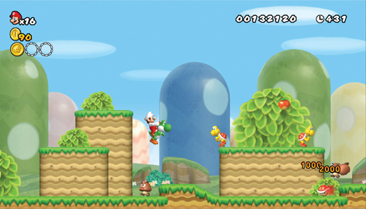
New Super Mario Bros.
New Super Mario Bros. has an abstracted version of atmospheric perspective, which works well for the style of the game. A sense of depth is created by T-intersections between overlapping objects, and by placing the darkest values and sharpest lines in the foreground, such as Mario’s hair and red overalls.

You’ve now garnered enough tools to tackle a more challenging landscape study. Landscape by Russian artist Alexei Savrasov offers an opportunity to practice drawing with the putty eraser in combination with the pencil.
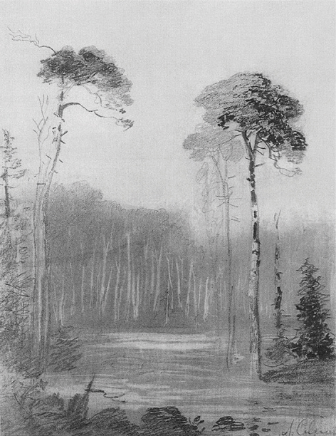
Landscape by Alexei Savrasov (1830–1897)
Throughout this drawing exercise keep in mind the tools you’ve learned to create the illusion of depth. So far you’ve worked on overlapping forms and T-intersections to describe the depth relationship between objects and have seen the effect that atmospheric perspective has on distant objects, diminishing the levels of contrast and softening forms.
In landscape drawing it’s useful to organize the scene into foreground, middle ground, and background elements. The foreground will feature the strongest contrasts, the sharpest edges, and the most details. Elements in the background will be lighter, softer, and relatively void of detail. With this in mind, the general order of drawing a landscape is from background to foreground.
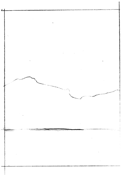
Begin your quick study by drawing the frame, matching the proportions of the original as accurately as you can. For the initial block in stage (described in Drawing Process) focus on outlining the biggest shapes first by indicating the horizon line and the top edge of the background trees to define the dominant break between light and shadow.
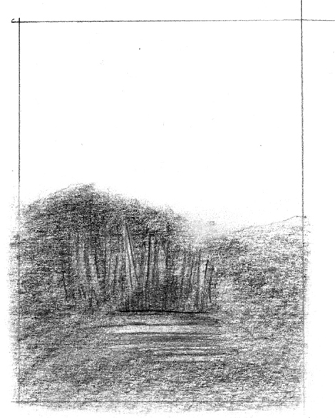
Continue concentrating on the biggest shapes by blocking in the lower half of the drawing with an even layer of shading. Savrasov would have likely smudged the lines with his finger or a paper blender to create a more even layer of value. The distant trees are “drawn” using the putty eraser kneaded into a blade-like shape.
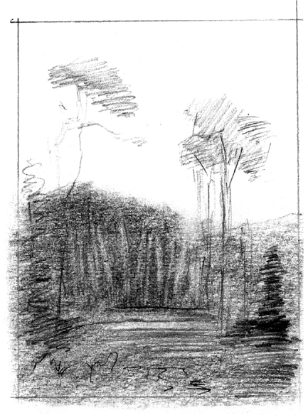
Having established the softer background elements, you can tackle the objects in the middle and foreground. Savrasov deliberately placed the trees on either side of the central avenue to align along imaginary guidelines that appear to converge toward a vanishing point. This has the useful effect of enforcing the illusion of depth. The repeating forms of the trees as they appear to get smaller with distance also communicate depth.
Your first pass over the middle and foreground should be fairly light, so you can easily make corrections and cut out the highlights before adding the darkest values.
Quickly mass in the branches of the trees and plants, paying closest attention to the texture of their contours, to suggest the internal forms.
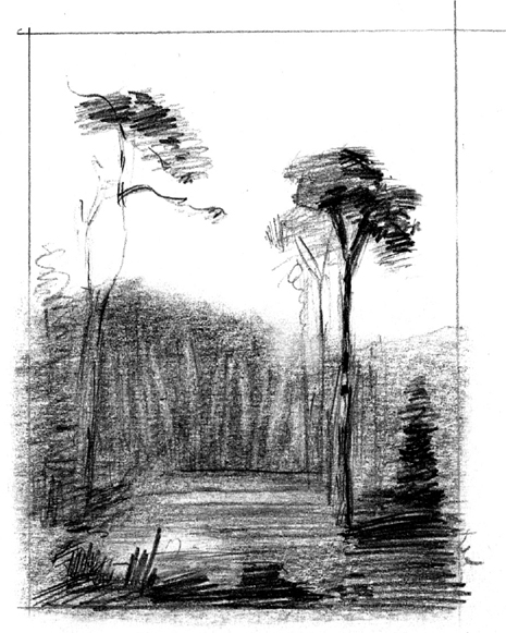
For the final pass, go in and add the darkest values, noting that Savrasov purposely concentrated the strongest contrasts and details on and around the foreground tree on the right, which he chose as his center of interest.
Make some refinements to the ground plane, adding horizontal lines to distinguish it from the upright trees in the background. Lastly, let loose, mimicking the great variety of pencil lines Savrasov used to describe the different textures.
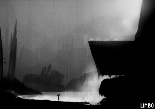
LIMBO (Concept image courtesy of Playdead)
The award-winning visuals from LIMBO are the brainchild of game director Arnt Jensen. Although in many ways more stylized than Alexei Savrasov’s drawing, both images have a lot in common in terms of the visual tools used to create the illusion of depth: overlap, diminishing contrasts, and softening of forms with distance and repetition of shapes.
Texture suggested in contours can convey enough information for viewers to imagine the missing visual information of the internal forms. Jensen has skillfully taken advantage of this phenomenon by giving objects ambiguous shapes that invite players to use their own imagination to complete the missing information. Each player will find different meaning in the shapes based on their personal experiences. If Jensen had gone the other way and made every detail explicit, there would be less room to engage the player’s imagination and emotions.