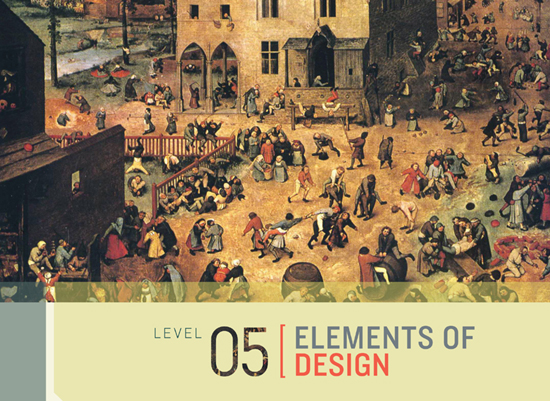

Detail of Children’s Games by Peter Bruegel the Elder (1525–1569)
WE SAW IN GRAVITY AND MOVEMENT how manipulating the shape of a line can create a sense of weight and movement. Classical artists also used line as a foundation for arranging elements in an image, which is known as composition.
These abstract approaches to design use the basic elements of visual grammar and have powerful implications for the way we design video games, from logos and user interfaces to environments, characters, and animations.
Although there are only five elements of visual grammar to consider—lines, shapes, volumes, value, and color—there are an infinite number of ways that we can manipulate them using classical design concepts to create complex emotions and player experiences, as we’ll see when we take a closer look at the various ways in which they’ve been applied to video games.

A first step in translating classical art principles to video games is to consider the in-game camera and whether it’s set to frame the action using a close-up, medium, or long shot.
There are many practical considerations when deciding on a camera shot. For example, the player must be able to see enough of the playing area to make decisions on how to act within the game, so gameplay often dictates the choice of camera shot. But the final decision on how to frame in-game objects is not just a technical one; the frame’s artistic intent will affect the emotional experience of the player as well. The ideal is to have the gameplay and artistic intent inform the camera shot unanimously, changing dynamically to fit changing situations in-game.
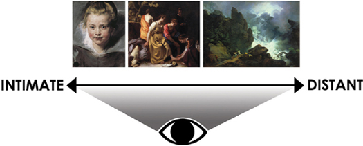
The viewer’s perceived proximity to characters in an image either creates an intimate feeling, as in a portrait (left) or still-life painting, or a more detached, distant relationship, as in a typical landscape painting (right).
Video games have a significant advantage over traditional media because the proximity device that influences the emotional connection between player and characters can be adjusted dynamically depending on the situation. A close-up shot creates an intimate connection with the playable character, but as the camera shifts away, the landscape becomes more prominent and the player-character connection more detached.

Heavy Rain (Artwork courtesy of Quantic Dream)
A game like Heavy Rain uses the close-up shot a great deal so players experience an intimate connection with subjects on-screen. The close-up shot is a translation of the composition conventions of classical portrait and still-life painting, where the subject takes up much of the visible frame.
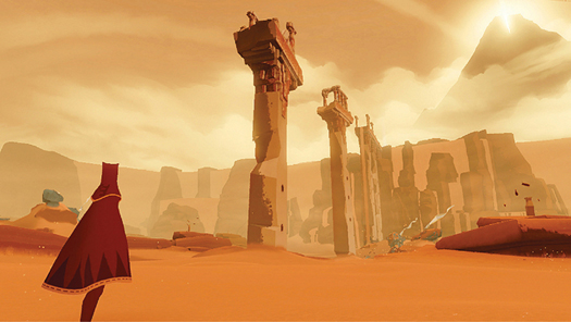
Journey (medium shot) (photo credit 5.3)

Journey generally employs a medium shot, which establishes a relationship between player, characters, and environment that fits somewhere between close-up and long shots for a more balanced effect. But the game’s camera constantly shifts the frame, zooming out to take in more of the landscape or zooming in to frame the character depending on the situation. (photo credit 5.4)
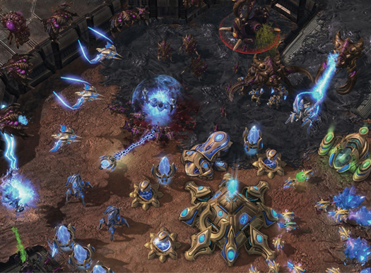
StarCraft II: Wings of Liberty (Artwork courtesy of Blizzard Entertainment)
The in-game camera in StarCraft II: Wings of Liberty frames the action with a long shot. The long shot is perfectly suited to the genre of real-time strategy games as it gives players a commanding view of the action. The distance and number of on-screen objects depicted in this battle scene make it difficult for players to feel an intimate connection with any one element. Instead the player’s attention is spread across many elements that are generally grouped by function for simplicity.
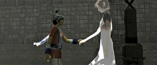
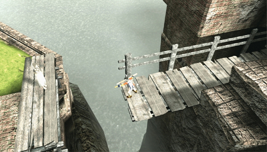
ICO
The interactive element of video games causes players to emotionally identify with their playable character as if it genuinely represented them. So in addition to directing the proximity of the camera to on-screen objects, an equally important design consideration is the proximity of the playable character to other characters in the game.
The game mechanics of ICO repeatedly bring characters together then separate them to create emotions of closeness and intimacy contrasted with loneliness and detachment, which makes the moments when Ico and Yorda are connected all the more powerful.

We briefly examined the significance of horizon line placement in Basic Perspective, but now we’ll take a closer look at this design tool and how the horizon line’s position in relation to the camera is used in games to affect the player’s feelings.
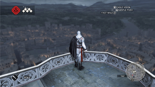
Assassin’s Creed II
Assassin’s Creed II allows players to scale buildings to reach the city’s rooftops, which places the horizon line high up in the frame, giving players a commanding and empowering view of their surroundings.
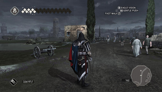
Assassin’s Creed II
The same character placed at ground level creates a more natural perspective with the horizon closer to the middle of the screen. The contrast between a high and middle horizon line in this game makes the player feel more exposed and vulnerable at ground level.
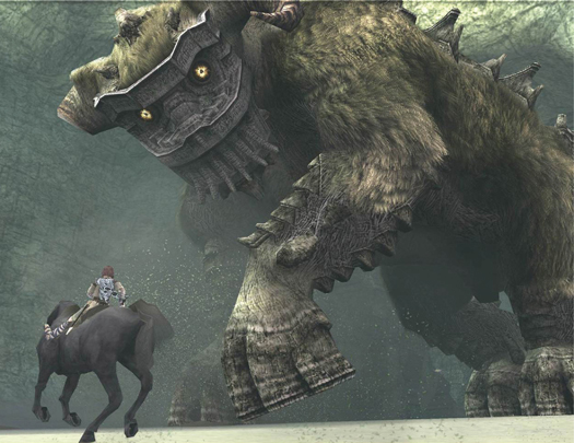
Shadow of the Colossus
Shadow of the Colossus from Team Ico effectively uses a low-angle shot to create a sense of vulnerability in the face of massive scale. Placing the camera near the ground, behind the playable character Wander, means the player is often looking up at the colossi that he must scale.
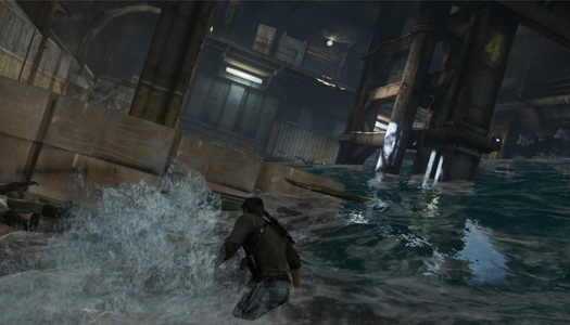
Uncharted 3
Tilt the horizon line diagonally and you get a dynamic effect.
Uncharted 3 uses a tilted perspective throughout the game to create an added sense of tension and disorientation for the player, particularly when the playable character of Nathan Drake is drugged or during the Sink or Swim level featured here.
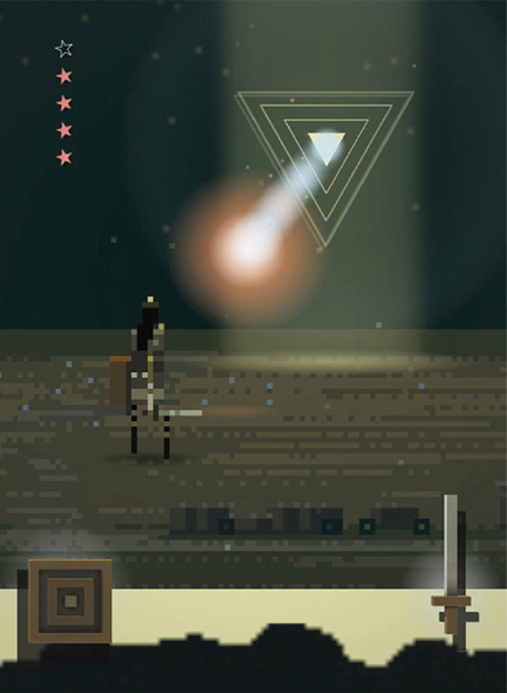
Superbrothers: Sword & Sworcery EP (Artwork courtesy of Superbrothers Inc.)
Superbrothers: Sword & Sworcery EP employs a centrally placed horizon line, which creates a neutral effect. Moving the horizon line further up or down would create a more dynamic composition that would be less appropriate for the relatively tranquil atmosphere of the game.
Players feel a lot of empathy toward their playable character, as if they were experiencing the situations themselves. Even though the placement of the horizon line is neutral, a powerful tension is created in this scene by the position of the playable character relative to the Trigon enemy (which references the camera angle in Shadow of the Colossus.
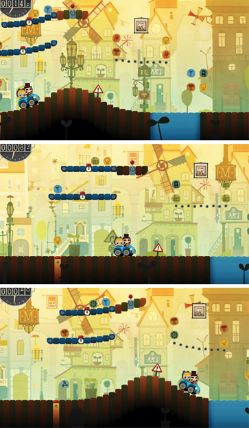
Bumpy Road (Artwork courtesy of Simogo)
The emotional effect of low-angle, eye-level, or high-angle shots, relating to the position of the horizon line in the vertical axis, can also be applied to the placement of objects along the horizontal axis—when deciding whether to place characters to the left, middle, or right of the frame. Bumpy Road from Simogo illustrates the dynamic possibilities of creating tension with this effect. A balanced feeling is created when the car is positioned centrally. Placing the car further left or right within the frame creates more dynamic energy.

Closely related to horizon line placement and perspective is the scale of characters in relation to other characters and to their environment. The relative size of the character can make the player feel either vulnerable or empowered.
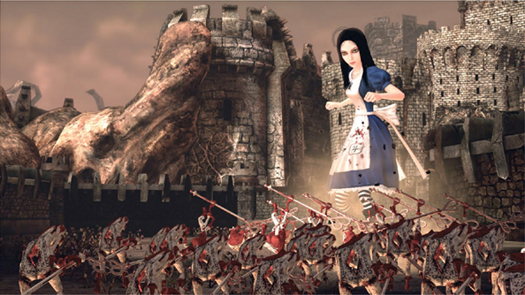
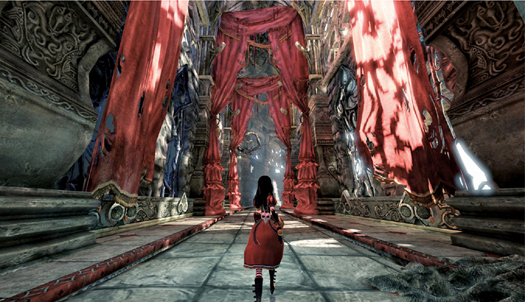
Alice: Madness Returns
American McGee’s Alice: Madness Returns takes full advantage of the video game medium’s ability to dynamically change elements on the fly by scaling Alice’s character throughout the game to create different emotional experiences. When Alice is small she can explore more of the environment, but she also becomes more vulnerable. When Alice grows to a larger size the player feels more powerful.

Three is the magic number in design. If you have more than three on-screen elements (or grouped elements) at any one time, it becomes increasingly difficult for players to orient themselves amid the visual noise. One way to maintain simplicity and keep the number of on-screen elements to a minimum is through grouping.
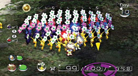
Pikmin
In the series of Pikmin games, the player can control up to 100 on-screen characters at any one time. That’s an incredible amount of information to take in. The reason the player doesn’t get overwhelmed by all the visual noise is that the characters are grouped into larger masses, sorted by function and color. The grouping helps players orient themselves within the action, as they only have to consider a few large masses rather than 100 individual elements.
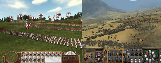
Empire: Total War
Empire: Total War features hundreds of soldiers fighting in battle, all of whom the player must control. Arranging the soldiers into large groups reduces the visual noise.
Note the rectangular group arrangement before battle (left) and the dagger-like shape that emerges incidentally during this particular charge (right).
As a game designer you have an infinite number of possibilities to use this concept and dynamically adjust the shape of groups to create different emotional effects (which we’ll explore in more detail in Shapes on this page).
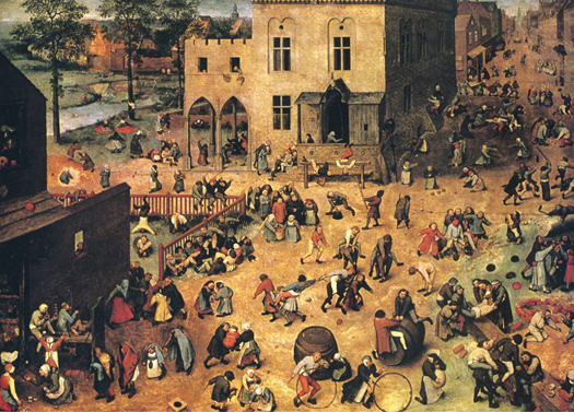
Children’s Games by Peter Bruegel the Elder
Another method to reduce noise is to align elements along composition lines, as Peter Bruegel did in Children’s Games. Even though there is a tremendous amount of information in this painting, it’s not overwhelming because there is order even where there appears to be none.
Bruegel exactingly placed figures along composition lines to dictate how viewers experience the image by offering them visual paths to read the scene.

The value key is the proportion of lights to darks in an image. The majority of artwork is designed around a fairly equal distribution of values, similar to the natural balance of values that we see in reality during the daytime. Shifting the values so that either the lights or darks become dominant is an effective way to create a special atmosphere within the gaming environment.
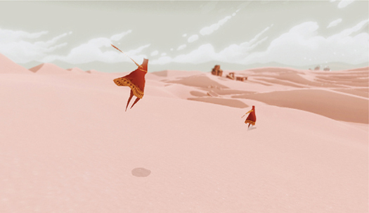
Journey
Journey employs a high-key in this desert scene to create a light and positive feeling for players traversing the environment. The majority of objects in the landscape are at the lighter end of the value scale, while select objects, such as the figures and important landmarks, are made prominent with darker values. (photo credit 5.5)
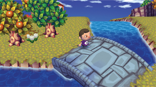
Animal Crossing: City Folk
Animal Crossing: City Folk virtually does away with shadows altogether. Soft-lighting and shadowless environments are common in children’s games because it creates a safe and surreal feeling. The flip side of removing shadows is that objects appear flatter and the spatial relationship between elements becomes difficult to judge (see Advanced Lighting and Values, for more detail).
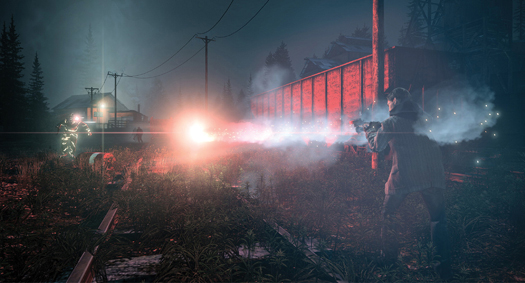
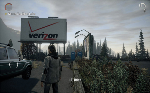
Alan Wake
The nighttime scenes in Alan Wake feature low-key lighting, with values mainly located at the darker end of the value scale. Points of light highlight key areas of interest, while other areas are shrouded in ominous shadow. The threatening emotions created by this lighting are amplified by the contrast to the mid-key lighting (for day scenes) which provides a fairly equal distribution of light and dark values.

We’ve practiced many of the fundamentals of drawing: techniques for holding a pencil, how to create various qualities of line, and how each line quality—thick or thin, light or dark, curved or straight or zigzag—communicates quite specific emotional responses to the artwork. But because of its interactivity, the viewer/player of a video game is actively involved in shaping the artwork, in affecting the screen visuals. In this section you’ll see how to design elements of a game so that players experience the same physical actions and sensations that artists experience in designing with line.

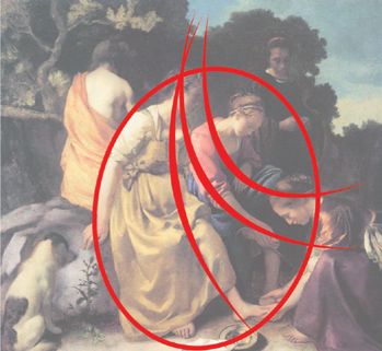
Diana and Her Companions by Johannes Vermeer (1632–1675)
Basing compositions on a system of lines allowed classical artists to control the viewer’s overall experience of an image by offering visual pathways along which a viewer’s eye would travel. Classical artists like Vermeer sought to make their compositional lines invisible to the untrained eye so that their subtlety could have a greater subconscious emotional effect. Vermeer exactingly designed each figure’s pose, aligning limbs and drapery along the frame of his compositional lines. This painting communicates a tranquil emotion largely because it’s constructed on a composition of gentle, curved lines.
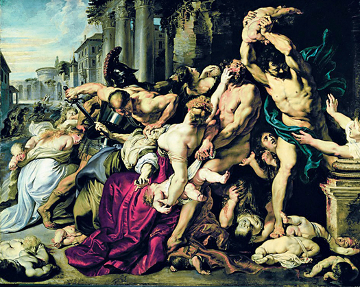
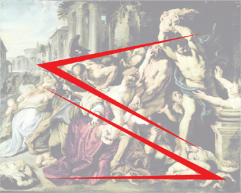
Massacre of the Innocents (c. 1610) by Peter Paul Rubens
In stark contrast to Vermeer’s Diana (opposite), the dominant compositional lines in Massacre of the Innocents by Peter Paul Rubens are two opposing triangles. Rubens aligned the figures to a network of straight, angular lines that communicate the aggressive, explosive force of the figures clashing together.
What made a composition like this possible was Rubens’s ability to create figures from imagination. He could compose the figures in any way he wished. Notice that the composition’s lower left triangle exclusively features female figures who are being trampled by the male figures in the upper right triangle. Make a simple study of this painting. See if you can find other lines that form its compositional framework.

Detail from Massacre of the Innocents by Peter Paul Rubens

Detail from Diana and Her Companions by Johannes Vermeer
Take a second look at the Vermeer and Rubens paintings and imagine substituting the lines of one for the other. You’ll find that it’s not details that communicate each painting’s particular emotion, but the larger compositional framework. If you were to switch the composition lines from one painting to the other, it would completely undermine the artists’ intended messages. The overarching design relies very little on detail elements like the sword in Rubens’s painting and the plant in Vermeer’s, which have very similar abstract shapes.
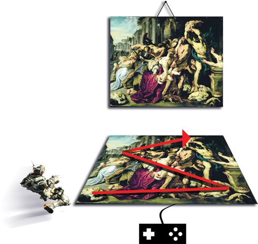
How can you translate the concepts of classical composition to video games to design powerful emotional experiences? By conceptualizing classical composition in a new way. Don’t think of compositional lines purely as visual pathways on a static medium; conceptualize them as an interactive virtual map whose pathways can be actively experienced by players.
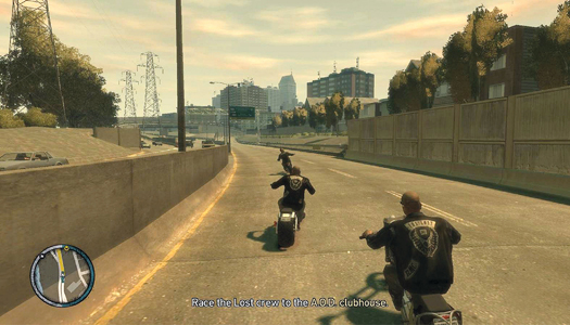
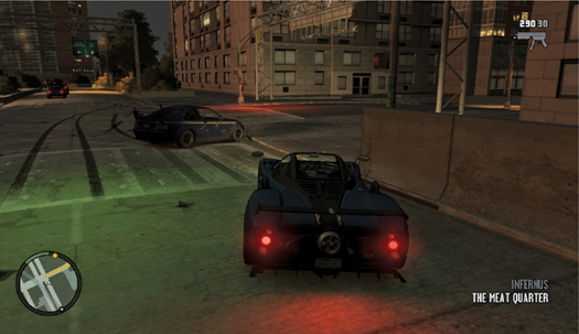
Grand Theft Auto IV
Consider the anticipation and action players experience driving through a slow-sweeping curve versus hitting the breaks around an angular corner in Grand Theft Auto IV. The curved street creates a gentle driving experience for the player while the angular corner creates a more aggressive emotional experience through the corresponding physical actions that they must perform.
In visual and interactive terms, the curved line of the road is like the composition of Vermeer’s Diana and Her Companions (this page). The angular pathway that the player takes in navigating corners is like the aggressive composition of Rubens’s Massacre of the Innocents (this page). Simply by conceptualizing the pathways within an environment as curved or straight lines you can design the players’ emotional experience as they travel through the interactive spaces.
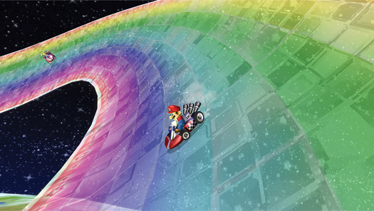

Mario Kart Wii
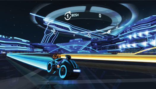

Tron: Evolution
The tracks in Mario Kart Wii (opposite) predominantly feature sweeping curves and vehicles have a softer handling. In contrast, the Light Cycles in Tron: Evolution (above) change direction in an angular manner, and players have to steer using more abrupt physical actions.
Video games that use motion controllers allow players to physically experience sensations of moving along lines in a virtual three-dimensional space, as if they were taking part in the act of creating the compositions they see. As with classical art, in video games it’s the composition, not the details, that has the strongest effect on the players’ emotions.
Apply your accumulated knowledge about concepts like gravity and movement to design the emotional experiences of the players on a macro level and the pathways that you make possible for them to navigate through your game environment. In another design approach, you could remove predefined pathways altogether (as in Journey’s desert landscape), leaving players free to “draw” their own path through the environment.
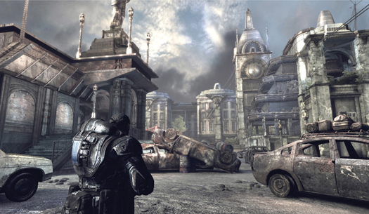
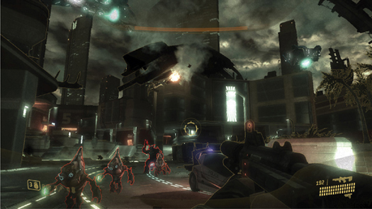
Gears of War 2 (above) and Halo 3: ODST (right)
The concept of designing an overarching emotional experience based on either curved or angular composition lines is present in first- and third-person shooter franchises like Halo and Gears of War.
Compare the graceful jump arcs, fluid movements, and pathways taken by Master Chief in Halo against the grounded and angular theme of Gears of War and its relatively angular forms and character animations. Although the gameplay conditions are very similar in terms of character actions and abilities, Gears of War feels more brutal due to its angular overarching concept. (photo credit 5.1)
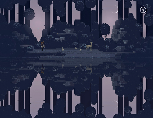
Superbrothers: Swords & Sworcery EP
Superbrothers: Swords & Sworcery EP is an example of line-based level design that sits between curved and angular concepts. The level restricts the Scythian’s movement to navigating horizontal and vertical pathways.
The game pathways affect players in the same way as traditional composition in that players are presented with an environment background that is constructed with an abstract series of lines. What video games add to the traditional theory of composition is that the game’s background image is an interactive environment through which players can move; the playable character dynamically traces the abstract lines of the composition. The visual and interactive components of the experience combine to create a type of emotional engagement that is not possible with traditional media.
The predominance of straight horizontal and vertical lines created by the 1-point perspective in these screens from Superbrothers: Swords & Sworcery EP creates a still and tranquil backdrop for the game. If Superbrothers’ art director, Craig Adams, had used diagonal lines (which evoke dynamic and energetic emotions) the resulting player experience would be at odds with the overall concept of the game.
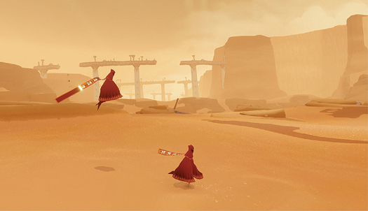


Journey (opposite) and Vanquish (above)
You can also direct the players’ emotional experience by applying line concepts to character animations. The characters in Journey (opposite) move and jump gracefully across the desert landscape, which the player traces across the screen with the push of a button. The gentle, curved movements in Journey, emphasized by the character’s flowing scarf, are in stark contrast to the violent zigzag movements of Sam Gideon in Vanquish (above). The different movement styles of each character can be likened to two distinct musical melodies: one is gentle and flowing, and the other abrupt and jagged.
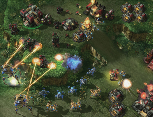
StarCraft II: Wings of Liberty: Protoss units attacking from the bottom; Terran units defending on the top (Artworks courtesy of Blizzard Entertainment)
StarCraft II: Wings of Liberty illustrates just how important distinct animations are in such a fast action video game, which presents a significant amount of visual information for players to assimilate. So much happens on-screen in a typical game of StarCraft II that it’d be near impossible for players to comprehend and manage events without distinguishing animations and shapes for the various character species and unit types.

StarCraft II: Wings of Liberty: Probe

StarCraft II: Wings of Liberty: Immortal

In StarCraft II the nonaggressive Probes that gather resources travel across the screen in gentle, back-and-forth, straight lines. In contrast, Immortal attack units travel with fast, aggressive movements along angular lines. In the middle of the action there simply isn’t time to take in all of the game’s rich visual detail, so it’s largely the distinguishing lines implied by the animations that allow players to subliminally recognize aggressive and nonaggressive units. Unique shapes for each species reinforce these visual distinctions.

Line dominated the theory of composition for the majority of art history, until some 150 years ago when artists began experimenting with photography. An evolution happened around this time, much like the evolution that video games are driving. Artists such as Edgar Degas started thinking not in terms of lines, but in terms of shapes. The reason for this is that they were exploring the way in which the photographic camera, and our eyes, records reality as light and shadow shapes. This was a revolutionary approach to painting at the time. In Degas’s artwork, below, and the paintings by Vermeer and Rubens on this page and this page, we’ll find a common theme of rounded versus angular elements.
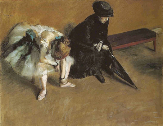
Waiting by Edgar Degas, J. Paul Getty Museum
Degas was a grudging member of the Impressionist movement, which marked the crossroads between classical and modern art. Degas was a great admirer of the master Jean-Auguste-Dominique Ingres who advised the younger Degas to “draw lines, young man, and still more lines, both from life and from memory, and you will become a good artist.” Degas did indeed draw many lines—until the arrival of photography, which changed the way Degas conceptualized his images from lines to shapes.
Although we can’t fully see the face of either figure in this pastel by Degas, an emotional tension is created by the contrast of a circle and a triangle shape. Degas further heightened the effect with a value contrast of black and white.

Volkswagen Beetle (left), Range Rover (middle), Lamborghini Gallardo (right)
Abstract communication with shapes is surprisingly universal, appearing in visual design in every artistic discipline. From left to right: the Volkswagen Beetle is designed around the circular concept to communicate that it’s fun and friendly; the square shape of the Range Rover communicates confidence, stability, and safety; while the Lamborghini’s triangular shape communicates aggressive speed.
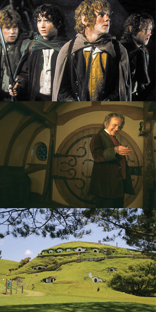
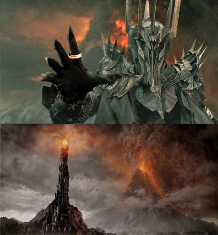
The Lord of the Rings (film trilogy): Hobbits and Sauron
You can see how primary shapes communicate emotions in these stills from The Lord of the Rings. At one end of the emotional spectrum are the good-natured Hobbits (left). A circular concept echoes through every level of detail, from the curl of their hair, rounded shirt buttons and shoulders, to the rounded buildings of Hobbiton and even the landscape itself.
On the other side of the emotional spectrum is the evil Sauron (above) whose menacing triangular shape runs throughout the design, from the sharp fingertips of his glove to the volcano on the landscape.
You can tell the entire Lord of the Rings story in shapes, with the good, circular Hobbits traveling from a safe, circular landscape to a dangerous triangular environment and back again. Appropriate colors and textures reinforce the emotional concept of each character.
Designing with shape was once considered a radical departure from classical theory. But the two elements are very closely bound: circles relate to curved lines; the square relates to straight vertical and horizontal lines; and the triangle relates to diagonal and angular lines. Surprisingly, the ability for basic shapes and lines to communicate emotions is rooted in reality, as we’ll now see.

Where do these concepts of soft rounded forms versus angular shapes originate? All around us in nature! Things that we deem safe tend to have rounded forms, while we’re naturally cautious in the company of sharp, pointy triangles. Our instinctive reactions to these objects are based on the tactile sense of touch. In visual art this physical sensation is missing, though viewers react to these shapes based on their real-life experiences.
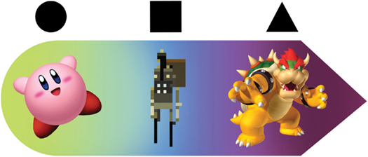
You can order the three basic shapes into a scale of emotions. From left to right: positivity and youthful energy (circles); strength and stability (squares); aggressive and threatening (triangles). Traditionally the circle and curved lines have also been used to communicate femininity and square or angular lines, masculinity.

Note how the well-known “good” characters on the left are designed around circular concepts, while the enemy characters in the right column are based on a dominant triangular concept. The silhouettes underscore the importance of designing characters around larger shape concepts and not details.
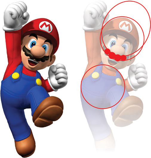
Mario
Even details should echo the character’s overall design concept and the emotion you want players to feel once the silhouette of a character has been established. Practically every element of Mario has been designed around a friendly circular concept, including his mustache (two overlapping circles and a series of smaller round shapes). His torso too is modeled on a sphere, the three-dimensional representation of the circle.

Wario (left), Goomba (above)
If Mario was designed around a triangular concept instead of a circular one, he’d no longer be Mario, he’d be Wario (left)! By little more than sharpening a few lines the artists at Nintendo transformed a friendly character into a villain. Although the Goomba characters (above right), Mario’s enemies, are designed around an aggressive triangular concept, their edges have been rounded to fit the overall friendly theme of the Mario universe. These three characters are an example of style consistency.

Flower
Soft, rounded shapes are the obvious choice for designing an environment of natural, organic beauty. But you need an element against which to measure this beauty in order for players to fully appreciate the positive feelings of the environment. Flower contrasts somber weather, hard-edged rock, and manmade structures against colorful fields, sunlight, and rolling hills to emphasize the latter’s natural beauty.
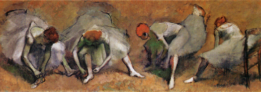
Frieze of Dancers by Edgar Degas
Repetition of shapes and echoing of movement can create a sense of harmony. Take a look at these beautiful ballerina renderings by Edgar Degas in which the artist drew the same figure from different angles, changing elements only slightly to create a feeling of harmonious movement. (photo credit 5.2)
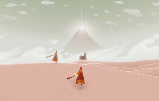
Journey
A sense of harmony similar to that in Degas’s Frieze of Dancers is evident in this screenshot from Journey, since the playable character is nearly identical for every player. A delicate harmony is created when this uniform design is coupled with the character’s graceful movement. (photo credit 5.7)

We can think of the primary shapes—circle, square, and triangle—as conventions that communicate common notions of good and evil, passivity and aggression, dynamic and static energy. These conventions are useful tools in game design, where it’s often necessary that players understand the significance of their gaming environment as quickly as possible.
There are many instances, however, where players are afforded more time to become familiar with gameplay elements or when designers wish to surprise players with the unexpected. If players expect circular forms to be friendly and sharp shapes to be threatening, then designing a game where the opposite is true can create a sense of mystery, surprise, and depth. The video games featured below are among the most distinguished of all time because they went against design clichés to offer new and unconventional emotional experiences.
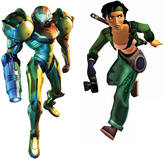
Samus Aran from Metroid Prime (left); Jade from Beyond Good & Evil (right)
Samus Aran and Jade are celebrated for their departure from the male-dominated role of hero. With so many oversexualized female video game characters, female characters that subvert this convention are refreshing and memorable. Interestingly, Samus’s gender wasn’t revealed till the end of the original Metroid game, which created a surprising twist for players who assumed they’d been playing a male character. Innovation is not only wide open regarding gender stereotypes, but ethnicity and social minorities too.
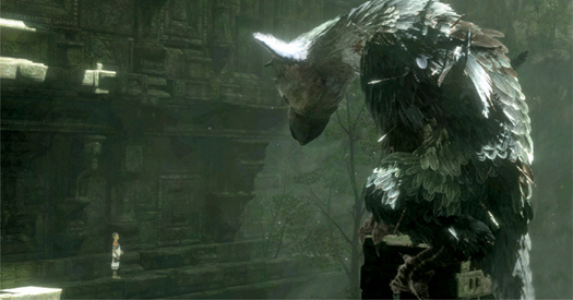
The Last Guardian (above and below)
The main protagonists in The Last Guardian are a young boy (see bottom left in the above illustration) and a strange mongrel creature. The friendship between the two characters is made visually ambiguous because of the creature’s impressive size and aggressive-looking claws and beak. But, as in reality, not everything that appears ugly or aggressive is necessarily unfriendly or dangerous.
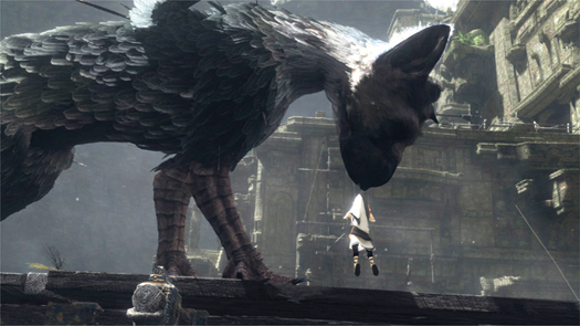
Rather than attempt to soften the threatening emotions created by the angular shapes of the mongrel creature, the designers expressly challenge player conceptions of good and bad. For example, there are instances in the game when the creature must aid the boy’s progress through the environment by lifting him with its mouth.

The Birth of Venus by Sandro Botticelli, Uffizi, Florence
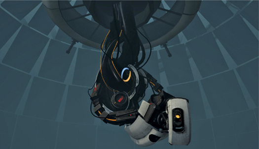
Portal 2
The villain in Portal 2 is a great example of subverting conventions. Rather than sticking to the stereotypes of villainy in the form of an aggressive male character, the art team at Valve Software took inspiration from Sandro Botticelli’s The Birth of Venus when designing the character of GLaDOS. The opposing curves that run gracefully down the length of Venus’s body have been translated to the inverted mechanical body of GLaDOS, turning the Renaissance icon of feminine beauty on its head, both literally and metaphorically, to create one of the most memorable and emotionally complex video game characters to date.
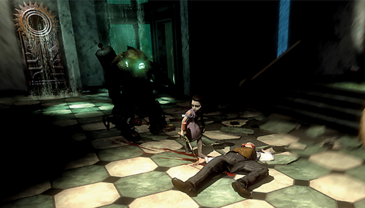
BioShock: Rapture (Artwork courtesy of Irrational Games)
The character designs in BioShock incorporate an interesting play on conventions. The Gatherers, who are the innocent-looking girls inhabiting the dangerous dystopia of Rapture, are at odds with what players would likely expect to encounter in such an environment. The young gatherers create a visceral contrast to the violence featured in the game.