37
All connected? Geographies of race, death, wealth, votes and births
Knowing less and less of each other’s lives
Figure 1 charts the share in annual incomes received by the richest single percentile of Britons as recorded between 1918 and 2005, both pre- and post-tax. The richest percentile of people in Britain receive some of their income from earnings, but a greater proportion from interest on wealth, dividends and shares, and the returns on investments made in stocks and rent on their land. At the end of World War I, one in every 100 people lived on about a sixth of the national income, 17 or 18 times more than the average family, 100 times more money than the poorest 10th saw in a year.
From 1918 through the 1920s, 1930s, 1940s, 1950s and 1960s the share of national income the affluent received fell. As many of the heirs to great estates had died in the Great War, the government taxed the aristocratic families, but just as crucially, the ‘great’ families became just a little more lax over who they slept with and subsequently married. The arithmetic of homogamy (assortative mating) is simple. Should you be a member of a family in the top percentile of income earners in 1918 you might expect to receive around £150,000 a year in today’s money, or 18 times average individual incomes. If you are careful and ignore 99 potential life partners in every 100, you might in theory meet and only choose from the one percentile like you. Because social networks were so limited it was not hard to avoid at least 90 of the other 99, or meet and mistreat them only as servants, but the other nine you had to tell yourself were beneath you when you did meet them. Then as a couple, and later possibly a family, you will remain in that top 1% of earners.
If you are very rich you are told ‘be careful’, should your eye stray and you find a young man or woman from the bottom of the top decile more attractive, or caring, or just more understanding or interesting, and you had successfully ignored 90 out of 100 other possible suitors, but not the 91st, and you pair up, then you as a pair will drop out of the top percentile. Another couple or individual will enter it, but they will not have been as well-off as you (or else they would have been in that group already) and so the average income of the best-off falls. Figure 1 shows a combination of many things, but it also includes the effect of that equalising process at work, increased freedom to choose who you love, gaining in strength right through to the 1970s. Note that this is especially true for the very rich as a large proportion of the income of the richest 1% is interest earnings from holding wealth, and high wealth is thus largely maintained over generations by marrying ‘correctly’.
Figure 1: Share of all income received by the richest 1% in Britain, 1918–2005
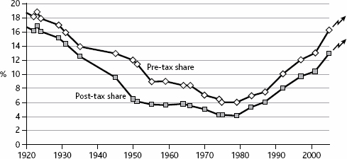
Note: Lower line is post-tax share. Editorial note: Arrows added to show most recent trend.
Source: Atkinson (2003, figures 2 and 3); from 1922 to 1935 the 0.1% rate was used to estimate the 1% when the 1% rate was missing, and for 2005 the data source was Brewer et al (2008, 11); the final post-tax rate of 12.9% is derived from 8.6%+4.3%, the pre-tax rate scaled from 2001.
In England debutantes (young aristocratic or upper class girls) were presented at court at the start of each social season right up until 1958. They were presented to make it clear that they were available for marriage, only marriage into the ‘correct’ families, of course. It became progressively harder after 1958 to know exactly who was most ‘respectable’. The process carries on today, especially in the USA at various huge ‘charity’ balls, but is less overtly state-sponsored than when the most suitable of young ladies were regularly presented to the Queen of England at court, just half a century ago. The very same Queen that we British remain subjects of today.
A combination of high mortality among even the upper classes in World War I, increased death duties, loss of wealth during the depression and later redistribution by increases in income and inheritance taxation all helped to bring down inequalities in income and wealth from 1918 to the end of the 1970s. However, it is also not hard to see, as collars became less starched, as Victorian norms became only a memory, and as the sexual revolution slowly developed, that as wealth became a little more equally spread, there were ways in which people could choose a little more often to be with someone they might actually love, and a little less often tolerated those they were expected to choose just to maintain the family silver.
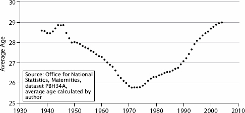
Figure 2 shows how the average age of mums fell and rose too. It was not just better knowledge of contraceptives or better chances for women to have careers that drove this trend up after it first went down. The timing also follows the trends described above. Figure 2 also shows why it is worth being wary of thinking that casual mechanisms are obvious when you first see two trends that are so similar. Average ages of mothers giving birth initially fell as it became possible to marry earlier and earlier, no longer having to wait until savings were sufficient for a new home to be afforded for the new couple. Greater financial and social equality, and the huge house building program that resulted from the growing belief that everyone deserved a home, made marrying earlier and then having children earlier much more conceivable.
Lower ages of motherhood was not the result of greater promiscuity but of having far fewer ‘great’ houses staffed by armies of mainly childless servants, and far more small houses built for new working class families. The middle classes saw their sexual freedom grow too as a result, and there was much more marrying between classes. Then, as social and economic inequalities rose, fewer new homes were built and the houses we had were more and more inefficiently shared out as market forces grew stronger in housing. Middle class people put off having children to very late ages and working class people did the same, if not so quickly. Age of parenthood both rose and socially polarised at the same time, so that the average age of 29 by 2004 was far less representative than the much lower average just 29 years earlier. Improved access to contraceptives helped people delay parenthood more effectively but were not the reasons why so many did, nor was it increased hedonism, although advertising that told you to ‘live for today’ because ‘you’re worth it’ became far more ubiquitous. More young adults talked about not being able to ‘afford’ to become a parent in the 1990s than did so in the 1970s. Why should that happen in a country that was overall so much richer?
Why too, from the late 1970s onwards, should we see individual earnings again concentrating within the best-off percentile (see Figure 1)? It was not just the progressive tax structure being dismantled after 1979. Earnings before tax (shown in the same figure) follow almost exactly the same trend. The rise is so quick that by 2005 the trend line suggests that we had returned to early 1930s levels of income inequality at the very top end. Add falling actual national wages during 2009, but bankers’ bonuses continuing, and we are back to 1918 levels of income inequality in 2010. Wealth inequalities in 2010 have skyrocketed. The Sunday Times ‘rich list’ of April 2010 reported that the wealth of the 1000 richest people in the UK had risen by 29.9% in just 1 year to stand at £335.5 billion.1 The annual rise itself was enough to more than wipe out the UK’s newly grown structural deficient to £70 billion! But step back in time a little to see how we got to such excesses again.
Figure 2: Average age of mothers giving birth in England and Wales, 1938–2004
The Pearson product-moment correlation coefficients between the pre-tax income share of the richest percentile and the excess mortality of the poorest 30%, the health advantage of the best-off 10th, and the geographical concentration of Conservative votes over the 1918–2005 period are: 0.57, 0.82 and 0.51 respectively (see Table 1 in the original article this is an extract of). Again, this is no evidence of a causal link – clearly the health advantages of the rich are most closely connected to their share of wealth. But these are also both in some way related to trends in inequalities in voting and to the fluctuations in the rates of premature mortality suffered by the poor. There is only a one in 100 chance that even the lowest of these correlations occurred by chance. The correlations with the post-tax income trend shown above are even stronger: 0.60, 0.86 and 0.58 respectively, and they are both higher and even more statistically robust. When the rich take even more of the national income of a country (and almost all of its wealth), the health of the poor suffers and voting in general elections becomes more spatially polarised. Similar trends have been suggested in the USA (Krugman, 2007): a kind of growing racism against the poor emerges. The poor are not seen like the rest of society, as people deserving to be treated as you would wish to be treated. How else can you defend holding individual wealth in its billions? To justify being so very rich you have to believe you would look after that wealth better than the poor would.