Although you'll spend a lot of time fine-tuning the color, size, and fonts of the text on your web pages, CSS also lets you apply other common text-formatting properties (like bold and italics) as well as some less common ones (like small caps and letter spacing).
Note
CSS lets you combine multiple text properties, but don't get carried away. Too much busy formatting makes your page harder to read. Worst of all, your hard work loses its impact.
Web browsers display type inside the <em> and <i> tags in italicized type and text inside the <strong>, <b>, <th> (table header), and header tags (<h1>, and so on) in bold type. But you can control these settings yourself—either turn off bold for a headline or italicize text that normally isn't—using the font-style and font-weight properties.
To italicize text, add this to a style:
font-style: italic;
Alternatively, you can make sure text isn't italicized, like so:
font-style: normal;
The font-weight property lets you make text bold or not. In fact, according to the rules of CSS, you can actually specify nine numeric values (100–900) to choose subtle gradations of boldness (from super-extra-heavy [900] to nearly-invisible-light [100]). Of course, the fonts you use must have nine different weights for these values to have any visible effect for your website's visitors. And since there aren't any fonts that work this way with web browsers yet, you have far fewer options for this property to worry about. So, for now, to make text bold:
font-weight: bold;
And to make text un-bold:
font-weight: normal;
Note
Since headlines are already displayed as bold type, you may want to find another way of highlighting a word or words that are strongly emphasized or bolded inside a headline. Here's one way:
h1 strong { color: #3399FF; }This descendent selector changes the color of any <strong> tags (usually displayed as bold) that appear inside a <h1> tag.
Capitalizing text is pretty easy—just hit the caps lock key and start typing, right? But what if you want to capitalize every heading on a page, and the text you've copied and pasted from a Word document is lowercase? Rather than retyping the headline, turn to the CSS text-transform property. With it, you can make text all uppercase, all lowercase, or even capitalize the first letter of each word (for titles and headlines). Here's an example:
text-transform: uppercase;
For the other two options, just use lowercase or capitalize.
Because this property is inherited, a tag that's nested inside a tag with text-transform applied to it gets the same uppercase, lowercase, or capitalized value. To tell CSS not to change the case of text, use the none value:
text-transform: none;
For more typographic sophistication, you can also turn to the font-variant property, which lets you set type as small-caps. In small cap style, lowercase letters appear as slightly downsized capital letters, like so: Pomp And Circumstance. While difficult to read for long stretches of text, small caps lend your page an old-world, bookish gravitas when used on headlines and captions. To create small-cap text:
font-variant: small-caps;
CSS also provides the text-decoration property to add various enhancements to text. With it, you can add lines over, under, or through the text (see Figure 6-6), or for real giggles you can make the text blink like a No Vacancy sign. Use the text-decoration property by adding one or more of the following keywords: underline, overline, line-through, or blink. For example, to underline text:
text-decoration: underline;
You can also combine multiple keywords for multiple effects. Here's how to add a line over and under some text:
text-decoration: underline overline;
But just because you can add these not-so-decorative decorations to text, doesn't mean you should. For one thing, anyone who's used the Web for any length of time instinctively associates any underlined text with a link and tries to click it. So it's not a good idea to underline words that aren't part of a link. And blink is like a neon sign flashing "Amateur! Amateur! Amateur!" (On top of that most browsers don't make text blink, even if you ask for it.)
Note
You can get a similar effect to underlining and overlining by adding a border to the bottom or top of an element (see Adding Borders). The big advantage of borders is that you can control their placement, size, and color to create a more attractive design that doesn't look like a link.
The overline option simply draws a line above text, while line-through draws a line right through the center of text. Some designers use this strike-through effect to indicate an edit on a page where text has been removed from the original manuscript. Coupled with the a:visited selector, you can also create a cool effect where previously visited links are crossed out like a shopping list.
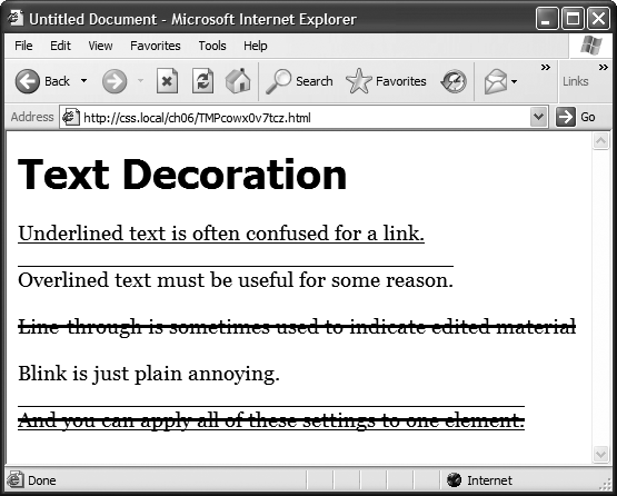
Figure 6-6. The text-decoration property in action. If this is what the people at CSS headquarters call "decorations," you'd best not ask for their design help on your next home remodel.
Finally, you can turn off all decorations by using the none keyword like this:
text-decoration: none;
Why do you need a text-decoration property that removes decorations? The most common example is removing the line that appears under a link. (See Underlining Links.)
Another way to make text stand out from the crowd is to adjust the space that appears between letters or words (see Figure 6-7). Reducing the space between letters using the CSS letter-spacing property can tighten up headlines, making them seem even bolder and heavier while fitting more letters on a single line. Conversely, increasing the space can give headlines a calmer, more majestic quality. To reduce the space between letters, you use a negative value like this:
letter-spacing: -1px;
A positive value adds space between letters:
letter-spacing: 10px;
Likewise, you can open up space (or remove space) between words using the word-spacing property. This property makes the space wider (or narrower) without actually affecting the words themselves:
word-spacing: 2px;
With either of these properties, you can use any type of measurement you'd use for text sizing—pixels, ems, percentages—with either positive or negative values.
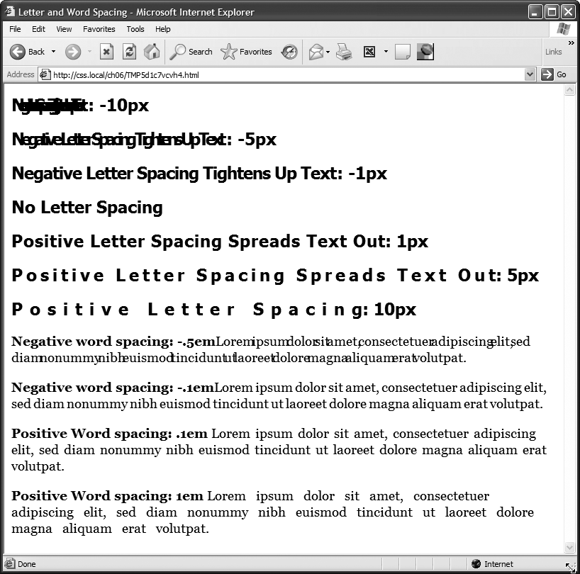
Figure 6-7. Use word and letter spacing judiciously. Too much or too little of either can make text difficult if not impossible to read.
Unless you're going for some really far-out design effect—in other words, totally unreadable text—keep your values small. Too high a negative value, and letters and words overlap. To keep the message of your site clear and legible, use both letter and word spacing with care.