Now that you know how to create a selector that targets links, how should you style them? Any way you want! There aren't any CSS properties intended just for links. You have full access to all CSS properties, so you're limited only by your imagination. Just make sure your links look like links. Not that they need to be blue and underlined, but links must look different from non-link text so visitors know they can click them.
If you make a link look like a button—adding a border, including a background, and making it change color when moused over—most people will understand they can click it. Likewise, links that appear in long passages of text should look clearly distinct. You can make links stand out by bolding the text, keeping the traditional underline, coloring the background, or adding a hover style. You can even add a graphic (like an arrow) that provides a clear visual cue that clicking the text takes you somewhere else.
Tip
Unless you set an <img> tag's border attribute to 0, web browsers usually add a border around linked images. To prevent this from happening, add this basic style to your style sheets: img { border: none; }.
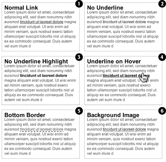
Since the beginning of the Web, vibrant blue, underlined text has signaled, "Click here to go there." But that underline and color are often the first two things a designer wants to change. Underlines are such a common way to mark a link that they're boring. (See #1 in Figure 9-1). Fortunately, you can do several things to eliminate or improve on the standard underline, while still ensuring that your links are identifiable:
Remove the underline entirely. To eliminate the regular underline, use the text-decoration property and the none value:
a {text-decoration: none;}Of course, removing the underline completely can confuse your visitors. Unless you provide other visual cues, your links look exactly the same as all the other text (#2 in Figure 9-1). So if you go this route, then make sure you highlight the links in some other way, like making link text bold (#3 in Figure 9-1), coloring the background, adding an informative graphic (Underlining Links), or making the link look like a button (Creating a Button).
Underline when mousing over. Some designers remove underlines for all links, highlight them in some other way, and then add the underlines back when the visitor moves his mouse over the link, as shown in #4 in Figure 9-1. To do so, simply remove the underline for links, and then reintroduce it using the :hover pseudo-class:
a { text-decoration: none; background-color: #F00; } a:hover { background-color: transparent; text-decoration: underline; }Use a bottom border. You can't control the color, width, or style of a regular link underline. It's always a solid, 1-pixel line in the same color as the link text. For greater variety, use the border-bottom property instead, like #5 in Figure 9-1. Hiding the normal underline and adding a dashed-line border looks like this:
a {
  text-decoration: none;
  border-bottom: dashed 2px #9F3;
}
You can alter the style, width, and color of the border. To put more space between the text and the border, use the padding property.
Use a background image. You can customize the look of links even further by using a graphical line. For example, #6 in Figure 9-1 uses a graphic that looks like a hand-drawn line. There's a similar technique for underlining headlines in the Chapter 8 tutorial (Replacing Borders with Graphics). Start by creating an underline graphic using a program like Fireworks or Photoshop, which have brush tools that simulate the look of a crayon, felt-tip marker, or whatever. Next, create a style for the link that removes the normal underline and adds a background image. Make sure the graphic repeats horizontally and is positioned at the bottom of the link. You may also need to add a little bottom padding to position the line. Here's an example:
a {
  text-decoration: none;
  background: url(images/underline.gif) repeat-x left bottom;
  padding-bottom: 5px;
}
It's best to use this technique for short, one- to-three-word links, since if the link runs longer than a single line, then Windows Internet Explorer 6 and 7 add the graphic to only the bottom of the last line (IE 8 gets it right).
You can also make links look like the buttons in the dialog boxes and toolbars you see in computer programs. Buttons look great in navigation bars, but you can also use them for any small (one- or two-word) links on your pages. Your main allies in this task are the border, background-color, and padding properties. With them, it's easy to create a wide range of boxy-looking buttons (see Figure 9-2).
Say you added a class to a link that you'd like to style as a button: <a href="stale.html" class="button">Free Donuts Here!</a>. To add a basic black outline around this link (like the top-left image in Figure 9-2), you'd create this style:
a.button {
  border: solid 1px #000;
}
You can get fancier by adding a background color as well, like so:
a.button {
  border: solid 1px #000;
  background-color: #333;
}
Note
In these examples, both a.button or .button would work for style names. In the case of a.button, the style only applies to <a> tags with the class button, while .button applies to any tag with that class name. If you want to make sure the style only applies to a particular tag, then add the tag name to the beginning. Adding the tag name is also a helpful reminder when looking over your CSS code—it provides a valuable clue as to what the style is intended to format. When you see a.button, it's clear that the style is aimed at particular links.

Figure 9-2. Use the border, background, and padding properties to turn a link into an obviously clickable button. Simply adding a border (top left) can be enough to get the point across. Or you can create more sophisticated-looking buttons by combining different borders of varying colors, styles, and widths with the background-color property (Determining Height and Width).
Mind you, all four borders don't need to be the same width, type, or color. You don't even have to have four borders. One common design technique is to add a beveled look to a button using four different border colors, as shown at top right in Figure 9-2. Creating the beveled look isn't difficult, but you need to remember what makes something look three-dimensional—the light source. Imagine a light shining on one of the four sides; that side is the lightest, while the side opposite is the darkest (since the raised button is blocking the light and putting that side into a "shadow"). The other two sides should have shades in between the "lit" and "shadow" borders. Here's the CSS used to create the beveled design in the top-right corner of Figure 9-2:
a.button {
  background: #B1B1B1;
  color: #FFF;
  font-weight: bold;
  border-width: 4px;
  border-style: solid;
  border-top-color: #DFDFDF;
  border-right-color: #666;
  border-bottom-color: #333;
  border-left-color: #858585;
}
Keep in mind that you can (and probably should) create a :hover state for your buttons as well. That way, your buttons can react when a visitor moves her mouse over the link, providing useful visual feedback. In the case of a beveled button, reversing the various colors—make a dark background lighter, a light border darker, and so on—is very effective.
Adding graphics to links is one of the easiest and most visually exciting ways to spruce up your site's navigation. There are any number of possible techniques and designs, but none of the good ones involve an HTML <img> tag. Instead, you can easily add attractive and informative imagery to any link using the CSS background-image property. You can see several examples in Figure 9-3. (You'll also learn more advanced techniques for using images to create graphical buttons and rollovers starting on CSS-Style Preloading Rollovers.)

Figure 9-3. Even a simple graphic can enliven a link and make its purpose clearer. A globe icon (5) is one way to indicate an external link, while a checkmark (6) can instantly let a visitor know that he's been there, done that.
If you need a refresher on background-image and related properties, flip back to Background Images. Meanwhile, here are a few things to keep in mind when you use images with links:
Don't forget. no-repeat. Normally a background graphic tiles repeatedly in the background. With many graphics, that effect looks awful for links (see #2, Figure 9-3). Unless you're using a subtle pattern like a gradient fill, remember to set the repeat option to stop the tiling like this: background-repeat: no-repeat;.
Control placement with background-position. To place an image accurately in the background, use the background-position property (Keywords). When you want to place an image on the far-right edge of a link but centered vertically on the line, use this CSS: background-position: right center.
For more accurate placement, use a specific value such as pixels or ems. These units of measurement make it easy to scoot a graphic a couple of pixels away from the left edge of the link. By combining these units with a percentage value, you can easily center a graphic vertically within a link but place it an exact amount away from the left edge: background-position: 10px 50%;.
Tip
In positioning background images, the first value is the horizontal placement (left to right); the second is vertical placement (top to bottom).
Unfortunately, there's no way to exactly place an image from the right or bottom edges. So if you want to move an image in from the right edge a bit, then you have two options: First, in your image-editing program, you can add empty space to the right edge of the graphic. The amount of empty space you add should be equivalent to how much you want to indent that graphic from the right. Once you've created the graphic, use the background-position property to place the graphic on the right edge of the element: for example, background-position: right top;. Or you can use percentage values: background-position: 90% 75%; places the point that lies 90 percent from the left edge of the image on top of the point 90 percent from the left edge of the styled element. As you can imagine, this method doesn't provide complete accuracy, so you'll need to experiment a little. (See background-repeat for more on how percentage positioning works.)
Padding gives you room. If you're using an image or icon to mark a link (like #3, #5, and #6 in Figure 9-3), then make sure to add padding on the side the image is on to move the link text out of the way. For instance, the third example in Figure 9-3 has 30 pixels of left padding to prevent the word "Home" from overlapping the picture of the house, while a little right padding makes room for the globe and checkmark in #5 and #6.
Note
Since the <a> tag is an inline element, adding top and bottom padding (or, for that matter, top and bottom margins) has no effect. See Displaying Inline and Block-Level Boxes for the reason why. You can, however, turn a link into a block-level element so that it can accept top and bottom padding and margins. You'll see this technique later in this chapter.
Use the pseudo-classes. Don't forget the :hover and :visited pseudo-classes. They can add great dynamic effects and provide helpful feedback about your links. You can swap in a different background graphic for any of these pseudo-classes. So you could, for example, have a dim light bulb graphic in the background of a normal link but change that graphic to a lit bulb when the mouse travels over it. Or don't use a graphic for the background of unvisited links, but once they're visited add a checkmark graphic to clearly identify their used status (see #6 in Figure 9-3).
Should you decide to use a graphic for a link's :hover state, keep in mind that browsers don't download the graphic until your visitor's mouse actually hovers over the link, so there'll be a noticeable delay before the graphic appears. Once the graphic is downloaded, however, the delay goes away. See CSS-Style Preloading Rollovers for a technique to prevent this awkward problem.