If you've mastered the basic :hover principle and know how to add a background image to a link, you're probably hungry for more elaborate ways to spruce up your site's navigation. In the following sections, you'll meet a few of the most popular techniques.
The :hover pseudo-class is a great way to add an interactive feel to a web page. But what if you want to highlight an area that's bigger than just a two-word navigation link? Suppose you have a list of news stories in a sidebar. Each item includes the title on one line, followed by a paragraph summary of the story. And suppose you want to highlight the area around both title and summary when a visitor mouses over them (see Figure 9-8).
Fortunately, Internet Explorer 7 and above, Firefox, Safari, Chrome, and Opera all understand the :hover pseudo-class when applied to all kinds of elements, not just links. So if you want to highlight a paragraph when the mouse moves across it, you can do so like this:
p:hover { background-color: yellow;}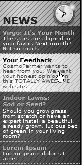
Figure 9-8. Give your visitors a big target. With a little clever CSS, you can make what looks like a headline and a paragraph behave like one giant button.
Look ma, no link! You can even apply hover effects to larger regions, like a div containing headlines, photos, and text paragraphs. So, if each news item in a page's sidebar is wrapped in a <div> tag and has a class of newsItem applied to it, this style changes the background color of each:
.newsItem:hover { background-color: #333; }Sadly, Internet Explorer 6 (and earlier) doesn't understand this style at all. That browser can display a hover effect only when it's applied to a link. And since the link tag is an inline element, you can't (at least according to the rules of HTML) wrap it around a block-level element. So you can't wrap both the headline of a story and the paragraph summary in the same link—exactly what you need to do to make both the title and summary change appearance when hovered over.
You're not out of luck, though. You just need to apply a little creative thinking. Don't put the title and summary into separate tags. Instead, keep them together in the link and use CSS to make the title look like a headline. Here's an example of marking up some HTML to achieve this effect. This snippet represents a single list item inside an unordered list:
<li class="story">
<a href="virgo.html"><span class="title">Virgo: It's Your Month!</span>
The stars are aligned in your favor. Next month? Not so much.</a>
</li>
In this case, both the title and summary are together inside the link, so you can highlight both with the same style:
li.story a:hover {
  background-image: url(highlight.gif);
}
In HTML, the story title ("Virgo, It's Your Month!") is wrapped in a <span> tag. You can make text look like a block-level headline with just a few simple rules:
.story span.title {
  display: block;
  text-weight: bold;
  font-size: 150%;
}
The key here is the block value, which makes the browser treat the text inside the span like its own headline with a line break before and after. Now, even though the title and summary look like they're separate block-level tags, they're still just part of the same inline <a> tag.
Note
You can also use JavaScript to create a better, more flexible, "big link." You can find a tutorial at www.creativepro.com/article/view-source-make-your-links-unforgettable.
In the bad old days, making a graphical link change to another graphic when moused over required JavaScript. With CSS, you can achieve similar effects with the :hover pseudo-class and a background image. However, there's one problem with the CSS method: Unless your visitor has already downloaded the rollover graphic, there's a noticeable delay while the browser sucks down the new graphic and displays it. The delay happens only the first time the visitor hovers over the link, but still, waiting for graphics to load is very 20th century.
The JavaScript solution can avoid this problem thanks to a technique called preloading which automatically downloads the rollover graphic well before it's needed. But CSS doesn't give you that option, so you need to enlist another clever maneuver called CSS Sprites (it was originally called the Pixy method), which utilizes a single graphic to create different states for the same button.
Note
To read about the original Pixy method (the predecessor to what you're about to learn), visit http://wellstyled.com/css-nopreload-rollovers.html. The evolved CSS Sprites method is now used widely by companies like Yahoo and Google, not just for rollover effects but to optimize the download speed of websites. You can read more about that at www.mezzoblue.com/archives/2009/01/27/sprite_optim.
Here's how to implement the method:
In your favorite image-editing program, create one image with different versions of the button.
You might create a regular state, a rollover state, and maybe even a "you are here" state. Place the images one on top of the other, with the regular link image on top and the rollover image below.
Measure the distances from the top of the entire graphic to the top of each image.
In Figure 9-9 (top) the rollover image's top edge is 39 pixels from the top of the graphic.
Create a CSS style for the regular link. Include the image in the background and place it at the left top of the style (Figure 9-9, middle).
Your style may look something like this:
a { background: #E7E7E7 url(images/pixy.png) no-repeat left top; }Create the :hover style.
Here's the trick: Use the background-position property to shift the graphic upwards, so the first image disappears and the rollover image becomes visible (Figure 9-9, bottom).
a:hover { background-position: 0 -39px; }
Besides preventing the dreaded download delay, this technique helps you keep your navigation graphics organized in a single file.
Tip
CSS gives you other ways to preload the image. You can place the image into the background of an element that's covered by another element. Say your site's logo appears in the top-left corner of the web page. You could place the rollover image in the top-left corner of the page's background: body { background: url(rollover.gif) no-repeat left top; }. When the page loads, the rollover graphic is sitting in the background of the page, but your visitors won't see it because it's covered by the logo. Another method is to place the rollover image inside a <div> that you position off the page using CSS positioning (see Hiding Parts of a Page). In either case, the browser downloads the image and the CSS rollover won't have any delays.
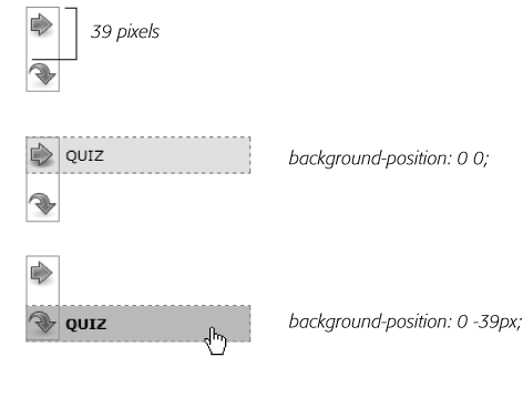
Figure 9-9. Using the CSS Sprites method, you can avoid an annoying delay while the browser downloads a rollover image for the first time. By combining all of the different link state graphics into a single image, you can display a different state simply by adjusting the positioning of the background image.
Note
Some websites take this technique to the extreme. Yahoo, Amazon, and Google (among many others) often put together dozens of little images into a single file and display only the portion of the file containing the desired button. You can see an example from Amazon here: www.flickr.com/photos/mezzoblue/3217540317.
On a more manageable level, the website of one well-known designer uses a single graphic to manage the 15 different buttons on her navigation bar. You can read about her technique at http://veerle-v2.duoh.com/blog/comments/the_xhtml_css_template_phase_of_my_new_blog_part_2/. You can also see this technique in action in this chapter's tutorial, in step 8 on Tutorial: Creating a Navigation Bar.
Ever since Amazon popularized them years back, tabbed navigation buttons have become one of the most common ways to highlight the organization of a site. With good reason, too: Selecting a tab to open a new "folder" of information is a metaphor everyone recognizes. You have many ways to create tab buttons. Most basically, you can use border and background colors around links to create a tab appearance (see Figure 9-7). This technique uses just CSS—no images.
But using graphics can really add depth and visual interest to your buttons. One common method is to create a tab made up of a single graphic—text added to a button graphic in a graphics program like Photoshop or Fireworks. However, updating a bunch of button images every time you change your site's navigation can get old quick. Furthermore, having different graphics for each button slows down the loading time of your site.
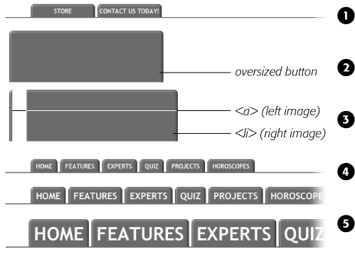
A slicker technique is to put a tab graphic in the background of each link and use regular HTML for the text. That way, updating your site's navigation is a simple matter of updating some text in a web page. Even someone with zero Photoshop experience can manage it. The only time a single graphic for a tab doesn't work well is when the text on each link varies in length. If one tab reads "Store," and the other reads "Contact Us Today!" the Store tab suffers from empty space and the Contact tab looks a little cramped (see #1 in Figure 9-10).
What you need in that case is a way to have the tab graphic shrink-wrap itself around the link text. Luckily, designer Douglas Bowman has come up with a creative technique that does just that. Dubbed the Sliding Doors method, it involves creating one very wide and tall tab graphic in your image editing program (#2 in Figure 9-10), and then slicing that image into two graphic files (#3 in Figure 9-10). The very thin graphic is the left edge of the tab. It should be only wide enough to reveal the sloping left edge of the tab. The second graphic is very wide—wider than you imagine any tab on the page would ever get—and forms the tab's main body and right edge.
Note
Douglas Bowman's Sliding Doors technique is a classic in CSS design. You can find his original article at the A List Apart website: www.alistapart.com/articles/slidingdoors. There's also a follow-up article covering more advanced techniques at www.alistapart.com/articles/slidingdoors2.
Now here's the tricky part. Since a tag can have only one background image, you need to apply the graphics as backgrounds to two different tags. Start by creating an unordered list and turning it into a horizontal navigation bar as described on Horizontal Navigation Bars. At this point, each <a> tag is nested inside one <li> tag, so you've got two tags to play with.
First, add the wide background image to the <li> tag and place it at the top-right corner of the tag. Do that by adding the following property to the style formatting for that button's <li> tag:
background: url(images/right_tab.gif) no-repeat right top;
The Sliding Doors technique capitalizes on the fact that a background image never extends outside of the box created by its tag. In other words, even though this image is really, really wide and tall, you won't see any part of the graphic that extends outside the region of the <li> tag—either below it or outside its left edge.
Note
If you like this technique, but aren't good at using Photoshop to create graphics, you can pick up free tab designs at www.exploding-boy.com/2005/12/15/free-css-navigation-designs and www.exploding-boy.com/2005/12/21/more-free-css-navigation-menu-designs.
Next, place the thin, left-hand graphic in the top-left background of the <a> tag by adding this property to the style for the link:
background: url(images/left_tab.gif) no-repeat left top;
Because the <a> tag is nested inside of the <li> tag, its background appears above the <li> tag's background. That left side tab graphic sits on top of the really wide tab graphic, creating the illusion of a single graphic. At this point, type whatever text you want for each link, in the process expanding the <li> tag and exposing more of the extra-wide graphic (see #4 in Figure 9-10).
Web designers link to all sorts of things: other web pages on their sites, web pages on other sites, Adobe Acrobat files, Word documents, and Zip archive files, to name a few. To help guide your site's visitors, you might want to supply clues to let them know where a link leads before they click it. Advanced selectors are a great way to do just that. Although this technique uses selectors from CSS 3 (the next, as yet-to-be-finished CSS standard) almost all browsers currently understand these selectors.
Note
Internet Explorer 6 doesn't understand these selectors (of course). However, the market share of that browser continues to plummet (as of this writing less than 17 percent), and you can still use this technique without harming the usability of your site. The majority of visitors will get the enhanced presentation, while IE 6 users will get the regular view of the site.
You can easily create a style that identifies links to other websites using an attribute selector. As you read on Attribute Selectors, attribute selectors let you style HTML tags that have a particular attribute—for example, an <img> tag with the alt attribute set to Our Company. You can also style tags whose attributes begin with certain values. Any link that points outside your site must be an absolute URL (see Controlling Repetition), meaning it must begin with http://—for example, http://www.yahoo.com. So to create a style that only affects links using an absolute URL, you use this selector:
a[href^='http://']
The ^= translates to "begins with," so this selector matches links like <a href="http://www.google.com/">, <a href="http://www.sawmac.com/missing/css2e/">, and so on.
You could style these any way you'd like, but one common technique is to add a small image next to the link—an icon indicating an external link. You'll see this in action on Adding a Background Image to a Link of this chapter's tutorial.
If you happen to use absolute links to point to other pages in your site, then you'll need to add another style to "turn off" the styling—otherwise, you'll end up highlighting those links as external links, when in reality they're just links within your site. This second style just uses a more detailed version of the selector listed above. For example, if your site is located at www.mysite.com, then you can create a selector that applies to those links like this: a[href^='http://www.mysite.com']. Putting this all together, if you want to add a globe icon next to external links, but not for links within your site, you can create these two styles:
a[href^='http://'] {
  background: url(images/globe.png) no-repeat center right;
  padding-right: 15px;
}
a[href^='http://www.mysite.com'] {
  background: none;
  padding-right: 0;
}
Note
If you want to get really fancy with your CSS, you can combine the attribute selector with the CSS 3 :not( ) selector to create a single style that will affect all absolute URLs except ones pointing to your own site:
a[href^='http://']:not(a[href^='http://www.mysite.com'])
This crazy-looking selector translates to "select all links that begin with http://, but not the ones that begin with http://www.mysite.com." The downside of this technique is that no version of Internet Explorer (not even 8) understands the :not( ) selector, so pretty much the majority of the web surfing population won't see any affect from this style.
Email links are another special kind of link. Normally, email links look just like any other link—blue and underlined. However, they don't act like any other link. Clicking one launches a visitor's email program, and some people find starting up a new program while browsing a website really distracting, so let 'em know it's for email.
The same basic technique described for external links above applies. Since all email links begin with mailto:, you can create a selector like the following to create a style to format just email links:
a[href^='mailto:']
You'll see an example of this in action in the tutorial on Adding a Background Image to a Link.
Some links point to files, not other web pages. You often see a company's annual report up online as a downloadable PDF file or a Zip archive of files (like the tutorials for this book) on a website. Links to those types of files usually force the browser to download the file to the visitor's computer, or, for PDF files, launch a plug-in that lets you view the file within the browser. It can be a real drag to click a link, only to find out that it's actually started a 100MB download!
You can identify specific file types in much the same way as external links or email links. But instead of looking for specific information at the beginning of the link's URL, you can find it at the end. For example, a link to a PDF document might look like this <a href="annual_report.pdf">, while a link to a ZIP archive could look like this: <a href="tutorials.zip">. In each case, the specific file type is identified by an extension at the end of the URL—.pdf or .zip.
CSS 3 provides an attribute selector that lets you find attributes that end with specific information. So to create a style for links to PDF files, use this selector:
a[href$='.pdf']
$= means "ends in," so this selector means select all links whose href attribute ends in .pdf. You can create similar styles for other types of files as well:
a[href$='.zip'] /* zip archive */
a[href$='.doc'] /* Word document */
You'll see examples of this technique in the tutorial on Tutorial: Creating a Navigation Bar.