In this tutorial, you'll style links in a variety of ways, like adding rollovers and background graphics.
To get started, download the tutorial files from this book's companion website at www.sawmac.com/css2e. Click the tutorial link and download the files. All the files are enclosed in a Zip archive, so you need to unzip them first. (You'll find detailed instructions on the website.) The files for this tutorial are contained inside the 09 folder.
Launch a web browser and open the file 09 → links → links.html.
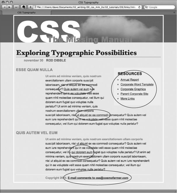
This page contains a variety of links (circled in Figure 9-11) that point to other pages on the site, links to pages on other websites, and an email address. Start by changing the color of the links on this page.
Open links.html in a text editor and place your cursor between the opening and closing <style> tags.
The page already has an external style sheet attached to it with some basic formatting, plus the <style> tags for an internal style sheet.
Note
As you've done before (Tutorial: Selector Sampler), you'll put the styles for this exercise into an internal style sheet for easy coding and previewing. When done, it's best to move the styles to an external style sheet.
Add a new style to the internal style sheet:
<style type="text/css">
a {color: #207EBF;}</style>This style is about as generic as it gets. It will apply to all <a> tag on the page. It's a good place to start, since it sets up the overall look of links for the page. You'll add more styles that will let you pinpoint links in specific areas of the page. Now, time to remove that boring old underline beneath the link.
Add text-decoration: none; to the style you just created.
This removes the underline, but also makes the link less visible on the page. Remember you should always do something to make links stand out and seem clickable to your site's visitors.
Figure 9-11. Here's a basic web page with links in their standard browser configuration—underlined and blue (or purple, if they're links to previously visited pages). In this case, some links point to other pages on the site, some point to other sites, and one is an email address. In this tutorial, you'll style each of these links differently.
Add font-weight: bold; to the a style.
Now links appear in bold (other text may appear bold, too). Next you'll replace the underline, but you'll do it a bit more creatively, using a border instead of the text-decoration property.
Add a border declaration to the style, so it looks like this:
a { color: #207EBF; text-decoration: none; font-weight: bold;border-bottom: 2px solid #F60;}The links really stand out, and using a border instead of the normal underline applied to links lets you change the line's color, size, and style (Figure 9-12, left). Now you'll change the look of visited links.
Add a :visited pseudo-class style for visited links:
a:visited {
 color: #6E97BF;
}
This style changes the look of visited links to a lighter, grayer shade of the main link color—a subtle way to draw attention away from an already visited page. If you preview the page, click one of the links (try one in the middle part of the page) and then return to the links.html page. You should see the link get lighter in color. You'll also notice that it stays bold and continues to have the orange underline you assigned to the a style in step 6. That's the cascade in action (Chapter 5)—the a:visited style is more specific than a plain a selector, so its color property overrides the color assigned by the a style.
Time to take it a step further by adding a rollover effect, so the link's background changes color when the mouse moves over it.
Add a :hover pseudo-class style to the style sheet:
a:hover {
  color: #FFF;
  background-color: #6E97BF;
  border-bottom-color: #6E97BF;
}
This pseudo-class applies only when the mouse is over the link. The interactive quality of rollovers lets visitors know the link does something (Figure 9-12).
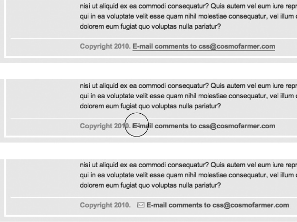
The email link at the bottom of the page looks no different than the other links on the page (Figure 9-13, top). You have other plans for that mailto link, however. Since it points to an email address, clicking it doesn't take a visitor to another page, but instead launches an email program. To provide a visual cue emphasizing this point, you'll add a cute little email icon.
Add a descendent selector to the internal style sheet of the links.html file:
#legal a {
  color: #666666;
  border: none;
  background: url(images/email.gif) no-repeat left center;
}
The email link's inside a <p> tag with an ID of legal, so this style affects only this link, and the color declaration makes it gray. The border: none setting removes the underline defined by the a style you created in step 6—you're going for a subtle look here. The background property adds an image on the left edge of the link. Finally, the no-repeat value forces the graphic to appear just a single time. Trouble is, the graphic lies directly underneath the link, so it's hard to read the text (circled in the middle image in Figure 9-13).
Add 20 pixels of left padding to the #legal a style you just created:
padding-left: 20px;
Remember that padding adjusts the space between content and its border. So adding some left padding moves the text over 20 pixels but leaves the background in place. One last touch: move the entire link a little away from the copyright notice.
Add 10 pixels of left margin to the style, so it finally ends up like this:
#legal a { color: #666666; border: none; background: url(images/email.gif) no-repeat left center; padding-left: 20px;margin-left: 10px;}This small visual adjustment makes it clear that the icon is related to the link and not part of the copyright notice (Figure 9-13, bottom).
Tip
You can also use an advanced attribute selector, as described on Attribute Selectors, to highlight all email links this way. You'll see those selectors used in the next section.
At times you may want to indicate that a link points to another website. In this way, you can give your visitors a visual clue that there's additional information elsewhere on the Internet or warn them that they'll exit your site if they click the link. Also, you may want to identify links that point to downloadable files or other non-web-page documents.
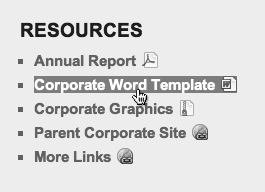
On the web page you're working on, the right-hand "Resources" sidebar contains different types of links that you'll highlight with icons—a different icon for each type of link. First, you'll set up a basic style that applies to all of those links.
Add this style to the links.html internal style sheet:
#resources a {
  border-bottom: none;
}
Since all of the links you want to format are inside a <div> with the ID resources, the descendent selector #resources a, targets just those links. This style gets rid of the underline that the generic link style added (step 6 on Adding a Background Image to a Link added).
Next, you'll add an icon next to external links.
Add another style at the end of the links.html internal style sheet:
a[href^='http://'] {
  background: url(images/globe.png) no-repeat right top;
}
This style uses the advanced attribute selector discussed on Attribute Selectors. Basically, it targets any link that begins with http://. As with the email link style you created earlier, this style adds a background image. It places the image at the right side of the link.
Note
In this section, you're using advanced attribute selectors to style the different links in the page's sidebar. Most browsers understand these styles—with the exception of IE 6. If you want to create similar styles that work with IE 6, your best bet is to use class styles—.externalLink, for example—and then manually apply class names to links that point outside your site: <a class="externalLink" href="http://www.twitter.com">. This method will take a lot of work, however, since you need to add classes to each type of link—external, PDF files, Word docs, and so on. Unless your client or boss demands it, it's better to be forward-looking and use these CSS 3 selectors—the dwindling community of IE 6 users will still be able to click the links, they just won't see the icons.
However, this style has a similar problem as the email link style—the image sits underneath the link's text. Fortunately, the solution is the same—just add some padding to move the image out of the way of the text. In this case, though, instead of adding left padding, you'll add right padding (since the icon appears on the right side of the link). In addition, since every link in the resources box will have a similarly sized icon, you can save some code by adding the padding to the #resources a style you created in step 1.
Edit the #resources a style so that it looks like this:
#resources a { border-bottom: none;padding-right: 22px;}If you save the page and preview it in a web browser, you'll see small globe icons to the right of the bottom two links in the sidebar. Time to format the other links.
Add three more styles to the internal style sheet:
a[href$='.pdf'] {
  background: url(images/acrobat.png) no-repeat right top;
}
a[href$='.zip'] {
  background: url(images/zip.png) no-repeat right top;
}
a[href$='.doc'] {
  background: url(images/word.png) no-repeat right top;
}
These three styles look at how the href attribute ends; identifies links to either Adobe Acrobat files (.pdf), Zip archives (.zip), or Word documents (.doc); and assigns a different icon in each case.
Finally, add a hover state for the resources links:
#resources a:hover {
  color: #FFF;
  background-color: #6E97BF;
}
This style both changes the color of the text and adds a background color (see Figure 9-14).
You can find a finished version of this tutorial in the 09_finished/links/links.html file.