In this exercise you'll turn a plain old list of links into a spectacular navigation bar, complete with rollover effects and a "You are here" button effect.
In a text editor, open 09 → nav_bar → nav_bar.html.
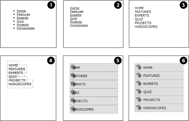
As you can see, there's not much to this file yet. There's an internal style sheet with the basic "reset styles" discussed on Starting with a Clean Slate, and one rule setting up some basic properties for the <body> tag. The HTML consists of an unordered list with six links. It looks like example #1 in Figure 9-15. Your first step is to add some HTML so you can target your CSS to format the links in this list.
Locate the opening <ul> tag and add id="mainNav" to it, so it looks like this:
<ul id="mainNav">
The ID attribute identifies this list as the main navigation area. Use this ID to build descendent selectors to format only these links—and not just any old link on the page.
Below the body style in the internal style sheet, add a new style:
#mainNav {
  margin: 0;
  padding: 0;
  list-style: none;
}
This style applies only to a tag with an ID of mainNav—in this case, the <ul> tag. It removes the indent and bullets that browsers apply to unordered lists, as shown in #2 in Figure 9-15. Next, you'll start formatting the links.
Add a descendent selector to format the links in the list:
#mainNav a {
  color: #000;
  font-size: 11px;
  text-transform: uppercase;
  text-decoration: none;
}
This style defines the basic text formatting for the links. It sets the color and font size, makes all letters uppercase, and removes the line usually found underneath links (# 3 in Figure 9-15). Now start making the links look like buttons.
To the #mainNav a style, add the following border and padding properties:
border: 1px dashed #999;
padding: 7px 5px;
If you preview the file now, you'll see a few problems (#4 in Figure 9-15): The borders overlap and the boxes aren't the same width. That's because the <a> tag is an inline element, so the width of the box is just as wide as the text in the link. In addition, top and bottom padding don't add any height to inline boxes, so the borders overlap. (See Displaying Inline and Block-Level Boxes for a discussion of inline boxes.) You can fix these problems by changing how a browser displays these links.
Add display: block; to the #mainNav a style.
You've changed the basic display of the <a> tag so that it acts like a paragraph or other block-level element, with the links neatly stacked one on top of the other. The only problem now is that they also extend the full length of the browser window—a little too wide for a button. You can fix this by constraining the width of the <ul> tag's style.
Note
If you preview the page in Internet Explorer 6 or earlier, you'll notice a gap between each nav button. Remain calm. You'll fix this bug in step 1 on Fixing the IE Bugs.
In the internal style sheet, locate the #mainNav style and add width: 175px; to it.
With the list's width now set to 175 pixels, the links still expand, but they're limited to the width of their container (the <ul> tag). In many cases, you'll have a list of links inside some layout element (like a sidebar) that already has a set width, so you'll be able to skip this step. (You'll learn how to add sidebars in Part III.)
Now for the fun part.
Add background properties to the #mainNav a style, like so:
#mainNav a { color: #000; font-size: 11px; text-transform: uppercase; text-decoration: none; border: 1px dashed #999; padding: 7px 5px; display: block;background-color: #E7E7E7;background-image: url(images/nav.png);background-repeat: no-repeat;background-position: 0 2px;}These lines add a gray background color to the links and a nonrepeating image at the left edge of each button (#5 in Figure 9-15). You still have a couple of things to fix: The link text overlaps the icon, and the border between each button is 2 pixels thick. (Technically, the borders are still just 1 pixel thick, but the bottom and top borders of adjoining links are creating a 2-pixel line.)
Remove the bottom border and adjust the padding for the #mainNav a style, so it looks like this:
#mainNav a { color: #000; font-size: 11px; text-transform: uppercase; text-decoration: none; border: 1px dashed #999;border-bottom: none;padding: 7px 5px 7px 30px;display: block; background-color: #E7E7E7; background-image: url(images/nav.png); background-repeat: no-repeat; background-position: 0 2px; }The text of each link sits clear of the icon and the borders look great…except for one thing. The last link's bottom border is now gone. (Sometimes CSS feels like two steps forward, one step back!) But you have a few ways to fix this snafu. One way is to create a class style with the proper border-bottom setting and then apply it to just that last link. But it would be easier to apply a bottom border to the <ul> tag containing the list of links. (Since there's no padding on that tag, there's no space separating the top of the <ul> from the top of that first link.)
Add a bottom border to the #mainNav style so that it looks like this:
#mainNav { margin: 0; padding: 0; list-style: none; width: 175px;border-bottom: 1px dashed #999;}There you have it: A basic navigation bar using borders, padding, background color and images (#6 in Figure 9-15).
Now it's time to add some interactive and advanced features to this nav bar. First, you'll add a rollover effect to the buttons in your main navigation bar. That way, the buttons change to show your visitor which button she's about to click.
It's also considerate to let your visitor know which page of your site she's on. Using the same HTML nav bar you already have, you can make this bit of interactivity happen automatically. You simply make the button's format change to match the page's section. Sounds simple, but it does require a little planning and setup, as you'll see in the following steps.
The rollover effect is easy, so get that out of the way first:
In the nav_bar.html file, add the following style to the end of the style sheet:
#mainNav a:hover {
  font-weight: bold;
  background-color: #B2F511;
  background-position: 3px 50%;
}
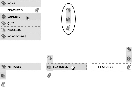
This style sets the button's hover state. It makes the text inside the button bold, and changes the background color to a vibrant green. In addition, it uses the CSS Sprites technique discussed on CSS-Style Preloading Rollovers. The same image is used as in step 8 on Tutorial: Creating a Navigation Bar—however, that image actually holds three different icons (see Figure 9-16). In this case, the image is centered within the button, displaying the middle icon in the file.
Now, moving the mouse over any of the buttons instantly changes its look. (Open the page in your web browser and try it yourself.)
Figure 9-16. With some basic CSS, it's easy to create interactive rollover effects for navigation buttons. You can even automatically highlight the section of the site in which the current page is located. To speed up the download of your navigation bar graphics, you can use the CSS Sprites method described on CSS-Style Preloading Rollovers. Basically you use one image (circled at top right) and adjust its position for different states of each button (bottom row).
Next, make your navigation bar more informative by highlighting the button that matches the section in which the page is located. To do so, you need to identify two things in the nav bar's HTML: the section a page belongs to and the section each link points to. For this example, assume that the page you're working on is the home page.
Locate the <body> tag, and then add id = "home", like so:
<body id="home">
Now that you know what section this page belongs to, you can use a descendent selector to create special CSS rules that apply only to tags on pages within the Features section. Next, you need to identify the section each link applies to, which you accomplish by adding some IDs to those links.
In the nav bar's HTML code, locate the Home link, and then add id="homeLink" so the tag looks like this:
<a href="/index.html"
id="homeLink">Home</a>This ID uniquely identifies this link, providing the information you need to create a style that applies only to that link.
You need to ID the other links in the navigation bar as well.
Repeat step 3 for each of the other links using the following IDs: featureLink, expertLink, quizLink, projectLink, and horoscopeLink.
You're done with the HTML part of this exercise. Now it's time to create some CSS. Because you've ID'd the page and the link, it's easy to create a descendent selector to highlight the Features link.
Add another style to the page's style sheet:
#home #homeLink {
  background-color: #FFFFFF;
  background-position: 97% 100%;
  padding-right: 15px;
  padding-left: 30px;
  font-weight: bold;
}
You've seen all these properties before. Again, you're using the CSS Sprites method to adjust the position of the background image. This time, the image is moved over to the right 97 percent (that is, the point 97 percent across the image is matched up with the point 97 percent across the button), and the bottom of the image is placed at the bottom of the button. In other words, it displays the icon at the bottom of the image (see Figure 9-16). See Percentage Values for a discussion of how percentage values work with background-images.
The most interesting part is the selector—#home #homeLink. It's a very specific selector that applies only to a link with an ID of homeLink that's also inside a <body> tag with an ID of home. If you change the ID of the page to quiz, for example, the link to the Home page is no longer highlighted.
Preview the page in a browser to see the effect: The Home link now has a white background and a paperclip icon. To make this work for the other links, you need to expand this selector a little…OK, make that a lot.
Edit the selector for the style you just added, like so:
#home #homeLink,#feature #featureLink,#expert #expertLink,#quiz #quizLink,#project #projectLink,#horoscope #horoscopeLink {background-color: #FFFFFF; background-position: 97% 100%; padding-right: 15px; padding-left: 30px; font-weight: bold; }Yes, that's a lot of CSS. But your set-up work here has a big payoff. This style now applies to every link in the nav bar, but only under certain conditions, which is exactly how you want it to behave. When you change the id attribute of the <body> tag to quiz, the link to the Quiz gets highlighted instead of the link to the Features section. Time to take your work for a test drive.
Note
This long-winded selector is an example of the group selector discussed on Constructing Group Selectors.
Change the id attribute of the <body> tag to feature like this:
<body id="feature">
Preview the page, and wham! The Feature link is now highlighted with a white background and a paperclip icon (Figure 9-16). The secret at this point is to just change the ID in the <body> tag to indicate which section of the site a page belongs to. For a horoscope page, change the id to id="horoscope" in the <body> tag.
Note
Ready to take this design further? Try adding a rollover effect to complement the style you created in step 6. (Hint: Use the :hover pseudo-class as part of the selector like this: #quiz #quizLink:hover. ) Also try adding a different graphic for the Home link. (You have a home.png file in the images folder to use.)
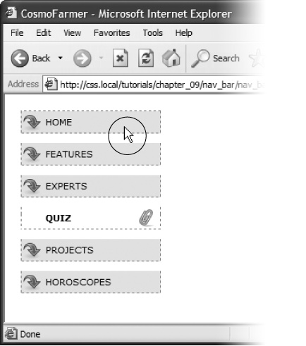
What would a CSS tutorial be if there weren't any Internet Explorer bugs to fix? Unfortunately, the navigation bar doesn't work quite right in Internet Explorer 6 or earlier (it's fine in IE 7 and 8). First, an annoying gap appears between each button. In addition, only the text—not the entire area of the button—is clickable (Figure 9-17). In other browsers, moving the mouse over any part of the background (including the empty space to the right of the link text) highlights the link. Fortunately, the fix is simple.
Figure 9-17. Internet Explorer has some problems with the navigation bar at this point. It adds space between each link and will highlight a link only if the cursor (circled) is directly over the text link.
Edit the #mainNav a style by adding zoom: 1. The final style should look like this:
#mainNav a { text-decoration: none; color: #000000; font-size: 11px; text-transform: uppercase; border: 1px dashed #999999; border-bottom: none; padding: 7px 5px 7px 30px; display: block; background-color: #E7E7E7; background-image: url(images/nav.png); background-repeat: no-repeat; background-position: 0 2px;zoom: 1;}As discussed in the box on Got Layout?, this weird little bit of code is enough to fix IE 6. Go figure.
If you have Internet Explorer 6, preview the page in it.
The navigation bar should now work as well in that browser as it does in more savvy browsers like Internet Explorer 8, Firefox, Opera, and Safari.
To see the completed version of this navigation bar, see the file 09_finished → nav_bar → nav_bar_vertical.html.
Note
In many cases, when creating specific styles targeted to just Internet Explorer, it's a good idea to isolate them from your other styles. Not that they're contagious, but they usually include nonsense CSS that for weird reasons smoothes out IE kinks. You don't want to read your style sheet later and get confused about why you included some bizarre CSS. In fact, the preferred method is to put IE-only styles in external style sheets and attach them using Microsoft's conditional comments feature. Get the full story on Isolate CSS for IE with Conditional Comments.
Suppose you want a horizontal navigation bar that sits at the top of the page. No problem—you did most of the hard work in the last part of this tutorial. Just modify that page a little to spread the buttons along a single line. (You'll use the nav_bar.html file you just completed, so if you want to keep the vertical nav bar, then save a copy of the file before proceeding.)
Make sure you've completed all the steps above to create the vertical navigation bar, and have the file nav_bar.html open in your text editor.
Now you'll see how easy it is to change the orientation of a navigation bar. Start by cleaning up some of the work you already did. You need to remove the width you set for the <ul> tag in step 6 on Using floats for horizontal navigation. That width prevented the nav buttons from spanning the entire length of the page. But since the <ul> needs to spread out much wider to contain the side-by-side buttons, this width has to go.
Find the #mainNav style, and then remove the width: 175px; declaration.
And now it's time for the big secret of vertical nav bars—placing the buttons side by side.
Add a new style to your style sheet (directly below the #mainNav style is a good spot):
#mainNav li {
  float: left;
  width: 12em;
}
This style applies to the <li> tag (the list items that hold each link). The first declaration floats the tag to the left. In this way, each <li> tag attempts to wrap around to the right side of the previous <li> tag. (You saw the same effect in the photo gallery tutorial on Tutorial: Creating a Photo Gallery.) Also, setting the width of the <li> tag defines the width of each button. Here, a value of 12ems provides enough space to contain the longest link name—Horoscopes. When you're working with longer links, you need to increase this value.
Tip
Using an em value for the width of the buttons used to be considered a best practice among web designers, since em values adjust to changes in the browsers font size. So if a visitor chose to increase the font size, the em-width button would also grow in size. However, most web browsers these days use a "page zoom" feature, so that when you enlarge the text, you're actually enlarging the entire page—zooming in—so even buttons and other elements whose widths are defined in pixels, grow in size. So nowadays, you see more designers using pixel values for everything.
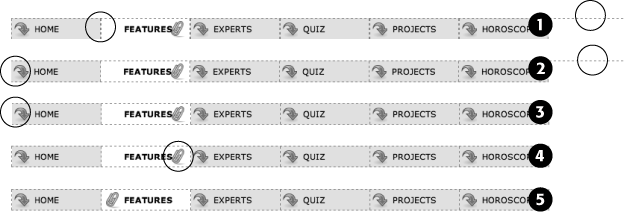
If you preview the page now, you'll see the basics are complete. All that's left are some cosmetic enhancements (see the circled areas of #1 in Figure 9-18). First, the bottom border you created in step 10 on Adding Rollovers and Creating "You Are Here" Links runs the entire length of the <ul> tag—wider than the navigation buttons themselves. Even stranger, that bottom border is no longer on the bottom—it's on top of the navigation buttons! In addition, since the buttons sit side by side, their left and right borders combine to make a 2-pixel border between each button. You'll fix that problem now.
In the #mainNav a style change border-bottom: none; to border-left: none;.
This change removes the left border so that the borders don't double up between buttons and at the same time adds a border to the bottom of each button. But that <ul> tag's bottom border is still on top of the buttons, and now the nav bar is missing a border on the far left button (see circled areas of #2 in Figure 9-18). No problem—just change the border on the <ul> tag.
Locate the #mainNav style and change border-bottom: 1px dashed #999999; to border-left: 1px dashed #999999;.
If you preview the page now, you'll see that the border above the buttons is gone, but there's still no left border (#3 in Figure 9-18). You're witnessing one of the complications of using floats. That is, floating the list items removes them from the normal flow of the document, so web browsers no longer see them as part of the <ul> tag, and the <ul> tag shrinks down to nearly no height—that's the reason the ul's bottom border appeared on top as well. (If this whole scenario sounds confusing, it is. That's why there's an entire section of Chapter 12 dedicated to dealing with the issue—see Overcoming Float Problems for the details.)
Fortunately, while the problem is complex, the solution is simple. Add one CSS property to the bulleted list.
Add two properties to the end of the #mainNav style (changes are in bold):
#mainNav { margin: 0; padding: 0; list-style: none; border-left: 1px dashed #999999;overflow: hidden;zoom: 1; /* for IE 6 */}The overflow: hidden forces the unordered list to expand. Why does this property work? See the detailed coverage on Clearing and Containing Floats. The zoom: 1 is for your old nemesis, Internet Explorer 6.
Finally, that paperclip aligned to the right edge of the "You are here" button looks funny (#4 in Figure 9-18). You'll switch its position to the left edge of the button.
Locate the "You are here" style you created in step 6 on Adding Rollovers and Creating "You Are Here" Links. (It's the one with the crazy, long-winded selector.) Change its background position from 97% 100% to 3px 100%. The style should now look like this:
#home #homeLink, #feature #featureLink, #expert #experLink, #quiz #quizLink, #project #projectLink, #horoscope #horoscopeLink { background-color: #FFFFFF;background-position: 3px 100%;padding-right: 15px; padding-left: 30px; font-weight: bold; }Preview the page, and you'll find a fully functional horizontal navigation bar (#5 in Figure 9-18). And guess what? It works perfectly even in Internet Explorer 6.
To see the finished version, open the file 09_finished → nav_bar → nav_ bar_horizontal.html.


