Float-based layouts take advantage of the float property to position elements side by side and create columns on a web page. As described in Chapter 7 (Wrap Content with Floating Elements), you can use this property to create a wrap-around effect for, say, a photograph, but when you apply it to a <div> tag, float becomes a powerful page-layout tool. The float property moves a page element to one side of the page (or other containing block). Any HTML that appears below the floated element moves up on the page and wraps around the float.
The float property accepts one of three different values—left, right, and none. To move an image to the right side of the page, you could create this class style and apply it to the <img> tag:
.floatRight { float: right; }The same property applied to a <div> tag full of content can also create a sidebar:
#sidebar {
  float: left;
  width: 170px;
}
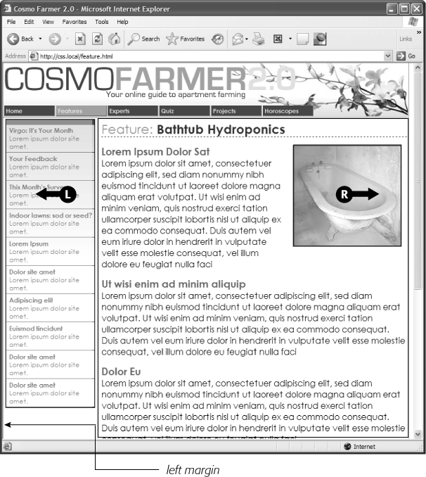
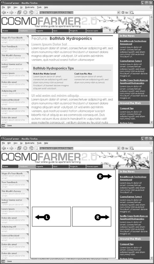
Figure 12-1 shows these two styles in action.
Note
The none value turns off any floating and positions the element like a normal, unfloated element. It's useful only for overriding a float that's already applied to an element. You may have an element with a particular class such as "sidebar" applied to it, with that element floating to the right. But on one page you may want an element with that class to not float, but to be placed within the flow of the page, like this Note box. By creating a more specific CSS selector (see Specificity: Which Style Wins) with float: none, you can prevent that element from floating.
Figure 12-1. You can use the float property to lay out a web page with multiple columns. On this page, a block of content is floated to the left edge. The sidebar has a set width, but the main content doesn't, which makes this design a liquid layout (Types of Web Page Layouts). The main section of the page simply expands to fill the width of the browser window. In the upper right, the bathtub photo is floated to the right.
A simple two-column design like Figure 12-1 requires just a few steps:
Wrap each column in a <div> tag with an ID or class attribute.
In Figure 12-1, the news items listed in the left sidebar are wrapped in one <div>—<div id="news">—and the main content in another div—<div id="main">.
Float the sidebar <div> either right or left.
When you work with floats, the source order (the order in which you add HTML to a file) is important. The HTML for the floated element must appear before the HTML for the element that wraps around it.
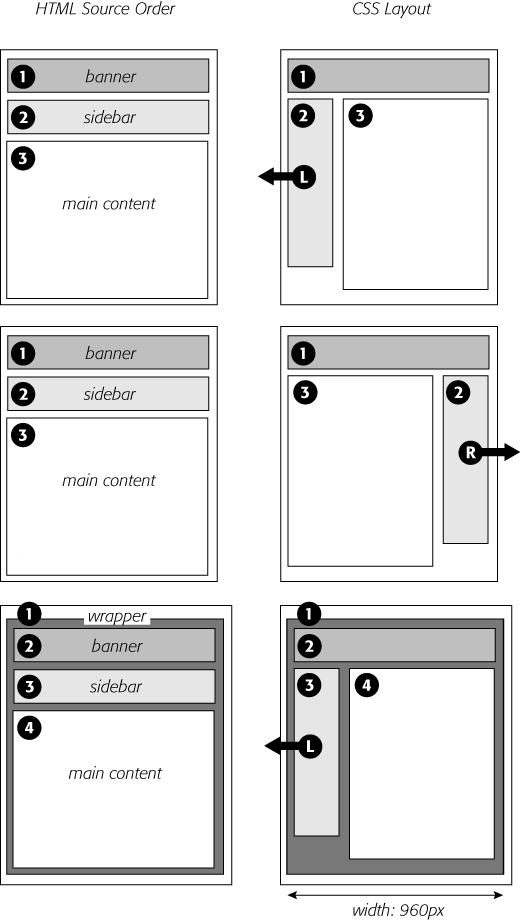
Figure 12-2 shows three two-column layouts. The diagrams on the left side show the page's HTML source order: A <div> for the banner, followed by a <div> for the sidebar, and, lastly, a <div> for the main content. On the right side, you see the actual page layout. The sidebar comes before the main content in the HTML so it can float either left (top, bottom) or right (middle).
Set a width for the floated sidebar.
Unless you're floating an image with a predefined width, you should always give your floats a width. This way, you create a set size for the floated element, letting the browser make room for other content to wrap into position.
The width could be a fixed size like 170px or 10em. You can also use percentages for a flexible design that's based on the width of the browser window. (See Using Pixels for more about the pros and cons of the different measurement units.) If the sidebar is 20 percent wide, and the browser window is 700 pixels wide, then the sidebar will be 140 pixels wide. But if your visitor resizes the window to 1000 pixels, then the sidebar grows to 200 pixels. Fixed-width sidebars are easier to design for, since you don't have to consider all the different widths the sidebar might stretch to. However, percentages let you maintain the same proportions between the two columns, which can be more visually pleasing.
Note
When the overall page design is a fixed width (as described in the box on Margin and Padding Shorthand), percentage width values for the sidebar are based on the fixed-width containing element. The width isn't based on the window size and won't change when the browser window changes size.
Add a left margin to the main content.
If the sidebar is shorter than the other content on the page, the text from the main column wraps underneath the sidebar, ruining the look of two side-by-side columns (see Figure 12-16 for an example). Adding a left margin that's equal to or greater than the width of the sidebar indents the main content of the page, creating the illusion of a second column:
#main { margin-left: 180px; }By the way, it's usually a good idea to make the left margin a little bigger than the width of the sidebar: This creates some empty space—a white gutter—between the two elements. So, when you use percentages to set the width of the sidebar, use a slightly larger percentage value for the left margin.
Figure 12-2. Creating a two-column layout is a simple matter of floating a <div> tag to the left (top). To make a sidebar move from the left to right side of the page (middle), just change the sidebar's CSS styling to float: right. You don't need to make any other changes to your CSS or HTML.
Avoid setting a width for the main content div. It's not necessary, since browsers simply expand it to fit the available space. Even if you want a fixed-width design, you don't need to set a width for the main content div, as you'll see in the next section.
Now that you've learned a basic two-column liquid layout, you can adapt it in countless ways. Converting it into a fixed-width layout is a snap. Simply wrap all the tags within the page's body inside another <div> (like <div id="wrapper">). Then, create a style for that new container element that has a set width, such as 960 pixels (see Figure 12-2, bottom). That width setting constrains everything inside the container box.
Tip
It's also possible to create a fixed-width page without resorting to the extra wrapper div: set a width on the <body> tag. You already saw an example of this technique in the tutorial on Controlling Page Margins and Backgrounds.
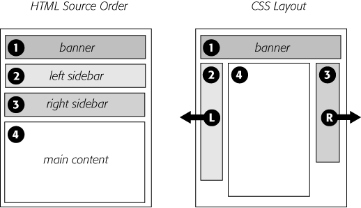
Expanding it into a three-column design isn't difficult, either (Figure 12-3). First, add another <div> between the two columns and float it to the right. Then add a right margin to the middle column, so that if the text in the middle column runs longer than the new right sidebar, it won't wrap underneath the sidebar.
The rest of this section explores more CSS layout techniques that use float-based layouts.
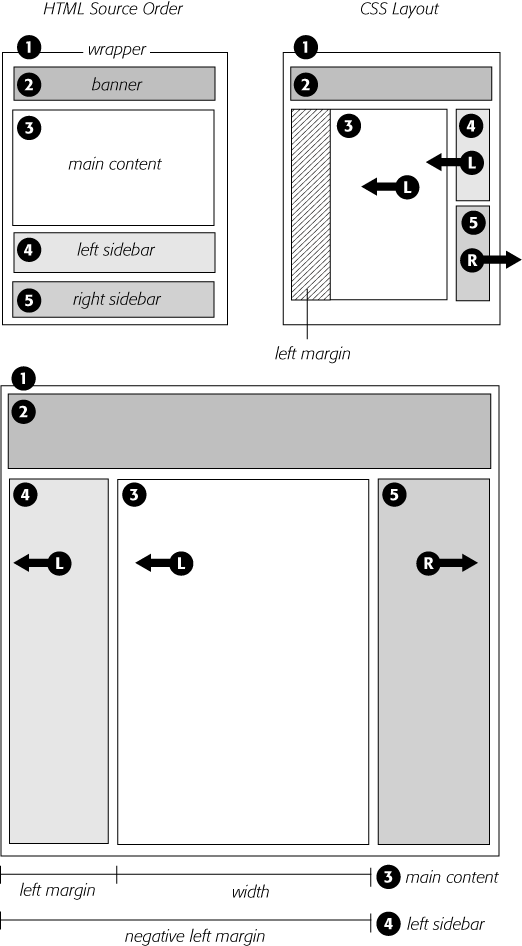
Figure 12-3. A three-column design uses the same concepts used to create a two-column design. In this case, you float both the left and right sidebars and add both left and right margins to the center column. The left-hand diagram shows the order of the HTML; the right side shows what the web page looks like.
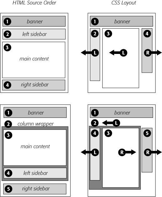
It's perfectly possible to float every column, not just the left and right sidebars. You could float the first sidebar to the left, the middle column to the left, and the right sidebar to the right, as shown in Figure 12-4, top. This approach lets you put more than three columns in your design. You can float four or more columns, as long as there's room for all the floats to fit side by side.
When you float all columns in a design, you need to pay close attention to the widths of each column. If the total width of all the columns is less than the space available—for example, if the browser window is smaller or the columns are placed inside another <div> with a set width—then the last column drops down below the others. (You can read a solution to this dropping float problem on Preventing Float Drops.)
In addition, floating more than just the sidebars lets you change the order of your divs in the HTML. Take, for example, the left diagram in Figure 12-3, which shows the order of the <div> tags for that page. Because of the way floated elements work, they must appear before any content that wraps around them, so in this example, the main content area must go after the sidebars.
The order of the <div> tags in the HTML may not seem like a big deal until you try to browse the web page without CSS, which is the case for many alternative browsers, including screen readers that read a page's content aloud to visually impaired visitors. Without CSS, all the sidebar material (which often includes navigational elements, ads, or other information that's not relevant to the main topic of the page) appears before the content the visitor came to read in the first place. The inconvenience of having to scroll past the same sidebar content on each page will turn off some visitors. Furthermore, your page is less accessible to vision-impaired visitors, who have to listen to their screen readers read off a long list of links and ads before coming to any real information.
And if that doesn't sway you, you've got the search engines to worry about. Most search engines limit the amount of HTML they read when searching a site. On a particularly long web page, they simply stop at a certain point—possibly missing important content that should be indexed by the search engine. Also, most search engines give greater value to the HTML near the beginning of the file. So if you're worried about getting good placement in search engine results, it's in your best interest to make sure the important content is as close as possible to the top of the page's HTML code. Finally, floating every column also avoids a 3-pixel bug that affects Internet Explorer 6 and earlier (see 3-Pixel Gaps).
In the top-left diagram in Figure 12-4, the main content's HTML is between the left and right sidebars, which is better than having it after both sidebars. You can even put the main content before both sidebars' HTML by wrapping the main content and left sidebar in one <div>, floating that <div> left, and then floating the main content right and the left sidebar left within that <div> (Figure 12-4, bottom). Voilà—the main column's HTML falls before the other <div> tags.
The bottom diagram in Figure 12-4 illustrates another useful technique—floating elements within floats. Imagine that the main content (3) and the left sidebar (4) divs didn't exist, and only the column wrapper (2) and the right sidebar (5) were left. You'd have just a basic two-column design, with one column floated left and another floated right. In fact, it's still a two-column design even with the two divs (3 and 4) placed back inside the column-wrapper div. The difference is that the left column is itself divided into two columns.
Figure 12-4. There's more than one way to float a page. CSS's flexibility provides many ways to create a multi-column layout. Using different methods of floating, you can easily change the source order of the HTML for the page, as you can see in the diagrams at left. Right-side diagrams represent final web page layout.
Although this arrangement is a bit confusing, it's also helpful in a number of instances. First, it lets you add columns within a column. The three-column layout at the top of Figure 12-5 shows a small Tips box in the middle column that also has two columns inside it. By nesting floats inside floats, you can create some very complex designs.
In addition, when you have just a couple of floated elements divided into columns with additional floated elements, it's easier to calculate the widths of page elements. That's a good thing when you need to control float drops (Preventing Float Drops) and other problems that occur when columns get too wide.
While the last section provided a few techniques that let you reorder the HTML for each column in a design, there's an even more advanced technique that gives you complete control over the placement of your columns. By using negative margins, you can put your <div> tags in any order you wish in your HTML, and then position them in a different order onscreen—thereby keeping your pages accessible to screen readers, text browsers, and search engines. In addition, since you don't need to worry about the source order, you can always change the design of a page—maybe float the main column to the far right and the two sidebars to the left—without having to change the HTML of the page. Be warned, though, this method involves math and some mind-bending uses of CSS. You can live a healthy, happy life using just the float methods presented earlier in this chapter. But if you're up for some adventure, read on. (The tutorial also presents a hands-on demonstration of this method, starting on Tutorial: Multiple-Column Layouts.)
Note
The technique described on these pages works only for fixed-width layouts, where you know the exact width of each column. For another method that achieves the same results with a liquid layout (where you don't know the exact width of the middle column), visit www.alistapart.com/articles/holygrail. Also, you'll find a completely liquid design using negative margins—all columns change width with the browser window—described in the book Flexible Web Design by Zoe Mickley Gillenwater (New Riders).
Here's how to lay out a page using negative margins:
Add a wrapper <div> around all of the page content.
This step provides a container for setting a fixed width for all of the content on the page and gives you an easy way to make the banner, columns, and footer the same width.
Set a width for the wrapper <div>.
Create a style for the wrapper div that gives it a set width. For example, 960 pixels is a typical size that accommodates visitors with 1024 X 768 pixel monitors.
Figure 12-5. Top: Create columns within columns by floating elements inside another floated element. In the middle column, the Tips box provides a simple two-column note that adds visual interest to the page. Bottom: It doesn't matter which direction the container is floated (in this instance, to the right)—you simply float the two additional columns left and right.
Wrap each column in a <div> tag with an ID or class attribute.
This part of the process is the same as creating any float-based layout. It defines the basic layout blocks (Figure 12-6, top left).
Float the divs for each column.
You must float each of the columns in your design. When you float them all to the left, they sit side by side. Another option is to float the left sidebar and main content left and the right sidebar right. (Since all columns are enclosed in the wrapper <div> from step 1, the right sidebar stays close to the central column.)
Set widths for each column.
You should always specify a width for a floated element. Depending on your design, you can also add padding, margins, and borders. Keep in mind, though, that the total width of the three columns in the browser window is the sum of the CSS width property values and the left and right margins, padding, and borders for each column. Yep, here's where the math comes in. If you're not careful, the total width of the columns may exceed the width provided by the wrapper <div>, causing the dreaded float drop (see Preventing Float Drops).
Note
The width property doesn't define the total width that an element takes up onscreen. Margins, padding, and borders count, too. If this stuff doesn't sound familiar, then read Understanding the Box Model to brush up on the CSS box model theory.
Add a left margin to the main column.
Here's where the negative-margin technique differs from the layout methods described earlier in this chapter. The left margin should equal the space required for the left sidebar. If the left sidebar is 160 pixels wide, then set the left margin of the main column to 160 pixels: margin-left: 160px. The top-right diagram in Figure 12-6 shows the page so far. The crosshatched area to the left of the main column (3) represents that column's left margin.
Or, say the left sidebar is 160 pixels wide and you want 10 pixels of space between it and the main content. In that case, add 10 pixels to the main column's left margin: margin-left: 170px.
Finally, when the left sidebar has padding and borders, you need to factor those in as well. Suppose the left sidebar is 160 pixels wide, has a 2-pixel right border and 10 pixels of left and right padding, and you want 10 pixels of space between it and the main column. Add all of these together to get the left margin value for the main column. So, 160 (width value) + 2 (right border) + 10 (left padding) + 10 (right padding) + 10 (gutter between sidebar and main column) = 192 pixels (margin-left: 192px).
Apply a negative margin to the left sidebar <div>.
At this point, the left sidebar is floated to the left, but since it comes after the main column in the HTML's source order, it appears on the right edge of the main column (Figure 12-6, top right). To get it into position, use a negative margin, which—believe it or not—pulls the sidebar clear across the main column to the left edge of the page. The only trick is figuring out what that negative margin value should be to move the sidebar the exact distance required to position it at the left side of the page. In other words, the left margin must equal the distance from the right edge of the main column to the left edge of the wrapper <div>.
Figure 12-6. Yes, Virginia, you can put three divs in any order in your HTML (top left) and position them in any order on the screen (bottom). The secret is using negative margins to pull an element that appears later in the HTML over and past an element that precedes it. In the top-right diagram, notice that the left sidebar (4) floats next to the main content column (3); adding a negative margin to the left sidebar pulls it into position on the left edge of the page. To make room for that left sidebar, you also add a positive left margin to the middle columns (indicated by the crosshatched box on the top-right diagram).
To determine that value, add the main column's width, left and right margins, left and right padding, and left and right borders. Say the main column is 400 pixels wide, has a 1 pixel border around it, has 10 pixels of left padding and 15 pixels of right padding, and has a 192 pixels left margin to accommodate the left sidebar. Just add the values together to get the left sidebar's left-margin value: 400+1+1+10+15+192 = 619. Then add a left margin to the style formatting the left sidebar, but make its value negative: margin-left: -619px;;. The minus sign is the critical piece that makes the whole thing work.
Fix the Internet Explorer bugs.
When you use negative margins, Internet Explorer 6 and earlier exhibits a weird bug—the double-margin bug. In this case, IE doubles the left margin applied to the main column, totally disrupting the design. The fix is to add display: inline to the style formatting the main column. (Read more about the double-margin bug on Handling Internet Explorer 6 Bugs.)
Once you get past the math, the negative margin approach rewards you with flexibility. If you want to swap the sidebars so the left sidebar moves to the right and right sidebar moves to the left, then simply swap the styles for those two divs. In other words, set the first sidebar to float right and the second sidebar to float left using a negative left margin. You'll see negative margins in action in the tutorial on Floating the Columns.
