In this tutorial, you'll explore elements of the CSS box model, adjust the spacing around objects on a page, add colorful borders to items on a page, and control the size and flow of page elements.
To get started, you need to download the tutorial files located on this book's companion website at www.sawmac.com/css2e/. Click the tutorial link and download the files. (All of the files are enclosed in a Zip archive. See detailed instructions for unzipping the files on the website.) The files for this tutorial are contained inside the 07 folder.
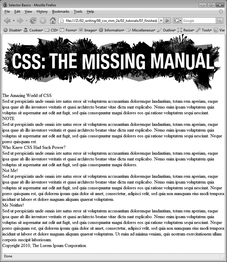
You'll start with a very basic HTML file containing an internal style sheet with a basic CSS reset style. It's not much to look at right now (see Figure 7-14).
Note
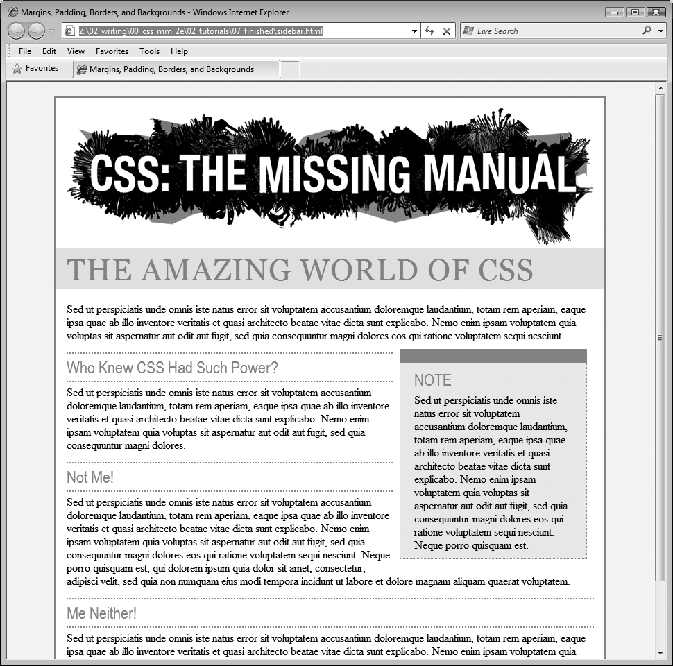
For a sneak preview of the final result, check out Figure 7-17.
In your favorite text editor, open 07 →sidebar.html.
There's already an internal style sheet added to this page containing a single group selector. This selector is the most important style in the CSS reset style sheet. It basically removes all margins, padding, font size, and font weight from the most common block-level elements and eliminates many of the cross-browser display problems you'll encounter related to these properties.
At a bare minimum, you should always include this style in every style sheet you create. Within this style, the most important properties are the margin and padding settings. There's enough cross-browser-related weirdness related to those two properties that you should always zero these out and start fresh. You'll start with something simple: a background color.
In the internal style sheet, click directly after the CSS comment /* end reset styles */ and add a tag selector style:
html {
 background-color: #FDF8AB;
}
This style adds a light yellow background color to the page. If you want to color the background of a web page, you can add the background-color property to either the <html> tag or the <body> tag. Next, you'll add some margins, borders, and other properties to the <body> tag.
Add another style to the internal style sheet:
body {
 background-color: #FFF;
 border: 3px solid #85A110;
}
This style adds a white background color to the <body> tag and a 3-pixel green border. Because the <body> tag sits inside the <html> tag, a web browser considers it to be "on top" of the <html> tag, so the white background will cover the yellow color you added in the previous step. Next you'll give the body tag a width and adjust its padding and margins.
Tip
Normally if you add a background color property to the <body> tag, that color fills the entire browser window; however if you also add a background color to the <html> tag, the body's background color only fills the area with content. To see this in action, just preview the web page after step 3 above; then delete the html tag style, and preview the page again. A weird, but useful bit of CSS trivia.
Edit the body style you just created by adding five new properties (changes are in bold):
body { background-color: #FFF; border: 3px solid #85A110;wwidth: 760px;margin-top: 20px;margin-left: auto;margin-right: auto;padding: 15px;}The width property constrains the body so that it's just 760 pixels wide: if a visitor's browser window is wider than 760 pixels, then he'll see the background color from the html style, and a 760-pixel box with the white background of the body tag.
Figure 7-14. This web page is barebones HTML, with a single style that removes much of the built-in web browser styling. It'll look a lot better with a box model makeover.
The margin-top property adds 20 pixels of space from the browser windows top edge—nudging the body tag down just a bit; while the left and right margin settings center the body in the middle of the browser window. "Auto" is just another way of telling a browser, "You figure it out," and since that auto value is applied to both the left and right margins, a browser simply provides equal space on the left and right side.
Note
You could also have used the margin shorthand property (Colliding Margins) to condense those three lines of margin settings to just one like this:
margin: 20px auto 0 auto;
Finally, to keep the content inside the <body> from touching the border line, 15 pixels of space are added to the inside of the body using the padding property—in other words the image and text is indented 15 pixels from all four edges.
Your style sheet is pretty far along, and you're ready to check the page.
Save the file and preview the page in a web browser.
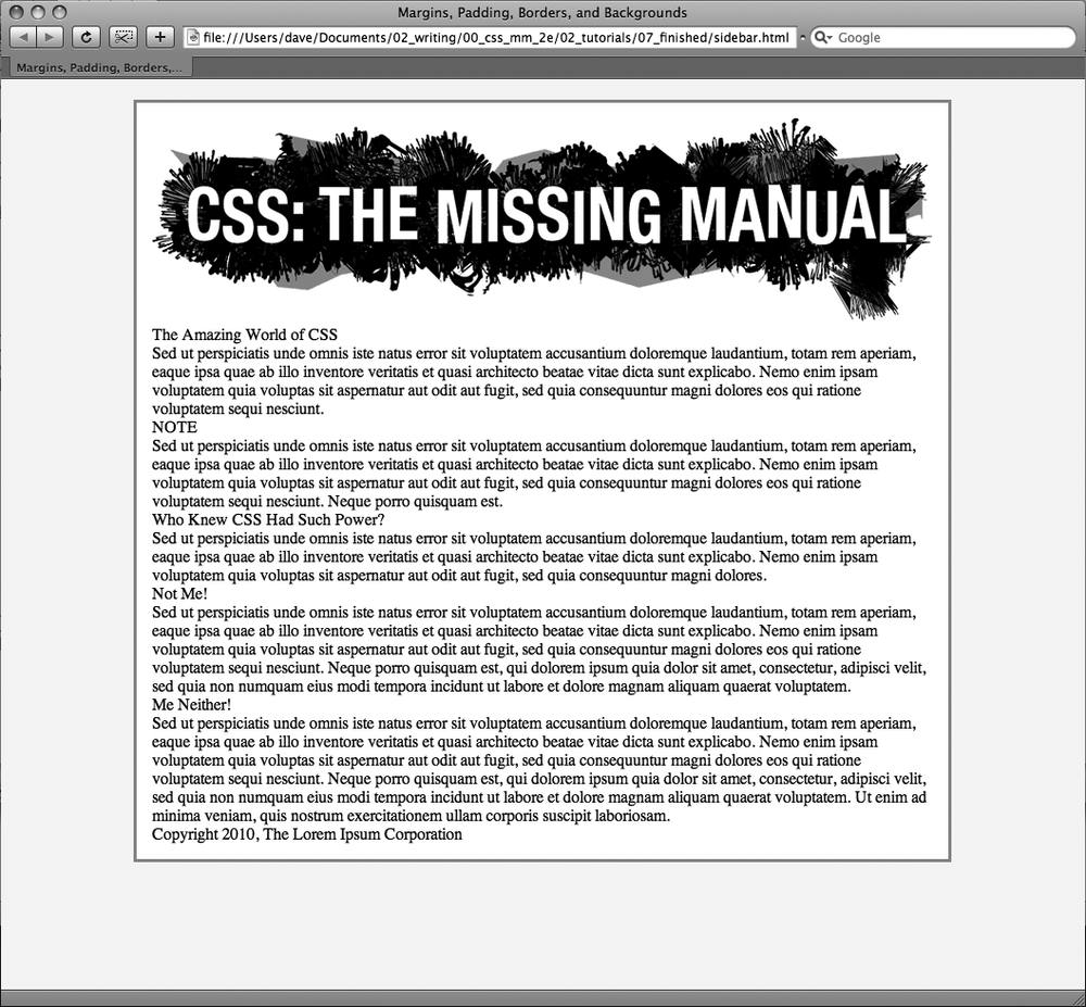
You should see a white box with an image, a bunch of text, and a green outline floating in a sea of yellow (see Figure 7-15). The text needs some loving attention. You'll take care of that next.
Figure 7-15. Setting the left and right margins to auto for any element with a set width centers it. In this case, setting a width for the body and adding margin-left: auto and margin-right:auto places it smack dab in the center of the browser window. Unfortunately, there's no easy way to center an element vertically (with equal space above and below it) using CSS. There are a few tricks that crafty designers have come up with, though. If you're after vertically centered elements check out www.student.oulu.fi/~laurirai/www/css/middle/ and www.search-this.com/2008/05/15/easy-vertical-centering-with-css/.
Since the CSS reset style pretty much stripped the text on this page of all formatting, you'll need to create styles to make the headings and paragraphs look great. You'll start with the <h1> tag at the top of the page.
Return to your text editor and the sidebar.html file. Click at the end of the closing brace of the body tag selector, press Enter (Return) to create a new line, and then add the following style:
h1 {
 font-size: 44px;
 font-family: Georgia, "Times New Roman", Times, serif;
 letter-spacing: 1px;
 color: #85A110;
 text-transform: uppercase;
}
This style uses many of the text-formatting properties discussed in the previous chapter—the top headline is 44 pixels tall and all uppercase, uses the Georgia font, and has a green color, with a little space between each letter. The real fun is adding a background color to really highlight the headline.
Add one new property to the h1 tag style so that it looks like this (changes in bold):
h1 { font-size: 44px; font-family: Georgia, "Times New Roman", Times, serif; letter-spacing: 1px; color: #85A110; text-transform: uppercase;background-color: #E2EBB4;}If you preview the page now, you'll see that the headline has a light green background. When applied to a block-level element like a headline, the background fills the entire horizontal space available (in other words, the color doesn't just sit behind the text "The Amazing World of CSS" but extends all the way to the right edge of the box).
The headline text is a little cramped—the "T" that begins the headline touches the edge of the background. With a little padding, you can fix this.
Add another property to the h1 tag style so that it looks like this (changes in bold):
h1 { font-size: 44px; font-family: Georgia, "Times New Roman", Times, serif; letter-spacing: 1px; color: #85A110; text-transform: uppercase; background-color: #E2EBB4;padding: 5px 15px 2px 15px;}The padding shorthand property provides a concise way to add padding around all four sides of the content—in this case 5 pixels of space are added above the text, 15 pixels to the right, 2 pixels to the bottom, and 15 pixels to the left.
There's one other problem with the headline: Because of the padding added to the body tag (see step 4 on Controlling Page Margins and Backgrounds), the headline is indented 15 pixels from the left and right edges of the green border surrounding the body. The headline would look better if it touched the green border. No problem; negative margins to the rescue.
Add one last property to the h1 tag style so that it looks like this (changes in bold):
h1 { font-size: 44px; font-family: Georgia, "Times New Roman", Times, serif; letter-spacing: 1px; color: #85A110; text-transform: uppercase; background-color: #E2EBB4; padding: 5px 15px 2px 15px;margin: 0 -15px 20px -15px;}Here, the margin shorthand sets the top margin to 0, the right margin to –15 pixels, bottom margin to 20 pixels, and the left margin to –15 pixels. The bottom margin just adds a bit of space between the headline and the paragraph that follows. The next trick is the use of negative values for the left and right margins. As mentioned on Removing Space with Negative Margins, you can assign a negative margin to any element. This property pulls the element out toward the direction of the margin—in this case, the headline extends 15 pixels to the left and 15 pixels to the right, actually expanding the headline and pulling it out over the body tag's padding.
Now, you'll add some formatting of the <h2> tags. Add the following style after the h1 tag style:
h2 {
 font-size: 24px;
 font-family: "Arial Narrow", Arial, Helvetica, sans-serif;
 color: #F96B18;
 border-top: 2px dotted #8DA516;
 border-bottom: 2px dotted #8DA516;
 padding-top: 5px;
 padding-bottom: 5px;
 margin: 15px 0 5px 0;
}
This style adds some basic text formatting and a dotted border above and below the headline. To add a bit of space between the headline text and the lines, it puts a small bit of padding at the top and bottom. Finally, the margin property adds 15 pixels above the headline and 5 pixels below it.
Save the file and preview the page in a web browser.
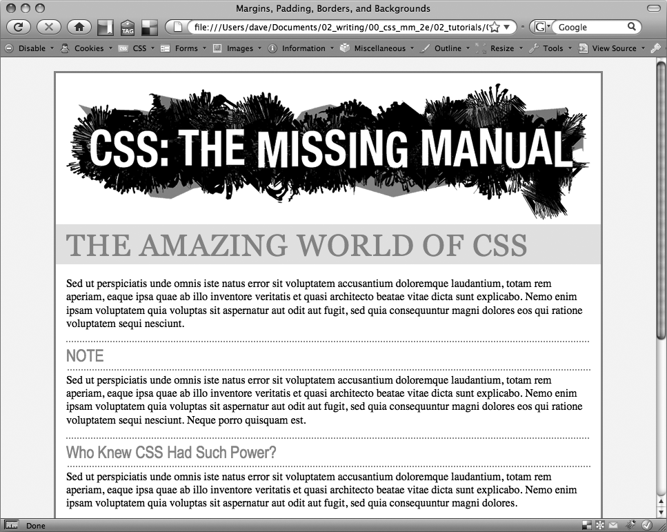
The headlines are looking good (see Figure 7-16). Next, you'll create a sidebar on the right side of the page.
Sidebars are common elements in most types of print publications like magazines, books, and newspapers. They compartmentalize and highlight small chunks of information like a resource list, contact information, or a related anecdote. But to be effective, sidebars shouldn't interrupt the flow of the main story. They should, like the name says, sit unobtrusively off to one side, which you can easily make happen with CSS.
Return to your text editor and the sidebar.html file.
First, you must isolate the region of the page that makes up the sidebar. The <div> tag is the perfect tool. You can enclose any amount of HTML into its own self-contained chunk by wrapping it in a <div> tag.
Click before the first <h2> tag (the one with the "NOTE" headline). Then type <div class="sidebar">, and press Enter (Return).
This HTML marks the beginning of the sidebar and applies a class to it. You'll create the .sidebar class style soon, but first you need to indicate the end of the sidebar by closing the <div>.
Click after the closing </p> tag that immediately follows the <h2> tag (this is the </p> that appears just before <h2>Who Knew CSS Had Such Power?</h2>. Press Enter, and then type </div>.
You've just wrapped a headline and paragraph inside a <div> tag. Next, you'll create a style for it.
In the page's style sheet, add the following style below the <h2> style you created earlier:
.sidebar {
 width: 30%;
 float: right;
 margin: 10px;
}
This style sets the width of the content area (where the text appears) to 30 percent. You don't have to use an absolute value like pixels for widths. In this case, the sidebar's width is 30 percent of the width of the container. The float property moves the sidebar to the right side of the box, and the margin property adds 10 pixels of space around the sidebar.
If you preview the page in a browser, you'll see that the basic shape and placement of the sidebar are set, but there's one problem: The borders from the <h2> tags appear underneath the box. Even though the floated sidebar moves the text of the headlines out of the way, floats don't displace borders or backgrounds. Those just appear right under the floated sidebar. One way to fix this problem is to simply add a background color to the sidebar, so you can't see the h2 borders. (There's another technique, as well, which you'll use in step 8 on Fixing the Browser Bugs.)
Add another property to the .sidebar style so it looks like this (changes in bold):
.sidebar { width: 30%; float: right; margin: 10px;background-color: #FAEBC7;padding: 10px 20px;}This property adds a light orangish color to the sidebar and indents the text from the sidebar's edges so it won't touch the borders you're about to add.
Finally, add two more properties to the .sidebar style so it looks like this (changes in bold):
.sidebar { width: 30%; float: right; margin: 10px; background-color: #FAEBC7; padding: 10px 20px;border: 1px dotted #FC6512;border-top: 20px solid #FC6512;}Here's an example of the handy technique described on Formatting Individual Borders. If you want most of the borders around an element to be the same, you can first define a border for all four edges—in this case a 1 pixel, dotted, orange line around the entire sidebar—and then supply new border properties for the specific edges you want changed—in this example, the top border will be 20 pixels tall and solid. This technique lets you use just two lines of CSS code instead of four (border-top, border-bottom, border-left, and border-right).
The headline inside the sidebar doesn't look quite right. It uses the same properties as the other <h2> tags (because of the h2 tag style you created in step 5). The border is distracting and the top margin pushes the headline down too much from the top of the sidebar. Fortunately, you can use a descendent selector to override those properties.
After the .sidebar style, in the internal style sheet, add a descendent selector:
.sidebar h2 {
 border: none;
 margin-top: 0;
 padding: 0;
}
Because of the .sidebar, this style is more powerful—that is, it has greater specificity as described on Specificity: Which Style Wins—than the basic h2 style. It erases the border from the original h2 tag style, along with the top margin and all of the padding. However, since this style doesn't have a font size, color or font family, those properties from the h2 style still apply—it's the cascade in action!
The page is looking good, but the borders on the h2 tags still run up to and behind the sidebar. That just doesn't look good, but you can fix it easily.
Locate the h2 style and add the overflow property, like so:
h2 { font-size: 24px ; font-family: "Arial Narrow", Arial, Helvetica, sans-serif; color: #F96B18; border-top: 2px dotted #8DA516; border-bottom: 2px dotted #8DA516; padding-top: 5px; padding-bottom: 5px; margin: 15px 0 5px 0;overflow: hidden;}Setting the overflow property to hidden hides the borders that pass beyond the headline text and under the floating element. (Unfortunately, Internet Explorer 6 doesn't get it and still displays the borders underneath the sidebar. But you'll fix that in the next section.)
Save the file and preview the web page in a browser.
The page should look like Figure 7-17.
Unfortunately, the page doesn't look like Figure 7-17 in Internet Explorer 6 for Windows. A couple of bugs in that browser affect the page's appearance for the worse. Read on for the fixes.
While the sidebar.html file looks just fine in Internet Explorer 7 and 8, earlier versions of that browser don't display the page correctly. If you have access to Internet Explorer 6, check it out. You'll see the problems.
For one thing, the border under the two <h2> headlines travels underneath the sidebar. In step 8 above, you used the overflow property to fix this problem in most browsers, but you need something else to get IE 6 straightened out. In addition, the margin around the sidebar is noticeably larger on the right.
Note
If you don't have access to check for yourself, just trust that problems are there and use this section to learn how to fix them for the sake of your visitors who are stuck with IE 6.
You'll tackle the first bug, the overextended borders, first:
Return to your text editor and the sidebar.html file.
You just have to add one property to the h2 tag style—it has no effect on other browsers, but it knocks some sense into IE 6.
Add this new style to the end of the sidebar.html page's style sheet:
h2 {
 font-size: 24px ;
 font-family: "Arial Narrow", Arial, Helvetica, sans-serif;
 color: #F96B18;
 border-top: 2px dotted #8DA516;
 border-bottom: 2px dotted #8DA516;
 padding-top: 5px;
 padding-bottom: 5px;
 margin: 15px 0 5px 0;
 overflow: hidden;
 zoom: 1;
}
Zoom isn't an official CSS property. It's a Microsoft-only property meant to enlarge an element on a page. That's not why you're using it here, though. In this case, the zoom property prevents the border from extending under the float in IE 6. It fixes the border bug—albeit in a completely arcane way. (See the box on Stopping the Float for more details on this browser voodoo.)
Next problem: The double-margin bug that's causing that extra space on the right side of the sidebar. Since this bug affects just IE 6, you'll create a * html style for the sidebar. (As described in the box on Wrap Content with Floating Elements, * html hides the rest of this selector—.sidebar—from all browsers except IE 6 for Windows and earlier.)
Add this style to your style sheet:
* html .sidebar {
 display: inline;
}
This use of the display property is another nonsensical bit of CSS. But it does the job: It tricks IE into removing the extra right margin.
Save the file and preview the page in Internet Explorer 6.
The page should now look like Figure 7-17 in that browser as well. Dealing with these browser bugs is an unfortunate reality for every web developer. You'll learn solutions (also known as hacks) to particular bugs throughout this book. Also, in Chapter 15, you'll learn even more strategies for dealing with hacks used to fix Internet Explorer browser bugs.
The solution is in the sidebar_finished.html file inside the 07_finished folder.
To try out your newfound skills, try this exercise on your own: Create a p tag style to add some pizzazz to the paragraphs on the page—try out some margin settings, font color, and so on. Next, create a class style for formatting the copyright notice that appears at the bottom of the sidebar.html page (called, say, .copyright). In this style, add a border above the copyright notice, change its text color, shrink its font size, and change the type to uppercase. (Hint: Use the text-transform property discussed in on Capitalizing.) After you've created the style, add the appropriate class attribute to the <p> tag in the HTML.


