Both margins and padding add space around content. You use these properties to separate one element from another—for example, to add space between a left-hand navigation menu and the main page content on the right—or to inject some white space between content and a border. You may want to move the border away from the edge of a photo (see Figure 7-2).
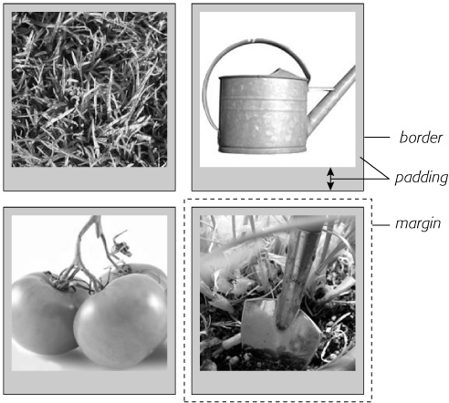
Figure 7-2. Each photo on this page has a 10-pixel margin, so the gap separating two photos is 20 pixels. Padding separates the images from their borders and exposes a gray background color. You can set the border, margin, and padding independently for each edge. Notice the larger padding applied to the bottom edge of each photo.
Padding and margin function similarly, and unless you apply a border or background color, you can't really tell whether the space between two tags is caused by padding or by a margin. But if you have a border around an element or a background behind it, then the visual difference between the two properties is significant. Padding adds space between the content and the border, and keeps the content from appearing cramped inside the box, while margins add white space (often called a gutter) between elements giving the overall look of the page a lighter appearance.
You can control each side of the margin or padding for an element independently. Four properties control margin edges: margin-top, margin-right, margin-bottom, and margin-left. Similarly, four properties control padding: padding-top, padding-right, padding-bottom, and padding-left. You can use any valid CSS measurement to define the size of a margin or padding, like so:
margin-right: 20px;
padding-top: 3em;
margin-left: 10%;
Pixels and ems are commonly used and act just as they do with text (see Using Pixels). A 20-pixel margin adds 20 pixels of space, and 3ems of padding adds space equal to 3 times the font size of the styled element. You can also use percentage values, but they're tricky. (See the box below for the details.)
Note
To remove all the space for a margin or padding, use 0 (margin-top: 0 or padding-bottom: 0, for example). To remove space around all four edges of the browser window—to let a banner or logo or other page element butt right up to the edge without a gap—give the body tag a margin of 0 and a padding of 0: margin: 0; padding 0;.
You'll frequently want to set all four sides of a style's margin or padding. But typing out all four properties (margin-right, margin-left, and so on) for each style gets tedious. Fear not: You can use the shortcut properties named margin and padding to set all four properties quickly:
margin: 0 10px 10px 20px;
padding: 10px 5px 5px 10px;
Note
If the value used in a CSS property is 0, then you don't need to add a unit of measurement. For example, just type margin: 0; instead of margin: 0px;.
The order in which you specify the four values is important. It must be top, right, bottom, and left. If you get it wrong, you'll be in trouble. In fact, the easiest way to keep the order straight is to remember to stay out of TRouBLe—top, right, bottom, and left.
If you want to use the same value for all four sides, it's even easier—just use a single value. If you want to remove margins from all <h1> tags, you can write this style:
h1 {
 margin: 0;
}
Similarly, use shorthand to add the same amount of space between some content and its border:
padding: 10px;
When it comes to CSS, two plus two doesn't always equal four. You could run into some bizarre math when the bottom margin of one element touches the top margin of another. Instead of adding the two margins together, a web browser applies the larger of the two margins (Figure 7-3, top). Say the bottom margin of an unordered list is set to 30 pixels, and the top margin of a paragraph following the list is 20 pixels. Instead of adding the two values to create 50 pixels of space between the list and the paragraph, a web browser uses the largest margin—in this case 30 pixels. If you don't want this to happen, then use top or bottom padding instead (Figure 7-3, bottom).
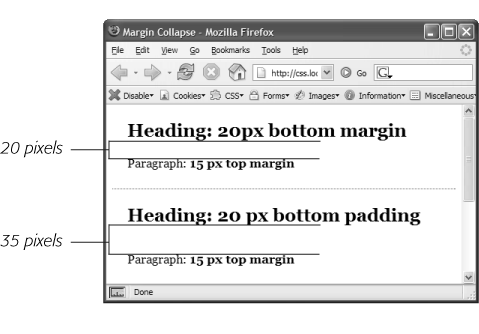
Figure 7-3. When two vertical margins meet, the smaller one collapses. Although the top headline has a bottom margin of 20 pixels, and the paragraph has a top margin of 15 pixels, a web browser adds only 20 pixels of space between the two elements. To get the full 35 pixels' worth of space that you want, use padding instead of margins, as shown in the bottom headline. Here, the heading has 20 pixels of bottom padding. Those 20 pixels get added to the 15-pixel top margin of the paragraph to form a 35-pixel gap.
Things get even weirder when one element's inside another element. This situation can lead to some head-scratching behavior. For example, say you add a "warning" box to a page (like a <div> tag to hold a warning message inside it). You add a 20 pixel top and bottom margin to separate the warning box from the heading above it and the paragraph of text below it. So far so good.
But say you insert a heading inside the warning box, and to put a little room between it and the top and bottom of the div, you set the heading's margin to 10 pixels. You may think you're adding 10 pixels of space between the heading and the top and bottom of the div, but you'd be wrong (Figure 7-4, left). Instead, the margin appears above the div. In this case, it doesn't matter how large a margin you apply to the headline—the margin still appears above the div.
Note
In the lingo of CSS, this phenomenon is known as "collapsing margins," meaning two margins actually become one.
You have two ways around this problem: Either add a small amount of padding around the <div> tag or add a border to it. Since border and padding sit between the two margins, the margins no longer touch, and the headline has a little breathing room (Figure 7-4, right).
Note
Horizontal (left and right) margins and margins between floating elements don't collapse in this way. Absolutely and relatively positioned elements—which you'll learn about in Chapter 13—don't collapse either.
Most measurements in CSS have to be a positive value—after all what would text that's negative 20 pixels tall (or short) look like? Padding also has to be a positive value. But CSS allows for many creative techniques using negative margins.
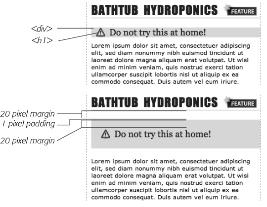
Figure 7-4. Holy shrinking margins Batman! Top: Whenever vertical margins touch, even when one element is inside another element (like the <h2> tag inside this div), the margins collapse. Bottom: To solve this dilemma, add a little padding or a border around the containing element (1 pixel of bottom padding on the <div>, in this case).
Instead of adding space between a tag and elements around it, a negative margin removes space. So you can have a paragraph of text overlap a headline, poke out of its containing element (a sidebar or other layout <div>), or even disappear off an edge of the browser window. And, hey, you can even do something useful with negative margins.
Even when you set the margins between two headlines to 0, there's still a little space between the text of the headlines (thanks to the text's line height, as described on Formatting Entire Paragraphs in the last chapter). That's usually a good thing, since it's hard to read sentences that bunch together and touch. But, used in moderation, tightening the space between two headlines can produce some interesting effects. The second headline of Figure 7-5 (the one that begins "Raise Tuna") has a top margin of –10px applied to it. This moves the headline up 10 pixels so it slightly overlaps the space occupied by the headline above it. Also, the left and right borders of the "Extra! Extra!" headline actually touch the letters of the larger headline.
You can also use a negative margin to simulate negative padding. In the third headline of Figure 7-5, the one that begins with "The Extraordinary Technique," a line appears directly under the text. This line is actually the top border for the paragraph that follows. (You'll learn how to add borders on Adding Borders.) But because that paragraph has a negative top margin, the border moves up and under the headline. Notice how the descending tail for the letter Q in the headline actually hangs below the border. Since padding—the space between content (like that letter Q) and a border—can't be negative, you can't move a bottom border up over text or any other content. But you get the same effect by applying a border to the following element and using a negative margin to move it up.
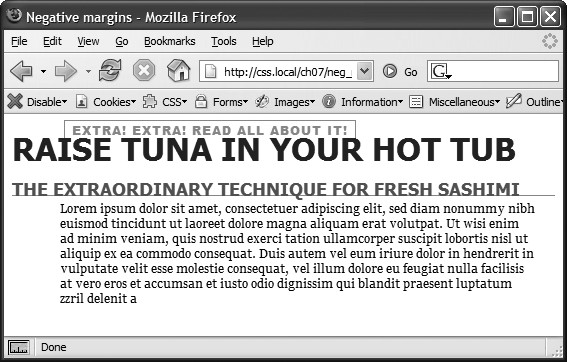
Figure 7-5. In this example, to make the last paragraph's top border look like it's actually the bottom border for the headline above it, add a little padding to the paragraph. Around 5 pixels of top padding moves the paragraph down from the border, while 4ems of left padding indents the paragraph's text, still allowing the top border to extend to the left edge.
Although web browsers treat every tag as a kind of box, not all boxes are alike. CSS has two different types of boxes—block boxes and inline boxes—that correspond to the two types of tags—block-level and inline tags.
A block-level tag creates a break before and after it. The <p> tag, for example, creates a block that's separated from tags above and below. Headlines, <div> tags, tables and lists are other examples of block-level tags.
Inline tags don't create a break before or after them. They appear on the same line as the content and tags beside them. The <strong> tag is an inline tag. A word formatted with this tag happily sits next to other text—even text wrapped in other inline tags like <em>. In fact, it would look pretty weird if you emphasized a single word in the middle of a paragraph with the <strong> tag and that word suddenly appeared on its own line by itself. Other inline tags are <img> for adding images, <a> for creating links, and the various tags used to create form fields.
In most cases, CSS works the same for inline boxes and block boxes. You can style the font, color, and background and add borders to both types of boxes. However, when it comes to margins and padding, browsers treat inline boxes differently. While you can add space to the left or right of an inline element using either left or right padding or left or right margins, you can't increase the height of the inline element with top or bottom padding or margins. In the top paragraph in Figure 7-6, the inline element is styled with borders, a background color, and 20 pixels of margin on all four sides. But the browser only adds space to the left and right sides of the inline element.
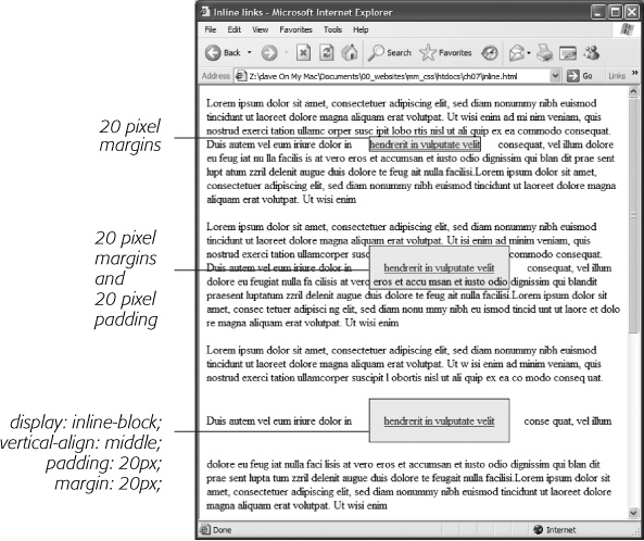
Figure 7-6. Adding top or bottom margins and padding doesn't make an inline element any taller, so you can run into some weird formatting. In the middle paragraph, the background and borders of a link overlap the text above and below. The background appears on top of the line before the styled inline text, but underneath the line following it because the browser treats each line as if it's stacked on top of the previous line. Normally, that isn't a problem since lines of text don't usually overlap. If you want top and bottom margins and padding to work for an inline element you can use the display:inline-block instruction (bottom). This leaves the item inline, but treats it like a box so padding, margins, borders, and width and height are all applied (and obeyed). This even works in Internet Explorer 6 and 7, but only for normally inline elements like links, <strong>, <em>, and <span> tags; you should also add vertical-align: middle so that IE 6 and 7 display the inline block the same as other browsers.
Note
One exception to the rule that inline elements don't get taller when padding or margin are added is the <img> tag (even though it's an inline tag). Web browsers correctly expand the height of the image's box to accommodate any padding and margins you add.
At times, you may wish an inline element behaved more like a block-level element and vice versa. Bulleted lists present each item as its own block—each list item is stacked above the next. Or, you may want to change that behavior so the list items appear side by side, all on a single line, as in a navigation bar (you can see an example of one on When Borders Bump in Chapter 9). Finally, you may want to treat an inline element like a block-level element. Maybe you want an image embedded in a paragraph to be on its own line, with space above and below.
Fortunately, CSS includes a property that lets you do just that—the display property. With it, you can make a block-level element act like an inline element:
display: inline;
Or you can make an inline element, like an image or link, behave like a block-level element:
display: block;
Note
The display property has a myriad of possible options, most of which don't work in all browsers. The inline-block value works in current browsers (see Figure 7-6). Another value, none, works in most browsers and has many uses. It does one simple thing—completely hides the styled element so it doesn't appear in a web browser. With a dab of JavaScript programming, you can make an element hidden in this way instantly become visible, simply by changing its display back to either inline or block. You can even make an element with a display of none suddenly appear using CSS: You'll see an example of that on float. Finally, a few other values for the display property are recognized by IE 8, Firefox, Safari, and Opera and provide one way to create CSS-based layout. This advanced technique is discussed in the box on Generated Content.