Some CSS properties apply to chunks of text rather than individual words. You can use the properties in this section on complete paragraphs, headlines, and so on.
In addition to changing the space between words and letters, CSS lets you adjust the space between lines of text using the line-height property. The bigger the line height, the more space that appears between each line of text (see Figure 6-8).
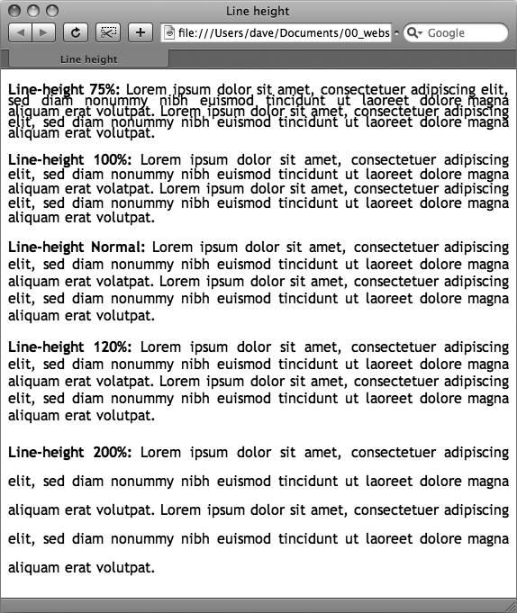
Figure 6-8. The line-height property lets you spread a paragraph's lines apart or bring them closer together. The normal setting is equivalent to 120 percent, so a smaller percentage tightens up the lines (top), while a larger percentage pushes them apart (bottom).
Just as with the font-size property, you can use pixels, ems, or percentages to set the size of line height:
line-height: 150%;
In general, percentages or ems are better than pixels, because they change according to, and along with, the text's font-size property. If you set the line height to 10 pixels and then later adjust the font size to something much larger (like 36 pixels), because the line height remains at 10 pixels, your lines then overlap. However, using a percentage (150 percent, say) means the line-height spacing adjusts proportionally whenever you change the font-size value.
The normal line-height setting for a browser is 120 percent. So, when you want to tighten up the line spacing, use a value less than 120 percent. To spread lines apart, use a value greater than 120 percent.
Note
To determine the amount of space that appears between lines of text, a web browser subtracts the font size from the line height. The result—called leading—is the amount of space between lines in a paragraph. Say the font size is 12 pixels, and the line height (set to 150 percent) works out to 18 pixels. 18 minus 12 equals 6 pixels, so the browser adds 6 pixels of space between each line.
CSS offers one other measurement method specific to line height, which is simply a number. You write it like this:
line-height: 1.5;
There's no unit (like em or px) after this value. The browser multiplies this number by the font size to determine the line height. So if the text is 1em and the line-height value is 1.5, then the calculated line height is 1.5em. In most cases, the effect is no different from specifying a value of 1.5em or 150 percent. But sometimes this multiplication factor comes in handy, especially since nested tags inherit the line-height value of their parents.
For example, say you set the line-height property of the <body> tag to 150 percent. All tags inside the page would inherit that value. However, it's not the percentage that's inherited; it's the calculated line height. So, say the font size for the page is set to 10 pixels; 150 percent of 10 is 15 pixels. Every tag would inherit a line height of 15 pixels, not 150 percent. So if you happened to have a paragraph with large, 36 pixel text, then its line height—15 pixels—would be much smaller than the text, making the lines squish together in a hard-to-read mess.
In this example, instead of using a line-height of 150 percent applied to the <body> tag, you could have all tags share the same basic proportional line-height by setting the line-height to 1.5. Every tag, instead of inheriting a precise pixel value for line height, simply multiplies its font size by 1.5. So in the above example of a paragraph with 36-pixel text, the line height would be 1.5 x 36 or 54 pixels.
One of the quickest ways to change the look of a web page is with paragraph alignment. Using the text-align property, you can center a paragraph on a page, align the text along its left or right edge, or justify both left and right edges (like the paragraphs in this book). Normally, text on a page is left aligned, but you may want to center headlines to give them a formal look. Languages that read from right to left, like Hebrew and Arabic, require right-alignment. To change the alignment of text, use any of the following keywords—left, right, justify, center:
text-align: center;
Justified text looks great on a printed page—mainly because the fine resolution possible with printing allows for small adjustments in spacing and because most programs used to layout printed material can hyphenate long words (thus attempting to equally distribute the number of characters per line). This prevents large, unsightly gaps or rivers of white space flowing through the paragraphs. Web pages are limited to much coarser spacing because of the generally low resolution of monitors and because web browsers don't know how to hyphenate long words. So when you use the justify option, the space between words can vary significantly from line to line, making the text harder to read. When you want to use the justify option on your web pages, test it thoroughly to make sure the text is attractive and readable.
In many books, the first line of each paragraph is indented. This first-line indent marks the beginning of a paragraph when there are no spaces separating paragraphs. On the Web, however, paragraphs don't have indents but are instead separated by a bit of space—like the paragraphs in this book.
If you have a hankering to make your web pages look less like other web pages and more like a handsomely printed book, take advantage of the CSS text-indent and margin properties. With them, you can add a first-line indent and remove (or increase) the margins that appear at the beginning and ends of paragraphs.
You can use pixel and em values to set the first-line indent like this:
text-indent: 25px;
or
text-indent: 5em;
A pixel value is an absolute measurement—a precise number of pixels—while an em value specifies the number of letters (based on the current font size) you want to indent.
Tip
You can use negative text-indent values to create what's called a hanging indent, where the first line starts further to the left than the other lines in the paragraph. (Think of it as "hanging" off the left edge.)
You can also use a percentage value, but with the text-indent property, percentages take on a different meaning than you've seen before. In this case, percentages aren't related to the font size; they're related to the width of the element containing the paragraph. For example, if the text-indent is set to 50 percent, and a paragraph spans the entire width of the web browser window, then the first line of the paragraph starts half the way across the screen. If you resize the window, both the width of the paragraph and its indent change. (You'll learn more about percentages and how they work with the width of elements on Keywords.)
Many designers hate the space that every browser throws in between paragraphs. Before CSS, there was nothing you could do about it. Fortunately, you can now tap into the margin-top and margin-bottom properties to remove (or, if you wish, expand) that gap. To totally eliminate a top and bottom margin, write this:
margin-top: 0;
margin-bottom: 0;
To eliminate the gaps between all paragraphs on a page, create a style like this:
p {
  margin-top: 0;
  margin-bottom: 0;
}
As with text-indent, you can use pixel or em values to set the value of the margins. You can also use percentages, but as with text-indent, the percentage is related to the width of the paragraph's containing element. Because it's confusing to calculate the space above and below a paragraph based on its width, it's easier to stick with either em or pixel values.
Note
Because not all browsers treat the top and bottom margin of headlines and paragraphs consistently, it's often a good idea to simply zero out (that is, eliminate) all margins at the beginning of a style sheet. To see how this works, turn to Starting with a Clean Slate.
For a special effect, you can assign a negative value to a top or bottom margin. For example a –10px top margin moves the paragraph up 10 pixels, perhaps even visually overlapping the page element above it. (See step 4 on Adding the Finishing Touches of the tutorial for an example.)
CSS also provides a way of formatting just a part of a paragraph using the :first-letter and :first-line pseudo-elements (see Figure 6-9). Technically, these aren't CSS properties, but types of selectors that determine what part of a paragraph CSS properties should apply to. With the :first-letter pseudo-element, you can create an initial capital letter to simulate the look of a hand-lettered manuscript. To make the first letter of each paragraph bold and red you could write this style:
p:first-letter {
  font-weight: bold;
  color: red;
}
To be more selective and format just the first letter of a particular paragraph, you can apply a class style to the paragraph—.intro, for example:
<p class="intro">Text for the introductory paragaph goes here...</p>
Then you could create a style with a name like this: .intro:first-letter.
The :first-line pseudo-element formats the initial line of a paragraph. You can apply this to any block of text like a heading (h2:first-line) or paragraph (p:first-line). As with :first-letter, you can apply a class to just one paragraph and format only the first line of that paragraph. Say you wanted to capitalize every letter in the first line of the first paragraph of a page. Apply a class to the HTML of the first paragraph—<p class="intro">—and then create a style like this:
.intro:first-line { text-transform: uppercase; }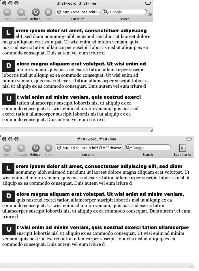
Figure 6-9. The :first-letter pseudo-element formats the first letter of the styled element, like the "initial caps" to the left. The :first-line selector, on the other hand, styles the first line of a paragraph. Even if your guest resizes the window (bottom), the browser still styles every word that appears on a paragraph's first line.
Note
For some strange reason, the Safari web browser doesn't understand the text-transform property (Capitalizing) when it's used with the :first-line pseudo-element. In other words, you can't use CSS to capitalize the letters of a paragraph's first line in Safari.