In this tutorial, you'll gussy up headlines, lists, and paragraphs of text using CSS's powerful formatting options.
To get started, you need to download the tutorial files located on this book's companion website at www.sawmac.com/css2e/. Click the tutorial link and download the files. All of the files are enclosed in a ZIP archive, so you'll need to unzip them first. (Go to the website for detailed instructions on unzipping the files.) The files for this tutorial are contained inside the folder named 06.
First, you'll get your style sheet started and add styles to format the body text.
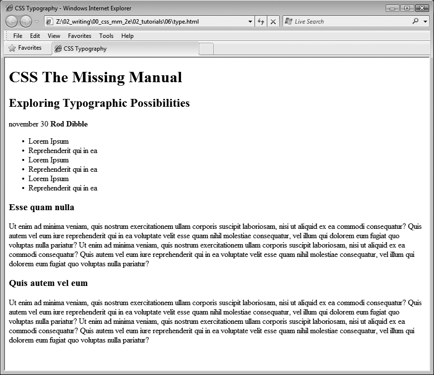
Launch your web browser and open the file 06 → text.html (see Figure 6-12).
It's not much to look at—just a collection of headlines, paragraphs and a lone bulleted list—but you'll turn it into something far better looking.
Open the file text.html in your favorite text editor.
Start by adding an internal style sheet to this file. (Yes, external style sheets are better, but it's perfectly OK to start your design with an internal sheet. See the box on Tutorial: Selector Sampler.)
In the <head> of the web page, click directly after the closing </title> tag. Hit Enter (Return), and then type <style type="text/css">. Press Enter twice and type </style>.
Now that the basic style tags are in place, you'll add the CSS reset discussed on Starting with a Clean Slate. Instead of typing it all out, you'll just copy and paste the CSS from an external style sheet.
Open the file reset.css. Copy all of the code from that file and paste it between the opening and closing <style> tags you added in the previous step.
If you preview the text.html file in a web browser now, you'll see that the text looks nearly the same—in other words, all of the basic HTML formatting the browser applied has been removed, so you can start with a clean slate.
Next, you'll create a style that defines some general properties for all text on the page.
Press Enter and type body {.
This is a basic tag selector that applies to the <body> tag. As discussed in Chapter 4, other tags inherit the properties of this tag. You can set up some basic text characteristics like font, color, and font size for later tags to use as their starting point.
Press Enter again, and then add the following three properties:
color: #002D4B;
font-family: Arial, Helvetica, sans-serif;
font-size: 62.5%;
These three instructions set the color of the text to a dark blue, the font to Arial (or one of 2 others depending on which font is installed—see Serif fonts), and the font size to 62.5 percent.
Note
Why set the page's base font to 62.5 percent? It just so happens that 62.5 percent times 16 pixels (the normal size of text in most web browsers) equals 10 pixels. With 10 pixels as a starting point, it's easy to compute what other text sizes will look like on the screen. For example, 1.5em would be 1.5 x 10 or 15 pixels. 2em is 20 pixels, and so on—easy multiples of ten. For more on this interesting discovery and more font-sizing strategies, visit http://clagnut.com/blog/348/.
Complete this style by pressing Enter, and typing a closing bracket to mark the end of the style.
At this point, your completed style should look like this:
body {
  color: #002D4B;
  font-family: Arial, Helvetica, sans-serif;
  font-size: 62.5%;
}
Your style sheet is complete.
Save the page, and open it in a web browser to preview your work.
The text on the page changes color and font…it also gets really small. Don't worry, that's the 62.5 percent font size you set in step 6. That's just the starting point for all text, and you'll easily increase the size of text by defining em sizes for the other tags.
Now that the basic text formatting is done, it's time to refine the presentation of the headlines and paragraphs.
Return to your text editor and the text.html file. Click at the end of the closing brace of the body tag selector in the internal style sheet, press Enter (Return) to create a new line, and then type #main h1 {.
This is a descendent selector (The HTML Family Tree). It provides more specific direction than a basic HTML tag selector. In this case, the selector tells the web browser "apply the following formatting to any <h1> tag inside another tag with the ID name main." If you look at the page's HTML, you'll see that there's a <div> tag with an ID of main (<div id="main">). As you'll learn later, it's very common in CSS-based designs to group HTML tags inside of <div> tags. You can then position individual div tags to create columns and other complex page layouts. It's also common to use descendent selectors like this one to pinpoint your formatting choices by affecting just the tags in certain areas of the page.
Hit Enter, and then type these three CSS properties:
color: #FF6600;
font-family: "Arial Black", Arial, Helvetica, sans-serif;
font-size: 4em;
You've just changed the color of the <h1> tag as well as the font. You've also set the font size to 4em, which for most browsers (unless the visitor has tweaked his browser's font settings) comes out to 40 pixels tall. That's all thanks to the 62.5 percent size you set for the body back at step 6. That smooth move made the base font size 10 pixels tall, so 4 x 10 comes out to 40 pixels.
Finally, complete this style by hitting Enter and typing the closing brace.
The completed style should look like this:
#main h1 {
  color: #FF6600;
  font-family: "Arial Black", Arial, Helvetica, sans-serif;
  font-size: 4em;
}
Save the file, and preview it in a web browser.
Next, spruce up the appearance of the other headings and paragraphs.
Return to your text editor and the text.html file. Click after the closing brace of the h1 tag , hit Enter, and add the following two styles:
#main h2 {
  font: bold 3.5em "Hoefler Text", Garamond, Times, serif;
  border-bottom: 1px solid #002D4B;
  margin-top: 25px;
}
Here you have another descendent selector that only applies to <h2> tags inside another tag with the ID main (you're probably getting the hang of these now). The font property used here is shorthand that combines the more long-winded font-weight, font-size, and font-family (see the box on Controlling margins between paragraphs). In other words, this one line makes the headline bold, 3.5ems tall, and specifies a font.
In addition, this style adds a decorative border below the headline and a bit of space between the headline and the tag above it (in other words, it adds some space between the "CSS The Missing Manual" and the "Exploring Typographic Possibilities" headlines). You'll read more about borders on Adding Borders, and margins in the next chapter.
Time to tackle more headlines.
Add another style below the one you added in the last step:
#main h3 {
  color: #F60;
  font-size: 1.9em;
  font-weight: bold;
  text-transform: uppercase;
  margin-top: 25px;
  margin-bottom: 10px;
}
This style dishes out some of the usual formatting—color, size, boldness—and also uses the text-transform property (Capitalizing) to make all of the text in the <h3> headlines uppercase. Finally, it adds a bit of space above and below the headlines using the margin properties.
Next, you'll improve the look of the paragraphs.
Add one more style to the page:
#main p {
  font-size: 1.5em;
  line-height: 150%;
  margin-left: 150px;
  margin-right: 50px;
  margin-bottom: 10px;
}
This style introduces the line-height property, which sets the spacing between lines. A percentage of 150 adds a little more space between lines in a paragraph than you'd normally see in a web browser. This extra breathing room gives the text a lighter, airier quality and makes the sentences a little easier to read (but only if you speak Latin).
The style also increases the font size to 1.5em (15 pixels for most browsers) and indents the paragraph from the left and right edges of the page. You'll notice that there's a lot of typing going on for the margin properties—fortunately, as you'll read on Colliding Margins in the next chapter, there's a margin shortcut property that requires much less typing to control the four margins of an element.
Time to try out a more advanced selector type
Add the following style to your style sheet:
#main p:first-line {
  font-weight: bold;
  color: #999;
}
The :first-line pseudo-element (Styling Paragraph Parts) affects just the first line of a paragraph. In this case, just the first line of text for each of the paragraphs inside the main div will be bold and gray.
Save the page and open it in a web browser to preview your work.
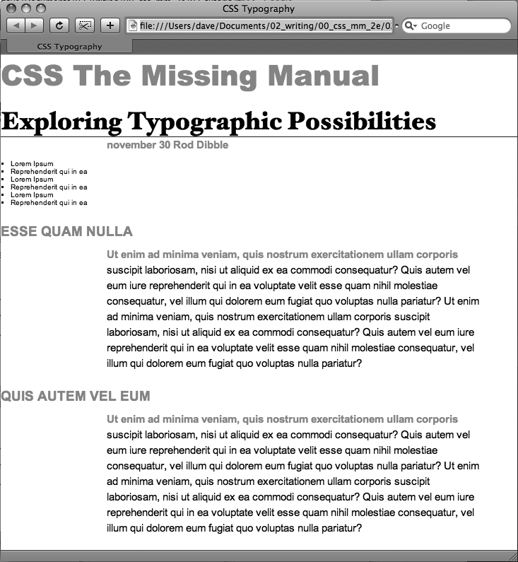
At this point, the page should look like Figure 6-13.
Figure 6-13. The page is starting to come together. The headlines, paragraphs, and basic text settings are in place. Depending on which fonts you have on your computer, you may notice slight differences between your design and the one pictured here. Specifically, if you're on Windows, the "Exploring Typographic Possibilities" headline will use either Garamond or Arial. This screenshot, taken on a Mac, uses the "Hoefler Text" font family specified in step 5 on Formatting the Headings and Paragraphs.
This page has a single bulleted list. The plan is to move the list over to the right edge of the page and have the text following it wrap around it. CSS makes this little trick easy.
Return to your text editor and the text.html file. Add the following style at the end of the page's internal style sheet:
#main ul {
  margin: 50px 0 25px 50px;
  width: 150px;
  float: right;
}
When formatting lists, you'll usually create styles for two different elements: the list itself (either the <ul> tag for bulleted lists or the <ol> tag for numbered lists) and the individual list items (the <li> tag). This style controls the entire list.
There are a few things happening in this style. First, the margin property uses the shorthand method. This one line sets all four margins around the list, replacing the four individual margin properties (margin-top, margin-right, and so on). The four values are ordered like this: top, right, bottom, left. So for this style, 50 pixels of space gets added above the list, 0 space on the right, 25 pixels on the bottom, and 50 pixels on the left.
The width property (discussed in detail on Determining Height and Width) makes the entire list 150 pixels wide. If any particular list item has more text than will fit within that space, it wraps to another line. The float property is the real magic—in this case, float: right means move the list over to the right edge of the page. This property also causes the text following the list to wrap around the left side of the list. It's a cool trick, and you'll learn a lot more about floats on Wrap Content with Floating Elements.
You'll control the look of the individual list items next.
Add one more style to the internal style sheet in the text.html file:
#main li {
  color: #207EBF;
  font-size: 1.5em;
  margin-bottom: 7px;
 }
Nothing new here: just changing the color and size and adding space below each list item. Time to check out your progress.
Save the page and preview it in a web browser.
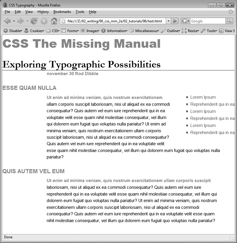
The page should now look like Figure 6-14.
Sometimes you want even more control over how a style is applied. For example, while you might want most paragraphs in one section of the page to look the same, you might also want one or two paragraphs to have their own unique look. In this tutorial, the paragraph of text near the top of the page—"November 30 Rod Dibble"—contains some unique information—a publication date and author. You want it stand out from the other paragraphs, so you'll add a class to the HTML and create a class style.
Figure 6-14. The float property gives you some interesting design options. In this case, the bulleted list is floated to the right edge of the page. In fact the float property is so useful, you'll see that it's the main ingredient of CSS-based layouts, like the ones you'll learn about in Chapter 11.
Locate the HTML for that paragraph —<p>november 30 <strong>Rod Dibble</strong></p> —and add class="byline" to the opening <p> tag. The HTML should look like this:
<p class="byline">november 30 <strong>Rod Dibble</strong></p>
Now it's a simple matter of creating a class style that overrides the generic formatting of the other paragraphs on the page.
In the internal style sheet near the top of the page, add a style for that paragraph:
#main .byline {
  color: #999999;
  font-size: 1.6em;
  margin: 5px 0 25px 50px;
}
This style tweaks the color, size, and placement of just that one paragraph. Note that if you'd just named that style .byline—a basic class selector—it wouldn't work. Thanks to the rules of the cascade described in the last chapter, .byline is less specific (less powerful) than the #main p style you created in step 7 on Formatting the Headings and Paragraphs, so it wouldn't be able to override the color, size, and margins specified by #main p. However, #main .byline is more specific and successfully formats that top paragraph.
That paragraph still needs some work. It would be great if the name stood out more. The HTML in this case provides just the hook you need.
Add another style to the style sheet:
#main .byline strong {
  color: #207EBF;
  text-transform: uppercase;
  margin-left: 5px;
}
If you look at the HTML in step 1 above, you'll see that the name—Rod Dibble—is inside a <strong> tag. The <strong> tag is used to emphasize text and mark it as important. But that doesn't mean you have to let it be bold, the way web browsers normally display that tag. Instead, this descendent selector targets the <strong> tag but only when it appears inside another tag with the class .byline, and only if all of that is inside yet another tag with the ID main—whew, that's pretty specific.
This style turns the text blue, makes it uppercase and adds a bit of space on the left side (nudging the name over just a bit from the "November 30" text).
For the last bit of design, you'll incorporate a few design touches that format the page and that main div so they both look better. Then you'll finish up with a cool bit of text formatting.
Return to your text editor and the text.html file.
First, you'll add a background color and image to the page.
Locate the body style near the top of the internal style sheet and add one new property so that it looks like this (changes are in bold):
body { font-size: 62.5%; font-family: Arial, Helvetica, sans-serif; color: #002D4B;background: #E1EEFD url(images/bg_body.png) repeat-x;}The background property is a powerful tool for any web designer. You've already used it a couple of times in earlier tutorials; it lets you add color and insert and control the placement of an image to the background of any tag. You'll learn the ins and outs of this property on Determining Height and Width, but for now this line changes the background color of the page to light blue and adds a dark blue stripe to the top of the page.
Next you'll spruce up the main div.
Add another style in between the body style and the #main h1 style:
#main {
  width: 740px;
  margin: 0 auto;
  padding: 0 10px;
  border: 4px solid white;
  background: transparent url(images/bg_banner.jpg) no-repeat;
}
In other words, click after the closing } for the body style, hit Enter and type the code above. You don't necessarily have to put the style in that spot for it to work, but for organizational purposes putting the style that controls the div before the other styles that format tags inside that div seems to make sense.
Note
You'll learn strategies for organizing your style sheets on Using Multiple Style Sheets.
The width property sets an overall width of this div (and the content inside it), essentially turning this page into a 740-pixel-wide document. The margin property values here—0 auto—put 0 pixels of space above and below the div and set the left and right margins to auto, which centers the div in the middle of the browser window. The padding property adds space inside the box, pushing content inside the div away from the border line. Finally, you've placed an image into the background of the div.
Those last two styles didn't have anything to do with text formatting, but if you preview the page, you'll see that they make it look a lot better…except for those two top headlines. The first headline isn't bold enough, and the second should fall below the newly added graphic.
Add one last style right after the #main h1 style:
#main h1 strong {
  font-size: 150px;
  color: white;
  line-height: 1em;
  margin-right: -1.25em;
}
The HTML for the headline looks like this:
<h1><strong>CSS</strong> The Missing Manual</h1>
The "CSS" is enclosed inside <strong> tags, so this descendent selector formats only that text (in that sense, it's like the style you added in step 3 on Adding the Finishing Touches that took advantage of a <strong> tag embedded within a paragraph). The text size is pumped way up, it's color changed, and line height is adjusted so that it fits inside the top of the page. You'll notice that the line height is set to 1em—as you read on HTML to Forget, an em is based on the current font size of the element, so in this case the line height will translate to 150 pixels—that's the font size of this style.
The one cool trick is the margin-right property, which is set to a negative value: –1.25em. Since a positive margin pushes elements away, a negative margin actually pulls elements on top of each other. In this case, the rest of the text in the headline—"The Missing Manual"—is scooted over 1.25 em, which is 1.25 times the font size (150 pixels), on top of the "CSS" text.
Note
Negative margins are perfectly legal (although tricky) CSS. They're even used for some pretty advanced CSS layout, as described on Using Negative Margins to Position Elements.
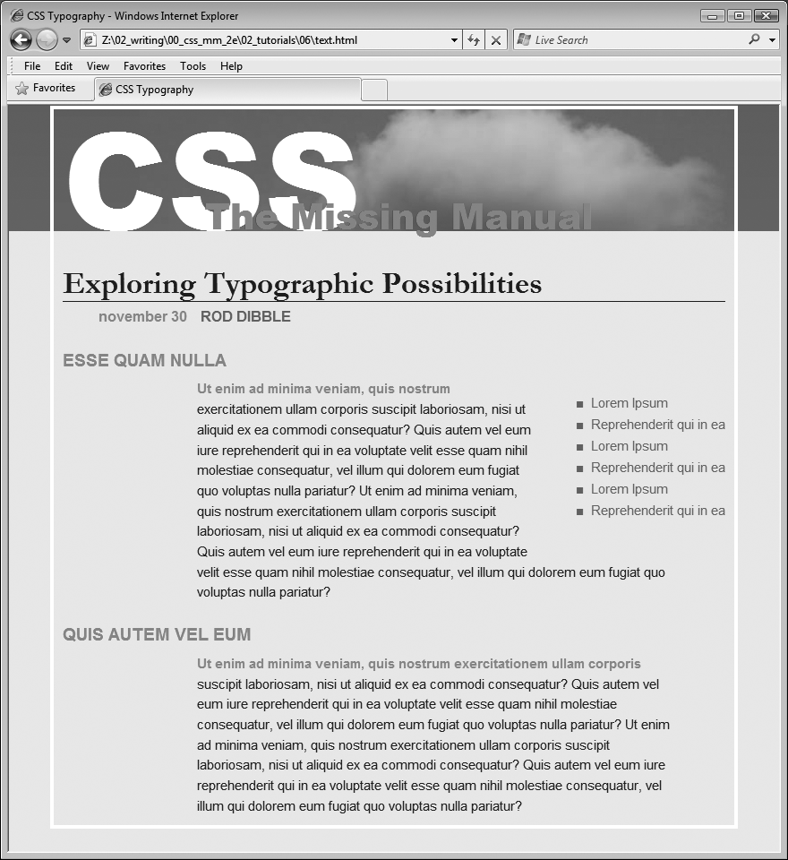
Save the file and preview it in a web browser.
It should look like Figure 6-14. You can compare your work to the finished text.html page located in the 06_finished folder.
Congratulations! You've explored many of the text formatting properties offered by CSS, and turned ho-hum HTML into an attractive, attention-getting design. In the next chapter, you'll explore graphics, borders, margins, and other powerful CSS design options offered by CSS.


