Most websites still rely on words to get their messages across. Sure, people like to look at photos, movie clips, and Flash animations, but it's the reading material that keeps 'em coming back. People are hungry for Facebook updates, news, gossip, how-to articles, recipes, FAQs, jokes, information lists, and even 140 character tweets. With CSS, you can—and should—make your headlines and body text grab a visitor's attention as compellingly as any photo.
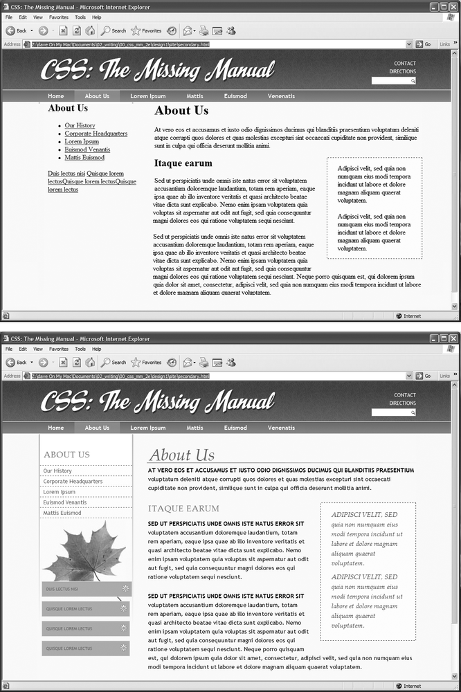
CSS offers a powerful array of text-formatting options, which let you assign fonts, color, sizes, line spacing, and many other properties that can add visual impact to headlines, bulleted lists, and regular old paragraphs of text (see Figure 6-1). This chapter reveals all, and then finishes up with a tutorial where you can practice assembling CSS text styles and put them to work on an actual web page.
The first thing you can do to make text on your website look more exciting is to apply different fonts to headlines, paragraphs, and other written elements on your pages. To apply a font to a CSS style, you use the font-family property:
font-family: Arial;
Note
In real life, when you put a CSS property into action, you must, of course, include all the other necessities of a complete style declaration block and style sheet, as described in Chapter 2: p { font-family: Arial; }, for example. When you see examples like font-family: Arial;, remember that's just the property in isolation, distilled down for your book-reading benefit.
Figure 6-1. Why settle for boring and drab text (top), when you can make your headlines scream and your text sing with a few simple CSS properties (bottom)?
Choose a font that makes your text eye-catching (especially if it's a headline) and readable (especially if it's main body text), as discussed in the figure on the previous page. Unfortunately, you can't use just any font you want. Well, actually you can use any font you want, but it won't show up on a viewer's computer unless she's installed the same font on her system. So that handcrafted font you purchased from the small font boutique in Nome Alaska won't do you any good on the Web—unless each person viewing your site has also bought and installed that font. Otherwise, your visitors' web browsers will show your text in a default font, which is usually some version of Times.
Note
For one cutting edge method of using any font you'd like there's Cufon: http://wiki.github.com/sorccu/cufon/about. This JavaScript-based solution lets you convert one of your fonts into a file that you can then use to replace HTML text. Although the technology behind Cufon is complex, it's quite easy to use.
One solution is to specify the font you'd like to use, as well as a couple of back-up choices. If your viewer's computer has your first-choice font, then that's what she'll see. But when the first font isn't installed, the browser looks down the list until it finds a font that is. The idea is to specify a list of similar-looking fonts that are common to a variety of operating systems, like so:
font-family: Arial, Helvetica, sans-serif;
In this example, a web browser first looks to see if the Arial font is installed; if it is, then that font is used; if not, the browser next looks for Helvetica, and if that isn't installed, then it finally settles for a generic font—sans-serif. When you list a generic font type (like sans-serif or serif), the viewer's browser gets to choose the actual font. But at least you can define its basic character.
Also, if the font's name is made up of more than one word, you must enclose it in quote marks:
font-family: "Times New Roman", Times, serif;
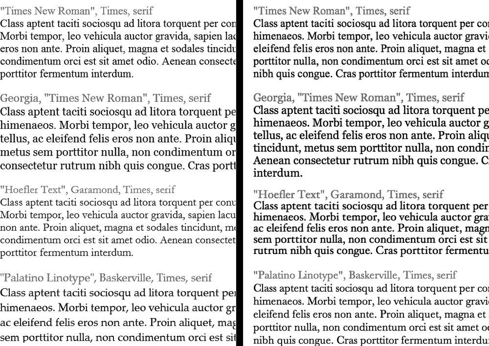
Here are some commonly used combinations organized by the type of font, including a generic font type at the end of each list.
Serif fonts are best for long passages of text, as it's widely believed that the serifs—those tiny "feet" at the end of a letter's main strokes—gently lead the eye from letter to letter, making text easier to read. Examples of serif fonts are Times, Times New Roman, Georgia, and the font in the main body paragraphs of this book.
"Times New Roman", Times, serif
Georgia, "Times New Roman", Times, serif
Baskerville, "Palatino Linotype", Times, serif
"Hoefler Text", Garamond, Times, serif
Examples of these fonts are in Figure 6-2.
Figure 6-2. Fonts don't always display the same on Windows (left) and Macs (right). The two systems come with different built-in fonts. In addition, anti-aliasing, which makes onscreen text look smoother, is better on the Mac than on Windows. If you're on Windows and want better looking type on your own computer, you can turn on Microsoft's Clear Type technology: www.microsoft.com/typography/cleartype.
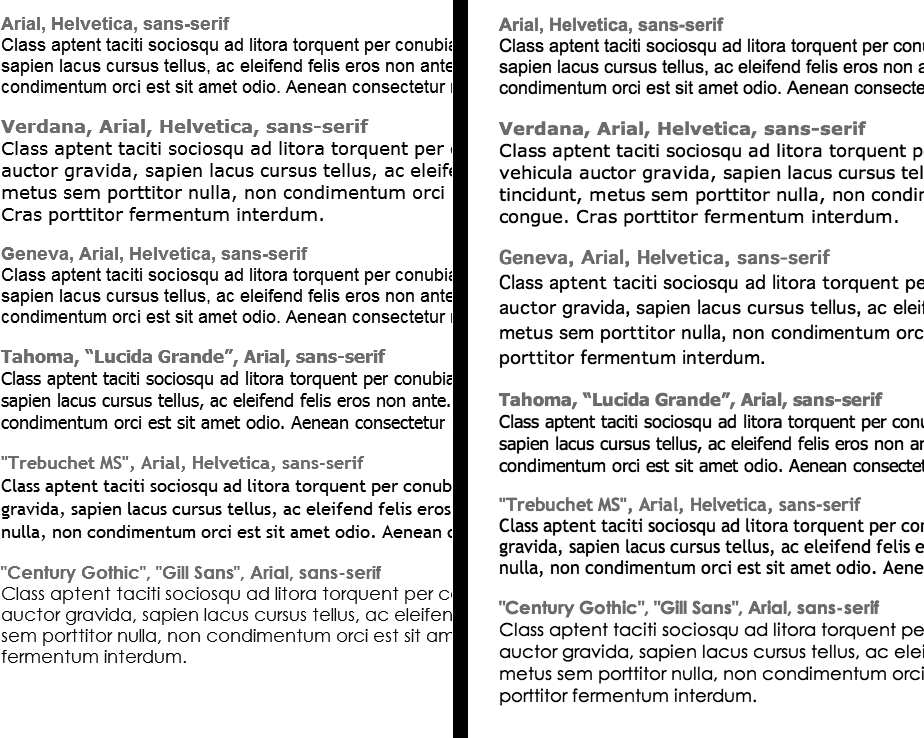
Sans-serif fonts are often used for headlines, thanks to their clean and simple appearance. Examples of sans-serif fonts include Arial, Helvetica, Verdana, and Formata, which you can see in the gray boxes in this book.
Arial, Helvetica, sans-serif
Verdana, Arial, Helvetica, sans-serif
Geneva, Arial, Helvetica, sans-serif
Tahoma, "Lucida Grande", Arial, sans-serif
"Trebuchet MS", Arial, Helvetica, sans-serif
"Century Gothic", "Gill Sans", Arial, sans-serif
Examples of these sans-serif fonts are in Figure 6-3.
Figure 6-3. Windows (left) and Mac (right). Some people believe that you should use only sans-serif fonts on web pages because they think the delicate decorative strokes of serif fonts don't display well on the coarse resolution of a computer screen. In the end, your aesthetic judgment is your best guide. Pick the types of fonts you think look best.
Monospaced fonts are often used to display computer code (like the CSS snippets you see throughout this book). Each letter in a monospaced font is the same width (these were traditionally used on typewriters to line up data into tidy columns).
"Courier New", Courier, monospace
"Lucida Console", Monaco, monospace
"Copperplate Light", "Copperplate Gothic Light", serif
"Marker Felt", "Comic Sans MS", fantasy
Examples of these font lists are pictured in Figure 6-4.
There are literally thousands of fonts, and every operating system ships with many more fonts than are listed here. However, here are a few fonts that are very common on both Macs and PCs, so you might want to give them a go:
Arial Black
Arial Narrow
Impact
Figure 6-4. Windows (left) and Mac (right). Courier is the most common monospaced font, but you're far from limited to it. Lucida Console is very common on Windows and Macs, and Monaco is installed on every Mac.
Be careful with Arial Black and Impact: They only have a single weight and don't include an italic version. Accordingly, if you use these fonts make sure to set the font-weight and the font-style (coming up on Capitalizing) to normal. Otherwise, if the text is bolded or italicized, the browser will make its best (read: ugly) guess at what the text should look like.
Tip
You can find a lot more information on which fonts are installed on which systems, including Macs, Windows, and Linux, at www.codestyle.org/css/font-family. For another good resource for thinking outside the normal set of web fonts, visit http://unitinteractive.com/blog/2008/06/26/better-css-font-stacks.
Black-and-white is great for Casablanca and Woody Allen films, but when it comes to text, a nice skyline blue looks much sharper and classier than drab black. Coloring your text with CSS is easy. In fact, you've used the color property in a few tutorials already. You have several different ways to define the exact color you want, but they all follow the same basic structure. You type color: followed by a color value:
color: #3E8988;
In this example, the color value is a hexadecimal number indicating a muted shade of teal (more in a moment on what hexadecimal is).
Every graphics program from Fireworks to Photoshop to the GIMP lets you select a color using hexadecimal or RGB values. Also, the color pickers built into Windows and Macs let you use a color wheel or palette to select the perfect color and translate it into a hexadecimal or RGB value.
Note
If your color design sense needs some help, you can find lots of attractive, coordinated collections of colors as well as great color-related resources at www.colourlovers.com.
The most common color system used by web designers is hexadecimal notation. A color value—like #6600FF—actually contains three hexadecimal numbers—in this example 66, 00, FF—each of which specify an amount of red, green, and blue, respectively. As in the RGB color system described next, the final color value is a blend of the amounts of red, green, and blue specified by these numbers.
You can also use the RGB—red, green, blue—method familiar in computer graphics programs. The color value consists of three numbers representing either percentages (0–100 percent) or numbers between 0–255 for each hue (red, green, and blue). So when you want to set the text color to white (perhaps to set it off from an ominous dark page background), you can use this:
color: rgb(100%,100%,100%);
or
color: rgb(255,255,255);
Note
If all these numbers and digits have your head spinning, then you can always fall back on the classic HTML color keywords. (Just don't expect your site to win any awards for originality.) There are 17 colors—aqua, black, blue, fuchsia, gray, green, lime, maroon, navy, olive, orange, purple, red, silver, teal, white, and yellow. In CSS, you add them to your style like so: color: fuchsia;.


