Two other CSS properties that form part of the CSS box model are useful for assigning dimensions to an object, such as a table, column, banner, or sidebar. The height and width properties assign a height and width to the content area of a style. You'll use these properties often when building the kinds of CSS layouts described in Part III of this book, but they're also useful for more basic design chores like assigning the width of a table, creating a simple sidebar, or creating a gallery of thumbnail images (like the one described in the steps on Tutorial: Creating a Photo Gallery).
Adding these properties to a style is very easy. Just type the property followed by any of the CSS measurement systems you've already encountered. For example:
width: 300px;
width: 30%;
height: 20em;
Pixels are, well, pixels. They're simple to understand and easy to use. They also create an exact width or height that doesn't change. An em is the same as the text size for the styled element. Say you set the text size to 24px; an em for that style is 24px, so if you set the width to 2em, then it would be 2 x 24 or 48 pixels. If you don't set a text size in the style, the em is based on the inherited text size (see Ems).
For the width property, percentage values are based on the percentage of the width of the style's containing element. If you set the width of a headline to 75 percent and that headline isn't inside any other elements with a set width, then the headline will be 75 percent of the width of the browser window. If the visitor adjusts the size of his browser, then the width of the headline will change. However, if the headline is contained inside a <div> (maybe to create a column) that's 200 pixels wide, the width of that headline will be 150 pixels. Percentage values for the height property work similarly, but are based on the containing element's height, instead of width.
While the width and height properties seem pretty straightforward, there are a few nuances that often throw people for a loop. First of all, there's a difference between the value you set for a style's width and height and the amount of space that a web browser actually uses to display the style's box. The width and height properties set the width and height of the content area of the style—the place where the text, images, or other nested tags sit. (See Figure 7-1 for a refresher on where the content area sits within the overall box model.) The actual width—that is, the amount of screen real estate given by the web browser—is the total of the widths of the margins, borders, padding, and width properties, as illustrated in Figure 7-8.
Say you've set the following properties:
width: 100px;
padding: 15px;
border-width: 5px;
margin: 10px;
When the width property is set, you always know how much room is allocated just for your content—the words and images that fill the space—regardless of any other properties you may set. You don't need to do any math, because the value of the width property is the room for your content (in the above example, 100 pixels). Of course, you do have to perform a little math when you're trying to figure out exactly how much space an element will take up on a web page. In the above example, the width that a web browser allocates for the style's box is 160 pixels: 20 pixels for the left and right margins, 10 pixels for the left and right borders, 30 pixels for the left and right padding, and 100 pixels for the width. (And versions of Internet Explorer for Windows older than version 6 get the whole thing wrong—see the note on Controlling the Tap with the Overflow Property—forcing you to do a little extra work for those browsers.)
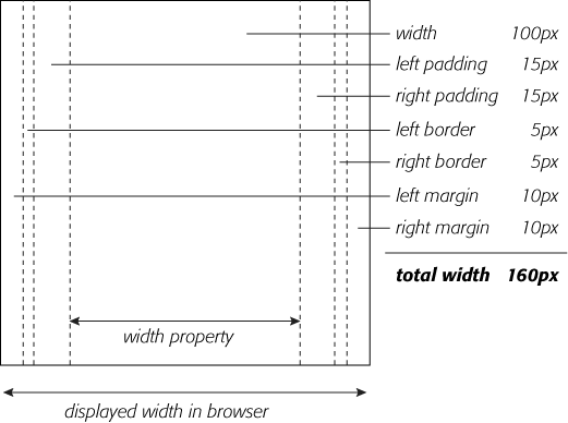
Figure 7-8. Calculate the actual width of a styled element's box by adding up its margins, borders, padding, and width properties. The height occupied on the screen by the element is calculated in the same way—the total of the height property, the top and bottom margins, the top and bottom borders, and the top and bottom padding.
The general rule of thumb for setting heights on page elements is don't! A lot of budding CSS designers try to set heights on everything in an attempt to get pixel-perfect control. But unless you're totally sure of the exact dimensions of the content inside a tag, you can run into some unwanted results (see Figure 7-9). In this example, a pull-quote box used to highlight an interesting comment from an article has a set width and height of 100 pixels. When more text than fits into the 100 pixel height is added to the box, its contents (in all browsers but IE 6) spill out the bottom. Even if you make sure that the text you put inside a box with a fixed height fits, if a visitor increases the font size in her browser, the text might resize to a height larger than the box.
In other words, the height property is useful for controlling the height of a div containing images, for example, because you can correctly determine the height of the images; but, if you use the height for elements that have text, make sure to not only test your pages in the major browsers, but also to test the page with different font sizes by increasing the font size in the web browser.
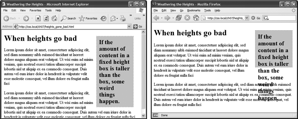
Figure 7-9. Depending on the browser you're using, the content in a box will display in one of two ways if it's taller than the box's set height. Internet Explorer 6 (left) and earlier for Windows will simply expand the box to fit the content. But other browsers, like Firefox (right) and Internet Explorer 7, keep the box the same height and spill the content out and below the edges.
Note
Internet Explorer 5 gets the whole width thing wrong. It uses the CSS width property to define the total width including margins, padding, and borders, resulting in page elements that are much thinner than in other browsers. The problem also crops up in IE 6 or IE 7 in quirks mode (see The Importance of the Doctype). Since IE 5 is all but dead, you probably won't have to worry about it. But if you have a time machine and plan on going back 10 years to amaze the world with your futuristic CSS design skills, you can learn about the IE 5 "box model problem" at http://reference.sitepoint.com/css/ie5boxmodel.
When the content inside a styled tag is larger than the style's defined width and height, some weird things happen. As shown in Figure 7-9, IE 6 just lets the box expand to fit the larger content, while other browsers let the content spill out of the box (past the borders and often over other content).
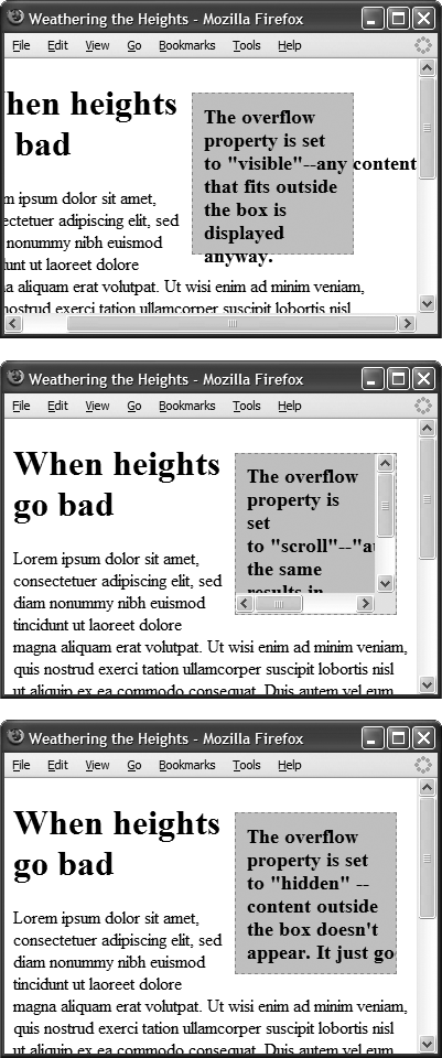
Fortunately, you can control what a browser should do in this situation with the overflow property. Overflow accepts four keywords that control how content that overflows the edges of a box should be displayed:
visible. This option is what browsers do normally. It's the same as not setting the property at all (Figure 7-10, top).
scroll. Lets you add scroll bars (Figure 7-10, middle). It creates a kind of mini-browser window in your page and looks similar to old-school HTML frames, or the HTML <iframe> tag. You can use scroll to provide a lot of content in a small amount of space. Unfortunately, scroll bars always appear when you use this option, even if the content fits within the box.
auto. To make scroll bars optional, use the auto option. It does the same thing as scroll but adds scroll bars only when needed.
hidden. Hides any content that extends outside the box (Figure 7-10, bottom). This option is a bit dangerous, since it can make some content disappear from the page. But it comes in handy for solving some IE browser bugs (see the box on the next page) and is a useful trick for float-based layouts.