Folks used to rely on the HTML <table> tag to create rows and columns for holding the pictures in a photo gallery. But you can achieve the same effect with a little CSS and far less HTML.
Open the file 08 → gallery_ex → gallery.html.
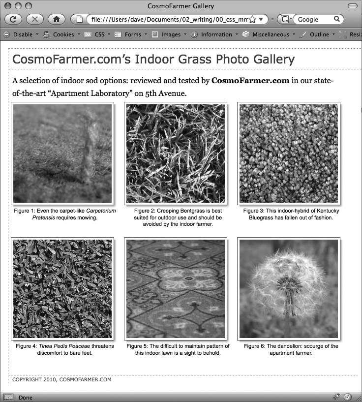
First, a quick review of the HTML used to construct the photo gallery. The page contains six photos and photo captions. Each photo and caption is contained in a <div> with a class named figure applied to it. This <div> functions just like the similar <div> used in the previous exercise for adding a caption. The photo itself is contained in another <div> with a class of photo:
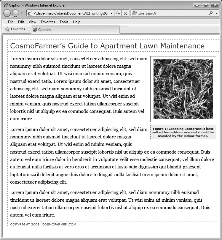
Figure 8-11. With the use of a containing <div>, a right float, and a little style, it's easy to add captions to photos.
<div class="figure">
 <div class="photo">
  <img src="../ images/dandelion.jpg" alt="Dandelion" height="200"
width="200"/>
 </div>
 <p>Figure 6: The dandelion: scourge of the apartment farmer. </p>
</div>
Locate the <link> tag near the top of the file, place your cursor after that tag, and then press Enter (Return) to create a new blank line.
The <link> tag attaches an external style sheet containing some basic formatting.
Add an internal style sheet. Then add two new styles, as follows:
<style type="text/css">
.photo img {
  border: 1px solid #666;
  background-color: #FFF;
  padding: 4px;
}

.figure p {
  font: 1.1em/normal Arial, Helvetica, sans-serif;
  text-align: center;
  margin: 10px 0 0 0;
}
</style>
These two styles add a border to each image in the gallery, and set the font, alignment, and margins of the captions. They use descendent selectors to target just the images and paragraphs inside the gallery.
All of the images and captions are themselves wrapped in one <div> with an ID of gallery, since enclosing the group of photos in another <div> provides even more formatting options. You could set a specific width for the gallery or add a border around it. But that enclosing <div> also provides another way to target the photos and paragraphs using descendent selectors. For example, #gallery img and #gallery p are also valid descendent selectors in this case. The main difference between the two approaches is the specificity of the styles (see Specificity: Which Style Wins). Because #gallery img is more specific than .photo img, its formatting options override the .photo img style.
Next, place the photos side by side.
Add the following style to the internal style sheet you just created:
.figure {
  float: left;
  width: 210px;
  margin: 0 10px 10px 10px;
}
This style floats each photo/caption pair to the left. In effect, it places the photos side-by-side until there's no more room in the row. The browser then drops the next photos down a row, until all of the photos are displayed one row on top of the next. The width is the total width of the photo plus padding and borders. In this example, it's 200 pixels for the photo, 8 pixels for left and right padding, and 2 pixels for left and right borders.
Note
In this fictitious photo gallery, each picture is the same width. In the real world, you may have pictures of varying sizes. See the box below for a trick that lets you arrange rows of pictures of different widths. Using different height images won't work (as you'll see in step 5). When you've got images with differing heights, stick with HTML tables (or you can use the advanced, doesn't-apply-to-all-browsers technique described in the tip on Adding Drop Shadows).
Save the file and preview the gallery.html page in a web browser. It should look like the left image in Figure 8-12.
Adjust the width of your browser window to make it thinner and wider and watch how the images reflow into the space. Aha—something's not quite right. The second row of images has two empty spaces where photos should be. This problem occurs because the caption for the second image on the first line is taller than the other captions on the line. Images that jump down to another row bump into that caption and can't get by it. (You can read more about this float property snafu on Clearing and Containing Floats.) Fortunately, there's a simple fix to this dilemma.
Tip
There is a way to avoid that weird display problem noted in step 5, as well as create a gallery that can handle different height images. Instead of using the float property, you can use display: inline-block on the .figure style. This will treat each image/caption pair as a block (a box with height and width) but also as an inline element (so the blocks can sit side-by-side). In addition, you can use the vertical-align property to make the picture tops align. The .figure style from step 4 could then be rewritten like this:
.figure {
  display: inline-block;
  vertical-align: top;
  width: 210px;
  margin: 0 10px 10px 10px;
}
The downside to this very simple and useful technique: It won't work in IE 6, IE 7, or Firefox 2. Hey, but at least it works in everything else, including IE 8!
Return to your text editor and the gallery.html file. Locate the .figure p style and add a height to it. The finished style should look like this:
.figure p { font: 1.1em/normal Arial, Helvetica, sans-serif; text-align: center; margin: 10px 0 0 0;height: 5em;}Adding this property sets a uniform height for each caption. In this case, it's tall enough to accomodate the lines of caption text. (If you needed more text, you'd just increase the height.)
Save the file and preview the page in a web browser. See the right side of Figure 8-12.
If you resize the browser window, the gallery reformats itself. With a wider window you can fit four or even five images on a row, but if you make it smaller you'll see only one or two images per row.
Your gallery looks good, but you can make it even more impressive. Adding drop shadows under each photo lends the page an illusion of depth and a realistic 3-D quality. But before you fire up Photoshop, you'll be glad to know there's no need to add individual drop shadows. Instead, you can make CSS automatically add a shadow to any image you want.

Figure 8-12. Floating elements next to each other is one way to simulate the column and row appearance of a table. But it doesn't work well if the elements are of varying heights (left). Using the height property can help you enforce equal heights and make sure elements line up correctly (right).
Note
CSS 3 provides a new CSS property—box-shadow—which can automatically add drop shadows to any style. It's cool, customizable, and easy to use, but only works in a few browsers. You can read about it on Font Freedom.
First you need a drop shadow graphic—just an image with fuzzy right and bottom black edges. There's one in the 08 → gallery_ex folder, but you can make your own in Photoshop, Fireworks, or any other image editing program that has a blur or drop shadow filter. (In Fireworks, for example, you'd create a white box and apply the drop shadow filter to it. Then save the file in PNG8 format.)
In a text editor, open the gallery.html file you completed in the previous exercise.
First, add a background image to the <div> tag that surrounds each image.
Add this style to the gallery page's internal style sheet:
.photo {
  background: url(drop_shadow.gif) right bottom no-repeat;
}
This .photo style adds a background image—drop_shadow.gif—to the lower-right corner of the photo <div>. The no-repeat value means the graphic won't tile.
If you preview the page now, you won't see much. That's because the drop shadow appears in the background. On top is the photo itself, which you styled in step 3 on Tutorial: Creating a Photo Gallery to have a white background, a black border, and 4 pixels of padding. What you need is a way to reveal that background image.
One clever technique pioneered by Richard Rutter (www.clagnut.com) is to move the image up and to the left a little—essentially moving it outside of its containing <div> tag. CSS provides a mechanism known as positioning that lets you control the exact placement of an element. You'll learn more about positioning in Chapter 13, but for now you need to add only three properties to the .photo img style you created in step 3 on Tutorial: Creating a Photo Gallery to reveal the drop shadow.
Note
Negative margins are another way to achieve the drop shadow shift. For details, see http://1976design.com/blog/archive/2003/11/14/shadows.
Locate the .photo img style, and add three positioning properties, like so:
.photo img { border: 1px solid #666; background-color: #FFF; padding: 4px;position: relative;top: -5px;left:-5px;}In a nutshell, these three properties simply move the photo up and to the left 5 pixels, exposing the underlying drop shadow graphic of the <div>. In fact, the very reason for using the <div> to contain the photo here is to provide an element to hold the drop shadow image.
Save the file and preview the page. It should look like Figure 8-13.
Each image has its own drop-shadow, and you didn't even have to open Photoshop!
Note
The graphic you used here is around 375 X 375 pixels, so it accommodates images only up to that size. You can use this same technique for larger images, but you'll need to create your own drop shadow.
You can use this drop-shadow method on any graphic, not just those inside a gallery. The key is surrounding the <img> tag with a container <div>, applying a drop shadow graphic to that <div>, and offsetting the <img> tag with negative top and left placement. Use this same effect to add a drop shadow to any box element, such as a sidebar or pull quote.
You can find a completed version of this tutorial in the 08_finished → gallery_ex folder.
Note
You may have noticed that the drop shadows you just created have abrupt left and top endings. They don't fade like actual drop shadows. To learn how to create more sophisticated drop shadows, check out www.alistapart.com/articles/cssdrop2 and www.ploughdeep.com/onionskin.