Internet Explorer 6 has a long history of CSS bugs, especially (and unfortunately) when it comes to float-based layouts. These bugs can affect the placement of floats and the overall width allotted to floated elements. If you're lucky, you may just get a slightly annoying difference in how your web page looks in Internet Explorer versus other browsers. At worst, these bugs can cause significant display problems like the float drops discussed in the previous section. This section tells you the most common problems and how to get around them.
Note
See the box on :after to decide how much you need to be worried about Internet Explorer 6.
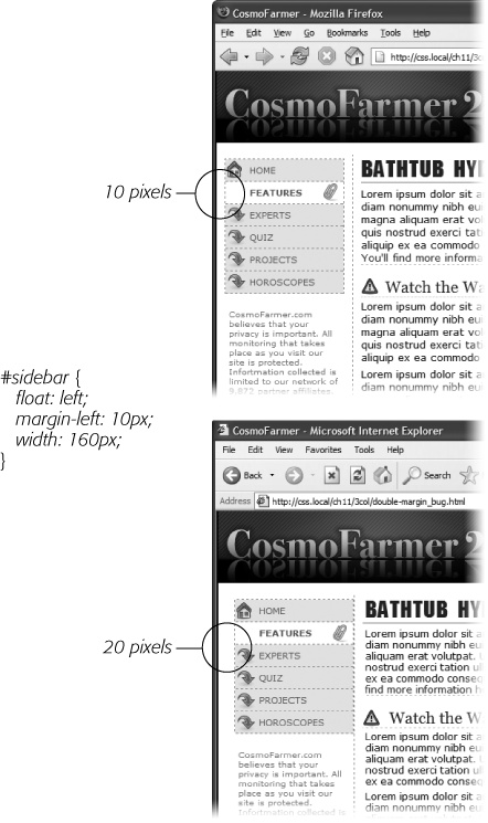
Internet Explorer 6 and earlier sometimes doubles the size of a margin you've applied to a floated element. The problem occurs only when the margin is in the same direction as the float—a left margin on a left-floated element or a right margin on a right-floated element. In Figure 12-13, there's a left-floated sidebar holding the site's navigation. To add a bit of space between it and the left edge of the browser window, the sidebar has a left margin of 10 pixels.
Most browsers, including Internet Explorer 7 and 8, Safari, and Firefox (Figure 12-13, top), add the requested 10 pixels of space. However, Internet Explorer 6 (bottom) doubles that margin to 20 pixels. Even with relatively small margins like 10 pixels, the visual difference is significant. Furthermore, if the layout is very tight, with precisely measured floated elements sitting side by side, then the doubled margin can easily trigger a float drop (Preventing Float Drops).
Figure 12-13. A 10-pixel left margin applied to a left-floated element should, in theory anyway, indent the float 10 pixels from the left edge of the page. Firefox (above) gets it right. But IE 6 (bottom) incorrectly doubles that margin. By adding 20 pixels to the left edge of the sidebar, IE 6 significantly changes the page's appearance.
Note
This margin doubling happens only when the element's margin touches the edge of its containing block. So when an element is floated left against another left-floated element, its left margin won't double.
The solution is simple: Add display:inline; to the CSS style for the floated element:
#sidebar {
  float: left;
  margin-left: 10px;
  width: 160px;
  display: inline;
}
In this case, the display property doesn't do anything except fix IE's bug. In fact, the only reason it's there is to force the sidebar element to "have layout," as described in the box on Tutorial: Multiple-Column Layouts, so you can alternatively use zoom:1 instead of display:inline. Floated elements are always block-level elements, and changing a style's display to inline won't alter that. (See Adding Borders for more on the display property.) However, even though this added style declaration doesn't adversely affect any other browsers, you may want to put it in an IE-only style using the * html hack:
#sidebar {
  float: left;
  margin-left: 10px;
  width: 160px;
}
* html #sidebar {
  display: inline;
}
Note
Internet Explorer's conditional comments feature provides an even better way to isolate IE-only styles than the * html hack. An external style sheet attached to a page using a conditional comment is read only by Internet Explorer; it's ignored by all other browsers. See Isolate CSS for IE with Conditional Comments for the details.
Internet Explorer 6 and earlier inserts an additional three pixels of space between a floated column and a non-floated column. The exact placement of that gap depends on a couple of conditions:
The non-floated column doesn't have a set width or height. If the column next to the float doesn't have any dimensions defined, then you'll see a 3-pixel indent between the edge of the column and the text inside that column. This space appears only along the float, so when the float ends, the text moves back to the left edge of the column (Figure 12-14).
In this case, the best solution is to live with it. The extra indent isn't terribly distracting and doesn't do anything else weird to the page. But if the perfectionist in you can't let go of this bug, you can fix it by doing what's known as "adding layout" to the non-floated element, as described in the box on Tutorial: Multiple-Column Layouts. Add an IE 6–only style for that column:
* html #mainColumn { zoom: 1; }The downside to fixing this bug is that it triggers the bug discussed next. (See what you get for being a perfectionist?)
Figure 12-14. On this page, the left-hand sidebar is floated left, while the central column isn't floated at all. A left margin on the central column indents it far enough to the left so that it won't wrap around the bottom of the sidebar. (This technique is described on Floating All Columns.) Unfortunately, Internet Explorer 6 and earlier also adds a small indent to the text in the non-floated column.
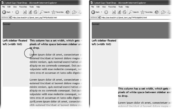
The non-floated column has a set width or height. When the column next to the float has a set layout dimension (like height in the previous example), another 3-pixel error appears—a small gap between the two columns (Figure 12-15, left). This bug is more serious than the one in Figure 12-14, since this 3-pixel gap can force the second column to drop below the floated element (Figure 12-15, right).
The solution to this problem is two-fold. First, you must eliminate the left margin of the non-floated column (but for IE 6 and earlier only):
* html #mainColumn { margin-left: 0; }Then, you must set the right margin for the floated column to –3 pixels. This pulls the non-floated column back into position:
* html #sidebar { margin-right: -3px; }In any normal browser, these styles make no sense. Some determined CSS experts (with time on their hands, apparently) came up with them to make IE behave. For more info on this phenomenon, check out www.positioniseverything.net/explorer/threepxtest.html.
Figure 12-15. Internet Explorer 6 often has trouble with floats. If, for example, a single column is floated left and another non-floated column with a set width wraps around the float, IE 6 and earlier inject a 3-pixel gap between the two columns (left). For designs that have precisely determined widths, that gap can add just enough space to force a column to drop below the floated element (right).
Another option is to float all of the columns. In the examples pictured in Figure 12-14 and Figure 12-15, removing any left margins from the non-floated column and floating it either left or right eliminates both 3-pixel problems:
#mainColumn {
  float: left;
}
This solution seems quick, but it adds a little more complexity, since you have to manage yet another float in the design.
Note
While a lot of bugs were fixed when IE 7 came out, that browser still has a few. You can read about them at http://css-discuss.incutio.com/?page=IE7. Fortunately, IE 8, which is quickly replacing IE 7, works very well with CSS.
A few more bugs plague float-based layouts in Internet Explorer 6. Many of them are so rare you may never come across them in your web design projects. But just in case, here are a couple of weird things that can happen when viewing a page in IE 6 or earlier.
If the bottom part of a floated element just disappears, it may be the guillotine bug. For information on the cause and solution (which fortunately has nothing to do with sharp, dangerous objects), visit www.positioniseverything.net/explorer/guillotine.html.
Content inside a floated element doesn't appear, but sometimes reappears if you resize the browser window or scroll. This oddity is aptly called the peek-a-boo bug. Learn about it at www.positioniseverything.net/explorer/peekaboo.html.


