In this tutorial, you'll explore how to create a multi-column, float-based layout using the negative margin technique discussed on Using Negative Margins to Position Elements. Download the files as described for the previous tutorial. The files for this tutorial are contained inside the folder named 12 → layout2.
Unlike the last exercise, all the HTML is already in place for this page. All you have to do is add CSS to create the layout. There are six major sections to the page, each enclosed in a <div> tag with an ID applied.
In a text editor, open the 12 → layout2 → start.html file.
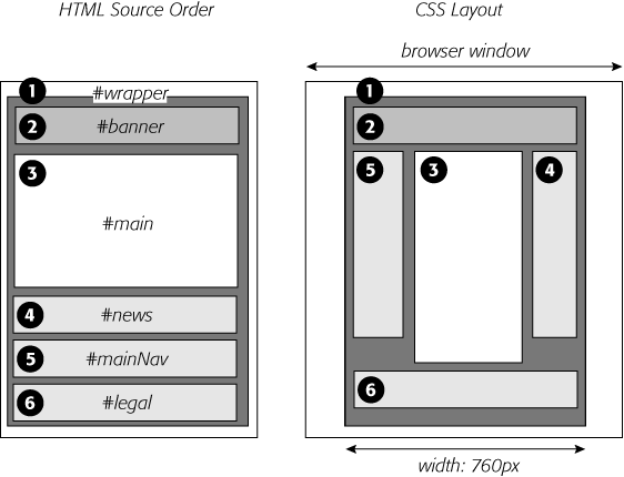
Figure 12-19 shows the basic structure of the HTML (left) and the final result you're aiming for (right). Currently, the divs just stack one on top of the other, because you haven't added any CSS layout—yet.
Begin by creating a fixed-width layout and centering it in the middle of the browser window.
Figure 12-18. Turning a liquid design into a fixed-width design is simply a matter of wrapping all the HTML inside the <body> tag in a new <div> tag and then creating a style that sets the width of the div. If you'd prefer to have the fixed design centered in the middle of the browser window, see the next tutorial.
In the <head> region of the HTML, place your cursor between the opening and closing <style> tags.
There's already an external style sheet attached to the page, with most of the visual formatting in it. You'll add the layout styles to this internal style sheet, which you can always move to an external style sheet later as described on Linking a Style Sheet Using HTML.
Add a new style for the wrapper div:
#wrapper {
  border-right: 2px solid #000000;
  border-left: 2px solid #000000;
  background: #FFFFFF url(images/column_bg.png) repeat-y right top;
}
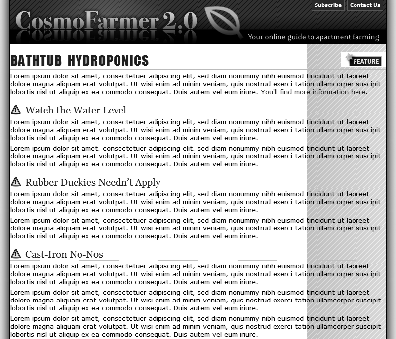
These declarations add a border to either side of the page and place a background image in the right side of the div. The image tiles vertically down the page and provides the background for the right sidebar in the final design. This setup is an example of the faux column technique described on Adding a "Faux Column".
Because the wrapper div encloses the other tags on the page, setting its width defines the width for the entire page (Figure 12-19).
Figure 12-19. These diagrams illustrate where the page begins (left) and where it ends (right). Currently, the page is just a series of <div> tags enclosed by one wrapper <div> tag. By setting a width for the wrapper and adjusting its left and right margins, you create a design that floats in the middle of the browser window.
Edit the #wrapper style you just created. Add a width and left and right margins so the style looks like this:
#wrapper {width: 760px;margin-right: auto;margin-left: auto;border-right: 2px solid #000000; border-left: 2px solid #000000; background: #FFFFFF url(images/column_bg.png) repeat-y right top; }The width property sets the overall width of the page content to 760 pixels. To center the wrapper div, set the left and right margins to auto. The auto value tells the browser that it should calculate the margins automatically. Also, since the value is applied to both left and right margins, the browser should split the difference between the two margins. In other words, the browser adds the same amount of space on either side of the wrapper div, whatever the window's width.
Preview the page now in a web browser. Resize the browser window, and you'll see that the page stays centered in the middle of the window. But you can still improve on the page's looks.
At the beginning of the internal style sheet, add a new style for the <body> tag:
body {
  margin: 0;
  padding: 0;
  background: #E6E6E6 url(images/page_bg.png) repeat-y center top;
}
The first two declarations eliminate any space around the page content, allowing the wrapper div to freely touch the edges of the browser window. The background property is where the real fun is. First, it changes the page's background to a sophisticated gray (#E6E6E6). Second, it adds a graphic and tiles it vertically from page top all the way to the bottom. The center value places the graphic in the middle of the window. That way, no matter how wide the window, the graphic stays centered. The graphic itself is slightly wider than the 760 pixels of the wrapper div and has a shadow effect on both the right and left sides. This gives the appearance that the wrapper is floating above the page, as shown in Figure 12-20.
Now it's time to create the three columns of this design. In the left diagram of Figure 12-19, notice the HTML for the main div containing the page's main content appears before the HTML for either the left sidebar with an ID of mainNav or right sidebar with an ID of news. A couple of factors make this design different from the basic float layout you created in the previous tutorial. First, since the HTML for the main div comes first, you have to float it to make the sidebars wrap around either side of it. Second, the main div appears in the middle, between the two sidebars. Normally, that kind of arrangement isn't possible. But you'll cleverly use negative margins (Using Negative Margins to Position Elements) to make it work.
Add a style to the internal style sheet for the main div:
#main {
  float: left;
  width: 419px;
  padding-left: 10px;
  border-left: 1px dashed #999999;
}
So far, this style is pretty basic. It positions the div at the left edge of the wrapper div, sets its width, adds a left border, and adds a little space between the text and the border. You'll position the news div next.
Add another style to position the right sidebar:
#news {
  float: right;
  width: 160px;
}
Lastly, you need to position the nav sidebar.
Add one more style to the internal style sheet:
#nav {
  float: left;
  width: 160px;
}
The page should look like Figure 12-21. Sure enough, there are three side-by-side columns, but they're not in the right order. The large column on the left belongs in the middle.
Here's where the negative margins come in. The basic process goes like this: First, you want to add enough left margin to the main column to push it into its final location in the middle of the page. Then, you need to add enough negative margin to the navigation sidebar to pull it over to the left of the main content area.
In the #main style, add margin-left: 160px;:
#main { float: left; width: 419px;margin-left: 160px;padding-left: 10px; border-left: 1px dashed #999999; }Back in step 3, the nav div (which is supposed to be the far left column) is 160 pixels, just like you used for the left margin. By indenting the main div 160 pixels, you've made room for the nav sidebar.
Add a negative left margin to the #nav style so that it looks like this:
#nav { float: left; width: 160px;margin-left: -590px;}Here's the story behind the –590 pixel value: Currently, the nav div and main div are both floated left. But because the nav div's HTML comes after that of the main div, it can float only as far left as the right edge of the main div. In order for the nav div to get to the left edge of the wrapper, it has to move all the way from the right edge of the main div to the left edge of the wrapper. In other words, it has to travel left the same distance (in pixels) from the left edge of the wrapper to the right edge of the main div.
The right edge of the main div is the grand total of its width, left and right margins, left and right padding, and left and right border. That is, 160 (left margin) + 10 (left padding) + 1 (left border) + 419 (width) = 590 pixels. So, giving the nav div a left margin of –590 pixels moves it over and past the main div, and into position.
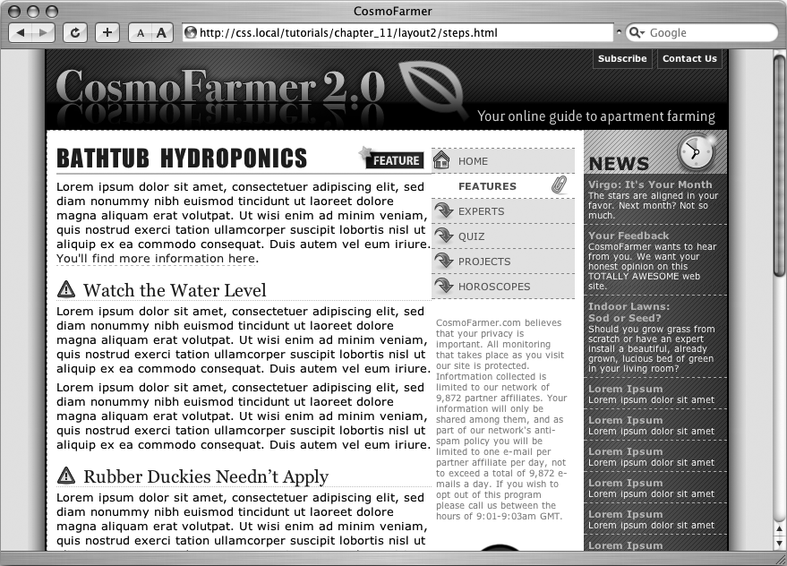
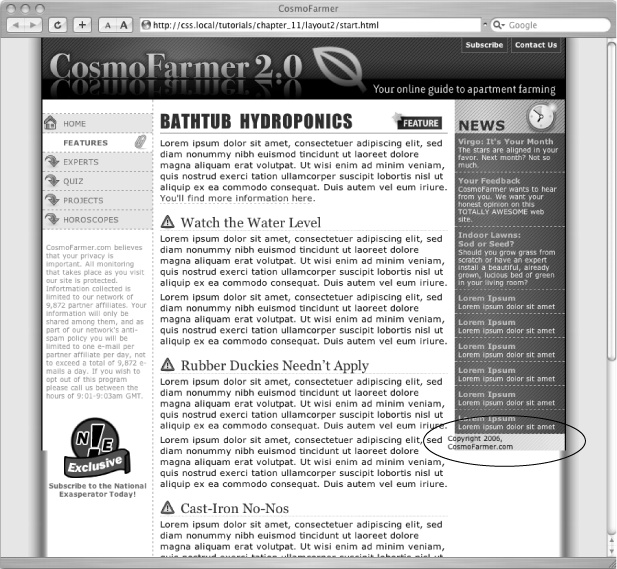
Preview the page in a web browser, and you'll see something like Figure 12-22. It works if you use Firefox or Safari. It's a different story with Internet Explorer 6. In that browser, you'll see a large empty space to the left of the middle column and no navigation bar anywhere in sight. That's the nasty double margin bug in action (Handling Internet Explorer 6 Bugs). Because the main div is floated left and it has a left margin, IE 6 doubles the margin, ruining the layout. Luckily, there's an easy fix.
Figure 12-22. Using negative margins, you can place columns in any order on the page. Doing so requires floating all of the columns, which can cause problems for content that comes after the columns, like the copyright notice (circled). That element tries to wrap around the floats, and in the process it gets crammed into a corner rather than positioned at the bottom of the page. To fix it, add clear: both to the copyright notice's style.
Add display: inline to the #main style:
#main {display: inline;float: left; width: 419px; margin-left: 160px; padding-left: 10px; border-left: 1px dashed #999999; }Now if you preview the page in IE 6, everything works fine (Figure 12-22).
The next couple of steps demonstrate how flexible CSS layout really is. First, you'll take care of the copyright notice that should appear at the bottom of the page. Currently, it's caught up in all of that floating stuff. It needs to clear the floats to get into position.
At the end of the internal style sheet, add one last style:
#legal {
  clear: both;
  margin-right: 160px;
  padding: 5px 5px 20px 160px;
  border-top: 1px dashed #999999;
  font-weight: bold;
  color: #666666;
}
This style applies a variety of formatting rules to the copyright notice. The most important is the clear declaration, which drops the copyright below all of the floats. The right margin pushes the copyright notice away from the right sidebar, so the top border (also defined in this style) doesn't overlap the background graphic.
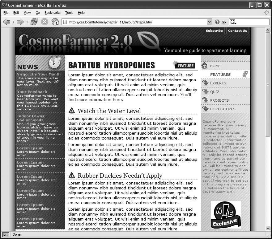
The page is basically done, and as a reward, you get to do one last thing to demonstrate how cool CSS really is. Think you can swap the two sidebars so that the news appears on the left and the navigation on the right? It's easier than it sounds—just a couple of changes to two styles.
Edit the #nav style by removing the negative margin and changing its float value from left to right. The finished style should look like this:
#nav {
  float: right;
  width: 160px;
}
The navigation bar moves to the right side. Now move the news to the left.
In the #news style, add margin-left: –590px and set the float to left like this:
#news {
  float: left;
  width: 160px;
  margin-left: -590px;
}
Save the page and preview it in a web browser (Figure 12-23). The columns have swapped with no messy HTML changes. All you did was swap the two styles. If you want to take this a bit further, you can move the background graphic applied to the wrapper from the right to the left and switch the border that appears on the left edge of the main content div to its right edge so that it butts up against the navigation div.
