8 Presenting Evidence in Tables and Figures
8.1 Choose Verbal or Visual Representations
8.2 Choose the Most Effective Graphic
8.3.1 Frame Each Graphic to Help Your Readers Understand It
8.3.2 Keep the Image as Simple as Its Content Allows
8.3.3 Follow Guidelines for Tables, Bar Charts, and Line Graphs
If your data are in the form of numbers, most readers grasp them more easily if you present them graphically. But you face many choices of graphic forms, and some forms will suit your data and message better than others. In this chapter, we show you how to choose the right graphic form and design it so that readers can see both what your data are and how they support your argument. (See pp. 413–14 in the bibliography for guides to creating and using graphics; see chapter 26 for details on formatting graphics.)1
8.1 Choose Verbal or Visual Representations
Ordinarily, present quantitative data verbally when they include only a few numbers. (see chapter 23 for presenting numbers in text.) Present them graphically when most of your evidence is quantitative or you must communicate a large set of data. But when the data are few and simple, readers can grasp them as easily in a sentence as in a table like table 8.1:
In 1996, on average, men earned $32,144 a year, women $23,710, a difference of $8,434.
Table 8.1. Male-female salaries ($), 1996

Table 8.2. Changes in family structure, 1970–2000

But if you present more than four or five numbers in a passage, readers will struggle to keep them straight, particularly if they must compare them, like this:
Between 1970 and 2000, the structure of families changed in two ways. In 1970, 85 percent of families had two parents, but by 1980 that number had declined to 77 percent, then to 73 percent by 1990 and to 68 percent by 2000. The number of one-parent families rose, particularly families headed by a mother. In 1970, 11 percent of families were headed by a single mother. By 1980 that number rose to 18 percent, by 1990 to 22 percent, and to 23 percent by 2000. Single fathers headed 1 percent of families in 1970, 2 percent in 1980, 3 percent in 1990, and 4 percent in 2000. Families with no adult in the home have remained stable at 3–4 percent.
Those data can be presented more effectively in graphic form, as in table 8.2.
8.2 Choose the Most Effective Graphic
When you graphically present data as complex as in that paragraph, you have many choices. The simplest and most common are tables, bar charts, and line graphs, each of which has a distinctive rhetorical effect.
■ To emphasize specific values, use a table like table 8.2.
■ To emphasize comparisons that can be seen at a glance, use a bar chart like figure 8.1.
■ To emphasize trends, use a line graph like figure 8.2.
While each of these forms communicates the same data, readers respond to them in different ways:
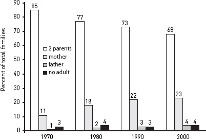
Figure 8.1. Changes in family structure, 1970–2000
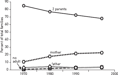
Figure 8.2. Changes in family structure, 1970–2000
■ A table seems precise and objective. It emphasizes individual numbers and forces readers to infer relationships or trends (unless you state them in an introductory sentence).
■ Both charts and line graphs emphasize a visual image that communicates values less precisely but more quickly than do the exact numbers of a table. But they also differ:
■ A bar chart emphasizes comparisons among discrete items.
■ A line graph emphasizes trends, usually over time.
Choose the graphic form that best achieves the effect you intend, not the first one that comes to mind.
How many choices you should consider depends on your experience. If you’re new to quantitative research, limit your choices to basic tables, bar charts, and line graphs. Your computer software may offer more choices, but ignore those that you aren’t familiar with.
If you are doing advanced research, readers will expect you to use the graphic form best suited to your point and your kind of data, and to draw from a larger range of choices. In that case, consult table 8.7, which describes the rhetorical uses of other common forms. But you may have to consider more creative ways of representing data if you are writing a dissertation or article in a field in which researchers routinely display complex relationships in large data sets.
8.3 Design Tables and Figures
Computer programs now let you create graphics so dazzling that you might be tempted to let your software make your design decisions. But readers don’t care how elaborate your graphics look if they are confusing, misleading, or irrelevant to your point. You have to decide how to make them clear, focused, and relevant, then set your software to reflect that judgment. (See A.3.1.3 and A.1.3.4 on creating and inserting tables and figures in your paper.)
8.3.1 Frame Each Graphic to Help Your Readers Understand It
A graphic representing complex numbers rarely speaks for itself. You must frame it so that readers know what to see in it and how to understand its relevance to your argument.
1. Introduce tables and figures with a sentence in your text that states how the data support your point. Include in that sentence any specific number that you want readers to focus on. (That number must also appear in the table or figure.)
2. Label every table and figure in a way that describes its data and, if possible, their important relationships. For a table, the label is called a title and is set flush left above; for a figure, the label is called a caption (or legend) and is set flush left below. (For the forms of titles and captions, see chapter 26.) Keep titles and captions short but descriptive enough to indicate the specific nature of the data and to differentiate every graphic from every other one.
■ Avoid making the title or caption a general topic:
Not Heads of households
But Changes in one- and two-parent heads of households, 1970–2000
■ Use noun phrases; avoid relative clauses in favor of participles:
Not Number of families that subscribe to weekly news magazines
But Number of families subscribing to weekly news magazines
■ Do not give background information or characterize the implications of the data:
Not Weaker effects of counseling on depressed children before professionalization of staff, 1995–2004
But Effect of counseling on depressed children, 1995–2004
■ Be sure labels distinguish graphics presenting similar data:
Risk factors for high blood pressure among men in Maywood, Illinois
Risk factors for high blood pressure among men in Kingston, Jamaica
3. Put into the table or figure information that helps readers see how the data support your point. For example, if numbers in a table show a trend, and if the size of the change matters, add the change to the final column. Or if a line on a graph changes in response to an influence not mentioned on the graph, as in figure 8.3, add text to the image to explain it:
Although reading and math scores initially declined by almost 100 points following redistricting, that trend was substantially reversed by the introduction of supplemental math and reading programs.
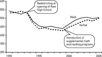
Figure 8.3. SAT scores for Mid-City High, 1990–2005
Table 8.3. Gasoline consumption

Table 8.4. Per capita mileage and gasoline consumption, 1970–2000

4. Highlight the part of the table or figure that you want readers to focus on, particularly any number or relationship mentioned in the sentence introducing the table or figure. For example, we have to study table 8.3 closely to see how it supports the following introductory sentence:
Most predictions about gasoline consumption have proved wrong.
We need another sentence explaining how the numbers relate to the claim, a more informative title, and visual help that focuses us on what to look for (table 8.4):
Gasoline consumption did not grow as many had predicted. Even though Americans drove 23 percent more miles in 2000 than in 1970, they used 32 percent less fuel.
The added sentence tells us how to interpret the key data in table 8.4, and the highlight tells us where to find it.
8.3.2 Keep the Image as Simple as Its Content Allows
Some guides encourage you to put as much data as you can in every graphic, but readers want to see only the data relevant to your point, presented in an image free of distractions.
1. Include only relevant data. If you want to include data just for the record, label it accordingly and put it in an appendix (see A.2.3.2).
2. Make the grid simple.
■ Graphics
![]() Box a graphic only if you group two or more figures.
Box a graphic only if you group two or more figures.
![]() Use caution in employing shading or color to convey meaning. Even if you print the paper on a color printer or submit it as a PDF, it may be printed or copied later on a black-and-white machine, and if it is a dissertation, it may be microfilmed. Shading and color may not reproduce well in any of these forms.
Use caution in employing shading or color to convey meaning. Even if you print the paper on a color printer or submit it as a PDF, it may be printed or copied later on a black-and-white machine, and if it is a dissertation, it may be microfilmed. Shading and color may not reproduce well in any of these forms.
![]() Never create a three-dimensional background for a two-dimensional graphic. The added depth contributes nothing and can distort how readers judge values.
Never create a three-dimensional background for a two-dimensional graphic. The added depth contributes nothing and can distort how readers judge values.
![]() Plot data on three dimensions only when you cannot display the data in any other way and your readers are familiar with such graphs.
Plot data on three dimensions only when you cannot display the data in any other way and your readers are familiar with such graphs.
■ Tables
![]() Never use both horizontal and vertical lines to divide columns and rows. Use light gray lines if you want to direct your reader’s eyes in one direction to compare data or if the table is unusually complex. But avoid using gray lines or shading in anything that will be microfilmed, because the photographed image may be blurred.
Never use both horizontal and vertical lines to divide columns and rows. Use light gray lines if you want to direct your reader’s eyes in one direction to compare data or if the table is unusually complex. But avoid using gray lines or shading in anything that will be microfilmed, because the photographed image may be blurred.
![]() For tables with many rows, lightly shade every fifth row.
For tables with many rows, lightly shade every fifth row.
![]() Do not use a font size smaller than nine points for a document that will be microfilmed. Smaller fonts will be illegible.
Do not use a font size smaller than nine points for a document that will be microfilmed. Smaller fonts will be illegible.
■ Charts and graphs
![]() Use grid lines only if the graphic is complex or readers need to see precise numbers. Make all grid lines light gray, unless the text will be microfilmed.
Use grid lines only if the graphic is complex or readers need to see precise numbers. Make all grid lines light gray, unless the text will be microfilmed.
![]() Use caution in employing shading or color to convey meaning. Even if you print the paper on a color printer or submit it as a PDF, it may be printed or copied later on a black-and-white machine, and if it is a dissertation, it may be microfilmed. Shading and color may not reproduce well in any of these forms.
Use caution in employing shading or color to convey meaning. Even if you print the paper on a color printer or submit it as a PDF, it may be printed or copied later on a black-and-white machine, and if it is a dissertation, it may be microfilmed. Shading and color may not reproduce well in any of these forms.
![]() Never create a three-dimensional chart or graph if you can represent the same data in two dimensions. The added depth contributes nothing and can distort how readers judge values.
Never create a three-dimensional chart or graph if you can represent the same data in two dimensions. The added depth contributes nothing and can distort how readers judge values.
![]() Never use iconic bars (for example, images of cars to represent automobile production). They add nothing, can distort how readers judge values, and look amateurish.
Never use iconic bars (for example, images of cars to represent automobile production). They add nothing, can distort how readers judge values, and look amateurish.
3. Use clear labels.
■ Label rows and columns in tables and both axes in charts and graphs. (See chapter 26 for punctuation and spelling in labels.)
■ Use tick marks and labels to indicate intervals on the vertical axis of a graph (see fig. 8.4).
■ If possible, label lines, bar segments, and the like on the image rather than in a caption set to the side. Do so in the caption only if labels would make the image too complex to read.
■ When specific numbers matter, add them to bars, segments, or dots on lines.
8.3.3 Follow Guidelines for Tables, Bar Charts, and Line Graphs
8.3.3.1 TABLES. Tables with lots of data can seem especially dense, so keep their image and content as simple as possible.
Table 8.5. Unemployment in major industrial nations, 1990–2000

Table 8.6. Changes in unemployment rates of industrial nations, 1990-2000
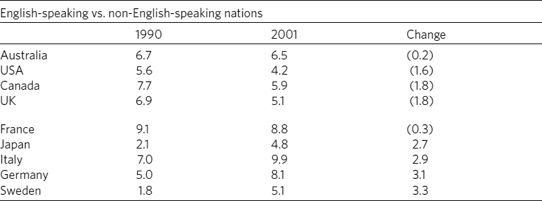
■ Order the rows and columns by a principle that lets readers quickly find what you want them to see. Do not automatically choose alphabetic order.
■ Round numbers to relevant values. If differences of less than 1,000 don’t matter, then 2,123,499 and 2,124,886 are irrelevantly precise.
■ Sum totals at the bottom of a column or at the end of a row, not at the top or left. Compare tables 8.5 and 8.6. Table 8.5 looks cluttered and its items aren’t helpfully organized. Table 8.6 is clearer because its title is more informative, the table has less distracting visual clutter, and its items are organized to let us see patterns more easily.
8.3.3.2 BAR CHARTS. Bar charts communicate as much by image as by specific numbers. Bars that seem to be arranged in no pattern imply no point, so if possible, group and arrange bars to give readers an image of an order that matches your point.
For example, look at figure 8.4 in the context of the explanatory sentence before it. The items are listed alphabetically, an order that doesn’t help readers see the point. In contrast, figure 8.5 supports the claim with a coherent image.
Most of the desert area in the world is concentrated in North Africa and the Middle East.
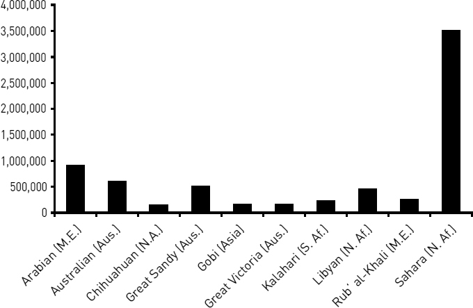
Figure 8.4. World’s ten largest deserts
Most of the desert area in the world is concentrated in North Africa and the Middle East.
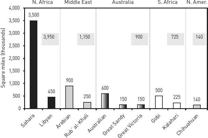
Figure 8.5. World distribution of large deserts
In standard bar charts, each bar represents 100 percent of a whole. But sometimes it helps readers if they can see specific values for parts of the whole. You can do that in either of two ways:
■ A “stacked bar” chart subdivides the bars into proportional parts, as in the chart on the left in figure 8.6.
■ A “grouped bar” chart uses a separate bar for each part of the whole but groups the bars, as in the chart on the right in figure 8.6.
Use stacked bars only when it’s more important to compare whole values than it is to compare their segments. Readers, however, can’t easily gauge proportions by eye alone, so if you do use stacked bars, do this:
■ Arrange segments in a logical order. If possible, put the largest segment at the bottom in the darkest shade.
■ Label segments with specific numbers and connect corresponding segments with gray lines to help clarify proportions.
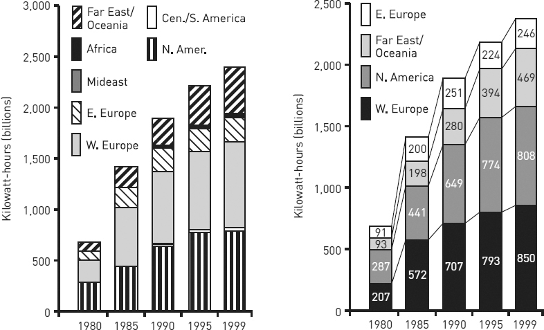
Figure 8.6. Stacked bar chart compared to grouped bar chart
Figure 8.7 shows how a stacked bar chart is more readable when irrelevant segments are eliminated and those kept are logically ordered and fully labeled.

Figure 8.7. Stacked bar charts showing generators of nuclear energy, 1980–1999
A grouped bar chart makes it easy for readers to compare parts of a whole, but difficult for them to compare different wholes because they must do mental arithmetic. If you group bars because the segments are more important than the wholes, do this:
■ Arrange groups of bars in a logical order; if possible, put bars of similar size next to one another (order bars within groups in the same way).
■ Label groups with the number for the whole, either above each group or below the labels on the bottom.
Most data that fit a bar chart can also be represented in a pie chart. It is a popular choice in magazines, tabloids, and annual reports, but it’s harder to read than a bar chart, and it invites misinterpretation because readers must mentally compare proportions of segments whose size is hard to judge in the first place. Most researchers consider them amateurish. Use bar charts instead.
8.3.3.3 LINE GRAPHS. Because a line graph emphasizes trends, readers must see a clear image to interpret it correctly. To create a clear image, do the following:
■ Choose the variable that makes the line go in the direction, up or down, that supports your point. If the good news is a reduction (down) in high school dropouts, you can more effectively represent the same data as an increase in retention (up).
■ Plot more than six lines on one graph only if you cannot make your point in any other way.
■ Do not depend on different shades of gray to distinguish lines, as in figure 8.8.
■ When you create a line graph from only a few values, the lines will be less precise. So if you plot fewer than ten values (called data points), indicate that by adding a dot at each data point, as in figure 8.9. If those values are relevant, you can add numbers above the dots. Do not add dots to lines plotted from ten or more data points.
Compare figure 8.8 and figure 8.9. Beyond its general story, figure 8.8 is harder to read because the shades of gray do not distinguish the lines well and because our eyes have to flick back and forth to connect lines with variables and their numbers. Figure 8.9 makes those connections clearer.
These different ways of showing the same data can be confusing. You can cut through that confusion if you first represent the same data in different ways (your computer program will usually let you do that quickly) and then ask someone unfamiliar with the data to judge the representations for impact and clarity. Be sure to introduce the representations with a sentence that states the claim you want the table or figure to support.
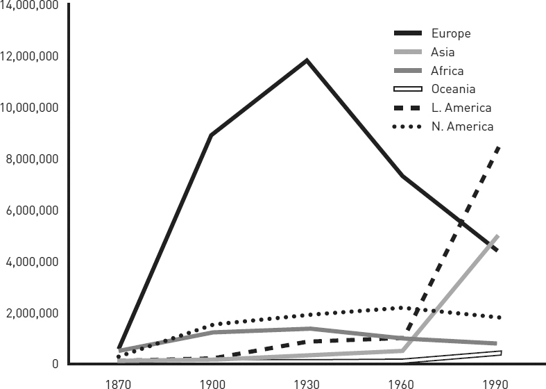
Figure 8.8. Foreign-born residents in the United States, 1870–1990
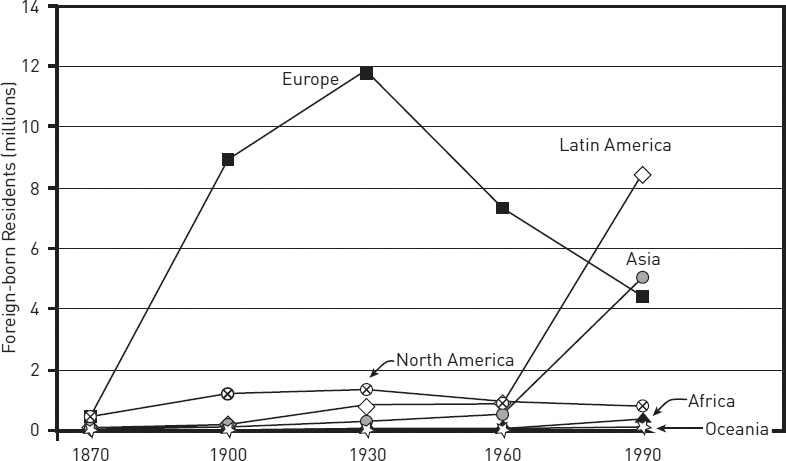
Figure 8.9. Foreign-born residents in the United States, 1870–1990
8.4 Communicate Data Ethically
Your graphic must be not only clear, accurate, and relevant but also honest. It should not distort its data or their relationships to make a point. For example, the two bar charts in figure 8.10 display identical data yet seem to send different messages. The full scale in the figure on the left creates a fairly flat slope, which makes the drop in pollution seem small. The vertical scale in the figure on the right, however, begins not at 0 but at 80. When a scale is that truncated, its drawn-out slope exaggerates small contrasts.
Graphs can also mislead by implying false correlations. Someone claiming that unemployment goes down when union membership goes down might offer figure 8.11 as evidence. And indeed, union membership and the unemployment rate seem to move together so closely that a reader might infer they are causally related. But the scale for the left axis in figure 8.11 (union membership) differs from the scale for the right axis (the unemployment rate). The two scales have been deliberately skewed to make the two declines seem parallel. They may be related, but that distorted image doesn’t prove it.
Graphs can also mislead when the image encourages readers to misjudge values. The two charts in figure 8.12 seem to communicate different messages even though they represent exactly the same data. These two charts are “stacked area” charts. Despite their visual differences, they represent the same data. These stacked area charts represent differences in values not by the angles of the lines but by the areas between them. In both charts, the bands for south, east, and west are roughly the same width throughout, indicating little change in the values they represent. The band for the north, however, widens sharply, representing a large increase in the value it represents. In the chart on the left, readers are likely to misjudge the top three bands because they are on top of the rising north band, making those bands seem to rise as well. In the chart on the right, on the other hand, those three bands do not rise because they are on the bottom. Here only the band for the north rises.
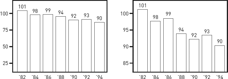
Figure 8.10. Capitol City pollution index, 1982–1994
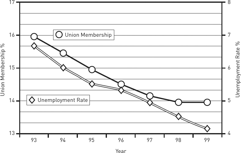
Figure 8.11. Union membership and unemployment rate, 1993–1999
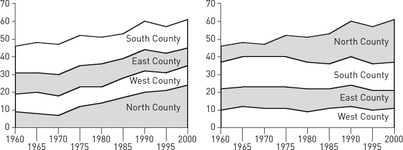
Figure 8.12. Representation of collar counties among State U. undergraduates (percentage of total)
Here are four guidelines for avoiding visual misrepresentations:
■ Do not manipulate a scale to magnify or reduce a contrast.
■ Do not use a figure whose image distorts values.
■ Do not make a table or figure unnecessarily complex or misleadingly simple.
■ If the table or figure supports a point, state it.
Table 8.7. Common graphic forms and their uses
|
Data |
Rhetorical uses |
Bar chart |
||
|
Compares the value of one variable across a series of items called cases (e.g., average salaries for service workersvariable in six companiescases). |
Creates strong visual contrasts among individual cases, emphasizing comparisons. For specific values, add numbers to bars. Can show ranks or trends. Vertical bars (called columns) are most common, but bars can be horizontal if cases are numerous or have complex labels. See section 8.3.3.2. |
Bar chart, grouped or split |
||
|
Compares the value of one variable, divided into subsets, across a series of cases (e.g., average salariesvariable for men and women service workerssubsets in six companiescases). |
Contrasts subsets within and across individual cases; not useful for comparing total values for cases. For specific values, add numbers to bars. Grouped bars show ranking or trends poorly; useful for time series only if trends are unimportant. See section 8.3.3.2. |
Bar chart, stacked |
||
|
Compares the value of one variable, divided into two or more subsets, across a series of cases (e.g., harassment complaintsvariable segmented by regionsubsets in six industriescases). |
Best for comparing totals across cases and subsets within cases; difficult to compare subsets across cases (use grouped bars). For specific values, add numbers to bars and segments. Useful for time series. Can show ranks or trends for total values only. See section 8.3.3.2. |
Histogram |
||
|
Compares two variables, with one segmented into ranges that function like the cases in a bar graph (e.g., service workerscontinuous variable whose salary is $0–5,000, $5–10,000, $10–15,000, etc.segmented variable). |
Best for comparing segments within continuous data sets. Shows trends but emphasizes segments (e.g., a sudden spike at $5–10,000 representing part-time workers). For specific values, add numbers to bars. |
Image chart |
||
|
Shows value of one or more variables for cases displayed on a map, diagram, or other image (e.g., statescases colored red or blue to show voting patternsvariable). |
Shows the distribution of the data in relation to preexisting categories; deemphasizes specific values. Best when the image is familiar, as in a map or diagram of a process. |
Pie chart |
||
|
Shows the proportion of a single variable for a series of cases (e.g., the budget sharevariable of US cabinet departmentscases). |
Best for comparing one segment to the whole. Useful only with few segments or segments that are very different in size; otherwise comparisons among segments are difficult. For specific values, add numbers to segments. Common in popular venues, frowned on by professionals. See 8.3.3.2. |
Line graph | ||
|
Compares continuous variables for one or more cases (e.g., temperaturevariable and viscosityvariable in two fluidscases). |
Best for showing trends; deemphasizes specific values. Useful for time series. To show specific values, add numbers to data points. To show the significance of a trend, segment the grid (e.g., below or above average performance). See 8.3.3.3. |
Area chart | ||
| Compares two continuous variables for one or more cases (e.g., reading test scoresvariable over timevariable in a school districtcase). | Shows trends; deemphasizes specific values. Can be used for time series. To show specific values, add numbers to data points. Areas below the lines add no information and will lead some readers to misjudge values. Confusing with multiple lines/areas. |
Area chart, stacked | ||
| Compares two continuous variables for two or more cases (e.g., Profitvariable over timevariable for several productscases). | Shows the trend for the total of all cases, plus how much each case contributes to that total. Likely to mislead readers on the value or the trend for any individual case, as explained in section 8.4. |
Scatterplot | ||
| Compares two variables at multiple data points for a single case (e.g., housing salesvariable and distance from downtownvariable in one citycase)or at one data point for multiple cases (e.g., brand loyaltyvariable and repair frequencyvariable for ten manufacturerscases). | Best for showing the distribution of data, especially when there is no clear trend or when the focus is on outlying data points. If only a few data points are plotted, it allows a focus on individual values. |
Bubble chart | ||
| Compares three variables at multiple data points for a single case (e.g., housing sales,variable distance from downtown,variable and prices variable in one citycase) or at one data point for multiple cases (e.g., image advertising,variable repair frequency,variable and brand loyaltyvariable for ten manufacturerscases). | Emphasizes the relationship between the third variable (bubbles) and the first two; most useful when the question is whether the third variable is a product of the others. Readers easily misjudge relative values shown by bubbles; adding numbers mitigates that problem. |
1. A note on terminology: The terms for graphics vary, so we will stipulate ours. In this chapter, we use the term graphics to refer to all visual representations of evidence. Another term sometimes used for such representations is illustrations. Traditionally, graphics are divided into tables and figures. A table is a grid with columns and rows that present data in numbers or words organized by categories. Figures are all other graphic forms, including graphs, charts, photographs, drawings, and diagrams. Figures that present quantitative data are divided into charts, typically consisting of bars, circles, points, or other shapes, and graphs, typically consisting of continuous lines. For a survey of common figures, see table 8.7.


