elementary linkage analysis
Multidimensional measurement and factor analysis |
CHAPTER 37 |
This chapter introduces some high level statistics and the principles that underpin them. The statistics covered here are:
elementary linkage analysis
factor analysis
what to look for in factor analysis output
cluster analysis
examples of studies using multidimensional scaling and cluster analysis
multidimensional data: some words on notation
a note on structural equation modelling
a note on multilevel modelling
Some of these materials have significant coverage (e.g. factor analysis), whilst others are more by way of introduction (e.g. structural equation modelling and multilevel modelling).
However limited our knowledge of astronomy, most of us have learned to pick out certain clusterings of stars from the infinity of those that crowd the Northern skies and to name them as the familiar Plough, Orion and the Great Bear. Few of us would identify constellations in the Southern Hemisphere that are instantly recognizable by those in Australia.
Our predilection for reducing the complexity of elements that constitute our lives to a more simple order does not stop at star gazing. In numerous ways, each and every one of us attempts to discern patterns or shapes in seemingly unconnected events in order to better grasp their significance for us in the conduct of our daily lives. The educational researcher is no exception.
As research into a particular aspect of human activity progresses, the variables being explored frequently turn out to be more complex than was first realized. Investigation into the relationship between teaching styles and pupil achievement is a case in point. Global distinctions between behaviour identified as progressive or traditional, informal or formal, are vague and woolly and have led inevitably to research findings that are at worse inconsistent, at best, inconclusive. In reality, epithets such as informal or formal in the context of teaching and learning relate to ‘multidimensional concepts’, that is concepts made up of a number of variables. ‘Multidimensional scaling’, on the other hand, is a way of analysing judgements of similarity between such variables in order that the dimensionality of those judgements can be assessed (Bennett and Bowers, 1977). As regards research into teaching styles and pupil achievement, it has been suggested that multidimensional typologies of teacher behaviour should be developed. Such typologies, it is believed, would enable the researcher to group together similarities in teachers’ judgements about specific aspects of their classroom organization and management, and their ways of motivating, assessing and instructing pupils.
Techniques for grouping such judgements are many and various. What they all have in common is that they are methods for ‘determining the number and nature of the underlying variables among a large number of measures’, a definition which Kerlinger (1970) uses to describe one of the best-known grouping techniques, ‘factor analysis’. We begin the chapter by illustrating elementary linkage analysis which can be undertaken by hand, and move to factor analysis. We move to a brief note on cluster analysis as a way of organizing people/groups rather than variables, and then close with some introductory remarks on structural equation modelling and multilevel modelling.
Elementary linkage analysis (McQuitty, 1957) is one way of exploring the relationship between the teacher’s personal constructs, that is, of assessing the dimensionality of the judgements that she makes about her pupils. It seeks to identify and define the clusterings of certain variables within a set of variables. Like factor analysis which we shortly illustrate, elementary linkage analysis searches for interrelated groups of correlation coefficients. The objective of the search is to identify ‘types’. By type, McQuitty (1957) refers to ‘a category of people or other objects (personal constructs in our example) such that the members are internally self-contained in being like one another’.
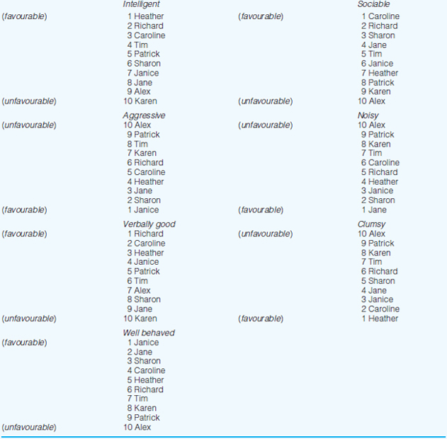
Seven constructs were elicited from an infant school teacher who was invited to discuss the ways in which she saw the children in her class. She identified favourable and unfavourable constructs as follows: ‘intelligent’ (+), ‘sociable’ (+), ‘verbally good’ (+), ‘well behaved’ (+), ‘aggressive’ (–), ‘noisy’ (–) and ‘clumsy’ (–) (see also Cohen, 1977).
Four boys and six girls were then selected at random from the class register and the teacher was asked to place each child in rank order under each of the seven constructs, using rank position 1 to indicate the child most like the particular construct, and rank position 10, the child least like the particular construct. The teacher’s rank ordering is set out in Table 37.1. Notice that on three constructs, the rankings have been reversed in order to maintain the consistency of Favourable = 1, Unfavourable =10.
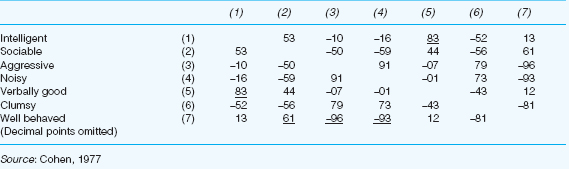
Table 37.2 sets out the intercorrelations between the seven personal construct ratings shown in Table 37.1 (Spearman’s rho is the method of correlation used in this example).
Elementary linkage analysis enables the researcher to cluster together similar groups of variables by hand.
1 In Table 37.2, underline the strongest, that is the highest, correlation coefficient in each column of the matrix. Ignore negative signs.
2 Identify the highest correlation coefficient in the entire matrix. The two variables having this correlation constitute the first two of Cluster 1.
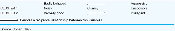
3 Now identify all those variables which are most like the variables in Cluster 1. To do this, read along the rows of the variables which emerged in Step 2, selecting any of the coefficients which are underlined in the rows. Table 37.3 illustrates diagrammatically the ways in which these new cluster members are related to the original pair which initially constituted Cluster 1.
4 Now identify any variables which are most like the variables elicited in Step 3. Repeat this procedure until no further variables are identified.
5 Excluding all those variables which belong within Cluster 1, repeat Steps 2 to 4 until all the variables have been accounted for.
Factor analysis is a method of grouping together variables which have something in common. It is a process which enables the researcher to take a set of variables and reduce them to a smaller number of underlying factors which account for as many variables as possible. It detects structures and commonalities in the relationships between variables. Thus it enables researchers to identify where different variables in fact are addressing the same underlying concept. For example, one variable could measure somebody’s height in centimetres; another variable could measure the same person’s height in inches; the underlying factor that unites both variables is height; it is a latent factor that is indicated by the two variables.
Factor analysis can take two main forms: exploratory factor analysis and confirmatory factor analysis. The former refers to the use of factor analysis (principal components analysis in particular) to explore previously unknown groupings of variables, to seek underlying patterns, clusterings and groups. By contrast confirmatory factor analysis is more stringent, testing a found set of factors against a hypothesized model of groupings and relationships. This section introduces the most widely used form of factor analysis: principal components analysis. We refer the reader to further books on statistics for a fuller discussion of factor analysis and its variants.
The analysis here uses SPSS output, as it is the most commonly used way of undertaking principal components analysis by educational researchers.
As an example of factor analysis, one could have the following variables in a piece of educational research:
1 Student demotivation.
2 Poor student concentration.
3 Undue pressure on students.
4 Narrowing effect on curriculum.
5 Punishing the weaker students.
6 Overemphasis on memorization.
7 Testing only textbook knowledge.
These seven variables can be grouped together under the single overarching factor of ‘negative effects of examinations’. Factor analysis, working through multiple correlations, is a method for grouping together several variables under one or more common factor(s).
To address factor analysis in more detail we provide a worked example. Consider the following variables concerning school effectiveness:
1 The clarity of the direction that is set by the school leadership.
2 The ability of the leader to motivate and inspire the educators.
3 The drive and confidence of the leader.
4 The consultation abilities/activities of the leader.
5 The example set by the leader.
6 The commitment of the leader to the school.
7 The versatility of the leader’s styles.
8 The ability of the leader to communicate clear, individualized expectations.
9 The respect in which the leader is held by staff.
10 The staff’s confidence in the Senior Management Team.
11 The effectiveness of the teamwork of the Senior Management Team.
12 The extent to which the vision for the school impacts on practice.
13 Educators given opportunities to take on leadership roles.
14 The creativity of the Senior Management Team.
15 Problem-posing, problem-identifying and problem-solving capacity of Senior Management Team.
16 The use of data to inform planning and school development.
17 Valuing of professional development in the school
18 Staff consulted about key decisions.
19 The encouragement and support for innovativeness and creativity.
20 Everybody is free to make suggestions to inform decision making.
21 The school works in partnership with parents.
22 People take positive risks for the good of the school and its development.
23 Staff voluntarily taking on coordination roles.
24 Teamwork amongst school staff.
Here we have 24 different variables. The question here is ‘are there any underlying groups of factors’ (‘latent variables’) that can embrace several of these variables, or of which the several variables are elements or indicators? Factor analysis will indicate whether there are. We offer a three-stage model for undertaking factor analysis. In what follows we distinguish factors from variables; a factor is an underlying or latent feature under which groups of variables are included; a variable is one of the elements that can be a member of an underlying factor. In our example here we have 24 variables and, as we shall see, five factors.
Let us imagine that we have gathered data from 1,000 teachers in several different schools, and we wish to see how the 24 variables above can be grouped, based on their voting (using ratio data by awarding marks out of ten for each of the variables). (This follows the rule that there should be more subjects in the sample than there are variables.) Bryman and Cramer (1990: 255) suggest that there should be at least five subjects per variable and a total of no fewer than 100 subjects in the total sample.
First the researcher has to determine whether the data are, in fact, suitable for factor analysis (Tabachnick and Fidell, 2007: 613–15). This involves checking the sample size, which varies in the literature, from a minimum of 30 to a minimum of 300. Tabachnick and Fidell (2007: 613) suggest that a sample size of 50 is very poor, 100 is poor, 200 is fair, 300 is good, 500 is very good and 1,000 is excellent; they suggest that 300 should be regarded as a general minimum, and if the sample size is small then the factors loadings (discussed later) should be high. It also involves having neither too few nor too many variables: too few and the extraction of the factors may only extract one or two items per factor, and this gives very little ‘added value’, too many and the number of factors extracted could be so many as to be unhelpful in identifying underlying latent factors. The data must also be ratio or interval. The researcher also needs to consider the ratio of sample size to number of variables (different ratios are given in literature, from 5:1 to 30:1), and the strength of intercorrelations between the variables should be no less than 0.3 (below this and the data may not be suitable for finding latent, underlying factors, as the variables are not sufficiently closely related). Factor analysis assumes a normal distribution (measured by kurtosis and skewness), linearity of relationships between pairs of variables (rather than, for example, curvilinearity (see Chapter 34)) and the removal or reduction in the number of outliers.
Two specific statistics can also be computed to test for the suitability of the data for factorization:
the Bartlett test of sphericity, which investigates the correlations between variables, and which should show statistical significance (ρ<0.05) (but mainly to be used where the number of cases per variable is five or fewer);
the Kaiser-Mayer-Olkin measure of sampling adequacy, which correlates pairs of variables and the magnitude of partial correlations amongst variables, and which requires many pairs of variables to be statistically significantly, and which should yield an overall measure of 0.6 or higher (maximum is one).
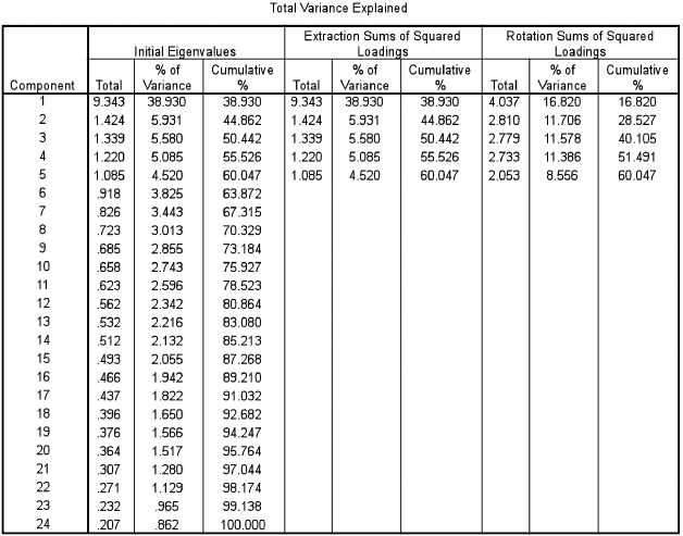
TABLE 37.4 INITIAL SPSS OUTPUT FOR PRINCIPAL COMPONENTS ANALYSIS (SPSS OUTPUT)
Extraction Method: Principal Component Analysis.
If the data are suitable for factor analysis then the researcher can proceed. This analysis will assume that the data are suitable for factor analysis to proceed and is based on SPSS processing and output (Table 37.4).
Though Table 37.4 seems to contain a lot of complicated data, in fact most of this need not trouble us at all. SPSS has automatically found and reported five factors for us through sophisticated correlational analysis, and it presents data on these five factors (the first five rows of the chart, marked ‘Component’). Table 37.4 takes the 24 variables (listed in order on the left-hand column (Component)) and then it provides three sets of readings: Eigenvalues, Extraction Sums of Squared Loadings, and Rotation Sums of Squared Loadings. Eigenvalues are measures of the variance between factors, and are the sum of the squared loadings for a factor, representing the amount of variance accounted for by that factor. We are only interested in those Eigenvalues that are greater than 1, since those that are smaller than 1 generally are not of interest to researchers as they account for less than the variation explained by a single variable. Indeed SPSS automatically filters out for us the Eigenvalues that are greater than 1, using the Kaiser criterion (in SPSS this is termed the Kaiser Normalization).
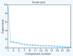
A scree plot can also be used at this stage, to identify and comment on factors (this is available at the click of a button in SPSS). A scree plot shows each factor on a chart, in descending order of magnitude. For researchers the scree plot becomes interesting where it flattens out (like the rubble that collects at the foot of a scree), as this indicates very clearly which factors account for a lot of the variance, and which account for little. In the scree plot here (Figure 37.1) one can see that the scree flattens out considerably after the first factor, then it levels out a little for the next four factors, tailing downwards all the time. This suggests that the first factor is the significant factor in explaining the greatest amount of variance.
Indeed, in using the scree plot one perhaps has to look for the ‘bend in the elbow’ of the data (after factor one), and then regard those factors above the bend in the elbow as being worthy of inclusion, and those below the bend in the elbow as being relatively unimportant (Pallant, 2001: 154). However, this is draconian, as it risks placing too much importance on those items above the bend in the elbow and too little importance on those below it. The scree plot in Figure 37.1 adds little to the variance table presented in Table 37.4, though it does enable one to see at a glance which are the significant and less significant factors, or, indeed, which factors to focus on (the ones before the scree levels off) and which to ignore.
Next we turn to the columns in Table 37.4 labelled ‘Extraction Sums of Squared Loadings’. The Extraction Sums of Squared Loadings contain two important pieces of information. First, in the column marked ‘% of variance’ SPSS tells us how much variance is explained by each of the factors identified, in order from the greatest amount of variance to the least amount of variance. So, here the first factor accounts for 38.930% of the variance in the total scenario – a very large amount – whilst the second factor identified accounts for only 5.931% of the total variance, a much lower amount of explanatory power. Each factor is unrelated to the other, and so the amount of variance in each factor is unrelated to, or explained by, the other factors; they are independent of each other. By giving us how much variance in the total picture is explained by each factor we can see which factors possess the most and least explanatory power – the power to explain the total scenario of 24 factors. Second, SPSS keeps a score of the cumulative amount of explanatory power of the five factors identified. In the column ‘Cumulative’ it tells us that in total 60.047% of the total picture (of the 24 variables) is accounted for – explained – by the five factors identified. This is a moderate amount of explanatory power, and researchers would be happy with this.
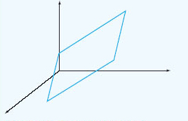
However, the three columns under ‘Extraction Sums of Squared Loadings’ give us the initial, rather crude, unadjusted percentage of variance of the total picture explained by the five factors found. These are crude in the sense that the full potential of factor analysis has not been caught. What SPSS has done here is to plot the factors on a two-dimensional chart (which it does not present in the data output) to identify groupings of variables, the two dimensions being vertical and horizontal axes as in a conventional graph like a scattergraph. On such a two-dimensional chart some of the factors and variables could be plotted quite close to each other, such that discrimination between the factors would not be very clear. However, if we were to plot the factors and variables on a three-dimensional chart that includes not only horizontal and vertical axes but also depth by rotating the plotted points through 90 degrees, then the effect of this would be to bring closer together those variables that are similar to each other and to separate them more fully – in distance – from those variables that have no similarity to them, i.e. to render each group of variables (factors) more homogeneous and to separate more clearly one group of variables (factor) from another group of variables (factor). The process of rotation keeps together those variables that are closely interrelated and keeps them apart from those variables that are not closely related. This is represented in Figure 37.2.
This distinguishes more clearly one factor from another than that undertaken in the Extraction Sums of Squared Loadings.
Rotation can be conducted in many ways (Tabachnick and Fidell, 2007: 637–8), of which there are two main forms:
Direct Oblimin: which is used if the researcher believes that there may be correlations between the factors (an oblique, correlated) rotation.
Varimax rotation: which is used if the researcher believes that the factors may be uncorrelated (orthogonal).
Pallant (2007: 183) argues for the importance of researchers giving strong consideration to the Direct Oblimin rotation. Even though it is more difficult to interpret, it is often actually more faithful to the correlated nature of the data and factors. The default setting in SPSS is the orthogonal, varimax rotation, and this may misrepresent the correlations between the factors, even though it is easier to analyse. Indeed Pallant (2007: 184) suggests starting with Direct Oblimin rotation.
Rotation in the example in Figure 37.2 is undertaken by varimax rotation. This maximizes the variance between factors and hence helps to distinguish them from each other. In SPSS the rotation is called orthogonal because the factors are unrelated to, and independent of, each other.
In the column ‘Rotation Sums of Squared Loadings’ of Table 37.4, the fuller power of factor analysis is tapped, in that the rotation of the variables from a two-dimensional to a three-dimensional chart has been undertaken, thereby identifying more clearly the groupings of variables into factors, and separating each factor from the other much more clearly. We advise researchers to use the Rotation Sums of Squared Loadings rather than the Extraction Sums of Squared Loadings. With the Rotation Sums of Squared Loadings the percentage of variance explained by each factor is altered, even though the total cumulative per cent (60.047%) remains the same. For example, one can see that the first factor in the rotated solution no longer accounts for 38.930% as in the Extraction Sums of Squared Loadings, but only 16.820% of the variance, and that factors 2, 3 and 4, which each only accounted for just over 5% of the variance in the Extraction Sums of Squared Loadings now each account for over 11% of the variance, and that factor 5, which accounted for 4.520% of the variance in the Extraction Sums of Squared Loadings now accounts for 8.556% of the variance in the Rotated Sums of Squared Loadings.
By this stage we hope that the reader has been able to see that:
1 factor analysis brings variables together into homogeneous and distinct groups, each of which is a factor and each of which has an Eigenvalue of greater than 1 ;
2 factor analysis in SPSS indicates the amount of variance in the total scenario explained by each individual factor and all the factors together (the cumulative per cent);
3 the Rotation Sums of Squared Loadings is preferable to the Extraction Sums of Squared Loadings.
We are ready to proceed to the second stage.
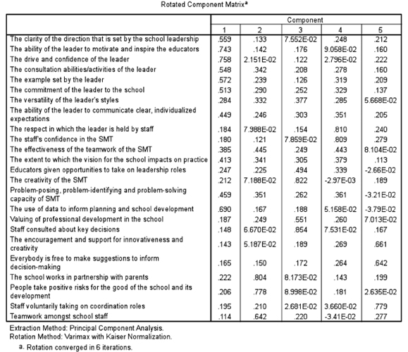
Stage 2 consists of presenting a matrix of all of the relevant data for the researcher to be able to identify which variables belong to which factor (Table 37.5). SPSS presents what at first sight is a bewildering set of data, but the reader is advised to keep cool and to look at the data slowly, as, in fact, they are not complicated. SPSS often presents researchers with more data than they need, overwhelming the researcher with data. In fact the data in Table 37.5 are comparatively straightforward.
Across the top of the matrix in Table 37.5 we have a column for each of the five factors (1–5) that SPSS had found for us. The left-hand column prints the names of each of the 24 variables with which we are working. We can ignore those pieces of data which contain the letter ‘E’ (exponential), as these contain figures that are so small as to be able to be discarded. Look at the column labelled ‘1’ (factor 1). Here we have a range of numbers that range from 0.114 (for the variable ‘Teamwork amongst school staff to 0.758 (for the variable ‘The drive and confidence of the leader’). The researcher now has to use her professional judgement, to decide what the ‘cut off points should be for inclusion in the factor. Not all 24 variables will appear in factor one, only those with high values (factor loadings – the amount that each variable contributes to the factor in question). The decision on which variables to include in factor one is not a statistical matter but a matter of professional judgement. Factor analysis is an art as well as a science. The researcher has to find those variables with the highest values (factor loadings) and include those in the factor. The variables chosen should not only have high values but also have values that are close to each other (homogeneous) and be some numerical distance away from the other variables. In the column labelled ‘ 1’ we can see that there are seven such variables, and we set these out in the example below. Other variables from the list are some numerical distance away from the variables selected (see below) and also seems to be conceptually unrelated to the seven variables identified for inclusion in the factor. The variables selected are high, close to each other and distant from the other variables. The lowest of these seven values is 0.513; hence the researcher would report that seven variables had been selected for inclusion in factor one, and that the cut-off point was 0.51 (i.e. the lowest point, above which the variables have been selected). Having such a high cutoff point gives considerable power to the factor. Hence we have factor one, that contains seven variables.
Let us look at a second example, that of factor two (the column labelled ‘2’). Here we can identify four variables that have high values that are close to each other and yet some numerical distance away from the other variables (see example below). These four variables would constitute factor two, with a reported cutoff point of 0.445. At first glance it may seem that 0.445 is low; however, recalling that the data in the example were derived from 1,000 teachers, 0.445 is still highly statistically significant, statistical significance being a combination of the coefficient and the sample size.
We repeat this analysis for all five factors, deciding the cut-off point, looking for homogeneous high values and numerical distance from other variables in the list.
By this time we have identified five factors. However neither SPSS nor any other software package tells us what to name each factor. The researcher has to devise a name that describes the factor in question. This can be tricky, as it has to catch the issue that is addressed by all the variables that are included in the factor. We have undertaken this for all five factors, and we report this below, with the factor loadings for each variable reported in brackets.
Factor One: Leadership skills in school management Cut-off point: 0.51 Variables included:
The drive and confidence of the leader (factor loading 0.758).
The ability of the leader to motivate and inspire the educators (factor loading 0.743);
The use of data to inform planning and school development (factor loading 0.690);
The example set by the leader (factor loading 0.572);
The clarity of the direction set by the school leadership (factor loading 0.559);
The consultation abilities/activities of the leader (factor loading 0.548);
The commitment of the leader to the school (factor loading 0.513).
Factor Two: Parent and teacher partnerships in school development Cut-off point: 0.44 Variables included:
The school works in partnership with parents’ (factor loading 0.804)
People take positive risks for the good of the school and its development (factor loading 0.778)
Teamwork amongst school staff (factor loading 0.642)
The effectiveness of the teamwork of the SMT (factor loading 0.445).
Factor Three: Promoting staff development by creativity and consultation Cut-off point: 0.55 Variables included:
Staff consulted about key decisions (factor loading 0.854)
The creativity of the SMT (senior management team) (factor loading 0.822)
Valuing of professional development in the school (0.551).
Factor Four: Respect for, and confidence in, the senior management Cut-off point: 0.44 Variables included:
The respect in which the leader is held by staff (factor loading 0.810)
The staff’s confidence in the SMT (factor loading 0.809)
The effectiveness of the teamwork of the SMT (factor loading 0.443).
Factor Five: Encouraging staff development through participation in decision making Cut-off point 0.64 Variables included:
Staff voluntarily taking on coordination roles (factor loading 0.779)
The encouragement and support for innovativeness and creativity (factor loading 0.661)
Everybody is free to make suggestions to inform decision making (factor loading 0.642).
Each factor should usually contain a minimum of three variables, though this is a rule of thumb rather than a statistical necessity. Further, in the example here, though some of the variables included have considerably lower factor loadings than others in that factor (e.g. in factor two: the effectiveness of the teamwork of the SMT (0.445)), nevertheless the conceptual similarity to the other variables in that factor, coupled with the fact that, with 1,000 teachers in the study, 0.445 is still highly statistically significant, combine to suggest that this still merits inclusion. As we mentioned earlier, factor analysis is an art as well as a science.
If one wished to suggest a more stringent level of exactitude then a higher cut-off point could be taken. In the example above, factor one could have a cut-off point of 0.74, thereby including only two variables in the factor; factor two could have a cut-off point of 0.77, thereby including only two variables in the factor; factor three could have a cut-off point of 0.82, thereby including only two variables in the factor; factor four could have a cut-off point of 0.80, thereby including only two variables in the factor; and factor five could have a cut-off point of 0.77, thereby including only one variable in the factor. The decision on where to place the cut-off point is a matter of professional judgement when reviewing the data.
In reporting factor analysis the above data would all be included, together with a short commentary, for example:
In order to obtain conceptually similar and significant clusters of issues of the variables, principal components analysis with varimax rotation and Kaiser Normalization were conducted. Eigenvalues equal to or greater than 1.00 were extracted. With regard to the 24 variables used, orthogonal rotation of the variables yielded five factors, accounting for 16.820, 11.706, 11.578, 11.386 and 8.556 per cent of the total variance respectively, a total of 60.047 per cent of the total variance explained. The factor loadings are presented in table such-and-such. To enhance the interpretability of the factors, only variables with factor loadings as follows were selected for inclusion in their respective factors: >0.51 (factor one), >0.44 (factor two), >0.55 (factor three), >0.44 (factor four) and >0.64 (factor five). The factors are named, respectively: Leadership skills in school management; Parent and teacher partnerships in school development; Promoting staff development by creativity and consultation; Respect for, and confidence in, the senior management; and Encouraging staff development through participation in decision making.
Having presented the data for the factor analysis the researcher would then comment on what it showed, fitting the research that was being conducted.
The SPSS command sequence for factor analysis is thus, clicking on each of the following: Descriptives → Click on KMO and Bartlett’ s test of sphericity → Coefficients → Continue → Extraction → Principal components → Correlation matrix → Unrotated factor solution → Scree plot → Based on Eigenvalue → Continue → Rotation → Direct Oblimin or Varimax (depending on whether the rotation is oblique or orthogonal) → Continue → return to main screen and Click OK.
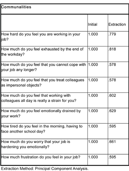
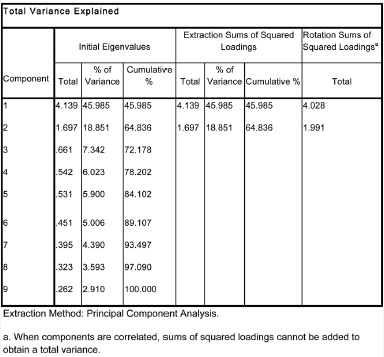
SPSS typically produces many sets of data in factor analysis. What follows is a set of pointers for what to look at in the different tables that SPSS typically produces. The example uses a Direct Oblimin rotation, using an example of research on factors that affect teacher stress. In some cases the SPSS tables are too large to reproduce in their entirety, so extracts are included that illustrate the main points being made. Imagine that we have given SPSS all the instructions indicated above, to run the SPSS analysis, and to check for the suitability of the data for factorization. In Table 37.6 the researcher checks that most of the correlation coefficients in the cells are greater than 0.3.
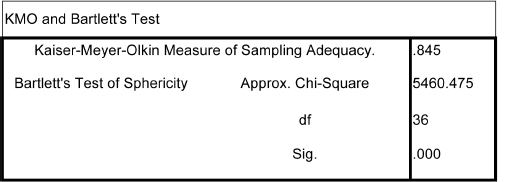
In Table 37.7 the researcher checks the suitability of the data for factor analysis by examining the output concerning the Kaiser-Meyer-Olkin (KMO) and the Bartlett test. Here the KMO measure is greater than 0.6 (0.845) and the Bartlett test is statistically significant (0.000), so the researcher is safe to continue, knowing that the data are suitable for factorization.
Table 37.8 indicates the amount of variance explained by each item (if it is lower than 0.3 then the item is a poor fit).
Table 37.9 indicates that two factors have been extracted (two components): factor one explains 45.985 per cent of the total variance; factor two explains 18.851 per cent of the total variance.
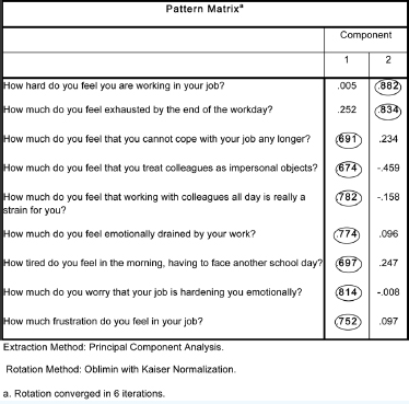
Table 37.10 provides the pattern matrix, from which the researcher can identify which variables load onto the factors. Here we have emboldened and circled the variables that load onto each factor, for ease of identification.
TABLE 37.6 CHECKING THE CORRELATION TABLE FOR SUITABILITY OF THE DATA FOR FACTORIZATION (SPSS OUTPUT)
|
How much do you feel that working with colleagues all day is really a strain for vou? |
How much do you feel emotionally drained by your work? |
How much do you worry that your job is hardening you emotionally? |
How much frustration do you feel in your job? |
Correlation How much do you feel that working with colleagues all day is really a strain for you? |
1.000 |
.554 |
.507 |
.461 |
How much do you feel emotionally drained by your work? |
.554 |
1.000 |
.580 |
.518 |
How much do you worry that your job is hardening you emotionally? |
.507 |
.580 |
1.000 |
.646 |
How much frustration do you feel in your job? |
.461 |
.518 |
.646 |
1.000 |
Guidelines for which variables to select to include in each factor are:
include the highest scoring variables;
omit the low scoring variables;
look for where there is a clear scoring distance between those included and those excluded;
review your selection to check that no lower scoring variables have been excluded which are conceptually close to those included;
review your selection to check whether some higher scoring variables should be excluded if they are not sufficiently conceptually close to the others that have been included;
review your final selection to see that they are conceptually similar.
The researcher is advised that deciding on inclusions and exclusions is an art, not a science; there is no simple formula, so the researcher has to use his/her judgement.
In reporting the factor analysis the researcher should consider:
Reporting the method of factor analysis used (Principal components; Direct Oblimin; KMO and Bartlett test of sphericity; Eigenvalues greater than 1; scree test; rotated solution).
Reporting how many factors were extracted with Eigenvalues greater than 1.
Reporting how many factors were included as a result of the scree test.
Giving a name/title to each of the factors.
Reporting how much of the total variance was explained by each factor.
Reporting the cut-off point for the variables included in each factor.
Reporting the factor loadings of each variable in the factor.
Reporting what the results show.
For examples of research that uses factor analysis we refer the reader to Note 1.
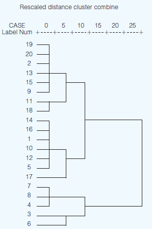
Whereas factor analysis and elementary linkage analysis enable the researcher to group together factors and variables, cluster analysis enables the researcher to group together similar and homogeneous subsamples of people. This is best approached through software packages such as SPSS, and we illustrate this here. SPSS creates a dendrogram of results, grouping and regrouping groups until all the variables are embraced.
For example, Figure 37.3 is a simple cluster based on 20 cases (people). Imagine that their scores have been collected on an item concerning the variable ‘the attention given to teaching and learning in the school’. One can see that at the most general level there are two clusters (cluster one=persons 19, 20, 2, 13, 15, 9, 11, 18, 14, 16, 1, 10, 12, 5, 17; cluster two = persons 7, 8, 4, 3, 6). If one wished to have smaller clusters then three grouping could be found: cluster one: persons 19, 20, 2, 13, 15, 9, 11, 18; cluster two: persons 14, 16, 1, 10, 12, 5, 17; cluster three: persons 7, 8, 4, 3, 6.
Using this analysis enables the researcher to identify important groupings of people in a post hoc analysis, i.e. not setting up the groupings and subgroupings at the stage of sample design, but after the data have been gathered. In the example of the two-group cluster here one could examine the characteristics of those participants who were clustered into groups one and two, and, for the three-group cluster, one could examine the characteristics of those participants who were clustered into groups one, two and three for the variable ‘the attention given to teaching and learning in the school’.
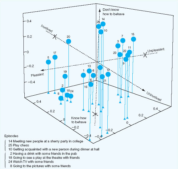
Forgas (1976) studied housewives’ and students’ perceptions of typical social episodes in their lives, the episodes having been elicited from the respective groups by means of a diary technique. Subjects were required to supply two adjectives to describe each of the social episodes they had recorded as having occurred during the previous 24 hours. From a pool of some 146 adjectives thus generated, ten (together with their antonyms) were selected on the basis of their salience, their diversity of usage and their independence of one another. Two more scales from speculative taxonomies were added to give 12 unidimensional scales purporting to describe the underlying episode structures. These scales were used in the second part of the study to rate 25 social episodes in each group, the episodes being chosen as follows. An ‘index of relatedness’ was computed on the basis of the number of times a pair of episodes was placed in the same category by respective housewife and student judges. Data were aggregated over the total number of subjects in each of the two groups. The 25 ‘top’ social episodes in each group were retained. Forgas’s analysis is based upon the ratings of 26 housewives and 25 students of their respective 25 episodes on each of the 12 unidimensional scales. Figure 37.4 shows a three-dimensional configuration of 25 social episodes rated by the student group on three of the scales. For illustrative purposes some of the social episodes numbered in Figure 37.4 are identified by specific content.
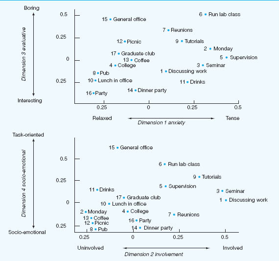
In another study, Forgas examined the social environment of a university department consisting of tutors, students and secretarial staff, all of whom had interacted both inside and outside the department for at least six months prior to the research and thought of themselves as an intensive and cohesive social unit. Forgas’s interest was in the relationship between two aspects of the social environment of the department – the perceived structure of the group and the perceptions that were held of specific social episodes. Participants were required to rate the similarity between each possible pairing of group members on a scale ranging from ‘l=extremely similar’ to ‘9=extremely dissimilar’. An individual differences multidimensional scaling procedure (INDSCAL) produced an optimal three-dimensional configuration of group structure accounting for 68 per cent of the variance, group members being differentiated along the dimensions of sociability, creativity and competence.
A semi-structured procedure requiring participants to list typical and characteristic interaction situations was used to identify a number of social episodes. These in turn were validated by participant observation of the ongoing activities of the department. The most commonly occurring social episodes (those mentioned by nine or more members) served as the stimuli in the second stage of the study. Bipolar scales similar to those reported by Forgas (1976) and elicited in like manner were used to obtain group members’ judgements of social episodes.
An interesting finding reported by Forgas was that formal status differences exercised no significant effect upon the perception of the group by its members, the absence of differences being attributed to the strength of the department’s cohesiveness and intimacy. In Forgas’s analysis of the group’s perceptions of social episodes, the INDSCAL scaling procedure produced an optimal four-dimensional solution accounting for 62 per cent of the variance, group members perceiving social episodes in terms of anxiety, involvement, evaluation and social-emotional versus task orientation. Figure 37.5 illustrates how an average group member would see the characteristics of various social episodes in terms of the dimensions by which the group commonly judged them.
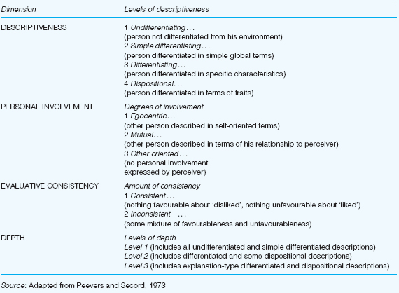
Finally we outline a classificatory system that has been developed to process materials elicited in a rather structured form of account gathering. Peevers and Secord’s (1973) study of developmental changes in children’s use of descriptive concepts of persons, illustrates the application of quantitative techniques to the analysis of one form of account.
In individual interviews, children of varying ages were asked to describe three friends and one person whom they disliked, all four people being of the same sex as the interviewee. Interviews were tape-recorded and transcribed. A person-concept coding system was developed, the categories of which are illustrated in Table 37.11. Each person-description was divided into items, each item consisting of one discrete piece of information. Each item was then coded on each of four major dimensions. Detailed coding procedures are set out in Peevers and Secord (1973).
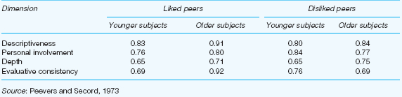
Tests of interjudge agreement on descriptiveness, personal involvement and evaluative consistency in which two judges worked independently on the interview transcripts of 21 boys and girls aged between five and 16 years resulted in interjudge agreement on those three dimensions of 87 per cent, 79 per cent and 97 per cent respectively.
Peevers and Secord (1973) also obtained evidence of the degree to which the participants themselves were consistent from one session to another in their use of concepts to describe other people. Children were re-interviewed between one week and one month after the first session on the pretext of problems with the original recordings. Indices of test-retest reliability were computed for each of the major coding dimensions. Separate correlation coefficients (eta) were obtained for younger and older children in respect of their descriptive concepts of liked and disliked peers. Reliability coefficients are as set out in Table 37.12. Secord and Peevers (1973) conclude that their approach offers the possibility of an exciting line of enquiry into the depth of insight that individuals have into the personalities of their acquaintances. Their ‘free commentary’ method is a modification of the more structured interview, requiring the interviewer to probe for explanations of why a person behaves the way he or she does or why a person is the kind of person he or she is. Peevers and Secord found that older children in their sample readily volunteered this sort of information. Harré (1977b) observes that this approach could also be extended to elicit commentary upon children’s friends and enemies and the ritual actions associated with the creation and maintenance of these categories.
For a further example of research using cluster analysis see Seifert (1997).
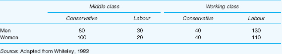
The hypothetical data in Table 37.13 refer to a survey of voting behaviour in a sample of men and women in Britain. The outline that follows draws closely on an exposition by Whiteley (1983):
the row variable (sex) is represented by i;
the column variable (voting preference) is represented
by j;
the layer variable (social class) is represented by k.
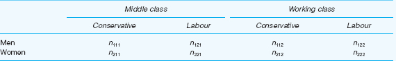
The number in any one cell in Table 37.13 can be represented by the symbol nijk that is to say, the score in row category i, column category j, and layer category k, where:
i = 1 (men), 2 (women)
j = 1 (Conservative), 2 (Labour)
k = 1 (middle class), 2 (working class).
It follows therefore that the numbers in Table 37.13 can also be represented as in Table 37.14 Thus,
n121 = 30 (men, Labour, middle class)
and
n212=40 (women, Conservative, working-class)
Three types of marginals can be obtained from Table 37.14 by:
1 Summing over two variables to give the marginal totals for the third. Thus:
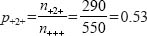
n++k=summing over sex and voting preference to give social class, for example:
n111 + n121 + n211 + n221 = 230 (middle class)
n112 + n122 + n212 + n222 = 320 (working class)
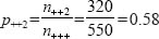
n+j+= summing over sex and social class to give voting preference
nj++ = summing over voting preference and social class to give sex.
2 Summing over one variable to give the marginal totals for the second and third variables. Thus:
n+11= 180 (middle-class Conservative)
n+21 = 50 (middle-class Labour)
n+12=80 (working-class Conservative)
n+22=240 (working-class Labour).
3 Summing over all three variables to give the grand total. Thus:
n+++=550=N
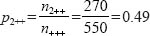
Whiteley (1983) shows how easy it is to extend the 2 x 2 chi-square test to the three-way case. The probability that an individual taken from the sample at random in Table 37.14 will be a woman is:
and the probability that a respondent’s voting preference will be Labour is:
and the probability that a respondent will be working class is:
To determine the expected probability of an individual being a woman, Labour supporter and working class we assume that these variables are statistically independent (that is to say, there is no relationship between them) and simply apply the multiplication rule of probability theory:

This can be expressed in terms of the expected frequency in cell n222 as:

Similarly, the expected frequency in cell n112 is:
Thus 
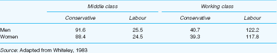
Table 37.15 gives the expected frequencies for the data shown in Table 37.14.
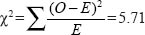
With the observed frequencies and the expected frequencies to hand, chi-square is calculated in the usual way:
Whiteley (1983) observes that degrees of freedom in a three-way contingency table is more complex than in a 2 X 2 classification. Essentially, however, degrees of freedom refer to the freedom with which the researcher is able to assign values to the cells, given fixed marginal totals. This can be computed by first determining the degrees of freedom for the marginals.
Each of the variables in our example (sex, voting preference and social class) contains two categories. It follows therefore that we have (2–1) degrees of freedom for each of them, given that the marginal for each variable is fixed. Since the grand total of all the marginals (i.e. the sample size) is also fixed, it follows that one more degree of freedom is also lost. We subtract these fixed numbers from the total number of cells in our contingency table. In general therefore :
degrees of freedom (df) =the number of cells in the table – 1 (for N) – the number of cells fixed by the hypothesis being tested.
Thus; where r=rows, c=columns and l=layers:
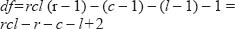
that is to say df=rcl – r – c –1+2 when we are testing the hypothesis of the mutual independence of the three variables.
In our example:
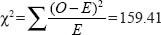
df=(2) (2) (2) – 2 – 2 – 2+2 = 4
From chi-square tables we see that the critical value of Χ2 with four degrees of freedom is 9.49 at p=0.05. Our obtained value greatly exceeds that number. We reject the null hypothesis and conclude that sex, voting preference and social class are significantly interrelated.
Having rejected the null hypothesis with respect to the mutual independence of the three variables, the researcher’s task now is to identify which variables cause the null hypothesis to be rejected. We cannot simply assume that because our chi-square test has given a significant result, it therefore follows that there are significant associations between all three variables. It may be the case, for example, that an association exists between two of the variables whilst the third is completely independent. What we need now is a test of ‘partial independence’. Whiteley (1983) shows the following three such possible tests in respect of the data in Table 37.13. First, that sex is independent of social class and voting preference:
(1) Pijk=(pi) (Pjk)
Second, that voting preference is independent of sex and social class:
(2) Pijk=(Pj) (Pik)
And third, that social class is independent of sex and voting preference:
(3) Pijk=(Pk) (Pij)
The following example shows how to construct the expected frequencies for the first hypothesis. We can determine the probability of an individual being, say, woman, Labour, and working class, assuming hypothesis (1), as follows:
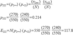
That is to say, assuming that sex is independent of social class and voting preference, the expected number of female, working-class Labour supporters is 117.8.
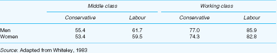
When we calculate the expected frequencies for each of the cells in our contingency table in respect of our first hypothesis  we obtain the results shown in Table 37.16.
TABLE 37.16 EXPECTED FREQUENCIES ASSUMING THAT SEX IS INDEPENDENT OF SOCIAL CLASS AND VOTING PREFERENCE
Source: Adapted from Whiteley, 1983
Degrees of freedom is given by:
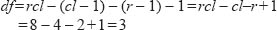
Whiteley observes:
Note that we are assuming c and l are interrelated so that once, say, p+ii is calculated, then p+12, p+21 and p+22 are determined, so we have only 1 degree of freedom; that is to say, we lose (cl – 1) degrees of freedom in calculating that relationship.
(Whiteley, 1983)
From chi-square tables we see that the critical value of Χ2 with three degrees of freedom is 7.81 at p=0.05. Our obtained value is less than this. We therefore accept the null hypothesis and conclude that there is no relationship between sex on the one hand and voting preference and social class on the other.
Suppose now that instead of casting our data into a three-way classification as shown in Table 37.13, we had simply used a 2 x 2 contingency table and that we had sought to test the null hypothesis that there is no relationship between sex and voting preference. The data are shown in Table 37.17.
When we compute chi-square from the above data our obtained value is Χ2 =4.48. Degrees of freedom are given by (r–1) (c–1) = (2–1) (2–1)=1.
From chi-square tables we see that the critical value of Χ2 with 1 degree of freedom is 3.84 at p=0.05. Our obtained value exceeds this. We reject the null hypothesis and conclude that sex is significantly associated with voting preference.
But how can we explain the differing conclusions that we have arrived at in respect of the data in Tables 37.13 and 37.17? These examples illustrate an important and general point, as Whiteley observes. In the bivariate analysis (Table 37.17) we concluded that there was a significant relationship between sex and voting preference. In the multivariate analysis (Table 37.13) that relationship was found to be non-significant when we controlled for social class. The lesson is plain: use a multivariate approach to the analysis of contingency tables wherever the data allow.
TABLE 37.17 SEX AND VOTING PREFERENCE: A TWO-WAY CLASSIFICATION TABLE
|
Conservative |
Labour |
Men |
120 |
160 |
Women |
140 |
130 |
Source: Adapted from Whiteley, 1983
Though this book will not concern itself with structural equation modelling (SEM), nevertheless we will note it here, as a powerful tool in the armoury of statistics-based research using interval and ratio data. Structural equation modelling is the name given to a group of techniques that enable researchers to construct models of putative causal relations, and to test those models against data. It is designed to enable researchers to confirm, modify and test their models of causal relations between variables. It is based on multiple regression and factor analysis, but advances beyond these techniques to create and test models of relationships, often causal, to see how well the models fit the data. Though SPSS does not have a function to handle this, the Analysis of Moment Structures (AMOS) is a software package that enables the researcher to import and work with SPSS files.
As was mentioned earlier, factor analysis can be both exploratory and confirmatory. Whilst the earlier discussion concerned exploratory factor analysis, confirmatory factor analysis is a feature of the group of latent variable models (models of factors rather than observed variables) which includes factor analysis, path analysis and structural equation analysis. Confirmatory factor analysis seeks to verify (to confirm) the researcher’s predictions about factors and their factor loadings in data and data structures. As was mentioned earlier, factors are latent, they cannot be observed as they underlie variables.
By contrast, path analysis – an extension of multiple regression – only works with observed variables, and it attempts to estimate and test the magnitude and significance of relationships, often putatively causal, between sets of observed variables.
Path analysis is a statistical method that enables a researcher to determine how well a multivariate set of data fits with a particular (causal) model that has been set up in advance by the researcher (i.e. an a priori model). It is a particular kind of multiple regression analysis that enables the researcher to see the relative weightings of observed independent variables on each other and on a dependent variable, to establish pathways of causation, and to determine the direct and indirect effects of independent variables on a dependent variable (Morrison, 2009: 96). The researcher constructs what she or he thinks will be a suitable model of the causal pathway between independent variables and between independent and dependent variables, often based on literature and theory, and then tests this to see how well it fits with the data.
In constructing path analysis computer software is virtually essential. Programs such as AMOS (in SPSS) and LISREL are two commonly used examples.
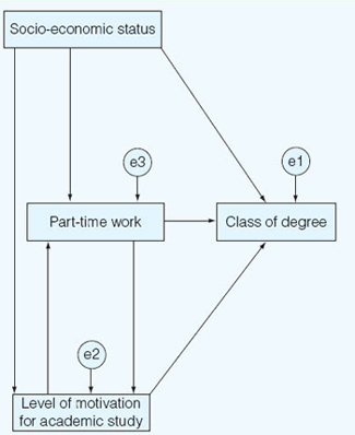
Morrison (2009: 96–8) gives an example of path analysis in degree classification, with three independent variables and their relationship to the dependent variable of degree classification:
socio-economic status
part-time working
level of motivation for academic study.
These three variables are purported to have an effect on the class of degree that a student gains (the dependent variable), as shown in Figure 37.6 (which is constructed from the AMOS software).
The researcher believes that, in this non-recursive model (a model in which the direction of causality is not solely one-way – see the arrows joining ‘part-time work’ and ‘level of motivation for academic study’, which go to and from each other – in contrast to a recursive model, in which the direction of putative causality is one-way only), socio-economic status determines part-time working, level of motivation for academic study and the dependent variable ‘class of degree’. The variable ‘socioeconomic status’ is deemed to be an exogenous variable (a variable caused by variables that are not included in the causal model), whilst the variables ‘part-time working’ and ‘level of motivation for academic study’ are deemed to be endogenous variables (those caused by variables that are included in the model) as well as being affected by exogenous variables.
In the model (Figure 37.6) the dependent variable is ‘class of degree’ and there are directional causal arrows leading both to this dependent variable and to and from the three independent variables. The model assumes that the variables ‘part-time work’ and ‘level of motivation for academic study’ influence each other and that socioeconomic status precedes the other independent variables rather than being caused by them. In the model there are also three variables in circles, termed ‘el’, ‘e2’ and ‘e3’; these three additional variables are the error factors, i.e. additional extraneous/exogenous factors which may also be influencing the three variables in question, and AMOS adjusts the results for these factors. (AMOS enables the researcher to draw the model and manipulate its layout.)
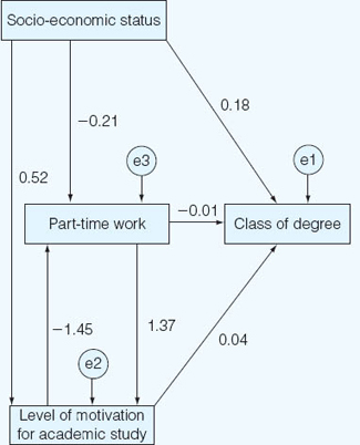
AMOS then calculates the regression coefficient of each relationship and places each coefficient on the model. An example of the model generated by AMOS is presented in Figure 37.7 (using the ‘standardized estimates’ in AMOS).
Here one can see that:
a ‘Socio-economic’ status exerts a direct powerful influence on class of degree (0.18), and that this is higher than the direct influence of either ‘part-time work’ (–0.01) or ‘level of motivation for academic study’ (0.04).
b ‘Socio-economic status’ exerts a powerful direct influence on ‘level of motivation for academic study’ (0.52), and this is higher than the influence of ‘socio-economic status’ on ‘class of degree’ (0.18).
c ‘Socio-economic status’ exerts a powerful direct and negative influence on ‘part-time work’ (–0.21), i.e. the higher the socio-economic status, the lesser is the amount of part-time work undertaken.
d ‘Part-time work’ exerts a powerful direct influence on ‘level of motivation for academic study’ (1.37), and this is higher than the influence of ‘socioeconomic status’ on ‘level of motivation for academic study’ (0.52).
e ‘Level of motivation for academic study’ exerts a powerful negative direct influence on ‘part-time work’ (–1.45), i.e. the higher is the level of motivation for academic study, the lesser is the amount of part-time work undertaken.
f ‘Level of motivation for academic study’ exerts a slightly more powerful influence on ‘class of degree’ (0.04) than does ‘part-time work’ (–0.01).
g ‘Part-time work’ exerts a negative influence on the class of degree (–0.01), i.e. the more one works part-time, the lower is the class of degree obtained.
AMOS also yields a battery of statistics about the ‘goodness of fit’ of the model to the data, most of which is beyond the scope of this book; suffice it to say here that the chi-square statistic must not be statistically significant (i.e. ρ>0.05), i.e. to indicate that the model does not differ statistically significantly from the data (i.e. the model is faithful to the data), and the goodness of fit index (the Normed Fit Index (NFI) and the Comparative Fit Index (CFI)) should be 0.9 or higher.
Path analysis assumes that the direction of causation in the variables can be identified, that the data are at the interval level, that the relations are linear, that the data meet the usual criteria for regression analysis and that the model’s parsimony (inclusion of few variables) is fair. Morrison (2009: 98) argues that path analysis is only as good as the causal assumptions that underpin it, nor does it prove unequivocally that causation is present; rather it only tests a model based on assumed causal directions and influences. Nevertheless, its utility lies in its ability to test models of causal directions, to establish relative weightings of variables, to look at direct and indirect effects of independent variables and to handle several independent variables simultaneously.
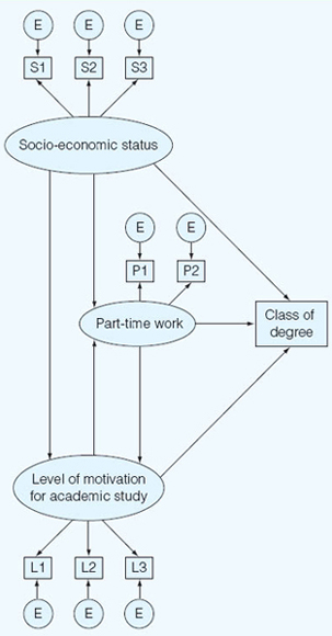
Structural equation modelling combines the features of confirmatory factor analysis (i.e. it works with latent factors) and of path analysis (i.e. it works with observed, manifest variables). Here each factor is a latent construct comprising several variables. This is shown in Figure 37.8, in which each factor appears in the ovals and each observed variable appears in a rectangle. Here the factor ‘socio-economic status’ (S) has three variables (S1, S2, S3), the factor ‘part-time work’ (P) has two variables (P1, P2) and the factor ‘level of motivation for academic study’ (L) has three variables (L1, L2, L3). Each variable has its own error factor (the small circles with ‘E’ inside them).
Structural equation modelling requires the researcher to:
construct the model (the factors and the variables);
decide the direction of causality (recursive or non-recursive);
identify the number of parameters to be estimated (number of factor coefficients, covariances, observations);
run the AMOS analysis (or another piece of software) and check the goodness of fit of the model to the data;
make any necessary modifications to the model.
This is a highly simplified overview of the process and nature of structural equation modelling, and the reader is strongly advised to read further, more detailed texts, e.g. Loehlin (2004), Schumacker and Lomax (2004), Kline (2005). Website introductions can be found at:
http://luna.cas.usf.edu/~mbrannic/files/regression/Pathan.html
http://faculty.chass.ncsu.edu/garson/PA765/path.htm www.sgim.org/userfiles/file/AMHandouts/AM05/hand-outs/PA08.pdf
http://people.exeter.ac.uk/SEGLea/multvar2/pathanal.html
http://userwww.sfsu.edu/~efc/classes/biol710/path/SEMwebpage.htm
http://ikki.bokee.com/inc/AMOS.pdf
http://core.ecu.edu/psyc/wuenschk/MV/SEM/Path-SPSS-AMOS.doc
Multilevel modelling (also known as multilevel regression) is a statistical method that recognizes that it is uncommon to be able to assign students in schools randomly to control and experimental groups, or indeed to conduct an experiment that requires an intervention with one group whilst maintaining a control group (Keeves and Sellin, 1997: 394).
Typically in most schools, students are brought together in particular groupings for specified purposes and each group of students has its own different characteristics which renders it different from other groups. Multilevel modelling addresses the fact that, unless it can be shown that different groups of students are, in fact, alike, it is generally inappropriate to aggregate groups of students or data for the purposes of analysis. Multilevel models avoid the pitfalls of aggregation and the ecological fallacy (Plewis, 1997: 35), i.e. making inferences about individual students and behaviour from aggregated data.
Data and variables exist at individual and group levels, indeed Keeves and Sellin (1997) break down analysis further into three main levels: (a) between students over all groups; (b) between groups; and (c) between students within groups. One could extend the notion of levels, of course, to include individual, group, class, school, local, regional, national and international levels (Paterson and Goldstein, 1991). Data are ‘nested’ (Bickel, 2007), i.e. individual-level data are nested within group, class, school, regional and so on levels; a dependent variable is affected by independent variables at different levels (p. 3). In other words, data are hierarchical. Bickel gives the example of IQ (p. 8), which operates simultaneously at an individual level and at an aggregated group IQ level. If we are looking at, say, the effectiveness of a reading programme in a region, we have to recognize that student performance at the individual level is also affected by group and school level factors (e.g. differences within a school may be smaller than differences between schools). Individuals within families may be more similar than individuals between families. Using multilevel modelling researchers can ascertain, for example, how much of the variation in student attainment might be attributable to differences within students in a single school or to differences between schools (i.e. how much influence is exerted on Student attainment by the school that the student attends). Another example might be the extent to which factors such as sex, ethnicity, type of school, locality of school and school size account for variation in student performance. Multilevel modelling enables the researcher to calculate the relative impact on a dependent variable of one or more independent variables at each level of the hierarchy, and, thereby, to identify factors at each level of the hierarchy that are associated with the impact of that level.
Multilevel modelling has been conducted using multilevel regression and hierarchical linear modelling (HLM). Multilevel models enable researchers to ask questions hitherto unanswered, e.g. about variability between and within schools, teachers and curricula (Plewis, 1997: 34–5), in short about the processes of teaching and learning.2 Useful overviews of multilevel modelling can be found in Goldstein (1987), Fitz-Gibbon (1997) and Keeves and Sellin (1997).
Multilevel analysis avoids statistical treatments associated with experimental methods (e.g. analysis of variance and covariance); rather it uses regression analysis and, in particular, multilevel regression. Regression analysis, argues Plewis (1997: 28), assumes homoscedasticity (where the residuals demonstrate equal scatter), that the residuals are independent of each other and, finally, that the residuals are normally distributed.
Multilevel modelling is the basis of much research on the ‘value-added’ component of education and the comparison of schools in public ‘league tables’ of results (Fitz-Gibbon, 1991, 1997). However Fitz-Gibbon (1997: 42–1) provides important evidence to question the value of some forms of multilevel modelling. She demonstrates that residual gain analysis provides answers to questions about the value-added dimension of education which differ insubstantially from those answers that are given by multilevel modelling (the lowest correlation coefficient being 0.93 and 71.4 per cent of the correlations computed correlating between 0.98 and 1). The important point here is that residual gain analysis is a much more straightforward technique than multilevel modelling. Her work strikes at the heart of the need to use complex multilevel modelling to asses the ‘value-added’ component of education. In her work (Fitz-Gibbon, 1997: 5) the value-added score – the difference between a statistically predicted performance and the actual performance – can be computed using residual gain analysis rather than multilevel modelling.
Similarly, Gorard (2007: 221) argues that multilevel modelling has ‘an unclear theoretical and empirical basis’, is unnecessarily complex, that it has not produced any important practical research results and that, due to the presence of alternatives, is largely unnecessary, with limited ease of readability possible by different audiences. Nonetheless, multilevel modelling now attracts worldwide interest.
Whereas ordinary regression models do not make allowances, for example, for different schools (Paterson and Goldstein, 1991), multilevel regression can include school differences and, indeed, other variables, for example: socio-economic status (Willms, 1992), single and co-educational schools (Daly, 1996; Daly and Shuttleworth, 1997), location (Garner and Raudenbush, 1991), size of school (Paterson, 1991) and teaching styles (Zuzovsky and Aitken, 1991). Indeed Plewis (1991) indicates how multilevel modelling can be used in longitudinal studies, linking educational progress with curriculum coverage.
The Bristol Centre for Multilevel Modelling (www.cmm.bristol.ac.uk/) produces online courses, introductory materials, workshops and downloads for multilevel modelling, software downloads for conducting multilevel modelling, and full sets of references and papers. Further materials and references can be found at Scientific Software International (www.ssicentral.com/hlm/references.html#softwarew). See also
http://m1se.lboro.ac.uk/resources/statistics/Multilevel_ modelling.pdf
http://statcomp.ats.ucla.edu/mlm/default.htm
http://stat.gamma,rug.nl/multilevel.htm
Straightforward introductions to multilevel modelling are provided by Snijders and Bosker (1999), Bickel (2007), O’Connell and McCoach (2008) and the publications from the Bristol Centre for Multilevel Modelling.
 Companion Website
The companion website to the book includes PowerPoint slides for this chapter, which list the structure of the chapter and then provide a summary of the key points in each of its sections. This resource can be found online at www.routledge.com/textbooks/cohen7e.
Additionally readers are recommended to access the online resources for Chapter 36 as these contain materials that apply to the present chapter, such as the SPSS Manual which guides readers through the SPSS commands required to run statistics in SPSS, together with data files of different data sets.