Crime Fighting Tips
The Apple-created confusions and complexities catalogued in the preceding chapters are by no means exhaustive, but merely representative of how and, just as importantly, why the main ways you interact with Apple devices have become more complicated over the years. These days (and for many many of the days preceding these days) few people can claim with a straight face that Apple products are easy to use, let alone intuitive. To use them productively you have to do a considerable amount of learning—even if all you want is to browse a few webpages, send an email or text, take a picture, or make a phone call.
I can’t unravel every mystery you’ll stumble over in the Apple ecosystem, if for no other reason than that new ones pop up all the time. Your Mac, your iPhone, and your iPad mutate a little (and sometimes much more than a little) every time you upgrade their software. And skipping all upgrades is not really a solution either, as Adam Engst has explained. At best I can give you coping mechanisms, strategies for dealing with the inevitable changes and concomitant confusions that new and upgraded software and hardware bring.
In this chapter I take another look at the various takeaways I’ve sprinkled through this book and then I offer a few pointers toward resources you can consult.
Takeaway Retakes
The takeaways I offer following many of the topics in this book are short observations or bits of guidance related to the topics they follow. I collect the takeaways and say a little more about them here.
How Interfaces Happen
Early on, in What Usability Is, I provided the following observation:
Hoo-boy! You should have seen the chain of comments in this book’s manuscript between Joe and me about this one. Both of us have been part of software development teams over the years, and we each have very decided opinions on whether interfaces “just happen” or not. Joe’s final comment to me was, “In my experience, a lot of bad UI happens because it’s designed by engineers without any usability training, oversight, or testing.” I cannot completely disagree with that, only on how much “a lot” is.
Yes, there are many mediocre developers out there, and many development teams that have neither a broad nor deep understanding of best user interface practices. Even a company as big and powerful as Apple, with the money and resources capable of luring and retaining the best of the best, has troubled teams, teams that may be overwhelmed by unrealistic development schedules or riven with strife and internal politics (very smart people can be just as fractious as the less gifted—and far more capable of sowing chaos). There are all sorts of ways perfection can elude Apple’s grasp.
Nonetheless, I still believe that most interfaces don’t just happen: attention is usually paid, although it is not always paid by those particularly skilled or interested in human interface methodologies or by those with an empathetic understanding of the people who must eventually use their creations. But in all but the most egregious cases of bad user interfaces, there is some underlying logic, some reason why the interface is presented in the manner that it has been.
My advice is to try to figure out that underlying logic before simply writing it off as completely wrong. That way, when you do provide feedback to Apple or any other software provider (and you should), you’ll be able to describe more clearly what’s wrong with the interface that vexes you so.
Mac Contextual Menus and Discoverability
When discussing the The Riddle of the Menu Shortcuts I had this to say about those right-click/Control-click contextual menus on the Mac:
Discoverability in human interfaces has to do with how easy a feature is to find. The more easily discovered a feature is, the more users are apt to employ that feature. Contextual menus, unlike most other menus in the Mac interface bag of tricks, are harder to find. Menu bars imply menus, and an arrow ![]() symbol beside a menu item strongly implies a hierarchical menu is attached. But there is nothing you see on the Mac’s screen to suggest the presence of contextual menus, making them, theoretically, harder to discover.
symbol beside a menu item strongly implies a hierarchical menu is attached. But there is nothing you see on the Mac’s screen to suggest the presence of contextual menus, making them, theoretically, harder to discover.
On the other hand, they are also insanely easy to discover because, aside from the Mac’s menu bar itself, almost anything you can click on the screen has a contextual menu attached: point and Control-click or right-click and, boom, there it is. Learn that one trick and you are good to go.
That leaves the real problem: learning which contextual menu items that are associated with each thing on the screen: after all, a file icon in the Finder offers different contextual menus items, for example, than a desktop picture or an app icon in the Dock.
Fortunately, you don’t have to memorize every contextual menu: just remember that you have contextual menus available to you. If you vaguely recall seeing a command to manipulate something on the screen but don’t remember where you saw the command, try Control-clicking that thing. The command you seek may be there, or it may not, but it takes you very little time to check.
Mac Command Key Shortcut Complexities
In The Keyboard Command Caper I discussed how and why command-key shortcuts to menu commands came about, and provided this takeaway:
Similarly, in The Keyboard Shortcut Heist I described how to roll your own shortcuts, and offered this:
Whether you make your own shortcuts or rely on the ones Apple and other developers provide, you have the same problems: remembering what they are and to which apps they apply. The fact is, shortcuts, whether they’re your own or pre-supplied, are something of an expert feature, and while it’s pretty cool to be an expert, it isn’t mandatory. Pick, choose, and use the ones you need or ignore them all. As long as you can get your work (and play) accomplished, who cares?
Mac Text Input Confusions
In addition to using the keyboard as a way of issuing commands to your Mac, you can sometimes use it to enter actual data! Yep, true story. However, typing text is not not always as straightforward as you might think.
In The Alternative Character Enigma I described how all sorts of characters other than the ones printed on your keyboard’s keys could be entered, and advised this:
Most of you may not need to enter special or foreign language characters more than occasionally, so taking the trouble to memorize how and where to find them is not time well spent; there is no shame in bringing up the Keyboard Viewer when you need it.
After you have entered text, though, it usually needs to be edited, and that means you have to select text. In The Extended Selection Conundrum I described a few non-discoverable text selection techniques and said:
Unlike what I just said about alternative characters, memorizing these techniques is time well spent because you will use them once you learn them and because there’s no easy crib sheet like the Keyboard Viewer to reveal them to you. Besides, there’s only a handful of them, so take the time.
That subset of readers who need to use non-American English keyboards occasionally can have those keyboards ready to hand on the Input Source system menu. But unless you switch keyboard layouts more than occasionally, you may find your keyboard behaving oddly and not immediately figure out why. In The Input Source Imbroglio I remarked:
I should add one additional takeaway: learn the keyboard command that switches among the keyboard layouts so you can get back to typing normally without taking your fingers off the keys—Option-Control-Space is the default for cycling through them, but, you know, that can be changed (that is, in System Preferences > Keyboard > Shortcuts > Input Sources).
Another way the text you type ends up not being the text you entered is when your Mac “thinks” it knows better than you. In The Substitute Text Surprise I suggested:
One takeaway addendum: if this sort of sleight of hand substitution really bothers or distracts you, learn how to turn it off. You nearly always can.
Mac Mouse and Trackpad Considerations
Pointing devices (mice, trackpads, trackballs) have been a defining characteristic of the Mac experience since the first Mac. (In fact, so useful are pointing devices that Apple has just recently made them available for iPads as well.) Nonetheless, the simplicity of the mouse and its brethren has eroded over time, and today they offer a plethora of pointing and clicking options that can overwhelm some of us.
As I advised in Trapping the Minimal Mouse:
I’m not encouraging you to give up your ways and adopt every new change and variation that Apple makes to its pointing device interfaces. If something works for you, it works! All that I am suggesting is that you learn where you go on your Mac to adjust the settings for your devices, and that you set a little time aside to explore new features when Apple provides them. There’s always a chance you may stumble across a feature that works even better for you than the ones you have been using.
Also, as I explored the Mac pointing device situation, I explained how the massive popularity of Apple’s iOS and iPadOS devices has affected the Mac user experience, seen most clearly in how it has changed the way scrolling works on the Mac. In The Reverse Scroll Incident, I riffed on Apple’s use of the word “natural” to describe the Mac scrolling settings that iOS and iPadOS have inspired:
I firmly believe this, and the late Professor George Stratton’s experiments early in the 20th century bear me out. I maintain that it’s worth spending a little of your time to learn the (by now, not so) new Mac scrolling paradigm, just as it is worth your time to explore new pointing device settings. You don’t have to adopt these changes, but you should not be ignorant of them.
Furthermore, integral as the mouse has been to the Mac user experience, it has become clear that Apple has settled on trackpads as being the most capable devices to expand what your fingers can do to control the Mac user interface. In The Matter of the Multiple Fingers, however, I pointed out a concomitant drawback to this strategy:
Several times I’ve mentioned how increasingly complex gestures make the Mac (and iOS and iPadOS) user experience similar to playing a musical instrument. Alas, not all of us are gifted with the talent to play one well. But most people (barring specific physical and perceptual issues) can master an instrument well enough to produce something recognizable as a melody—given enough practice. So, once again, my secondary takeaway here is for you to consider spending time, in this case time to practice new trackpad gestures, and, preferably, for you to do it when you don’t have an urgent task pressuring you to produce quick results. Who knows? The few minutes that you spend over the course of, say, a week or two to learn new trackpad gestures as they arrive on the Mac could improve your experience more than you might expect.
Mac Window and Task Management Issues
In The Task Trouble I described the long and winding road the Mac took from being a small-screen, single-tasking computer to the wide-screen (and sometimes multi-screened) multitasking powerhouse it is today. I recounted how, as the Mac traveled down that road, it had to take on board many ways of managing its ever growing capabilities. What was simple to use in the beginning couldn’t help becoming more complicated as it evolved more powerful capabilities, and over the decades it has offered many techniques, some unique, others duplicative, for users to manage the complexity. I summed up my descriptions of the Mac’s window-management features with this:
Do you detect a recurring theme here? It’s this: take the time to learn a little about your options—you don’t have to master them, but you cheat yourself from coming across better ways to do some of the things you do with your Mac if you don’t at least explore them.
Revisiting the Dock
The Dock is possibly the most obvious tool you can use to manage your Mac’s complexity. But the Dock is so hard to miss that it is easy for some users to forget that it is only a convenience—that the apps, documents, and folders that appear on it are merely shortcuts to some of the apps, documents, and folders available to their Macs. In The Dock Disappearance I opined:
Use the Dock. Make it hide offscreen or not, as you prefer; stick it on the left of the screen, the right, or the bottom, whichever best suits you; load it with apps and documents or pare it down to just a few of your favorite, most-clicked icons—your choices are your choices, neither right nor wrong. What is wrong is not knowing how to configure the Dock for your convenience.
Revisiting Launchpad
In The App Sequestration I described Launchpad, an iOS-inspired alternative to launching your Mac’s apps from the Dock or the Applications folder. Abut this utility I said:
Again, you don’t have to use Launchpad if your current methods of launching apps works for you. Before you say, “Nah, not for me!” you owe it to yourself to use it for a day or two to see if it enhances your Mac experience. Unlike the Dock, Launchpad includes all your apps, and it offers more ways for you to arrange your apps for easy access than the Finder’s Applications folder. Personal note: I don’t use it all the time, but I’ve found that its search feature is very fast and convenient, and that it often is easier to navigate than my Applications folder.
Revisiting Task Focusing Techniques
I know how annoying it is once you’ve established your ways of doing things to break your flow and focus just to experiment with alternative methods for achieving the same goals. At the same time, I know how annoying it is to have to spend time sifting through all the windows and apps you can have open and running on a modern Mac to get to the ones you currently want to use. In my exploration of the modern Mac’s Full and Split Screens, I counseled:
Not every app is better running in Full Screen mode: the odds that you’ll ever need to run Reminders in Full Screen on a 27-inch Retina display iMac are quite small. Neither do many of us engage in the kind of multitasking that can take good advantage of Spaces or Split View. On the other hand, these features truly can help you focus on the task at hand: you’ll see no Twitter window peeping out at the edge of the screen to distract you from that report you’re writing with Pages when you’re doing your work Full Screen!
So, even if you don’t think you’ll ever use them, these features have their uses. Learn how they work. As many users have found, you can trigger each of these features inadvertently—knowing how to get back to your Mac’s more customary and comfortable way of displaying things will save you time and stress.
Revisiting Hot Corners and Active Edges
In The Edge Case I chronicled how and why, over time, the edges and corners of your Mac’s display have become critical regions for interactive exploitation. I then exhorted:
In fact, though, you don’t have to take advantage of them if you don’t want to do so. You should, nonetheless, know what can happen in these regions and learn how to take control of the settings that manage those interactive behaviors. You may never enable a single hot corner yourself, but who knows when a software update or a coworker/housemate/buddy with whom you occasionally share your Mac might turn one of them on.
iOS and iPadOS Interactivity Evolution Confusion
In The Case of the New Kid in Town I recapitulated the (relatively) brief history of iOS devices and had this to say:
Yes, in many ways the touch interface of iOS and iPadOS devices makes them accessible to a wide range of users, from grandparents to toddlers to even dogs and cats. But simplicity can often mask complexity. Apple and others (like Take Control Books) do provide some help, but most users end up fumbling their ways to an only partial understanding of the many ways their fingers can exploit their devices. Lots of iOS and iPadOS users, attempting not to look ignorant, don’t ask fellow users for tips and suggestions. Don’t be that person: ask and share. And, of course, practice.
Even though the things single-finger gestures might do are, by their very nature, difficult to discover on your own, manipulating a touch interface with one finger is not that different from manipulating objects on the screen with the pointer that a Mac mouse provides. But add in gestures that involve two, three, or even four fingers and your prior Mac experience becomes much less transferable. The Many-Finger Exception had this advice:
The idea behind this takeaway is much like the one behind the previous takeaway: ask for help, consult any documentation you can find, and practice. Also, remember that iOS and iPadOS are young and that Apple is experimenting all the time with new ways to exploit the Multi-Touch interface they have developed, so not only do you have to fill in the current plot holes you encounter but also to deal with new ones that appear in every sequel—and those sequels tend to come out yearly.
iOS Look and Feel Upheavals
iOS users had already become accustomed to the operating system’s rapid evolution as the iPhone and the iPad quickly rose to dominate a vibrant and competitive market for portable devices. Still, the radical redesign of look and feel that come to it with iOS 7 (described in The Skeuomorphic Excision) was unusual in that it upended one of the core conceits of both iOS’s previous versions and those of its ancestor, the Macintosh operating system: that buttons on the screen should resemble buttons that people press in the physical world. I said about this change:
This change has had some benefits: it removed clutter (often distracting) from screens that had far too little space to spare for clutter, and made the operating system seem fresh again—critical in a marketplace as dynamic and fashion-sensitive as the one it had helped make. Still, it made the operating system just a little bit less friendly for first-time users. When any text or symbol the screen can be a tappable button, a new user can flounder over what to do next. Experimentation, hints from friends, and the occasional tip that may (or may not) pop up in a notification in iOS and iPadOS can help, but the fact remains that having to guess what is and is not a tappable button can be a source of user frustration.
Helpfully, even as frames and shadows around buttons vanished, making their buttonness less than obvious, Apple came to rely increasingly on text-like symbols instead of text labels to indicate buttons. In The Curious Case of the Cryptic Glyphs I pointed out:
Apple faces a constant struggle between making their devices always look fashionably fresh and imposing a level of consistency in their interfaces so users aren’t left completely adrift in a sea of confusion whenever new versions of iOS and iPadOS set sail. The growing collection of button-like symbols Apple provides to developers can, over time, provide such consistency across operating system iterations. But can is the operative word: even in recent versions of the operating system, like iPadOS 13, tapping what looks like a Reply ![]() button at the bottom of a message in Mail does not initiate a reply but instead elicits a popover containing numerous options, of which the Reply command is only one.
button at the bottom of a message in Mail does not initiate a reply but instead elicits a popover containing numerous options, of which the Reply command is only one.
iOS and iPadOS Gestural Complexity
In the opening to The Great Swipe Hunt I pointed out how swipe is a problematic gesture because sometimes it can be differentiated from a drag or a flick only by what it does. And when more than one finger is involved, or when the swipe is performed at the edge of the screen, or when it doesn’t follow a straight path, confusion can quickly arise. In The Swipes That Switch I described swipes for going back to the Home screen and for entering the App Switcher, and once again reverted to my musical analogy:
I have little to add (except to provide a bonus link for those readers who already know what a theremin is).
One big difference between iOS and iPadOS (see The Case of the Separated Siblings) is the latter’s multitasking capabilities. To enable users to create and manipulate iPadOS’s multitasking features, Split View and Slide Over, Apple developed several multiple-finger gestures. In The Swipes That Combine I said this about them:
Although new and newly supported iPad add-ons, such as trackpads and Apple Pencils, can have a role to play in using and simplifying the iPad’s multitasking features, the iPad still must be able to perform those functions in their absence, so don’t expect complex multi-finger gestures to be superseded by hardware add-ons. In fact, it might be a safe bet to expect more such gestures in future versions of iPadOS.
iOS and iPadOS Data Entry and Editing Evolutions
The clipboard is a wonderfully useful concept: without an imaginary place to stuff bits of information temporarily for later incorporation elsewhere, editing (whether textual or graphic) becomes much more tedious. In The Clipboard Connection I described the various ways in which Apple has made the clipboard accessible to iOS and iPadOS device users over the years, and I noted:
Yes, even something so fundamental to the Apple experience as the clipboard (it even predates the Macintosh!) is not immune to changes as Apple’s devices and operating systems evolve. Sooner or later, such changes will affect you. Expect them and you may not be blindsided when they occur.
And it’s not just the clipboard that changes. In Tales of the Glass Keyboard Gang I described how iOS and iPadOS onscreen keyboard has changed over time as Apple experimented with improving it or, at least, expanding its capabilities. I pointed out that:
It may not be the first thing you do when you install a new version of iOS or iPadOS, but it wouldn’t be a bad idea to explore the keyboard on your devices following updates to see what, if anything, has changed.
Finally, in Interned in the Correctional System I looked out how Apple’s forays into machine-learning and artificial intelligence have made your devices more helpful in correcting your blunders—and more creative and efficient in making blunders of their own! I said:
As software becomes more “intelligent” it also becomes more unpredictable, and the interaction of the various artificial intelligence components in your devices’ software can make data entry mistakes even more efficiently than you can! That’s always been the problem with assistants, whether artificial or natural: you have to supervise them. You can forgo the use of such aids, but that draconian solution comes with drawbacks of its own—let’s face it, features like predictive text and Auto-Correction can make typing on a small screen much less arduous. No matter whether you use these assistants or not, you will always need to proofread your work.
Mystery Solving Resources
Though sometimes your best resources for getting a grip on your Apple interface confusions can be knowledgeable friends and colleagues, many of the odd mysteries, hidden features, and quirks in macOS, iOS, and iPadOS can be solved, learned, or at least described, in publications of various types—hey, how do you think your friends and colleagues stumbled upon their knowledge of Apple interface arcana?
Below I describe some the major resources I consulted when tracking down some of the answers in this book.
Apple Aids
A natural source of information about Apple’s software is Apple itself, and it comes in a variety of forms through a variety of channels.
User Guides
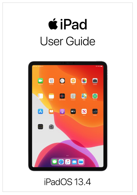
It’s a mystery to me why more people don’t know that Apple publishes user guides that explain its various operating systems’ features, but I suspect it is because the guides’ titles aren’t for the operating system but rather the hardware product line that runs the system. For example, there is no iPadOS 13 manual as such but there is an iPad user guide that describes the operating system that runs on Apple’s current iPad products (Figure 92).
Apple regularly updates the product line guides to describe the current version of the operating system that runs on that product line. The updates usually appear as soon as, or not very long after, Apple releases significant changes in the operating systems they describe.
You can get Apple’s free user guides in ebook form from the Apple Book Store, which you access through the Apple Books app. Exactly where in the Book Store you find them depends, confusingly enough, on the operating system you use to run Apple Books:
macOS: Click the link for Apple User Guides in the Quick Links section at the right side of the Book Store’s top page.
iOS and iPadOS: On the Book Store’s top page, tap Browse Selections > Computers & Internet, and then scroll down to the section on the Computers & Internet page to the Free Apple User Guides heading.
Should you prefer your Apple operating system information in webpage format, you can find web versions of these guides as follows:
macOS: Go to https://support.apple.com/guide/mac-help/welcome/mac
iOS: Go to https://support.apple.com/guide/iphone/welcome/ios
iPadOS: Go to https://support.apple.com/guide/ipad/welcome/ipados
Support Communities
Apple provides a (lightly) curated set of questions and answers about Apple products, including its software, in what the company calls the Apple Support Communities. The Communities consist of discussions by Apple product users about problems they have encountered and questions that they have.
You can either post a question in the search field at the top of Apple Support Communities main page or scroll down and then click a product line icon to see questions and answers about those products.
Note that you may have to separate a lot of chaff from wheat as you peruse the questions and answers, and you often may not find an answer that addresses your particular question. Nonetheless, there often are good answers to be found amid the discussions, and it may well be worth a few minutes of your time to wander through the material posted at this site.
Apple Help and Tips
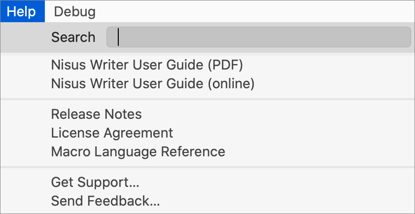
For many years a Help menu has been a standard item on Macs. Apps that include this standard menu generally use it to provide application help: for example, in Nisus Writer Pro (in which I’m composing this book) the Help menu provides items to provide application help (in two forms), release notes for the current version of the app, an item to send feedback to the developers, and more (Figure 93).
But what about Mac Help? The Help menu in the Finder provides that (Figure 94).

Unfortunately, iOS and iPadOS do not offer a similar built-in Help system. No worries, though: you can add an icon to your Home Screen for your device’s User Guide so that iOS or iPadOS help is always just a tap away. Do the following:
In Safari on your device, open the user guide link for either iOS or iPadOS that I provided in User Guides above.
At the top of the screen, tap Safari’s share
 icon.
icon.Scroll down in the popover that appears and tap Add to Home Screen (Figure 95). The icon is added to your Home screen; tap it to open the User Guide in Safari on your device anytime you want to consult it.

Apple also provides a free Tips app for iOS and iPadOS. To get it, go to the App Store on your device and search for “Apple Tips.” Although this app doesn’t provide a complete Help system, it does contain useful tips for your device and is often a good place to begin when you want to discover what new and interesting things Apple has added to its iOS and iPadOS bags of tricks; Apple updates this app regularly with new and revised tips.
Third Party Aids
People have been writing about Apple and Apple products for a long time. Sadly, much of that writing has fallen prey to science-fiction writer Theodore Sturgeon’s revelation: “90 percent of everything is crud” (he didn’t say “crud” but this is a family publication). Nonetheless, there’s a lot of good writing about Apple available. Here are just a few of the places I go to look for information.
Take Control Books
Of course you’ve heard of them; you’re reading one of this publisher’s books right now!
Take Control Books has been publishing useful ebooks about technology for years and has managed to survive the vicissitudes of book publishing in an internet-dominated world where the expectation that everything should be free has decimated the ranks of book and magazine publishers. Its authors (with the probable exception of yours truly) are well-known and respected voices in the Apple community.
More to the point, Take Control Books offers books that cover new versions of macOS as Apple releases them, as well as providing guides to various Apple-specific topics such as managing your Apple ID, using Apple’s media apps, automating your Mac, and much, much more. I turn to this publisher’s books—frequently—for help in solving many of the Apple-related riddles my friends and acquaintances bring to me.
Its ebooks are compatible with most ebook readers and are also available as PDFs. Happily, they are unencumbered with Digital Rights Management software, so your are not locked in to any specific ebook reader when you purchase one. You can find out more by scrolling down to About the Publisher.
Online Publications
Magazines, both paper and virtual, come and go, and those that manage to survive the intense competition for readers often do so by publishing articles with attention-grabbing titles that contain very little useful information. Here are a few online publications that I trust to provide substance.
TidBITS
Don’t let the fact that I occasionally publish pieces in this online publication dissuade you: founded by the same people who originally founded Take Control Books, TidBITS has been providing clear, concise, and helpful articles about Apple-related topics for 30 years, making it the longest running internet technology publication still in existence. In fact, it predates the World Wide Web!
Its articles appear both online in web versions as well as in a weekly emailed newsletter. And, unlike some publications, it maintains article archives that go back to the very beginning: if you want to find out what was hot with Cyberdog 1.1 back in 1996, you can easily find out.
Best of all, TidBITS lives up to its name. Its articles tend to be short and succinct, so you won’t have to search through the verbal cruft to find treasure.
The Verge
Established in 2011, The Verge bills itself as “an ambitious multimedia effort” dedicated to covering “how technology will change life in the future for a massive mainstream audience.” This Vox Media, Inc. publication features a staff of respected editors and a stable of intelligent and articulate contributors, and tends to avoid breathless clickbait-y article titles.
Although it covers much more than Apple products, its site does offer a dedicated Apple section that features helpful guides, useful reviews, and newsworthy articles.
iMore
A good place to find helpful tips, iMore offers buying guides, product reviews, and detailed how-tos. Its articles are well-written and researched, never overly technical and often a lot of fun.
MacStories
Written by “Federico Viticci and friends” and founded by Viticci in 2009, MacStories is updated daily with Apple news, reviews, and opinions. In addition to covering Mac topics (as you might deduce from its name), this site focuses on the iPad as one of its “core themes” and is a particularly useful source of news, reviews, and tips about that branch of Apple’s product lines.
The Cult of Mac
Founded by Leander Kahney (author of the book The Cult of Mac, first published in 2004), this site bills itself as a “daily news website that follows everything Apple” and has been in operation since 2010. Its contributors have appeared in a variety of respected publications, and, while not completely immune to posting the occasional sensationalist article, tends to provide substantive reportage and analysis.
Apple News
This is not a publication but an Apple-produced app for Mac, iOS, and iPadOS that aggregates articles by many dozens of publications both for free and by subscription (yes, it will try to get you to pay for a subscription; no, you don’t have to if you don’t want to). The app is available from the App Store if it is not already installed on your device.
While much of what Apple News aggregates and makes available is not technology-related, it does offer feeds you can follow from each of the five publications I mention above, as well as an Apple News Spotlight that contains current information from a variety of sources. If you want a quick daily perusal of what’s happening with Apple and its products, you could do worse than spend a couple of minutes each day checking it out.