
Chapter 9
Post-enumeration—
dissemination and analysis
This chapter addresses the use of geospatial information, GIS, and spatial analysis in support of data dissemination, the ultimate stage of a census. The need for meaningful presentation allowing for better interpretation and compelling insights of statistics is more critical than ever. The data user community continues to grow and includes new types of users who may be looking at this type of data for the first time. GIS has continued to advance in this area, as well, with an array of improved tools for spatial analysis, mapping, and graphing. GIS and the geographic database are at the forefront of dissemination in most NSOs. The widespread use of such tools has contributed to increased demand for census and geographic products that integrate statistical and geospatial information. This demand requires a dissemination strategy that is put in place prior to the census undertaking and takes into account multiple users’ needs, multiple formats or mediums, and varying needs for data, including small area data, with the commensurate assurances of confidentiality.
Dissemination strategies
In conducting their census, NSOs expend a lot of effort to collect census data, and even more for their analysis. But these efforts will not bear fruit and influence policy decisions unless the census information is made available in a suitable format to the various users. The UN has put it clearly in these terms: “A census is not complete until the information collected is made available to potential users in a form suited to their needs.”1 Many countries in fact are bound by local laws or legislation to disseminate their data, and moreover feel the pressure from civil society to share data for the public good. Citizens today expect and demand more detailed and timely data and expect to access this data from any device, anywhere, anytime.
To maximize the use of census results, NSOs should develop a dissemination strategy that can be implemented through a sound dissemination program, with the objective of promoting the benefit and application of census data. The lessons learned from the country experiences in the recent round of censuses have clearly shown that the census dissemination program should be considered as an integral part of the overall planning process of the census. A census dissemination program should be user-centric and based on a detailed analysis of the various user needs and expectations, including the determination of the form and scope of census data. Users today must include government agencies and internal users, as well as citizens, civil society, researchers, academia, developers, and more. Considerations should also include determining the level of geography at which census data will be disseminated, timing the main dissemination operations, determining the mode of dissemination, determining estimated costs, and identifying the human and technological resources that will be needed.
As technological capabilities increase and digital products replace traditional publications, the dissemination strategy should consider the diversification of the means of distribution, taking advantage of existing and new technologies to enhance the process to reach a wider audience, including the media and the public. It should particularly address the challenge of developing cost-effective mechanisms for the marketing and continued delivery of useful census and geography products and services to a diverse customer base, which can go far beyond the first couple of years after the census. Some countries have stated that the primary goal of their census dissemination process is to ensure that census and geography products and services meet the primary needs of most of the data users.2 In addition to the fact that the disseminated census products should be of sufficient quality to meet user needs, safeguards should be put in place to ensure that individual information is kept confidential.3
Another factor for a successful dissemination program requires the development of an outreach strategy that improves statistical literacy and awareness among users, policy makers, and the media. This includes making them aware of any limitations in the data and what can be delivered based on the level of detail of the data. Finally, one main benefit of developing an overall dissemination strategy at an early stage of the census planning is to draw the attention of the policy and decision makers and eventual donors to the facts that census funding is not centered only on the enumeration phase and that dissemination activities also need to be properly funded. The latter means that budget and human resources need to be determined and ideally secured from the beginning of the census project.
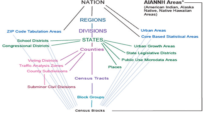
Figure 9.1. US Census standard hierarchy.
In designing and developing census information products for the 2020 Round of Censuses, the UN recommends considering the statistical framework of the 2030 Agenda for Sustainable Development, particularly the list of indicators modeled for the monitoring of the implementation of this agenda. The SDG Indicator Framework provides the final list of these indicators, which is now available at the UNSD website (https://unstats.un.org). Therefore, all efforts should be put in place to produce census statistics in line with this framework.4 To help countries measure, monitor, and report their progress on achieving the SDGs within a geographic context, the UNSD has been teaming with Esri since May 2017 to develop a data hub, a web-mapping and data management platform that integrates various data systems using ArcGIS.i This Federated Information System for the SDGs (FIS4SDGs) is an example of tying census data directly to the goals, targets, and indicators and creating reports and information products to support the monitoring of the goals (see http://www.sdg.org).
Level of data release (geographic)
As previously mentioned, one of the earliest decisions in census planning relates to the administrative and geographic areas for which census data on diverse socioeconomic characteristics of the population will be reported and disseminated. This is generally based on consultations with stakeholders and various data users. The decision would consider a spectrum of geographic levels, from the highest level (country level) to the lowest geographic level (small areas), at which data can be disseminated with both a sufficient quality and flexibility to satisfy the needs of the various data users, and security measures to ensure that individual information is kept confidential.
Considering the dissemination geography at an early stage is important partly due to its relationships with the collection geography, because the geography on which the census is collected will affect the geography on which the census data can be disseminated (see chapter 4). In this context, there are two main methods for the dissemination geography, based on the geographic level of census data production, namely administrative method or grids. The traditional administrative method uses the EA as a basis to report census data in accordance with a hierarchical system of administrative units ranging from the local up to the country level. Using the administrative method and trying to offer a more flexible dissemination system, certain countries use a finer geography for their EAs to the level of a block, bounded by physical features such as streets or rivers, thus allowing reporting on data for small areas (see figure 9.2).

Figure 9.2. Example from the Instituto Brasileiro de Geografía e Estatística on dissemination possibilities.5
The second method relies on census data production at the point-based level (generally, buildings, businesses, and address registers geocoded with geographic coordinates to which the statistical information can be referenced), which can be aggregated at any spatial unit, administrative level, or even in a grid system, an inherently geographical output system6 suitable to time series (for comparability) and environmental analysis. The population grid system is popular in Europe, particularly in the Nordic region. If census data is collected at the point level, new methods of dissemination are also possible, including ad-hoc shapes or units of dissemination based on local neighborhoods or other local criteria such as a drive-time polygon.
Each method has its advantages and disadvantages due to the different geographic levels at which census data can be disseminated. For example, the grid method requires the existence of georeferenced point datasets with high spatial accuracy, allowing NSOs to build small areas statistics, as well as delivering aggregations at various user-defined spatial units. In the absence of these point-based datasets, countries might opt for the administrative method that uses the EA as the key unit for the delivery of small area data. Administrative boundaries can also be superimposed on gridded maps, contributing greatly to their readability.
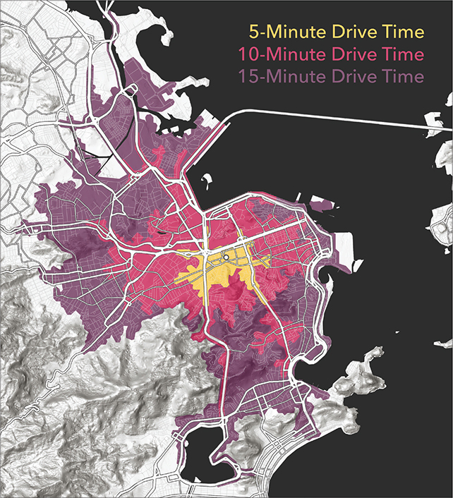
Figure 9.3. Brazil map showing drive-time polygons for five minutes, ten minutes, and fifteen minutes in Rio de Janeiro.
Pros and cons of administrative boundaries
This table is extracted from “The UN-GGIM Challenge to Develop Integrated Core Assets” presented by Tim Trainor, Retired Chief, US Census Bureau.7
PROS |
CONS |
Spatial accuracy of data |
Comparability |
Field verification |
Boundary changes |
Imagery verification |
Traditional census data collection is becoming more infrequent for countries |
Geocoding/address verification |
Use of nonvisible boundaries |
Authoritative sources |
Number of different geographic areas |
Local government involvement |
Cartographic considerations/generalization of boundaries |
Local knowledge |
Varying participation |
Nesting relationship with other geographic areas |
Irregular sizes |
Cadastral boundaries |
Irregular shapes |
Data thresholds |
Variable density measures |
Separate land and water area |
High costs to maintain the data |
Response rates |
Legal variation |
Response options |
Regional variation |
Response quality |
Topographic variation |
Sample frame |
Insufficient understanding of microcharacteristics inside macroscale units |
Controls on disclosure |
Data integration is difficult |
The statistical community has repeatedly debated whether to choose one or the other, although technology today supports both. The UN-EG-ISGI agreed on GSGF principle 2, which states: “The Global Framework recommends that the linkage of a geocode for each statistical unit record in a dataset (i.e., a person, household, business, building or parcel/unit of land) occurs within a data management environment . . . .”8 However, it is also recognized that many countries are still collecting data only at EA level.
Each approach needs to consider user needs and maintain statistical and geospatial integration, bearing in mind that a single approach to the geographic dissemination of statistics may not be feasible. In this case, a hybrid solution combining the two methods is an option, depending on how transfer between the two approaches could be achieved.9
Pros and cons of grid-based statistical areas
This table is extracted from “The UN-GGIM Challenge to Develop Integrated Core Assets” presented by Tim Trainor, Retired Chief, US Census Bureau.10
PROS |
CONS |
Global and local scope—fully scalable |
Disclosure control/cell size |
Uniform scale conducive to cross-border studies |
Grid cell sizes in rural areas |
Comparability; better suited for Spatial Data Infrastructures (SDI) |
When merging datasets, there is a need to change from one coordinate system to another before the data compilation into grids |
More attention to problem-oriented science |
European terrestrial reference system (ETRS80) is based on Lambert Azimuthal Equal Area coordinate reference system with fixed projection center; different projections may be needed in other parts of the world |
Can locate people in space with more precision |
Coding systems (scale intervals versus quadtree solutions) |
Good territorial framework for sampling |
Due to high data volume, errors are difficult to find and correct |
Can aggregate to different kinds of territorial units |
Various grids may be adopted within regions or countries |
Ready to use with GIS analysis |
Areas with dynamic or transient population fluctuations pose numerous complications for regional analysis |
Easily generated from point-based georeferenced data |
|
Able to see clusters |
|
Easy and cost-efficient to collect |
|
Micro-scale analysis using flexible size grids |
|
Data integration is possible with newer data sources, (i.e., ground-based, imagery, Internet) |
|
Stable over time; time-series not affected |
Data privacy and security during dissemination
The privacy and security of census data during dissemination is a major concern for national statistical authorities because one of the primary goals of confidentiality is to protect privacy by not allowing specific information related to an individual to be revealed or an individual observation to be identified, sometimes referred to as personally identifiable information (PII). The concerns are even greater when the individual observation involves location information and the use of sophisticated technology to access and disseminate it. There are different measures to address and mitigate these concerns and protect the privacy of census and statistical data. For example, to prevent an individual or organization from being identified within the socioeconomic data and private information from being disclosed, the data being released may need to be de-identified and anonymized or “confidentialized.”11 In this section, we will focus on the confidential issues related to the geocoded census data and the use of geospatial technologies for census data dissemination.
Irrespective of the geographic unit and the method used for its geocoding, there is generally a difference between the level of data collection units, which can be a building or household, and data dissemination areas or levels of geography to which the data needs to be aggregated to ensure the confidentiality of individual information. The geography level at which a threshold of a number of persons can be released serves as an initial protection against disclosure. For example, the threshold can be set at a geography of 100 to 300 persons or 40 to 120 households, though there can sometimes be population or household counts available at lower geography.12
It is frequently argued that the development of a dwelling frame has elevated the issue of confidentiality due to concerns over the use of address data of housing units. While address data itself is not confidential and could be made available, confidentiality concerns are particularly raised when the address data is linked to data on individuals. To ensure preservation of data confidentiality, lower-level data would be available only to some authorized users. An acute issue of privacy protection arises when the names of household heads are included in the referencing of dwellings—a practice used to identify dwellings for which a formal address (such as street names and numbers) is missing. In such cases, we need to justify why it is necessary to collect identifying information about the head of household and ensure that, to protect privacy, the data is anonymized when disseminated and identifying information about individuals is destroyed once it is no longer needed.
GIS data is generally not about specific individuals but rather about geographic locations and features such as addresses, coordinates (latitude/longitude), postal units, land parcels, settlements, administrative units, and so on. Database attributes are expected to require various levels of confidentiality. For example, the location of an individual’s house and property tax, which are generally public records, are less sensitive than the individual’s income and income tax. Although GIS can provide valuable insight into patterns of census data to the public, there is a legitimate concern involving the disclosure of confidential information through spatial display.
While the method of aggregating spatial data can mitigate these concerns, disclosure methods should be applied when the information is at the point level. ArcGIS technology is widely used today in secure enterprise solutions in both commercial and classified environments. Applying security controls to ArcGIS solutions is no different from securing any other IT solution. Security principles and controls can be applied at all levels of the architecture. Based on the security policies and requirements of the organization, ArcGIS security13 can be applied at the application, network, operating system, and RDBMS levels.
NSOs should also consider the use of other data security methods such as remote wipe of data from a lost or stolen device or other enterprise security methods including firewalls, virtual private networks (VPNs), secure data encryption protocols, and more to secure confidential data and PII.
Another area for consideration of data privacy and security is the use of outsourced services or consultants. NSOs often need to outsource services in one or more tasks at the different census stages, including the dissemination operation. This may expose NSOs to potential confidentiality breaches for which they need safeguards by way of guidance and explicit provisions in the contract with the service providers, specifying contractor responsibilities for prompt notification to the agency if unauthorized disclosure or misuse occurs. NSOs should also be aware that implementation of such contract provisions will be enforced and monitored.
Open data considerations
As stated in chapter 3, the recent rise of the open data movement is at the forefront of the data revolution and has been particularly recognized by the UN within the context of the global SDGs. Countries are increasingly adopting open data policies, developing and executing open data strategies, and participating in initiatives in cooperation with international organizations14 and civil society. Recognizing that the national statistical systems are concerned by this open data movement, the 2017 Cape Town Global Action Plan for Sustainable Development Data, endorsed by the UNSC, did “encourage national statistical offices to embrace the open data initiative and ensure stakeholders of the national statistical system as part of . . . the process.”15
While data has been at the center of many systems and applications, most of the data, particularly that provided by governmental organizations, has been considered proprietary and subject to restrictions. Open data came out of a need for the access and use of data that is deemed to be in the public domain. While big data is defined by volume, velocity, and variety, open data is fundamentally defined by its use. Most definitions of open data include these basic features:
•Data must be publicly available, preferably online, and relatively easy to use to accommodate the largest number of users.
•It must be open-licensed to allow for its reuse and redistribution.
•It should be machine-readable so that datasets can be easily retrieved—downloaded in open formats and read by software—and analyzed.
•Datasets must be as complete as possible, documented, and available as a whole to render complete information about a subject.
•Data should be available free of charge, or at minimal cost, so that anyone can access.
There are significant benefits related to the use of open data for citizens and society in general: open data can help increase governmental transparency and social accountability, better target aid and public investments, and more effectively monitor service providers to deliver results. More specifically, there are economic benefits in terms of increased efficiency, new products and services, and the stimulation of economic development. Particularly, start-ups and small businesses are benefiting from the data-driven products and services they can generate and deliver. However, many governments have concerns about what data should be open to the public. What kind of procedures are needed to share this data? How should shared data be monitored and updated?
The biggest concerns that governments have expressed are related to confidentiality, privacy, and security. These concerns apply to census and statistical data. In this regard, the UNSD has stated: “Open data platforms can only achieve public support and success if proper precautions are taken to protect the privacy of individual persons, business and civil society organizations and we manage to ensure that data generated by administrative, civil and business registers could be made public by matching access with strict ethical and security protocols and secure technology platforms.”16 One example of security measures being taken are when open data catalogs implement security measures to protect data and metadata from being changed by unauthorized users.
With more countries adopting open data policies, particularly those promoted by the Open Government Partnership (OGP),17 the access to geospatial information is being affected, increasing its use and value and benefiting a wider range of users (see the Census 2016 Ireland case study in chapter 8). However, since geospatial data is provided by multiple sources, some from official governmental agencies and others from nonauthoritative sources such as crowd-sourced data, the quality of open data varies considerably in terms of completeness and consistency. National statistical and geospatial agencies are uniquely placed to ensure data quality, and their responsibility will continue to grow as the volume of open data increases.18 Governments are required to play a central role, not only to develop and implement policies but to mitigate the concerns about the misuse of open data. For example, the African Data Consensus has recommended: “African governments should acknowledge open data provided by credentialed data communities as acceptable sources of country statistical information.”19
Many other considerations pertain to “open”: open data, open specifications, open APIs, open source, and, most importantly, open systems that are standards-compliant and interoperable for an open community. The ArcGIS platform is an open platform with a platform-independent approach that ensures interoperability. ArcGIS supports industry and community standards, libraries in every major programming language, integration with common analysis and data management tools, and a growing repository of open-source software. Integrating open data sharing as a part of the platform achieves transparency and improves collaboration for all users.
Esri’s open data strategy is built around geography, where ArcGIS technology can serve as the open data backbone for the organization, with a standard framework for unlocking and managing existing data, such as statistical, environmental, and health information.20 The ArcGIS platform provides an easy way to integrate, manage, and publish this data for interagency collaboration and public consumption. Moreover, with the increasing use of GIS SaaS, we see solutions that can reduce the human and physical capital required to host geospatial data and reduce operational costs. Maps themselves provide an intuitive way to both share and analyze the data that the organization is providing.21

Figure 9.4. Open Data for Census 2016 Ireland: Bringing Geography and Statistics Together.22
Output needs—raster, CSV, tabular, maps
As noted previously, the identification of census output products in response to user needs, as part of the dissemination planning, should consider the available tools for wider publication. Typical census data outputs include tabular data, digital thematic maps, geographic files and other cartographic database dissemination products, digital imagery, digital interactive atlases, web-based mapping, and even APIs. We will elaborate on some of these in the next sections.
Dissemination of census and statistical data in digital form is ubiquitous and dominant today among users. Geospatial information too has evolved from files to databases and now to the web. Today, many census agencies use database management systems, such as Oracle, DB2, SQL or PostgreSQL, and the geodatabase to drive the creation of information products and the dissemination of data. In the past, we may have used a central database environment that helped us serve the needs of clients. Today, we need a system of distributed web services, feature services, and map services. We need to serve lightweight clients and custom applications on the web and on smart devices and desktops. GIS platforms are now more than ever a key part of the dissemination process.
An ArcGIS Server web service represents a GIS resource—such as a map, locator, or image—that is located on an ArcGIS Server site and is made available to client applications. Specialized GIS software to work with a service is not needed, and the service can be consumed within a web browser or custom application. This is a big change in the way that data users can consume and get access to information. In addition, ArcGIS applications, such as ArcMap and ArcGIS Pro, can also act as clients to web services, and census agencies can write their own apps to consume web services.
When working with a service hosted by ArcGIS Server, users have, in most cases, the same level of access to resources that they would have if those resources were located on their computer. A map service, for example, allows client applications to access the contents of a map on the server in much the same way that they would if the map were stored locally.
Much of the work in data dissemination today is actually in building and maintaining key foundational layers and basemaps that support the agencies’ operations. These layers will find their way online as maps, as data layers, and even in analytical models. Statistical data can then come to life once joined to geographic data and be shared to users of all types. Information can be stored in ArcGIS as different types of geographic information such as web maps, scenes, layers, analyses, and apps.
Layers, one of the most important collections, can include streets, points of interest, parks, water bodies, and terrain. Layers are how geographic data is organized and are the basis for analysis.
Basemaps are another key. Today, the map mashup is more popular than ever. Basemaps can be as relatively simple as a street map, raster imagery, or a combination of the two (e.g., imagery with labels). GIS systems provide the ability to easily share data so that anyone can access and build on the work of others.
Not every census dataset appropriate for use with a GIS comes in a ready-to-use spatial format. Often, the data comes as a table or a spreadsheet, and it needs to be linked with existing spatial data or a geography boundary file.23 Most GIS software can import spreadsheets and CSV files and read vector data out of these text files. For example, the software can read vector data out of GPX files, the popular format for GPS tracks, or CSV files that includes longitude (x) and latitude (y) columns. It can also convert, for example, raster data and export it to CSV and other tabular files that contain the x,y,z coordinates and all the attributes.24 What’s worth noting is that the divide between vector-based GIS and raster-based GIS is being increasingly blurred, and ArcGIS offers the tools to work with both.
Generally, the outputs are provided by the census database in the form of either tabular data or geographic products. Obviously, one of the important features of census outputs is to be easily accessible, retrievable, and usable. Data should be available for download in widely used formats to easily lend themselves to machine processing, such as CSV or XML, and as a single download file (with all data in a dataset) as much as possible.25 For example, a data download for a specific area or region should include the geographic data and the attributes together, not as separate downloads.
Cloud/hybrid approaches
Chapter 3 touched on the growing use of cloud services in general. In this section, we will focus on the use of the cloud for dissemination purposes. As discussed earlier, cloud offerings can include public, private, or hybrid approaches. One hybrid approach that many GIS users take is to leverage ArcGIS Online along with the public and/or the private cloud.
The cloud can be useful in dissemination due to unpredictable spikes in load, for cost containment, or simply to provide a simple means of sharing and collaboration.
Often when setting up a service to make data accessible, it is hard to predict the demand and therefore scale that is necessary to support end users. By leveraging the cloud in data dissemination, organizations can better respond to demand spikes and therefore offer a stable service to data users while managing the costs associated with this service.

Figure 9.5. Cloud deployment options.
Metadata
The benefits of developing and implementing common standards and metadata are recognized by both statistical and geospatial communities because they enable interoperability and facilitate the use and integration of statistical and geospatial data and services in virtually all sectors of the economy. It is often noted that the development of common standards and metadata makes statistical and geospatial information more accessible, shareable, and relevant to a wider range of stakeholders and users.
We have already provided a definition and concepts of metadata in chapter 6 and noted that metadata is crucial for the management and maintenance of a digital GIS database, but its use spans all stages of the census and beyond. While its need for the geospatial database is more limited to the developers and those in charge of its maintenance, metadata needed for dissemination is designed for the different users of the census results. There is a growing need for comprehensive and easily accessible metadata to better understand the statistical data being presented.
The basic purpose of metadata is related to the production of census data and its documentation, processing, and interoperability. However, there are three major purposes for metadata related to data dissemination: facilitating the discovery of relevant data, supporting its correct use, and providing transparency in it. For example, metadata supports the correct use of data by providing contextual information and explaining the main relationships, causations, and trends in the data, including reference date, data source, data access conditions, release policy and confidentiality, and, when necessary, information on how the data was collected, compiled, processed, edited, and validated.26
In recognition of the important role of metadata for census data dissemination, the UN Principles and Recommendations, rev. 3, recommends the following: “Metadata are a key element of census dissemination to ensure that the underlying concepts are well understood and that the results are well interpreted.” Further, it should be an integral part of statistical collection and dissemination processes. The UN also recommends that all tabulations should include some type of metadata or references to where this information can be obtained.ii
Based on lessons learned from the 2010 Round of Censuses and other reviews, it is agreed that metadata should be an integral part of the census process, including census dissemination. In this regard, the dissemination of metadata should be comprehensive and accessible. It was also recognized that there is a lack of common metadata standards and proper guidelines in terms of development and presentation of metadata. To address this issue, it was recommended that procedures for standardization be developed to respond to the needs expressed by many countries and to improve interpretation and facilitate sharing and comparability among countries. In this respect, international standards are emerging: for example, two international metadata standards being used today are the SDMX and the DDI (see additional details in chapter 6). The SDMX was approved by the ISO in 2013 as an international standard (ISO 17369:2013). A number of international agencies have endorsed SDMX, supported by the UNSC. The DDI,27 which originated in 1995 and was initially aimed at social science research, is an international standard for describing surveys, questionnaires, and statistical data files.iii
The DDI is an international metadata standard designed to focus on describing microdata and the processing performed on the data as it is integrated and tabulated,28 but the SDMX is designed to describe statistical data and standardize how that data and metadata are exchanged. The SDMX is particularly dedicated to handle large amounts of tabular data, some of which may have geographic meaning, through a location name (e.g., region/area) or a unique identifier (UID) that relates to a boundary (e.g., mesh-block, area unit, etc.). Likewise, in the geospatial world, international metadata standards, such as ISO-19115 or ISO-19139, do exist and are well established. ISO 19115-1:2014 is applicable to digital data and services, and its principles can be extended to many types of resources such as maps, charts, and textual documents as well as nongeographic data. While there is little reference to any specific geospatial component within the SDMX, recent efforts have been made by the European Union, through Eurostat, to integrate INSPIRE and SDMX data infrastructures for their 2021 population and housing censuses.
ArcGIS easily supports the metadata creation workflow. In ArcGIS, an item’s metadata is created, edited, and viewed on the item page. Item details include the title, the type, the source, author, last modified date, thumbnail, and tags. It can also include additional information such as a summary and description, how accurate and recent the item is, restrictions associated with using and sharing the item, credits, and so on. This information can help others discover and validate the usefulness of the items. In ArcGIS, metadata is saved with the item it describes. It is copied, moved, and deleted with the item.

Figure 9.6. Example of ArcGIS metadata categories.
Organizations can enable metadata, which allows members of the organization to use the built-in metadata editor to include additional standards-based metadata for all item types. Metadata can be included for all items in a portal, including web maps, web scenes, and web apps. Organizations select a metadata style, which configures the organization’s experience for editing and viewing metadata. In addition to determining the information available for viewing and editing, the metadata style identifies the metadata standard being followed and the schema used to validate an item’s metadata for the standard. Regardless of the applied style, the metadata is always stored in ArcGIS metadata format. This means that metadata is not lost if the organization switches the metadata style.
The ArcGIS metadata format contains fields that can store all content in all metadata standards supported by ArcGIS, including all Federal Geographic Data Committee (FGDC) Content Standard for Digital Geospatial Metadata (CSDGM), all ISO 19139 metadata content, all North American Profile metadata content, and all INSPIRE metadata content. The ArcGIS format also stores item properties, such as thumbnails, that are not included in these official metadata standards and profiles.
Currently noticeable is the gap between the standards used for the dissemination of statistical data and those used for the geospatial information, making the link between statistical and geospatial information more challenging at the working level. Efforts are being made by the OGC, which recently developed the Table Joining Service (TJS) standard. This standard is designed to offer a web service interface that enables the automatic, service-oriented joining of tabular and geographic data across the web while keeping the data distributed at the data providers’ source location.29 As mentioned in chapter 6, the UN-EG-ISGI has recommended, as a future area of standardization, to work on a statistical-geospatial metadata interoperability in integrating, for example, the SDMX and the DDI with ISO-19115. Furthermore, the Expert Group is developing the GSGF as a common standard allowing both statistical and geospatial communities to work together.
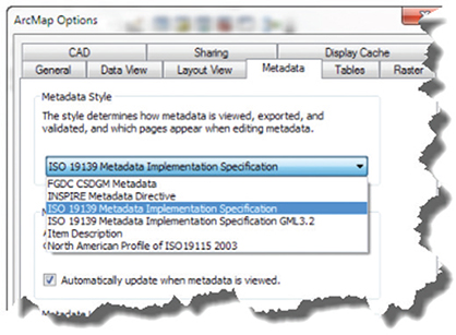
Figure 9.7. Metadata styles.
Data sharing
In a data-driven world, with the rapid emergence of technologies such as the cloud, the IoT, mobile technology, web GIS, and artificial intelligence, new horizons are opening for data analysis, accessibility, and sharing. Moreover, the increasing developments of open systems across organizations, applications, and industries attest to the vital importance of data sharing. In this context, sharing statistical data has been a rallying cry among development partners in statistical development and among many users more at ease with these advanced technologies.
In response to the needs for sharing data, and in addition to the adoption and building of technical capacities, NSOs should include in their overall data policy specific provisions for data sharing, including institutional arrangements and agreements with other governmental organizations defining custodianship, rights and responsibilities; preparation of guidelines containing general advice and guidance on data sharing; and particularly measures and procedures with regard to the protection of individual privacy and data confidentiality. There is increasing recognition that responsible data sharing, allowing the maximum use of data for statistical purposes while taking into consideration security concerns, contributes to the evidence-based decision-making capability of both governments and communities.
At the national level, with the large number of players involved in data production, requests for data sharing are affecting NSOs and exposing them to challenges in terms of coordination and security concerns but also providing opportunities for adding value to their data. NSOs are embracing the need to share data in line with the existing institutional arrangements in their countries. For example, it is now widely accepted that developing NSDIs better facilitates the availability, access to, and effective sharing of geospatial data among geospatial information authorities and other governmental organizations, including NSOs, the private sector, universities, and citizens in general.
Sharing data is also needed at the regional level, particularly to assist in the formulation of community policies across boundaries. One example is the INSPIRE initiative to build a European Union spatial data infrastructure to enable the sharing of harmonized and qualitative geospatial information among public sector organizations and facilitate public access to geospatial information across Europe. Furthermore, developing a global strategic framework for statistical and geospatial information has been a goal for both the statistical and the geospatial communities. Such a framework constitutes a foundation for building geospatial information infrastructure at all levels and provides reference framework, allowing the integration and sharing of various data to support decision-making for sustainable development.30
With respect to the geospatial technology in support of data sharing, many organizations expressed the need for a GIS capable of integrating services and data from multiple sources and in different formats. In this regard, Esri technology and products support interoperability, and Esri plays an active role in the development of open standards, which has helped ensure that data can be easily accessed by other technologies and applications. Esri products support numerous data converters and direct read access, including Spatial Data Transfer Standard (SDTS), Vector Product Format (VPF), imagery, CAD files, digital line graph (DLG), and TIGER®. The ArcGIS system supports more than 100 formats and continues to add more as the industry demands. Of equal importance, Esri systems enable organizations to share GIS services and communicate across different vendor implementations. An open, distributed, and networked GIS architecture provides the framework for sharing data.
GIS role in creating products for dissemination
GIS has been widely used in the dissemination of census and statistical data. Even without initiating a full digital census-mapping program, many NSOs had been using GIS for dissemination purposes, as GIS software packages offer simple and easy methods for putting census data on maps that enhance their understanding and enable users to visualize statistical information. Moreover, GIS enables the presentation of census results in different forms—maps, charts, graphs, map applications, and story maps—and maps can be customized and dynamically presented with links to the charts, graphs, and other media. In addition to the capacity of producing maps in traditional paper formats, GIS enables maps to be easily exchanged in digital format on an intranet, the Internet, or other storage media.31 With the building of a geospatial census database at the EA level, GIS provides powerful tools to proceed with spatial analysis, allowing the user to create various products to be disseminated. In addition, with the use of mobile technology and the web, the census data dissemination has reached new horizons, putting census data at the fingertips of the users and the public in general. We will elaborate on the various media of presentation of census products created using GIS in the subsequent sections.
Thematic maps
Consider this definition of geographic maps: “A map is a symbolised image of geographical reality, representing selected features or characteristics . . . .”32 A thematic map for statistical data dissemination is an even greater simplification of reality, designed to show the geographical distribution of a statistical variable for selected geographic areas, leaving out all irrelevant details. Thematic maps for dissemination are generally produced not only for the major census data users, but also for a wider, nonspecialist audience. Thus, they should be designed carefully and of a quality that meaningfully illustrates census results and makes them easily understandable. Thematic maps are also often meant to support textual information, accompanying census reports.
Since a thematic map shows the geographic distribution of one or more specific data themes for standard geographic areas, GIS, with its data structure organized by layers or themes, can straightforwardly represent the various statistical variables through maps. In addition, with an ability to combine a variety of datasets in an infinite number of ways, GIS is useful for representing the results of the combination of many themes at once. Generating graphic outputs in the form of thematic maps requires that GIS software have a wide variety of graphic symbols and format options. GIS tools offer mapping functionalities to customize the design of the output, including cartographic symbols and insets, as well as text options for labeling and annotating the map legend and other metadata.
Creating a good thematic map takes thought. Before creating one, consider some simple questions such as the following:
•What is the story you are trying to tell?
•What is the intended message?
•Who is the intended audience?
•What do they know about the topic?
•What do you want them to understand?
•What data do you need to tell this story?
A thematic map can be qualitative or quantitative in nature.33 Thematic maps can also provide insights on change over time by showing comparisons of topical indicators in a time series, provided that comparable indicators are available from previous censuses.
Many types of maps can be made from a single dataset and a single theme of data. Maps can also be symbolized in many ways, including point symbols, proportional symbols, graduated symbols, heat maps, clustering, and more. The traditional choropleth (graduated color) map is what many typically choose, but today, many other choices allow us to communicate the data.
However, there are many other traditional choices, including 3D, dot density, cartograms, contours, multivariate symbol, proportional symbol, predominance, and even bivariate mapping.
Even more exciting are some of the modern ways of engaging users with maps. Maps like predominance maps and smart maps provide visual storytelling, build trust, and engage users.

Figure 9.8. Types of data.
Many other types of maps might be considered for publications on special topics or to highlight interesting aspects of census results in regions of the country. Since tabulations of census data can be disaggregated by statistical variables such as age and sex, population, level of education, or urban/rural, GIS-based thematic maps for census dissemination can represent these variables geographically. In other words, a thematic map can show the spatial distribution of one or more specific data themes for standard or selected geographic areas.34 While a thematic map may be univariate (dealing with one data attribute or one variable), bivariate (combining two data themes and modeling their correlations), or even multivariate (two or more datasets), the majority of thematic maps today are for a single purpose: showing the spatial distribution of one particular theme (e.g., population density map, land use map, and so on). However, innovation in technology is changing this and making it easier for the noncartographer to create beautiful maps easily.
The ability to map two attributes from your data within a single map in ArcGIS is possible today. Comparing two attributes or understanding relationships is important. A relationship map combines two data patterns to see whether those patterns converge geographically. Sometimes, patterns look similar; relationship mapping allows the combining of two map patterns to explore where patterns overlap or diverge. Combining two color ramps to show a combination of the patterns would yield a grid and map like this image.
In figure 9.12, the corners convey a great deal of information. The purple values show high rates of both obesity and diabetes. The darkest pink values show the areas with a high amount of diabetic population but fewer people with obesity. The darkest blue values show where people are most likely to be obese but less likely to have diabetes.

Figure 9.9. Traditional choropleth map. These two maps compare a five-class natural breaks map to a continuous ramp map using the 2018 average household size in each county.
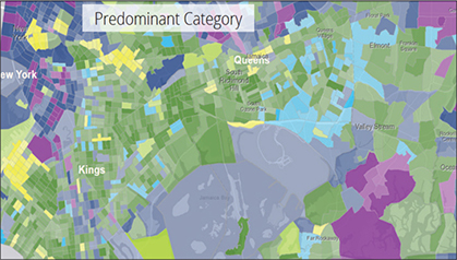
Figure 9.10. Predominance map.
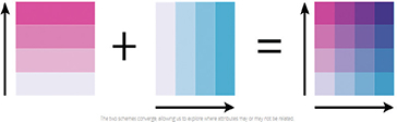
Figure 9.11. Color ramps combined to understand a pattern.
This type of map is valuable, especially when exploring data. It can help users quickly assess whether two attributes might be related.
Traditionally known as bivariate choropleth maps, these maps have always been possible in ArcGIS but required a great deal of customization and forethought. Now, these maps can be created in minutes and easily modified while the user explores the data. Using color ramps inspired by Dr. Cynthia A. Brewer,35 these bivariate choropleth maps show how two data patterns overlap (or don’t overlap).36

Figure 9.12. Relationship map.
Atlas products
An atlas traditionally is defined as a book of maps and charts. It is a way to assemble a collection of maps and show selected topics or themes of the census at the national and subnational levels. As a way of disseminating the census, many NSOs in the past would create a census atlas to provide a broader picture of the population in the country and the living conditions, economic conditions, geographical distribution, urban/rural spatial patterns, and disaggregation of data by gender and other categories. Generally, thematic maps in an atlas present census data at a country level, or major civil divisions (provinces or states), urbanized regions, large cities, and human settlements. However, for the big cities and urban agglomerations, the maps of the census atlas would present data at a lower geographic level—small areas such an aggregation of EAs (e.g., the US Census Atlas presents data at the “census tract” for the largest cities and metropolitan areas).
Historically, NSOs published census atlases, generally high-quality large-format maps in color, and in some cases do so today. However, with the use of GIS-based systems and the growth of the Internet, the traditional paper-based atlas is increasingly being replaced by an atlas in digital form that is published online. The production of a web-based atlas requires a team with subject matter expertise in data, mapping, and GIS skills. A digital atlas can include static or interactive images. A static digital atlas provides thematic maps, uploaded in various formats (e.g., PDF, BMP) to a website as a repository, allowing the user to view them as static web pages.
Online atlases today can be much more interactive and can serve multiple users, from GIS and statistics subject matter experts to citizens and civil society, academia, and research. Publishing digital maps and data with a modern GIS can allow users to produce custom maps of census data and indicators, constituting what is a dynamic or interactive census atlas. This interactive census atlas has the advantage of being able to serve the needs of users without GIS expertise, users who want more information than is possible with a prepackaged static census atlas. It may include digital boundary files, layers, and some major ratios, indices, or averages such as population densities appropriate for mapping already calculated; it may also provide tools for creating maps on the fly.
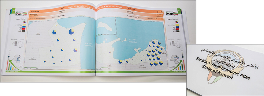
Figure 9.13. Traditional printed atlas: Statistics Socio-Economic Atlas State of Kuwait.
An interactive atlas should be oriented to a broad audience of users. It needs to be user-friendly, allowing users the option of choosing between different themes for display and presentation by geographic area and allowing for exploration of the data. More specifically, it needs to allow users to perform their own query of the database and dynamically customize the maps and views according to their needs. GIS query tools are often used to search for data in the database and display results in both map and tabular formats. An interactive atlas can also offer users various delineation options by selecting, for example, schools or health-care facilities in a district as seed points to create a report or map or to define ad hoc areas by drive time or hand-drawn polygon. GIS web maps provide an interactive experience. A GIS-based web atlas offers tools that enable users to view the data by interacting with the map. A user may pan a map in any direction, zoom in or out to view specific areas in more or less detail, pan to areas of interest, layer different indicators on top of one another, create composite indicators, modify colors and symbols, and generate a range of charts and graphs.37 An online atlas can also allow the user to change methods for data display—e.g., quantile or equal interval—and interact with or interrogate the data to better understand what is being represented using smart mapping and other new methods.
An interactive atlas in the past was a serious undertaking that required planning and understanding the data users. A multidisciplinary team with expertise in statistics, mapping, and usability were all important. Until recently, many NSOs, particularly those in developing countries, may not have had the in-house skills to perform this kind of work. Today, however, with advancements in technology, these types of projects are not only within reach but are obtainable for any organization. The tools have become simpler to use and understand and yet much more sophisticated in functionality.
Gazetteers
A gazetteer is a geographic index or dictionary that helps to identify the geographic location associated with a place name. Place names matter for a census, particularly for two main operations: enumeration and dissemination. At the enumeration stage, one of the biggest challenges for the NSO is the multiplicity of names that enumerators find when identifying their EAs and collecting data. In addition to the names of cities, towns, villages, and settlements, the geographic names of reference features are needed, such as rivers, roads, forests, mountains, ridges, shoreline features, and so on. At the dissemination stage, standardized place names are needed for reporting and communicating census data about the right places. The UN has recommended that, for all census products, the NSO should “adopt a standardized approach to place names and codes” to “allow for easy comparability by data users.”38 In addition, place names have a cultural influence and the ability to present the heritage inherent in the place they identify. It is critically important to report census data with the correct name of a village or a settlement; an error may cause an emotional response if the place name is a cultural reference and the community has an emotional attachment to it.

Figure 9.14. Sample online atlas: Statistical Atlas of Albania by INSTAT (https://instatgis.gov.al/#!/l/prefectures/population/prefpop1).
The UN Group of Experts on Geographical Names (UNGEGN),39 which addresses the national and international standardization of geographic names, has been promoting and encouraging member states to create their national gazetteers for standardized geographical names. UNGEGN defines a gazetteer as a “list of toponyms arranged in alphabetic or other sequential order, with an indication of their location and preferably including variant names, type of topographic feature and other defining or descriptive information.”40 The gazetteer is used in conjunction with a map as a reference document. However, geographic names are not only a part of a map, but they constitute an important communication tool reflecting the historical and cultural heritage of the country.
Many countries have their national gazetteers in print or online, and some have developed online searchable geographic name databases that have their gazetteer as part of their national atlas.41 Gazetteers are generally made in the native language of the country, though names of places often differ between languages. For example, an Italian gazetteer may use the name Milano (in Italian) for that city, while in English or French the name used is Milan. In geographic name terminology, a word that describes a geographic place using native terminology (an internal name) is referred to as an endonym, while using non-native terminology (external name) is referred to as an exonym. In our example, Milano is an endonym, and Milan is an exonym. Therefore, some countries and even regional organizations have developed or are developing multilingual gazetteers.42 Generally, national gazetteers are created by the National Commission on Toponymy or the NMA or any other national organization in charge of geographic names. It is therefore advisable that the NSO inquire about the existence of a national gazetteer within the country before proceeding with developing a gazetteer on its own. This avoids duplicating effort and allows the NSO to use the standardized geographic names used within the country and at the international level. As for the classification of the places by code, where the place code should be a UID for every level of geography, the NSO could adopt a similar approach used for the coding scheme of the national administrative hierarchy: “A popular method is to classify each level of geography using a two or three digit code. For nested geography, e.g. a district within a province within a region, the individual codes are concatenated together to form a unique national code for that geographic unit.”43 Place names are generally considered attributes of the geographic units of the GIS database.
In addition to using a gazetteer as a companion document with a map or for census dissemination, it can be used for disaster management and humanitarian purposes. A national gazetteer including geographic names and coordinates of population settlements, referred to as P-codes in the UN humanitarian community, can be paired with population estimates and used by humanitarian organizations for development and emergency response.44
ISO/TC 211 has developed an international standard, namely ISO 19112:2003, that defines the essential components of a gazetteer, enabling gazetteers to be constructed in a consistent manner. A gazetteer conforming to ISO 19112:2003 meets these requirements.45
1.The gazetteer is described by at least the following four attributes:
•Identifier
•Territory of use (i.e., the geographic domain covered by the gazetteer)
•Custodian (i.e., the organization responsible for maintaining the gazetteer)
•The location types for which instances are recorded in the gazetteer
2.Optionally, the gazetteer may also be described by the following two attributes:
•Scope (i.e., description of the location types in the gazetteer)
•Coordinate reference system (i.e., name of the coordinate reference system used to describe positions of location instances in the gazetteer)
3.The gazetteer is versioned; a new version is created whenever any location instance is added, removed, or replaced with a new version of a location instance. The version information is included in the name attribute.
4.All location instances are recorded in the gazetteer and location instances conform to ISO 19113:2003.
Esri offers an online World Gazetteer as part of ArcGIS Online.

Figure 9.15. Gazetteer of Australia. The gazetteer provides information on the location and spelling of more than 370,000 geographic names across Australia and its external territories.46
Infographics
Infographics are visual graphic representations of information, data, or knowledge intended to present information quickly and clearly. Every NSO aims to present large amounts of census data in a compelling way so that users can have a quick and clear insight into the post-census state of population and housing conditions in their country. Data producers understand that the use of infographics is the most efficient way to create visual presentations and comparisons of census data that is otherwise hard to fully understand or interpret when shown in tabular form. Infographics are typically consumed by all categories of users who usually glance quickly at the data and information. Infographics can also be used to create dashboards (see figure 9.16), which are typically designed for a category of users, such as business experts who can perform simple analysis (such as ranking and filtering) or managers and decision-makers who want to have an overall high-level understanding of the data being reported.

Figure 9.16. Example of an infographic in a dashboard.47
Furthermore, when census data is visualized with graphs, charts, tables, and graphics in combination with a map, the outcome is more telling and engaging, which can raise public awareness of and interest in the usefulness of census data. Given the web’s graphical nature, the combination of web mapping and infographics fits well in the design and creation of attractive websites and portals. One of the major capabilities of a GIS is to enable users to create, display, and visualize information in different forms—maps, charts, graphs, and other graphics (such as histograms or scatter charts). GIS maps that are dynamically linked to charts, graphs, and other media allow greater exploration of spatial data and enable census data to come to life (see figure 9.17 of the UNSD SDG hub with infographics).

Figure 9.17. Infographics in new UNSD SDG website (www.sdg.org) showing the use of infographics to help understand SDGs using statistical data combined with geospatial data.
What many users would like to ideally have is business-like dashboards, with the ability to ask questions using GIS and then present the results and communicate them in a captivating and effective manner. In the past, the concern and challenge were how to create engaging graphics with maps in a balanced way that fits with cartographic presentation principles.48 Today with modern GIS, this is no longer a challenge. The focus is instead on a successful communication of insightful information through compelling visualization and engaging stories.
According to Jim Herries, an applied geographer with Esri in Redlands, California: “The most valuable maps are information products. They are visually interesting the very first time you see them, and they reward you with additional information.”
Smart mapping
This book has consistently stressed the importance of mapping for the census and the useful information that maps convey to the many users of census data. The book has also highlighted the importance of the dissemination of census data through thematic maps, atlases, map applications, web mapping, and infographics. In the past, this may have required classically trained cartographers with experience and a certain set of tools and knowledge. Today, maps are a commodity; every person is becoming a cartographer, zooming and panning, turning layers on and off to create the desired experience. In this context, the need is growing to create meaningful yet accurate maps easily. The challenge for the GIS community is how to create and deliver tools that everyone can use—even someone not familiar with GIS or statistical data. Users want to create interactive web maps that communicate meaningful stories from their data. This challenge has been met in part with the introduction of smart mapping by Esri.
The mission of smart mapping is to provide a kind of strong “cartographic artificial intelligence” that enables virtually anyone to visually analyze, create, and share professional quality maps in just a few minutes, with minimal mapping knowledge or software skills.49 Put simply, smart mapping is about using computation and analysis to automate the creation of easy-to-use maps that are both beautiful and meaningful. Smart mapping, introduced by Esri in 2015, is a capability that is built into ArcGIS Online and ArcGIS Server technology, enabling users to create with just a few clicks the kind of map they want to create and the kind of story they want to tell. One of the critically important capabilities of smart mapping is the added ability to interactively explore data layers—for example, users can explore the range of values for median household income within each US block group in a map by interacting with the histogram of median income values. The ability to interact with the data behind each map layer provides deeper insights into the questions users are trying to answer.50 Thus, smart mapping can bring census data to life, making it real, relevant, and meaningful to users.
Smart mapping can be performed in three simple steps:
1.Choose an attribute to show.
2.Select a drawing style.
3.Explore the options.
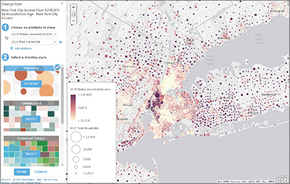
Figure 9.18. The simple steps in smart mapping.
Once a drawing style is chosen, users are given a set of options for customizing their map. Clicking the Options button allows users to explore their data and make additional cartographic changes. Depending on the attribute and data type, these elements can be changed:
•The data classification method
•The symbol size
•The symbol color and shape
•The transparency of the features
•The rotation of the symbols
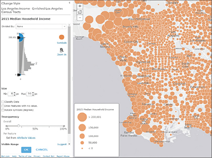
Figure 9.19. Example of smart mapping with a histogram.
A histogram is included to help users understand how the data is distributed. The  symbol allows users to quickly see the average value within the attribute being used. By default, the map is set to highlight statistically significant high and low values. Dragging the handles or type in a specific value changes the representation of the data values. The classification can also be changed to use common methods: natural breaks, equal interval, quantile, and standard deviation.
Smart mapping will help make suggestions as the map is edited. For example, if the basemap is changed, smart mapping will automatically adjust the available color ramp options so the data will contrast well with the map’s background. Smart mapping will suggest options that work with a specific combination of data and attribute choices.
As Esri looks to the future, it must continue to develop tools such as this because the layperson will become a “cartographer.” It is incumbent on cartographers and GIS professionals to simplify the process and teach data users how to make accurate, compelling maps.

Figure 9.20. Example of above and below capability available in ArcGIS.51
Mobile applications
There is no other technology that spread worldwide as rapidly as mobile technology. Mobile applications have proliferated, and today, there is an application or “app” for almost anything you can think of. The mobile device is now not only a phone but also a calculator, an alarm clock, a camera, a GPS device, a compass, a map, a calendar, a watch, a currency converter, a tape measure, and more. A mobile application is generally defined as a software application developed specifically for use on mobile devices, such as smartphones, tablets, and more. Mobile applications are distinguished from those running on desktop or laptop computers or on the web. There are generally three categories of mobile applications: (1) native apps that are developed specifically for a given platform (working with a specific operating system such as Android or iOS) and that can be accessed only from the dedicated application store (such as Google® Play or Apple’s App Store), taking full advantage of all the device features; (2) web-based apps that refer to the mobile apps that run in mobile web browsers rather than directly on the mobile device; and (3) hybrid apps that combine elements of both native and web apps.52
What is obvious about the mobile app development trends is that location-based services, with mapping and GPS capabilities, are now mainstream. This development is made possible by the fact that nearly all smartphones come with GPS and Bluetooth low-energy capabilities to provide applications with location-based services (LBS). These LBS are positioned to grow owing to their increasing popularity not only for weather, navigation and routing, tracking, and finding the nearest store or restaurant, but especially for location-based offers, advertisements, and services—which even offer deals to app users depending on their location. This mapping revolution has been underway for some time, from the early days of MapQuest® and Microsoft Earth to Google Maps, Bing, Yahoo!®, and Apple Maps® today. The industry has paved the way for mobile mapping apps. Location technology is being applied in numerous ways today, and yet we have probably just begun to scratch the surface.
Developers can create apps in several different ways. Traditionally, developers might build an app from scratch, which takes time and requires expertise. Today, the industry is changing and moving toward toolkits that help develop apps quickly. AppStudio for ArcGIS® is a good example of this and a groundbreaking tool in the GIS app revolution. It allows users to convert their maps into beautiful, consumer-friendly mobile apps ready for Android, iOS, Windows, Mac OS X, and Linux. It also allows users to publish the maps using their own brand to all popular app stores; no developer skills are required.
One great example is the winner of the AppStudio for ArcGIS “App Challenge.” In a disaster, Evacu8® helps locate, check, and preregister to evacuation centers prior to arriving. This type of application brings data and maps together in a useful tool for citizens and agencies alike. Apps allow us to deliver the experience that users need—with authoritative data, thereby enhancing decision-making.
The Nepal case study is an example of architecture leveraging modern GIS technologies. For more information, see the Esri 2015 white paper Modernization of National Statistical Organization (NSO) Business Processes Using GIS available at https://www.esri.com/library/whitepapers/modernization-national-statistical-organization-business-processes.pdf.

Figure 9.21. Custom apps for the enterprise.53
Case study: Nepal
The Government of Nepal’s Central Bureau of Statistics (CBS) provides government agencies data for planning, policy-making, and economic growth measurements. Using household surveys and national census methods to collect data, CBS assesses Nepal’s socioeconomic conditions and measures economic growth. Within the government services, the bureau is a technology leader. It investigates new technologies to improve methods for more scientific and reliable data collection, processing, and analysis.
In 2018, CBS conducted its first economic census to count all entrepreneurial units in the country. The information provides the government insight into the status and financial aspects of the nation’s enterprise business activities. In addition, the census establishes a baseline for measuring business growth and gives entrepreneurs intelligence for creating better business strategies.
CBS asked its GIS team to produce enumerator area (EA) maps for the entire country. The team, consisting of two GIS professionals, faced multiple challenges. GIS data about the country is scarce. In urban areas, landscapes rapidly change. Internet connections are not stable and power outages are common. Because Nepal’s street systems are not built on a grid, defining specific EAs is complicated. The team could not reuse the EAs outlined in the previous census because new government leaders had changed administrative boundaries. What’s more, streets do not have names, making it difficult for enumerators to navigate streets.
The team used ArcGIS to complete the task. To edit enumeration boundaries, they used the platform’s basemaps and satellite imagery for urban areas. They also accessed OpenStreetMap data, which contains content contributed by users from around the world. The interface map is written in the country’s official language and script, Nepali. The team chose ArcGIS Pro to output maps because of its high-performance capability.
Although Nepal’s Internet infrastructure is improving, it is not yet reliable for large projects. When the connection is working, the team downloads geospatial data, such as Esri’s satellite imagery, and performs editing tasks offline. Because administrative boundaries tend to change, CBS uses statistics software to process attribute values. Using these values, ArcGIS dissolves and merges old boundary polygons to update the boundaries.
Using ArcGIS Online, the GIS team built a web application that helps enumerators use their tablets in the field to navigate through mazes of nameless streets. The app identifies EAs by area number and lays out a route to the location.
During the spring, CBS conducted Nepal’s National Economic Census 2018 in about six weeks. The GIS team used imagery and open content to create enumerator maps for the country. It also built mobile apps that helped enumerators navigate locations and enabled them to survey businesses throughout the country.
Web-based mapping
In this era of GIS, the Internet, the cloud, open data, and social media, census data dissemination and communication have become even more important and challenging. The web lends itself as a key medium to the dissemination of census data, allowing all standard geographic products and major tabular data to be disseminated to a wider audience. Web-based mapping has simplified access and allows us to easily discover, use, make, and share maps and data with others. It is a user-oriented approach par excellence, aiming to respond to the high expectation of “anywhere, anytime, any device” access.
NSOs are increasingly making census data available via the Internet with web apps, maps, and various information products. Some country experiences with the use of web-based mapping for census data dissemination clearly show the benefits of web dissemination. This can be summarized as: (1) improved timeliness; (2) increased accessibility; (3) broader reach; (4) increased utilization; and (5) increased awareness of the value of census statistics. NSOs opting for web-based dissemination must consider the same concepts as in the past when publishing via paper or simple CSV files but also must consider the diversity of users and experience with data and user needs. Checking the quality of census data before publishing the results continues to be the priority. However, we should also consider the users and their level of experience with data. We see increased user expectations and the need to enhance accessibility and discoverability as well as the need for clear metadata. NSOs must also consider the need for a mechanism to respond to queries from users, who will have questions on the data—for example, data aggregation and disaggregation methods, margin of error and more—and will require regular interaction over time to adjust to these new methods.
Every NSO has an official website which is used to provide information about the NSO’s activities and conventional statistical indicators. In some countries, the website also provides census data to the public, civil society, academia, researchers, and developers. Often, the NSO will dedicate a specific website for the census data dissemination itself. What varies from one country to another is the scope of the census products provided and the level of sophistication of the tools, particularly web maps and apps, offering the users access to the data.
As stated previously, the use of the web as a dissemination medium for maps has been popularized by Google Maps and other mapping applications such as Bing Maps. This represented a major advancement in the awareness of geography and underscored the importance of spatial thinking. In addition, it allowed for major advancement and innovative approaches in generating, publishing, and delivering maps and data in a much more user-friendly way.
The other major development has been in APIs, which enables users and developers to create custom applications.54 An API is a set of functions, procedures, methods, or classes used by computer programs to request services from the operating system. Computer programmers use APIs to make applications.
ArcGIS provides tools for app builders and developers alike such as Web AppBuilder for ArcGIS. This is an intuitive what-you-see-is-what-you-get (WYSIWYG) application that allows one to build 2D and 3D web apps without writing a single line of code. It includes powerful tools to configure fully featured HTML apps. As the map and tools are added, they can be seen in the app and used right away.
Maps can be incorporated in apps to add functionality in many ways. For example, a map can be added to a dashboard app that displays key indicators for the area of interest, or to a time-series app that lets users cycle through data from past surveys.

Figure 9.22. Kuwait Finder and Kuwait Stats apps.
APIs provide new ways to access and disseminate data, including providing access to census data for application developers both inside and outside the census organization.55 GIS-based APIs are designed to manage data for its delivery to a web browser client from a GIS server. Some NSOs have already begun using these methods of data dissemination to deliver their census data directly from their GIS database.
Another popular idea is that of the mashup, a web application that combines data from more than one source into a single integrated tool. An example of a mashup is the use of data from Google Maps to add location information to statistical data, thereby creating a new and distinct map that was not originally provided by either source. Another example would be to overlay life expectancy at birth (for both sexes) from one source (UNdata®) over the world map from Google Maps. In figure 9.23, World Bank data that displays the proportion of national parliament seats held by women at the country level from 2012 to 2015 is overlaid on an Esri basemap. According to Webopedia, “this capability to mix and match data and applications from multiple sources into one dynamic entity is considered by many to represent the promise of the Web service standard . . . .”56 Mashups exemplify a captivating way to integrate statistical and geospatial information.
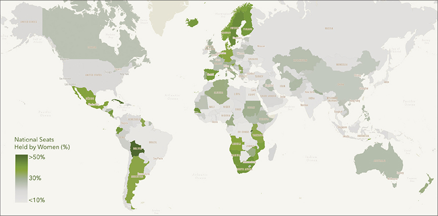
Figure 9.23. Example of a mashup using data from World Bank on national parliament seats held by women overlaid on an Esri basemap.
As mentioned in chapter 6, there are international standards for web-based mapping services—for example, a Web Map Service (WMS) that has been developed by the OGC and adopted by the ISO as a standard protocol for serving georeferenced map images over the Internet that are generated by a map server using data from a GIS database. WMS is a widely supported format for maps and GIS data accessed via the Internet and loaded client side into GIS software. Most GIS software supports WMS. Other open standards such as Web Feature Service (WFS) and Web Coverage Service (WCS) also support web-based data, services, and systems interoperability.
As we think about web-based mapping for census data dissemination, in the past the implementation of a comprehensive dissemination system would have required substantial human resources with skills in web design, GIS, and mapping. Today, with new tools and advancements in technology, this is becoming simpler and more manageable for the NSO. It still requires important work to be carried out to make census products accessible, share methods and metadata, and interact with users. An additional issue for some countries is the limited accessibility of tools in areas with limited connectivity or a low bandwidth.
Findings of the evaluation of the 2010 Round of Censuses have shown that the use of the Internet to disseminate static web pages was well established, but only half of the countries or areas were planning to disseminate interactive online databases, making it possible for users to make their own requests.iv It was also found that the use of GIS web-based mapping tools was growing, and half of the countries expressed intentions to move ahead in this domain.57 Today, this trend has been confirmed, and the use of GIS web-based tools is the goal for all countries (see figure 9.24). In summary, the use of GIS benefits all the stages of the census.
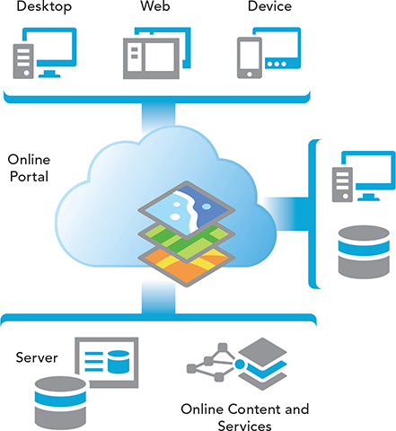
Figure 9.24. ArcGIS deployed in a statistical organization.
Case study: Canada
Statistics Canada (StatCan) conducts a census every five years and runs approximately 350 active surveys on nearly all aspects of Canadian life. StatCan has made census data easier to view and understand through online interactive maps and dashboards. Census statistical information provides elected representatives, businesses, unions, nonprofit organizations, and citizens with a solid foundation for informed decision-making.
Beginning with the 2001 Census of Population, StatCan introduced new ways to view census data with a series of data visualization tools, such as age pyramids. In 2011, the agency introduced the Focus on Geography Series. This tool presented data as tables, texts and maps that showed population, age and sex, language, etc. Canadians could also see how the population had changed over time. By the 2016 Census, StatCan had rolled out more advanced data visualization tools. These tools included a variety of interactive charts and a new statistical dashboard—the Census Program Data Viewer (CPDV), an advanced web-based data visualization tool.
The CPDV makes data easier to interpret. It shows basic geographic and sociodemographic data categorized by statistical indicators. Users can easily find statistical information about a geographic location using the thematic map. At a glance, users can compare statistical values for different locations and identify relationships between indicators.
The CPDV helps people answer fundamental questions related to places in Canada, including the following:
•What are the top five ethnic origins reported in each of the census metropolitan areas of Montréal, Ottawa–Gatineau, Toronto, Calgary, and Vancouver?
•What are the top ten municipalities where a language other than English or French is spoken most often at home?
•How does the average age for my municipality compare with that for my province, my territory or the nation?
•Is there a relationship between level of education and average income?
The CPDV is built using ArcGIS and Geocortex software. The platform’s dashboard technology was used to feature a map that could display different levels of geography to show Canada’s diversity at general and more detailed levels.
The platform has met StatCan’s goals: it displays more than 5,000 geographic locations in a single chart and includes charting indicators that have extreme outliers (e.g., population changes). Corporate formatting standards can be applied to data so that the data is usable across the agency. The dashboard fits into the web template designed by the Government of Canada.
The result is shown in figure 1.
The simplicity of the user experience conceals design complexities that are managed behind the scenes. For instance, developers followed an iterative process to make corrective changes as they encountered issues. They created a new data model that supported the efficient mapping and charting of an unlimited number of indicators.
For the 2016 Census, StatCan mapped approximately 100 indicators at seven different levels of geography, ranging from provinces and territories to cities and neighborhoods. The CPDV generated dynamic layers by joining indicator data to spatial features. Without geographic information system automation, StatCan staff would have had to build 700 individual data layers. Because of these dynamic layers, the CPDV is capable of supporting approximately 5,000 users viewing the dashboard at any one time. In addition to the mapped indicators, an extra 400 indicators are used to generate charts.
As a member of the United Nations Statistical Commission, StatCan endorses the Fundamental Principles of Official Statistics, and built its census system accordingly. The agency also designed the CPDV to meet all Government of Canada standards for accessibility, interoperability, security and web usability. Its adaptive design enables users to view data on desktops, tablets, and smartphones.
The CPDV, along with other data visualization tools, provides new ways to visually communicate statistical information and engage data users. The system demonstrates the importance of statistics in the economic and social development of Canada.
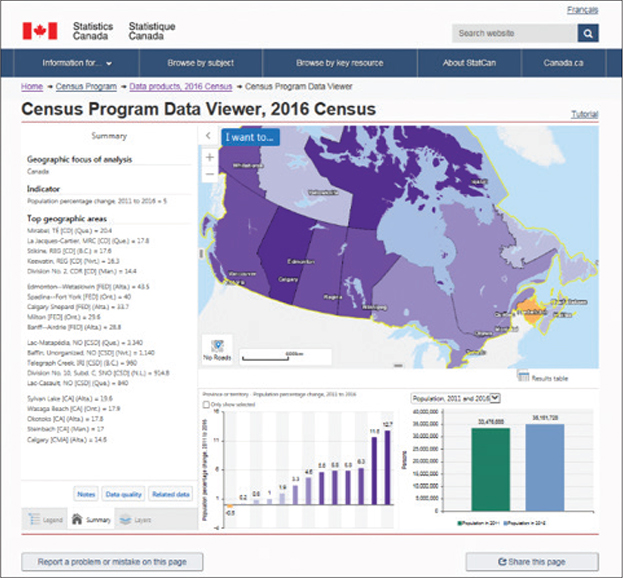
Figure 1. Statistics Canada’s Census Program Data Viewer is a dashboard that shows statistical indicators and locations.
References
i.UNSD launched this research exercise to test a data hub with a pilot group of fourteen countries representing all the regions of the world, namely Brazil, Colombia, Ireland, Kenya, Mexico, Morocco, Palestine, the Philippines, South Africa, Qatar, Senegal, Tanzania, UAE, and the United Kingdom. See details in “A Data Hub for the Sustainable Development Goals” in the Spring 2018 issue of ArcNews at http://www.esri.com/esri-news/arcnews/spring18articles/a-data-hub-for-the-sustainable-development-goals.
ii.The UN Principles and Recommendations have also recommended that “all tabulations should include the following metadata or references to where this information can be obtained: census questions; reasons why they are asked; conceptual definitions (census dictionary); geographic hierarchies used; changes since the previous census with regard to content, operational methods or geographic boundaries; and quality indicators such as coverage rates and item non-response. . . . If a long-form sample is used in the census, metadata should also provide information on the sampling variability of the results. When the census tabulations include suppressed data cells due to small numbers, the metadata should also include a methodological note on the rules and methods of suppression.” The UN document also states that the type of metadata items includes population groups included, source of statistics (type of census), type of population count, classifications, definitions of urban/rural, duration of residence, etc.
iii.The International Household Survey Network (IHSN) Microdata Management Toolkit uses the DDI metadata standard.
iv.For example, South America appeared to be keeping abreast with the technological advances in this domain as all the nine responding countries plan to offer online databases. In Africa, where the access to high-speed Internet was still limited, only one third of the countries intended to develop such interactive online databases. See The 2010 Round of Population and Housing Censuses in the World by Jean-Michel Durr.
Notes
1.See p. 1.206 in the UN’s Principles and Recommendations for Population and Housing Censuses, rev. 2. ST/ESA/STAT/SER.M/67/Rev.2. Available at https://unstats.un.org/unsd/demographic-social/Standards-and-Methods/files/Principles_and_Recommendations/Population-and-Housing-Censuses/Series_M67Rev2-E.pdf.
2.An example is Statistics Canada.
3.See the UN Principles and Recommendations for Population and Housing Censuses, rev. 3. ST/ESA/STAT/SER.M/67/Rev.3. Available at https://unstats.un.org/unsd/publication/seriesM/Series_M67Rev3en.pdf.
4.See the UNSD Handbook on the Management of Population and Housing Censuses, rev. 2. Available at https://unstats.un.org/unsd/publication/seriesF/Series_F83Rev2en.pdf.
5.See the UN Economic and Social Council’s report National Statistical and Geographical Institute of Brazil: Global Geographic Information Management. Available at https://unstats.un.org/unsd/statcom/41st-session/documents/2010-13-Brazil-GGIM-E.pdf
6.Proponents of the grid method would argue that even in the absence of a point-based statistical data as a source data for statistical grids, grids might be produced from disaggregated larger statistical geographies using auxiliary information (see the in-depth review of developing geospatial information services based on official statistics—Note by the United Kingdom Office for National Statistics, ECE/CES/2016/7).
7.See the presentation slides for “The UN-GGIM Challenge to Develop Integrated Core Datasets” at http://ggim.un.org/meetings/2015-2nd_Mtg_EG-ISGI-Portugal/documents/Tim_Trainor_Grid_v_admin_Lisbon_2015.pdf.
8.See the GSGF principles in the “What is the GSGF?” box in chapter 2.
9.See the UN-EG-ISGI Second Meeting Report. Available at http://ggim.un.org/meetings/2015-2nd_Mtg_EG-ISGI-Portugal/documents/EG-ISGI-Second%20Meeting-Summary-.pdf.
10.See “The UN-GGIM Challenge.”
11.See the in-depth review of developing geospatial information services based on official statistics—Note by the United Kingdom Office for National Statistics (ECE/CES/2016/7).
12.For instance, the New Zealand threshold is set at “meshblocks,” which average 100 people, while UK output areas are at least 100 persons and forty households (average size is 300 persons and 125 households). See the Note by the United Kingdom Office for National Statistics.
13.For the most up-to-date information on ArcGIS security, see the ArcGIS Trust Center at https://doc.arcgis.com/en/trust/documents. The site provides white papers on security, implementation patterns with ArcGIS, mobile applications, and detailed security answers relative to ArcGIS Online for information security professionals.
14.See the World Bank Open Government Data Toolkit at http://opendatatoolkit.worldbank.org/en.
15.See the Cape Town Global Action plan at https://unstats.un.org/sdgs/hlg/Cape-Town-Global-Action-Plan.
16.See the UNSD forty-eighth Session Statistical Commission Friday Seminar on emerging issues at https://unstats.un.org/unsd/statcom/48th-session/side-events/documents/20170303-1M-Stefan-Schweinfest.pdf.
17.The OGP, initially launched in 2011, has grown from eight participating countries to seventy-five in 2017. The OGP was established to bring governments and civil societies working together to develop and implement open data reforms.
18.See Future Trends in Geospatial Information Management: The Five to Ten Year Vision. Available at http://ggim.un.org/documents/UN-GGIM-Future-trends_Second%20edition.pdf.
19.See African Data Consensus. Available at https://www.uneca.org/sites/default/files/PageAttachments/final_adc_-_english.pdf.
20.Included with ArcGIS Online, ArcGIS® Open Data lets users instantly unlock their data for the public in just a few clicks.
21.See An Open Data Approach That Works at http://www.esri.com/library/brochures/pdfs/open-data-government.pdf. Also see ArcGIS: An Open Platform for Innovation at https://www.esri.com/~/media/00C24660087A4EFB9F069148017EABD4.pdf.
22.See Census 2016 Open Data Site, Ordnance Survey Ireland: “On this site, Census 2016 datasets [from Central Statistics Office (CSO) Ireland] have been combined with Ordnance Survey Ireland’s (OSi) official boundary data as part of a collaborative project between the Central Statistics Office (CSO) and OSi to link geography and statistics. . . . [This site] was created to promote the use of Geography and Statistics to support evidence based decision making across the Irish Public Sector and among Civil Society. This site and the data it presents are Open, Public and Free to Use.” Available at http://census2016.geohive.ie. See also the Census 2016 Ireland case study in chapter 8.
23.For example, we may be working with census data for a country in which the data is in a table, CSV, Microsoft Excel file, Microsoft Access database table, or other geospatial format. To map this data with ArcGIS software, we need to merge it with a shapefile containing boundaries of census tracts. The operation is known as a table join.
24.Convert raster to a CSV values and latitude–longitude based on raster value in ArcGIS.
25.According to the World Bank Open Data Toolkit: “Open Data catalogues typically make each dataset available as a unique and permanent URL, which makes it possible to cite and link to the data directly.”
26.See also the Australian Bureau of Statistics’s 1500.0 - A Guide for Using Statistics for Evidence Based Policy, 2010. Available at http://www.abs.gov.au/ausstats/abs@.nsf/lookup/1500.0chapter92010.
27.See http://www.ddialliance.org.
28.See the Open Data Foundation’s The Data Documentation Initiative (DDI): An Introduction for National Statistical Institutes. Available at http://odaf.org/papers/DDI_Intro_forNSIs.pdf.
29.See UN-GGIM Future Trends, second ed.
30.See the “What is the GSGF?” box in chapter 2.
31.See the 2012 Esri white paper What is GIS? Available at http://www.esri.com/library/bestpractices/what-is-gis.pdf.
32.The International Cartographic Association has developed this definition of geographic maps: “A map is a symbolised image of geographical reality, representing selected features or characteristics, resulting from the creative effort of its author’s execution of choices, and is designed for use when spatial relationships are of primary relevance.”
33.See the Pennsylvania State University’s College of Earth and Mineral Sciences article Mapping Our Changing World: 3.2 Thematic Maps. Available at https://www.e-education.psu.edu/geog160/c3_p14.html.
34.In 1854, John Snow, a London doctor, created the first thematic map used for problem analysis when he mapped the spread of cholera throughout the city.
35.Dr. Brewer is professor of geography at Pennsylvania State University and a renowned expert in color theory in cartography.
36.To learn more about this mapping style and to see examples, see the ArcGIS Blog articles How to Make a Relationship Map in ArcGIS Online (https://www.esri.com/arcgis-blog/products/arcgis-online/mapping/how-to-make-a-relationship-map-in-arcgis-online) and What Is a Relationship Map? (https://www.esri.com/arcgis-blog/products/arcgis-online/mapping/what-is-a-relationship-map).
37.See the Esri ArcUser® article “Making Census Data More Useful.” Available at http://www.esri.com/esri-news/arcuser/summer-2013/making-census-data-more-useful.
38.See the UN’s Handbook on the Management of Population and Housing Censuses rev. 2. Available at https://unstats.un.org/unsd/publication/seriesF/Series_F83Rev2en.pdf.
39.See details about UNGEGN at https://unstats.un.org/unsd/geoinfo/UNGEGN/geonames.html.
40.See the UN’s Glossary of Terms for the Standardization of Geographical Names. Available at https://unstats.un.org/unsd/geoinfo/UNGEGN/docs/pdf/Glossary_of_terms_revised.pdf.
41.Consider the case of Sweden, National Atlas of Sweden—The Swedish Gazetteer at http://www.sna.se/gazetteer.html.
42.“A multi-lingual gazetteer (service) shall most probably be established as a part of INSPIRE.” Available at http://inspire.ec.europa.eu/theme/gn.
43.See the UN’s Handbook on Census Management, rev. 2.
44.See the UN’s Handbook on Geospatial Infrastructure in Support of Census Activities. Available at https://unstats.un.org/unsd/demographic/standmeth/handbooks/series_f103en.pdf.
45.See details at https://www.iso.org/standard/26017.html.
46.See http://www.ga.gov.au/placename.
47.See http://mediamaps.esri.com/Infographics/SideBanners.html to interact with this example.
48.See the Esri ArcUser article “Make Maps People Want to Look At,” available at http://www.esri.com/news/arcuser/0112/make-maps-people-want-to-look-at.html.
49.See the book The ArcGIS® Book, Second Edition: 10 Big Ideas about Applying The Science of Where™ from Esri Press.
50.See The ArcGIS Book.
51.See https://www.esri.com/arcgis-blog/products/arcgis-online/mapping/better-breaks-define-your-maps-purpose for details.
52.See the Nielsen Norman Group article “Mobile: Native Apps, Web Apps, and Hybrid Apps,” available at https://www.nngroup.com/articles/mobile-native-apps.
53.See https://appstudio.arcgis.com for details.
54.Some depict this trend as a move from maps to apps.
55.See, for example, the US Census Bureau’s API at http://www.census.gov/developers (reported in the UN’s Handbook on Census Management).
56.See https://www.webopedia.com/TERM/M/mash_up.html.
57.See The 2010 Round of Population and Housing Censuses in the World from Jean-Michel Durr. Available at http://jmstat.com/publications/SINAPE%202010.pdf.