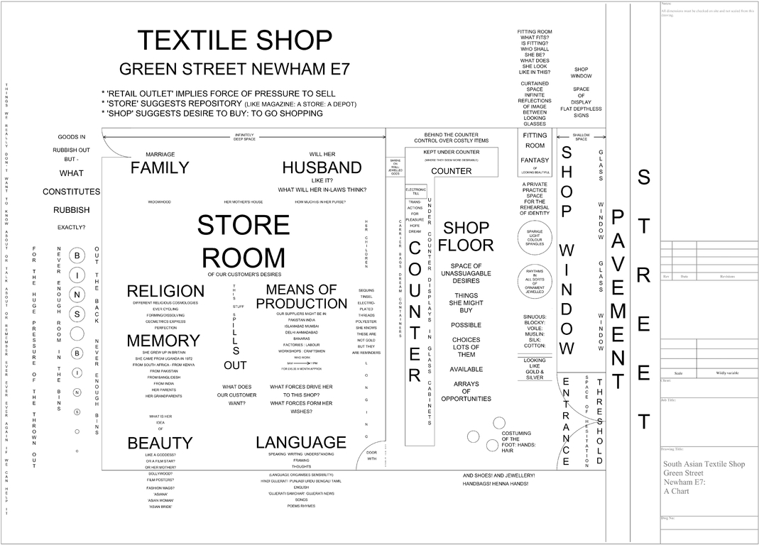
Figure 4.2.1 Charting a London South Asian textile shop (2009). Copyright Helen Scalway. There is a zoomable version of this image available at www.flickr.com/photos/22894783@N08/3398749790/
Gail Davies and Helen Scalway
In this exchange, artist Helen Scalway and geographer Gail Davies reflect on collaborative work, which has been running in different intensities from 2010 to today.1 They discuss diagramming as a form of spatial ethnographic practice, located at the interstices of geographical enquiry, ethnographic methods and visual analysis. This practice emerged in Helen’s work on the ‘Fashioning Diaspora Space’ project, as a way of creatively mapping worlds mediated through the materiality and meaning of translational clothing, patterns and ornament. Practices of diagramming acted as a creative and conceptual provocation throughout the analysis and dissemination of Gail’s subsequent work on the spatialized aspects of knowledge production in a very different realm: changing experimental practices in animal research and the coordination and commodification of international research resources in biology (Davies 2012a, 2012b, 2013a, 2013b). Diagramming practices became essential to the work of conceptualization from Gail’s ethnographic research. Sharing written accounts of ethnography and working collaboratively on the production of diagrams enabled the complex and often closed spaces of biological research to become legible for wider dissemination and discussion. These diagrams also offered a critical space for opening up the topologies of scientific translation, in both biology and social theory. These alternative diagrams hold flows of materials and meanings together, productively placing the tension between simplification and the complex interactions in both contemporary biology and the social analysis of biology in view.
According to Sunder Rajan (2006: 20), the analysis of biocapital
cannot simply be a network analysis that traces the various types of technoscientific or capital flows that occur in order to produce and sustain this system. Such an account also needs to understand how these flows are constantly animated by multiple, layered and complex interactions between material objects and structural relations of production, on the one hand, and abstractions, whether they are forms of discourse, ideology, fetishism, ethics, or salvationary or nationalist belief systems and desires, on the other. These abstractions may be hard to pin down and map in the same diagrammatic fashion as networks and flows, but it is essential to acknowledge them.
The term ‘diagramming’ implies schematising; while places, in their density and richness of meaning, seem to defy schematisation. Yet in relation to the visual investigation of place, is there some expansionary potential in the ‘diagram’ to become a visual medium through which meaning pours out everywhere, rather than being pared too much away in simplification?2
Gail: Can I start by asking you about how you use practices of diagramming in your work?
Helen: I think of myself as a visual worker. I was an art student in a very interesting art college, and had tutors who said to me ‘politicize, don’t aestheticize’. But the aesthetics come out if one thinks with integrity, then the work will have a strength which is of a different kind. I think the word ‘artist’ is just too vague, a word like a screen to project anything on to, whereas if I think of myself as a visual worker it directs me towards thinking and thinking through doing, thinking through my practices.
The word ‘diagram’, I think carries a load which can be misunderstood in that it can refer to quite technical things, work that’s always digital, for example. It might be taken to mean digital visualizations of data, datascapes and things like that and I have looked with interest at datascapes. But of course, what they deal with always is quantification, they metricize, they are looking at quantities, whereas I’m interested in the much more messy flows which turn space into complex place.
My diagrams tend to start as hand drawings because that’s the way I think. I suppose the idea first came to me as a result of coming across Gilles Deleuze’s formulation of the diagram as a map of the relationships between forces.3
He insists, and others have insisted and expanded after him, that such diagrams will always be very abstract, they’re not pictures and they really do abstract away from anything figurative, to just focus on the actual forces. Whereas I rather transgress this.
I would more often use the word ‘chart’ for what I do because I often find it helpful to take, for example, an architectural floor plan and look at that. That can be the ground plan of an entire site, like an animal research facility where I’d be looking not just at the actual mouse house and the places where procedures are carried out and the quarantine rooms and so on, but also such things as the barriers and the café and the sports facilities and the larger context.
Gail: We have in front of us a diagram of a shop [Figure 4.2.1], which was the first piece of your work I encountered. Can you tell us a bit more about this chart first, and how you put it together?
Helen: This drawing is an attempt to chart a South Asian textile shop serving a diasporic community in Green Street E13 [London], and is based on numerous visits and conversations in such shops. The proprietors, their assistants and the clients became collaborators on this piece as their input was incorporated. The diagram sought to engage as an economical but intriguing way of presenting the multi-dimensionality of the place and is perhaps the single most innovative piece of work I made during the Fashioning Diasporas project (Breward, Crang and Crill 2010).4
I became aware of this place as an incredibly shifting, rich, diverse, multiple space that was full of different histories. London, like every other big cosmopolitan city, is in a state of becoming, it’s in a state of flux and change and you can’t still it. It’s very likely that in a couple of decades, these communities will have moved away just as other communities have done, like the Huguenots who came in the seventeenth century and the Jewish communities who came in through Spitalfields in the nineteenth. So this was something to try and seize hold of, the space at a moment of shifting time.
Figure 4.2.1 Charting a London South Asian textile shop (2009). Copyright Helen Scalway. There is a zoomable version of this image available at www.flickr.com/photos/22894783@N08/3398749790/
I used to look at things like weather maps repeatedly, and those digital models which are animated, so you can see the storm coming and elements feeding in. Maps of course are often beautiful but they provoke me by eliminating all the traces of the journey and I wanted to make a diagram that somehow could contain all that shifting life. The work is not literal though it riffs on the conventions of the architectural drawing of actual floor plans. Where it departs from the literally descriptive is in its labelling. So, for example, the street has got these plate glass windows with shallow display space behind. You look in from the street and there’s a shallow space of display. Then the threshold, the door, is a space of hesitation. The fitting room is the space where the question is asked, ‘What do I look like in this?’, ‘Who am I when I wear this?’ – that is the question which makes that little cubbyhole space into a place, a fitting room, that and the infinite reflections between looking glasses; the shop floor is a space of unassuageable desires. Then there’s a one-way mirror – the shops I used to go into, had one-way mirrors between the front of shop and the store room. Go through them into the store room, and what is actually stored in there? Here the way the diagram works changes, the register changes. It’s not just the boxes and the extra stock, though of course it’s that as well. The diagram suggests the store room is a hidden reservoir of customer’s desires, of the forces which have formed her taste. The influence of her family, is she a widow, will her husband like it, what will her in-laws think, what is her religion, what are her memories, what is her idea of beauty? These are some of the unseen forces which have produced the front of the shop, a real place with its arrays of choices. Then, every shop has a front door but also a back door leading to the dustbins. The diagram asks what constitutes rubbish, we can get into questions of abjection here, what is it that might get put out the back, thrown out, buried? This shop diagram is mapped in black and white, apparently simple, on to a pared-down architectural floor plan. So what you’ve got is something that’s almost like a document for discussion, it’s not meant to be beautiful, it is meant to get people talking. Then I took a very early draft version of this document back to Green Street, by that time I’d learned which were the three or four shops where the people were really helpful to me, and we spread it out on the counter. I was on one side and they were behind the counter and we pored over this, the clients and shop assistants and proprietors were all helpful, so they became my colleagues and my co-workers. I was really dependent on them.
Gail: Do you get any sense about what new insights this allowed you to include or how it allowed you to see how they were reading or understanding the diagrams?
Helen: They gave me a very positive response. I had been concerned at what they might say ‘let alone’ think but they seemed to recognize what I showed them with a warmth in their recognition. They said, ‘Oh yes, we understand this’. They took on board the various registers and different dimensions in the diagram at once, as though they had a real inwardness with it or it made something visible which they knew all about from the inside. They also made suggestions for which I was grateful, for example when it got to ideas about beauty one of the assistants said, ‘The magazines are really important to us, Asian Bride, you’ve got to put that in’, and someone else said, ‘And the film posters because we are passionate about films’. The Bollywood films are very important and so I was actually able to put more things in. Those conversations really made it possible for me to begin to populate the diagram.
The diagram really got them going. Of course, there were some language difficulties. Not all the older ladies in Green Street speak English, they would be speaking in Hindi or Bengali, that is the ones who might be in their 60s or older, their daughters might be in their 40s and they would be speaking accented English but their grand-daughters, these are the 14/15/16 year olds were speaking as East London as they come, ‘innit’. So this was fascinating especially when they started arguing with each other over the diagram – that was great.
Gail: When I saw this diagram, I immediately thought there were similarities with what I was struggling with in my work. This challenge about how you think about relationships within a space where everyone’s talking slightly different languages. In the world I was researching, you had researchers experienced in molecular biology; care staff concerned with animal welfare; patients hoping for clinical translation; institutions invested in economic outcomes. There are people with desires for careers, hopes for cures and concerns about animal experiences. All of that’s in there. It has different inflections, intensities and visibilities in different spaces, but with potential relevance for every space. The ways they then relate – or don’t translate – becomes important for how science is operating now, and so is interesting to social science too. But given these are often unfamiliar and inaccessible spaces – both literally and in terms of their technical languages – this can be hard to convey in writing. I was drawn to your diagramming as a way of thinking through and representing these complexities.
Helen: You spoke for five minutes at Exeter University and I thought, ‘I need to speak to this lady’! Because you are approaching spatiality through lithe gymnastics in language, a kind of place-making in language itself, a complex set of connected and related places which are performed in writing, and this is a striking way of evoking this emergent space of becoming and of translation.
I’m very interested in the performativity of your work, the way that in the length of a sentence or a paragraph, you will travel across different terrains of language, different registers of language, so that your writing is spatialized not only in what it writes about but in what it performs, in the gymnastics that it performs between one register and another.
Gail: Thank you! Well, we have carried on a conversation ever since, which has varied in its own intensities given our other complex commitments. But it seems to me it endures as it is based on shared interest in a productive, but ultimately irresolvable tension, that comes from trying to clearly communicate the provocations of complexity. The conversation has carried on over email, meetings when we have chatted through my publications and your images. And I am also so grateful for your reading of my work and have gained a huge amount from this, particularly in how diagramming opens up ways of thinking about ethnographic practice and conceptualization too.
Gail: Can you say something about how you start work on these kinds of diagrams?
Helen: By first visiting the place with the intention of observing in an extremely active way. Absolutely not in a foreclosing way: rather, in a wide open one, even a vulnerable one, prepared to be surprised, even taken far aback, out of one’s comfort zone. And by watching people’s behaviours, that is vitally important, wondering to myself what is it that is important to them? What does the place mean for them, in their terms? Then, thinking about the questions raised by all this observation, questions which one might never have foreseen. There are masses of notes and query marks and bracketty bits trailing about untidily at this stage.
The next step involves finding or making an initially sparse diagram, and making it burgeon and leak with all those layers of meaning. It’s somehow about holding on to those untidinesses and irreconcilabilities. So, what gets called ‘labelling’ can be an intensely thought-provoking activity. But it all originates with the habit of letting the space decentre one’s own vision: of letting oneself be thrown by the potentially many different ways there might be of seeing this space, or door, or barrier or whatever. You can bring this approach to any place, and so to any diagram of a place, asking what complexities are layered up in there and how you might convey these.
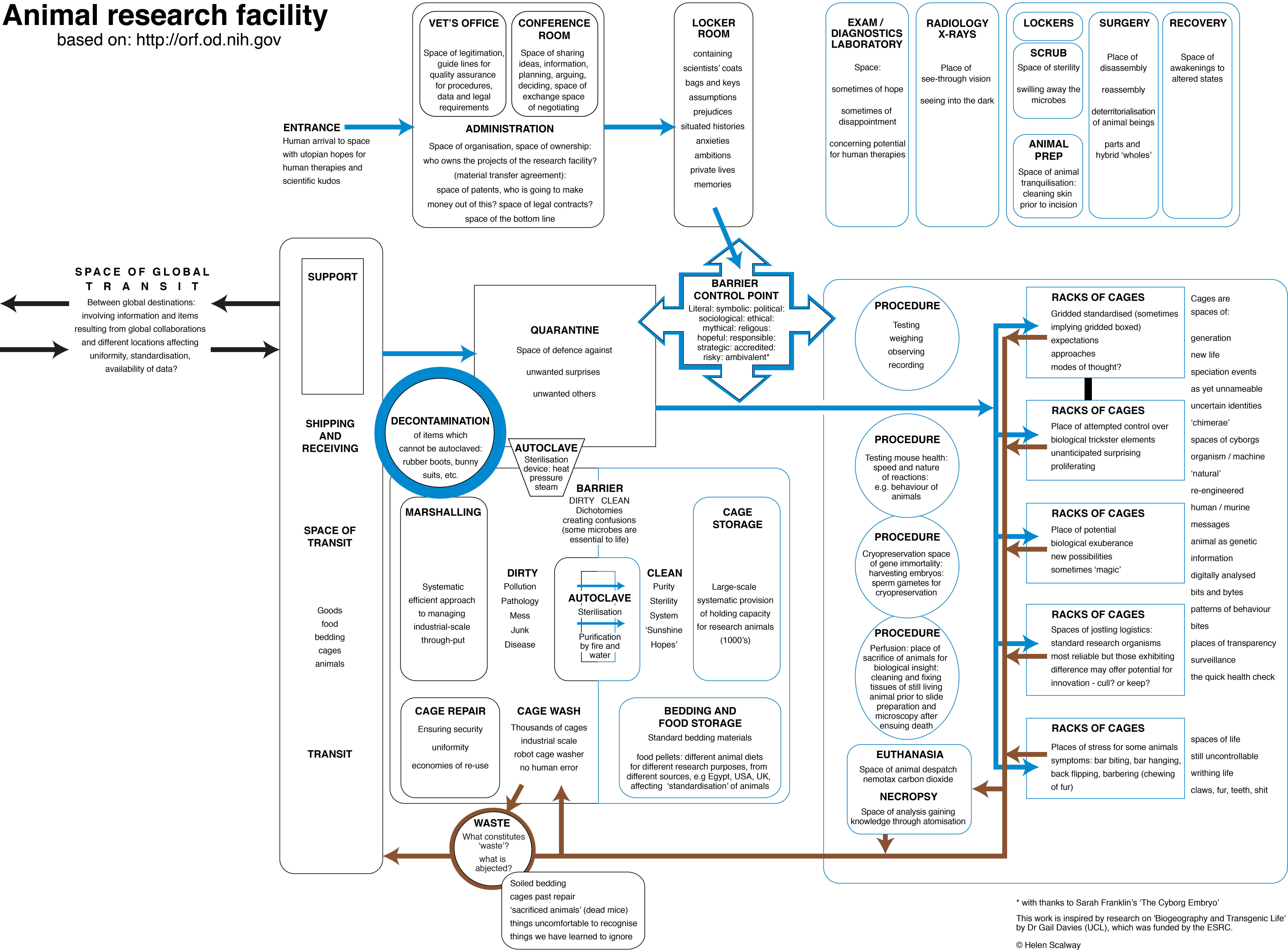
Gail: One reason the charts are so interesting to me is they’re clean in their look, they’re black and white and they’re a mix of flow diagrams, arrows, boxes, text and spaces, which have of them something of the qualities of an architectural diagram. Or their system. The one that I am looking at now is taken from a process diagram produced by the NIH, which is an idealized version of how laboratory spaces should be organized and flow of materials circulated to ensure a separation between the dirty and clean spaces in an animal research facility. What you have then done is added into these the other flows that animate these spaces, making the multiple and complex layering of materials and meanings values within these spaces legible. So, when you first look at them, you think ‘oh yes I know what I’m looking at here’. It seems familiar. But when you read into them, you find unexpected things. Instead of the apparent or idealized transparency of a scientific diagram, which you might aim for in science, you get a rendering of overlapping perspectives, material practices and amidst these social anxieties too.
Can I ask how your process changed in our case, when at least at first, you were working through my ethnographic writing and description, before you were able to visit some sites?
Helen: I recall that soon after we first met you sent me some of your writings. Amongst these was a set of extremely scrupulous and sensitive interviews with different kinds of scientists working in animal research labs, concerning, as I understood it, what their work meant to them. These interviews, with their different perspectives, suggested a kind of Babel. But the very fact that the interviews were like a Babel, and that this was exactly what you were grappling with, was what appealed to me, whose interest as an artist has often been in the conveying of multiple perspectives. I was intrigued. How on earth could there be a visual map of a work place when all these people understood their work in that place so differently? How could one make sense when the sense was so multiple?
Then you sent me your paper on ‘mutant mice’ (Davies 2013a). I sat greedily over it – why? Well, for this reason. I was a student and teacher of literature before I embarked on art studies, and I have always been completely entranced by early nineteenth-century English literature with its implications for re-envisioning and for embodying understandings of world’s ‘becoming’. I have always thought Mary Shelley’s novel of that revolutionary time, Frankenstein, a profound work about responsibility, care, consequences. I was always teaching it and every time found more in it. Your engagement with contemporary ideas of the ‘monstrous’ in relation to the biologically unfamiliar context of lab animals, resonated at so many multiple points with my own imaginative understanding of the ‘monstrous’, that I was plunged willy-nilly head over heels into dialogue and drawing.
Subsequent exchanges between us served all the more to engage and intrigue. For me it has been the way thought and making are provoked in me by your writing, which
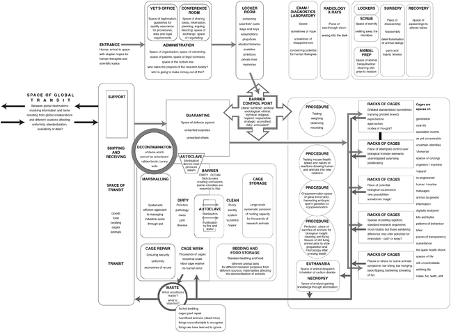
Figure 4.2.2 Animal research facility: re-diagramming relations (201 3). Copyright Helen Scalway. There is a zoomable version of this image available at www.micespace.org/ffcw.jpg
has kept the conversation glowing. I think in any co-working there has to be this kind of real interest in and by the work of the other, and enough stuffon both sides to feed it, for dialogue to deepen and become true collaboration.
Gail: I think our collaboration is also sustained by this mutual interest in the uneasy and shifting relations between words and diagrams and meanings.
Helen: In your interviews you present all these different kinds of scientists, some will tell their work as though it’s a matter of bio informatics, just completely at one with the idea of DNA as encodable information, bits, zeros and ones, while a vet or an animal handler or an animal technician, each have different ways of telling the story and it’s those slippages which the diagrams could be really interesting in helping to make clearer.
Gail: We’ve got the locker room from an animal research facility represented here, where researchers leave items they can’t take into the facility, prior to going through barrier controls. These may contain scientists’ coats, bags and keys; it is also the receptacle for assumptions, prejudices, situated histories, anxieties, ambitions, private lives, memories and so on. These are essential aspects that animate the space of the facility itself too; they are never fully contained here.
If you go back to the idea of the diagram being maps of relations, these are not necessarily between abstract forces here. There may be those present, but these are also deeply social, material, humanized and non-human spaces in which the incongruous entities that inhabit these spaces interact. Later, in the ‘non-human spaces’ we get the jostling together of bites and byte, as animal bodies are made into bodies of data. Following the process on, there are similar questions around disposal as there are in the sari shop – what is it that might get put out the back, thrown out, buried? Here are things that are sacrificed, wasted, past repair, ignored or uncomfortable. I have to say, these are not necessarily languages I would use. When you write with these as anthropological terms, you bring certain commitments centre stage. But they fit here, as diagramming is able to capture divergent dimensions, which are hard to keep in play in the right way in a written narrative.
Helen: Yes, I think the great thing that these diagrams do is that they make writing spatial. It would have taken perhaps 50 pages of prose or more to describe all that’s going on in this animal research station. What the diagram does is to let you see at least some of it in one place, on a screen or sheet of paper. It lets the eye wander around. You can go around it in a directed way but also you can scan around it in your own way, in your own time. The other thing that it does, I think, is it breaks the sequential flow which written verbal language always has, and that sequentiality really does structure thought in a particular way, but it can also be a very containing and controlling way. I would suggest that the reason these diagrams can allow thought to behave differently is that sequentiality is broken, allowing things to be seen simultaneously or in a different order, the components have been dispersed in a way which lets the viewer or reader pick them up and rearrange them in their own way. And it’s also quite surprising to see what goes side by side with what.
Gail: What these diagrams do as well, I think, is they allow you to say something very important about the role of the social, the biographical if you like, in these spaces, but without reducing science to the social. They’re actually deeply humanistic diagrams if you don’t mind me saying.
Helen: They’re meant to be . .. I have to say that these diagrams became even more social after a conversation with Kaushik (Sunder Rajan) who said to me that the nature of scientific collaboration might also be much complicated by the social: for example, there might be two people, scientific colleagues who might have started as friends but have since quarrelled and they’ve still got another two years of the collaboration to run, and that tension gets into what they still have to produce.
Gail: That’s something I have found difficult to write about in my work, because of commitments to preserving anonymity, the partiality of the knowledge that you always encounter, and the question of how to give recognition to the biographies, communities and socialities that matter without somehow reducing the scientific practices to a social explanation. You allow people to make their own connections between infrastructures and social processes, so they remain open in a way which is tricky to do in academic texts.
I wonder if I could ask you what your encounter with contemporary biomedical science practices has been like and how your work has changed in the shift from sari shops to scientific infrastructures?
Helen: I think the encounter that really struck me was at one of the facilities that I gained access to in the UK. I drove to it. You take a turn off a road which is discreetly marked, in such a way that the place is invisible from the main road. Having got through the initial security check from the car park, where the security men phoned ahead, I was then accompanied to a rather beautiful building with shallow, wide steps to a quite grand, simple, contemporary building, lots of glass and light. You go into this corporate entrance and it’s a really quite splendid atrium, glass and light and transparency.
It connected to another aspect of fashioning diaspora, working in the archives at the V&A (Victoria and Albert Museum, London),5 which had already sensitized me to the idea of how institutions produce ‘knowledge’, how important is the framing to what they are going to declare as ‘knowledge’, whether the framing is by a grand nineteenth-century ceramic staircase (as in the V&A) or a grand twentieth-century corporate atrium. Framing is utterly important and the value which is perceived in the knowledge, it relies on this grand context, this is one way in which things gain their authority.
At this facility, I was told that I certainly could not get within smelling distance of the mice which had been my big request. Instead I was taken to the press and education office and I was kindly treated but, certainly, we were not going to go anywhere near the mouse house. On the walls there were various lush decorative art works, the walls were high and white and light, there was a sense of corporate well-being, the library, the lecture theatre, the provision for refreshments, all of these things were very well appointed and I just had this feeling of having been on the receiving end of a presentation, perhaps a Utopian one.
With the lab diagrams, I think I’m conscious of wanting to put in all the things that might complicate what offers to be pure reason or to have the authority of ‘scientific knowledge’ or certainty or uniformity. The textile shop hadn’t got any uniformity, it was not about science, it was all to do with desire, the customers’ love of vivid orange or crimson with loads of silver and beads, so those issues were not there. But with the lab diagram, perhaps because I had been reading Bruno Latour (2005) I was really looking at the ways that these objectivities, so called, are really anything but. Here there are the break-out rooms and corridors and café spaces and the sports halls, squash courts and swimming pools and so on, the kinds of social spaces where love affairs might start or quarrels break out, where the collaborations and competitions and contests of the labs might be continued in other ways.
Gail: They are drawing our attention to interplay of hopes and desires, in personal biographies and the social imaginaries that animate science. They are also intimately connected to
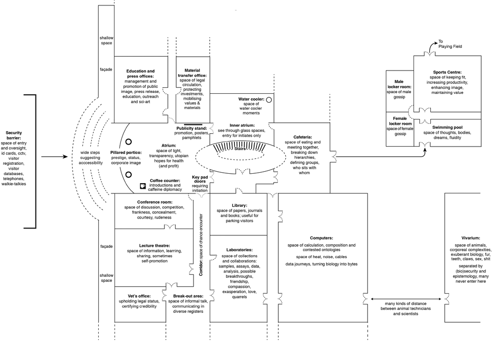
Figure 4.2.3 An international biology research facility (201 3). Copyright Helen Scalway. There is a zoornable version of this image available at www.micespace.org/Utopian.jpg
their wider geographical setting. I think that’s another comparison with the Victoria and Albert Museum. That institution acknowledges the fact it’s also a geographical project, about collecting, which has had to engage in a post-colonial shift. This is one reason artists are being brought in to work with them in new ways, to trouble this colonial narrative, or encourage us to think differently about it. However, the geography of science is, I think, both essential to, but often erased from these kinds of animal facilities and international infrastructures. Geography inflects the practices of science and scientists in important ways. A collaborative project may be underpinned by an idea of ‘universality’, but requires people in different countries to work together in ways defined through one place. These architectures also embody national and regional investments, whilst at the same time signalling openness and placeless-ness. Animals and biological materials are also often transformed through their circulations across space. Mice change from place to place, due to microbial factors or genetic drift. So, if you want to think about translating science from these ‘placeless’ places, you have to think about how translations are made; how do linguistic, organizational, social and material aspects of experiments connect; and what do these institutions have to do to manage shape patterns of biological potential and emergence. There is thus also a temporality to these diagrams.
Helen: I think there’s a great deal to be said on the question of translation, to pick out just one strand from several in what you have just said. It invariably involves transformation. One of the most fascinating pieces you wrote was on the Rosetta Stone where you were actually really querying that metaphor, of the Rosetta Stone, for translation in this context of bioscience (Davies 2012b). The Rosetta Stone metaphor suggests there is something which can be translated bit for bit into some exact equivalent, as though it didn’t change in translation and of course, it’s not like this. In terms of language, for example, people who are bilingual seem to be able to move between different sensibilities, for example the English and French languages embody completely different sensibilities, it’s almost like inhabiting two different worlds.
To some extent I’ve tried to address this, coming away from the architectural diagrams and using maps. There are a great many map artists and I think a lot of map art is not very interesting, but by bringing the atlas into play and working with the scalpel, cutting mouse outlines from maps say, of Japan, Singapore, North America, in the area where the Jackson lab is, Maine and the UK, Harwell and the Sanger labs, these
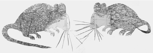
Figure 4.2.4 Map Mice (2012). Copyright Helen Scalway
different pages of the atlas, each speak. People will see the mouse outline, but they also read the different place names and feel the huge gust of other worlds. Whole other cultural hinterlands can be activated with the use of maps. I certainly wouldn’t claim originality in cutting up and rearranging maps, it’s just that cutting mice out of an atlas is a bizarre thing that this project has provoked me into. Mice are very interested in each other, so when you put these mice together and their whiskers touch, they seem to be sensing each other. Geographically what does that mean? That distance and that intimacy? The UK mouse is maybe starting something with a Singaporean or Chinese or American mouse, these are issues I’m trying to refer to with a very light touch, the images are meant to suggest that the mice bring a whole lot of other stuff with them, how they, as animals have been fed, how they have been handled, the history of their genetic inheritance, their lives in those facilities and in those different parts of the world, all of that becomes animated, I hope, through these map images. A bit ambitious, perhaps.
Gail: I think it does raise intriguing and critically important questions around what a model is. What does it mean to model human disease in a laboratory mouse? And what does it then mean to move the model from one lab to another, or towards clinical application? That’s another whole question we’ve engaged through your work, which is the way science often uses arrows in textbooks, policy guidance and papers, to indicate the steps to translational research as separate and sequential, and suggest materiality is not transformed through processes of translation.
Gail: When we look at the arrow, it’s something that’s given to us, which we don’t tend to think about very much. Diagrammatic arrows are embedded in our thinking and in our computers, and in the ways we write and do analysis. I guess I’m interested in how the grammatology or the semiotics of the arrow forms such a strong way of thinking in all of these biological and social scientific representations of translations, which as you’ve indicated, are just so much more messy than the arrow can ever indicate.
Helen: Latour (1998) seems to suggest that the way that scientific diagrams and illustrations come into being should be subject to as much scrutiny as is given to the process whereby old master art works have come into being. This is because scientific diagrams have all that mess and different trials and the passage of time elided so they can sometimes appear speciously clean and orderly and that gives them authority. But in fact, they are often embodiments of inflected narratives like other narratives, just as entangled in their place and time.
Gail: And the arrow has become such a dominant icon of what we might call ‘trans’ biology. But it leaves so much out and is suggestive of linearity, when so much of what we now know about translational research is that it is dynamic, nonlinear, sometimes about expanding fields (Davies 2012b), and often about embodied skills and interactions too.
Helen: I think that it’s debated, but the arrow seems to have started with the image of a pointing hand as we see on old street signs. There is one in Hampstead in London left over from the early twentieth, late nineteenth century, a wonderful image. There have been entire papers written on the iconography of the arrow as it appears in places like airports, but in those places it will certainly have had its genesis in the graphic design software in someone’s computer. Often for example it will be in PowerPoint or some such other digital program, where what we’re given is a selection, but the choice we are offered is
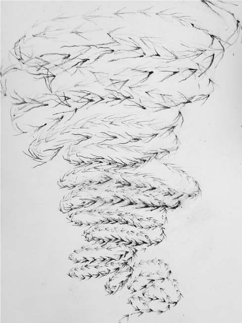
Figure 4.2.5 Swarm (2014). Copyright Helen Scalway
Gail: The arrow emerging from the hand, seems like the ultimate reduction. You move from something that was touched, that was embodied, that had a subject identified with it and suddenly it becomes abstracted and abstracted. You lose the touch, you lose the embodiment, you lose the sense that the gesture emerged from relations, it had an origin, a someone who was gesturing towards something for someone else. When you think of it this way, the arrow becomes this way of figuring a movement that’s not only about a direction, but always about a relation.
Until you started talking to me about them, I hadn’t begun to look at how often such devices were used, not only in visual representations but also in the way you write and think. Just to give you one anecdote, I had some proofs back for an article and the copy editor suggested changing one of the words that I’d used. I’d talked about the importance of ‘recognizing’ something quite challenging, which was the impossibility of living without some form of suffering. The phrase was taken from Haraway (2008). The extract is:
Recognising shared suffering is not simply to suggest symmetry between humans and animals, to raise the status of one versus the other in subsequent cost-benefit equations. It is more complicated than this, for both animals and humans are inserted into complex knots of relations, which recognise the impossibility of living without suffering.
Davies 2012a
To me this term ‘recognition’ was really important. It had layers in it about encountering, about valuing, about acknowledging. It also had at its core this encounter with the other. So for me the point was about recognizing the impossibility of living without being implicated in some form of suffering, whether in relation to animal experimentation or in recognizing our interdependencies, of my health being dependent upon the corporeal experience of other people in other places participating in food production, biomedical, experimental or clinical processes. So this word ‘recognition’ implied to me a relationship to the other, a process of knowing, and the two together, of recognizing the implications of this knowledge in the context of the other.
However, the copy editor didn’t like the repetition of the word ‘recognize’ and changed it to ‘highlighting’! And I suddenly thought ‘where does highlighting come from?’ It is a visual term. It’s the brightest part of a painting, or a device to highlight what already exists. It’s a felt tip pen or it’s the mark that you make on computer on a text. It suddenly seemed to remove everything I was trying to think about in terms of embodied relations and replaced it with an indication of emphasis. It was extraordinary. I got quite angry!
Helen: The encounter had gone. It’s the encounter with the other which had gone.
Gail: That same manoeuvre goes on when you look at an arrow. That’s lost the fact that it was a hand that had a relationship to a subject, or a potential relationship, to the other within it. So the arrow just becomes the way of highlighting either a sequence, we move from this to this. It’s lost the encounters within it. And I think what you’re doing in your work, by putting arrows alongside other sorts of intensities and depths and emotions, is you’re replacing that. And I guess it comes back to what I started out by saying, is that these are quite humanistic forms, in the sense that they return multiple forms of subjectivity back into a system that you’re trying to understand.
Helen: The graphic software arrows can produce distance which should not be there. Often, there might be much to be said for returning to the expressivities of hand drawing, where you can suggest that something is less certain, cloudier, more dissolving, more resolved in one part than another.
What you say about the hand is absolutely beautiful and it’s a thought that I hadn’t had; a very potent thought. In the light of your comment I think the use of a digital hand pointing as a cursor, a connection between human user and digital interface, could be seen as a disturbing misappropriation, almost a kind of theft. There are sites discussing the hand icon on digital interfaces as connection between user and digital content, and a lot of concern that these are usually white hands with all the implications that carries.7 But it also leads to something that’s a problem, something that’s unresolved for me which is that with icons like the arrow, we’re using some kind of code. The ‘clean’ software arrow too simply encodes complexities but if I make a more nuanced cloudy or multiple arrow or an arrow which is drawn, the problem then is how is it going to be read? How is it going to be understood?
If I hand-draw then I’ve got to make sure that I’m still making a communication, unless I want to be deliberately laconic or mysterious, which I don’t. In the hand drawing of code, looking to use the way of drawing a part of the code’s communication, I’m slipping between several forms of . .. well if you like epistemologies, modes of communication. Allied with this problem is another, I’m looking at a diagram right now and, it’s static. All over it is written and printed, things that are about the liveliness, the teeth and the claw and the furs and the hopes and the memories, etc., the place has obviously got a swarming life and yet the map itself looks very static.
The question of how you animate either a map or an arrow, make it richly communicative, give it whatever nuance is needed, is an unresolved one, probably unresolvable!
I’ve been returning to using materials, very much trusting the materials to try and create the idea of a living organism, as a sort of timeline. Like a river or a flow into which various things pour, but with the unpredictability of the sort of materials I use: inks, dyes, pigments, powders, muds, earths, gravels, sands. These of course get carried into the stream and they will have their odd inter-reactions which are unforeseeable and often quite exuberant.
Gail: That’s the tension we indicated at the start; it’s the tension that’s in people like Borges and the ultimate map being the map of all the territory that’s fundamentally useless because it has so much in it, that it is the world, not a useable representation of it. This is the same tension in science – you need to abstract, to reduce, to understand and to render things in a way that makes them manipulable and intelligible. But also you need to hold onto those parts that have the potential for new understandings, for something unexpected, for emergence to come through, otherwise if either one of those aren’t there, then you’ve either got a static system or you’ve got a totally excessive arrangement that’s not understandable. And it is the same challenge for the work of ethnographic analysis.
So in some ways what you’re doing is always moving between the two and I guess reminding us, at different points, that there are things that do have this potential for excess and maybe sometimes we’re focusing on the wrong ones of those and we need to go back and open up certain points. But it is not that everything should be open at every possible point.
Helen: At every point Gail, you yourself are stitching back and forth between different systems, holding together multiple ways, things which have to be held in view together when we’re looking at how something like biology travels. So at every point, yes I am querying the closedness. This visual work comes straight out of yours.
Some of my provocations about these diagrams and the word ‘diagram’, comes with this big history as well. I find that Bruno Latour uses diagrams and I get very . . . I think ‘Just don’t do this, put these back in the computer and shut the lid’. Why do those diagrams not help? I think it is because they are too reductive, they’re too simple, they are so flat and elliptical as to be incomprehensible. I would like to . . . point to, these impasses of communication . . .
Figure 4.2.6 Symbol and stuff (2014). Copyright Helen Scalway.
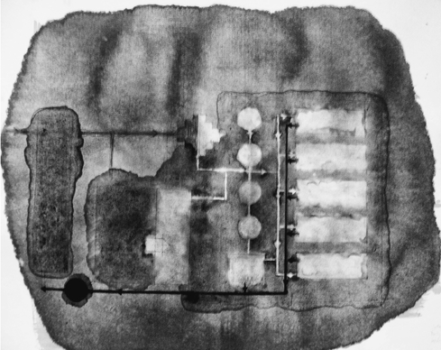
Figure 4.2.7 Lab Cleanliness: ink and bleach (2013). Copyright Helen Scalway
Gail: I’ve said this before but those diagrams from books like Laboratory Life and We Have Never Been Modern have been picked up quite widely in geography, and in some ways do produce generative outcomes, but then mostly they have travelled widely without their complexities. People using actor-network-theory started drawing these linear networked topologies in the same way as he renders the spaces of translation as simple networks of translation . . .
Helen: And they don’t change. Translation involves such changes.
Gail: And they don’t change and they lack all sorts of things that geographers talk about through a concern about flattened topologies. Latour (1999) himself then goes onto say ‘actually it should be actant rhizome theory’ but there’s little attempt to follow that through with a new visual vocabulary. And it is difficult. A lot of actor-network-theory gets stuck with these reductive visual imaginaries.
Helen: One of the things I’m interested to produce is a mapping or series of mappings that are rhizomatic and full of arrows doing different things, but this could be an undertaking.
Gail: But in many ways you are already doing this I think. Your experimental working with materials, pushing the qualities of materials like graphite powder or flows of inks to the point where they tip over into something else that’s potentially monstrous, and they begin to, if you like, point to the issues in holding onto openness and messiness in forms that are not just about narratives but about materiality too.
This is perhaps most evident where you have combined practices of diagramming with experiments with materials. I am thinking of the piece you did re-diagramming the animal research facility. This involved drawing with sepia ink and then to quote from your description of this piece ‘attempting with inevitable lack of success to wash out the designated “clean” areas of the floor plan with bleach. Sepia ink was used as it separates easily into its constituent pigments and reacts strongly with bleach in unforeseeable ways’. This was an extraordinary image for me, which must have emerged from some of my writing about the challenge of managing and understanding microbes in animal facilities. But I hadn’t or couldn’t have seen it in this way without your help.
Helen: I think we’re both very much involved with the incommensurability of different people’s meanings as they jostle in one space and that’s where I find your writing particularly evocative, in that one can see that live trapeze artist swinging from one ring to another, over gaps. But if you have to write 10,000 words which have a beginning, a middle and an end, it’s different from a diagram. The diagram is like a single freeze frame of a space at a particular moment, it hasn’t got a beginning, it hasn’t got an end but nonetheless the incommensurable meanings are there, written in, but it hasn’t got to have that linear structure of time.
These practices of diagramming do have a specific relation with aesthetics – a subversive one. They work ironically and self-consciously to exploit the visual rhetoric, the aesthetics of modernity, the pared down, the uniform and replicable – in that they riff off the idea of the industrial flow-chart, in their use of digitally generated clean lines, boxes, circles and arrows. I wanted the viewer of these documents to think at first glance, ‘I understand what this is, this is an image of some kind of familiar industrial space’ based on received visualizations of flow-chart thinking. But then gradually, as the viewer goes beyond the purely visual elements and begins to engage with the text on the documents, I hope that that familiarity breaks down, as the text works against those over-familiar elements and we realize that the closed boxes and circles are unable to contain all that is swarming out. One set of meanings essentially from an earlier time, with simpler understandings, cannot possibly contain, despite its offer to do so, the much more exuberant and complex meanings we are groping towards today. This image points to both the overflow of materials you mention, but also of these meanings.
1 This conversation was first recorded in 2012 prior to the joint presentation of work in the Knowledge/ Value Seminar series organized by Kaushik Sunder Rajan in Beijing in September 2012. It was reviewed and updated in 2017 for publication in this handbook. Further images from this collaboration are available via www.micespace.org/galleries/ (last accessed 2/5/2017).
2 Scalway, H. (2011). Concept note for Charting Place: Diagrams, charts and the visualisation of the making of places, ‘Landscape Surgery’ seminar at Royal Holloway University of London.
3 ‘The diagram . .. is the map of relations between forces, a map of destiny, or intensity, which proceeds by primarily non-localizable relations and at every moment passes through every point’ (Deleuze 1988: 36).
4 For more information on the Fashioning Diaspora project, see www.vam.ac.uk/content/articles/f/fashioning-diaspora-space/ (last accessed 2/5/2017).
5 For more information on Helen’s work in the V&A archives, see www.vam.ac.uk/blog/section/moving-patterns (last accessed 2/5/2017).
6 For more on Helen Scalway’s residency around visual experiments with arrows, see www.c4rd.org.uk/RESIDENCY_ARCHIVE/Pages/Helen_Scalway.html (last accessed 2/5/2017)
7 For more reflections on the iconography or arrows, see www.uxmatters.com/mt/archives/2009/10/the-ever-evolving-arrow-universal-control-symbol.php (last accessed 2/5/2017).
Breward, C., Crang, P. and Crill, R. (Eds.) (2014). British Asian Style: Fashion and Textiles/Past and Present. London: V and A Publishing.
Davies, G. (2012a). Caring for the multiple and the multitude: assembling animal welfare and enabling ethical critique. Environment and Planning D: Society and Space, 30(4): 623–638.
Davies, G. (2012b). What is a humanized mouse? Remaking the species and spaces of translational medicine. Body & Society, 18(3–4): 126–155.
Davies, G. (2013a). Mobilizing experimental life: spaces of becoming with mutant mice. Theory, Culture and Society, 30(7–8): 129–153.
Davies, G. (2013b). Writing biology with mutant mice: the monstrous potential of post genomic life. Geoforum, 48: 268–278.
Deleuze, G. (1988). Foucault (trans. S. Hand). Minneapolis: University of Minnesota Press.
Haraway, D. (2008). When Species Meet. Minneapolis: University of Minnesota Press.
Latour, B. (1998). How to be iconophilic in art, science and religion? In P. Galison and Caroline A. Jones (Eds.) Picturing Science, Producing Art (pp. 418–440). London and New York: Routledge.
Latour, B. (1999). On recalling ANT. The Sociological Review, 47(S1): 15–25.
Latour, B. (2005). Reassembling the Social: An Introduction to Actor-Network-Theory. Oxford University Press.
Sunder Rajan, K. (2006). Biocapital: The Constitution of Postgenomic Life. Durham, NC: Duke University Press.