Neural Data Analysis I
Encoding
Pascal Wallisch
The primary goal of this chapter is to introduce you to the fundamental methods of analyzing spike trains of single neurons used to characterize their encoding properties: raster plots, peri-event time histograms, and tuning curves. While there are prepackaged tools available for these methods, in this chapter you will program these tools yourself and use them to analyze behavioral data recorded from a motor area of a macaque monkey.
Keywords
neural encoding; raster plot; peri-event time histogram; tuning curve
17.1 Goals of this Chapter
The primary goal of this chapter is to introduce you to the fundamental methods of analyzing spike trains of single neurons used to characterize their encoding properties: raster plots, peri-event time histograms, and tuning curves. While there are prepackaged tools available for these methods, in this chapter you will program these tools yourself and use them to analyze behavioral data recorded from a motor area of a macaque monkey.
17.2 Background
In general, neuroscientists are interested in knowing what neurons are doing. More specifically, neuroscientists are often interested in neural encoding—how neurons represent stimuli from the outside world with changes in their firing properties. Let’s say you are studying a neuron from a visual area. You would first present a research participant with controlled visual stimuli with a number of known properties—orientation, luminance, contrast, etc. Using standard electrophysiological techniques, you then record the response of the neuron to each stimulus. You can repeat the presentation of a given stimulus and then see how similar (or different) the neuronal responses are. A raster plot is a simple method to visually examine the trial-by-trial variability of these responses. You can examine what features these responses have in common by averaging over all responses to create a peri-event time histogram. Finally, to capture how the average response of the neuron varies with some sensory feature, you can generate a tuning curve that maps the feature value onto the average response of the neuron.
17.3 Exercises
17.3.1 Raster Plot
Because action potentials are stereotyped events, the most important information they carry is in their timing, as opposed to their size or shape. A raster plot replaces each action potential with a tick mark that corresponds to the time where the raw voltage trace crosses some threshold.
Load the dataset for this chapter from the companion web site. Contained within that dataset is a variable spike, which contains the firing times (in seconds) of a single neuron for 47 trials of the same behavioral task. Here, you are examining a recording from a cell in the motor cortex, and the task involves moving the hand from the same starting position to the same ending position. For each trial, the spike times are centered so that the start of movement coincides with a timestamp of 0 seconds. Because the neuron did not fire the same number of times for each trial, the data are stored in a struct, which is a data structure that can bundle vectors (or matrices) of different lengths. To access the spike times for the first and second trials, type
If you look at the workspace, you can verify that the vectors t1 and t2 are not the same length. Now plot the first trial as a raster (remember, you don’t have to type the comments marked with "%"):
| figure | %Create a new figure |
| hold on | %Allow multiple plots on the same graph |
| for ii = 1:length(t1) | %Loop through each spike time |
| line([t1(ii) t1(ii)], [0 1]) | %Create a tick mark at x = t1(ii) with height of 1 |
| end | |
| ylim([0 5]) | %Reformat y-axis for legibility |
| xlabel(‘Time (sec)’); ylabel(‘Trial #’) |
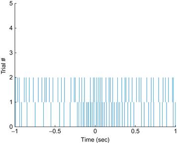
Even when you’re looking at one trial, it appears that the neuron fires sparsely at first but then ramps up its firing rate a few hundred milliseconds before the start of movement. Now plot the next trial:
Your results should look like those in Figure 17.1.
The relationship between the firing rate and start of movement is not nearly as clear in the second trial as in the first trial. However, in this chapter’s final project, you will want to visualize data from all trials at once. One way is to simply write a loop to plot the raster for each trial as above. Another way is to take advantage of a built-in MATLAB® function called histc. This simply computes a histogram, meaning it counts how many values in a vector fall in within a discrete set of intervals, or bins. If we select a small enough bin width (say 5 ms), it will be very unlikely that we will have more than one spike in a given bin, so we can convert our collection of spikes times into a matrix of zeros and ones, indicating whether or not a spike is present for a given trial in a given time range. We can then use the image plotting function imagesc (introduced in Chapter 16, “Convolution”) to plot that matrix. This is less precise than plotting each spike time as a line as before, but it serves for most purposes. Try the code below:
| raster=zeros(47,401); | %Initialize raster matrix |
| edges=[-1:.005:1]; | %Define bin edges |
| for jj=1:47 | %Loop over all trials |
| %Count # of spikes in each bin | |
| raster(jj,:)=histc(spike(jj).times,edges); | |
| end | |
| figure | %Create figure for plotting |
| imagesc(~raster ) | %‘~’ inverts 0s and 1s |
| colormap(‘gray’) | %Zero plotted as black, one as white |
17.3.2 Peri-Event Time Histogram
The raster shows us the trial to trial variability, but it would also be nice to see what the response of an “average trial” looks like. This average neural response is captured by the peri-event time histogram, which is abbreviated PETH. Peri-event means that all the trials are centered relative to some relevant event—in this case, the start of movement. If our data were from a sensory array, the relevant event would be whatever stimulus we presented. This is why a PETH is sometimes also referred to as a peri-stimulus time histogram, or PSTH. However, in a motor system, where neural firing precedes the event we measure, this term is a little awkward, so we will stick with the more general term — peri-event time histogram.
Time histogram means you divide the time period into a series of bins (0 to 100 ms, 100 to 200 ms, etc.) and count how many spikes fall in each bin for all trials. Luckily, we just saw that MATLAB has a function that makes this easy: histc. To look at all trials, you will initialize the PETH with zeros and then sequentially add each trial’s results. Try the following:
| edges = [-1:0.1:1]; | %Define the edges of the histogram |
| peth = zeros(21,1); | %Initialize the PETH with zeros |
| for jj=1:47 | %Loop over all trials |
| %Add current trial’s spike times | |
| peth = peth+histc(spike(jj).times,edges); | |
| end | |
| bar(edges,peth); | %Plot PETH as a bar graph |
| xlim([-1.1 1]) | %Set limits of X-axis |
| xlabel(‘Time (sec)’) | %Label x-axis |
| ylabel(‘# of spikes’) | %Label y-axis |
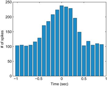
Your results should look like those in Figure 17.2.
Now the pattern in neuronal activity is clear: the firing rate begins to increase about half a second before movement start and returns to baseline by half a second after movement start. Of course, for the y-axis to indicate firing rate in spikes per second, you would need to divide each bin’s spike count by both the bin width and the number of trials.
17.3.3 Tuning Curves
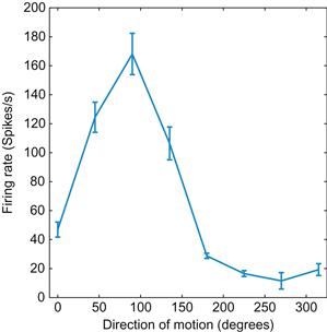
Many neurons respond preferentially to particular values of a stimulus. Typically, this activity gradually falls off from a maximum (corresponding to the preferred stimulus) along some stimulus dimension (e.g., orientation, direction). By plotting the stimulus dimension on the x-axis and the neural activity (typically a firing rate) on the y-axis, you can determine the preferred stimulus of a neuron. Figure 17.3 shows a tuning curve of a neuron from area MT, which is a part of the visual cortex that aids in the perception of motion. As you can tell, the neuron prefers upward motion (motion toward 90°).
17.3.4 Curve Fitting
Typically, tuning curves like this are fit to a function such as a Gaussian curve or a cosine function. Because all measurements made in the real world come with errors, it is usually impossible to describe empirical data with a perfect functional relationship. Instead, you fit data with a curve that represents a model of the proposed relationship. If this curve fits the data well, then you conclude that your model is a good one.
The simplest relationship you will typically look for is a linear one. Many neurons are thought to encode stimuli linearly. For example, ganglion cells in the limulus (horseshoe crab) increase their firing rate linearly with luminance of a visual stimulus (Hartline, 1940). You can simulate this relationship as follows:
| x = 1:20; | %Create a vector with 20 elements |
| y = x; | %Make y the same as x |
| z = randn(1,20); | %Create a vector of random numbers |
| y = y + z ; | %Add z to y, introducing random variation |
| plot(x,y, ‘.’ ) | %Plot the data as a scatter plot |
| xlabel(‘Luminance’) | |
| ylabel(‘Firing rate’) |
MATLAB contains prepackaged tools for fitting linear relationships. Just click on the figure, select Tools, and then select Basic Fitting. Check the boxes for Linear and Show equations, and you will see the line and equation that best fit your data. However, you might also like to be able to do this yourself. The command in MATLAB to fit data to a polynomial is polyfit. For example:
| p=polyfit(x,y,1) | %Fits data to a linear 1st degree polynomial |
The first value in p is the slope and the second value is the y-intercept. If you plot this fitted line, your result should be similar to Figure 17.4:
| hold on | %Allows 2 plots of the same graph |
| yFit = x*p(1)+p(2); | %Calculates fitted regression line |
| plot(x,yFit) | %Plots regression |
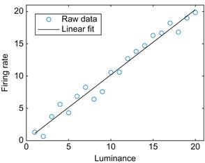
Figure 17.4 A linear fit of the relationship between the firing rate of a simulated ganglion cell and the luminance of the stimulus.
Because MATLAB has a number of curve-fitting functions, there are a number of ways to perform this regression. One function worth mentioning is the function regress, because this can perform multiple linear regression, where a dependent variable is a function of a matrix of multiple independent variables. For this example, we assume the firing rate is a function of the luminance plus some baseline firing rate. We simply need to bundle the luminance with a vector of ones (representing the baseline) before performing the regression. In the code below, note the use of the transpose function (using the apostrophe as a shortcut) to convert row vectors into column vectors.
| predictor=[x’ ones(20,1)]; | %Bundle predictor variables together into a matrix |
| p=regress(y’,predictor) | %Perform regression |
| yFit=predictor*p; | %Calculate fit values |
Now you will fit data to a more complicated function—a cosine. First, generate some new simulated data:
| x = 0 : 0.1 : 30; | %Create a vector from 0 to 10 in steps of 0.1 |
| y = cos (x); | %Take the cosine of x, put it into y |
| z = randn(1,301); | %Create random numbers, put it into 301 columns |
| y = y + z; | %Add the noise in z to y |
| figure | %Create a new figure |
| plot (x,y) | %Plot it |
MATLAB does not have a built-in function for fitting this to a cosine-tuning function, but it does have a nonlinear curve-fitting function: nlinfit. You will need to specify the details of the fit. Here, you will use a cosine function with the y-offset, amplitude, and phase as free parameters. You can define this function “inline,” which means it can be used by other functions in MATLAB in the same session or M-file.
Type this command to define a generic cosine function:
Here, p(1) represents the y-offset; p(2), the amplitude; and p(3), the phase. You can assume the frequency is 1. Now enter the following:
This function accepts angles theta and parameter vector p and transforms them using the relationship stored in mystring.
The first parameter of nlinfit is a vector of the x-values (the angle theta in radians). The second parameter is the observed y-values. The third parameter is the name of the function to fit, and the last parameter is a vector with initial guesses for the three free parameters of the cosine function. If the function doesn’t converge, use a different initial guess. The nlinfit function returns the optimal values of the free parameters (sorted in p) that fit the data with the cosine function, as determined by a least squares algorithm.
Instead of defining a function inline, you can also save a function in an M-file. In that case, you will need to include an @ (at) symbol before the function name, which will allow MATLAB to access the function as if it were defined inline:
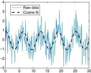
You can use the inline function to convert the optimized parameters into the fitted curve. After plotting this, your result should look similar to Figure 17.5.
| hold on | %Allows 2 plots of the same graph |
| yFit = myfun(p,x); | %Calculates fitted regression line |
| plot(x,yFit,‘k’) | %Plots regression |
We introduced the nlinfit function because it can be used to fit any arbitrary relationship you are interested in, whether it is linear or not. However, there are a couple of drawbacks to using to fitting a cosine-tuning function. The preferred direction isn’t necessarily restricted to a reasonable range (say, from −π to π). Worse, the value may be off by π if the amplitude is found to be negative. A solution is possible because the cosine-tuning function can be reformulated as linear regression of the sine and cosine of the movement direction (review your trigonometric identities to see why). So you can again use the multiple regression function regress to find the preferred direction:
| predictor=[ones(301,1) sin(x)’ cos(x)’]; | %Bundle predictor variables |
| p=regress(y’,predictor) | %Linear regression |
| yFit=predictor*p; | %Calculate fit values |
| theta=atan2(p(2),p(3)); | %Find preferred direction from fit weights |
17.4 Project
The data that you will use for your project were recorded from the primary motor cortex (abbreviated MI) of a macaque monkey (data courtesy of the Hatsopoulos laboratory). MI is so named because movements can be elicited by stimulating this area with a small amount of electricity. It has also been shown that MI has direct connections to the spinal cord. MI plays an important role in the control of voluntary movement (as opposed to reflexive movements). This doesn’t mean that MI directly controls movement, because other areas in the basal ganglia and the brainstem are important as well. Animals with a lesioned MI can still make voluntary movements, albeit less dexterously than before. However, it is clear that MI contains information about voluntary movement, usually a few hundred milliseconds before it actually happens. There is also a somatotopic map in MI, meaning that there are separate areas corresponding to face, arm, leg, or hand movements. These data are recorded from the arm area.
The behavioral data were collected using a manipulandum, which is an exoskeleton that fits over the arm and constrains movement to a 2D plane. Think of the manipulandum as a joystick controlled with the whole arm. The behavioral task was the center-out paradigm pioneered by Georgopoulos and colleagues (1982). The animal first holds the cursor over the center target for 500 ms. Then a peripheral target appears at one of eight locations arranged in circle around the center target. In this task there is an instructed delay, which means that after the peripheral target appears, the animal must wait 1000–1500 ms for a go cue. After the go cue, the animal moves to and holds on the peripheral target for 500 ms, and the trial is completed.
There are two interesting time windows here. Obviously, MI neurons should respond during a time window centered around the go cue, since this is when voluntary movement begins. However, MI neurons also respond during the instructed delay. This result is somewhat surprising because the animal is holding still during this time. The usual interpretation is that the animal is imagining or preparing for movement to the upcoming target. This means that MI is involved in planning as well as executing movement.
If you treat the direction to the peripheral target as the “stimulus,” you can arrange the neuronal responses in a tuning curve. These can be described with the same cosine curve used before, where the phase of the fitted cosine corresponds to the preferred direction of the neuron.
In this dataset, the neuronal spiking is stored in a struct called unit. Information for unit #1 is accessed with unit(1). Spike times are stored in unit(1).times. There are three more important variables: the instruction cue times are stored in instruction, the go cue times are stored in go, and the direction of peripheral target is stored in direction (1 corresponds to 0 degrees, 2 corresponds to 45 degrees, etc.).
In this project, you are asked to do the following:
1. Make raster plots and PETHs for all the neurons for both time periods: instruction cue to 1 second afterward, and 500 ms before the movement onset to 500 ms afterward. Which neurons are the most responsive? Print out a few examples. Do you think the PETHs are a good summary of the raster plots? How does the time course of the responses differ between the two time periods?
2. Create tuning curves and fit a cosine tuning curve to the firing rates of all neurons for each time period. Report the parameters of the fit for each neuron and save this information for later chapters. How good of a description do you think the cosine curve is? Do the tuning curves differ between the two time periods? If so, why do you think this is?
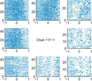
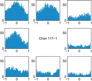
Figures 17.6 and 17.7 show examples of what your results might look like. The locations of the smaller plots correspond to the locations of their associated peripheral targets. Here, a timestamp of 0 corresponds to the start of movement. You can use the command subplot to subdivide the plotting area. For example, the command subplot(3,3,i) makes the ith square in a 3×3 grid the active plotting area.
