3.3 Market Supply: What the Market Sells
So far, we’ve focused on the supply decisions of an individual firm. Now it’s time to analyze market supply—the total quantity of an item supplied across all firms in the market. Just as your company’s individual supply curve illustrates the quantity that an individual business will supply at each price, the market supply curve plots the total quantity that the entire market—including all producers—will supply, at each price.
From Individual Supply to Market Supply
Just as we built market demand curves by adding up individual demand, we build market supply curves by adding up the individual supply curves of all potential suppliers.
Market supply is the sum of the quantity supplied by each seller.
For each price, the market supply curve illustrates the total quantity supplied by the market. This means that you’ll need to figure out the total quantity supplied when the price is $1, then $2, then $3, and so on. To find the total quantity supplied at a given price, simply add up the quantity supplied by each individual supplier.
There’s a shortcut you can use if all the suppliers are quite similar. For example, if there are 100 refineries making the same supply decisions as BP, then at any given price, the quantity supplied will be 100 times the quantity BP supplies. This relationship between individual and market supply is shown in Figure 5. Because the market supply curve is built from individual supply curves, the same factors that shape individual supply, such as rising marginal costs, also shape market supply.
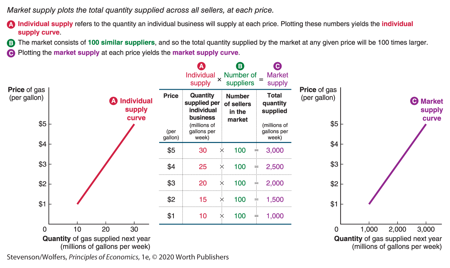
Figure 5 | The Market Supply Curve for Gasoline in the United States
How market analysts estimate supply curves.
Estimating market supply curves in the real world is somewhat more complicated, as suppliers are not typically identical to each other. As such, when you want to assess market supply, you’ll need to figure out how much each potential supplier will supply at any given price. For example, we already know that BP produces 20 million gallons of gas when the price of gas is $3, but how many other businesses are producing gas? And how much will they each supply when the price is $3? Just as you can get a sense of market demand from surveying a subset of potential buyers, you can estimate market supply by surveying a sample of businesses, asking how much they will each supply at any given price. A comprehensive survey can illustrate how different segments of the market will increase the quantity supplied as the price changes. The tricky part is that you have to survey not only those businesses that are currently supplying gas, but also those businesses that might enter the market when the price is high.
The Market Supply Curve Is Upward-Sloping
The market supply curve in Figure 5 shows that a higher price of gas leads to a higher total quantity of gas to be supplied, and hence the market supply curve is upward-sloping. Economists have found that in virtually every market the higher the price, the greater the quantity supplied. That is, the market supply curve obeys the law of supply.
There are two reasons that a higher price leads to a larger quantity supplied to the market:
Reason one: A higher price leads individual businesses to supply a larger quantity.
When the price of the good your business sells is higher, you’ll supply a larger quantity. Indeed, this is exactly what the individual supply curve shows. And because the market supply curve is built by adding up individual supply at each price, it inherits many of the characteristics of those individual supply curves, including their upward slope.
Reason two: A higher price means more businesses are supplying their goods and services; a lower price means fewer businesses are doing so.
There’s a second dynamic to consider: A higher price means that it’s more profitable to be a supplier in your industry. And that’s the sort of signal that leads existing firms to expand into your market, or new entrepreneurs to start new businesses. As a result, a higher price leads to more suppliers, leading to a larger quantity supplied.
On the flip side, a lower price means fewer businesses will be profitable, and thus fewer businesses will be willing to supply their goods and services. And that, in turn, helps explain why a lower price leads a smaller total quantity to be supplied.
As you evaluate market supply, make sure that your analysis accounts for both the choices that existing businesses make and also for whether new businesses will enter the market or existing businesses will exit.
Movements Along the Supply Curve
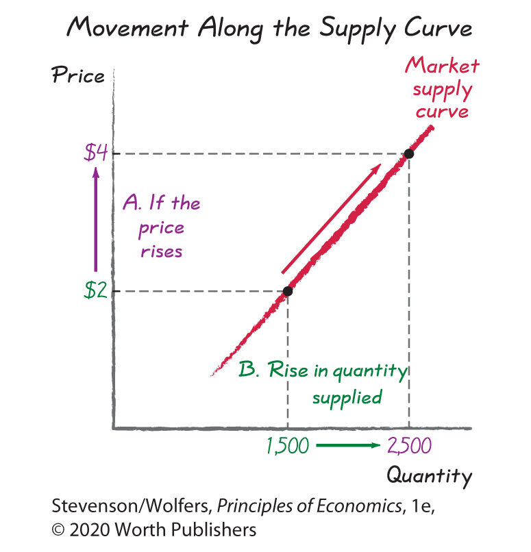
Managers find the market supply curve to be useful because it aggregates and summarizes the behavior of their competitors, showing the total quantity supplied across all sellers. To forecast the total quantity supplied in your market, simply locate the price on the vertical axis, then look across until you hit the supply curve, and finally look straight down to the quantity axis for your answer. The market supply curve shown on the right of Figure 5 shows that at $2 per gallon, the market supplies 1,500 million gallons of gas. To figure out what happens when the price rises to $4, find $4 on the vertical axis, look across to where it hits the market supply curve, and then look down at the horizontal axis to see that the new quantity of gas supplied is 2,500 million gallons. Just as the law of supply suggests, a higher price led to a rise in the quantity supplied from 1,500 million to 2,500 million gallons per week.
Notice that a price change led to a movement from one point on the market supply curve to another point along the same curve. That is, a price change causes movement from one point on a fixed supply curve to another point on the same curve. We use very specific terminology to keep this clear: A change in prices causes movement along the supply curve yielding a change in the quantity supplied. (This is just like demand, where a change in price causes movement along the demand curve yielding a change in the quantity demanded.) That insight covers the effects of price changes. Our next task is to evaluate how other changes will shift the supply curve.