13.1 Measuring Inequality
Many political debates boil down to disagreements about how much inequality and poverty there is, and what to do about it. In order to have an informed opinion, you’ll need to understand the facts. And so our next task is to survey the data. As we dig into the numbers, we’ll discover that there are many different ways to assess the extent of inequality and poverty each of which yields different insights. Our goal is to present an array of different measures, so that you can see the full picture and form your own judgments.
Income Inequality
Let’s go to the data to see how much income inequality there is in the United States and how it’s been changing. We’ll then take a look at inequality around the world.
Income is distributed unequally.
Let’s be clear what we mean by income—it’s the money you receive in a period of time, like a year. To analyze the distribution of income, we sort families from low to high income, and then divide them into five equal-sized groups, called quintiles. The left-most bar in Figure 1 shows that the average family income of the lowest-income quintile of families is $18,944 per year. Taking these folks together, the bottom fifth receives 3.8% of total income. At the other extreme, the right-most bar shows that the highest-income quintile has an average family income of $245,039. Taking all their income together, the highest-income quintile earns nearly half (48.8%) of all income in the United States.
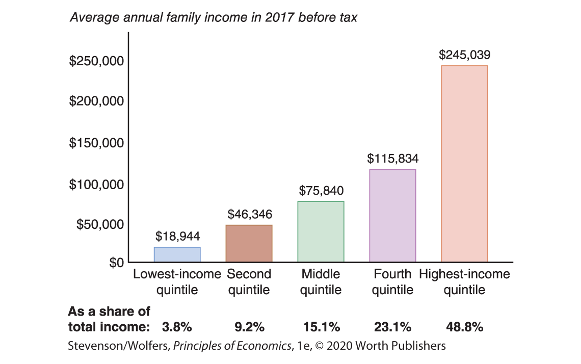
Figure 1 | The U.S. Income Distribution
Data from: U.S. Census Bureau.
Income inequality is rising.
Figure 2 shows how the income share of each quintile has changed since 1970. The largest shift is at the top: The highest-income quintile has increased their share of income from 40.9% in 1970, to 48.8% in 2017. The share of income accruing to each of the other quintiles has declined.
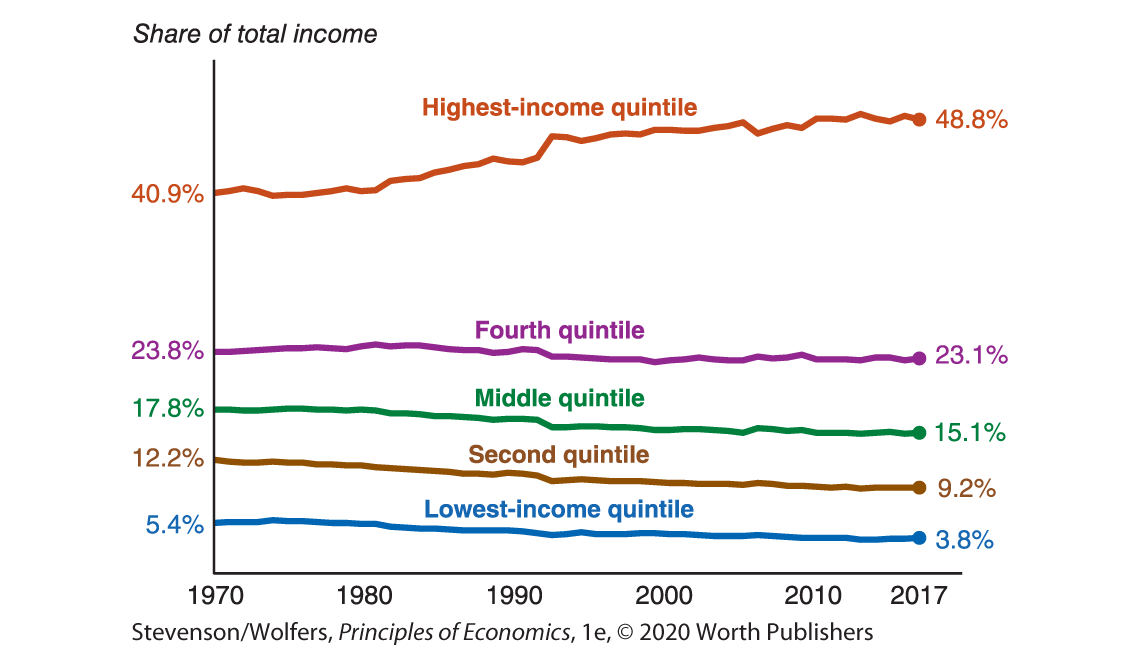
Figure 2 | Changes in the Distribution of Income Over Time
Data from: U.S. Census Bureau.
While the income share of the bottom quintile doesn’t look like it has changed much, don’t let the compressed scale fool you—their share has fallen by nearly a third, from 5.4%, to 3.8%. It’s important to realize, however, that this doesn’t mean that their income actually fell, because even though they’re getting smaller slices, the size of the pie grew. Incomes grew for many families over this period, but incomes grew fastest for those at the top of the income distribution, which means that their share of all income earned in the United States also grew.
The rich are getting richer.
While the rich are a small proportion of the population, they account for a remarkably large share of total income. The top 5% of families receive more than one-third of all income (38.1% to be exact). The richest 1% receive more than one-fifth, and the very richest 0.1% of families earn over one-tenth of all income.
Figure 3 broadens the historical lens and tracks the income shares of those at the top of the distribution over the last century. While current levels of inequality are high relative to historical norms, we saw similar levels of inequality in the 1920s. Inequality subsequently fell through the 1950s before starting its long recent rise in the 1980s.
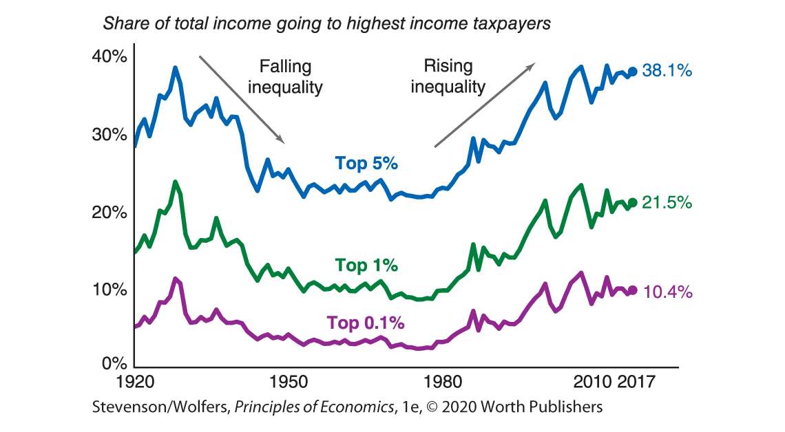
Figure 3 | A Rising Share of Income Is Going to the Top
Data from: World Inequality Database.
The United States is more unequal than most developed countries.
Let’s compare the income distribution in the United States with that in other developed nations. Each bar in Figure 4 runs from the income held by those at the 10th percentile—meaning that only 10% of people in the country have less income—to the income held by the 90th percentile—meaning that only 10% of the people in the country have more income than them. Among these countries, the gap between the two ends is largest for the United States. The United States stands out because its rich are richer than those in other countries.
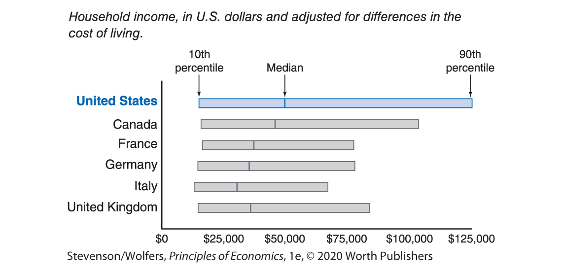
Figure 4 | International Comparisons of Income Inequality
Data from: Luxembourg Income Study, Wave IX (∼2013).
The distribution of income around the world is even more unequal.
So far we’ve focused on differences between high and low-income families within a country. But the differences between high- and low-income countries are much larger. As a result, the level of income inequality across the whole world is much larger than it is in any individual country. Figure 5 shows the global income distribution, plotting the share of the global population at each level of annual income. Be careful as you read this figure to note that the horizontal axis shows a ratio scale. Notice that much of the world’s population gets by on an annual income that’s less than $1,000 per year. Indeed, many earn an annual income of only a few hundred dollars, or just a dollar or two per day. This global context suggests that even the very poor in the United States are well off compared to the billions of people scraping to get by in India, China, and all the other countries in the developing world.

Figure 5 | The World Distribution of Income
2016 Data from: Branko Milanovic, Global Inequality: A New Approach for the Age of Globalization, 2018.
Alternative Measures of Inequality
So far we’ve examined inequality in annual income. But annual income is by no means the single best indicator of your living standards, your purchasing power, or your opportunities. Income varies from year to year for many people, and people differ in both the amount of their savings and their ability to earn more in the future. For instance, if you’re like most students you probably have little accumulated savings and a low current income. But five years from now, you’ll probably be earning a lot more than you are today. Today, as a student, you’re focusing on building your skill set precisely because you expect to earn more down the road. You might also be young, without a lot of work experience. Imagine meeting a 50-year-old who’s worked full time since they were 18. If they have the same annual earnings that you have this year, do you think that there is any inequality between the two of you? What if they earn nothing, but have an investment portfolio and savings worth $2 million?
There are no right answers to these questions—they simply represent different ways to think about inequality. Let’s explore them.
There is much more inequality of wealth than income.
Your total purchasing power and your economic resources may be better represented by your wealth than your income. Wealth refers to all the assets—including savings, cars, a home—that you currently have. Wealth is considered a stock, which is something that is measured at one specific time and represents the amount of assets you have at that time. In contrast, income is a flow, since the money flows in over time.
Wealth is much more unequally distributed than income. Figure 6 sorts all households in terms of their wealth. The bottom three quintiles combined hold only 2% of all wealth. At the opposite extreme, 90% of all wealth is held by the wealthiest quintile. And even within this wealthiest quintile, wealth is still extremely unequally distributed. In fact, the wealthiest 1% of all households—folks who have an average wealth of over $25 million—hold 40% of all wealth. Adding in the next group, the wealthiest 5% hold 67% of all wealth. All told, millionaires—the folks who make up the wealthiest tenth—hold about 79% of all wealth. This inequality partly reflects the fact that wealth accumulates and is passed from generation to generation.

Figure 6 | Distribution of Wealth
Data from: Survey of Consumer Finances, 2016.
Permanent income may be a better measure of living standards.
Economists believe that your living standards largely reflect your permanent income—which is your average lifetime income—rather than your income in a given year. There is less inequality in permanent income than in measured annual income because some of income inequality reflects temporary ups and downs that don’t reflect your long-run economic situation. There are also clear patterns as you age—people earn less when they are young and tend to earn more as they get older and more experienced. So some inequality reflects differences between younger and older people.
Because people can borrow and save, annual income is not as good a predictor of what you can afford to consume compared to your permanent income. For instance, as a college student it makes more sense for you to borrow money than it does for someone in their 50s with the same earnings as you because your highest-earning years are ahead of you. That means that you can consume more today by borrowing from your future, while still having higher future consumption. Similarly, you should always save when you are doing well financially because you’ll need your savings when things are not going as well. Savings help people smooth the income bumps in the road that we all face.
There is less inequality in spending than in income.
An alternative approach suggests that because your living standards are largely determined by the goods and services you actually buy and consume, inequality in living standards may be better measured by focusing on what people spend, rather than what they earn. In Figure 1 we saw that the top quintile of the population receives around 13 times as much income as the bottom quintile. But differences in spending are much less stark. The top quintile spends only around four times as much as the bottom quintile. You’re probably thinking that’s because the highest income families save more, and you’re right. But people whose incomes are temporarily high or low drive much of the measured inequality in income. Those with temporarily high incomes are saving because they know that their good times won’t last. Since these folks maintain more moderate spending habits, there is less consumption inequality.
Intergenerational mobility and inequality of opportunity.
Inequality in current and permanent income, consumption, and wealth are all examples of inequality in outcomes. How might we measure inequality of opportunity? Many people believe that regardless of whether you are born into a poor, middle, or upper class family, you should have the same opportunity to succeed. This suggests focusing on intergenerational mobility—the extent to which your economic circumstances are independent of those of your parents. Careful studies show that around half of the economic advantage or disadvantage enjoyed by your parents will be transmitted to you. For instance, if your father earns about 80% more than the typical dad, on average, kids like you will earn about 40% more than the typical child. Economic disadvantage is similarly transmitted from parents to children. So your parents matter, but your own hard work, your investments, and luck also matter.
You’ve probably heard the United States described as the “land of opportunity.” Yet despite this self-image, the United States has less intergenerational mobility than Australia, Canada, France, Germany, or Sweden, and is at a level roughly comparable with the United Kingdom. But even across the United States there are large differences in intergenerational mobility. Researchers have shown that the chances that a child raised in a low-income household makes it to the top quintile of the income distribution varies substantially across U.S. cities, even neighborhoods within cities. This research shows that the neighborhood that you grow up in can have a big impact on your outcomes as an adult. To find out about the intergenerational mobility of the neighborhood you grew up in, you can visit opportunityatlas.org.
Interpreting the DATA
Why do people disagree about the extent of inequality?
You now have a robust understanding about the degree of economic inequality in the United States. And this understanding is crucial to resolving some of our fiercest political debates.
The top bar in Figure 7 shows the actual distribution of wealth, while the next bar shows the results of a survey asking people what they think the distribution of wealth is. Comparing these bars, we learn that people don’t accurately perceive the extent of wealth inequality. They know that the rich have a large share of total wealth, but they underestimate just how lopsided that share is.

Figure 7 | Distribution of Wealth
Data from: “Building a Better America—One Wealth Quintile at a Time,” by Michael A. Norton and Dan Ariely, 2011.
The same survey also asked about what they think the ideal distribution would be, and this bottom bar suggests that people would prefer wealth to be more equally distributed. Taken together, we see that while some of the debate about inequality is driven by differences about what people want, some of it is driven by a lack of knowledge of the facts.

Recapping with a meta observation: How economists collect facts.
At this point, it should be clear that measuring inequality is no easy task and that’s why people can easily be misled if they hear only one statistic. In fact, if you want to persuade someone of your view, you’ll likely find that some statistics are better for your position than others. That’s why sometimes people cherry-pick their favorite statistics, which is why you can’t always trust what you read or hear.
Notice that you were able to get a useful understanding of inequality by following a recipe that economists often use when trying to learn more about a new area:
- You examined the current levels of inequality.
- You dug deeper to see who was more or less affected by inequality.
- You analyzed how inequality has changed over time.
- You compared inequality across countries.
- You reexamined the robustness of our conclusions to alternative ways of conceptualizing, defining, and measuring inequality.
This is a recipe that you’ll find tremendously helpful throughout your career. Simply replace the word “inequality” in these bullet points with wages, international trade, taxes, bicycle commuting, vegetarianism, or whatever issue you are trying to learn about, and you’ll quickly become an expert.