29.3 Analyzing Macroeconomic Data
The business cycle influences just about every aspect of your life. It’s something you’ll need to factor in when figuring out whether to spend big because you expect smooth economic sailing, or whether to tighten your belt so you can withstand a coming economic storm. It influences whether you’re likely to succeed in finding a better job or whether you need to worry about unemployment. It’ll shape whether it’s a good time to start a business, whether you’ll be able to find qualified workers, and whether your input costs are likely to rise.
And so our next task is to figure out how best to analyze macroeconomic data and learn how to read the top indicators that most economists follow. You can look the numbers up for yourself by getting familiar with the St. Louis Fed’s FRED database, which is available at: https://fred.stlouisfed.org/. We’ll then pull all these ideas together to give you a toolkit for tracking the economy.
The Basics of Macroeconomic Data
If you log onto the FRED database to look up the latest economic statistics, one of the first things you might notice is that there are a lot of choices. Real or nominal? Seasonally adjusted or not? Quarterly or annual? Let’s start with a guide to the most commonly used terms.
Seasonally adjusted data take out seasonal patterns.
For lots of data series you need to choose between “seasonally adjusted” and “not seasonally adjusted.” The reason some data are seasonally adjusted stems from a fact about economic life: There are strong seasonal patterns in some of the things that we do. For instance, Figure 14 shows that ice cream production spikes in the summer and plummets in the winter. It’s not just ice cream, though. Seasonal patterns are evident in many data series, such as teen employment, which spikes when school ends, and retail sales, which rise before the holidays. In each case, seasonally adjusted data remove these predictable seasonal influences. The reason to do this is so that you can spot the changes in the underlying trends. Figure 14 shows that ice cream sales have been pretty stable once you take out the seasonal pattern.
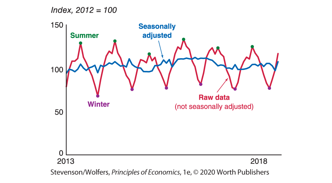
Figure 14 | Ice Cream Production
Data from: Federal Reserve Board.
If you’re trying to assess the underlying strength of the economy, you’re usually better off focusing on the seasonally adjusted numbers.
The frequency of different data series varies, but you can compare annualized rates.
Most data that you’ll want to follow won’t be collected annually—they will be weekly, monthly, or quarterly (every three months). But you’ll sometimes see an option to choose what’s called “annualized” data. These data are from a time period of less than a year converted into an annualized rate—that is, as if the same growth rate occurred throughout the year. This makes it easier to compare growth rates measured across different time periods.
You typically want to focus on real data.
You’ll also run into the words “real” and “nominal” quite a bit. As you learned in Chapter 24, real variables adjust for inflation so that you’re comparing quantities, holding prices constant. Nominal variables are expressed in the prices of the year of the data—so nominal GDP in 2010 reflects GDP measured in 2010 prices and nominal GDP in 2020 reflects GDP measured in 2020 prices. The problem with nominal data is that it’s hard to tell whether an increase reflects rising prices or rising quantities, which is why you’ll typically use real data, such as real GDP, to track the economy’s performance over time. Real data series will typically be described as being measured in something like “chained 2012 dollars.”
Pay attention to data revisions.
Some data are frequently revised, so when you look up data, realize that it might be different from the last time you looked at it. Updates to earlier estimates are called revisions, and they can be quite substantial because initial estimates can be based on incomplete data. For example, the final quarter of 2008 was one of the worst quarters in America’s economic history. But the initial GDP report issued at the end of January 2009 didn’t reflect this fact yet. It said that real GDP fell at a 3.8% annual rate. That’s bad, but not disastrous. But one month later, that figure was revised down to a 6.2% annualized decline. That’s disastrous. And today we know that GDP actually fell at an 8.2% annualized rate at the end of 2008. Let this be a reminder that just because you’ve seen the data doesn’t mean that you have seen the final word.
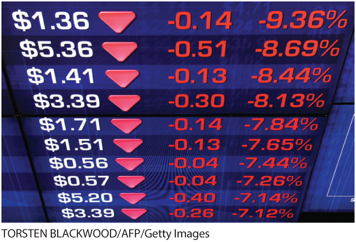
Top 10 Economic Indicators
Okay, now that you know something about how to analyze macroeconomic data, let’s take a look at some key macroeconomic indicators. I often get asked what’s the one indicator that I follow to know how the economy is doing. My response? You shouldn’t only look at one indicator if you really want to know what’s happening. That’s because different types of data tell you different things. Let’s take a look at the top 10 economic indicators those who track the economy follow.
Indicator one: Real GDP is the broadest measure of economic activity.
First, there’s real GDP, which measures the total size of the economy. Real GDP is the broadest measure of economic activity since it measures total production, total spending, and total income across the whole economy. It’s typically calculated by adding up all spending in the economy—you know, 
Indicator two: Real GDI provides a useful cross-check on GDP.
There’s another closely related measure of the economy’s total output. An alternative measure called Gross Domestic Income (or GDI, for short) is calculated by adding up total income. Because every dollar of spending is also a dollar of income for whomever received it, GDP and GDI should be equal. In practice, these measurements can differ because they’re each constructed using different data sources with different shortcomings. Early reports of the income data are often more reliable than the spending data, and so GDI often flashes warning signs for the economy sooner than GDP does. In fact, many countries combine income and expenditure measurements to create their primary GDP statistic. The United States doesn’t, so it’s worth tracking both measures.
Indicator three: Nonfarm payrolls tell you if the labor market is improving.

Is the labor market improving?
Nonfarm payrolls track how many jobs are created each month. It’s called “nonfarm payrolls” because it tracks the number of workers on businesses’ payrolls. Don’t worry about the fact it misses farm jobs because they’re only a small fraction of the economy. Nonfarm payrolls is one of the most important indicators because it’s released soon after the end of each month, and so it provides an early and quite reliable look at how quickly the economy is creating jobs.
Indicator four: The unemployment rate is an indicator of excess capacity.
The unemployment rate tells you the share of the labor force that wants a job and hasn’t been able to find one. It’s a snapshot of how strong the labor market is and how easy it is to find a job. It’s important both as an economic indicator—a measure of excess capacity—and also because unemployment is a major source of misery for many people.
Indicator five: Initial unemployment claims provide a timely indicator.
Initial unemployment claims tell you how many people lost their jobs and applied for unemployment insurance during the previous week. These numbers often bounce around a lot, but they’re valuable because they’re available quickly and offer timely insight into what was happening as recently as last week.
Indicator six: Business confidence tells you what managers are planning.

Business confidence tells you what managers are planning.
Business confidence surveys ask managers about their plans over the next few months or years. Business confidence is a leading indicator, and when it starts to fall, a recession might be on the horizon. The most closely watched data series is the Institute for Supply Management’s Purchasing Managers’ Index. It surveys business executives to find out if they’re planning to increase or decrease production, hiring, prices, and more. They are also asked whether the pace of change will slow down or quicken. Sadly, this is the only one of our top ten indicators that you can’t download from FRED.
Indicator seven: Consumer confidence tells you what consumers are thinking.
Consumer confidence surveys ask regular people how optimistic they are about the economy, which provides useful information about how much they’re likely to spend in coming months. The consumer confidence index rises when consumers become more upbeat about the economy, signalling that they’re likely to spend more, particularly on big-ticket items like cars or consumer durables. Like business confidence, consumer confidence is a leading indicator. There are a few surveys of consumer confidence, but one of the most frequently cited is the University of Michigan’s Consumer Sentiment Index.
Indicator eight: The rate of inflation tells you what’s happening with prices.

Inflation tells you about price changes.
Economists pay close attention to the consumer price index because it provides a sense of how much economy-wide prices are growing. For example, if businesses find that sales are booming so much that they’re hitting capacity constraints, they may raise their prices faster or more often than they usually do, boosting inflation. As such, rising inflation may indicate that the economy is producing above potential, while falling inflation suggests there remains unused resources.
Indicator nine: The employment cost index tells you what’s happening with wages.
The employment cost index tells you how fast wages and benefits are rising. Rising compensation is a sign of a healthy economy, and higher wages often translate into more spending. While there are other measures of wages, this is the only index that accounts for changes in the composition of the workforce. Importantly, it accounts for both wages and benefits, and so it measures the rise in labor costs experienced by businesses. Because higher costs often lead to higher prices, this index is a leading indicator of inflationary pressure.
Indicator 10: The stock market tells you about the future expected profits of businesses.
Traders bid up or down individual stocks based on their estimate of each business’ future profits. Through this process, stock prices come to reflect investors’ expectations about the future strength of corporate profits. A strong overall stock market suggests that traders are optimistic about the future of business profitability, and so it often signals a vote of confidence in the economy more generally. If the stock market is falling, there’s reason to be worried.
The S&P 500—the stock market index that tracks the value of 500 large publicly traded firms—provides a useful summary of the state of the stock market. Stock prices are often the first sign of either a strengthening or weakening economy, although it’s also been known to send false signals. It’s worth following, but don’t obsess over every blip. As one economist cheekily said, “The stock market has predicted nine out of the last five recessions.”
Interpreting the DATA
Why do financial markets sometimes rise after a good employment report, and other times fall?
Sometimes when new data come out showing strong jobs growth, stock prices fall in response. That sounds crazy, right? Aren’t strong job numbers good for the economy, and hence the stock market? Of course they are.
Sometimes stock prices fall after a good jobs report.
But the stock market is forward-looking, and today’s stock prices already incorporate investors’ expectations about the future path of the economy. Thus, what matters to investors is whether the latest numbers show the economy is strong or weak relative to their expectations. For instance, if stock prices already reflect expectations that the economy is growing very strongly, and the latest numbers show that it’s only growing somewhat strongly, then investors will be disappointed by this news. They’ll revise their expectations about economic conditions downward, leading the stock market to fall.
To predict how financial markets respond to new economic data, focus on the difference between outcomes and expectations.

Put the 10 indicators together in a dashboard.
Figure 15 puts the 10 indicators together to form a “dashboard” that will help you track the economy. It shows how the economy has evolved over the past 20 years. And if you want to see the latest numbers, the dashboard is online at: https://research.stlouisfed.org/dashboard/17183.
Figure 15 | A Dashboard for Tracking the Economy
Data from: Federal Reserve Bank of St. Louis.
Do the Economics
Head over to the St. Louis Fed’s FRED database and look up the latest numbers for our top 10 economic indicators, and use these to come to your own judgment about the current state of the economy. Let me help: In Figure 15, I’ve included the codes you’ll need to look up each indicator. In Figure 16, you can get a sense of a “typical” outcome by looking at the first column, which shows the median for each indicator over the past twenty years. The next column shows the range that the data points are typically in half the time (economists call this the interquartile range), so you can get a sense of which numbers are roughly normal. Numbers outside that range bear watching because they might suggest the economy is either particularly weak or strong.
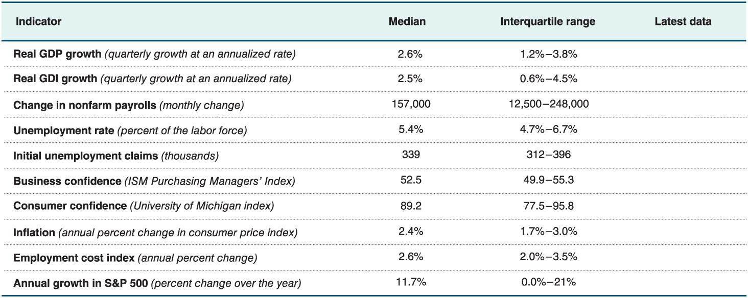
Figure 16 | Economic Indicators’ Typical Outcomes
Your task is to look up the latest data and fill in the final column. What’s your assessment? Is the economy doing well or poorly?

Tracking the Economy: An Economy Watcher’s Guide
Now that you know how to understand macroeconomic data and the main economic indicators to look out for, let’s put all of it together. Here are five tips for tracking the economy.
Tip one: Track many indicators.
I’ve given you a list of 10 top economic indicators for a reason: It’s best to track many economic indicators, not just one. Our measures of the economy are still imperfect, and the U.S. economy is large and complex, so it’s best to keep track of many different indicators to get a full view of the economy.
As you grow more sophisticated, you may want to add other data series to your dashboard, particularly given how fast new data is becoming available. We’re in the middle of a data revolution that could transform our understanding of the economy. Just about everything you buy is tracked by credit cards, supermarket scanners, and customer loyalty cards. Your feelings about the day are reflected in your Google searches and social media posts. And your weekly pay is tracked by your employer, their payroll company, and the tax authorities. This enormous stream of data—sometimes called “big data” (there’s a lot of it!)—is becoming an increasingly important source of new economic indicators. Already, economists are collecting data on online prices to help track inflation, data on credit card purchases to track spending, data on Google searches for “new car” to track auto sales, and data on tweets mentioning “lost my job” to track unemployment.
Tip two: Broad indicators beat narrow indicators.
Some indicators are a better reflection of the economy than others, and you should give greater weight to indicators that account for a greater share of the economy. For instance, we have lots of data about the industrial sector because it’s easy to measure what rolls off a factory production line. But only about a seventh of the economy is in the industrial sector, and so you might be learning about sector-specific factors rather than broader trends. For example, in 2015 and 2016, industrial production shrank even as the rest of the economy continued to grow. Focusing too much on the narrow measures of industrial production would have led you to underestimate the economy’s broader strength, as indicated in Figure 17.
Figure 17 | A Narrow Sector May Conceal Broader Trends
Data from: Bureau of Economic Analysis; Federal Reserve Board.
Tip three: Seek just-in-time data and distinguish between leading and lagging indicators.
Some indicators are published months and months after the fact, while others are published only a few days later. To stay up to date, it’s best to give more weight to indicators that are published quickly. For instance, you only have to wait four days to learn about the number of initial unemployment claims last week. Nonfarm payroll numbers also come out only a few weeks after they are collected. And the stock market incorporates information in real time. These are timely indicators, telling you about current trends.
In contrast, reliable GDP data are not released until nearly two months after the end of each quarter, which means that in late May you’re reading about how the economy performed from January through March. To keep on top of the latest trends, you’ll need to be more up to date than that!
But while you want to pay attention to just-in-time data, also remember that some indicators lead the business cycle, while others lag it.
Tip four: Find the signal amid the noise.
Macroeconomic data are often rough estimates based on incomplete samples. This means they contain a lot of noise, jumping up and down for reasons unrelated to the underlying trends. That noise makes it harder to discern the signal about where the economy is going.
Averaging over the past few data points can help you minimize the influence of this noise, allowing a clearer picture to emerge. The left side of Figure 18 shows that month-to-month changes in nonfarm payrolls bounce around a lot, but if you focus on the average over the last 12 months, the signal emerges from the noise. To calculate the 12-month moving average, simply add up every monthly data point from the past 12 months and then divide by 12.
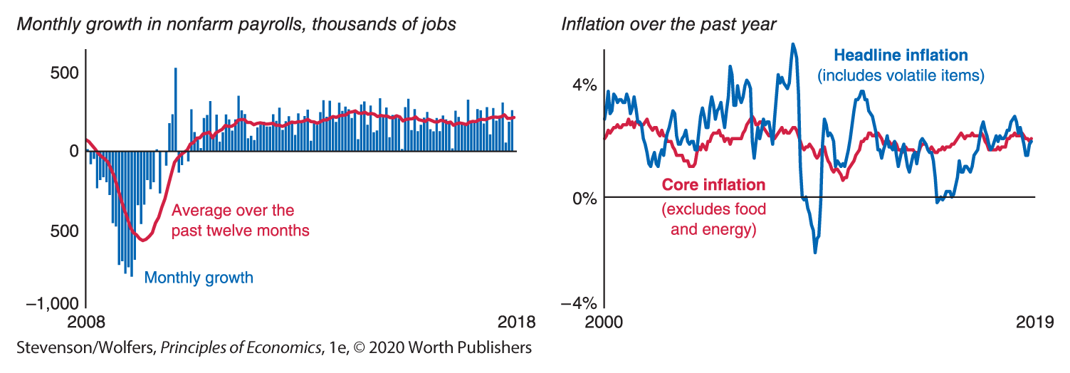
Figure 18 | Finding the Signal by Ignoring the Volatile Noise
Data from: Federal Reserve Bank of St. Louis; Bureau of Labor Statistics.
Another strategy for finding the signal in the noise is to look past volatile components of the data so the trend can shine through. For instance, food prices often rise and fall due to the weather, while oil prices reflect geopolitical developments in the Middle East. Neither gives a useful signal of the underlying inflation rate. The right side of Figure 18 shows core inflation, which excludes the influence of food and energy prices, along with a measure of inflation that includes those volatile components. The two measures follow the same long-run patterns, but in the short run core inflation is less volatile and hence is more predictive of long-run inflation trends.
Tip five: Adjust your outlook when data differ from expectations.
An indicator that suggests strong economic growth when you already expected strong economic growth shouldn’t change your outlook. What really matters is whether that indicator came in stronger or weaker than expected. When the data matches your expectations, there isn’t much news there. But if the data show that the economy is stronger or weaker than you expected, then that’s news, and you’ll need to adjust your outlook.
EVERYDAY Economics
How to better understand your favorite company, your GPA, and your health
These five tips aren’t just about how to better track the economy. They apply to tracking just about anything: the performance of your favorite company, your performance in college, and even your health. In each case, you’ll do better if you:
Track many indicators: An analyst tracking Apple follows its revenues, costs, prices, inputs, and so on. A good student tracks their study time, their performance on homework, and their grades on quizzes and exams. And if you want to track your health, you might track your sleep, your diet, and your exercise. Your doctor will also tend to follow a “dashboard” of data like your blood pressure, heart rate, and lab tests.
Look at broader indicators that are more representative of Apple’s performance, your learning, or your health. For example, while you might own a scale and therefore can easily track your weight, it’s not a very broad indicator of overall health. Your resting heart rate or blood pressure is a broader indicator.
Seek just-in-time data, and in particular, the latest news about your company, your academic performance, and your health. Pay particular attention to news that might be a leading indicator of change. Have there been leaks about the next iPhone? Are you keeping up with your class reading? Have you started eating more junk food?
Look through the noise: Don’t let an unusual result shape your views too much. Look beyond one particularly good earnings report, an in-class quiz that you took after not getting much sleep, or your latest cold to form a better understanding of the true state of your company, your GPA, and your health.
Adjust your outlook when outcomes differ from what you expect: When Apple’s sales are up 5%, whether it’s good news or bad news depends on what you were expecting. If you thought that the latest iPhone was going to lead to a 10% increase in sales, then the paltry 5% might be bad news. Similarly, if you go into an exam fully prepared and expecting to ace it, a B might be a negative surprise; that same grade might be good news for a student who was struggling. Finally, your doctor telling you that you have moderately high blood pressure is good news if you expected it to be very high, but it’s bad news if you expected it to be normal.