You’ve seen how easy it is to build simple graphs in stages, starting with plot(). Now you can begin to enhance those graphs, using the many options R provides.
The cex (for character expand) function allows you to expand or shrink characters within a graph, which can be very useful. You can use it as a named parameter in various graphing functions. For instance, you may wish to draw the text “abc” at some point, say (2.5,4), in your graph but with a larger font, in order to call attention to this particular text. You could do this by typing the following:
text(2.5,4,"abc",cex = 1.5)
This prints the same text as in our earlier example but with characters 1.5 times the normal size.
You may wish to have the ranges on the x- and y-axes of your plot be broader or narrower than the default. This is especially useful if you will be displaying several curves in the same graph.
You can adjust the axes by specifying the xlim and/or ylim parameters in your call to plot() or points(). For example, ylim=c(0,90000) specifies a range on the y-axis of 0 to 90,000.
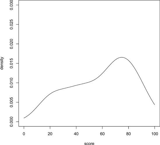
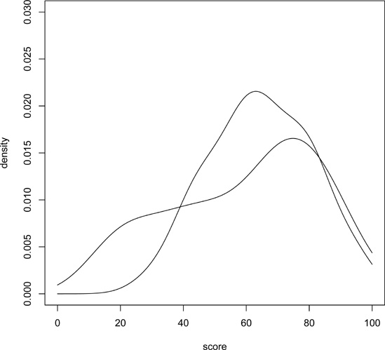
If you have several curves and do not specify xlim and/or ylim, you should draw the tallest curve first so there is room for all of them. Otherwise, R will fit the plot to the first one your draw and then cut off taller ones at the top! We took this approach earlier, when we plotted two density estimates on the same graph (Figure 12-3 and Figure 12-4). Instead, we could have first found the highest values of the two density estimates. For d1, we find the following:
> d1

Call:
    density.default(x = testscores$Exam1, from = 0, to = 100)

Data: testscores$Exam1 (39 obs.);    Bandwidth 'bw' = 6.967

       x             y
 Min.   :  0   Min.   :1.423e-07
 1st Qu.: 25   1st Qu.:1.629e-03
 Median : 50   Median :9.442e-03
 Mean   : 50   Mean   :9.844e-03
 3rd Qu.: 75   3rd Qu.:1.756e-02
 Max.   :100   Max.   :2.156e-02
So, the largest y-value is 0.022. For d2, it was only 0.017. That means we should have plenty of room if we set ylim at 0.03. Here is how we could draw the two plots on the same picture:
> plot(c(0, 100), c(0, 0.03), type = "n", xlab="score", ylab="density")
> lines(d2)
> lines(d1)
First we drew the bare-bones plot—just axes without innards, as shown in Figure 12-7. The first two arguments to plot() give xlim and ylim, so that the lower and upper limits on the Y axis will be 0 and 0.03. Calling lines() twice then fills in the graph, yielding Figure 12-8 and Figure 12-9. (Either of the two lines() calls could come first, as we’ve left enough room.)
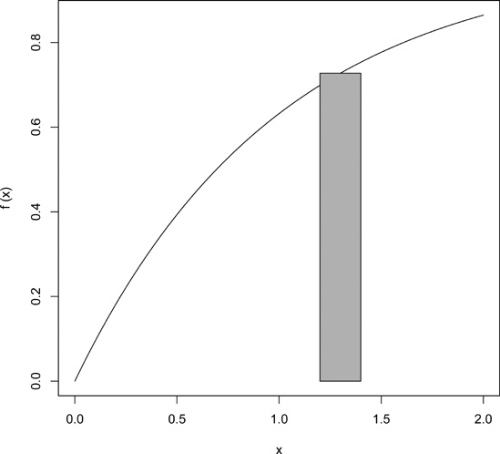
You can use polygon() to draw arbitrary polygonal objects. For example, the following code draws the graph of the function f(x) = 1 - e-x and then adds a rectangle that approximates the area under the curve from x = 1.2 to x = 1.4.
> f <- function(x) return(1-exp(-x))
> curve(f,0,2)
> polygon(c(1.2,1.4,1.4,1.2),c(0,0,f(1.3),f(1.3)),col="gray")
The result is shown in Figure 12-10.
In the call to polygon() here, the first argument is the set of x-coordinates for the rectangle, and the second argument specifies the y-coordinates. The third argument specifies that the rectangle in this case should be shaded in solid gray.
As another example, we could use the density argument to fill the rectangle with striping. This call specifies 10 lines per inch:
> polygon(c(1.2,1.4,1.4,1.2),c(0,0,f(1.3),f(1.3)),density=10)
Just plotting a cloud of points, connected or not, may give you nothing but an uninformative mess. In many cases, it is better to smooth out the data by fitting a nonparametric regression estimator such as lowess().
Let’s do that for our test score data. We’ll plot the scores of exam 2 against those of exam 1:
> plot(testscores)
> lines(lowess(testscores))
The result is shown in Figure 12-11.
A newer alternative to lowess() is loess(). The two functions are similar but have different defaults and other options. You need some advanced knowledge of statistics to appreciate the differences. Use whichever you find gives better smoothing.
Say you want to plot the function g(t) = (t2 + 1)0.5 for t between 0 and 5. You could use the following R code:
g <- function(t) { return (t^2+1)^0.5 }  # define g()
x <- seq(0,5,length=10000)  # x = [0.0004, 0.0008, 0.0012,..., 5]
y <- g(x)  # y = [g(0.0004), g(0.0008), g(0.0012), ..., g(5)]
plot(x,y,type="l")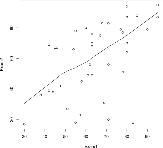
But you could avoid some work by using the curve() function, which basically uses the same method:
> curve((x^2+1)^0.5,0,5)
If you are adding this curve to an existing plot, use the add argument:
> curve((x^2+1)^0.5,0,5,add=T)
The optional argument n has the default value 101, meaning that the function will be evaluated at 101 equally spaced points in the specified range of x.
Use just enough points for visual smoothness. If you find 101 is not enough, experiment with higher values of n.
You can also use plot(), as follows:
> f <- function(x) return((x^2+1)^0.5)
> plot(f,0,5)  # the argument must be a function name
Here, the call plot() leads to calling plot.function(), the implementation of the generic plot() function for the function class.
Again, the approach is your choice; use whichever one you prefer.
After you use curve() to graph a function, you may want to “zoom in” on one portion of the curve. You could do this by simply calling curve() again on the same function but with a restricted x range. But suppose you wish to display the original plot and the close-up one in the same picture. Here, we will develop a function, which we’ll name inset(), to do this.
In order to avoid redoing the work that curve() did in plotting the original graph, we will modify its code slightly to save that work, via a return value. We can do this by taking advantage of the fact that you can easily inspect the code of R functions written in R (as opposed to the fundamental R functions written in C), as follows:
1    > curve
2    function (expr, from = NULL, to = NULL, n = 101, add = FALSE,
3        type = "l", ylab = NULL, log = NULL, xlim = NULL, ...)
4    {
5        sexpr <- substitute(expr)
6        if (is.name(sexpr)) {
7    # ...lots of lines omitted here...
8        x <- if (lg != "" && "x" %in% strsplit(lg, NULL)[[1]]) {
9            if (any(c(from, to) <= 0))
10                stop("'from' and 'to' must be > 0 with log=\"x\"")
11            exp(seq.int(log(from), log(to), length.out = n))
12        }
13        else seq.int(from, to, length.out = n)
14        y <- eval(expr, envir = list(x = x), enclos = parent.frame())
15        if (add)
16            lines(x, y, type = type, ...)
17        else plot(x, y, type = type, ylab = ylab, xlim = xlim, log = lg, ...)
18    }
The code forms vectors x and y, consisting of the x- and y-coordinates of the curve to be plotted, at n equally spaced points in the range of x. Since we’ll make use of those in inset(), let’s modify this code to return x and y. Here’s the modified version, which we’ve named crv():
1    > crv
2    function (expr, from = NULL, to = NULL, n = 101, add = FALSE,
3        type = "l", ylab = NULL, log = NULL, xlim = NULL, ...)
4    {
5        sexpr <- substitute(expr)
6        if (is.name(sexpr)) {
7    # ...lots of lines omitted here...
8        x <- if (lg != "" && "x" %in% strsplit(lg, NULL)[[1]]) {
9            if (any(c(from, to) <= 0))
10                stop("'from' and 'to' must be > 0 with log=\"x\"")
11            exp(seq.int(log(from), log(to), length.out = n))
12        }
13        else seq.int(from, to, length.out = n)
14        y <- eval(expr, envir = list(x = x), enclos = parent.frame())
15        if (add)
16            lines(x, y, type = type, ...)
17        else plot(x, y, type = type, ylab = ylab, xlim = xlim, log = lg, ...)
18        return(list(x=x,y=y))  # this is the only modification
19    }
Now we can get to our inset() function.
1    # savexy:  list consisting of x and y vectors returned by crv()
2    # x1,y1,x2,y2:  coordinates of rectangular region to be magnified
3    # x3,y3,x4,y4:  coordinates of inset region
4    inset <- function(savexy,x1,y1,x2,y2,x3,y3,x4,y4) {
5       rect(x1,y1,x2,y2)  # draw rectangle around region to be magnified
6       rect(x3,y3,x4,y4)  # draw rectangle around the inset
7       # get vectors of coordinates of previously plotted points
8       savex <- savexy$x
9       savey <- savexy$y
10       # get subscripts of xi our range to be magnified
11       n <- length(savex)
12       xvalsinrange <- which(savex >= x1 & savex <= x2)
13       yvalsforthosex <- savey[xvalsinrange]
14       # check that our first box contains the entire curve for that X range
15       if (any(yvalsforthosex < y1 | yvalsforthosex > y2)) {
16          print("Y value outside first box")
17          return()
18       }
19       # record some differences
20       x2mnsx1 <- x2 - x1
21       x4mnsx3 <- x4 - x3
22       y2mnsy1 <- y2 - y1
23       y4mnsy3 <- y4 - y3
24       # for the ith point in the original curve, the function plotpt() will
25       # calculate the position of this point in the inset curve
26       plotpt <- function(i) {
27          newx <- x3 + ((savex[i] - x1)/x2mnsx1) * x4mnsx3
28          newy <- y3 + ((savey[i] - y1)/y2mnsy1) * y4mnsy3
29          return(c(newx,newy))
30       }
31       newxy <- sapply(xvalsinrange,plotpt)
32       lines(newxy[1,],newxy[2,])
33    }
Let’s try it out.
xyout <- crv(exp(-x)*sin(1/(x-1.5)),0.1,4,n=5001)
inset(xyout,1.3,-0.3,1.47,0.3,  2.5,-0.3,4,-0.1)
The resulting plot looks like Figure 12-12.
