All for ourselves and nothing for other people, seems, in every age of the world, to have been the vile maxim of the masters of mankind. As soon, therefore, as they could find a method of consuming the whole value of their rents themselves, they had no disposition to share them with any other persons.
ADAM SMITH
The man of great wealth owes a peculiar obligation to the state because he derives special advantages from the mere existence of government.
THEODORE ROOSEVELT
As discussed in chapter 5, the lognormal distribution is the fairest income distribution that guarantees that all citizens in BhuVai are equally happy, at equilibrium, as they lead their lives the way they wish, while making a valuable contribution to society. No one in this utopia would want to trade his life for someone else’s, as he is already as happy as everyone else. A society where everyone is equally happy is the best that a society can deliver to its citizens. What more could one ask of a society? It has achieved its purpose. This is the utopia everyone would love to live in. This is the target society we should all strive for. We can’t do any better than this. So if a real-world society comes close to this utopia, it is doing very well for its citizens.
How close are the real-world societies to BhuVai? That is, how close are the real-world income distributions to the ideal lognormal one?
To answer this, we compare the prediction made by our theory with pretax income data, as reported by Piketty and his coworkers, for a dozen different countries. We then define a new measure of income inequality, ψ, which quantifies how fair a given country is with respect to sharing the total income pie among its citizens. Now ψ reveals which countries are closer to BhuVai and which are not. Since ψ identifies the target (i.e., fairest inequality) quantitatively, we could use it to rationally formulate and fine-tune tax and transfer policies that result in a more equitable society. We also compare our predictions for a two-class society with the results from agent-based simulations.
While our theory is developed for modeling pay distributions in large corporations, its predictions may be compared with countrywide pretax income (excluding capital gains) data as most of it is an aggregate of the pay of individuals. In essence, we are approximating an entire country as a large corporation functioning in a free-market environment. We compare our model’s predictions for the shares of the total income by three segments of the population (namely, bottom 90%, top 10% to 1%, and top 1%) with those observed in different countries as reported by Piketty and his colleagues in their World Top Incomes (WTI) Database (Alvaredo et al. 2015). Ideally, we should be comparing our predictions with wage income data. However, since we weren’t too confident about the reliability of what we found for a number of countries, we decided to use the pre-tax income data, excluding capital gains, from the WTI Database. Since this data includes dividend income (according to the information we received), the inequality effect might be somewhat more pronounced. However, since we are using the same basis across different time periods, and across different countries, our main conclusions regarding the key trends and outcomes remain the same.
While there are different statistical procedures and measures to use to test the closeness of any two distributions, we focus on the one that matters most—the amount of money in the income pie shared by different classes. We compare the income shares of the top 1%, top 10% to 1%, and the bottom 90% of the population in both cases, BhuVai versus the real world. This is, after all, what the income inequality debate is all about. Of course, we fully expect real-life free-market societies to deviate from ideality, but we are interested in understanding how big the deviations are and why.
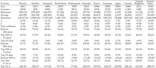
While the income distributions should be lognormal in different countries, if they were functioning as BhuVai, they may have different means and variances depending on the minimum, average, and maximum annual incomes in the different countries, which determine the μ and σ of the corresponding lognormal distributions. As an example, we show these parameters in table 6.1 for the different countries.
The minimum, average, and maximum income data are obtained from the WTI Database. For the maximum income, we chose to use the threshold income at 99.9%. At this cutoff, the area under the lognormal curve would correspond to 6σ. Strictly speaking, 6σ covers 99.73% of the population in general, but in our case it covers 99.865% as there is no one below the minimum-income threshold. So this is a very good approximation. Thus, we estimate σ by using the approximation


For the United Kingdom and Netherlands where the 99.9% threshold data are not available, we found that the data are well approximated by the average salary of the top 0.5%, by testing this heuristic for the other countries where the threshold is known. For Switzerland, Sweden, Norway, and Denmark, there is no minimum-wage requirement and hence those data are not available. For these countries, we consulted several country-specific sources to obtain guidelines about what the typical minimum wage–like compensation might be for entry-level positions in recent years (2010 to 2014). We then used historic data on annual increases for the average income of the bottom 90% of the population to deflate and back-calculate the minimum wage for the past years.
Once μ and σ are known, we can uniquely determine the corresponding lognormal distribution and compute the income shares of the bottom 90%, top 10% to 1%, and the top 1%. Since μ and σ typically vary from year to year (because of the changes1 in the minimum, average, and/or maximum income from year to year), the ideal distribution of income to the bottom 90%, top 10% to 1%, and the top 1%, as predicted by the model, also shifts from year to year, though not by much. As an example, these values are displayed in table 6.1 for the twelve countries, which are commonly used examples (Piketty and Saez 2003), for the years shown.
Now we know from empirical data that the free-market economies of the Scandinavian countries are generally fairer in the economic treatment of all their citizens, not just the wealthy ones. We also know that the United States does not do as well. We further know that other Western European countries such as France, Germany, and Switzerland are somewhere in between.
Can our theory predict these outcomes? That is, just by knowing only the minimum, average, and maximum incomes in a free-market society, can the model identify how fair these societies are?
To test the model along these lines, we define a new index of inequality that uses the ideal lognormal distribution (one that is appropriate for the country under consideration) as the reference. This new measure, which we call nonideal inequality coefficient ψ, is defined as
where ψ measures the level of nonideal inequality in the system. When ψ is zero, the system has the ideal level of inequality, the fairest income inequality found in BhuVai. When ψ is small, the level of inequality is almost ideally fair; when it is large, the inequality is more extreme and unfair. We computed the predicted income shares for the different countries for the period from ~1920 to ~2012, depending on the availability of the data in the WTI Database.
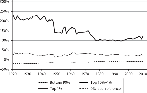
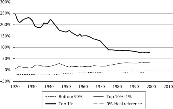
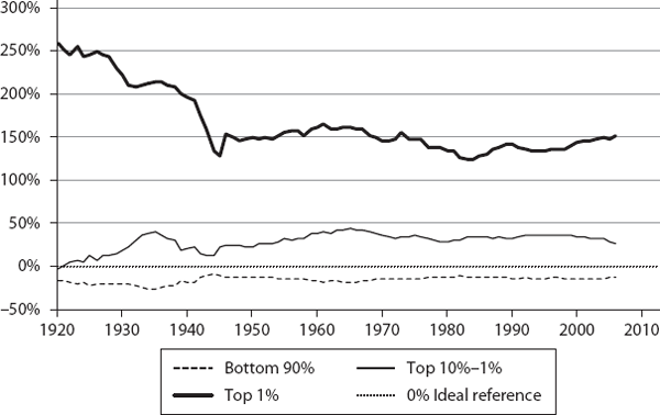
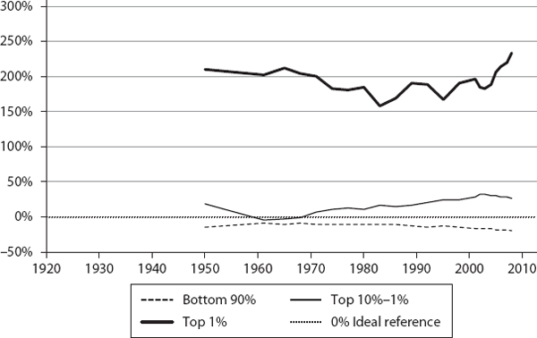
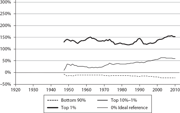
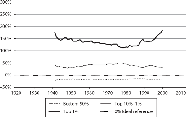
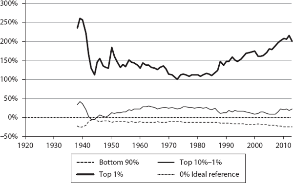
We then computed ψ for the three segments (bottom 90%, top 10% to 1%, and top 1%) for these countries, annually, for the corresponding time periods (sample values are shown in table 6.1). These are plotted in figures 6.1 through 6.12. If a country were functioning as an ideal free-market system, as defined by our theory, the corresponding ψ values for the three segments would all be exactly zero. This is the reference line which is shown as the 0% line (black dotted line) in the plots.
As we can see, the theory’s predictions are in general agreement with what is known about these countries regarding their inequalities. The twelve countries are shown, roughly, in the order of generally increasing inequality according to our model. Our objective here is not to rank them in a strict order but to show how different countries have deviated from ideality.
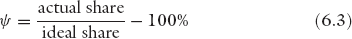
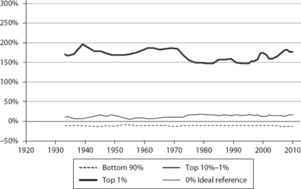
Let’s examine what these charts tell us. As we expected, none are ideal, but there are some pleasant surprises. Consider Norway as an example. Its bottom 90% and top 10% to 1% income shares have been remarkably close to the ideal BhuVai values over the last ∼20 years.
Its bottom 90% ψ has steadily improved, from a low of about −20% in 1929 to about −2% in 1993, and it has been ∼5% to 10% below the ideal value in the last ∼20 years. Similarly, its top 10% to 1% ψ has come down from a high of ∼40% in 1968 to ∼5% in 2011. In fact, during ∼1991 to 2011, it has been hugging the ideal line quite closely, sometimes a little bit above and sometimes a little below, typically within a narrow ±6% band.
As for the top 1%, ψ has steadily improved toward the ideal value over a period from ∼1929 (at ∼160%) to ∼52% in ∼1990. After spiking up in 2005, it came down to ∼104% in 2011. But clearly the top 1%’s share is much more nonideal than that of the bottom 99%.
We find similar close-to-ideality trends in Sweden, Denmark, and Switzerland, for the bottom 90% and top 10% to 1%. In these countries, typically, the bottom 90% ψ is within ∼10% of the ideal value; the top 10-1% ψ is within ∼15% to 25%.
All these countries, which practice hybrid free-market economies, are generally known to be fairer in their economic treatment of all their citizens. But how fair are they? We could not answer this question before, as there was no reference to compare with, but now we can as our theory provides such a benchmark—the lognormal distribution of BhuVai. We find it remarkable that the income sharing values these countries have achieved for the bottom 90% and top 10% to 1% are so close to the ideal distributions.
We find this to be a surprising result because we didn’t expect any real-world economic system to come this close to BhuVai, given the simplifying assumptions and approximations in our model regarding the hybrid utopia. For an overwhelming majority of the population (∼99%), these countries have achieved a near-ideal degree of fairness, presumably through an enlightened combination of individual, corporate, and societal values, and macroeconomic policies, all executed through the hybrid free-market mechanism.
Clearly, this did not happen quickly, and it took some time, as the trends show, but it is encouraging to find that through the mistakes made and lessons learned, societies can evolve and adapt to “discover” a near-ideal distribution, given a chance through the political process. In addition, what is even more remarkable is that these hybrid free-market economies did not know, a priori, what the ideal, theoretically fairest, distribution was, and yet they seem to have “discovered” and maintained a near-ideal outcome empirically on their own. While these agreements with the aggregate model predictions are encouraging, more thorough studies are needed, using detailed distribution data to validate these initial impressions and understand the comparisons more rigorously.
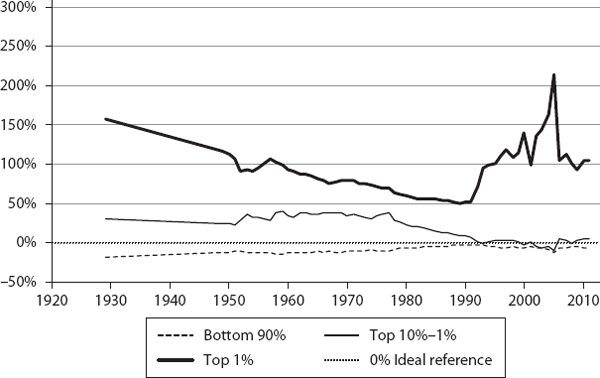
From the charts, it appears that the Netherlands, Australia, and France are broadly in the same general class of higher inequality compared to the first group. The next group comprises Germany, Japan, and Canada, and finally the United Kingdom and United States are about the same. It is curious, though, that Japan shows a much higher share for the 10% to 1%, compared with even the United States or United Kingdom. It will be interesting to understand why and how this happens in Japan. Again, our objective here is not to rank these countries in any strict order, but to show how different countries deviate from ideality.
Another interesting result is that from ∼1945 to 1975 the United States was only ∼12% below the ideal level for the bottom 90%. But, since then, it has lost a lot of ground ending at ∼24% below the ideal level in 2012. It is also interesting that the top 10% to 1% dropped from a high of ∼30% in 1963 to a low of 8% in 2007. While these two segments lost ground (strictly speaking, the top 10% to 1% is still doing well, enjoying more than its fair share of income), the top 1% went from a low of ∼100% in 1973 to a high of ∼215% in 2012.
This outcome is what Reich describes as predistribution (Reich 2015, xiv): “This has resulted in ever-larger upward predistribution inside the market, from the middle class and poor to a minority at the top. Because these predistributions occur inside the market, they have largely escaped notice.”
This predistribution, by the way, is not a trivial amount. Our theory helps us estimate the income share lost by the bottom 90%. For instance, in the United States, the bottom 90 percent’s fair share is ∼70%, but its actual share is ∼53%. We realize that real systems cannot approach the ideal value, but if we got back to where we were during 1945 to 1975, at ∼63%, it would add a considerable amount of income, an extra 19% (from 53% to 63%), to the bottom 90%.
Doing a quick back-of-the-envelope estimation, in 2010, we found the total wage income in the United States was ∼$8 trillion. The fair share for the bottom 90% is ∼$5.6 trillion. Instead it received ∼$4.2 trillion, a loss of ∼$1.4 trillion. If its share had been ∼63%, it would have received ∼$5.0 trillion, or, $0.8 trillion more—as though every American in the bottom 90% had gotten a 19% raise that year. Given that the top 1% saves ∼40%, the next 10% to 1% saves ∼12%, and the bottom 90% has near-zero savings, it is reasonable to estimate that ∼30% of $0.8 trillion would have been the extra consumption (due to the increase in aggregate demand from the expenditures of the bottom 90% over what would have been spent by the top 1% and the 10% to 1% segments) added to the economy. The United States GDP in 2010 was ∼$14 trillion. Assuming a multiplier of 1.5, the extra consumption could potentially have increased the GDP by ∼$0.36 trillion (or 0.3 × 0.8 × 1.5 = 0.36), about a 2.5% increase every year.
In an era when the economy is struggling to grow at 2% per year, an additional growth of about 2.5% is not a trivial amount. Thus, every year the United States has been potentially losing a growth of perhaps ∼2% for a decade or more because of reduced aggregate demand from the bottom 90%. Hence, as many economists have argued, besides the troubling unfairness issue, there are the lost opportunities from growth loss that we need to be concerned about. Conservatives tend to emphasize the need for higher economic growth, but have often missed the importance of more widely distributed growth. These estimates stress the potential negative impact of unfair income inequality on economic growth. Admittedly, these are very rough estimates, and one should perform more careful calculations, but it’s likely that we are losing at least 1-2% growth annually due to extreme income inequality.
Economists have known that the period from about 1945 to 1975 was when both the bottom and middle classes were doing well in the United States, but we see here how well they were doing in sharing the fruits of the country’s progress. While the country might have been more unjust in racial and gender inequalities in that period than now, it appears to have been closer to ideality in economic matters. Our theory, in particular ψ, could provide quantitative guidance for formulating tax and transfer policies, which can correct for these inequities in after-tax income, such that after-tax ψ is close to zero, thus restoring fairness in the society.
F. Scott Fitzgerald, the great American novelist who chronicled the lifestyle of the rich and famous in the Roaring Twenties in his magnum opus, The Great Gatsby, is reputed to have said, “The rich are different from you and me.” In reply, Ernest Hemingway, a literary giant himself, who won the Nobel Prize in Literature in 1954, is supposed to have quipped, “Yes, they have more money.”
Indeed! And our analysis shows how much more. We see that in all these countries, including Scandinavia, the top 1% have deviated from ideality the most. They are enjoying much more than their fair share according to our theory.
What if they are indeed different and better? If we accept that in real life the top 1% are indeed different from the rest of the population (i.e., we have a two-class society) because of their special talents and drive, then one could argue that they should get more as they contribute more.
But how much more?
We find that perhaps Scandinavia can help us answer this question. The Scandinavian countries, which have managed to approach a near-ideal distribution empirically for the bottom ∼99%, seem to allocate about ∼50% to 100% more than the ideal share for the top 1% (see figures 6.1 through 6.12) during their best periods of fairness. They have it almost right for a great majority of their population, the bottom 99%. So it stands to reason that what they have allocated for their top 1% is likely to be their fair share under the real-life nonideal conditions.
Sure, it is more than the ideal share allocated in BhuVai, but we don’t expect to see that in the real world anyway. The question is: How close can we get to it pragmatically? We believe the Scandinavian numbers are those practically feasible numbers for the top 1%. As we see from the figures, even the United States was in this range, during 1945 to 1975 although near the top end. These trends offer us a valuable practical insight that ∼50% to 100% above the one-class model’s ideal value is perhaps the target to strive for to restore a sense of fairness in practice for the top 1%. We can fix this at the beginning, i.e., where the income originates in corporations, or at the end, in after-tax and transfer policies, or a combination of both.
A common measure used to quantify inequality is the Gini coefficient, which ranges from 0 (when everyone gets the same income) to 1 (when all income goes to a single individual, considered to be the most unfair outcome). While the Gini index measures inequality, it does not measure the level of fairness (or unfairness) in inequality. As we have stated before, equality of income is not the fairest distribution, as different people contribute differently, whether in a corporation or a society. Therefore, while lower Gini coefficient values generally signal lower inequality, they don’t necessarily imply that they also signal the fairness of a society.
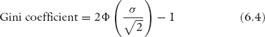
Since a lognormal distribution is the fairest outcome, for the sake of comparison, we computed its Gini coefficient, which would make it the ideal value that a country should achieve, for the 12 countries (see figures 6.13a and b). The Gini coefficient for a lognormal distribution is given by:
where σ is the lognormal standard deviation and Φ is the cumulative density function for the standard normal distribution.
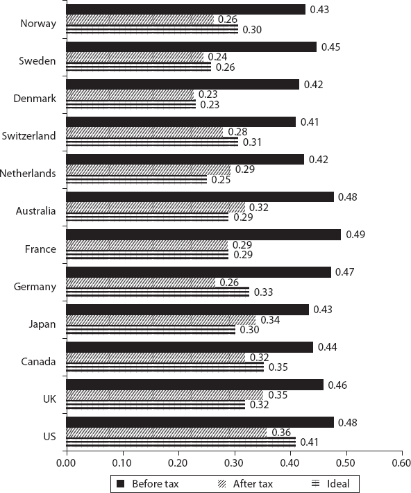
The empirical values are obtained from the Organisation for Economic Co-operation and Development (OECD) and the Luxembourg Income Studies (LIS) database and sources (OECD 2015; LIS Database 2015). They correspond to two different time frames (the exact years are not provided in the sources we used), and they show before and after taxes and transfers. As we have seen in figures 6.1 through 6.12, the general trend of Scandinavian countries closely approaching the ideal distribution is found here as well. Their actual coefficients (after taxes and transfers) are very close to the ideal values, and in some cases they appear to have even overcompensated and dropped below them, according to one set of data (e.g., Norway, 0.26 versus 0.30; Sweden, 0.24 versus 0.26; Switzerland, 0.28 versus 0.31) but not according to the other set (e.g., Norway, 0.37 versus 0.30; Sweden, 0.33 versus 0.26, Switzerland, 0.31 versus 0.31). This is even the case for the United States (0.36 versus 0.40), which is not equitable, as we see in figures 6.1 through 6.12. Switzerland seems to have overcompensated for fairness according to both data sets. Given our reservations about the Gini coefficient as a measure of equity and fairness, we don’t take these discrepancies too seriously and we show the comparison only for the sake of completeness.

Despite our reservations about the Gini coefficient, there is one valuable lesson to be drawn here. The before- and after-tax and transfer values in the Gini coefficients show how macroeconomic policies can be used to achieve greater fairness, a level that approaches ideality, in practice. In that regard, it would be valuable to compare the posttax and transfer income distributions for the three segments with the model predictions (as we did in figures 6.1 through 6.12 for the pretax income). Since we now know what the target (i.e., fairest) distributions are, we could rationally design and fine-tune tax and transfer policies that result in the desired, near-ideal, after-tax income distribution for a given society.
For example, in the United States, the ideal income share of the top 1% is 5.8% whereas the actual share is 17.5%. Based on this information, we can design tax rates and income thresholds in such a way that the after-tax income share of the top 1% is closer to ideality (i.e., after-tax ψ1 is closer to zero), thus improving fairness in the society. Similarly for other levels, one can do this for every percentile of the population, all the way down to the bottom. Our theory provides the moral justification for taxation, based on the foundational principle of equality of all citizens and their fair treatment. We, of course, realize that this kind of approach is perhaps more likely to be adopted in Scandinavia, and in other European countries, first before it gets any chance in the United States, given its political climate.
We could also develop similar guidelines for deciding executive compensation in corporations. For instance, in November 2013, Swiss voters considered and rejected a referendum (Garofalo 2013) that would have capped the CEO pay ratio at 1:12. The number 12 was decided rather arbitrarily; it was felt that the CEO couldn’t make more in one month than what the lowest employee makes in one year. Using our framework, we can examine this more rationally to develop guidelines based on the fundamental principles of economic fairness rather than on arbitrary limits (we discuss this in chapter 7).
Depending on the aggregate data available, one can compute ψ for other segments, such as deciles and quintiles. We can then compute an overall composite coefficient Ψ, e.g., by calculating
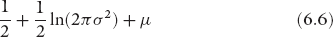
where w may be equally weighted, population-weighted, or income-weighted. We have not done this because it is not clear, a priori, what weights would reflect the overall level of fairness (or unfairness) correctly. Careful studies are needed before any recommendation can be made along these lines. Another property of the lognormal distribution that can be used for comparison is, of course, entropy itself, which is given by
One can then calculate ψen = actual entropy/ideal entropy − 100%. We can also develop a similar coefficient by using the Theil index instead of entropy, because they are, of course, closely related. Again, careful further studies are needed to identify the most useful nonideal inequality coefficient. However, it is clear that we need an appropriate reference to compute that, and it is our proposal that we use the lognormal distribution as that ideal basis.
To test our theory’s predictions regarding multiclass societies, we ran an agent-based simulation comprising 1 million agents in two classes, at 100 salary levels, with a minimum pay of $20,000 (using a minimum wage of $10 per hour and 2000 hours per year) and a maximum pay of $3,000,000. We chose a two-class society because empirical income data from different countries seem to suggest that the bottom 95% to 97% of a population follows a lognormal distribution, while the top 3% to 5% follows a power law or Pareto distribution (Champernowne and Cowell 1998; Chatterjee et al. 2005; Chakrabarti et al. 2013). So we explored the typical case of 95% of the population in class 1 and 5% in class 2. The respective α, β, and γ values for the two classes are shown in table 6.2. The dynamics unfolds by each agent trying to maximize its utility given by equation (3.6) by switching from its current job to a better one, and the equilibrium (stationary) distribution emerges over time, as shown in figure 6.14.
| j |
αj |
βj |
γj |
| 1 |
93.4 |
3.87 |
2.17 |
| 2 |
95.8 |
3.67 |
4.34 |
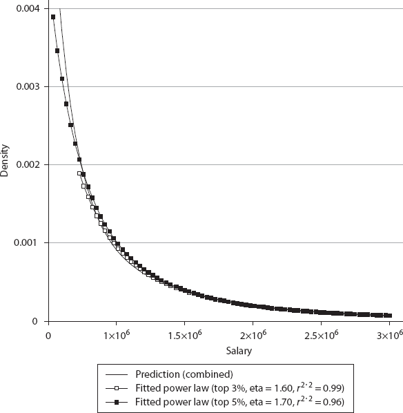
In figure 6.14, the gray (class 1) and black (class 2) histogram bars are data from the simulation, and the lines are predictions by the model. As the results show, the two populations are sufficiently separated; hence the individual lognormal distributions predicted by the model [equation (5.50)] fit the data very well. For the population shown in black (class 2), its higher α makes it value the utility from salary more, its lower β motivates it to put in greater effort, and its higher γ makes the utility from future prospects more important, compared to the class 1 agents. As a result, class 2 agents are averse to jobs with lower pay. It is the opposite for the agents from class 1. Hence they separate, almost like phase separation in physicochemical systems, or the separation of oil and water in a mixture. We observe that the combined distribution (solid black line), as one might expect, fits the lognormal distribution for the gray population (class 1) quite well in the lower and medium salary ranges, but deviates from it for higher salaries.
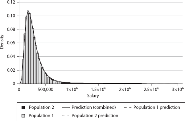
We also show that the distribution of the higher salaries (largely occupied by the black population agents) can be fitted to an inverse power law, given as
1. Top 3% fitted: η = 1.60, r2 = 0.99
2. Top 5% fitted: η = 1.70, r2 = 0.96
We see that the inverse power law fit is very good for both the top 3% and to 5%. The Pareto exponents from our simulation data agree well with empirical data reported in the literature—between 1 and 2, but typically around 1.5 for the top 3% (Chakrabarti et al. 2013). Thus, the main lesson here is that while the overall distribution is a combination of two lognormal distributions, it can be quite easily misidentified as a lognormal for the majority and an inverse power law or Pareto distribution for the minority at the top end of the salaries. This again confirms similar warnings by (Perline 2005) and (Mitzenmacher 2004). For actual salary distributions reported in the literature (Chakrabarti et al. 2013), the available data are not good enough to sort this out clearly, and further studies are needed.
Our two-class approach can be generalized for a Π-class game along the lines we described above. However, as noted, we might need only three classes, at most four, to model empirical data effectively. At any rate, at present the empirical data reported in the literature are not good enough to test three-class or four-class models. The best it seems to be able to do is to identify the need for a two-class model, but even there it appears unable to discriminate between a lognormal distribution and a power law fit for the top 3% to 5% as shown in figure 6.15.
An interesting question is, Why does the two-class split in actual data occur at about 95% to 97% of the population? Why not at 80%, for instance? In our theory, this is related to the fraction of the population that is highly motivated, talented, and driven to individual accomplishments and success (i.e., class 2). It would be nice if we had demographic data that directly showed where this two-class split occurs in the real world, but we don’t.
To summarize, we compared the predictions made by our theory with empirical data on pretax income (excluding capital gains) distributions from different countries. We defined a new measure of income inequality ψ, which quantifies how fair the inequality is in real-world societies.
So how close are the real-world societies to BhuVai? As we expected, none are ideal, but there are some pleasant surprises. In Scandinavia, the income shares of the bottom 90% and top 10% to 1% are remarkably close to the ideal BhuVai values over the last ~20 years. This is surprising because we didn’t expect any real-world society to come this close to BhuVai, given the restrictive assumptions and approximations in the ideal model. For an overwhelming majority of the population (~99%), Norway, Sweden, Denmark, and Switzerland (and to a lesser extent, the Netherlands and Australia) have achieved income shares that are quite close to the values for the ideal free market. It is quite remarkable that these are before taxes and transfers.
What is even more surprising is that these societies did not know, a priori, what the ideal, theoretically fairest, distribution was, and yet they seem to have “discovered” a near-ideal outcome empirically on their own and have maintained it over 20 years.
The United Kingdom and the United States are at the other end of the inequality spectrum, with a high degree of unfairness, which is not a surprise.
Based on our analysis, one could argue that the aforementioned countries are functioning almost like the free-market societies envisioned by Adam Smith. Through an enlightened combination of individual, corporate, and societal values, and macroeconomic policies, these countries have made sure that the interests of the bottom ∼90% are not trampled upon by the rent-seeking market power of the top ∼10%.
It’s instructive to compare Scandinavia and the USSR. In both cases, there is state intervention in the economy. Both are socialistic to varying degrees. However, while the state intervention in Scandinavia somehow managed to produce a near-ideal free-market outcome, the centrally planned USSR economy was a total disaster. There are lessons to be learned here—it appears there is a role for optimal state participation.
Real-life free markets are not level playgrounds, where rent seeking is widespread, market power is routinely exploited, and the influence of the working class is steadily diminishing. As we discussed in section 3.1, the free market, ideal or otherwise, itself is a human creation, and, as Reich (2015) observes, “Few ideas have more profoundly poisoned the minds of more people than the notion of a ‘free market’ existing somewhere in the universe, into which government ‘intrudes.’…Government doesn’t ‘intrude’ on the ‘free market.’ It creates the market.” In Scandinavian societies, it seems that the government has defined the “rules of the game” in such a way that the resulting free market behaves almost ideally.
These countries, particularly Scandinavia, are generally derided by free-market fundamentalists as socialist welfare states, while the United States is generally considered to be the shining example of free-market capitalism. Our theory suggests, in the context of distributive justice, that it is quite the contrary. The United States is where the free-market mechanism has broken down the most. While the American free-market democracy has many great things going for it—as evidenced by its ability to attract copious global talent and the constant stream of innovations produced year after year, leading to economic growth and dominance—we have dropped the ball on distributive justice in the last three decades.
Since ψ identifies the target (i.e., fairest inequality) quantitatively, it provides quantitative guidance for formulating tax and transfer policies that can correct for the inequities in pretax income such that after-tax ψ is close to zero, thus restoring fairness in the society.
We conclude with a comparison of our predictions for a two-class society with the results from agent-based simulations and empirical data, which support our claims. We observe that while the overall distribution is a combination of two lognormal distributions, it can be quite easily misidentified as a lognormal for the majority (bottom 95-97%) and an inverse power law or Pareto distribution for the minority at the top (3-5%).
It is important to highlight an intriguing outcome of our analysis. Observe that properties like utility, welfare, value etc., are difficult to measure and quantify in practice. This, and their subjective nature, have long been a source of concern and criticism in economics. Unlike energy, the source of inspiration for the neoclassical models, which can be measured precisely, utility or value cannot be measured. However, even though our theory is built on the non-measurable quantity utility, it finally yields a result—the income distribution—that can be measured, quantified, and verified empirically. In that sense, this is like the wave function in quantum mechanics, a complex quantity which in itself is not measurable but facilitates the prediction of other measurable quantities. We are not, of course, suggesting that utility is a complex quantity. We only observe that even non-measurable quantities can lead to measurable and useful results at the end. The empirical verification of our theory’s prediction of lognormal income distribution can be seen as a verification of the logarithmic utility assumption, u = lnS.2 This implies that this directly non-measurable quantity can now be measured indirectly.
We now shift our focus from country-wide income distributions to a company specific topic of great importance, namely, pay distribution and executive compensation in companies. Can our theory provide some guidance in this matter? As it turns out, it can, and this is what we address in chapter 7.