UNCERTAINTY
UNCERTAINTY
GLOSSARY
algorithmic bias Algorithms learn how to make decisions by processing examples of humans performing the same task. If this data is taken from a prejudiced source, the model will learn to replicate those prejudices.
automated system Repetitive tasks or calculations carried out by computers, e.g. automated passport gates at airports, self-driving cars and speech-to-text software.
causation If a change in one variable directly causes a change in another variable, causation exists.
correlation Two variables are correlated if a change in one is associated with a change in the other.
cross-validation Fitting and testing a predictive model on different subsets of a data set. Cross-validation can be a method for fine-tuning a model’s parameters, and can also provide better estimates of a model’s performance.
data point A piece of information. A single data point may consist of several quantities or variables, provided they are all associated with a single observation from the real world.
Gallup poll A series of regular surveys, conducted by the company Gallup, to gauge public opinion on a range of political, economic and social issues.
natural variation Changes or fluctuations that occur in populations or the natural world over time, e.g. natural variations in a country’s birth rate over time.
noise Random variations in data collected or measured from the real world. Minimizing or accounting for the effects of noise in data is a crucial step in many statistical analyses.
non-probability sampling Method of sampling from a population, where not all members of the population have an equal chance of selection.
non-response bias Introduced when people who are able or willing to respond to a survey differ significantly from people who do not or cannot respond.
null hypothesis The hypothesis that there is no significant difference between populations, meaning that any observed difference is due to error, noise or natural variation.
p-value The probability that the results observed in an experiment would occur if the null hypothesis was true.
predictive model A mathematical model which predicts the value of an output, given values of an input.
regularization A technique to discourage overfitting in models.
sample A subset of a population, selected for participation in a study, experiment or analysis.
sampling Selecting members of a population as participants in a study or analysis.
selection bias Introduced when samples for a study are selected in a way that does not result in a representative sample.
self-selection bias Introduced when participants assign themselves to a study, or a group within a study. This may lead to a sample that is biased and unrepresentative of the population.
statistically significant A result that is very unlikely to have occurred if the null hypothesis were true. For example, if a study was investigating whether students who drink coffee perform better in exams than students who don’t, the null hypothesis would be ‘there is no difference in exam performance between students who do and don’t drink coffee.’ If a study found significant differences in performance between coffee drinking and non-coffee drinking students, the null hypothesis could be rejected.
time series analysis The analysis of a signal or variable that changes over time. This can include identifying seasonal trends or patterns in the data, or forecasting future values of the variable.
training data Many machine learning models are fitted to training data, which consists of inputs and their corresponding outputs. The model ‘learns’ the relationship between the inputs and outputs, and is then able to predict the output value for a new, unseen input value.
univariate and multivariate time-dependent data Univariate time-dependent data consists of the values of a single variable over time, whereas multivariate time-dependent data consists of the values of more than one variable.
SAMPLING
the 30-second data
‘Garbage in, garbage out’: data scientists know that the quality of their data determines the quality of their results, so most of them have learned to pay careful attention to measurement collection. When analysts can work with an entire population’s data – such as Netflix tracking the film-watching habits of its subscribers – drawing conclusions can be a straightforward matter of just crunching numbers. But that completeness is not always practical. In criminal healthcare fraud investigations, the ‘full population’ would be health claims records numbering in the trillions. Instead, lawyers might have data scientists strategically choose a subset of records from which to draw conclusions. Other times, as with political polling, all that is available is a sample. If the sample is a randomly chosen one, statistical theories exist to tell us how confident we should be in our generalizations from sample to population. Increasingly, data scientists are relying on what is known as ‘non-probability sampling’, where the sample is not chosen according to any randomization scheme. So using Twitter data to track the buzz of a candidate or brand will not give a random sample representing the entire population – but it still has worth.
3-SECOND SAMPLE
When the entire population of interest can’t be measured or questioned, a sample is taken – but how that is done is as much an art as it is a science.
3-MINUTE ANALYSIS
In 1936, the US was in the Great Depression, and a conservative small-town mayor was challenging President Roosevelt for office. The most influential magazine of the time, Literary Digest, polling 2.4 million voters, predicted a challenger’s landslide. Wrong: Roosevelt swept the nation. What happened? The sample was large but biased; the magazine polled its subscribers – car owners and telephone users – all wealthier than average. Within two years Literary Digest had folded, and a new science of statistical sampling was launched.
RELATED TOPICS
See also
3-SECOND BIOGRAPHIES
ANDERS NICOLAI KIÆR
1838–1919
First to propose that a representative sample be used rather than surveying every member of a population.
W. EDWARDS DEMING
1900–93
Wrote one of the first books on survey sampling, in 1950, which is still in print.
GEORGE HORACE GALLUP
1901–84
American pioneer of survey sampling techniques and inventor of the Gallup poll.
30-SECOND TEXT
Regina Nuzzo
Statisticians work to find out the accuracy of conclusions even from irregular samples.
CORRELATION
the 30-second data
A correlation is a kind of dance – a ‘co-relation’ – between two features in a data set. A positive correlation means the dancers are moving more or less in the same direction together: when crude oil prices rise, for example, retail petrol prices also tend to rise. A negative correlation means the dancers are still in sync but are moving in opposite directions: longer website loading times are associated with lower customer purchase rates. Correlations can only capture linear relationships, where two features can be visualized on a graph together as a straight line. That means an analysis of business characteristics such as staff cheerfulness and customer satisfaction might return a ‘zero correlation’ result, hiding a more interesting story underneath: a curvilinear relationship, where customers dislike too little cheerfulness but also too much. Another problem is that correlation is not the same as causation. Sales of ice cream and drowning deaths are positively correlated, but of course that does not mean that banning the sale of ice cream will save lives. The causation culprit is often a third characteristic (daily temperature). It is up to the analyst to intelligently use all available information to figure out whether the apparent cause-and-effect is real.
3-SECOND SAMPLE
At the heart of modern data science lies a surprisingly simple concept: how much do two things move in sync with each other?
3-MINUTE ANALYSIS
In 2014, for a fun project before final exam week, Harvard law student Tyler Vigen purposely set out to find as many coincidental correlations as possible across multiple data sets. His website Spurious Correlations quickly went viral, allowing millions of visitors to view graphs showing the high correlation over time between oddball variable pairs, such as the number of people who have died by becoming tangled in their bedsheets and the per capita cheese consumption in the US.
RELATED TOPICS
See also
3-SECOND BIOGRAPHIES
KARL PEARSON
1857–1936
English mathematician who developed Pearson’s correlation coefficient, the most common way to measure correlation.
JUDEA PEARL
1936–
Israeli-American computer scientist and philosopher whose work has helped researchers distinguish correlation from causation.
30-SECOND TEXT
Regina Nuzzo
Graphs illustrating dynamic relationships can be a data scientist’s most powerful tool.

REGRESSION TO THE MEAN
the 30-second data
Can stats explain the strange phenomenon where top rookie athletes fall from glory and go on to a disappointing second season? The usual explanation is that stars hit this slump because they choke under pressure and attention from a stellar debut. But data whizzes know better – it is just a statistical affair called regression to the mean. And it’s not unique to sports; you can find examples everywhere. Why do the most intelligent women tend to marry men less intelligent than themselves? Why was a company’s surprisingly profitable quarter immediately followed by a downturn? Why do hospital emergency departments get slammed the moment someone remarks, ‘Wow, it’s quiet today’? It is probably not a cause-and-effect story (or superstitious jinx). Regression to the mean says that extreme events don’t stay extreme forever; they tend back towards the average, just on their own. It is not that any true effect in the data disappears – to the contrary, native athletic talent persists, good fiscal management carries on – but the extreme luck that pushed an individual into the top tiers today is likely to fade out tomorrow. Data scientists know to be on guard for this effect, lest they be fooled into spotlighting trends that aren’t real.
3-SECOND SAMPLE
‘What goes up must come down’ – it may seem obvious, but in stats this is easy to miss, and it can lead to some puzzling trends.
3-MINUTE ANALYSIS
Regression to the mean is especially important when analysing data that has been chosen based on a measurement that has exceeded some threshold – for example, patients whose last blood pressure measurement was considered dangerous, or patients with a sudden worsening of depression symptoms. In fact, about a quarter of patients with acute depression get better no matter what – with drugs, therapy, placebo or nothing at all – leading some researchers to question the usefulness of standard depression treatments.
RELATED TOPICS
See also
3-SECOND BIOGRAPHIES
FRANCIS GALTON
1822–1911
First coined the concept of regression to the mean in his study of genetics and height.
DANIEL KAHNEMAN
1934–
Nobel Laureate who suggested regression to the mean might explain why punishment seems to improve performance.
30-SECOND TEXT
Regina Nuzzo
Stats can help explain dramatic swings of fortune in sports, as well as in life.

CONFIDENCE INTERVALS
the 30-second data
When you’re lucky enough to get data on an entire population – all customer purchases from a web vendor last year, say – then getting the true average is easy: just crunch the numbers. But when all you get is a sample of the population – like satisfaction ratings from only 1,000 customers out of 1 million – knowing the true average value is much trickier. You can calculate the average satisfaction rating of your sample, but that’s just a summary of these particular 1,000 customers. If you had taken another random 1,000 customers, you would get a different average. So how can we ever talk about the average satisfaction of all million people? That is where confidence intervals come to the rescue – one of the tools statisticians use in pursuit of their ultimate goal of drawing conclusions about the world based on limited information. Statisticians have worked out ingenious maths that takes information from one sample and uses it to come up with a whole range of plausible values for the average of the entire population. So instead of just saying the average satisfaction rating in one sample was 86 per cent, you can say, with some confidence, that the average satisfaction in the entire customer population is between 84 and 88 per cent – which is much more valuable information.
3-SECOND SAMPLE
Confidence intervals are almost magical in their ability to take a piece of limited information and extrapolate it to the entire population.
3-MINUTE ANALYSIS
Beware journalists reporting numbers without confidence intervals. For example, a 2017 Sunday Times article highlighted a reported drop of 56,000 employed people in the UK, saying ‘it may signal the start of a significantly weaker trend’. Digging deeper into Office for National Statistics reports, however, reveals a confidence interval for the true change in number employed running from a 202,000 decline to a 90,000 increase. So employment may not have dropped at all – it might have actually improved!
RELATED TOPICS
See also
3-SECOND BIOGRAPHY
JERZY NEYMAN
1894–1981
Polish mathematician and statistician who introduced confidence intervals in a paper published in 1937.
30-SECOND TEXT
Regina Nuzzo
Making conclusions about the big picture with confidence is where the field of statistics shines.

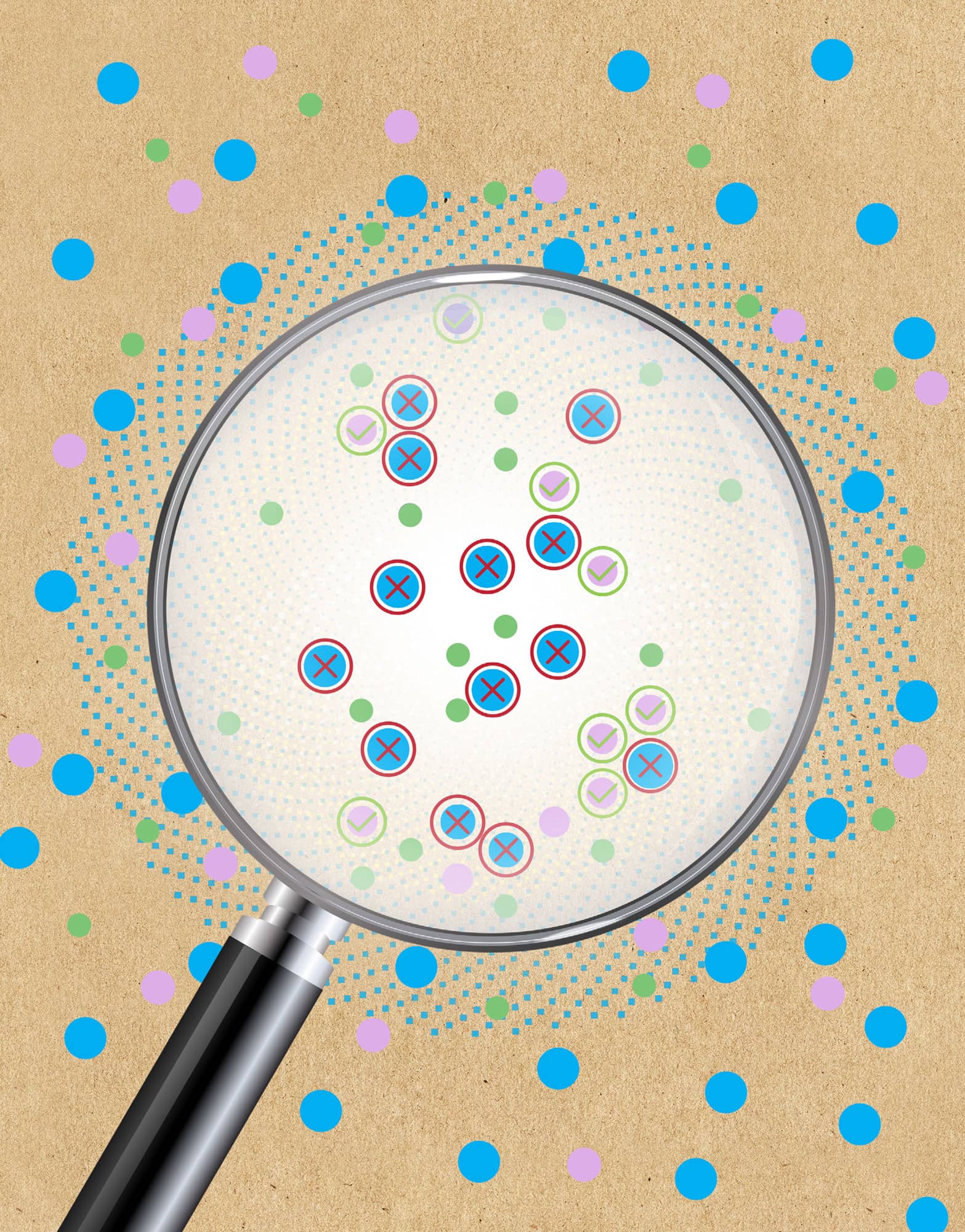
SAMPLING BIAS
the 30-second data
Data points are like gold nuggets, so data scientists eagerly scoop up whatever they can find. Smart analysts do something even more valuable: they stop, look around and ask what happened to all the nuggets that aren’t lying around in plain sight. Are those left-out data different in any systematic way from the data that were easy to collect? Take, for example, a report’s estimate that 10 per cent of men suffer from impotence – results that were based on a survey of patients at an andrology health clinic. This selection bias happens when the participants chosen differ in important ways from the ones not chosen (such as, here, their sexual health). Related to this is self-selection bias, where, for example, service satisfaction ratings can easily skew negatively if only the most irate customers take time to respond. Likewise, there is non-response bias; medical studies, for example, can be misleading if researchers ignore the fact that those participants most likely to drop out are also the ones who are the sickest. Sometimes it is possible to statistically correct for a bias problem, but recognizing the problem in the first place is often the hardest part.
3-SECOND SAMPLE
It’s almost a paradox in data science: what’s not in a data set can be even more important than what’s in it.
3-MINUTE ANALYSIS
In the Second World War the American military gathered data on bullet holes from planes returned from European battles. Where were the highest bullet densities, they asked, so extra armour could be added to spots where planes are shot at the most? Statistician Abraham Wald turned the question on its head. These data only show where planes that managed to make it back home had been hit, he pointed out. Planes were getting shot at in other places, but these planes, hit in other spots, didn’t survive. So the armour belonged, he said, where the bullet holes weren’t.
RELATED TOPICS
See also
3-SECOND BIOGRAPHIES
ABRAHAM WALD
1902–50
Hungarian mathematician whose work on Second World War aircraft damage illustrates the concept of survivorship bias.
CORINNA CORTES
1961–
Danish computer scientist and Head of Google Research, who works on sample bias correction theory.
30-SECOND TEXT
Regina Nuzzo
A skilled data scientist will seek out gaps in the data collection process and analyse their potential impact.

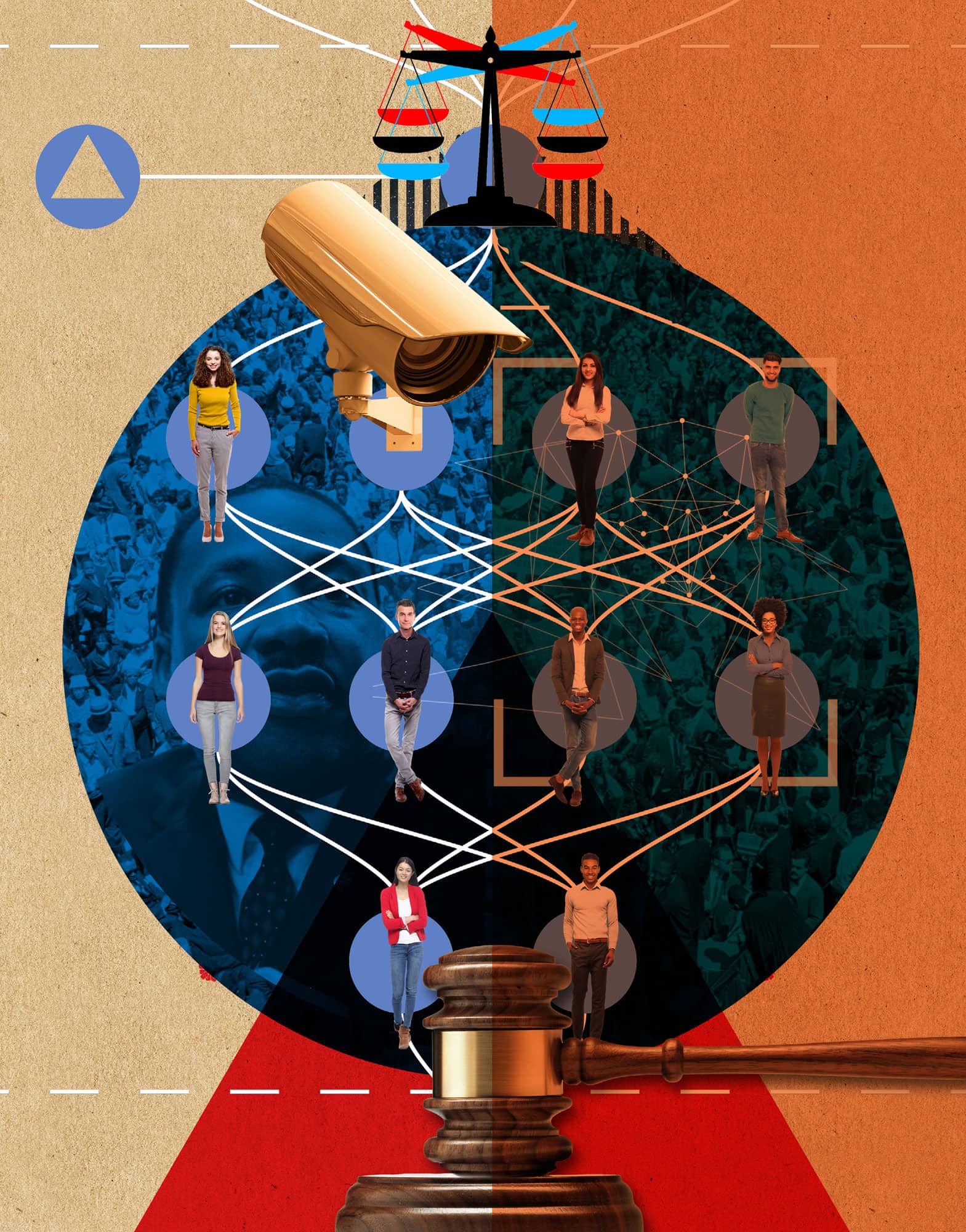
BIAS IN ALGORITHMS
the 30-second data
Algorithms learn how to make decisions by processing examples of humans performing the same task. An algorithm for sentencing criminals might be trained on thousands of historic decisions made by judges, together with information about the offenders and their crimes. If this training data is taken from judges who give harsher sentences to people of colour, the model will learn to replicate those prejudices. In 2018, the Massachusetts Institute of Technology’s (MIT) Media Lab showed that face recognition systems developed by Microsoft, IBM and China’s Face++ were all significantly worse at detecting female faces, and performed poorly on images of darker-skinned women. With police forces in the UK and US testing automated facial recognition systems for crime prevention, low accuracies and false alarms could have far-reaching consequences for civil liberties. In 2018 Amazon scrapped an automated CV screening tool due to gender bias. The system was trained on data from previous successful candidates, who were mostly male, due to existing imbalances in the technology industry. This produced a tool that penalized applications containing phrases more likely to appear in women’s résumés, such as ‘women’s football team’. The algorithm learned to equate men’s CVs with success, and women’s with failure.
3-SECOND SAMPLE
Can a computer be racist, sexist or homophobic? Human biases are often built into automated systems, with serious consequences for the most vulnerable groups in society.
3-MINUTE ANALYSIS
As many machine learning models are developed by private companies, their training data and source code are not open to scrutiny. This poses challenges for journalists investigating algorithmic bias. In 2016, an investigation by the news outlet ProPublica used Freedom of Information requests to reverse-engineer the COMPAS algorithm, used in the US to predict the likelihood of criminals reoffending. They uncovered racial discrimination, raising questions on regulation and transparency in AI.
RELATED TOPICS
See also
3-SECOND BIOGRAPHY
JOY BUOLAMWINI
fl. 2011–
Computer scientist and digital activist, based at the MIT Media Lab, and founder of the Algorithmic Justice League.
30-SECOND TEXT
Maryam Ahmed
The potential for bias might sound far-fetched, but algorithm bias poses a very real problem requiring creative solutions.
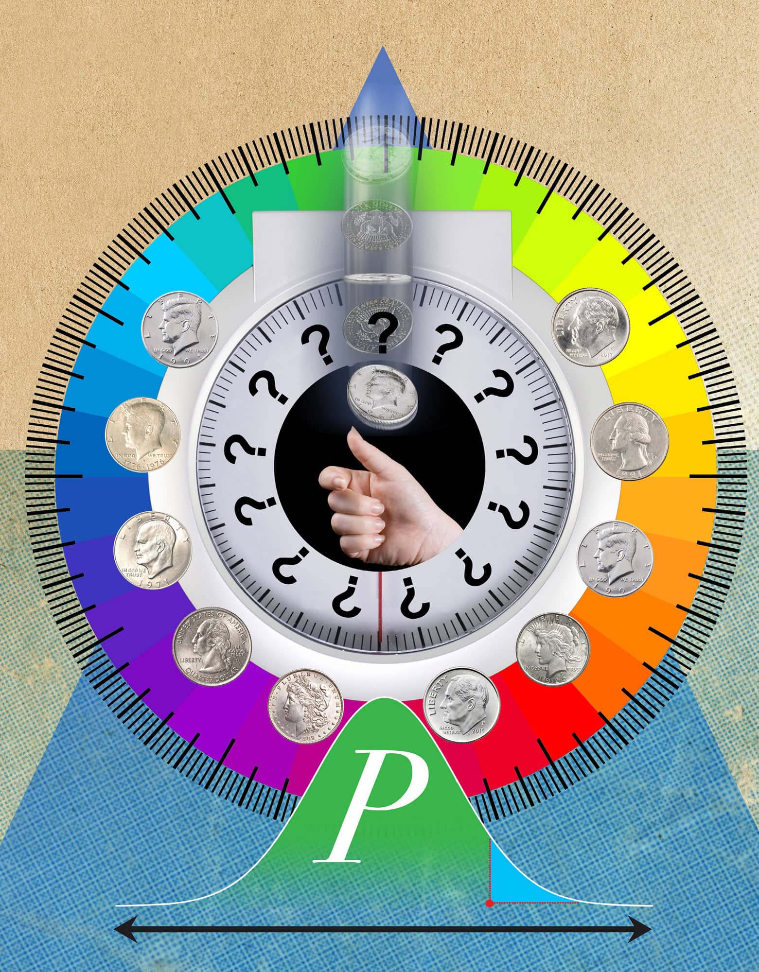
STATISTICAL SIGNIFICANCE
the 30-second data
It is worth getting to know the p-value, because this tiny number boasts outsized importance when it comes to drawing conclusions from data. The tininess is literal: a p-value is a decimal number between 0 and 1. It is calculated when you have a question about the world but only limited data to answer it. Usually that question is something like, ‘Is there something real happening here in the world, or are these results just a random fluke?’ If you toss a coin 100 times and it comes up heads every time, you might suspect that the coin is double-headed, but there is still the possibility (however negligible) that the coin is fair. The p-value helps support your scepticism that this event didn’t happen by accident. By tradition, results with a p-value smaller than 0.05 get labelled ‘statistically significant’ (in the case of the coin, getting all heads from five flips). It is this label that people often use for reassurance when making decisions. But there is nothing magical about the 0.05 threshold, and some experts are encouraging researchers to abandon statistical significance altogether and evaluate each p-value on its own sliding scale.
3-SECOND SAMPLE
Are those interesting patterns in a data set just a random fluke? A century-old stats tool can help answer that.
3-MINUTE ANALYSIS
P-values are easy to hack. In 2015, media around the world excitedly reported on a study showing that chocolate leads to weight loss. Then the author revealed the truth: he was a journalist, the data was random and his results just a false-positive fluke. He knew that in 5 per cent of studies p-values will be smaller than 0.05 just by chance. So he ran 18 separate analyses of random data – and then reported only the deliciously statistically significant one.
RELATED TOPICS
See also
3-SECOND BIOGRAPHIES
KARL PEARSON
1857–1936
British statistician who first formally introduced the p-value.
SIR RONALD FISHER
1890–1962
British statistician who popularized the p-value in his 1925 book for researchers.
30-SECOND TEXT
Regina Nuzzo
P-values help statisticians work out whether results are a random fluke – or not: the gold standard of statistical evidence has some major flaws.
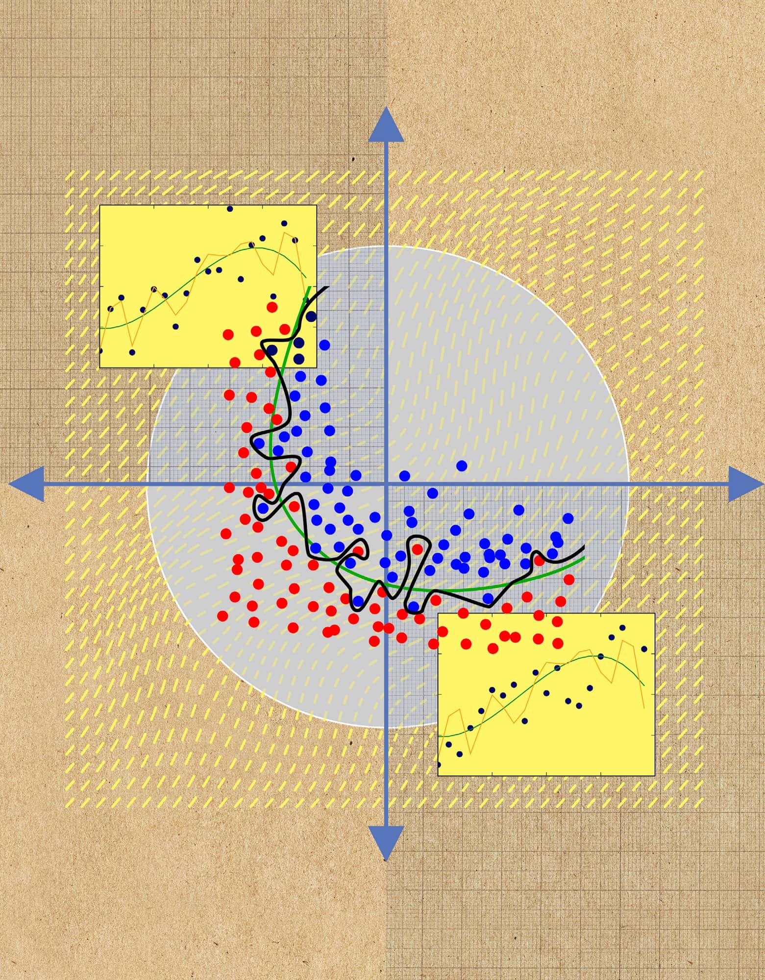
OVERFITTING
the 30-second data
Building a predictive model involves finding a function that describes the relationship between some input and an output. For example, a data scientist may want to predict a university student’s final grade based on their attendance rate in lectures. They would do this by fitting a function to a ‘training’ set of thousands of data points, where each point represents a single student’s attendance and grade. A good model will capture the underlying relationship between grades and attendance, and not the ‘noise’, or natural variation, in the data. In this simple example, a reliable model may be a linear relationship. When a new student’s attendance is added, the model will use it to predict their final grade because it generalizes to the student population as a whole. An overfitted model will involve more parameters than necessary; instead of fitting a straight line to the university data set, an overenthusiastic data scientist might use a very complex model to perfectly fit a contorted, meandering curve to the training data. This will not generalize well, and will perform poorly when presented with data for a new student. Understanding that a complex model is not always better is a crucial part of responsible and thoughtful data science practice.
3-SECOND SAMPLE
Beware of complex models that fit the data perfectly. It is likely they are overfitted, and will predict poorly when presented with new data points.
3-MINUTE ANALYSIS
There are ways to avoid overfitting. Cross-validation gives an estimate of how well a model will work in practice, by training the model on a subset of the training data and testing its performance on the remaining subset. Regularization is a technique that penalizes a model for being too complex; in the university example, a line would be preferred over a curve.
RELATED TOPICS
See also
30-SECOND TEXT
Maryam Ahmed
If a model’s performance seems too good to be true, then it probably is!