
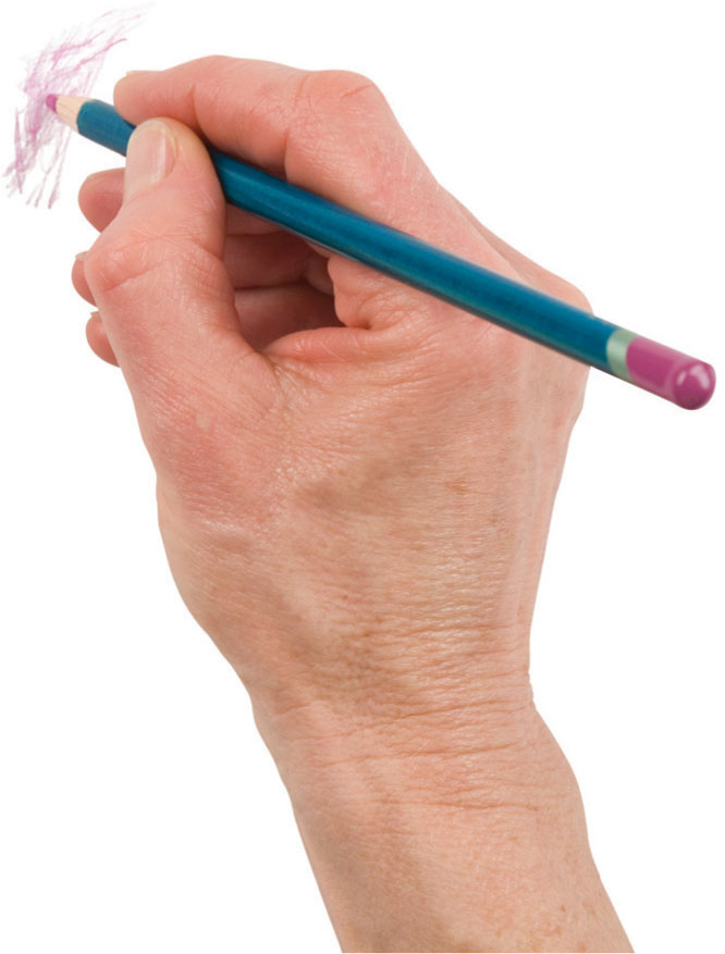
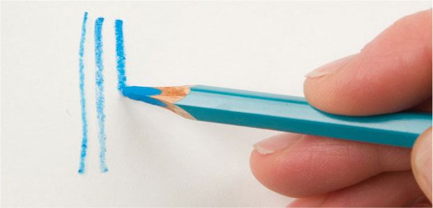
Handling pencils
There is no right or wrong way to hold a colored pencil; any grip that is comfortable and gives you control of the pencil movement is right for you. However, you may vary your handgrip depending on the nature of the paper, the area to cover, and the direction of the marks you intend to make, and thus the effects you obtain will vary subtly as you alter your grip and pressure.
The conventional grip in which the shaft of the pencil rests in the curve of the thumb and first two fingers gives tight control and enables you to make very delicate marks, firm lines, and careful shading by small movements of the fingers, wrist, or hand.
For more open, scribbled, or hatched textures use more sweeping movements of your hand and arm. Alternately, grip the pencil with your hand either over or under the shaft, which encourages free, gestural movements. Shading with the underhand grip can be light and quick, and with the overhand one, heavy and vigorous—especially if you stand at an easel or at a tilted board.
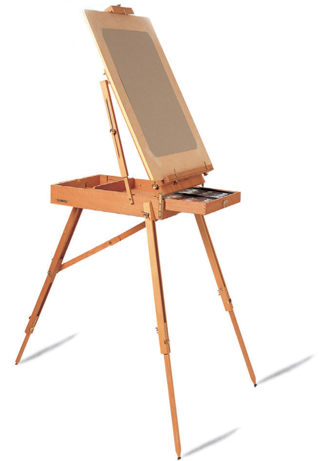
Using an easel
Working at a sturdy easel encourages full use of the arm as well as the wrist and so facilitates sweeping movements, more flowing marks, and perhaps heavier pressure. Perspective is often easier to judge, particularly vertical and horizontal structures as you are working on the same plane.
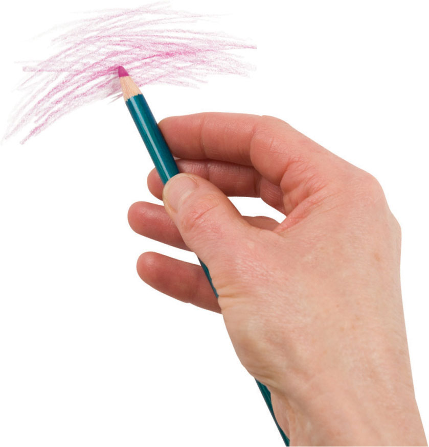
The “writing” grip
Use this conventional grip for maximum control where extreme precision is required.
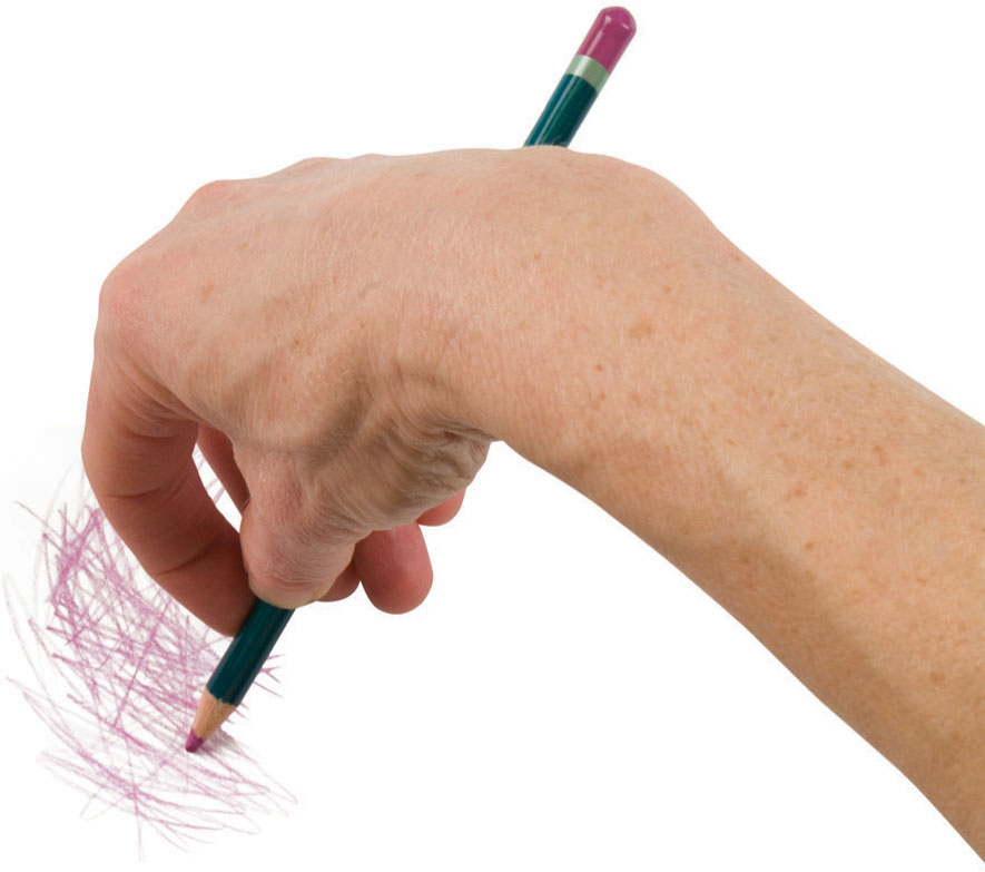
The underhand grip
This grip will facilitate free movement of the wrist, and is ideal for open shading.
Your choice of working position depends greatly on how large you want to work. If you are not using an easel, then a drawing board is a good idea. Propped up on some wooden blocks, or against a table as shown here, an angled board is ideal for drawing, and can help with your posture too. Always ensure you are sitting comfortably—an adjustable chair is a good idea, especially for those with back problems. But regardless of the type of chair you use, try to stand up regularly and avoid spending long periods of time hunched over your work.

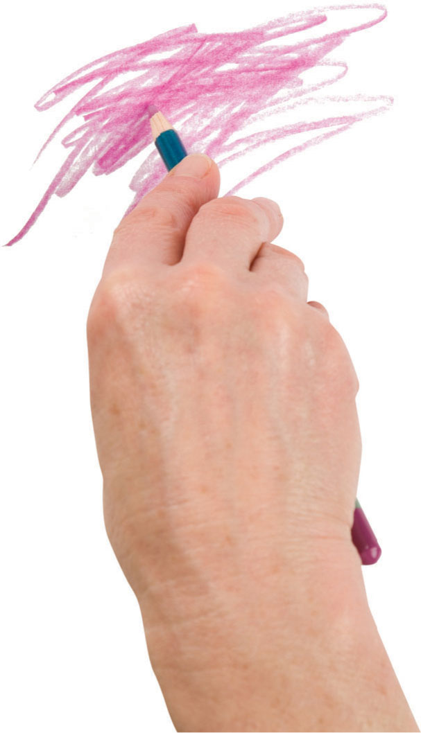
The overhand grip
Heavier, more gestural marks can be made with this grip.
Wrist movement
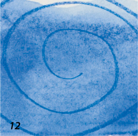
Curves and ellipses are more easily created if your wrist is allowed to move freely. Here the wrist has twisted from a position in line with the hand to one almost at right angles.
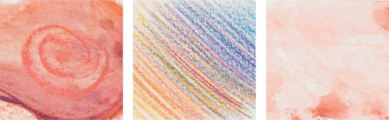
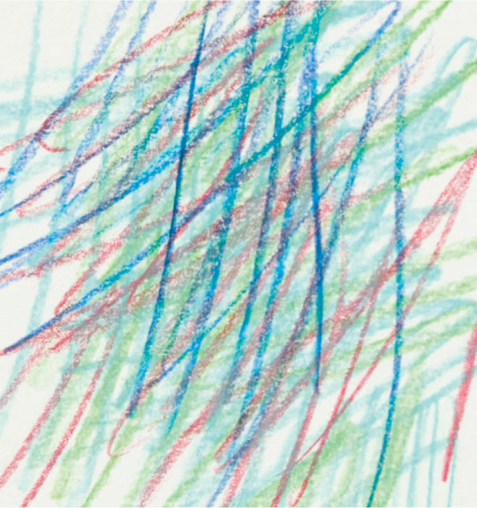
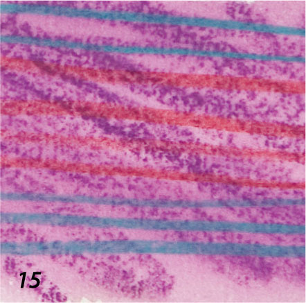
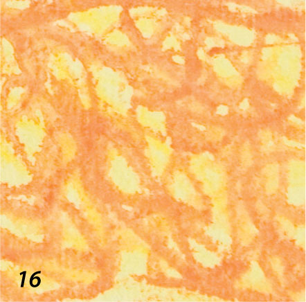
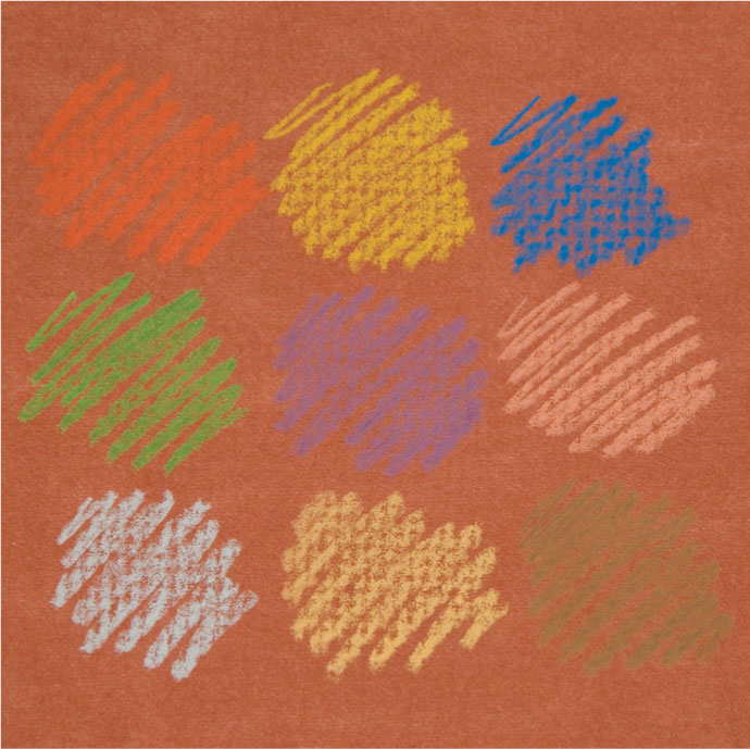
Mark-making: Dry pencils
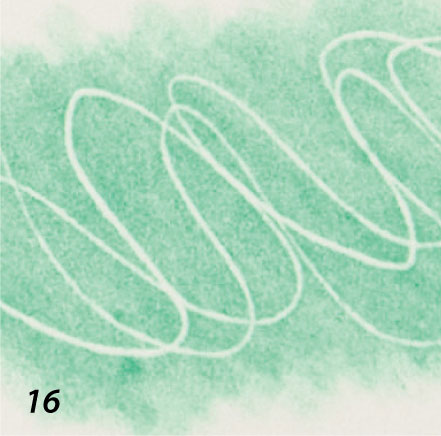
Marks are the means through which you record and translate your visual experiences, so before launching into drawing an actual subject from life or memory, gain familiarity with your materials. You could divide your page with a grid similar to the one shown here, or allow yourself to freely roam over the page. Become absorbed in the lines, dots, shading, and the relationships between colors you produce—and the differences between brands, if you are using more than one.
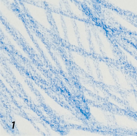
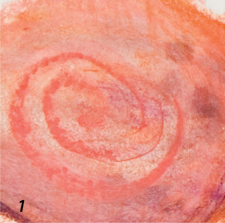
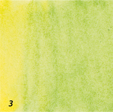
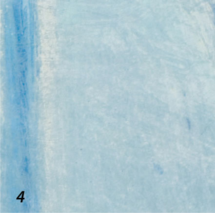
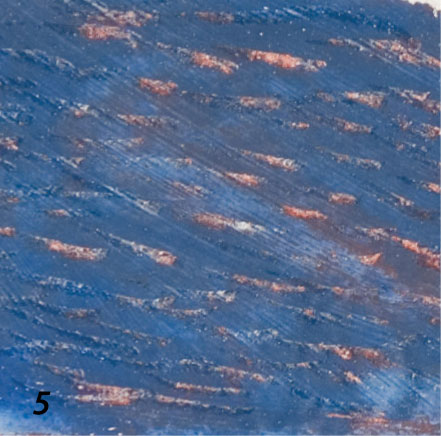
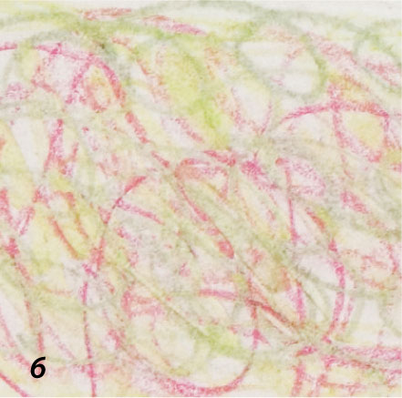
1 Loose, scribbled marks and a medium pressure on watercolor paper.
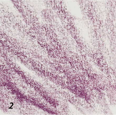
2 Loose, shaded marks with a slightly heavier pressure on watercolor paper.
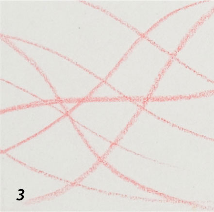
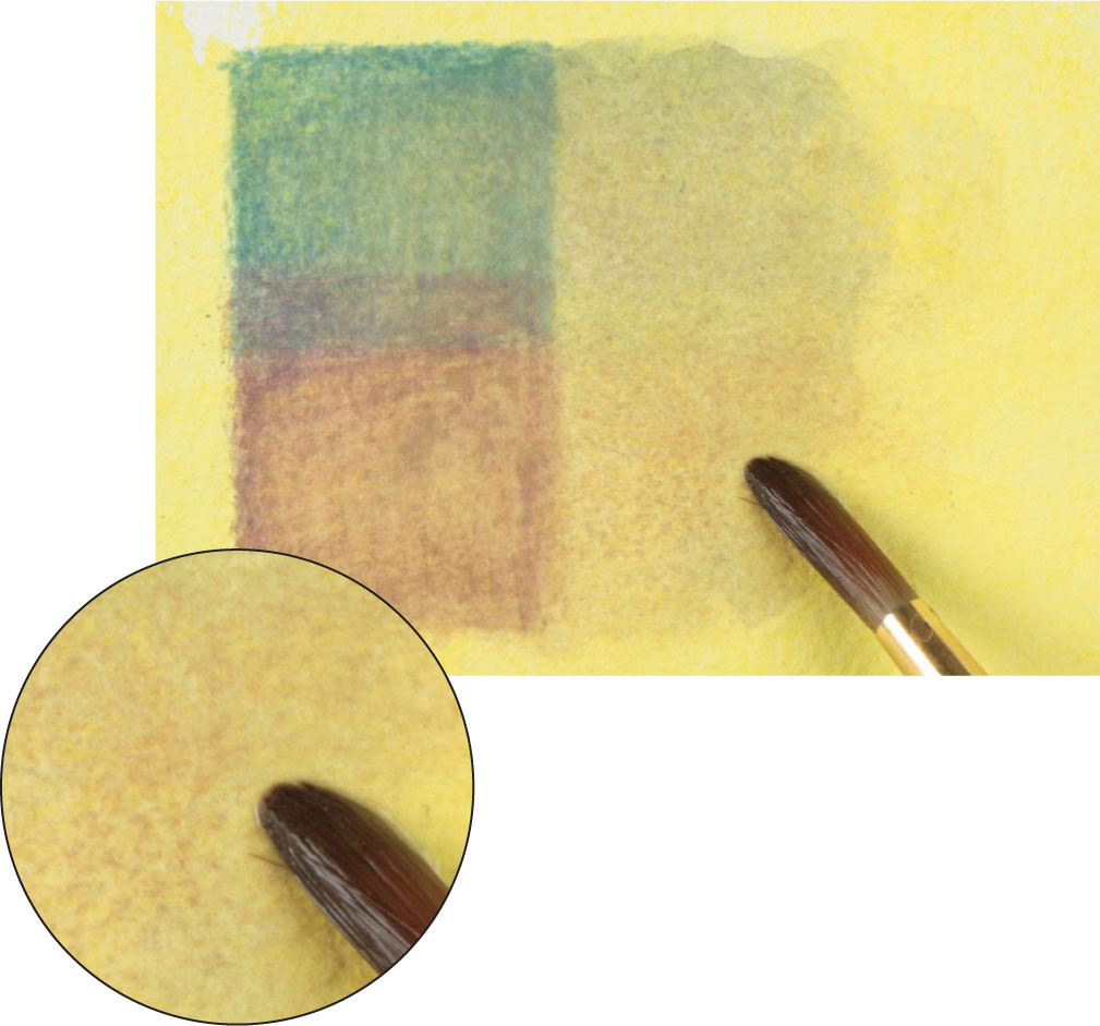
3 Sharp point and medium pressure on smooth drawing paper.
4 Sharp point and medium pressure on drawing paper stained with thin oil pastel.
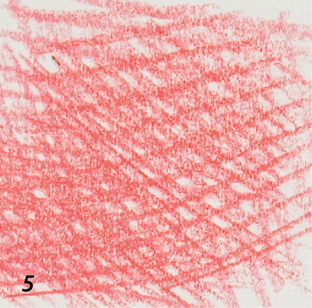
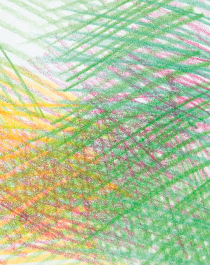
5 Dense crosshatching in one color on smooth drawing paper.
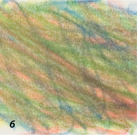
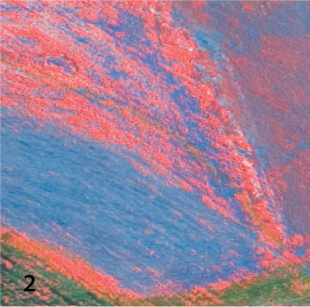
6 Dense, scribbled marks in several colors, overlaid and blended. This decreases their intensity and enhances the flashes of orange.
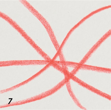
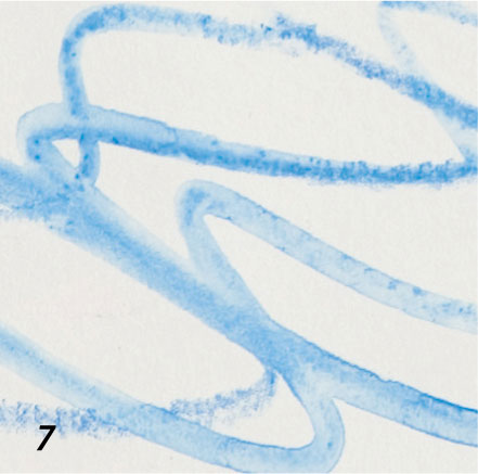
7 Firm, even pressure on smooth drawing paper.
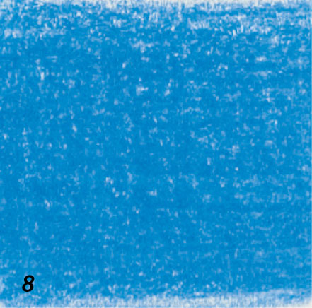
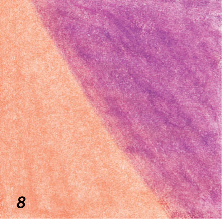
8 The grain of the paper filled with layers of the same blue.
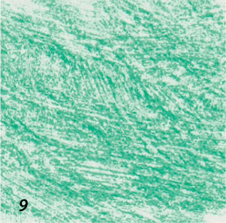
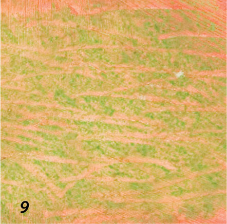
9 Fine scratched marks add further subtlety to heavy shading on textured paper.
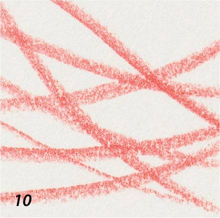
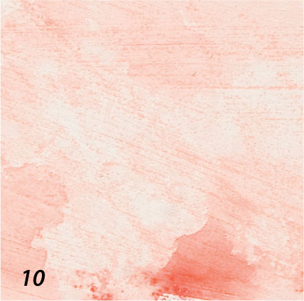
10 Firm pressure on heavy, smooth drawing paper.
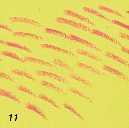
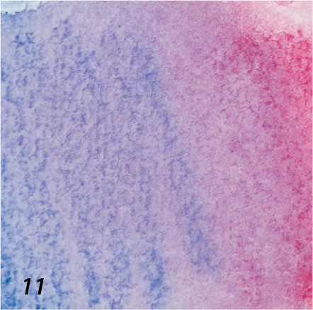
11 Short, energetic hatched red marks on a complementary lime green.
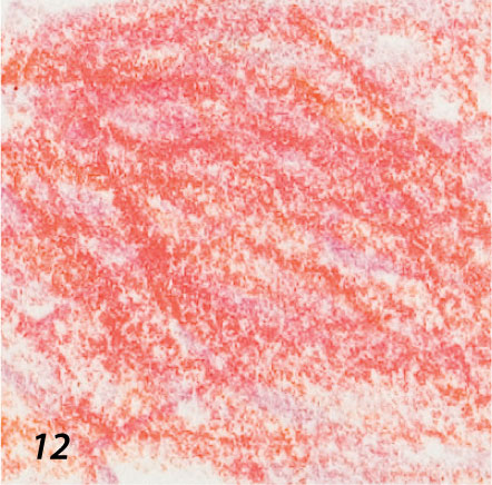
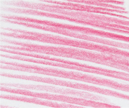
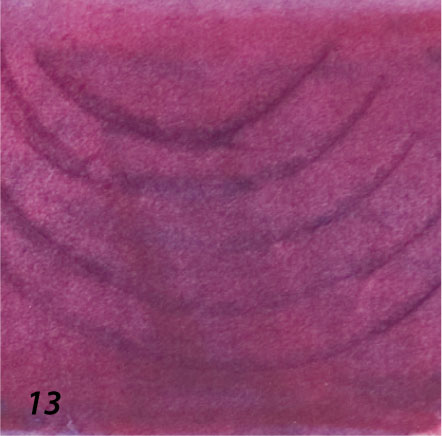
12 Loose shading in harmonious pinks and reds on textured paper.
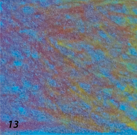
13 Vibrant dark tones created by dense layering of blue, red, and yellow.
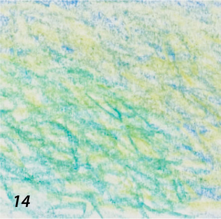
14 Light shading in blue and yellow to produce green.
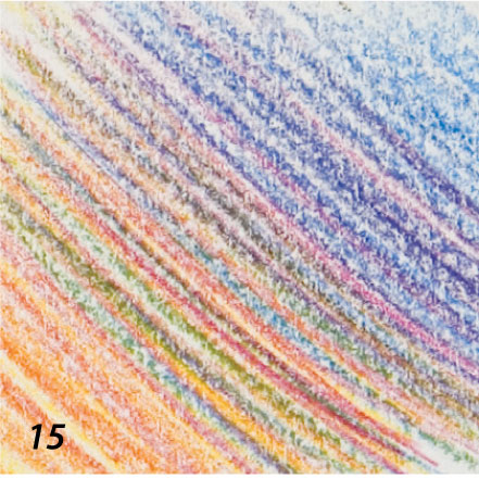
15 Close, linear hatched marks in different colors to produce a blended effect.
16 Color densely shaded over impressed marks (see page 36) on smooth drawing paper.
Hatching
Hatching and crosshatching are blending techniques, traditionally used to build up areas of tone in monochrome drawings using a linear medium, such as pen and ink drawing or engraving. In colored pencil work, these methods are an effective way to mix colors or to modify them.
Hatched lines are roughly parallel and can take any direction. Heavy lines, closely spaced, give a fairly solid area of tone or color, appearing more dense than widely spaced, light lines. Crosshatching is simply two or more sets of lines hatched one over another in different directions. An area of dense crosshatching would read, from a distance, as a continuous tone or color. The direction of the lines can be carefully manipulated to represent form and volume or loosely massed to give a lively surface or sense of movement.
Working in line only does not have to be restrictive. It can be a very free and unencumbered way of drawing from life, as there is plenty of scope for redrawing or adjusting marks by overlaying new ones, gradually building up a more complex finished piece.
Regular hatching
Hatched lines can be of equal weight and spacing or may vary with gradual alteration in thickness and spacing.
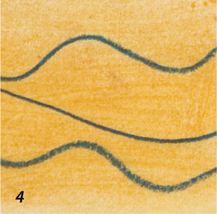
Evenly spaced hatched lines of equal weight.
Lines of varying thickness, spacing, and weight.
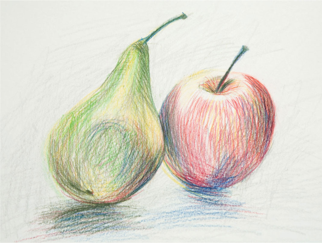
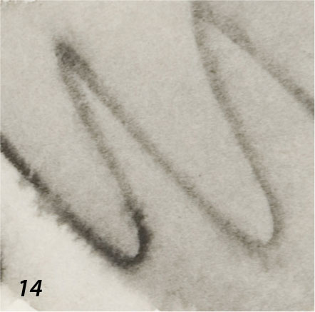
Free hatching Worrying about the precise direction and spacing of hatching and crosshatching can sacrifice the sense of life and energy in a drawing, so free yourself with some quick studies such as the apple and pear shown here. The pencils have been allowed to move easily following the form of the fruit, and the directional marks have been extended into the background for added dynamism.
Crosshatching
The denser texture of the closely crossed lines allow you to develop deeper and livelier color as the white of the paper is gradually eliminated.
This loosely hatched and crosshatched sketch uses change in pressure to alter the tonal balance.
Hatched and crosshatched lines can be used to effectively blend two or more colors.
Hatched lines can be loosely massed to give a lively surface or a sense of movement.
Blending
Blending one color into another is generally achieved by shading—using the side of the pencil and moving it back and forth across the paper. Using the side of the pencil leaves a softer, more open mark than the point, especially on grainy paper, which can be gradually blended into an adjoining color by subtly overlapping the edges of the two colors so that neither is dominant and there is no discernible join. This is known as feathering.
Blending two colors
An effective blend is made by loosely shading over an existing color of a similar hue or tone; the two mingle and appear as a blend although there are two distinct layers. This is more pronounced when shading on previously colored paper with a grain, as the pigment sits on the surface and leaves the “dips” in the lower sheet free—the eye will blend two colors used in this way, achieving a lively surface quality.
Blending with an even light pressure and no linear bias.
Blending with heavy pressure for increased intensity of color and tone with emphasis in the direction of shading.
Feathering using light and moderate pressure in one direction to blend two colors.

Working on dark paper
The seascape shown opposite, Dinas Head, has been worked on black paper, with yellows and pinks blended by means of shading and heavy pressure to cover the paper. The colors appear light on the dark ground, evoking a quality of light characteristic of this coastal area.
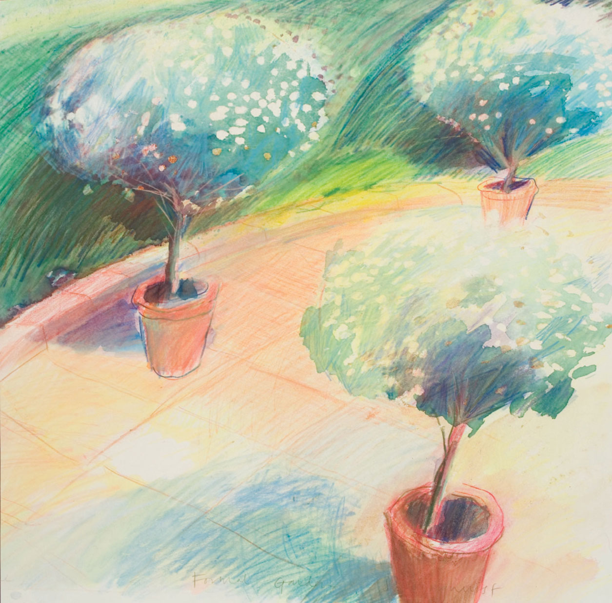
Blending by unifying
The effect of sunlight in Formal Garden shown left, is emphasized by shading with yellow over large patches of previously worked color. This helps to pull the composition together, brightening even the shaded areas. The watercolor paper used for the drawing is soft, with no obvious grain, which aids the merging of the pencil strokes, seen particularly in the light and shade of the hedge in the background.
Blending with solvents
The marks made with some types of colored pencil can be blended with solvents—water, turpentine, or the spirit-based medium in a colorless marker blender. Only pencils formulated to be water-soluble will react with water. Spirit solvents may dissolve the colors of pencils intended to be used dry—this has to be a matter of experiment, as it depends on the proportions of the pigment and binding materials in the pencil lead, and the effects are not wholly predictable.
There are two methods that enable you to take advantage of the more fluid textures produced by solvent techniques. You can either dip the tip of the pencil into the solvent, so that the color becomes softened and spreads as you lay it down; or you can shade or hatch with a dry pencil tip and work into the color area with the solvent using a brush, paper stump (torchon), or cotton bud—or with a marker blender, which is simply a marker pen that contains a colorless solvent. You can combine the effects of wet and dry color by allowing the dampened marks to dry, then reworking the area with the pencil.
To avoid distortion that may occur through the paper buckling when it is wetted by the solvent, stretch the paper beforehand, or work on a pre-stretched paper block or board.
ARTIST’S TIP
Unless you use very thin paper, no stretching is required when working with solvents, as they don’t buckle the paper like water does. But bear in mind that spirit or turpentine can stain colored paper, and if using a marker blender, the tip needs to be kept clean or it may become contaminated and dirty future blending.
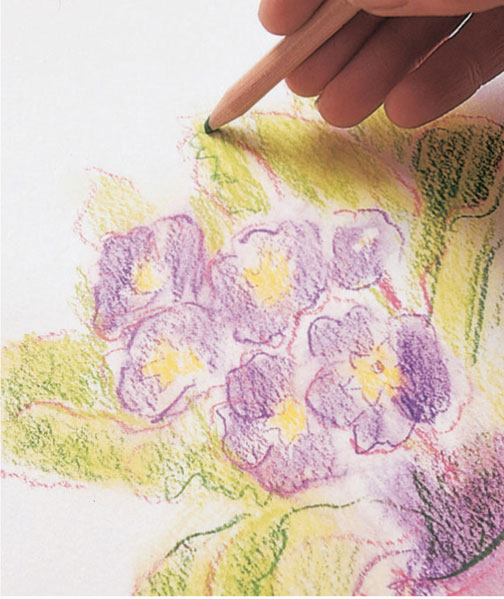
Using spirit solvent
1 The shapes of the flowers are rapidly sketched with a soft, waxy pencil line. A rag dampened with turpentine is used to spread the color delicately, indicating the areas of darkest shading.
2 The line drawing is strengthened and some broad color areas blocked in with light shading. Notice the heavy grain of the watercolor paper—when applying solvent, you need to use good-quality paper to avoid buckling or tearing.
3 A second stage of rubbing with turpentine softens the color and spreads it into the paper grain. The pencil marks are just moistened, not flooded with the solvent.
4 To develop the intensity of color, pencils are used once more to shade in the solid shapes. The moisture from the underlayers makes the pencil marks smoother and more vibrant.
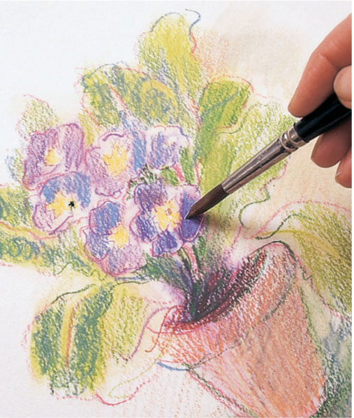
5 Applying solvent with a brush makes the color dissolve and spread more like paint. It is possible to do this selectively, to build up a contrast of different textures.
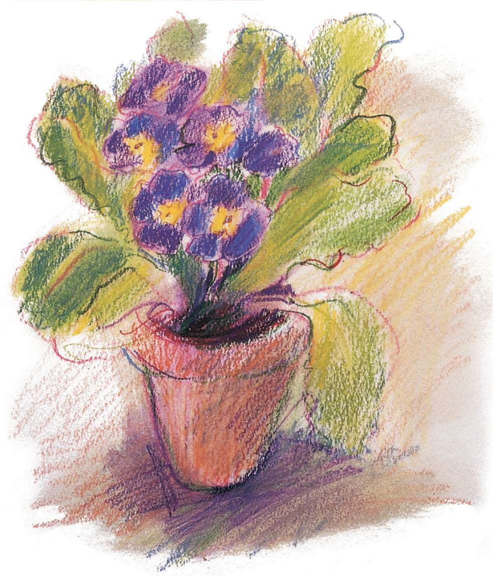
6 In the finished vignette, the brushed color comes up very fresh and intense, contrasting nicely with the more open surface qualities of the pencil shading and line work.
Blending water-soluble pencils
Water-soluble pencils are wonderfully versatile, as they can be used both wet and dry, or a combination of the two, in any one drawing. Apply water with a brush, rag, or fine mist spray after the pencil is applied, and some of the pigment will dissolve, leaving soft and hard edges. Adding more water may even remove the drawing element completely to produce a watercolor wash effect. You can wet the paper before drawing, or dip the tip of the pencil in clean water to give a soft line.
It’s advisable to stretch your paper (see page 16) unless it is the heaviest watercolor paper, but if you plan to use a limited amount of water, just enough to dampen the paper, try attaching it to a board with masking tape on all sides. This is a good method for instant sketches.
ARTIST’S TIP
There are many types of brushes you can use. As you become more experienced, you will begin to learn which type of brush works best for you. Remember: a good brush should have a certain resilience. You can test the spring of a brush by wetting it into a point and dragging it lightly over your thumbnail. It should not droop but spring back.
Blending more than one color
Lay down two dry colors one on top of the other and wash with water—once you have blended them there is little significant difference as to the order in which they are laid. Differences are more discernable when dry pencils are laid over each other, as you will see below.
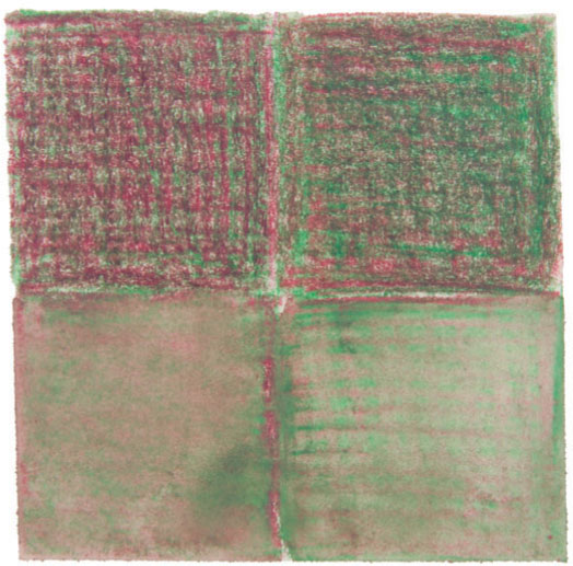
The crimson (top right) slightly dominates the viridian when laid on top, although these two hues are similar in tone, as is evident when the colors are laid the other way round (top left). There is little difference once washed over.
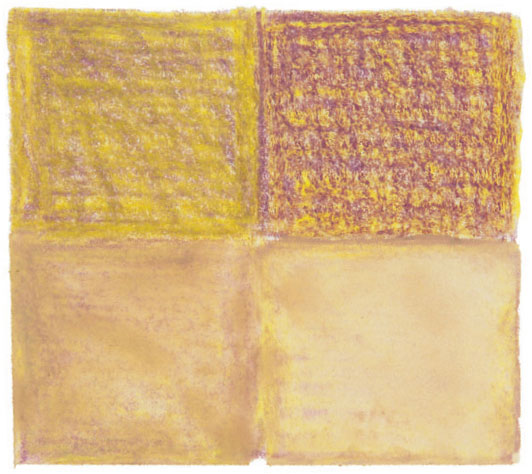
Yellow over purple (top left) looks quite different to purple over yellow (top right) because of the contrast in tonal value between the two. However, the differences are not so evident once they are washed with water (see bottom row).
Red over lime green (top left) and lime green over red (top right) are tonally very similar, but there is a slight change in hue. Again, the differences in hue, and the order in which they are laid, are less apparent once washed with water.
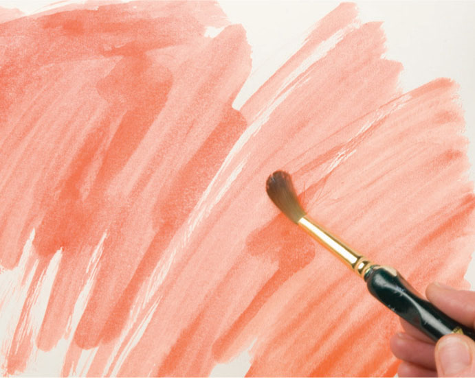
Blending with water
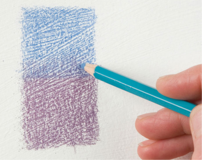
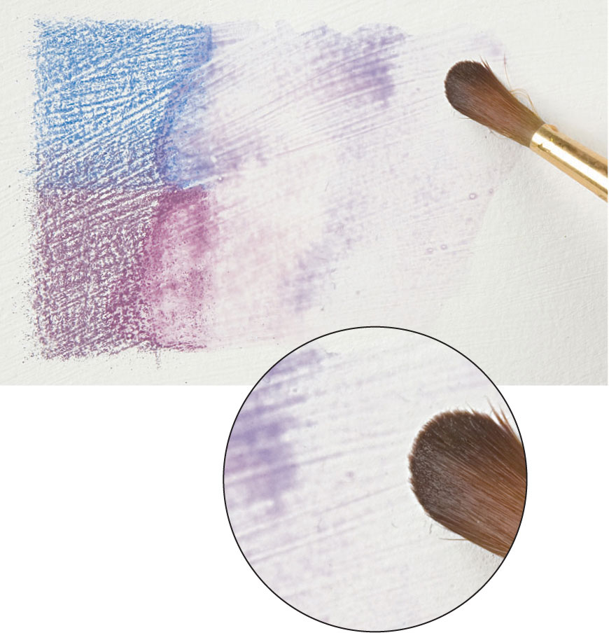
Blending with water, using a brush, sponge, or rag, allows subtle mixtures and varied line quality to be achieved.
1 A swatch is made using a dry pencil.
2 Water is added with a brush and the color is blended more thoroughly, loosing most of the pencil marks.
Dipping the pencil in water first produces different marks. Where the pigment is wet, it makes a deeper and stronger mark that tails off as it dries.
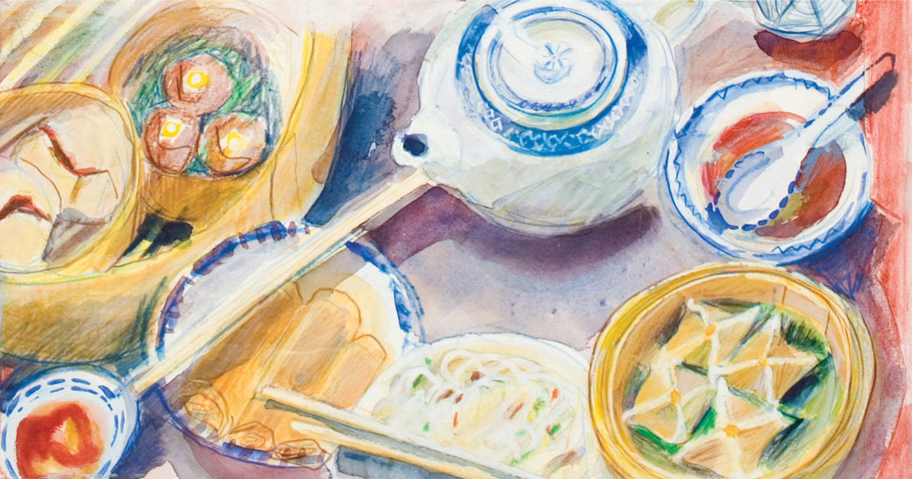
Watercolor effects
This drawing, Chinese Dishes, was begun with a rough sketch blocked in with shading, much of which was then dissolved using water and a brush to create a fluid watercolor painting. It was then reworked with drawn lines and some loose shading to emphasize shape and form, and the process was then repeated. The stages are integrated so that it is not always possible for the viewer to identify the order in which they were made.
Mark-making: Water-soluble pencils
Using water-soluble pencils will give a different appearance to the marks you make. Depending on your approach, your finished work might resemble a watercolor painting rather than a drawing, with few visible pencil marks, or alternatively, you might choose to employ the contrast between water-blended areas and pencil texture. Use the examples shown here as a starting point for your own experiments until you feel you can use the medium with confidence to describe and interpret your subject.
1 Wet, red pencil with heavy pressure over dried water-blended color.
2 Red acrylic ground allowed to dry and overlaid with blue pencil blended with water. The red and the blue will not mix.
3 Yellow overlaid with green and softened with a wet brush.
4 Color spread with water to produce a thinned and lightened blue.
5 Red-stained paper with water-blended blue laid on top and then scratched with a craft knife to reveal the underlying color.
6 Scribbled wet pencil marks lightly meshed together.
7 Scribbled, soft marks made with a pencil dipped in water.
8 Two colors begin to blend with solvent in the form of a marker pen.
9 Impressed marks (see page 36) on red-stained paper with shaded overlay in green.
10 Scribbled marks blended with water and allowed to “pool” as in watercolor.
11 Blue blended with red on grainy paper. The marks have been softened but still remain visible.
12 Dry pencil over a previous layer of water-blended blue.
13 Marks on wet paper, colored with a pencil wash.
14 Marks on dry paper with water brushed over the surface afterward.
15 Texture created by layering wet and dry pencil marks.
16 Wet pencil loosely scribbled over commercially made colored paper.
Impressing
This is a way of producing clean “negative” lines in a drawing by indenting the paper. When worked on white paper, it is also known as “white line drawing.” Lay a sheet of good-quality drawing paper or a smooth watercolor paper on a pad made from a few sheets of newspaper to provide the necessary yielding surface, and use an implement such as a “dead” ballpoint pen or, a knitting needle or the end of a paintbrush handle to impress lines. Subsequent gentle shading will glide over the impressed mark, revealing the color of the paper. For a varying effect, use a sharpened colored pencil to make the lines, so the impressed line will be of that color rather than that of the paper.
Using tracing paper
Impressing can be done freehand, but if the drawing is complex, you can make it first on tracing paper, laying this over a clean sheet of drawing paper and retracing the outlines firmly with a pencil point. Impressing can be used to create specific decorative effects such as the patterns in a fine lace tablecloth, the delicate tracery of leaf veins, or simply as a negative outline in white or the chosen paper color.
ARTIST’S TIP
It is useful to keep one or two alternate impressing “tools” for different thicknesses of line; a compass point will give a finer negative line than a paint-brush handle.
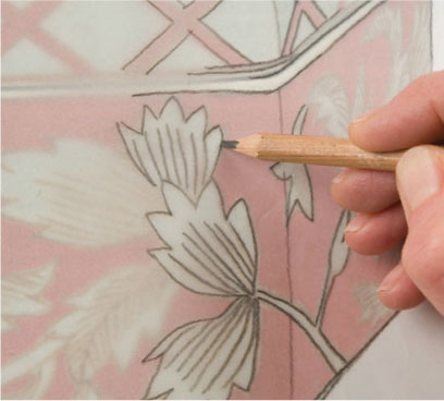
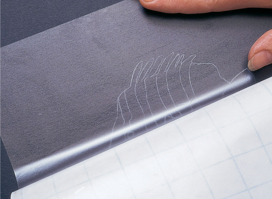
1 Place a sheet of tracing paper over your chosen design and make a pencil tracing of the whole image.
2 Remove the tracing paper from the image, lay it over your drawing paper and redraw the lines to be impressed using a ballpoint pen or pointed implement.
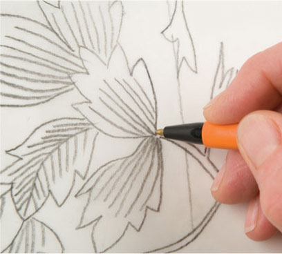
3 Remove the tracing paper. Using the side of the pencil, shade over the impressed surface to reveal white lines.
4 The shading can be taken a stage further to include more than one color, but make sure that the impressed lines are kept free of color.
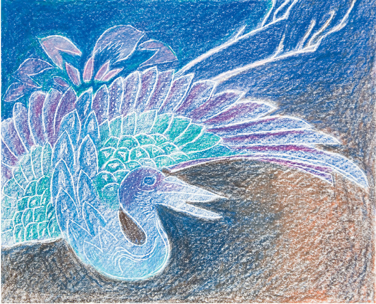
White line drawing
This crane design is taken from a nineteenth-century Japanese fabric. The white lines are made by tracing the image with a ballpoint pen, impressing a “blind” line onto smooth white drawing paper.
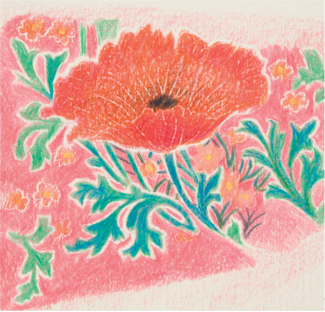
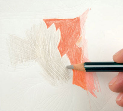
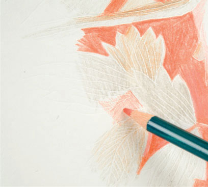
Negative outline
The poppy design uses an impressed white line as an outline, shaded lightly all over in pink before the green was added. The poppy head was shaded again in red before further impressing to give the fine, broken lines on the petals.
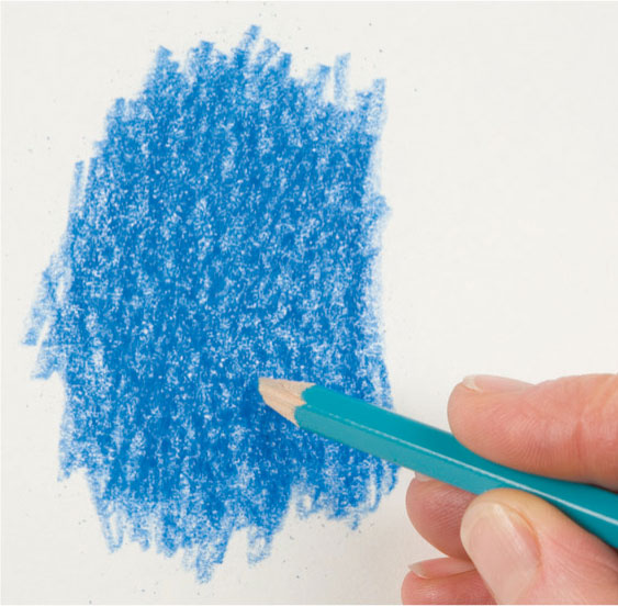
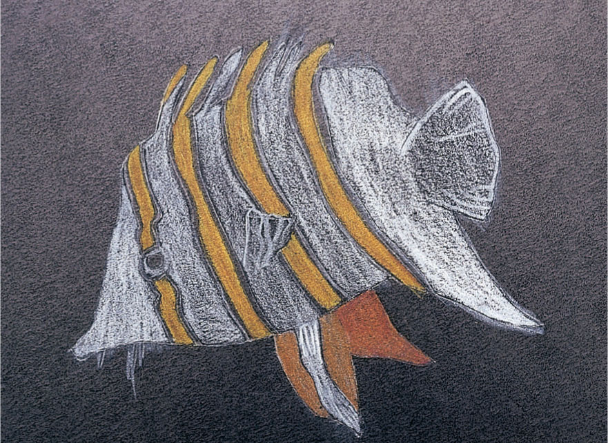
Sgraffito
Sgraffito is the technique in which an underlying layer is revealed by scratching or scraping the top one away. It works particularly well when the media is soft and easily removed, as with oil paint or oil pastel. Colored pencils tend to mesh together when overlaid and impregnate the surface of the paper rather than sit on the top, so care should be taken to avoid damaging it. However, sgraffito is reasonably successful when the pigment is compacted and on smooth or primed paper. Use the point for fine lines or scrape lightly with the side of the blade for broken areas.
Try representing the flicker of light penetrating dark foliage, the sky through tangled branches, a complex textured surface, or a distinctive linear structure, such as basket weave, waving corn, or the fragile veins of a leaf skeleton.
Scraping out
Removing color with a knife by scraping with the edge of the blade rather than the point, can be used to clear unwanted pigment build-up in order to rework or to create striking “negative” line drawing.
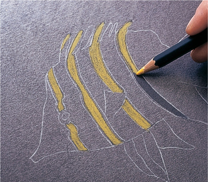
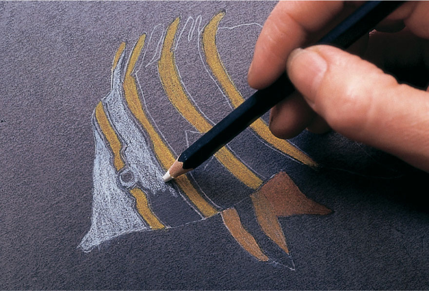
1 Use a colored pencil to build up an area of compacted color.
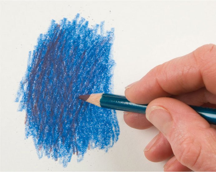
2 Here a second hue is added to deepen the color and to increase its density.
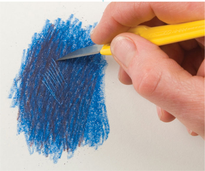
3 Use a craft knife to carefully scrape away fine lines or patches of color, so the white of the paper or the pigment underneath is revealed. Use the flat part of the blade rather than digging into the paper with the point.

Revealing colors
Merriscourt Farm—High Summer has been worked on primed paper, with sgraffito used to take out some of the dark tree mass on the extreme left to reveal the yellows and pinks beneath. Fine scratched hatching adds variety and detail to the straw bales and the barley field.
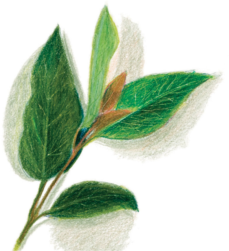
Fine lines
Here fine lines are scratched into compacted pigment to emulate delicate leaf veins. The effect is reinforced with further gentle shading over the scratch marks; anything too heavy and they would fill in.
ARTIST’S TIP
For good results, prime the stretched paper (see page 16) with an acrylic or gesso primer or a layer of acrylic paint (see pages 56–57). This acts as a barrier between the pencil and the paper, preventing it from absorbing the pencil color. The top color can be scraped away with a craft knife to reveal white or colored marks.
Burnishing
Burnishing is used to give an overall finish to a drawing, to heighten selected areas, or to imitate shiny materials such as metal or glass. It is difficult to make radical changes to a burnished area once established, although it can be removed with water (if you are using water-soluble pencils) or broken up by scraping with a craft knife or even glasspaper.
To burnish with a colored pencil, apply a top layer to a previously worked area, using firm pressure so that the color is compacted and no grain is evident. This creates a smooth, blended surface, increasing brightness and reflectivity. The choice of hue adds a warm or cool bias to the subject, and also either heightens or subdues the color. Use a white or pale pencil for highlights and rejuvenate dark areas by burnishing with a relatively lighter or brighter color.
Effects of burnishing
Burnishing with a colored pencil creates a glazed surface effect. It compresses and polishes the first layer, pressing out the grain. It can give the impression of colors being more smoothly blended and increases the brightness and reflectivity of the surface. The color applied affects the original hue, as shown in the below examples, where the same red color has been subjected to several burnishing effects.
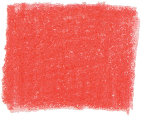
Dense shading in red pencil.
The same color burnished with blue-gray.
The same color burnished with light yellow.
Red is burnished with white.
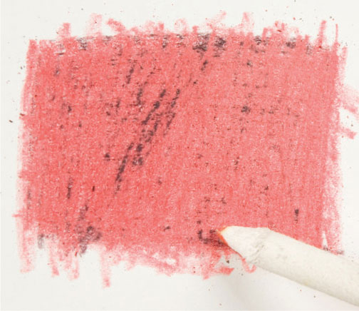
Burnished with a torchon.
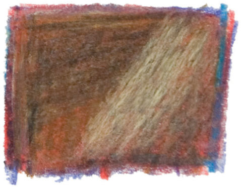
Highly compacted red, orange, and blue, partially burnished with white.
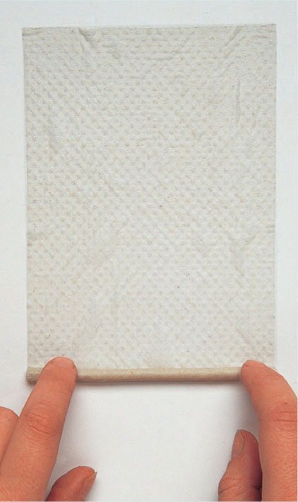
To make a burnishing tool, you need a toothpick and a small piece of paper towel. Soak the towel in water and then roll it around the stick, without letting the paper protrude too far beyond the points of the stick. The paper will shrink as it dries to form a tight covering, without the need for further adhesion. Your paper stump is then ready for use.
Burnishing using a tool
Half of the colored patch has been burnished by rubbing with a paper stump (torchon) to achieve a compacted and shiny effect.
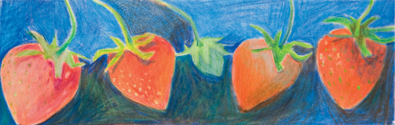
First of the season
Heavy pressure with a variety of red pencils was used for the four strawberries and then burnishing. From left to right, burnishing with white pencil, with yellow pencil, silver-gray pencil, with a paper stump (torchon), and with light yellow in the darkest areas of the background.
ARTIST’S TIP
Try burnishing with a rolled-paper stump (torchon) or a plastic eraser, to avoid the color changes caused by overlaying colors.
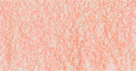
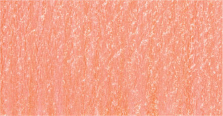
Working on colored paper
Colors and tones can only be judged in relation to each other, so the appearance of your pencil colors will inevitably be affected by the paper color. Red marks on a blue paper, for example, will look very different to the same marks on yellow paper. This applies even to “white” paper, which is always lighter in tonal value than the lightest pencil color, thus making the marks appear a little darker in contrast, especially if the white plays a dominant part in the work. Colors blended with water are brighter on white paper than they are on a colored or tinted ground.
You can buy various colored papers, but it can be more satisfactory to hand color them yourself. You can lay washes of watercolor or thin acrylic, but remember that the paper must be stretched in advance or it will buckle (see page 16). The choice of color depends very much on the subject and how you propose to treat it. You might choose a color that blends with the landscape you are working from, perhaps a pale cool blue for early morning light, or a contrasting color, such as red or yellow ochre for warm earth tones to enhance a predominately green landscape and bring it to life.

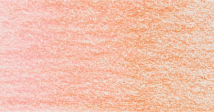
Colored-paper effects
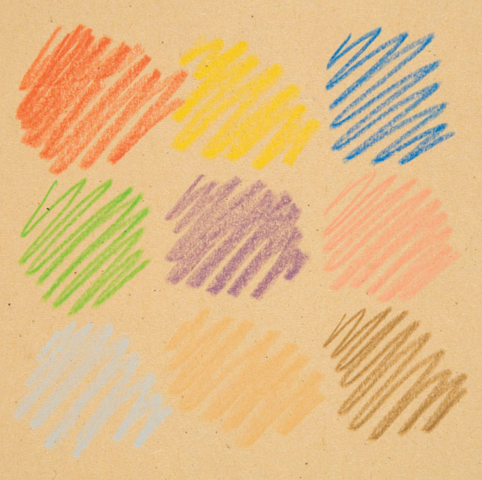
A colored ground affects the appearance of the pencil color through contrast, enhancing or altering the different qualities of the color to a greater or lesser extent. Neutral tints such as beige, buff, or gray provide a mid-toned background and make good all-round choices; brightly colored paper will make a strong impact on the overall image, intensifying the hue and texture of the pencil marks, but be aware that a particularly vivid background may compete with the applied colors. The swatches on the opposite page show the varying effects a colored background can have on a color’s appearance.
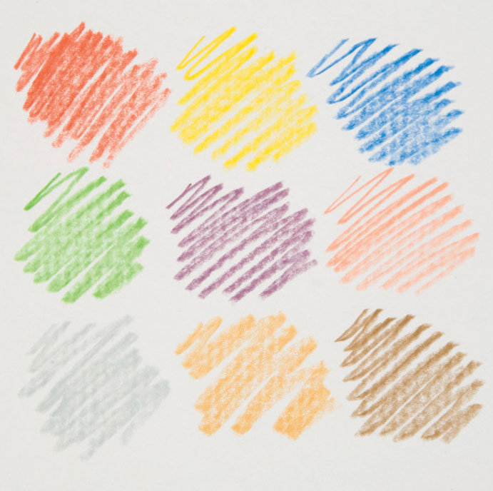
Neutral ground On this pale gray ground the colors retain their identity, though the colors that are close in tone to the paper show up less clearly.
Warm ground The warm yellow ground enhances and lightens the more translucent yellow, pink, and cool gray.
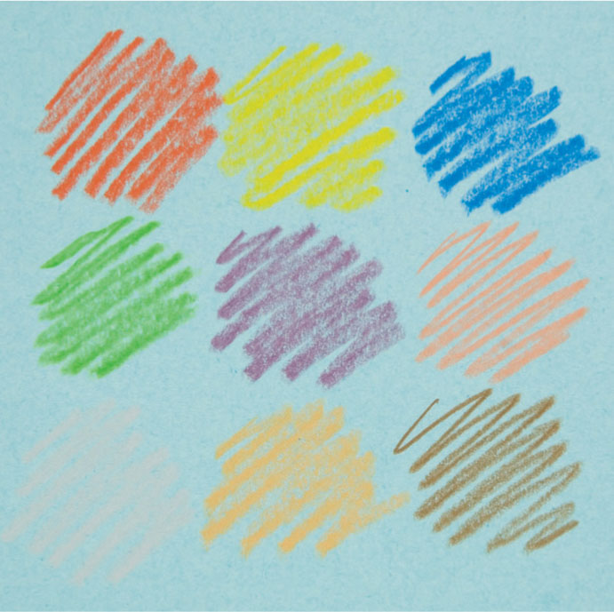
Cool ground The cool blue ground shown here deepens and brightens the raw sienna, darkens the red and raw umber, and gives a slightly green tinge to the yellow.
Dark ground The colors all appear lighter on the darker, terracotta ground, but its intensity reduces the contrast, especially of the red, violet, and the raw umber.

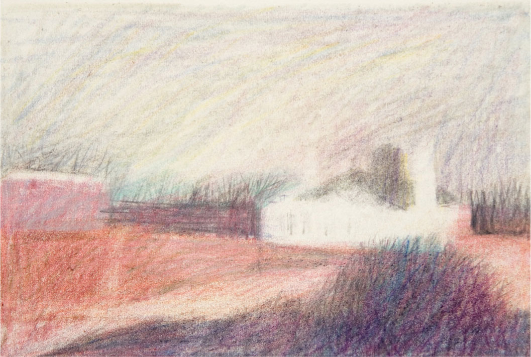
Inexpensive paper
Towards Reydon is worked in dry pencil in cool blues and pinks on warm-toned brown sugar paper. This kind of paper can inhibit the build-up of layers, as the color quickly becomes compacted, and too much erasing will tear the surface. However, you may find that you can develop your work by changing the type of pencil used for the final layer—the new pencil will often adhere more successfully.
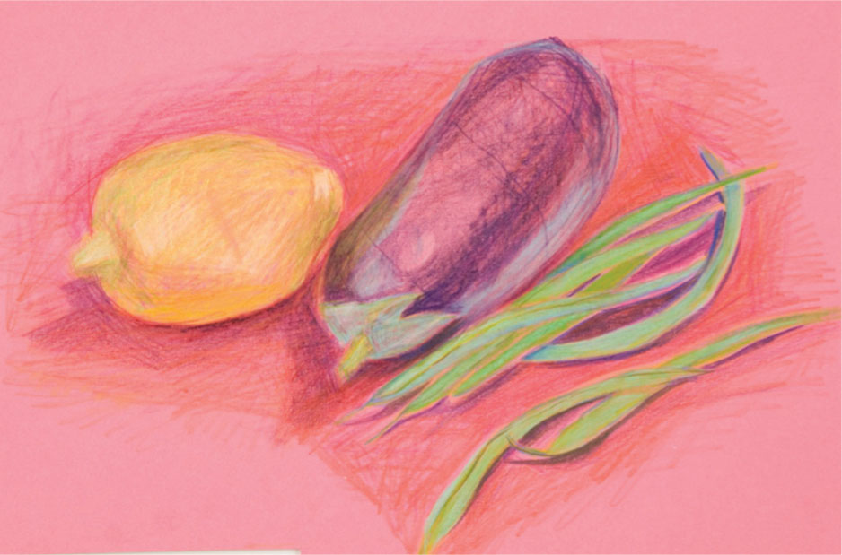
Bright-colored ground There is an almost luminous quality to this vignette in dry pencil on bright pink paper. Full use of complementaries or near-complementaries (see page 70) is seen in the use of the cool pink with the green of the beans and warm yellow lemon. The paler colors (pigment mixed with white) have a greater opacity than the others and so are less affected by the ground color, thus adding to the vibrancy.
Coloring your own paper
Coloring paper yourself allows you to choose the exact hue you want and to modulate it to allow for a dense ground in one area and lighter in another. You can use oil pastel or acrylic paint as shown below, or even stain your paper with a used tea bag.
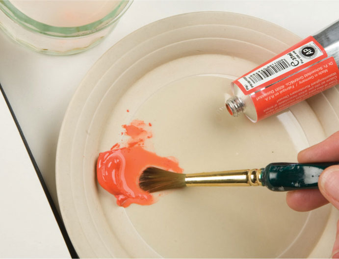
1 Squeeze a small amount of acrylic paint in your chosen color onto a plate or palette and mix it with a brush loaded with a generous amount of water. For a more fluid consistency, you may need to add more water to enable the paint to spread easily over the paper surface.
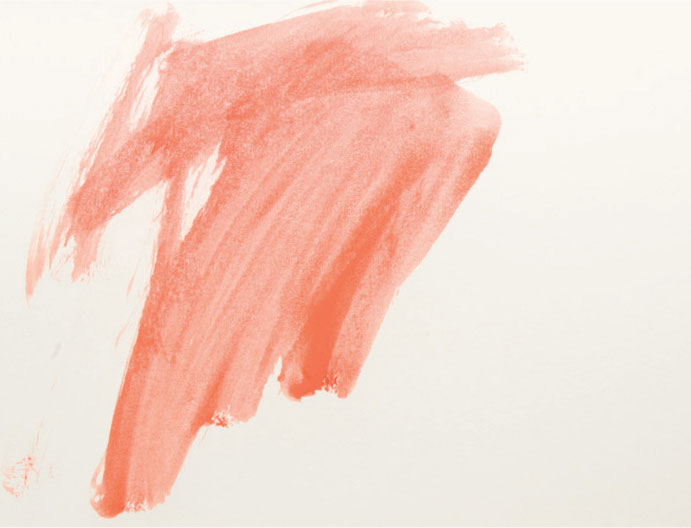
2 Using a brush, spread the paint over the paper, adding more water to the palette if necessary. Be sure to work quickly—If the paint starts to dry, hard edges will begin to occur.
3 As you are painting, you will notice the brush marks are apparent. These can be either left as they are or smoothed out as shown in step 4 if they are too dominant.
4 While the paint is still wet, use a damp rag to spread the paint further to the edges of your paper and smooth out some of the brush marks. Once dry, your paper is ready to work on.
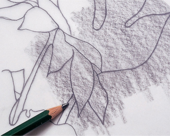
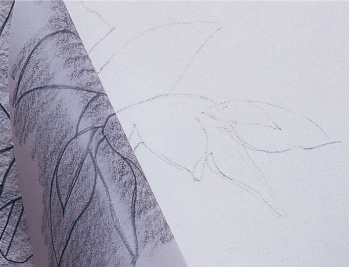
Transferring a sketch
With some types of colored pencil drawing it is important to have a clear and accurate guideline before you begin the color work. Corrections and erasures in the under-drawing can spoil the paper surface, so to avoid this, make a working drawing which can be transferred via tracing paper to the final drawing paper. Or, if you are working from a photograph or an existing drawing, you can enlarge or reduce it on a photocopier, and then trace the outlines. Alternately, you can scan the image into your computer and use the scanning software to make any necessary alterations before printing out, but this would limit you as to size.
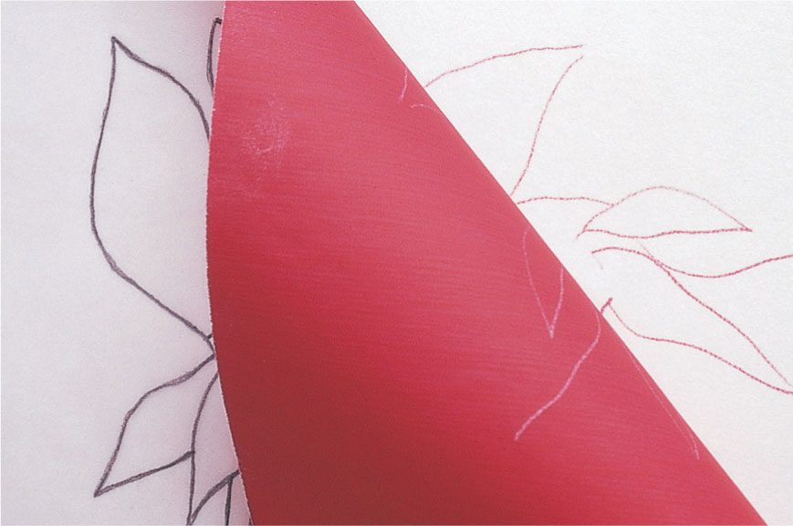
Transfer paper
A quicker and cleaner method is to use transfer paper, which is similar to carbon paper but is made in a range of colors, and thus has the advantage of allowing you to choose a suitable color. Slip the transfer paper colored side down between the tracing and the drawing paper, and then draw over the outlines lightly.
The tracing method
The conventional method of transferring a sketch simply involves using a piece of tracing paper and a colored pencil.
1 Draw the outlines on tracing paper, and then scribble on the back with a graphite pencil, coloured pencil, soft pastel, or chalk
2 Place the tracing paper onto the drawing paper and go over the outlines again with a ball point pen or sharp pencil to transfer the image.
Resizing your image
If you don’t have access to a photocopier to enlarge or reduce an image, you can do it by hand, as shown below. This is a slow method, but it is good practice, helping to sharpen your observation and drawing skills. All of these methods, however, are essentially devices for copying. Practice enlarging or reducing by eye to be sure of retaining the vitality of your work.
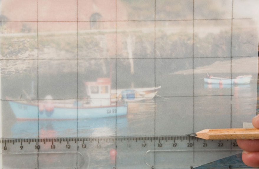
1 Draw a grid directly onto the surface of the image or onto a sheet of tracing paper or thin acetate laid over it. Use marker pen if using acetate.
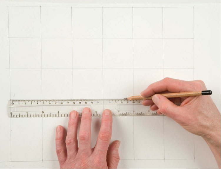
2 Draw a larger grid with the same number of squares but to the same scale as on your drawing paper.

3 Copy the contents of each square on to the equivalent square on the drawing paper. Plot the main points where shapes or edges cross over the perimeter of each square into the next one, carefully, before developing the detail.
Masking
A mask is anything that protects the surface of your drawing and prevents color from being applied to a specific area. The simplest form of mask is a piece of paper laid on to your drawing paper; the pencil can travel up to or over the edge of the paper and when you lift the mask, the color area has a clean, straight edge. You can obtain hard edges using cut paper; torn paper makes a softer edge quality. You can also use thin cardboard, or pre-cut plastic templates such as stencils and French curves.
If it is important to mask off a specific shape or outline, which may be irregular or intricate, you can use a low-tack transparent masking film which adheres to the paper while you work, but lifts cleanly afterward without tearing the surface. You lay a sheet of masking film over the whole image area and cut out the required shape with a craft knife. Carefully handled, the blade does not mark the paper beneath. Low-tack masking tape can also be used to outline shapes; it is available in a choice of widths, and the narrower ones are very flexible for masking curves.
Loose masking
Thin cut or torn paper can be used as a mask either to protect your work from smudging, or to keep an area clear of color while working right up to the edge, without the need for a linear outline.
1 Place the paper mask on the drawing paper and hold it down firmly. Begin by shading lightly over the edges of the mask.
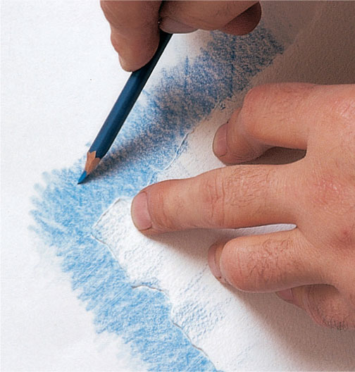
2 Build up the shaded color to the required density, keeping the direction of the pencil marks consistent at each side of the mask.
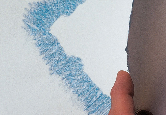
3 Lift the top corner of the mask to check that you have a clean edge quality and the right intensity of color. Keep the lower edge of the mask in place, so you can just drop it back if you need to rework the color area.
Using masking tape
Masking tape will give a straight edge to create a clean “frame” around a drawing, avoiding the need for a ruler. A hard edge might be used for a geometric structure, or it can be stretched slightly or cut to mask curves.
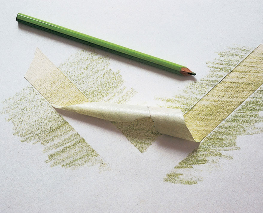
1 Lay down the masking tape evenly, but do not rub too firmly, or you may have trouble lifting it without damaging the paper surface. Shade color over the edges of the tape as you would with paper masks. An advantage of masking tape is that you can work over both sides of the tape at once. When complete, peel back the tape carefully.
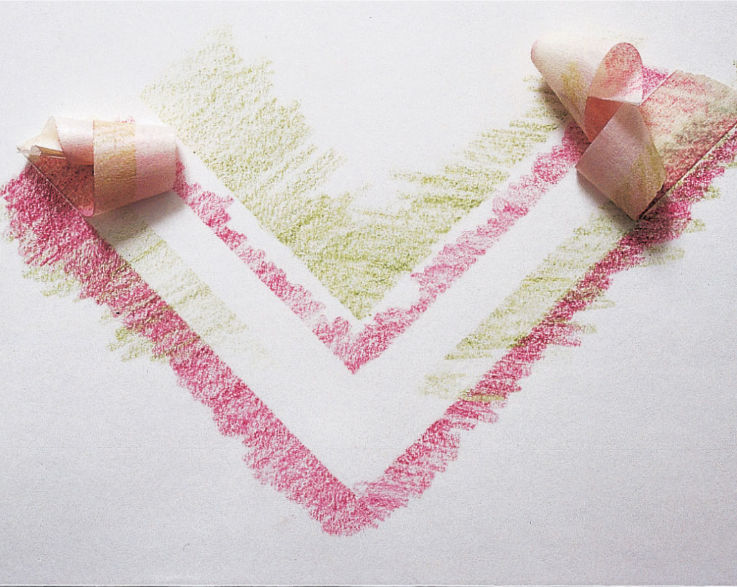
2 If you are overlaying colors, you can use the same mask, or a fresh piece of tape, to cover the paper while you lay the second color.
Using masking film
This is useful for hard-edge, precise work, especially where an image is to be repeated. It has the advantage of being slightly sticky so that it will stay in place while you shade in the cut-out shapes. Practice cutting the stencil with a craft knife, as curves are not always easy to cut accurately.
1 Trace the outline of your drawing on paper. Detach the top edge of the masking film from its backing sheet and smooth it down on the paper covering the image area with a border of film all around. Gradually pull back the rest of the backing sheet, smoothing the film across the paper as you go.
2 Identify the first shapes you are going to color, and cut around them with a sharp craft knife. Lift one corner of the cut film and peel back the shape. Repeat as necessary. Apply the colored pencil to each shape filling it with color up to and over the masked edges.
3 When you have completed all areas in one color, move on to the next. Cut and lift the mask sections in sequence, then shade in color.
4 At this stage the coloring is complete, and the uncut masking film is still on the paper, causing the black background to look grayed. The next stage is to remove the remaining masking film completely.
5 Compare the finished effect to step 4. With the mask removed, the edges of the colored areas stand out sharply against the black, making each shape clean and distinct.
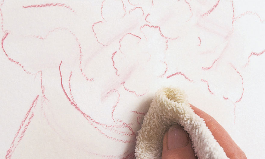
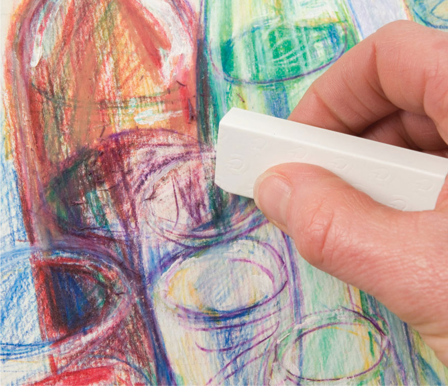
Erasing techniques
An eraser can be used both to make corrections and as a drawing tool, although in both cases the process works slightly less well than with graphite pencils. Even so, lightweight strokes are easily eradicated, and in many cases, alterations can be made to regain a surface suitable for reworking. As a drawing tool, use your eraser to create lighter or negative marks on a darker surface, although this will not be effective on washed areas.
The type of eraser you choose will depend on your paper: a kneadable eraser for smooth papers and something firmer, such as a plastic eraser, for more textured ones. Try both and see which you prefer. You can cut a plastic eraser to a suitable size for more precise work, such as the soft feathered edge of animal fur, and kneadable erasers can be pulled into a point. Densely compacted color can be scraped back with a craft knife to open it up a little or to allow for further work with an eraser.
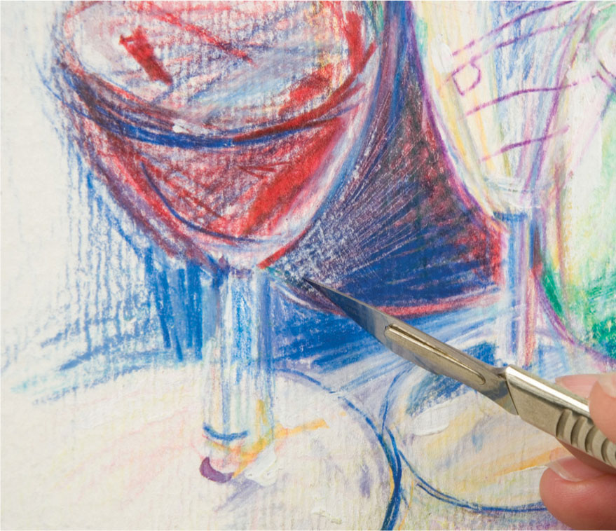
Eraser alterations
The pencil work had become heavy and too dark on the wine glass. An eraser is used to take out some of the excess pigment.
Making alterations with a knife
Similarly, a sharp blade used with care removes pigment that has become too heavy and allows light into the picture.
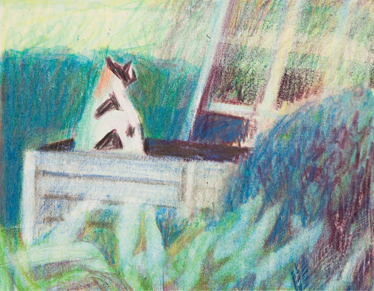
Eraser drawing
For Cat in the Garden, the artist has used an eraser as a drawing tool to lighten the leaves in the foreground and to lose the definition of the trellis at the right-hand side.
Softening blends
The Pavilion at Marston shows subtle layering and integral use of an eraser to soften the color blends and to lighten it in places, notably patches of sky and in the foreground.
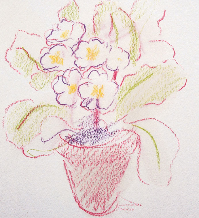
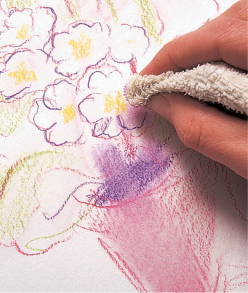
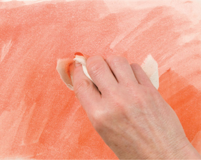
Rectifying mistakes
Marks made with water-soluble pencils can be removed by simply wetting them with water and lifting off the resultant “paint” with a rag or paper towel. Repeat several times, as long as you are working on stretched paper (see page 16), and leave to dry thoroughly before reworking. This is often the most effective way to remove unsuccessful drawing. Rather than working too precisely, it is often best to take out a wider area around the problem, leaving a soft or ragged edge, or to work up to a hard edge which might form a natural break in the drawing, so that the new drawing blends in seamlessly. Alternatively, a cotton bud can be used for precision.
White gouache or acrylic could be used to conceal unwanted marks, so long as the surface is busy enough for you to integrate the change in texture.
ARTIST’S TIP
Subsequent layers of pencil and wash on an acrylic underpainting will not muddy it, as acrylic is resistant to water. Color can be wiped away to reveal the clear color underneath, perfect for rectifying mistakes.
Searching for perfection
Alteration to preliminary work can often be a bonus, adding texture and depth—or history—to the finished piece. In the search for the perfect line or descriptive mark, reshaping, or even removing can be part of the drawing process. Leave the “wrong” one in until you are sure of the right one to avoid making the same mistake twice. Or leave it in as part of the drawing; the eye will always pick out a true line from previous permutations.
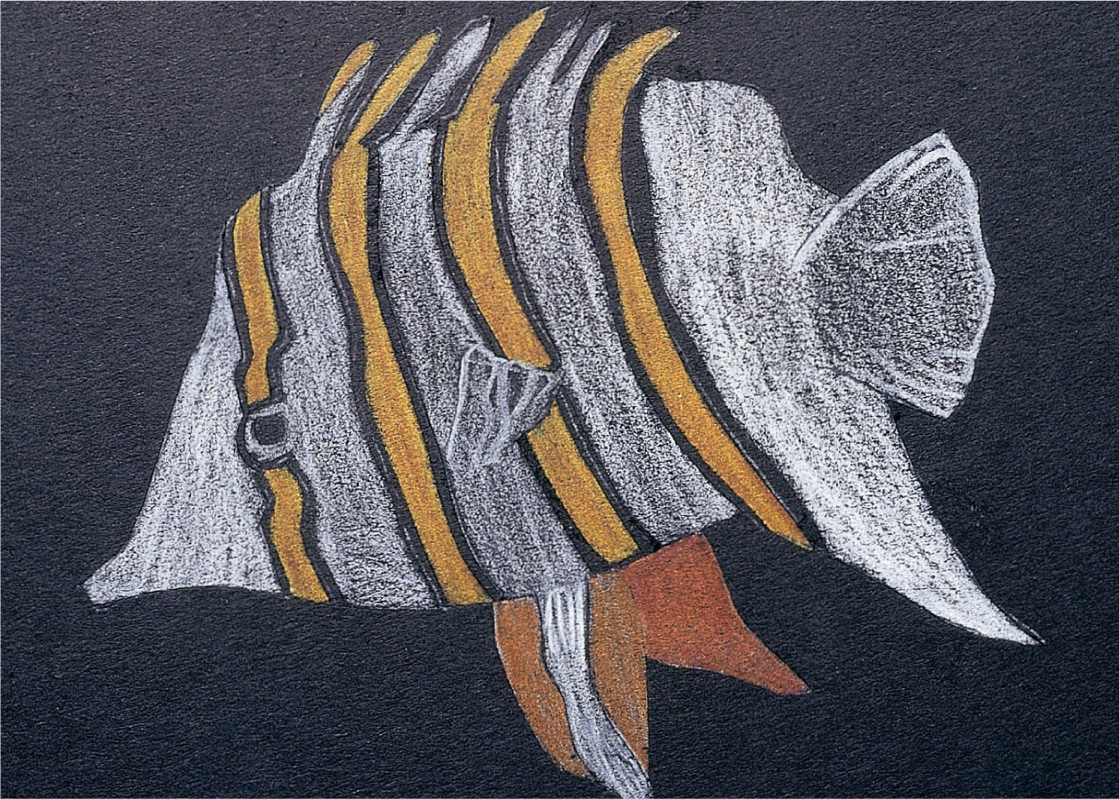
Exploring structure
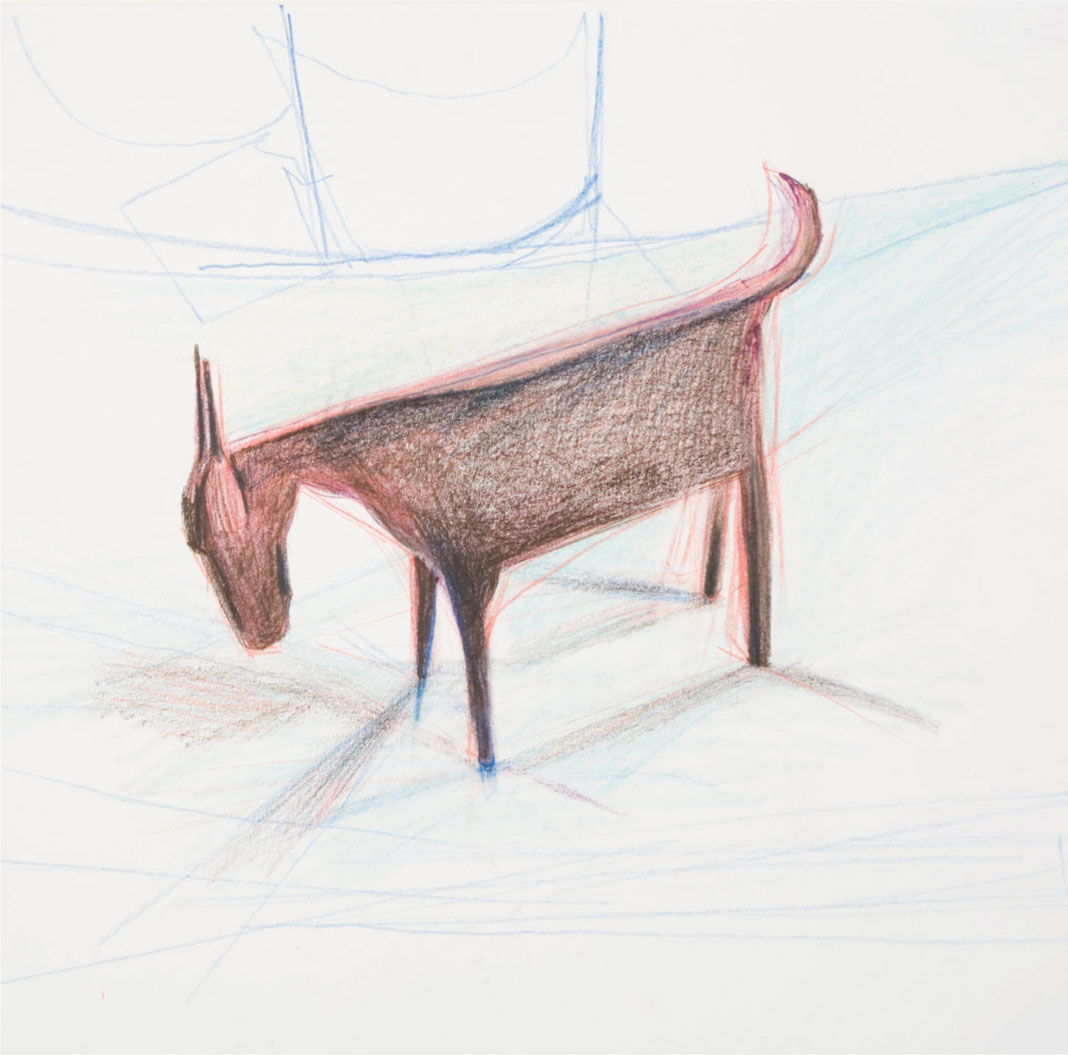
This is the initial stage of the later drawing shown on page 71. The drawing in red explores the structure, and the angle of this metal goat has been allowed to tell its story, and indeed plays an important part in conveying a sense of liveliness to this static object.
Making alterations
Alterations are easily disguised if the paper surface is undamaged. Enough pigment can be removed for further work even if the paper is discolored. If the subsequent drawing is to be lighter, a little white paint can be dabbed over to provide a more neutral ground color. This sequence shows you how to implement alteration techniques effectively.
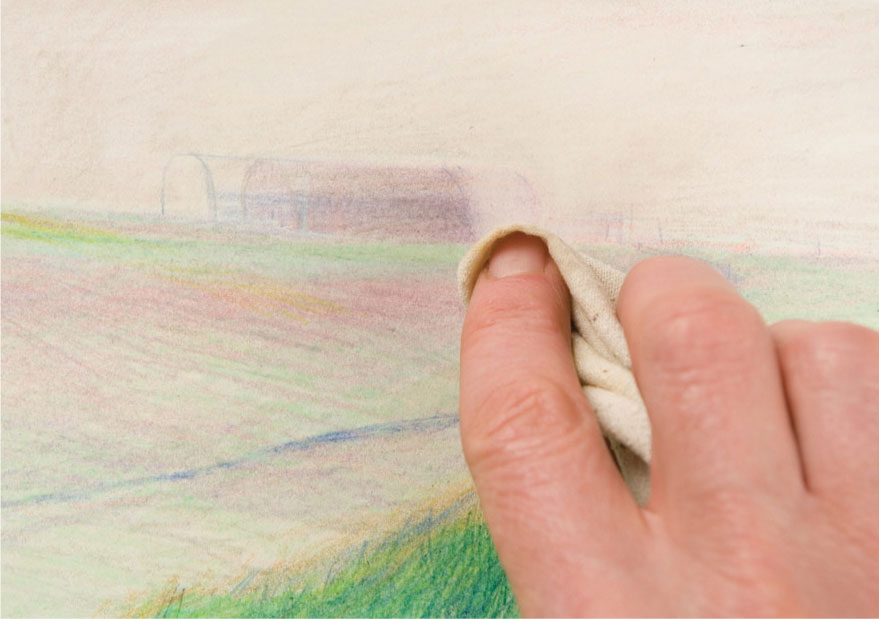
1 The barn on the horizon in this landscape is to be moved slightly to the left. The new position is sketched in and a rag dampened with water is used to gently wipe away most of the unwanted drawing. The drawing is removed around the area to be changed, softening the edge.
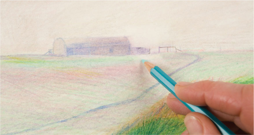
2 When the paper is completely dry, the barn is redrawn and the surrounding area blended into the new work.
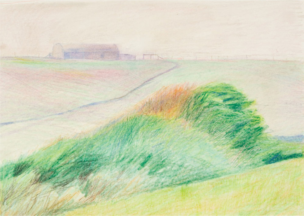
3 The new position of the barn makes for a more satisfactory composition.
Underpainting
To underpaint, either lay an all-over ground color before you start, as shown on page 45, using thin acrylic paint, watercolor, or even thin oil or oil pastel, or use the paint as the first stage in the drawing, blocking in the main shapes of your composition, and choosing colors that will play a role in the color relationships of the finished piece.
If you decide on the latter approach, remember that because colored pencils are less opaque than paint, the base layer will affect the covering layer and darken it, so use a lighter shade on top to combat this. Your choice of color depends upon those to be applied later, but in general, choose a base color that will enrich the final layers. For example, you could use a harmonious burnt sienna or warm yellow under a red for a light, bright effect, or you might establish the main light and dark passages in muted monochrome tones, a cool blue, or warm gray.
Underpainting with primer
A primer stops the paper absorbing pigment, and can be used in a considered way to alter the surface texture before painting. The bright white of an acrylic primer can add brightness to translucent or thin layers painted or washed over it, and the dry primer will reveal brush marks which can be integrated within the surface texture, contrasting with any unprimed areas.
1 Underpainting with acrylic primer produces an interesting textured surface to work on with water-soluble pencils. Use a bristle brush and coat the paper with primer straight from the pot. When dry, the brush marks will remain slightly raised, providing a texture that plays an integral role in the look of your finished piece.
2 When colors are shaded over the primer, the brushmarks will show to give a hatched effect.
3 Water is added using a soft brush and brushed over the waterproof surface. The wet pigment flows over and into the crevices.
Underpainting with acrylic paint
Ordinary acrylic paint in white or a color is less textural than acylic primer, but will act as a barrier between the paper and subsequent work. Remember: The chosen hue of the paint will affect the colors used however, as shown in the example here.
Here the same two colors are shaded over a yellow ground and water is then added. You will notice the yellow pigment alters their color and how they blend to form a neutral brown with yellow overtones.
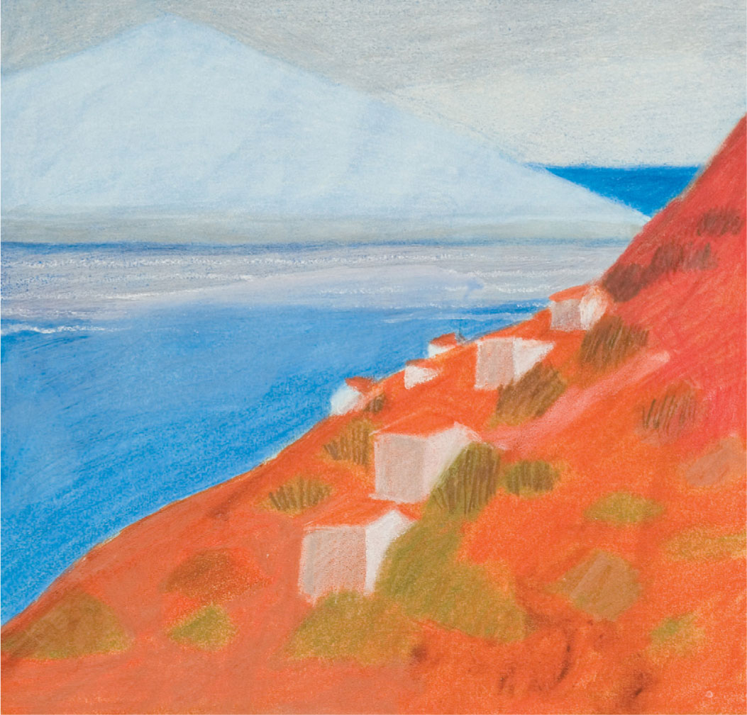
Underpainting with toning colors
This hot landscape was under-painted in acrylic in a bright turquoise blue for the sea, sky, and island section and a rich burnt sienna for the foreground. Although all the underpainting is well covered, it still influences the overlaid color, adding a sense of light and brightness.

Underpainting with contrasting colors
In comparison, the same landscape was underpainted in a cool complementary blue-gray which gives the completed picture a slightly muted feel, although there are flickers of interest where the blue is allowed to show through, and to contrast with the reds and oranges.
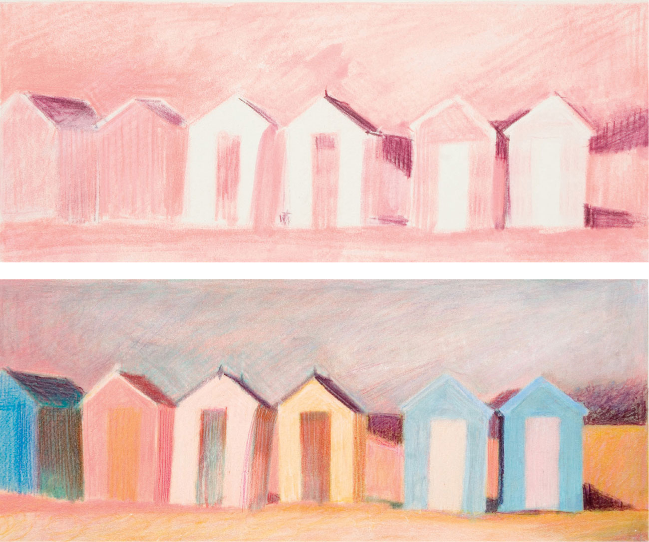
Monochrome underpainting
East Coast Beach Huts was begun with a monochrome pencil underpainting, using reds of different tonal value blended with water. Only light pressure was used, just enough to indicate the changes in tone before continuing in full color.
Mixed media
Colored pencils can be a useful addition to other media, adding texture as well as being used to define or clarify a drawing previously worked in pastel or paint. You might try a few different methods, such as working with colored pencil over blended oil pastel, drawing into a colored-paper collage, making a line and wash drawing with a fiber-tipped pen and water-soluble pencils, or combining watercolor.
Oily surfaces
Thin oil paint or oil pastel spread with a little mineral spirit makes a pleasant fluid surface to draw on. The grease seems to mix with the pencil pigment and intensifies the color although it can leave a stain, especially on colored paper, so use only where it will be camouflaged by further work.
Building up in more than one medium
Thin acrylic, gouache, watercolor, and colored inks can all be used in conjunction with pencils to build up the image as well as for under-painting. Color the drawing with water-soluble colored pencils using shading or hatching, and blend with water. Or draw with a combination of colored pencils and one of the several types of pastel available—all contribute varying qualities of color and texture.
Variety and contrast
In Cricket and Wildflowers the contrast of the drawn lines and the brushed ones give variety and liveliness. Colored inks, white gouache, and water-soluble pencils are thinly laid, with the white textured ground playing a major role in conveying the airy freshness of the subject matter.
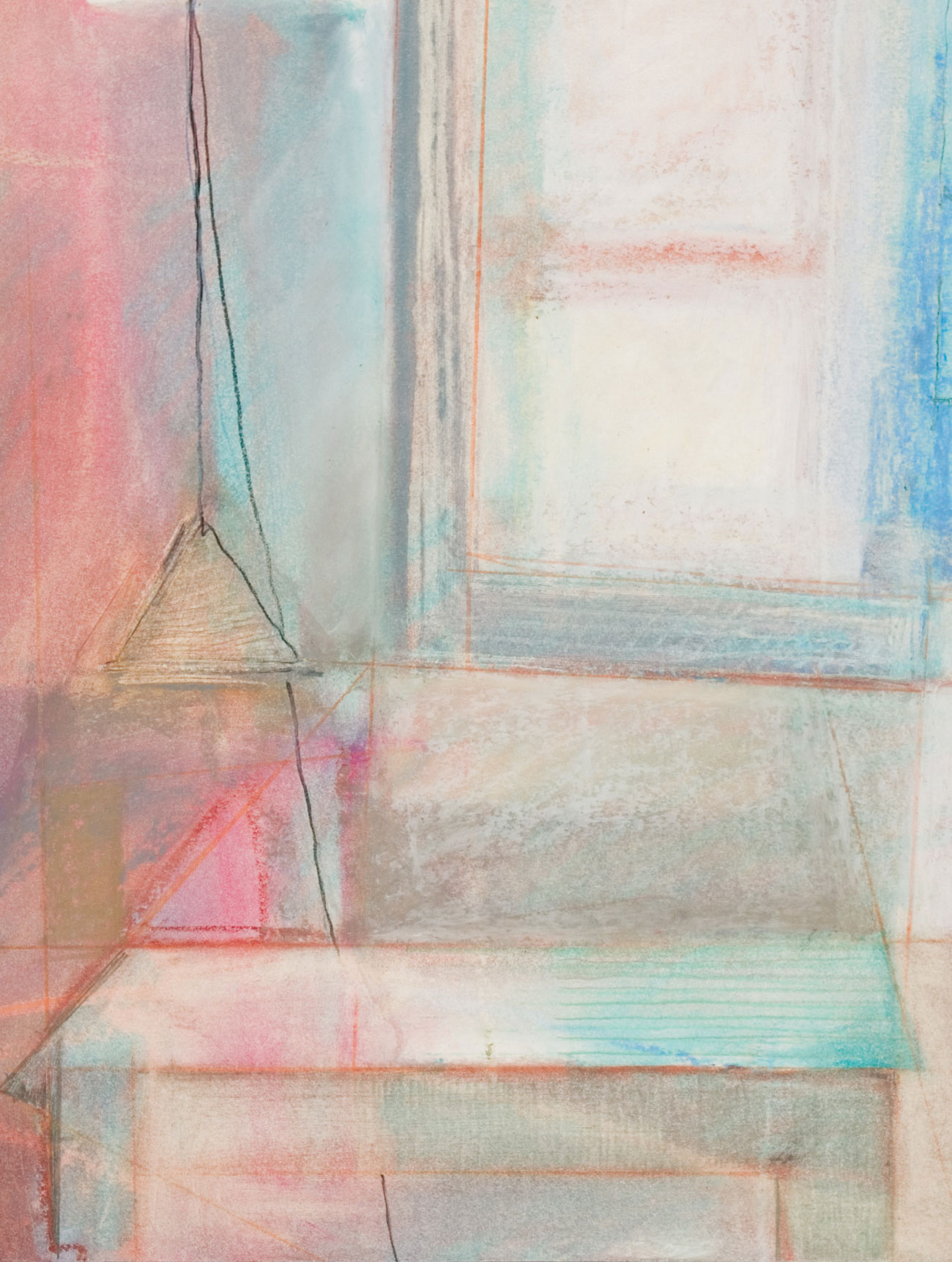
Line work
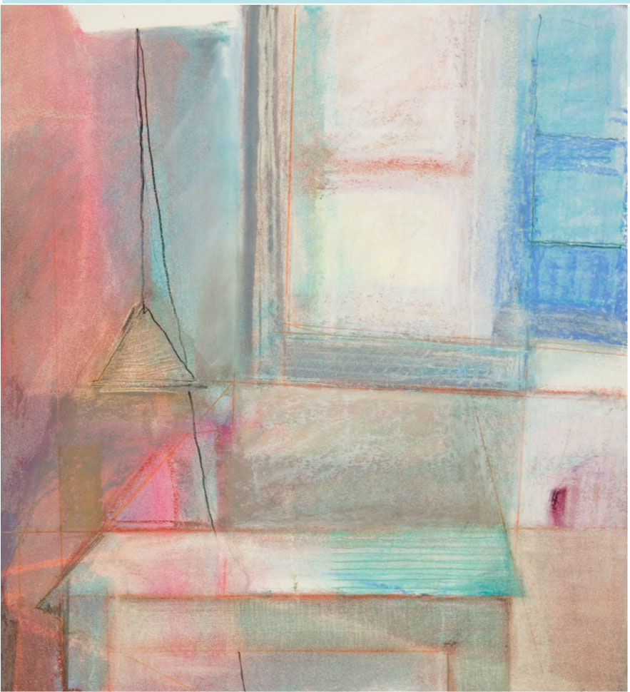
Both colored pencil and graphite lines have been used in Table at the Window, and although minimal, they play an important role, emphasizing geometry and perspective in an otherwise soft-focus oil pastel rendering.
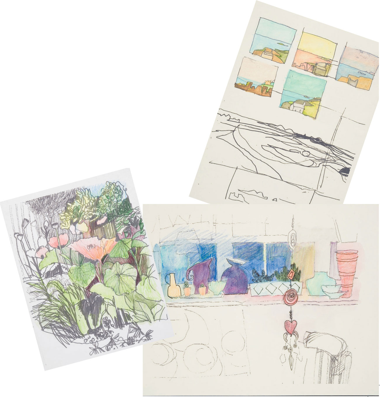
Line and wash
In the pages from a sketchbook, shown right, fiber-tipped pens of different thicknesses were used for the drawings, which were then colored using wet and dry pencil. Further detail was added after the paper had dried.