Choosing a viewpoint
If you are working from life rather than from sketches or photographs, the first stage in composing your picture is to decide on your angle of viewing. It is surprising how radically even raising or lowering your own eye level can affect a scene, so try looking at it from both a seated and a standing position—in landscape, a low viewpoint will make more of the foreground, and high one will emphasize the distance. You may also find that a slight shift from one side to another may make a big difference. For example, a group of trees might overlap and thus be hard to read from one angle, but if you move to the right or left they will separate out.
In still life, a high viewpoint will often yield a more dramatic composition than the more common eye-level one, as it organizes the object into a pattern. Try setting up your group on a low table, or even on the floor, and work standing up.
Using a viewfinder
Very few artists are without one of these simple devices. A viewfinder consists of nothing more than a piece of card with a rectangular aperture in the middle, and can be made in minutes. By holding the viewfinder up at various distances from your eye, you can bring the subject close or push it away, and so decide how much to include, and whether cropping would help the composition. You can also work out the best format by holding it up first horizontally and then vertically.
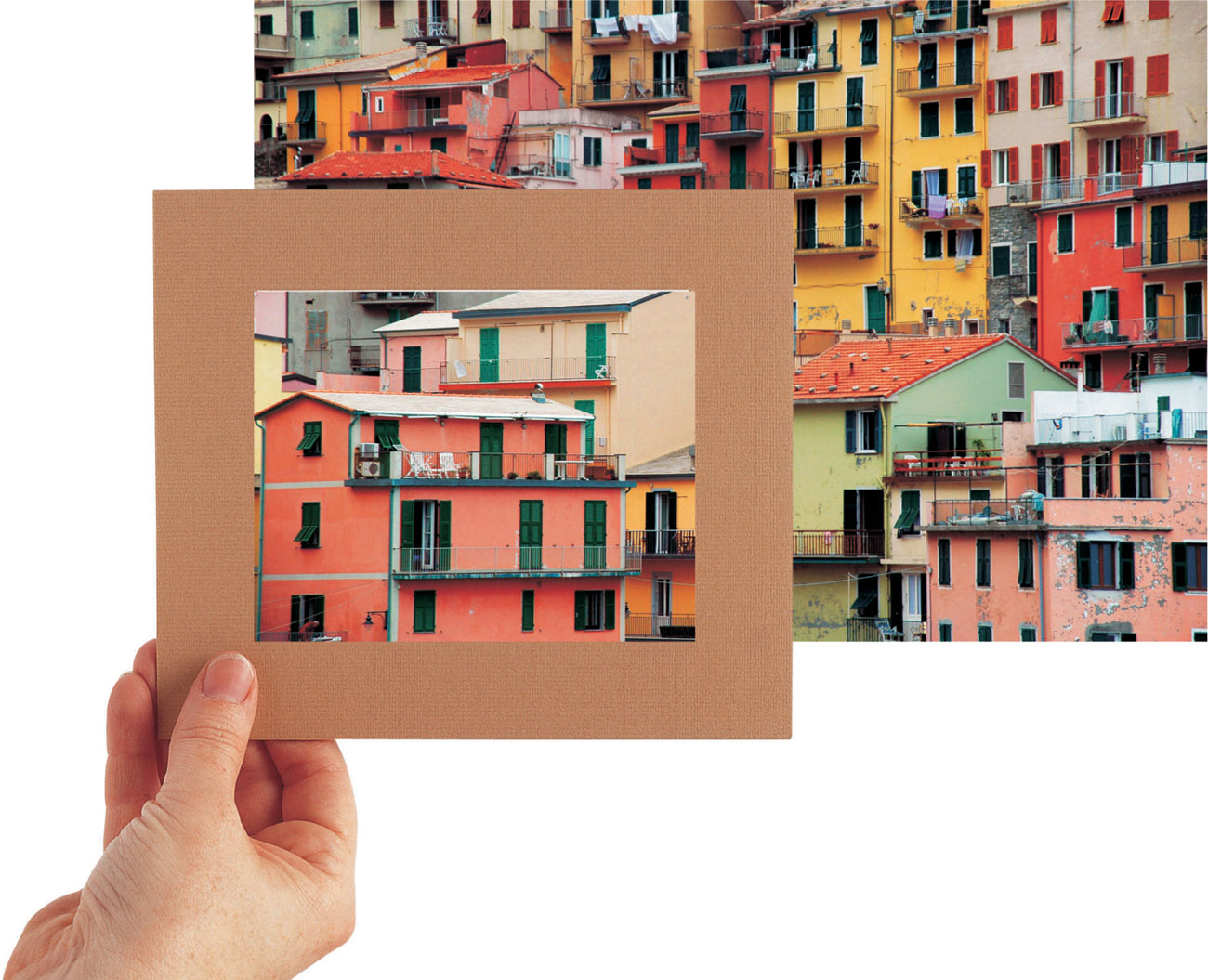
Changing the viewpoint
Here a viewfinder is used to take a closer viewpoint, selecting just one section of the scene.

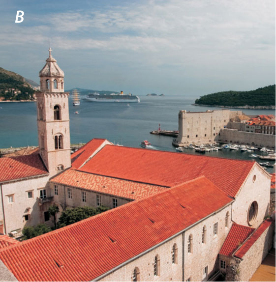
Changing the emphasis
The viewpoint shown in photo A is perfectly satisfactory; it makes a good composition, as the diagonals of the roof and walls lead in to the more distant buildings. However, you might consider changing the emphasis by focusing in more closely on the foreground building to give a more geometric structure to the image (see photo B). Use the viewfinder to explore possibilities.
Exploiting shape and texture
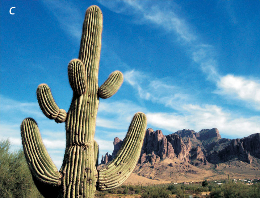
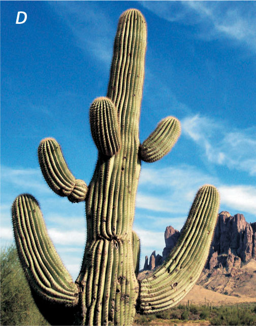
In photo C, the photographer has aimed at contrasting the strong shape of the cactus with the distant mountains and the diagonals of the clouds, but you could explore the shapes and textures by taking a closer viewpoint and letting the cactus fill the whole of the picture (see photo D). In this case, it would be best to omit any distracting background detail.
Choosing a format
Once you have decided on your viewpoint, the next stage is to decide on the format of your drawing—whether you want to work on a horizontal rectangle (landscape format) or an upright one (portrait format). Sometimes this will be obvious, but it isn’t always, so use your viewfinder again (see page 80) to frame the subject in different ways. If you are working from a photograph, cut two L-shaped pieces of card and move them around on the photo—there is always a temptation to use the same format as the photo, but you may find that by taking a section from the middle of, say, a landscape, you can make a more exciting composition, using an upright shape.
Paper formats
Drawing papers are made in standard-sized rectangles, but you don’t have to stick to these proportions—you might prefer a very long rectangle, or even a square, in which case you simply leave some of the paper uncovered. If you do this, it is best to sketch in lines where you intend the drawing to begin and end, otherwise you will be inhibited by the edges of the paper.
Elongated rectangle
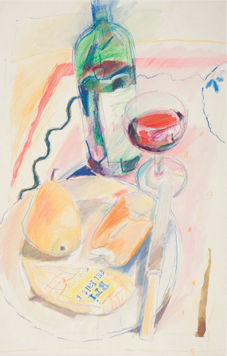
In this piece an unusually tall portrait format has been chosen to accomodate the long diagonals of the knife and table edge. Commissioned for a book cover, the illustration is allowed to bleed freely at the edges.
Landscape format
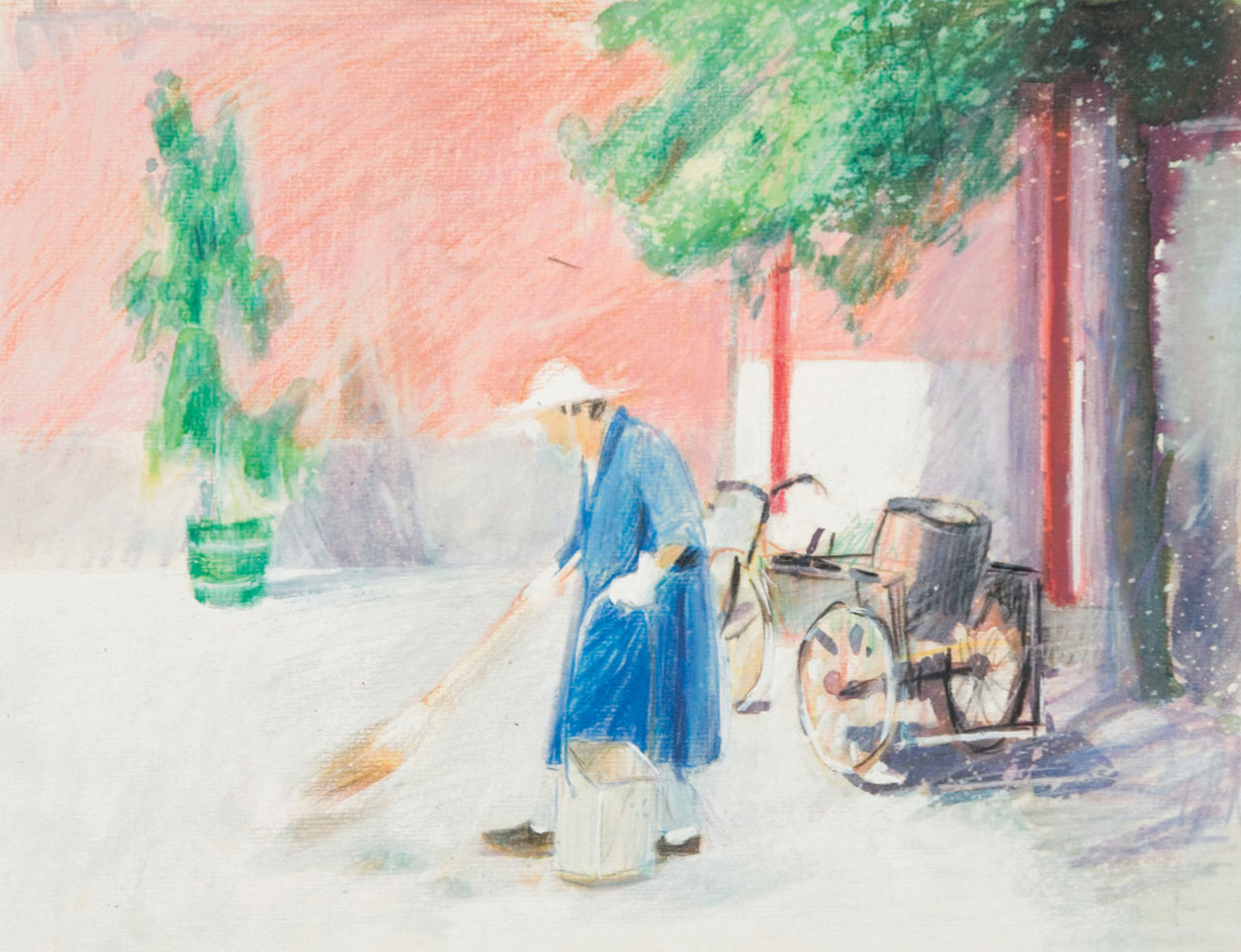
In Street Cleaner, the classic landscape format makes use of strategically placed horizontals and verticals. It is loosely drawn in colored pencil and inks spattered with bleach, which reinforces its light, airy quality.
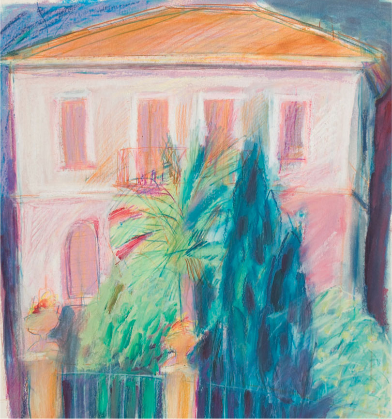
Square format
The Pink House almost fills the frame, determining its shape. Acrylic and oil pastel have been used boldly in blocks of color, the linear marks of the colored pencil work tying them together in the initial drawing, and also adding texture and movement.
Composition
There are few hard and fast rules about how to design or compose, a picture, but you should aim for a good balance of shapes and colors so that you create a harmonious whole rather than a series of unrelated elements. To make links between different parts of the image, a common device is to create “echoes,” by repeating similar colors and/or shapes from one area to another. In a landscape with a blue sky, you might bring in touches of blue among the greens of grass, and balance a foreground tree with a similarly shaped one in the middle distance.
It is vital to keep the viewer’s interest, so don’t leave large areas where “nothing is happening,” and if there is a dominant feature, avoid placing it too centrally; symmetry tends to split the image into two halves, leaving no center of interest. Don’t divide a landscape into equal areas of land and sky—a good ratio would be two thirds to one third of either sky or land. Try also to lead the eye into and around the picture by means of visual signposts. In landscape, curves, or diagonals, which the eye naturally follows, can be used to lead into a focal point—these could take the form of a path or fence running in from the foreground to the middle distance. In still life, folds of drapery can be used to perform the same function.
Making compositional choices
Below is a sequence of sketches made before deciding on a final composition for the finished piece. The objects are moved around, before a horizon line is decided upon.
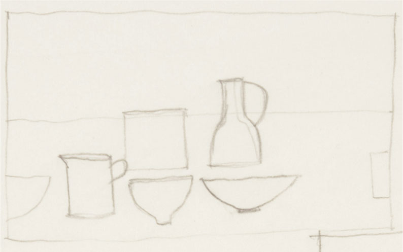
1 In this asymmetrical composition, the horizon line is just above the halfway mark, with most of the detail in the bottom half. The objects are carefully spaced. The eye is drawn diagonally up and to the right of the horizon line to the tall jug, and the two half shapes form a connection by taking your eye from one side and to the other, but not out of the picture.
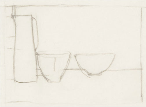
2 This is far less interesting. It is too heavy at the left-hand side and the eye is drawn along the horizon but has nowhere to go but back again.
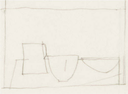
3 This lacks cohesion, as the line at the top doesn’t relate to the table-top below, but the space could be given distance using directional marks and the layering of color.
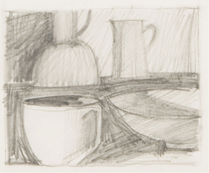
4 This tonal study makes a rough pattern of the light and darks. Almost square in format, the four large objects are used to fill the space, with only one of them seen “whole.”
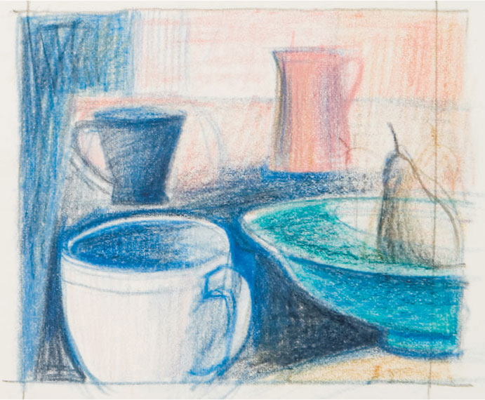
5 The final plan looks at the light sources more carefully. Some of the objects are changed or moved to create a feeling of greater distance and suggestions for color have been included using a limited palette of three or four hues.

6 In the finished piece, slight changes have been made. The juxtaposition of the objects is reinforced and the way the light falls is clarified. While preliminary sketches can help with compositional choices, it’s not always necessary to keep exactly to the plan!
Sketching
Colored pencils are an excellent medium for sketching—clean, lightweight, easily portable, and versatile. You can work rapidly in line only to describe individual shapes and forms, or build up color masses quickly, with loose shading and hatching. Select at least one pencil from each of the main prismatic colors (see page 66) and perhaps a couple of extras, such as an ochre or olive green or cool gray (see Basic palette, page 19), although you will find that for really quick sketching, two or three held ready in your other hand for instant changeover may be enough.
If you already know your subject and thus have some idea of its color range, you can choose pencil colors accordingly—greens and blues for some landscapes, and reds and browns for others, for example, but remember that you will need the complementaries to your main selection for contrast and nuance (see page 70).
ARTIST’S TIP
If you intend to make sketches on which to base a finished work, you will need more visual information than if you are simply sketching for its own sake. So if you don’t have enough time—or the right colors—to give a full account of the scene, make written notes in the margin of your sketch. And if the weather is changeable, it is also a good idea to carry a camera to record the scene as it was when you began the sketch.
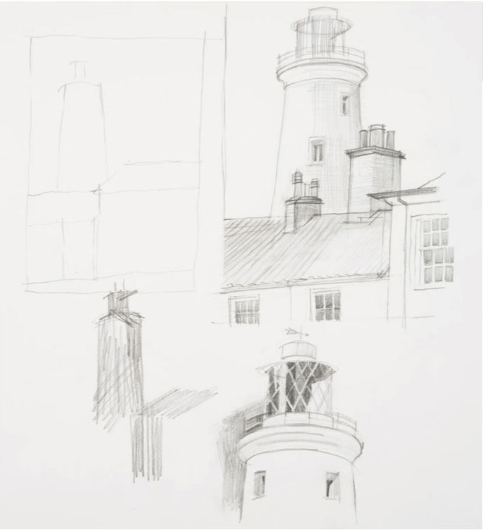
Analysis Pencil sketches analyzing difficult perspective or detail are useful to take back to the studio. Here, the relative sizes of the chimneys and the lighthouse is important, as is the perspective and the detail of the lantern.
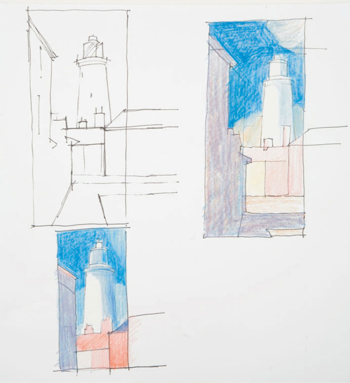
Line drawings A fiber-tipped pen is handy for simple line drawings. Here the focus is composition, so only the main shapes are extrapolated, and colored pencil is then used to record local color and relative tonal value.
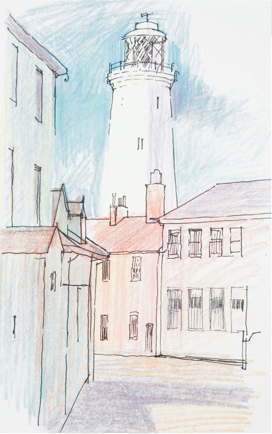
Recording the main elements This quick sketch shows the lighthouse in situ. It is simply drawn with little extraneous detail, but care has been taken to record the relative proportions of the buildings and the main differences in light and shade.
Drawing styles: Loose
Loose drawing styles will vary between artists, but as a general rule, the whole image is worked on simultaneously, with a gradual build-up to the completed piece. This way of working allows for changes in composition, perspective, or scale to be made easily, as a feeling for the whole image can be seen from the start. Changes can be either disguised or incorporated into the work, and you won’t encounter the problem of finding that you have spent hours working on one section only to find that it is too big or too small.
The work can be defined or refined as you wish; the stages in modeling form, enhancing light and shade, or developing detail can be halted or continued at virtually any stage.
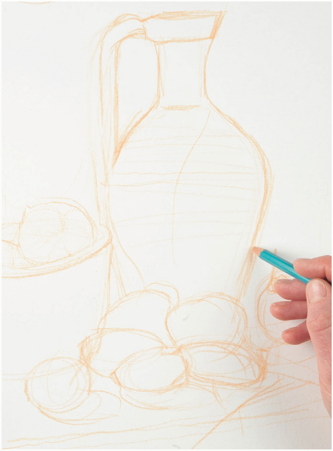
1 An initial drawing is made in a warm ochre pencil using a strong, definite approach. The color will easily blend in to the subsequent drawing and will not inhibit any future changes.
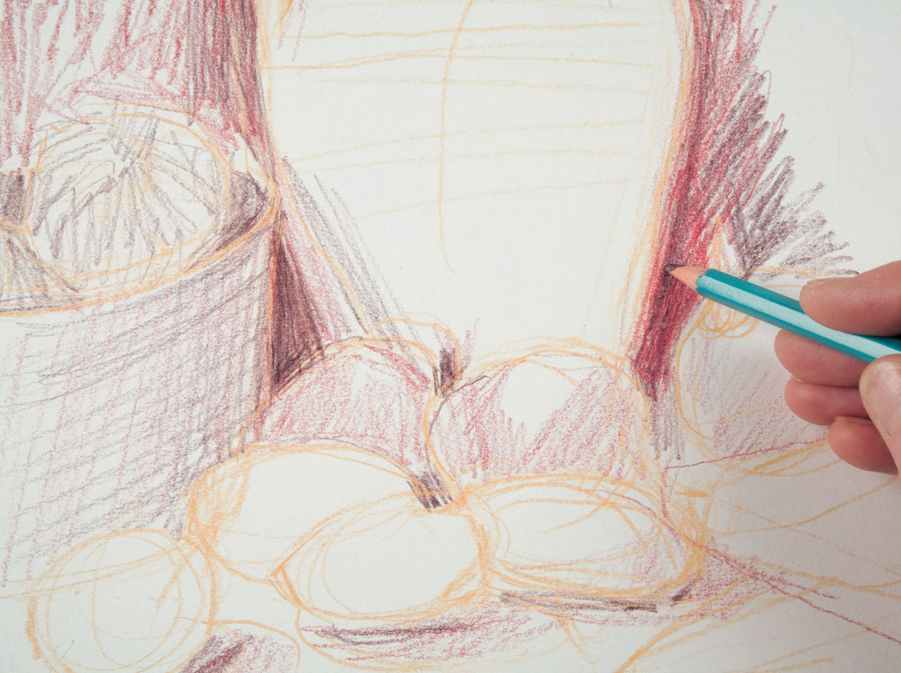
2 Light shading is added in blue and overlaid with red in more shadowy areas. The loose hatching creates a sense of liveliness; the red and blue together suggest a deep warm darkness appropriate to the subject.
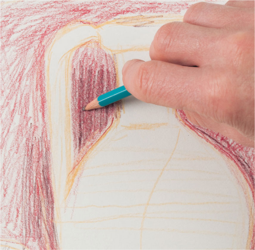
3 This close-up shows work in the heavily shaded areas; loose hatching and crosshatching are employed to gradually build the density required.
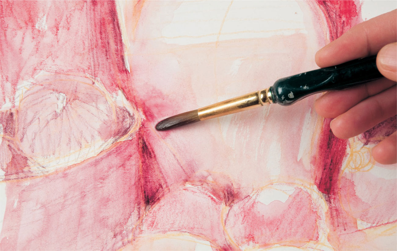
4 Shading is blended with water, deepening the color and tone and providing a smooth surface on which to layer further color when dry.
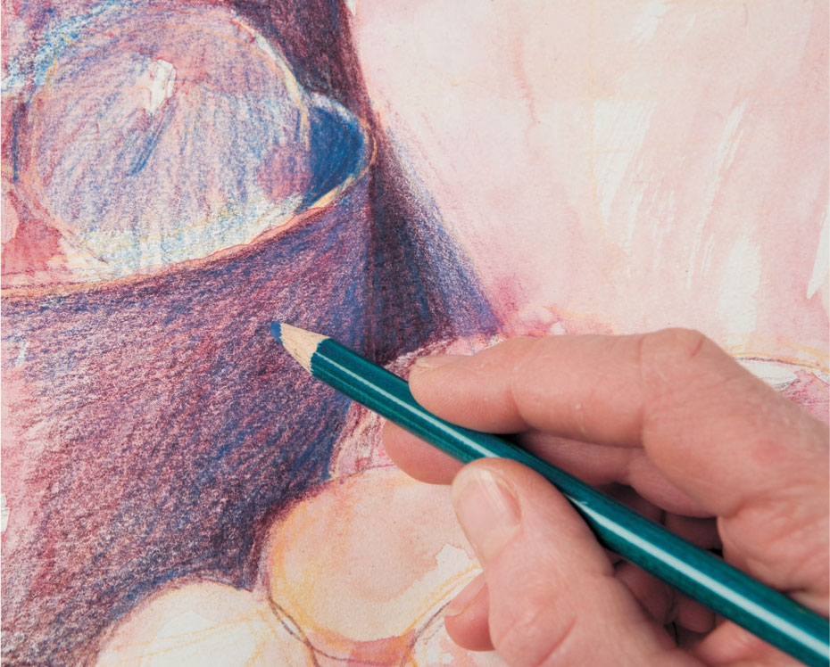
5 Shading and hatching using dry pencil in dark blue is overlaid; but the grainy texture of the paper now impregnated with red still shows through.
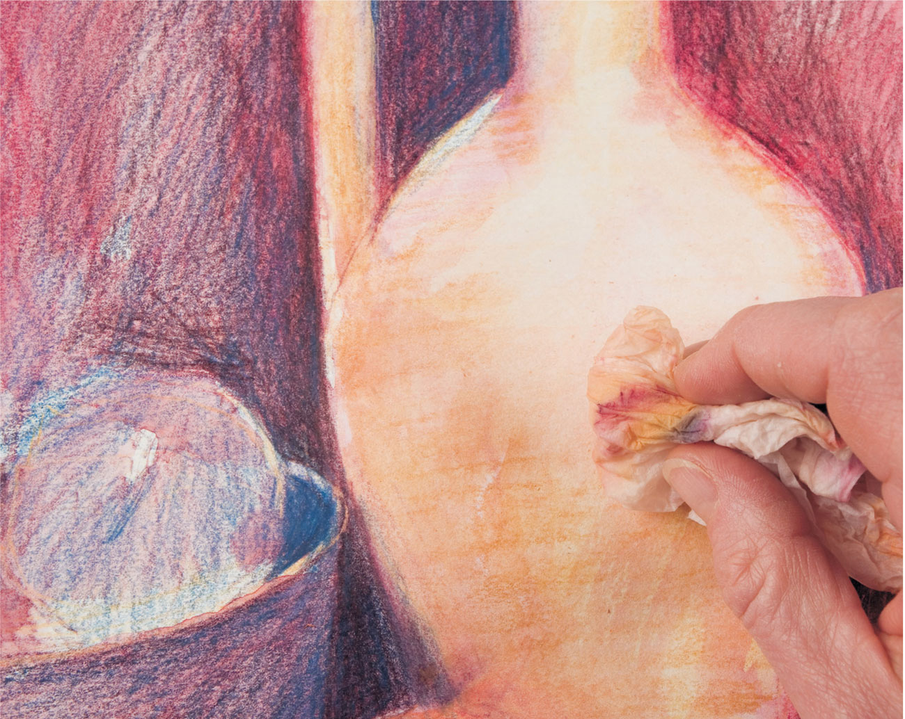
6 New colors are added and yellow ochre is applied to the jar, and then wiped over with a damp paper towel to soften and blend the drawn marks.
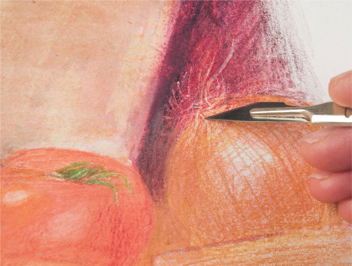
7 The layered area of dark tone behind the onion is sufficiently compacted to allow sgraffito to be used effectively to denote the fine dried roots.
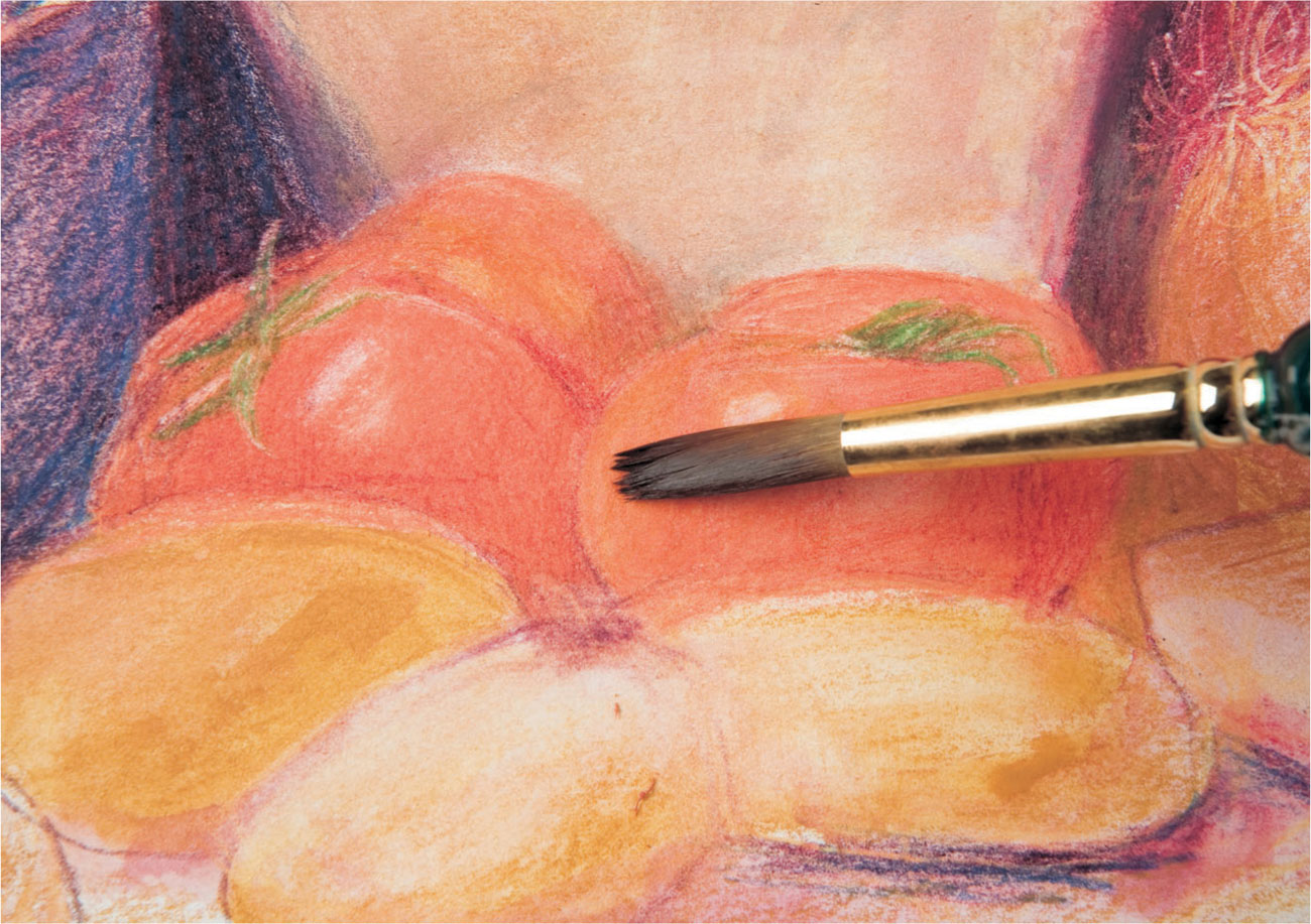
8 The round tomatoes and their shiny skin gradually evolve through a combination of drawing and blending with a brush. The highlights are removed with an eraser on dry paper.
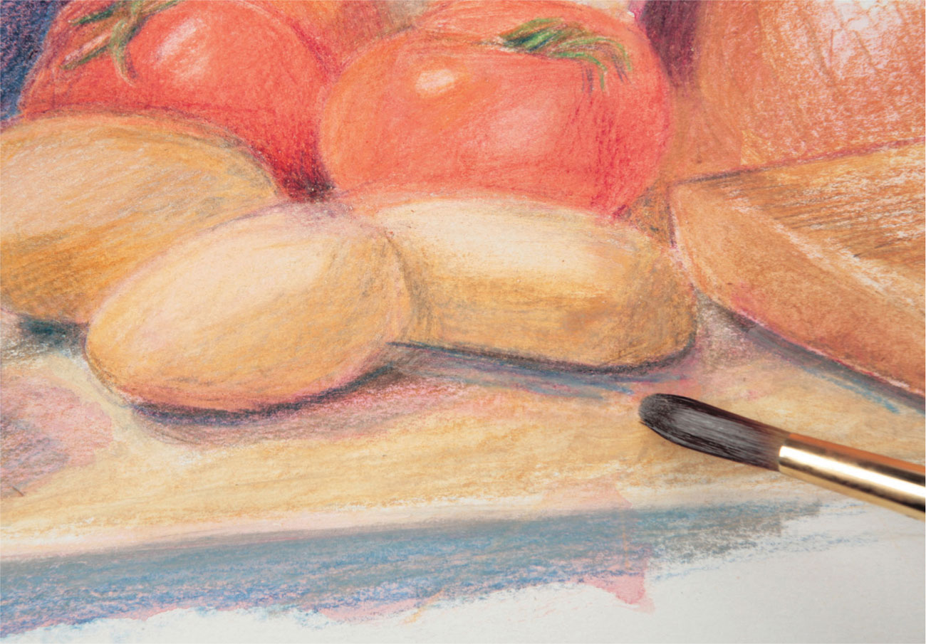
9 Loose, heavy shading partially blended with water in yellow ochre and blue-violet conveys the fairly rough texture of the table top and chopping board. Continuing in the same free manner, details are added to develop form, such as the deeper tone under the potatoes and around the tomatoes.
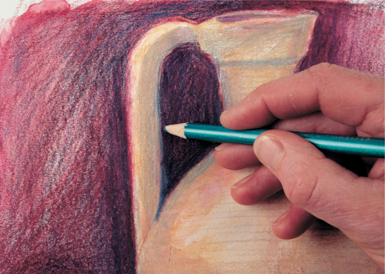
10 Greater contrast is needed in other areas, and here an indigo pencil is used to help the background recede and so give depth to the jar. However, as the shadows recede, more light (in the form of the red underpainting) is allowed to show through.
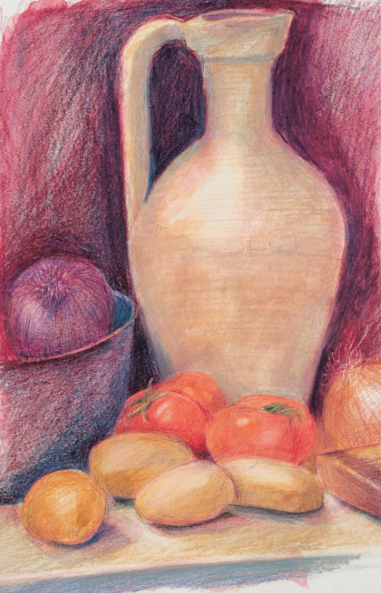
Jane Strother
Stone Jar with Vegetables The finished picture is both strong and lively, helped by the method of working over the whole picture at once. Surprisingly few colors have been used. Taken from across the spectrum but tending to be warmer variants, predominantly the redblues—ultramarine, violet, and indigo—yellow ochre, scarlet, and French gray.
Drawing styles: Tight
Working in a “tight” or controlled manner suggests a methodical way of working from a careful initial drawing through to completion, with little room for changes to be made during the process. Adaptations can be made however, so long as the paper texture isn’t altered by too much rubbing out.
In this demonstration, sections are completed separately before moving onto the next, from left to right, as the artist is right handed, to reduce the possibility of smudging.
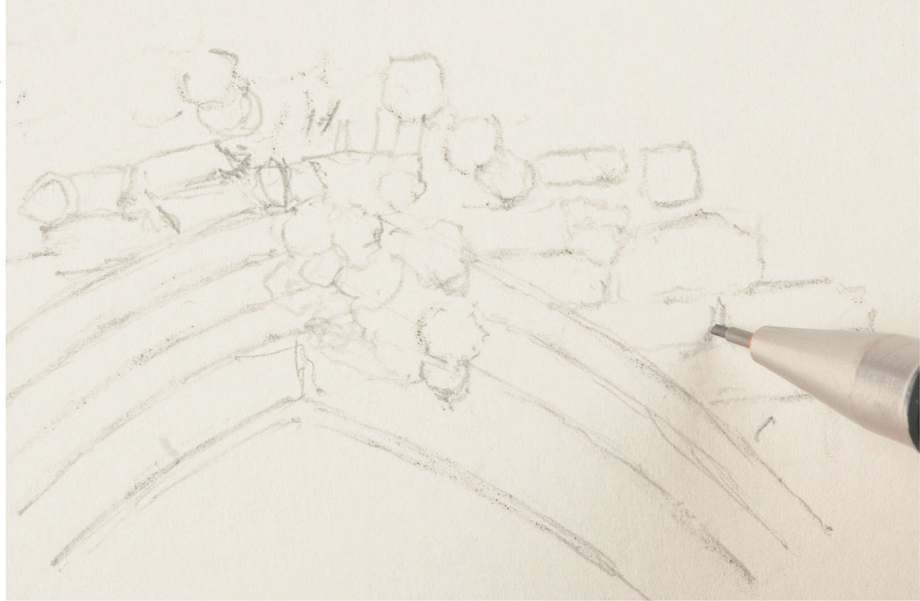
1 The initial drawing is transferred to the drawing paper using tracing paper, working in line only with a sharp HB pencil and light pressure. The artist concentrates on the detailed parts of the composition.
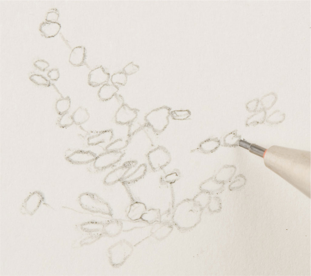
2 This close-up shows part of the flower area transferred to the drawing paper using graphite pencil. Small blobs of reusable adhesive putty can be used to blot the surface. This prevents the gray graphite discoloring subsequent colored-pencil work.
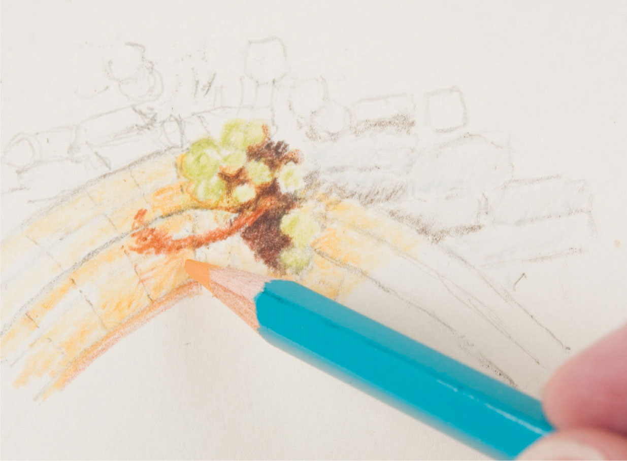
3 The brickwork and the archway are lightly colored in to judge the effect, avoiding any heavy pressure which could fill the paper.
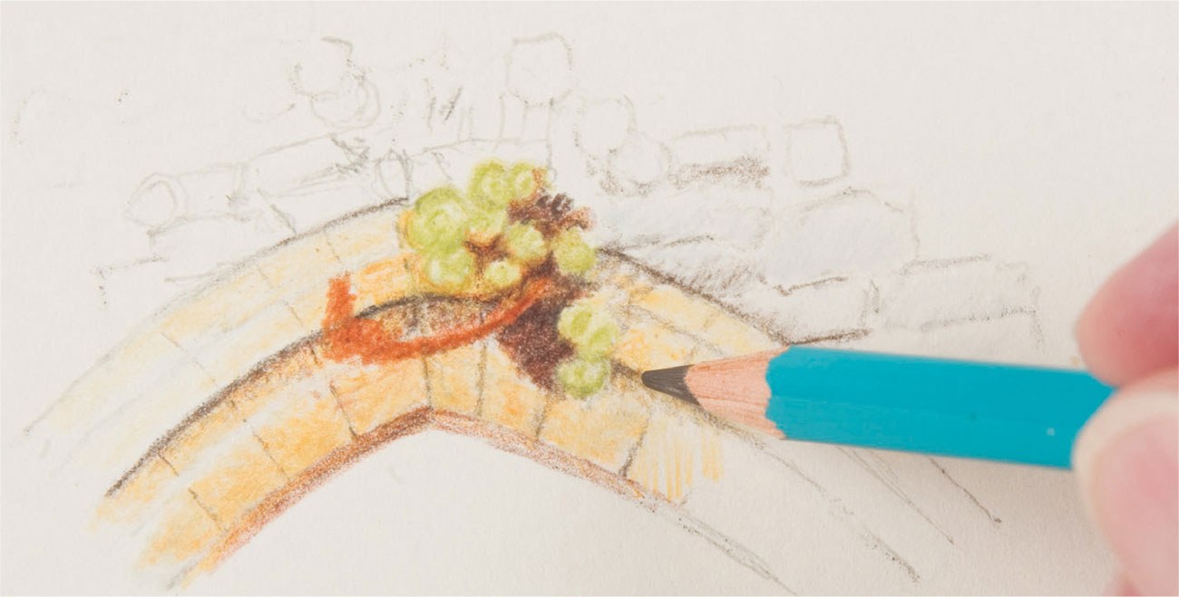
4 Once the colors are established, layers are built up to achieve the desired effect, with careful modeling of form by observation of shadows and highlights.
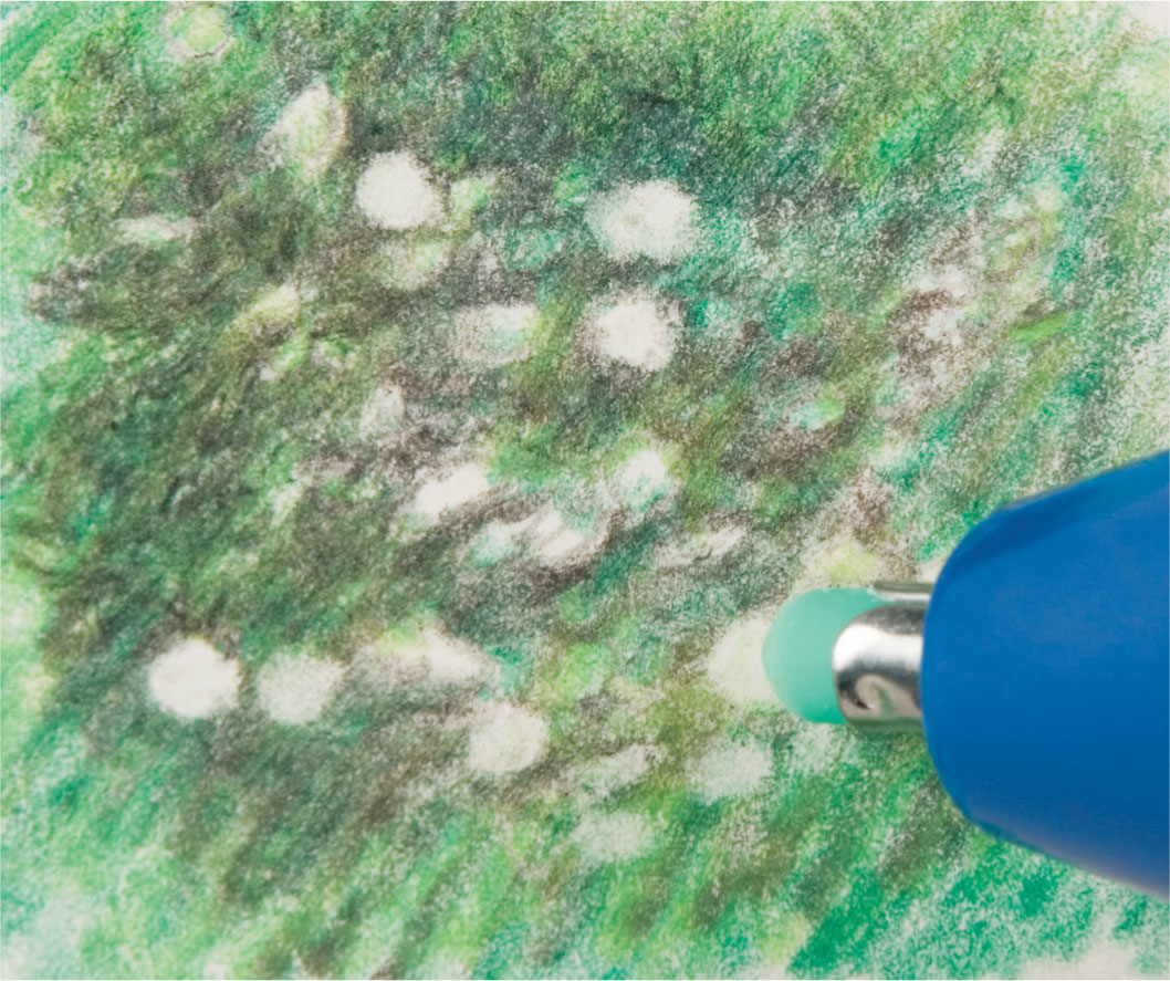
5 A battery-operated electric eraser easily removes small circles representing the flower heads without damaging the paper or disturbing the surrounding work.

6 The flowerheads are carefully added in yellow colored pencil, and the surrounding detail is developed using a brown pencil.
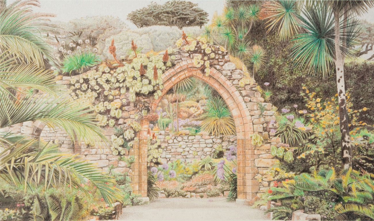
Robin Borrett
Abbey Gardens In developing this work, the artist has concentrated on the texture of the background trees, slowly increasing the detail as he moves toward the foreground. A relatively small palette has been used—depth of color and breadth of hue have been achieved by layering. An electric eraser or blob of reusable adhesive putty easily lifts off color where alterations are necessary. Gradually the whole surface is covered and painstakingly finished to the same level of detail.
Comparing methods: Loose
Here, two artists using differing approaches have reworked the same photograph, Poppy Fields, (shown right) in colored pencil. As in the examples on pages 88–101 the obvious point of departure is in the initial drawing. In the loose style, Artist A keeps to the same level of development for the whole picture at all times and uses a greater range of gestural marks whereas Artist B’s tight style is very even in its surface quality. Greater use has been made of the effects of color contrast in Artist A’s piece, resulting in greater vibrancy and suggested mood.
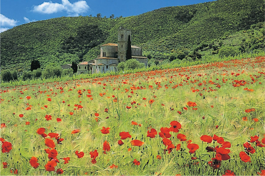
Poppy Fields The original photo with its brightly-colored poppies and contrasting blue sky is interpreted by each artist in their own individual way.
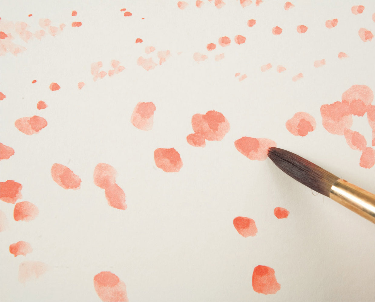
1 After making a very loose sketch to “place” the hillside and the field, the poppies are indicated in red acrylic paint without any further drawing. The paint ensures their redness, as any underlying color would affect the purity of the red.
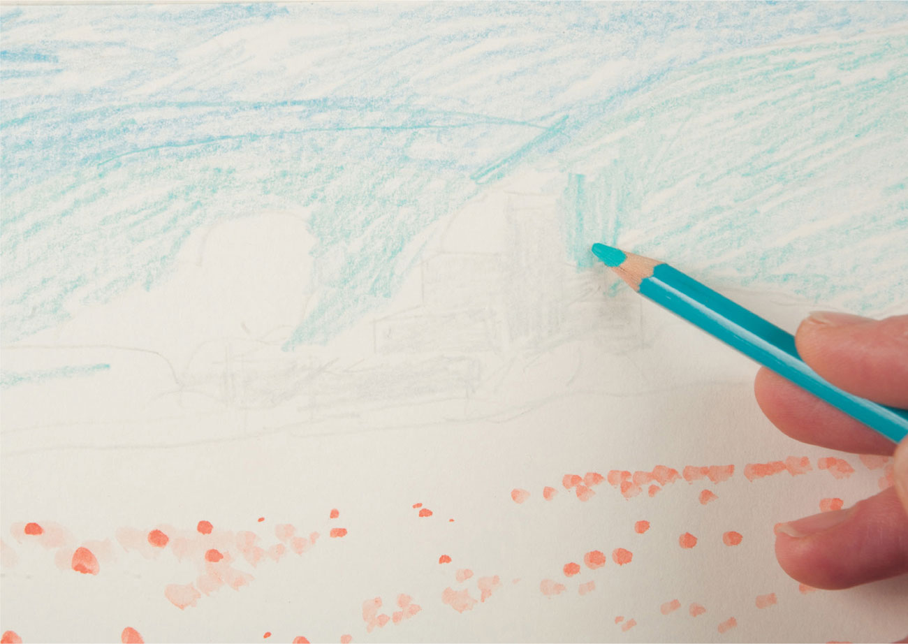
2 With the poppies in place, the composition is mapped out with a light blue-gray pencil. Blues are lightly hatched to indicate the sky and shaded areas.
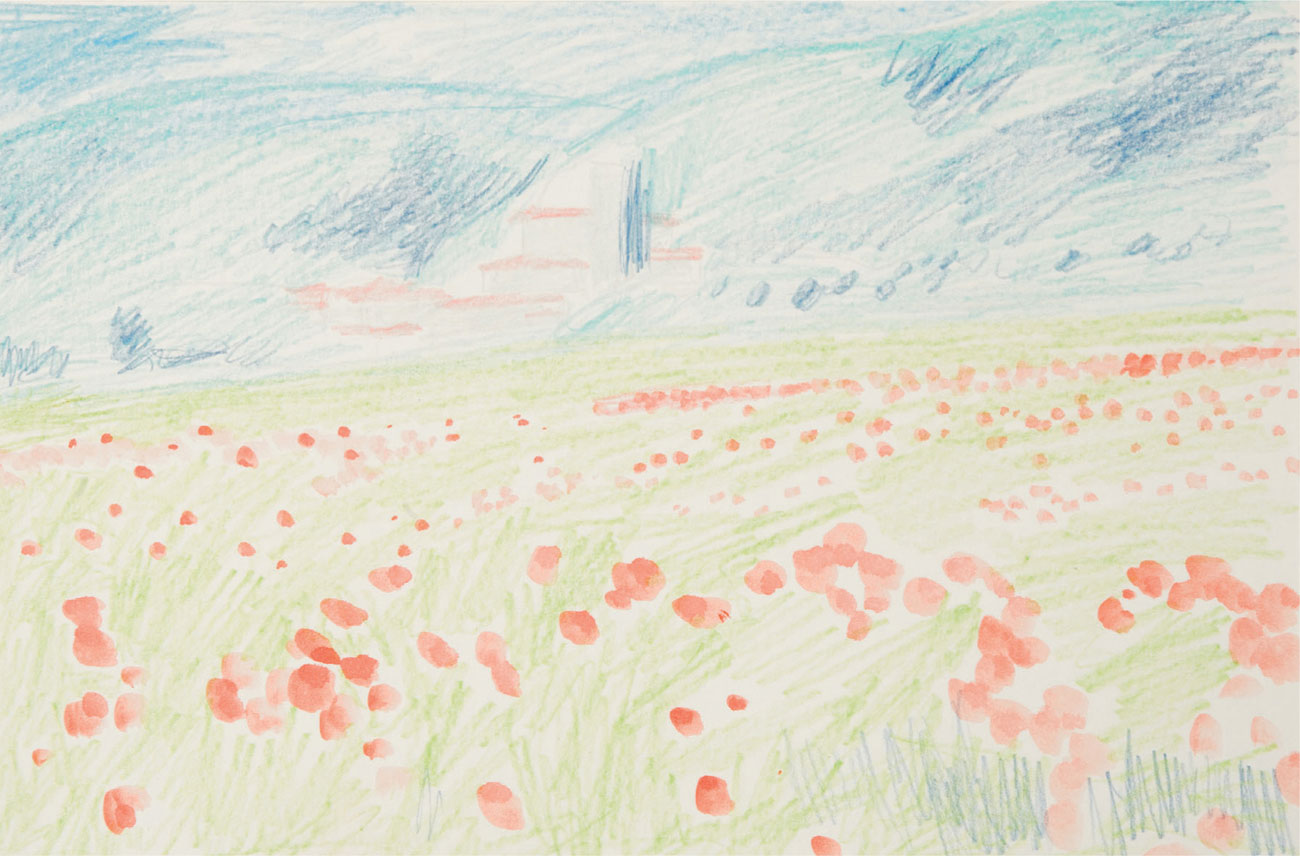
3 The overall view shows a color indication for the whole picture area. Even though the shading is very light, at this stage, it is still important for the marks to follow the form of the hillside, and the direction of the grasses.
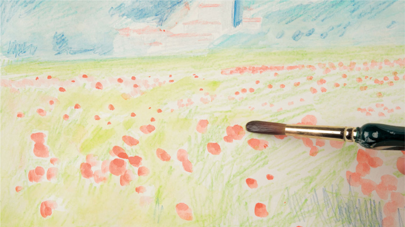
4 Blending the shading with water removes most of the “white” areas, although the color is still very translucent. The red poppies are kept free of stray brushwork, but the rest is freely worked.
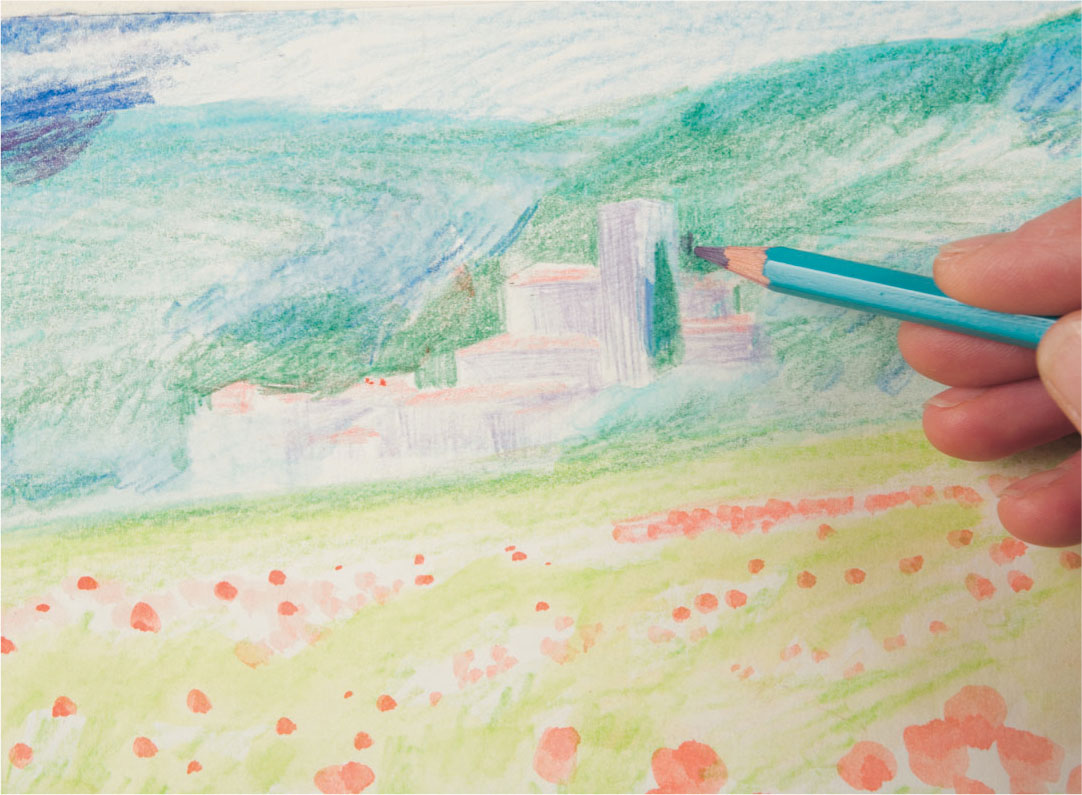
5 The background is worked up in blue, green, gray, and violet, still following the contours and defining the shape of the group of buildings.
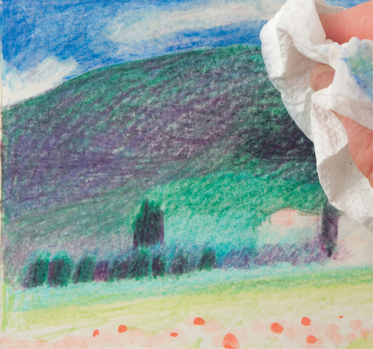
6 Continued work on the hillside creates richer color, and the paper grain remains evident through the layering. Some of the drawing describing the monastery needs changing and is easily removed with a damp rag.
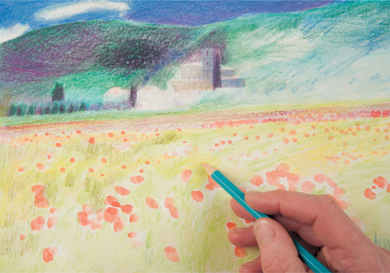
7 Redrawing is left for the moment while the field is developed to the same level as the hillside, with heavier use of yellow and light greens, and some red shading toward the back.
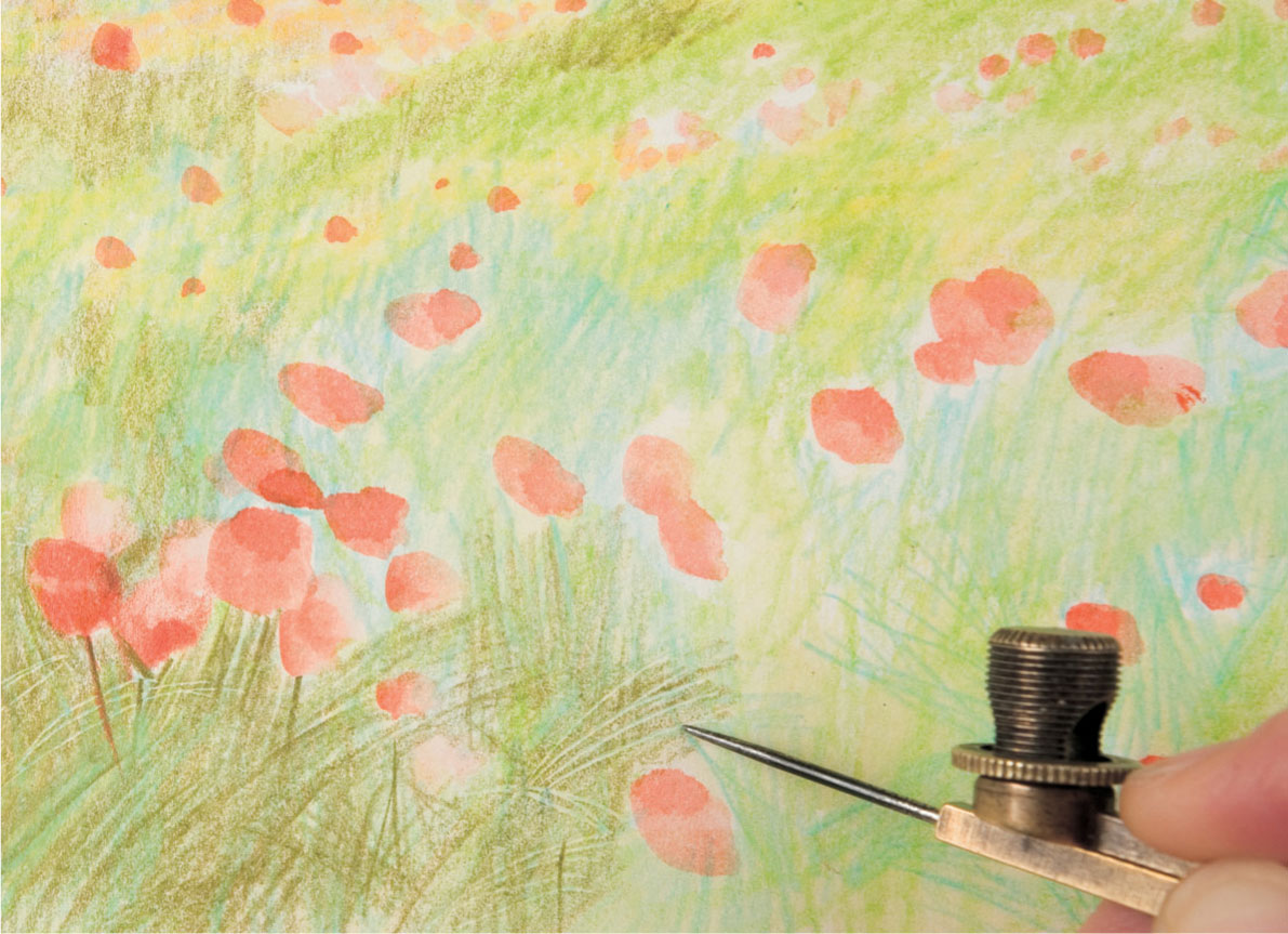
8 A compass point used as an impressing tool over previously colored greens and yellows, is tried as an experiment, to evoke the waving barley in the foreground. The lighter marks are subtly revealed when overlaid with a different shade of green.
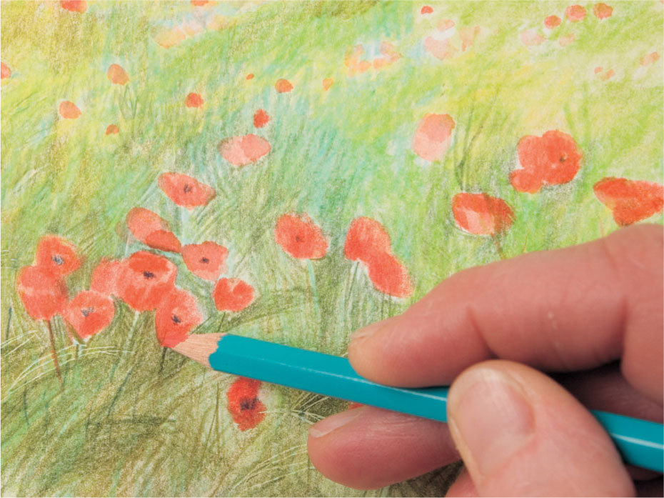
9 The poppy shapes are strengthened with reds and indigo centers, using a pencil occasionally dipped in water. Further drawing in olive green defines the stalks and grasses in the foreground.
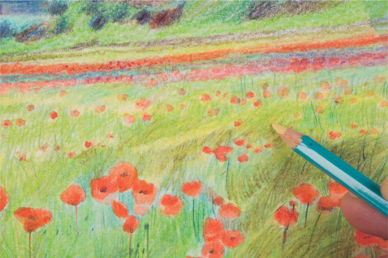
10 A bright warm yellow shaded over the greens ties whole areas of the field together, its translucent quality allows the layering underneath to show through.
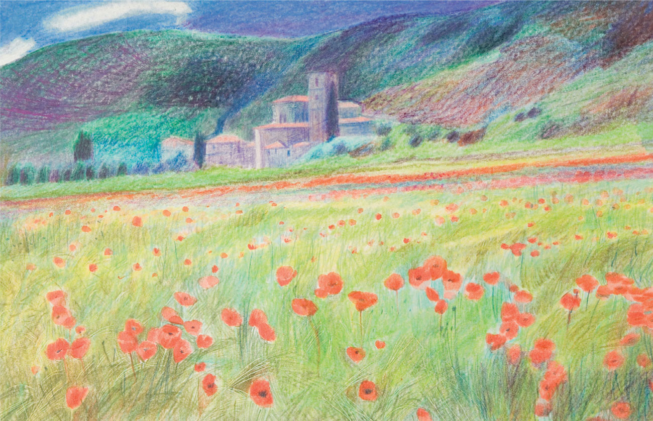
Jane Strother
The Monastery
In the completed picture the grain of the paper is evident in the shading of the hills, giving an appropriate mottled texture, and contrasting with the more linear textures in the foreground. The buildings are redrawn, with care taken to keep the roofs light and bright. There is no white paper showing; the “white” patches are lightly covered during one of the initial washes and with a white pencil (in the sky).
Comparing methods: Tight
Artist B uses a much tighter style in his recreation of the same photograph. The concentrated approach implemented here results in an intricately worked drawing. Artist B takes time to build up his work section by section, producing an evenly worked, detailed piece, although the color contrasts are much less evident than those displayed in Artist A’s interpretation of the same subject.
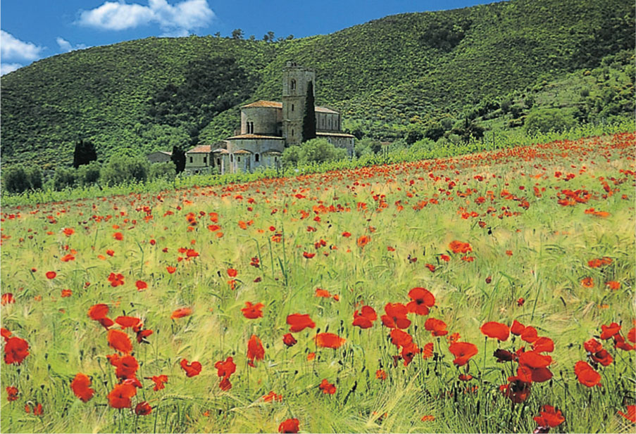
Poppy Fields The same photograph is reworked by Artist B in a much more detailed and methodical way than Artist A’s style.
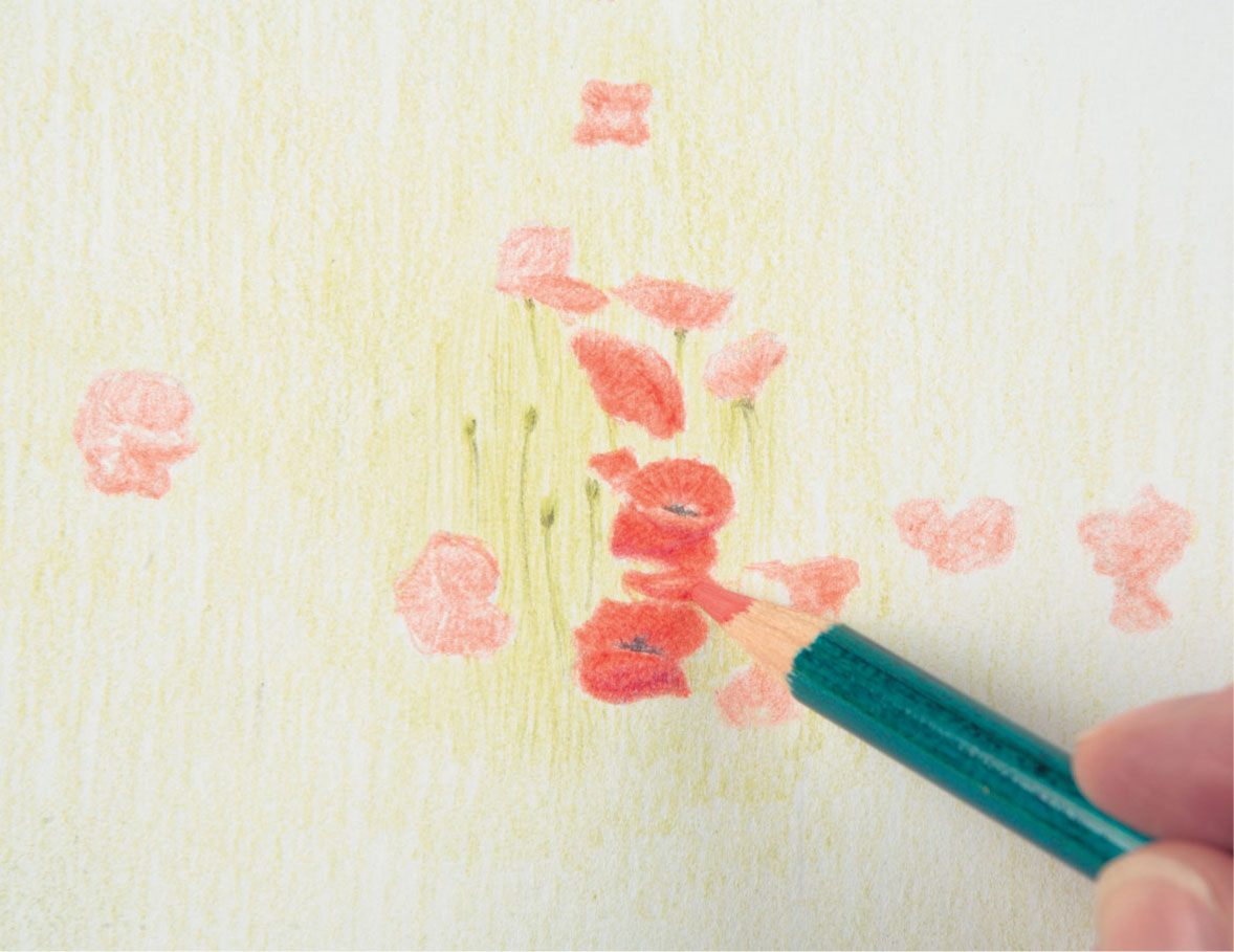
1 Working lightly the artist begins with the foreground after transferring the initial sketch to drawing paper using tracing paper. The main shapes are accurately drawn from the beginning.
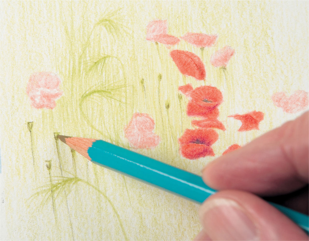
2 The flowerheads, stalks, and grasses of one section are completed before moving on, working from left to right and from front to back. White paper is allowed to show through the hatching. A sharp pencil point is crucial for this degree of detail.
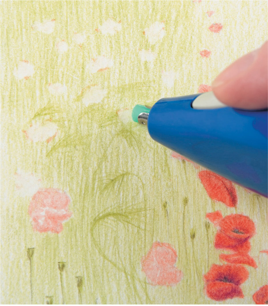
3 After working up the stalks with a green pencil using varied pressure, spaces for more flowerheads are erased using an electric eraser, which takes out exactly the required amount of color.
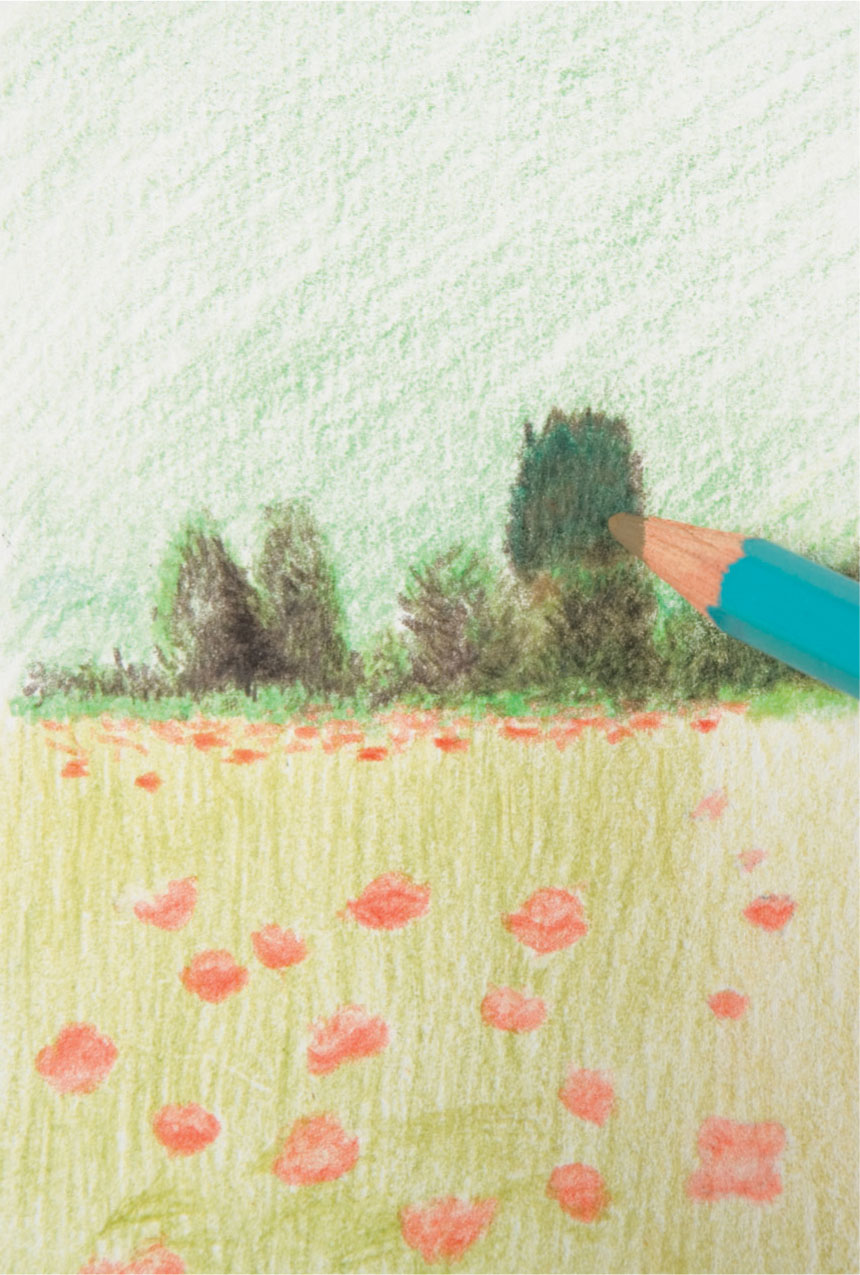
4 In this example, the artist works from front to back, from the field to the undergrowth, and then to the hillside. His more usual approach is to work from left to right, which keeps his hand away from the finished work.
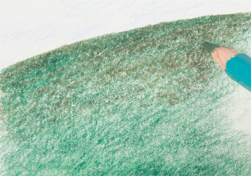
5 The hillside is built up, slowly and painstakingly copying the texture and colors. The pressure is still light, and hence the white grain of the paper remains, the depth of tone created by layering.
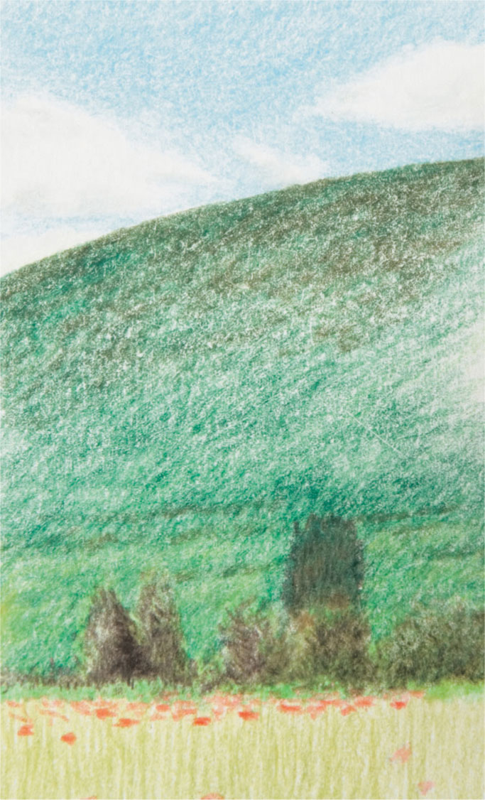
6 The sky begins to complete the picture. The overall feel is of calm and light due to the even pressure and paper grain, which helps to unify the surface.
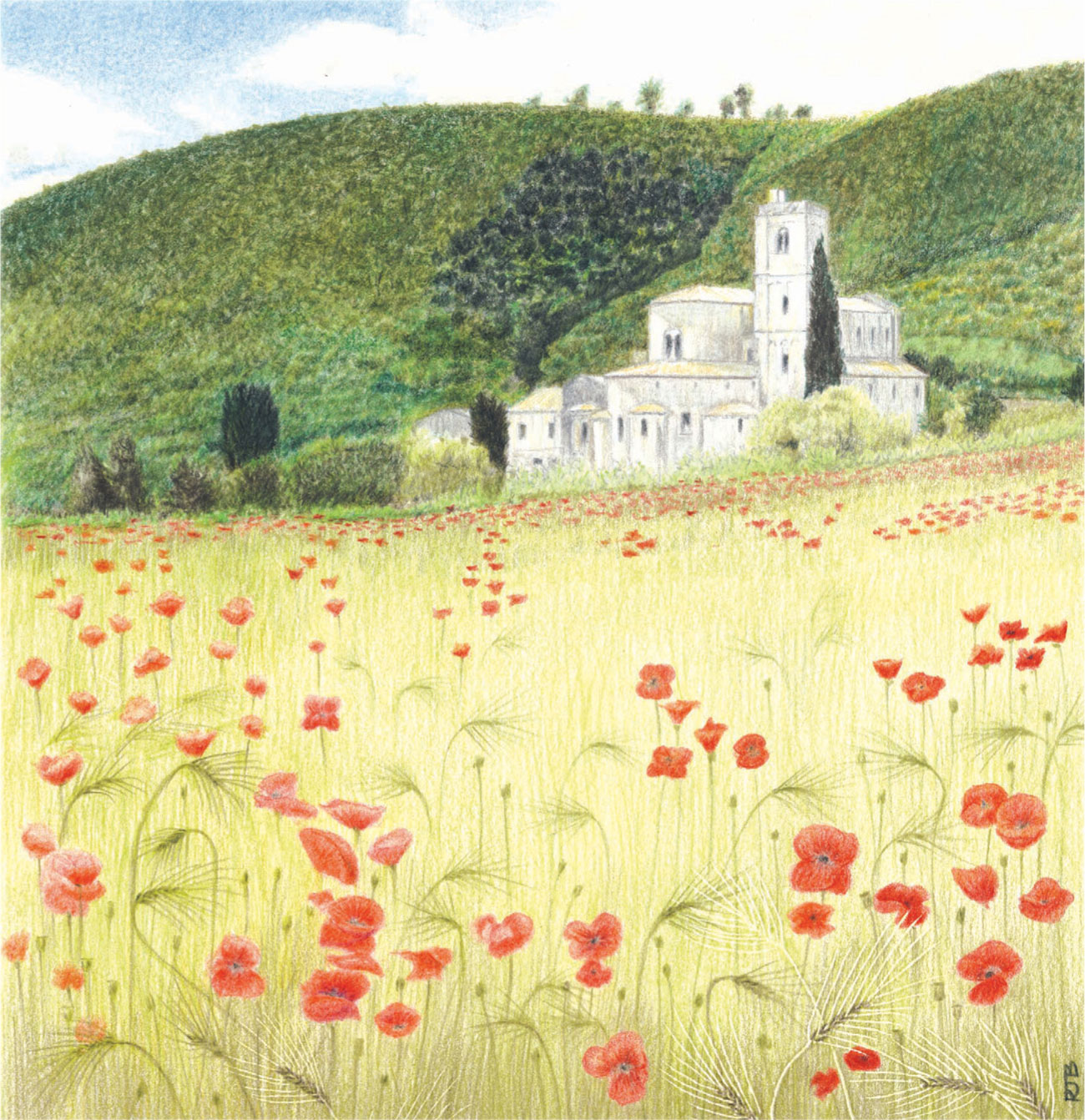
Robin Borrett
Poppy Field
In the final stages, the poppies are given more definition, and a few stalks and heads of wheat added, but care is taken not to overwork the foreground, as this would detract from the focal point of the picture.

